
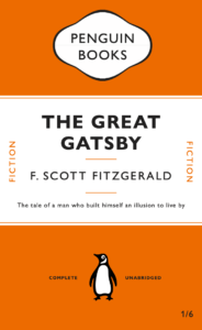
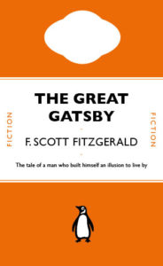
Above is my copy of the penguin classic cover. I followed the tutorial provided, it took me longer than expected as the cartouche was quite fiddly when I tried to smooth out the lines. This task helped me learn some of the fundamentals of InDesign and more about paragraph styles and hidden characters.
Category: Penguin cover (James’s project)
Penguin cover
The Great Gatsby Penguin Cover
Following the tutorial set on Friday’s lesson, I designed the Penguin book’s cover of The Great Gatsby.
The Dracula
Since I struggled the most on the first task with creating smooth edges on the cartouche, I decided to further the practice of this technique by creating a blood dripping effect from where the top line is and also to mirror the themes of the book. I also used the pencil tool to draw the rough guide of where I wanted the drip effect to run, which has resulted in a more organic appearance than if I were to use the oval tool to base the shape off of. Again, overall this task has helped me learn how different tools can be manipulated for different purposes.
Peter Pan
As I have never worked with Indesign, I thought James’ tutorial was very useful in knowing the basic techniques within this software. I found the paragraph style very useful and the different layers you could add and lock so that it is easier to adjust specific images/text at a time.
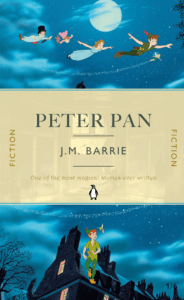
For my second book cover design, I did Peter Pan and got inspiration from the illustrations from the book and also the 2003 movie. For the background, I used a one of the scenes from the Peter Pan movie, where they are flying to Neverland and I really like how movement can be captured at the top, which will draw the reader into the book and make them question where they are going. For the bottom image, I used the same scene and just split the image in half so that the cover flows from top to bottom. For the middle section, I overlaid a yellow background on top of the scene where Wendy looks out of her window, with a big bright moon in the centre, adjusting the transparency levels to a 50% and 80%. I really like this result as again, this gives the reader a preview of the storyline, but also makes the book come to life in a way compared to if it was just a solid yellow background.
Overall, I am very happy with this design as the story of Peter Pan is meant to be described as magical and thrilling, and I think I have managed to achieve these two things with the vibrant colours, use of space, font and images.
If I were to improve part of it, I would maybe change the colour of the font where it says ‘One of the most magical stories ever written’, making it bolder or even brighter. I could have used the effects tool to add some glimmer/shine around it to enhance the ‘magical’ bit of the review.
The Boy in the Striped Pajamas
Following the tutorial of copying The Great Gatsby book cover on Adobe InDesign, I decided to develop my own version of this with my personal choice of book, The Boy in the Striped Pajamas. This book is important to me because, I read this when I was younger and it really helped me to put into perspective the true horrors that prisoners during World War two had to endure. Because the main setting of the book is set around the border between the Jewish Camp and the countryside; I decided to create my own barbed wire fence using the line tool. I made irregularities with the coiling of the fence as it allowed the title as well as the rest of the text to be read easier than having objects that would obstruct the view. Fitting the theme, the blue and faded white stripes symbolize the uniforms that prisoners had to wear, adding to the meaning behind the book. Here I had to add further leading to my design as I wanted all of my information clearly conveyed within each stripe of colour from the background. The cover is supposed to communicate a simple message through the simplicity of what is being conveyed (the barbed wire fence and background).
Great Gatsby Penguin Book Cover Design
Replicating any existing design is a challenging process. However, with a limited understanding of InDesign, I was aware that I would likely find this more difficult than usual.
While following the tutorial video, I was quickly discomforted by the differences between InDesign and other Adobe software. While replicating this book design, the most challenging aspect was the paragraph styles. Trying to create specific style sheets for each piece of text was time consuming, but would be useful if the text needed altering in future designs. Similar to previous work in Photoshop, working non-destructively and ensuring that the document is useful for the future is always a beneficial way of working.
I also found the top element challenging to create – the tools were far from the smooth vector graphic software of Illustrator, and I struggled to create the shape. While the final result is similar to that in the original, it is by no means perfect. I intend to use my time in the Skills module to continue working on my InDesign ability, as I am aware this is my weakest package in the Adobe Suite.
Looking at the design in the context of Photoshop Mockup, I think that the replication was pretty successful. As previously stated, the upper most element could do with more work, as smoothing the edges would likely lead to a better result, but I decided that a more complete course on LinkedIn Learning would likely be more beneficial to my later work.
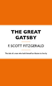
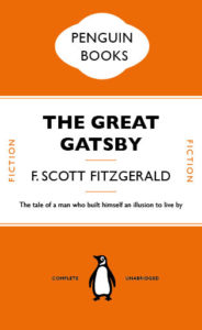
The Great Gatsby
For this, we followed James’ video on using Indesign, in which we recreated a penguin classic book cover. I found this very useful as I had never used Indesign before and it was very easy to follow. This task of recreating the cover was very helpful in getting to grips with the InDesign design program whilst also being able to understanding professional design.
I found recreating the text pretty straightforward. However the most confusing part was the recreation of Penguin Books logo as making the shape was very complicated and it took me the most time to do.
Great Gatsby
Here is my version of the Great Gatsby using the video tutorial.
Penguin Book Cover
![]()
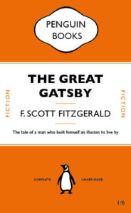
This is my recreation of the Penguin Books cover for the novel The Great Gatsby. I used Gill Sans for the text as this was already in my InDesign. I have included some progress steps to show how I got to my end result.
The Great Gatsby

Through the online class, I have learnt the fundamental skills using Indesign. One of the techniques I found MOST vital is to create paragraph style to the text while making different adjustment like tracking and leading in one panel. I have also learnt loads of useful shortcuts that will be useful to adapt in future designs, like holding shift to achieve perfect move and scale objects proportionally, as well as shift+alt to copy an image.
The hardest part will be working on the cartouche that at the top and using shapes to crop it out, but the pen tool help me a lot with it at last. Overall, it’s such a great practice copying traditional book design and step in using Indesign.