
On this week's Baseline Shift, the University of Reading’s Different by Design team, currently consisting of Lamar Kaki and Minh Nguyen, joined us to give a talk about what it means to be inclusive in design.
Author: Sara Nogueira Pérez
Feedback jam: Magazines & packaging
Rob Banham and Mattew Lickiss joined us in one of our feedback sessions. Our feedback sessions are dedicated to helping students get additional feedback from tutors on a particular project of theirs. We had part 3 students sharing their work on their magazine designs as well as their packaging.
Studio FourPlus
Top 10 tips from Ivalo Nedkov, a co-owner of Studio FourPlus, which is located in Sofia, Bulgaria. The studio specialises in branding and motion design.
Design Print Bind: Working together
Flaminia Rossi and Samantha Whetton, owners of Design Print Bind talked to us about running a small studio, what it's like as a freelancer and the communities they are a part of.
Magazine layouts
Design ideas & process
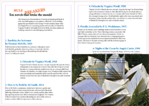
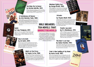
I wanted to show two very different design layouts and chose a non-linear and a linear design. For one I wanted to use a lot of images with not a lot of space between the writing and for the other I wanted it to be very striped back in terms of visual design features.
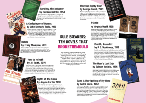
For the very stripped back design approach I wanted to let the typography do most of the visual effect and only used one photograph. This was possible through the use of the text wrap panel. Wrapping the text around the image it could add extra visual to the spread and tie into the text so it doesn’t seem out of place or forced. To stop the image from taking over I used the direct selection tool to cut the image in half so only the right bottom triangle remained, thus allowing the text to wrap around the photograph in a diagonal line to bring it together.
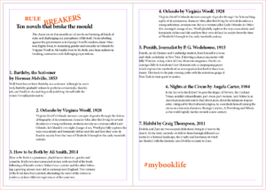
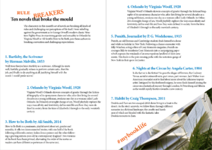
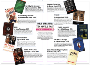
One of my design ideas was to create a circular layout, with the individual book covers surrounding the middle, creating a boarder for the circle. As it is a circular design the most important information goes to the centre, the core of the design. Individual book’s descriptions and information surrounds the title and introduction ,which the reader needs to make sense of what is going on – otherwise they may believe that it’s an ordinary list of books. Another reason for the book information going around the circle is to ensure it is clear that all the books are of equal weight in the hierarchy. There can be no mistaking one as more important than the another. To emphasise the purpose of the article I changed the colouring of the words ‘break the mould’ as that’s what it comes down to, these books aren’t the norm.
Software tutorials
Building on the skills I learned from my previous experience with the Adobe InDesign software when we did the book exerts last term I used my notes to reiterate the principles we touched upon already. This helped me a lot in terms of setting up the hierarchy – especially with the non-linear design as it is an unusual spread for people to come across. Following the rule that something new catches people’s attention, but too many new and unusual things may end up confusing the reader in the end I drew from my experience of common and uncommon techniques. In order to get the spacing between the linear design right I used the guide lines. Similarly I ended up using the guide lines to centre the title and article introduction for the circular spread.
I did use the Adobe InDesign tutorial for Adding work with graphics to learn how to use the text wrap panel. This allowed me to further develop both my designs. Another good thing I learned from this tutorial is how to use the direct selection tool to alter the frame of an image in InDesign. I used this for the chosen photograph to become an integral part of my design to ensure I wouldn’t overwhelm my design with my chosen image. It allowed me to incorporate the photograph into the existing design, while keeping the balance of the layout. With the text wrap I managed to generate more space for the non-linear layout while also linking the individual covers to the corresponding information.
While it wouldn’t have worked for my designs, I do want to learn some more about how to wrap text around an object. Especially as the object doesn’t need to be removed from the image before being placed into InDesign. There’s so many possibilities I can explore with this. Moreover, in future, I would like to explore some more magazine layout styles, in particularly the call out features they use.
Resources for research & inspiration
One of my hobbies is Bullet Journaling (BuJo), so I create layouts a lot within my life to keep myself organised, jot down my ideas and thoughts and to relax. This meant that when this task was presented to me I already had a lot of different inspiration from creating my BuJo. As I wanted to do something that was non-linear I used a double spread layout I like to use on occasion as I felt it would suit the purpose. While I cannot recall who initially introduced me to this particular layout The Petite Planner uses a spread like this for her weekly spread to give you a better idea. Many others in the BuJo community use a similar layout for some of their spreads – the most popular ones I believe are to ones for tracking habits to improve them.
In terms of my other design idea I didn’t have a singular inspiration, I simply knew I wanted to create a large contrast between my two designs. I’m also rather fond of simply having text be the visual as I feel it is being often overlooked. Since I knew the other design would be quite heavy with images, colours and not have a lot of space I wanted this design to show the opposite (within reason of course). After having looked at some of my peer’s designs so far I developed a better understanding of what exactly I wanted my linear layout to look like.
The hidden help
When I think of cinema listings my immediate thought is of the little image displayed by the title, e.g. a still from the movie. Something it gives you a glimpse of what it may be about, other times it catches your attention or causes curiosity. This made the task a bit more difficult to me as we weren’t meant to utilise images merely type.
Having said this I found the challenge quite fun to do as we needed to highlight things such as subtitles, audio subscriptions as well as ratings, whilst also highlighting the date, time and location of the screening and what is being screened amongst other things. We weren’t given the movie blurb which to me meant we were given the bare necessities so this made highlighting particular things more difficult and I really had to think about the importance and hierarchy. Creating this myself made me realise how much help these leaflets have always given me without me realising it – the hierarchy and layout themselves ensure we understand everything and can easily navigate the cinema listings without really having to think too much.
Furthermore, this task truly taught me the importance of ensuring I utilise the correct document size before I start designing in InDesign. You cannot make it smaller once it’s been designed – it will chop the design down and you’ll end up with only a small section. If the brief says A5 don’t create it on A4 accidentally.
Do our eyes deceive us?
Ever played one of those ‘Guess the logo’ games? At the beginning they’re easy enough to get and as you go towards the harder levels you have to start puzzling together the less known logo names by guessing what the letters are. You imagine what shapes could go in the gap, which would be the most likely. Well today has definitely taught me I need to go back to playing them some more as I need to pay more attention to the letter shapes!
 On the left is the sample text we were given, from this we were told to write ‘cadbury’ in the same font. Bellow you will see my attempt at doing so.
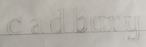 As you can see my photography skills needed some work, focusing on the text though one can tell immediately that i did not track ahead of time. Another thing I needed to improve upon is the proportions of the letters, as the bowl of the a is much too high. Once we compared the attempts to the actual font it also became apparent I needed more weight at the top of the c and the y was more linear than curved. Moreover the top of the letters only have serifs to the left not both ways as I did on the u and y.
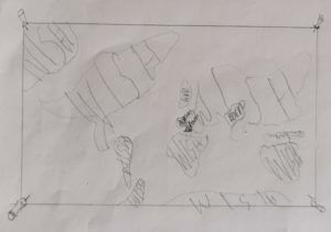
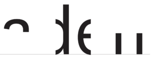 Having looked at my previous mistakes we tried another type of exercise. To find the hidden part of the letters. We were given the template on the right. Where do I go from here? I attempt to visualise the rest of the word of course! I had my logo game training, so I can see it’s obviously adell! Wrong. Luckily someone discovered that upon highlighting the word and right clicking it asks if you want to look up “aden”, mistake averted. Knowing the actual word then made me look back and question how I could have thought it was adell… the spacing between the two stems is much to far apart, it has to be an n.
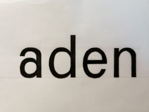 I used the letter shapes present to trace and check then letters I created before colouring it all in black for better contrast. The result can be seen on the left. From the d I traced the angle the a needed to split into a separate stroke and it’s thickness, tracing the first part of the allowed me to flip it in order to see where the second part should be. I also used the d to create the top of the n as I did for the bottom half of the a. Whilst it’s still not the exact same as the font this attempt is much closer to it than my previous attempt. I also downloaded a scanning app to improve my photography and overall am quite content with the outcome of todays project. I also decided I should play more guess the logo games again in order to sharpen this skill further and pay more attention to individual letter shapes.
Italy, Spain, Germany or the UK?
I decided to look at how the different countries in Europe responded to Covid-19, did some put their message across clearer? What could be done better? To narrow down the countries I chose Italy which was the epitome of the pandemic for a while as well as Spain which also went into quite a drastic lock down in comparison to the UK. In addition to this I also included Germany in this, as in my mind Germany is a very pragmatic and effective country.
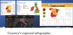 Looking at the different infographics showcasing the pandemic is interesting. Whilst they all broke the country into regional areas (apart from Italy) They all use different colour coding, and yet they all have the same principle – red is the highest danger. In addition to this most countries use the traffic light system to put their message across to the general public very effectively. Spain does take this a step further and show various other categories for each region using pictograms. Italy also does more than Germany and the UK by giving a list of the most impacted areas and showing the survivors as well as deaths and people who tested positive for coronavirus.
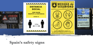
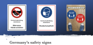
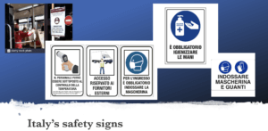
When looking at the general colours used in these official signs in the various countries it’s quickly apparent that the preferred colour for this is blue. Though Spain seems to prefer using yellow, whilst Germany uses both red as well as blue equally. I think this might be due to the road sign rules, where blue means instructions. This makes a question about how effective the Spanish road signs really will be.
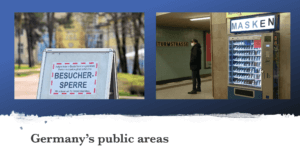
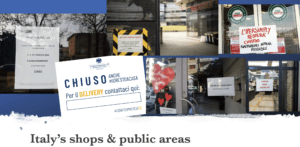
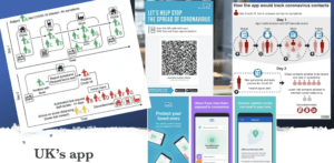
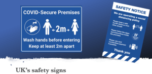
Looking at how countries handled public areas & shops the UK seems to be more effective with it than the rest. This is mainly due to the NHS app, though it does rely on everyone having a mobile phone which can scan QR codes, which isn’t always the case… Nonetheless through the app people are more likely to be notified about potential exposure to Covid-10 than in the other countries like Germany, where they have forbidden visitors from entering a public area (shown above) as a precaution. Having said this Germany does have mask dispensers in public areas so no one will have an excuse for not wearing a mask on public transport, shops, schools, etc. Moreover, Italy has got an official government issued template for restaurants. Very interestingly the only word in yellow (the rest is blue) is “DELIVERY” which, as we know, is an english word. This could mean the locals and tourists all understand that they have to call the number listed bellow (once filled in) to order, as they are only available for deliveries. No other government has issued templates as such for shops and restaurants so this might be something worth looking at to implement as well as the mask dispensers.
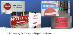
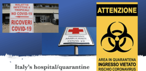
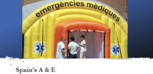
Another thing I noticed with foreign countries is the hospital and quarantine signs. Whilst I didn’t find english coronavirus quarantine signs the remaining 3 countries are worth looking at. What these signs indicate is that the Covid-19 is in the same area as a hospitals A&E generally, which I think is the worst place. The most vulnerable people in critical conditions closest to the virus? Spain resolved this problem by putting up a temporary A&E tent though this is obviously not ideal, until a better solution is found this is acceptable. Moreover, looking at the quarantine signs Germany opted for stop and no entry signs which very clearly portrays their intent. Italy on the other hand took it a step further. Instead of the everyday stop signs they modified the universal toxic sign into a quarantine sign for Coronavirus, making it highly effective as people will definitely take notice of a sign usually portrays mortal danger. We will make time to read what the pseudo toxic sign says, even if we cannot speak the language the “coronavirus” at the bottom makes its meaning clear to everyone.
Pinocchio
We all know Penguin books, but how much work goes into the design?
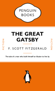
I for one, never realised that the lines between the headers weren’t just added in afterwards, they’re attached to the text itself and change with the text. This honestly surprised me a lot. I also did not know there were hidden characters used every time I write something, e.g. space (a dot placed near the top of the x-height). Just working on this cover made me appreciate just how much actually goes into the formatting of a book cover design.
This made me want to try to recreate a children’s book in a similar style without all the flare and illustrations surrounding them typically. A childhood favourite of mine was always Pinocchio. I like the idea that lies are visible straight away, there’s no hiding them they’ll catch up to you. It’s the ideal book to strip back and recreate in this style.
The Traveling Map
The person who’s ideal gift I designed had the following 3 facts:
- Born in Pakistan, moved to the UK at age 16
- Love make-up and fashion
- Want to travel
At first I came up with various ideas e.g. a suitcase which cleans and folds all the clothes and stops them from getting wrinkles, a make-up kit which never runs out of supplies, etc.
 So I developed my ideas and found that the originally most basic idea of a map showing the places they’ve traveled had the most meaning behind it. It shows you where you’ve been and where you’re still going to go.
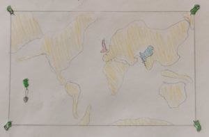
I continued to develop my idea. Turning it into a world scratch map, so only the countries they’ve been and the one they are in stand out.
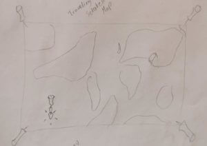
Building on that some more the map gained to ability to transport the person to the country they scratch. So when they scratch Italy for example they will automatically be teleported to Italy.
My 3 random words were as follows:
- cycle
- paintbrush
- vulture
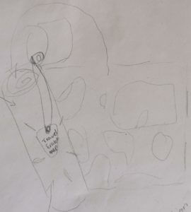 In order to incorporate “cycle” I gave the map it’s own traveling case, with a button-strap in the lid so they can attach their scratching pick. This traveling case also protects the map from all the elements (e.g. water) as well as being the perfect size to fit into a bicycles’ water bottle carrier.
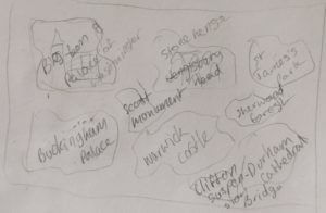 Having successfully incorporated “cycle” I began to think about how I could incorporate “paintbrush”. I began thinking about what a paintbrush is used for rather the brush itself. This lead me to the idea that this magical gift map could show the person some landmarks in the current country to educate them a bit, as well as look pretty. Hence the back of the map will now show them some of the amazing landmarks in the UK, until they travel abroad in which case it may turn into the Sagrada Famila or the Coluseum, etc.
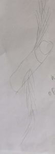 Short of adding a “vulture” painting on the back or front I soon realised I needed to again not think of the vulture directly in order to incorporate it into the gift design. After a while I got thinking about the ideas of vultures flying, so what’s to say this magical scratch map couldn’t do so as well? Taking a bit of inspiration from the golden snitch as well I turned the map’s wings into feathers. To ensure this magical map couldn’t get lost or stolen it will come to the owner when they want it and only opens for them.
Thus came to be the Traveling Map gift idea.