Author: Richard Andre

Building confidence with Photoshop

Design ideas and design process

Golden Statue

This idea was to help me develop techniques for manipulating light and material on photoshop. Here, I have turned a stone statue into gold. For a graphic designer, I imagine it is an invaluable skill as it breaks free from the restrictiveness of the materials of the photographed object.

I began by isolating the statue and placing it against a black background. I then used curves to make the stone appear to be metallic. Apparently the best way to do this is to manipulate the curve into a zig-zag pattern.

I have used the quick selection tool and the solid colour fill adjustment layer to isolate the statue.

The final step in the process is to use colour look-up, which I have become quite familiar with in the past few weeks. I selected the EdgeAmber option, which was surprisingly simple. I wonder if that is all there is to creating the illusion of material.

I have used curves to change the brightness of different tones in the image. This makes it look more metallic.

Autumn Mountains

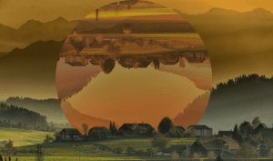
Using colour look-up again, I have created an intriguing image that shows one section in two different states. As such, it would have a lot of potential for a travel-based podcast.

The first step to achieving this was using command+J to duplicate the background layer. I then used the ellipse tool to draw a circle between them and turned the top layer and the circle into a clipping mask. This circular cutout could now be repositioned over the original image.

Using a clipping mask allows for repositioning of the selected area.

I used colour look-up and curves to change the colouring of the cut out so that it looked more autumnal, creating some contrast in the image.
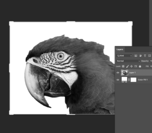
The image was cleaned up with the brush tool. This is just before I used colour look-up.

Tropical Rainforest

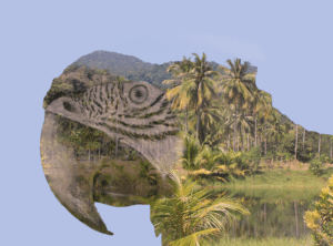
This design crams a lot of detail into a very small space. When considering a podcast image, this is an important consideration, as you’d want the images to make sense on a small display like a phone screen.

Like with my gold statue idea, I began with the selection tool and a solid colour adjustment layer to isolate a section of the image. I decreased the saturation down to -100.

The isolated image is desaturated using adjustment layers.

I turned the parrot’s head into a clipping mask after placing an image of a rainforest on top. After that, I used the eyedropper tool to recolour the background so that it matched the sky.

The parrot just before the eyedropper is used.

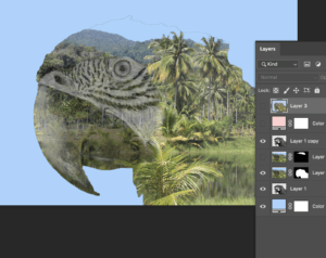
The finishing touch was done by changing the blend mode to multiply, so that the colour was richer.

Software Tutorials

The “Midas Touch” Filter in Photoshop! (Gold Effect)

I used this tutorial to create the golden texture. In a previous week I used a similar tutorial to manipulate light within an image. This tutorial on the other hand, helps me to manipulate material. My next step is, logically, to combine both techniques. This will allow me to progress beyond the constraints of the images I am working with.

Photoshop tutorial – How to make photo effect “Geometric Reflections”

Clipping masks seem an integral function of photoshop, and this tutorial has really helped me build confidence with them. This tutorial in specific involved flipping the clipping mask over, which I did not know was possible. There is clearly a lot more for me to learn about even the most basic aspects of this software. Moving forwards, I should experiment with clipping masks further, so that I can know the true extent of their use.

Double Exposure Effect – Photoshop Tutorial

I had been recommended this tutorial on YouTube for quite some time, so I am glad I finally viewed it for this task. Like the last tutorial, this involved clipping masks, but in a way that was much more complex. I think this technique is more technically impressive, so in future I will have to layer clipping masks up so that I can make even more impressive designs. To obtain true mastery over this software, I should combine everything I know, form the lighting and materiality effects to the more technical clipping mask techniques.

Resources for research and inspiration

For this Photoshop task, I used only images that were available through Pixabay. I used them primarily as a source of inspiration, so that I could then look on YouTube to find techniques. I have found that the high-quality images found on sites like Pixabay and Pexel are a great source of free images for use in artwork. I hadn’t actually used these sites before this module, so I now feel like I am no longer constrained by which images I might have on my camera.

  • https://pixabay.com/photos/rain-forest-palm-trees-river-273780/
  • https://pixabay.com/photos/macaw-colorful-parrot-animals-5952965/
  • https://pixabay.com/photos/statue-monaco-antique-figure-4115144/
  • https://pixabay.com/photos/mountains-village-trees-hills-615428/

A great advantage of using images like this is that for most purposes, the number of images available are unlimited. There is also a huge number of images for any one topic, so there is a high chance that you can find one with just the right angle, colours  and lighting. This way, if your skills on photoshop are limited like mine are, these websites can do a lot of the work for you.

Another week, I also used Pexels, which is a similar site. I think using these websites has really helped me build confidence with photoshop as I feel a lot less limited by what I know how to do. Compared to software like Illustrator, Photoshop seems a lot more resource based, so it is important to have a supply of images I know I can dip in to.


Information design is fun

While doing this task I learned that it can be hard to keep track of all the different types of data you might need to handle when doing information design. I thought that my stylings were sufficient but on closer inspection I missed highlighting a lot of information, such as what language the films is and whether the film has subtitles or not. I also now have a greater appreciation for how hard its can be to get all of your information on one page, as it took a lot of adjustments so that the text fit snugly within the margins of one page. Feedback indicated that my decoration clashed with some of the information for the films, so I increased the transparency so that the text contrasts more with the background decoration.

A Bone-Breaking Clown

Three facts that I was presented with were that someone had two birthdays, someone had never broken a bone, and that someone fell off of a horse once. While reusable birthday cake and horse stabilisers looked promising, they were ultimately dead ends. Oner rejected idea was a birthday cake Rubik’s cube– enough combinations to see you through every birthday you’ll ever have.

The fact I went with for my final idea was that my partner had never broken a bone, so I reasoned a thoughtful gift would be a chance to finally break one. A bone breaking machine seemed a little too on the nose, and two random words, bottle and skeleton didn’t lead anywhere. My final random word was clown, which I think had potential.

Minding the Gap Can Get Tricky

This task was quite straightforward as all the brief was, was to write the word ‘Cadbury’ in the typeface provided. This proved more tricky than I’d anticipated as I chose a serif font, so the structure of the lines was a lot more organic when compared to a sans serif font. This meant that getting the proportions right for every stroke involved was quite hard.

I thought I’d done a good job, but as Gerry pointed out, my serifs were way too pointy and my stroke width was very inconsistent.

For the second part of the task, we had to fill in the remaining parts of the letter from what we were given on the sheet. My serifs definitely improved this time but again, maintaining consistent stroke widths was hard.

Varying amounts of formality in Covid communications

One of the interesting things about the pandemic is the wide range of graphic responses to it. Prom the government, to companies, to families in their homes, there is a massive variety of notices which have been put up, both formal and informal. Companies such as Tesco and Next will probably have their own in-house graphic designers while smaller businesses and families won’t. This means that some notices look very professional and on-brand, whereas others will appear more handmade and thrown together. Two noteworthy examples I found where those of Tesco and one at a shop in the oracle.


Tesco’s poster keeps the Tesco typeface and colour scheme as well as a fitting illustration. As a sidenote, I think it’s also quite interesting how a face mask has become so widely used and recognised. It’s as if simplistic representations of face masks have entered our vernacular. While the poster clearly mimics the Tesco styling, which the designer evidently intended, I would argue that this makes it too easy to ignore. In a Tesco store, there may be many similar posters with this styling, which means this porter may blend in to the point were it’s not actually paid attention to. This makes the design unsuccessful. I think mimicking the official Tesco aesthetic too much runs the risk of appearing too cold and official. I don’t think this design really speaks to the customer in the exact same way as intended as it’s styled almost more of an advertisement.

The other shop (which I unfortunately can’t remember the name of)  on the other hand, has appeared to have taken a rather different approach. They have included two guinea pigs with a rainbow between them. This is quite bizarre, but I think it actually does a lot to maybe make the company’s communication more informal and friendly. The rainbow has come to symbolise the NHS recently, and the guinea pigs may just be being used as symbols for a softer approach. I’m not sure if this is intended, but the rainbow between them makes it appear as if they were socially distant. It’s not exactly professional, but I think this actually communicates to the customer better by doing a lot to humanise the business and its effort for the pandemic. The guinea pigs almost give the business a vulnerable quality.

To conclude, I think the more personal, if less professional communication involving the guinea pigs is actually better, because it humanises the company and is less likely to be ignored.

My job was easy

My initials, R and A are really similar in terms of shape, so I think I had an easier time with this brief than most. That doesn’t mean it was that straightforward though.  Because of their similar shape, when I tried to blend the characters together it tended to look a lot more like A and P rather than A and R. I found that the solution was to morph one of the legs of the A into one of the legs of the R by making it curve off at each end. T think this has worked pretty well as it should look a lot more like A and R in the final image than it does in the process photos. This has taught me that even when a brief appears to be easy, there will still be graphical problem solving that requires creative thinking.

The Borrowers

Before this project, I’d used InDesign before, but I wasn’t aware of the depth of control that it offered. There is definitely a lot to learn here and I think it will be hard to remember all the tips and tricks, especially for text layout. Moving forward thought, I’m definitely interested to see how much can be accomplished on this software. The book I chose to redesign was ‘The Borrowers’ by Mary Norton. I’d certainly like to think my design doesn’t need an explanation!

Bleak, Boring, and Grey

In this project I looked at lettering the environment. Specifically, I took pictures of the greyest, most uninteresting lettering that I could find. Minus the sign on the library, I think I’d rarely notice any of it. This is actually interesting though as particularly with “Altron”, this lettering seems to be in public view but the target audience isn’t necessarily the general public. It’s very unclear as to what the name “Altron” is, so it’s meaningless to most who will see it.

All of this lettering is at a different elevation to the surface it exists on, either being raised above , sunken in, or been punched through. This should make the words more prominent, but really they will me ignored almost all of the time.

Happiness

The idea:

The image which immediately sprang to mind when considering “happiness” was a sunflower, maybe because of the colour yellow, or maybe because the word “sunflower” just sounds happy. I liked the idea of a whimsical character so I gave the sunflower a smiling expression. To turn this image on its head, I drew from the connection between a crop such as sunflowers which are used for oil, and the harmful effects of pesticides used in their production. It is well known that bees are dying at an alarming rate due to factors such as pesticides, so I thought to include dead bees to dampen the mood of this otherwise joyful scene.

The process:

I began by sketching the idea out and inking over it with a drawing pen. On Illustrator I then vectorized the image and coloured it on photoshop. Upon recommendation I animated a camera pan from the top of the image (the happy part) to the bottom (the sad part). I also duplicated the image and darkened it several times to give the animation more depth. I’d never made a GIF on photoshop before so this was a new experience for me

Reflection:

While I think I’ve achieved my goals well, when linking the outcome to the actual brief, I’ve realized that the link between happiness to ecocide is a bit tenuous. This is an important finding as to me, it highlights how it is easy to follow your own interpretation of a brief instead of the actual one.