Author: Megan Beedie

New branding for Georgina Rivers Academy

Background

Georgina Rivers has been in the nail and beauty industry for over 18 years and is a qualified educator, teaching courses for Cuccio ltd and Sallys. She has recently opened her own training academy here in Reading, Berkshire. She has also created her own brand of nail products called GeorgiaBella nail systems. 

Our brief was to create a new visual identity for the client to be incorporated across both a website for the academy, as well as other printed and digital deliverables to aid and boost her business. 

Deliverables and responsibilities 

Due to this job having a large amount of deliverables (some added later in the design process), we decided, once set on overriding visual guidelines for the project, that it would be best to divide them up so that we could focus well on a few of the deliverables each. This was an instrumental and successful factor to working in a group on this project, we all knew what to focus on and could give each other strong feedback throughout the design process. In this report I will focus on the design process as a whole but with a focus on the deliverables that I worked on which were the Certificates, Business cards and the GeorgiaBella logo. 

Primary

  • Digital visual identity guidelines (including academy and GeorgiaBella logo)
  • Responsive website with additional sections for academy and new aesthetics section
  • Social media guidelines / rework (Instagram)
  • Social media advert (animation)
  • Mail Chimp advert

Secondary

  • Business cards (mock up additional)
  • Certificates (mock up additional)
  • Fliers (mock up additional)


Research and ideation

 The project began with us all focusing mainly on the web design aspect of the job as this was the main request from the client. We began this project by looking for inspiration through existing nail and beauty web pages, there is a lot of competition within the market for our client so it was important that we understand how to create a unique but successful branding and website for her. One common theme we noticed when carrying out our research was the use of pink within the field (figure 1). The client had requested that she specifically wanted to stay away from pink and wanted to continue using the teal colour she was currently using on her existing website. She also wanted to continue using her existing logo which was a monogram surrounded by a box. As a group we discussed these choices and decided that in order to create a fresh look for the clients new academy site that we would have to make some changes. After carrying out some research and exploration of colour (figure 2) we decided to slightly change the colour scheme by darkening the bright teal colour to a darker one, the client was really happy with this change and felt that it reflected the classiness and professionalism of her brand. 

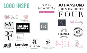
(Figure 1) Logo Moodboard  


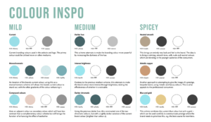
 (Figure 2) Colour Exploration


We also brainstormed ideas for how to develop the monogram logo by exploring ‘GR’ in different typefaces. (figure 3). We found the box around the monogram problematic because it did not apply well in situations such as social media profile pictures and banners which was going to be a big aspect of the clients launch of her academy. We therefore decided to remove this box and slightly alter the typeface used with the monogram to create the polished logo. As a group we were keen to explore typefaces in greater detail as we knew the importance of type in reflecting the feel of the brand. The client was hesitant to diverge from the typography she was already using on her existing website but we still wanted to present her with different ideas. It was my task to focus on researching and exploring typography at this stage and I wanted to explore typographic hierarchy to get an idea of how type would function across the different deliverables we were creating (figure 4). One of the members of my group, Alex, suggested that I came up with three levels of varying intensity of typographic suggestions for the client (mild, medium and spicy). This approach was really useful as it allowed me to reassure the client that she still had the option to stick with the typographic branding she was already using but it also allowed me to explore other avenues so that we could decide as a collective which would be the most effective for the new brand. I would definitely use this approach again on other projects, particularly if it involves a rebrand as clients can often feel attached to their old brand and the design features within it so this approach allows you to respect the clients wishes whilst still being able to explore alternatives that the client may end up preferring.


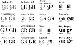
(Figure 3) Monogram exploration


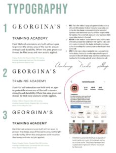
(Figure 4) Typographic exploration 


Design development

After making these initial changes with the brand colours and logo we felt, a long with the client, that we had a good starting point to create a new website and other deliverables within the new brand guidelines we had created. Each team member worked on prototyping the new website in Adobe Xd which again helped us to solidify the brand identity. We then began to work separately on our own deliverables.

Business cards

When creating business cards for the client I wanted to ensure that they encapsulated the values of the brand. As done with other luxury/ designer brands I created a pattern out of the monogram which the client was pleased with. Originally we were to have two separate cards for the salon and academy aspects of the business but the together with the client we decided that it would be more effective to have just the one card. The cards feature social media handles alongside the appropriate social media handles. After feedback from our supervisor, I changed the social media icons to be black and white as they were distracting from the Georgina Rivers branding. I was shocked at how much of a difference this made to the overall professionalism of the business cards, this is something I will take forward in future design work that incorporates social media logos. 

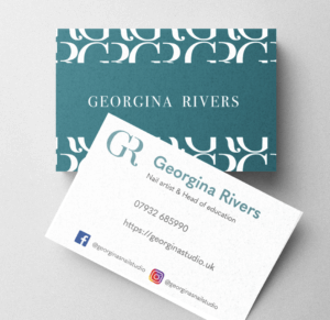
(figure 5) final business card design


Certificates 

Designing certificates for the client was probably the most challenging aspect of this job for me as   we struggled to reach a design that the client was pleased with, leading to around sixteen different certificate designs over the course of the job.  Due to the pandemic and busy schedules on both our and the clients side it was often difficult to meet in person which lead to a lot of feedback being given over email, this in turn made communication less clear and made it challenging to understand what the client truly wanted for this deliverable. This was definitely a huge learning curve for me and with help from our supervisor I learnt some key skills in communicating with a client. Some key tips from my supervisor were to create a summary after every client meeting of what is expected of me and then to follow this up with the client via email to check that I hadn’t missed anything out and to also give them an opportunity to add any more feedback they had forgotten to mention at the time. This then ensures that the client and the designer are in sync with each other and avoids disappointment or frustration due to miscommunication. 

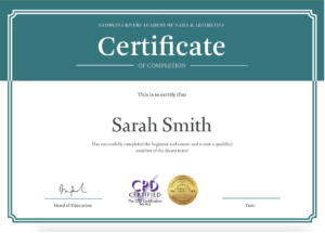
(Figure 6) Final certificate design

Reflection 

Overall I learnt a lot over the course of this real job in terms of dealing with clients and working in a design team. There were some challenges a long the way with the main issue probably being communication amongst the group and with the client. This real job taught me how important communication between the client and other designers is. Communication issues across the project (due to various reasons) also lead to issues of time management and frustrations for both the client and the design team. Dealing with these issues as a group with help from our supervisor has now given me some great strategies to prevent this from happening in future jobs. For example when communication was becoming stunted causing our progress on the job to slow, we were advised by our supervisor that we commit to a meeting with the client, the same time each week. Although a simple step, and one not always adhered to, this did have a huge impact on the progress we were making. Having a time slot that everyone expected and could prepare for each week meant we were much more organised as a team and could progress the job with regular feedback. 

As a whole this job has been challenging yet fulfilling at the same time. I feel it has improved my ability to work with a client and has taught me new skills I look forward to practicing in future work.

Quieter Lifestyle logo

Background

Around 20% of the University of Reading halls are now labelled as quieter lifestyle. The scheme aims to group together students who identify with living a quieter lifestyle so that students can have a more comfortable halls experience.

The brief

The brief for this project was to create a singular brand logo to be displayed on signage outside halls residences that fall under the quieter lifestyle category. We also created guidelines for the logo to ensure the client felt comfortable in using the logo on future applications that we may not be involved in as designers.

PURPOSE AND FUNCTION: The logo will be used on signage placed on lampposts outside the corresponding quieter lifestyle halls to inform people that they have entered a quieter lifestyle area and should behave accordingly and be respectful of the residents. The audience will mainly be students living in these halls or other students walking by, for that reason it was crucial that we made the logo relatable to students. The logo needs to be legible and has to accurately represent the goals of the quieter lifestyle halls without being patronising. 

REQUIREMENTS: The client was eager for the logo to be designed from a student perspective so they left the brief quite open for us to explore different design ideas which we would present to them so they could choose an appropriate logo.

Research

Due to the fast paced nature of this job there was not sufficient time to do the full scale of research we would have liked to do including user personas and audience research however we did manage to carry out what we felt was a sufficient amount of research in order to enhance our performance on the job as best we could.

When researching similar schemes within student accommodation we only found one example named ‘Quieter halls’ which is created by mystudenthalls. The scheme accredits certain buildings with the quieter halls status if it fits under certain criteria. It was interesting to look at the approach used for a logo with the same function as the one we were designing. We felt it did a good job in conveying a quiet atmosphere but we felt it was missing a human touch that would relate to students.


Quieter Halls logo by my student halls

Because there isn’t many examples of logos used for this particular reason, we wanted to carry out further research into existing symbols and signs used to signify that people should be quiet. We found that the ‘shushing’ symbol is represented a lot in these kinds of signs and although it is clearly legible it also has patronising connotations. As students we felt this symbology would remind our generation of being at school and being told off so steered clear of this in our designs. 

Research into ‘be quiet’ symbols and logos

Our final step of the research process was to create a moodboard of imagery that related to the themes of quiet and stillness. We also considered themes that would tie into these that students would relate to.

The board includes themes of:

  • sleeping 
  • Peaceful nature
  • Having a warm drink 
  • Reading 
  • Listening to music with headphones  


Mood board


Ideation 

Some of our initial sketches

Between the two of us we began to create initial sketches inspired by the research we had undertaken. After meeting with the client we narrowed down these sketches to two logo designs which we could develop further.  The client didn’t have any other feedback than this at this stage so we went onto develop these in illustrator

Design development 

Developed ideas favoured by client 

Along with developing the designs which the client favoured we also developed some of the other sketches into vectors in illustrator to keep the options open at this stage. They were still happy with the designs initially chosen and their only feedback was asking to see the face logo in the same blue colour so that they could see which colour it would be most effective in.

Developed combination logo 

After feedback from our supervisor we were advised that the face used for one of the logo designs wasn’t developed enough. We were advised that the illustration was too basic and was giving off more of a childlike impression than would be intended. I decided to develop this so that the face looked more mature, I also put the face facing at an angle which makes the whole logo much less flat. This feedback was really useful because it reminded me of who we were aiming the design at and I felt that it became much more personal and human at this stage. We also received valuable feedback after a real jobs meeting from peers who had previously lived in quieter lifestyle who said that the design was well suited.

Upon further feedback from our supervisor we were advised to explore the logo further still by trying out different stroke styles. It felt counter-intuitive to go back and explore different styles at this stage as the client was happy with the design but after doing so it allowed me to understand simple ways in which logos can be improved.

Exploring different stroke styles

We realised that the brush like strokes added a nice effect to the logo, making it appear less harsh and helping it to reflect better the theme of peacefulness. We decided it would also be interesting to have different versions of the logo using colour to indicate diversity of the person. As a pair we thought that it would make sense to have variety amongst the logos as they would be displayed quite repetitively on signs and doors in close proximity. We also came up with different layouts as the client was unaware of what format they would be placing the logo on.

Developed logo variations with colour 

Final deliverable

Although as a team we were very pleased with the outcome of the developed logos, as well as these being approved by the supervisor, the client decided that they preferred the original design. This was quite challenging because as designers we preferred the more developed versions but we had to provide what the client wanted. The client also ended up only using the logo we provided and not the type to go along with it.  

Final logo sent to the client 

Final logo application 

Overall

Overall this was a really fulfilling project. Although it was fast paced, we learnt a lot of valuable skills a long the way. Having not worked on logo designs before we both learnt how important it is to come up with a wide array of designs and to think outside of the box as well as really focusing on who the logo is for. This project has allowed us to build our confidence in logo design and I believe we have picked up skills that would help us not only in future logo design work but also in any branding work as a whole.

Homegoing Banner

Design Ideas and Design Process

This is the vector drawing I created in response to a brief asking us to design a Facebook banner for the book “Homegoing”.  The task required us to base the banner of the existing cover for the book. In order to start generating ideas I pasted an image of the book cover next to my art-board in illustrator.  I wanted to have a deeper understanding of the book in order to guide my design ideas. To do this I read about the book on a BBC webpage which gave a brief summary of the themes conveyed in the book. This allowed me to keep my work relevant to the story. I decided to create a sense of duality in my banner as the story is based on two sisters leading very different lives lead and how this effects generations after them. I had the idea to create a banner with two silhouettes (as this would create a similar effect to the existing book cover), facing each other. I also looked at photography of west African women and found photos I could trace to make the banner contextually accurate to the setting of the book. 

 I started the design process off by using the eyedropper tool to grab two of the colours from the existing book cover and created two rectangles on each half of the art board in these colours. I pasted the images of the women in and flipped one round so that their was a ‘mirroring’ effect. I then began to use the pen tool to trace around the images, I used the command key to edit the handles (fig1). I then filled in the outline with the colour of the mirrored images background, creating a kind of cut out mirror effect (fig2).

(fig 1-2) showing the use of pen tool to create a mirrored SILHOUETTE effect


To add some detail to the silhouettes, I added a headband to one women and a hoop earring to another, I feel like this also added to representing the characters more accurately with them being of opposite classes in society. I used the shape tool for the earring and edited a circle to fit the shape of an earring and I used the pen tool for the headband. (Fig3-6).   

 (fig 3-6) showing the use of the shape and pen tools to create a hoop earring and headband 


To add some further detail to the banner. I replicated the plants seen on the book cover I did this by using the pen tool to create the rounded white shape, I then used the pen tool again to create half the diamond shape and duplicated this using the option key and dragging my mouse. I then flipped this and combined the  two shapes using the shape builder tool. (Fig 7-9). I then used the shape builder tool again, this time pressing the option key for remove, to remove the overlapping shapes going off the art board.(fig 10-11)

(fig 7-9) using the shape builder to create a diamond shape by combining two halves
(fig 10-11) using the shape builder tool to remove excess shapes


I decided that I wasn’t overly happy with the colours that I had used so I changed the silhouette shapes to match the dark navy colour that is used in the plants. I also wanted to add some more repetition to my design so I duplicated the silhouettes and made them larger behind the first ones to add an outline effect. (Fig 12-13) 

(fig 12-13) adding last touches – changing colour SLIGHTLY and adding a coloured outlines to the SILHOUETTE


Software Tutorials

For this task I found two tutorials. One very broad tutorial/course (https://www.youtube.com/watch?v=Ib8UBwu3yGA&t=10918s) which helped me to understand the software as a whole and was a good outline of the features it has to offer and how these can be used. I also found a shorter and more specific tutorial on how to create a silhouette in illustrator (https://www.youtube.com/watch?v=9EquA6Xje4g&t=443s). I found the illustrator course video on YouTube really beneficial as I feel like it took me through all the tools I needed to get a good grasp of the software. It demonstrated how to use the shape and line tools, the shape builder tool, the curvature tool, the pen tool, the pencil tool, brushes, gradient tool and the pattern tool as well as other features such as liquifying and distorting and bending and warping shapes. I think the most useful part of the tutorial was probably learning about the shape builder tool. This really helped me to realise that I could create any shape I wanted quickly and easily within this software. For example for this task I used the shape tool when creating the navy parts of the plants. I feel like this tutorial taught me that I really needed to practice using the pen tool, which I had aimed to do in this task and I feel as though my use of it was effective, especially in creating the silhouettes of the two women. The second tutorial helped to reinforce the importance of the pen tool in creating complex shapes and this is where I got the idea to trace an existing image.

Resources for Research and Inspiration

One of my main inspirations for this task was the original book cover for “Homecoming” as well as the actual story itself.  I wanted to create a social media banner that really represented the themes of the book whilst associating with the style of illustration used on the existing book cover. I learnt more about the book through reading (https://www.bbc.co.uk/programmes/articles/341QFdHDQGDqQzzx5P1BMmc/vote100books-7-novels-by-women-that-deserve-your-attention). I did also take a look at the different covers that had been previously designed to see how other designers had approached this book and its themes. Another strong influence on my work was researching photography of west African women. This allowed me to depict the characters accurately in terms of the hairstyles they would wear. It was also inspiring to see their clothes as this made me think about different patterns I could have used. The last thing I did to gain inspiration for this task was looking at a website that displayed different ways to create a Facebook banner (https://www.canva.com/learn/50-creative-facebook-covers-to-inspire-you/). This website displayed 50 different Facebook covers and was a really good insight into all the possibilities when designing a social media banner. It also helped me to consider things like where the banner wouldn’t be visible behind the profile picture. It was really useful to look at what worked well and what didn’t work well and apply this to my own work. Although it was not related to this particular task it did also help me to consider how the profile picture and banner need to compliment each other and the different ways this can be achieved. Overall all of these things were really influential in my final design.

A list for Reading Film Theatre

Task C – Cinema Listings

The feedback I was given was pretty positive but I made a few changes to the listing. I added a key for the symbols (cc) and (ad). This is something I chose not to do in my original design as I didn’t think it was necessary with the symbols being well known but after feedback I remembered the brief stating the listing must be suitable for international users. International users may have different symbols for subtitles and audio description so the key is important in this sense. Another criticism was that the text within the film descriptions often cut of mid word onto the next line so this is something I altered.

Illustration Vs Typography

For this task I wanted to look at the differences between graphic design that has been released as a part of a government campaign and graphic design that his been done by individuals not employed by the government. I found some really interesting pieces of design from something called ‘the visual art project’ which is a virtual art gallery that invites graphic designers and artists to submit original poster designs that respond visually to the Covid-19 pandemic. The project was created by Mark Kelner (a DC-based artist), Ben Ostrower (a graphic designer specialising in political campaign branding who founded (wide eye), and Zachary Levine (a historian and curator who runs throughline collaborative).

I thought this would be a good source of comparative work as the designers haven’t had to work with a specific client like the government released Designs. Obviously the two designs have different intentions in terms of sending a message about covid but I think both are effective in their own way. The government design uses a very bold sans serif type in all caps which creates an extremely legible message. The message of ‘control the virus’ is also in a larger type which creates an almost summary of the governments instruction. In comparison to the poster regarding hand washing, the governments design is much more accessible. Not only could this design be read a lot further away (impacting more people) it is just easier to read in general with the centre alligned, large type. The colours used also give this design some sense of urgency for the reader. The border of the design look almost like some kind of hazardous tape which alerts the reader to read the warning.

The hand washing poster uses an extremely small type to elaborate on the message of ’20 seconds’. The use of such a small font here could work in either one of two ways. Some people could be intrigued at the fact that they cannot read the words at first glance or alternatively, someone may simply not be bothered to read it as it requires more effort to look closer. This designer is almost allowed to take this risk as they have not been employed by the key people responsible for controlling the virus. For such an important message perhaps it is best to stick to legible type.

Another large difference between the two designs is that the hand washing poster used illustration to portray a message. A line drawing is used to resemble the washing of hands. Again this could of have varying impact. A line drawing is not something that is bold or even legible at all from a certain distance. This leads to similar implications of the small font choice.. Some may be interested by this, it looks like a piece of art.. however some may hardly notice the subtly of this design which means a failure to pass a crucial message on.


these-excellent-covid-19-posters-are-both-beautiful-and-beneficial

Pairing ‘m’ and ‘b’

For this brief I wanted to experiment with different ways my two initials could be joined together to create a monogram. This was an interesting task as I felt as though it forced me to look closely at the specific details of letter forms. I wanted to keep my design simple and I wanted the letters still to be legible despite the brief stating that it was fine if they weren’t. I felt as though if I joined the letters in a way that made them no longer legible then the monogram would lose meaning. I developed my idea by playing around with colour and sizing of the two letters, this resulted in a few different outcomes that I was pleased with.

Sketches for Initals

The Handmaid’s Tale

After creating a replica of the penguin classics edition of ‘The Great Gatsby’ (pictured below), we were given the task to create our own book cover following the basic principles of the classic penguin format but deviating from this slightly in order to create some kind of symbology/irony within the cover.

I chose the book ‘The Handmaids Tale’ as this is a book I enjoyed reading and feel as though is an appropriate title for a classic style penguin cover. I knew that I would use the colour red as this is symbolic for the book in that the dresses the handmaids wear are red. I also wanted to use white as this is the colour of their bonnets. I wanted the book cover to resemble the identity of the books main character. My first Idea is pictured on the left below, I switched the cartouche shape, that penguin covers use, to two shapes that create the image of a face and a bonnet in the style that the handmaids wear. I wasn’t overly pleased with the outcome of this so I decided to get rid of this and return back to the cartouche shape and work within this shape to create some imagery. I created a simple eye shape within the cartouche as there is lots of imagery throughout the book to do with ‘the eye’ and being watched. I kept it all red so the eye is slightly hidden (just like it is in the book). I used three colours to represent the white bonnet, a shade of colour to represent the characters skin and red to represent the dress. I felt that this three part background didn’t work well for the cover so I eventually settled on using white for the middle and upper section to allow for contrast against the title text and also to resemble the white of the Handmaid’s Bonnet.


Noticeable Type

For this project we were asked to capture images of typography across campus and then compile them in some kind of system. I chose to compile these images in a hierarchy from top to bottom in terms of which bits of type I was most attracted to at first glance. Once i had the final compilation of images I found it really interesting to see strong differences between the top and bottom images. The type that I found most appealing tended to be more colourful with bold large letters that made the words legible. I also thought it was interesting to see that certain typography that I placed very low on the list was sometimes portraying an important message such as social distancing. It was strange to see such an important message presented so badly through type.

This task reinforced to me how crucial typography is in portraying certain messages within our environment.

Pain

Within the theme of pain I wanted to demonstrate the difference between mental and physical pain. To do this I illustrated a scene of two friends sat drinking. One is wearing a sling on his arm to represent physical pain. For the other man I drew a brain that is beaten up/ bandaged and bloody, my intentions with this was to create a metaphor for mental illness as it cannot be seen in the same way as physical illness but can often be just as painful. To represent the invisibility of mental pain I used animation so that the brain appears on and off to show how we can always see physical pain like broken bones but cannot always see mental pain.