Background
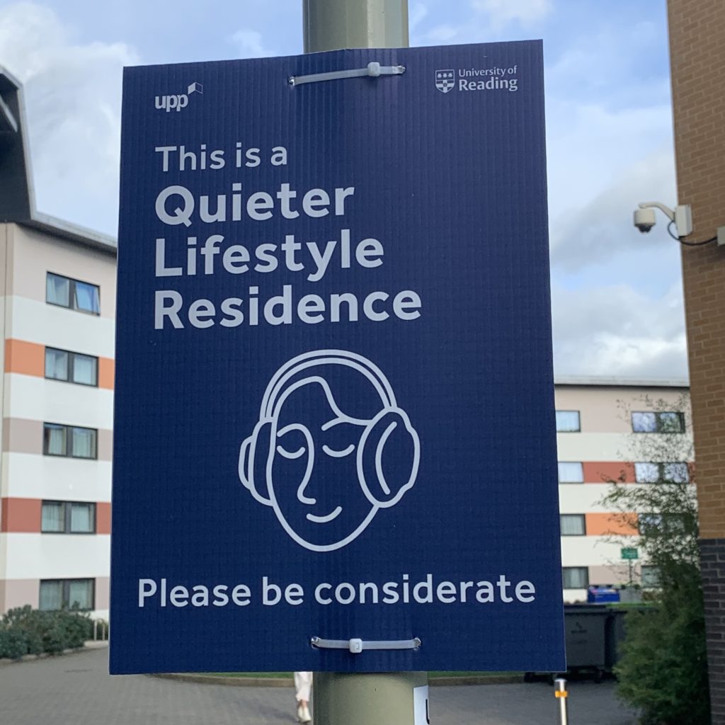
Around 20% of the University of Reading halls are now labelled as quieter lifestyle. The scheme aims to group together students who identify with living a quieter lifestyle so that students can have a more comfortable halls experience.
The brief
The brief for this project was to create a singular brand logo to be displayed on signage outside halls residences that fall under the quieter lifestyle category. We also created guidelines for the logo to ensure the client felt comfortable in using the logo on future applications that we may not be involved in as designers.
PURPOSE AND FUNCTION: The logo will be used on signage placed on lampposts outside the corresponding quieter lifestyle halls to inform people that they have entered a quieter lifestyle area and should behave accordingly and be respectful of the residents. The audience will mainly be students living in these halls or other students walking by, for that reason it was crucial that we made the logo relatable to students. The logo needs to be legible and has to accurately represent the goals of the quieter lifestyle halls without being patronising.
REQUIREMENTS: The client was eager for the logo to be designed from a student perspective so they left the brief quite open for us to explore different design ideas which we would present to them so they could choose an appropriate logo.
Research
Due to the fast paced nature of this job there was not sufficient time to do the full scale of research we would have liked to do including user personas and audience research however we did manage to carry out what we felt was a sufficient amount of research in order to enhance our performance on the job as best we could.
When researching similar schemes within student accommodation we only found one example named ‘Quieter halls’ which is created by mystudenthalls. The scheme accredits certain buildings with the quieter halls status if it fits under certain criteria. It was interesting to look at the approach used for a logo with the same function as the one we were designing. We felt it did a good job in conveying a quiet atmosphere but we felt it was missing a human touch that would relate to students.
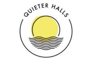
Quieter Halls logo by my student halls
Because there isn’t many examples of logos used for this particular reason, we wanted to carry out further research into existing symbols and signs used to signify that people should be quiet. We found that the ‘shushing’ symbol is represented a lot in these kinds of signs and although it is clearly legible it also has patronising connotations. As students we felt this symbology would remind our generation of being at school and being told off so steered clear of this in our designs.
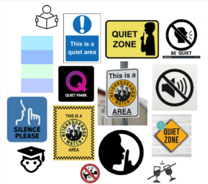
Research into ‘be quiet’ symbols and logos
Our final step of the research process was to create a moodboard of imagery that related to the themes of quiet and stillness. We also considered themes that would tie into these that students would relate to.
The board includes themes of:
- sleeping
- Peaceful nature
- Having a warm drink
- Reading
- Listening to music with headphones
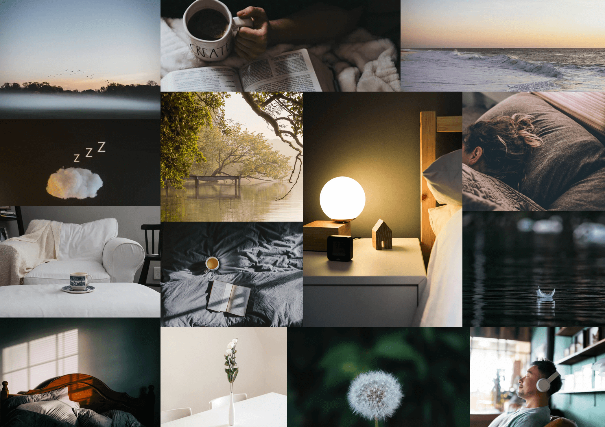
Mood board
Ideation
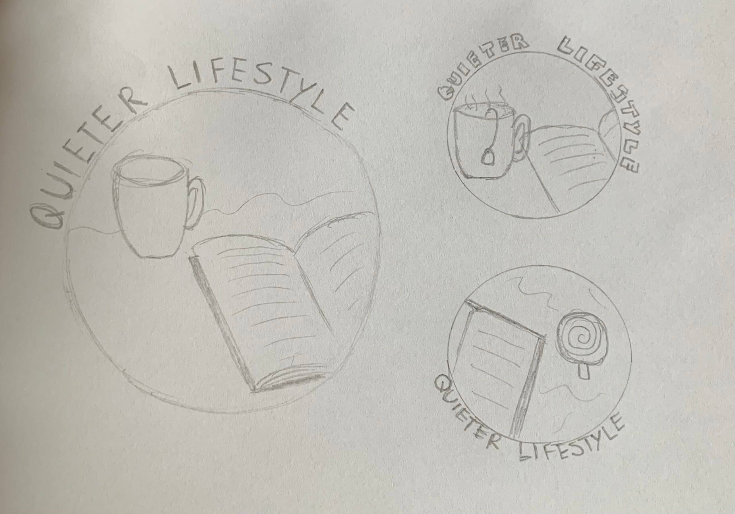
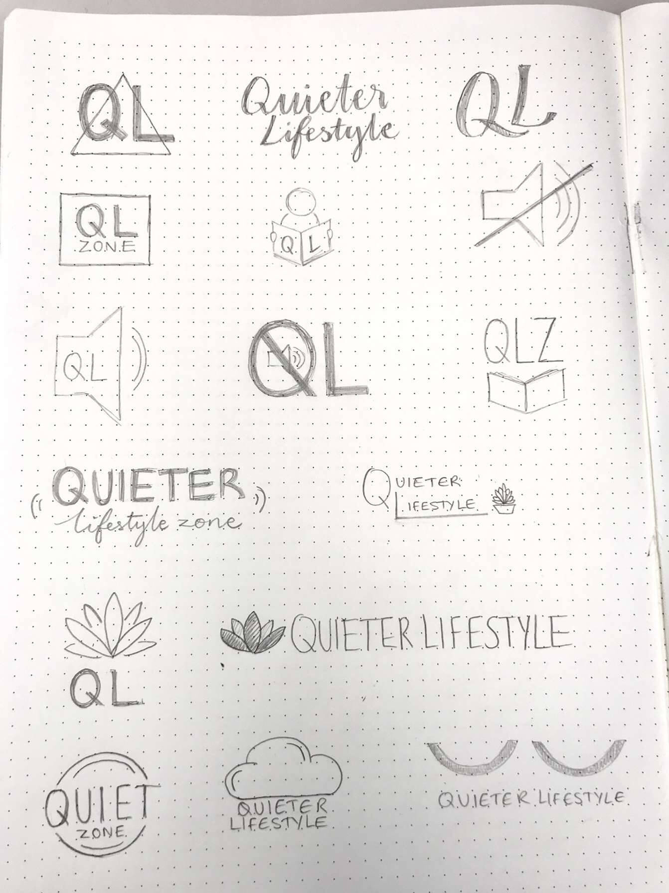
Some of our initial sketches
Between the two of us we began to create initial sketches inspired by the research we had undertaken. After meeting with the client we narrowed down these sketches to two logo designs which we could develop further. The client didn’t have any other feedback than this at this stage so we went onto develop these in illustrator
Design development
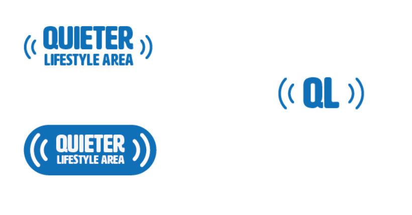
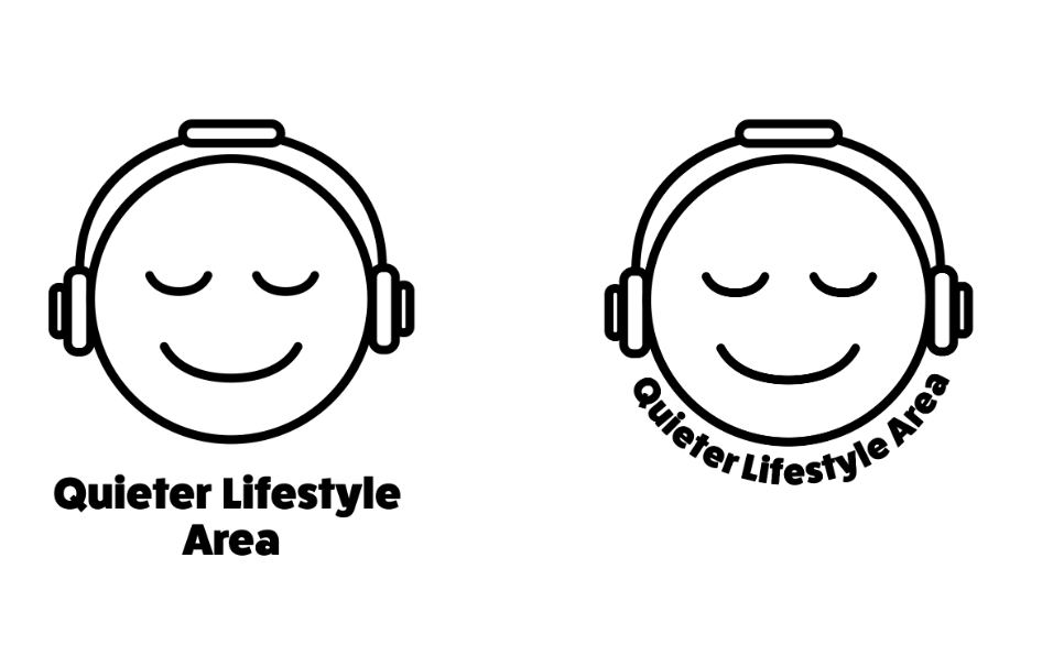
Developed ideas favoured by client
Along with developing the designs which the client favoured we also developed some of the other sketches into vectors in illustrator to keep the options open at this stage. They were still happy with the designs initially chosen and their only feedback was asking to see the face logo in the same blue colour so that they could see which colour it would be most effective in.
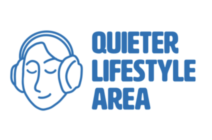
Developed combination logo
After feedback from our supervisor we were advised that the face used for one of the logo designs wasn’t developed enough. We were advised that the illustration was too basic and was giving off more of a childlike impression than would be intended. I decided to develop this so that the face looked more mature, I also put the face facing at an angle which makes the whole logo much less flat. This feedback was really useful because it reminded me of who we were aiming the design at and I felt that it became much more personal and human at this stage. We also received valuable feedback after a real jobs meeting from peers who had previously lived in quieter lifestyle who said that the design was well suited.
Upon further feedback from our supervisor we were advised to explore the logo further still by trying out different stroke styles. It felt counter-intuitive to go back and explore different styles at this stage as the client was happy with the design but after doing so it allowed me to understand simple ways in which logos can be improved.
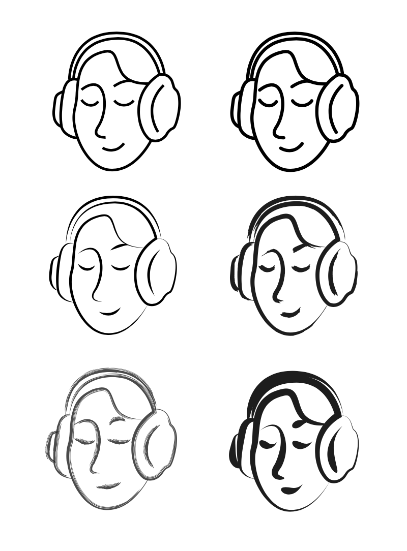
Exploring different stroke styles
We realised that the brush like strokes added a nice effect to the logo, making it appear less harsh and helping it to reflect better the theme of peacefulness. We decided it would also be interesting to have different versions of the logo using colour to indicate diversity of the person. As a pair we thought that it would make sense to have variety amongst the logos as they would be displayed quite repetitively on signs and doors in close proximity. We also came up with different layouts as the client was unaware of what format they would be placing the logo on.

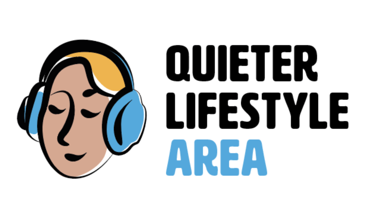
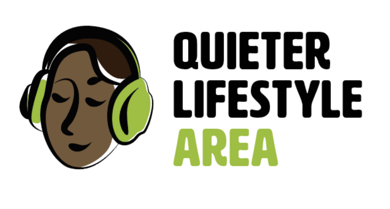
Developed logo variations with colour
Final deliverable
Although as a team we were very pleased with the outcome of the developed logos, as well as these being approved by the supervisor, the client decided that they preferred the original design. This was quite challenging because as designers we preferred the more developed versions but we had to provide what the client wanted. The client also ended up only using the logo we provided and not the type to go along with it.
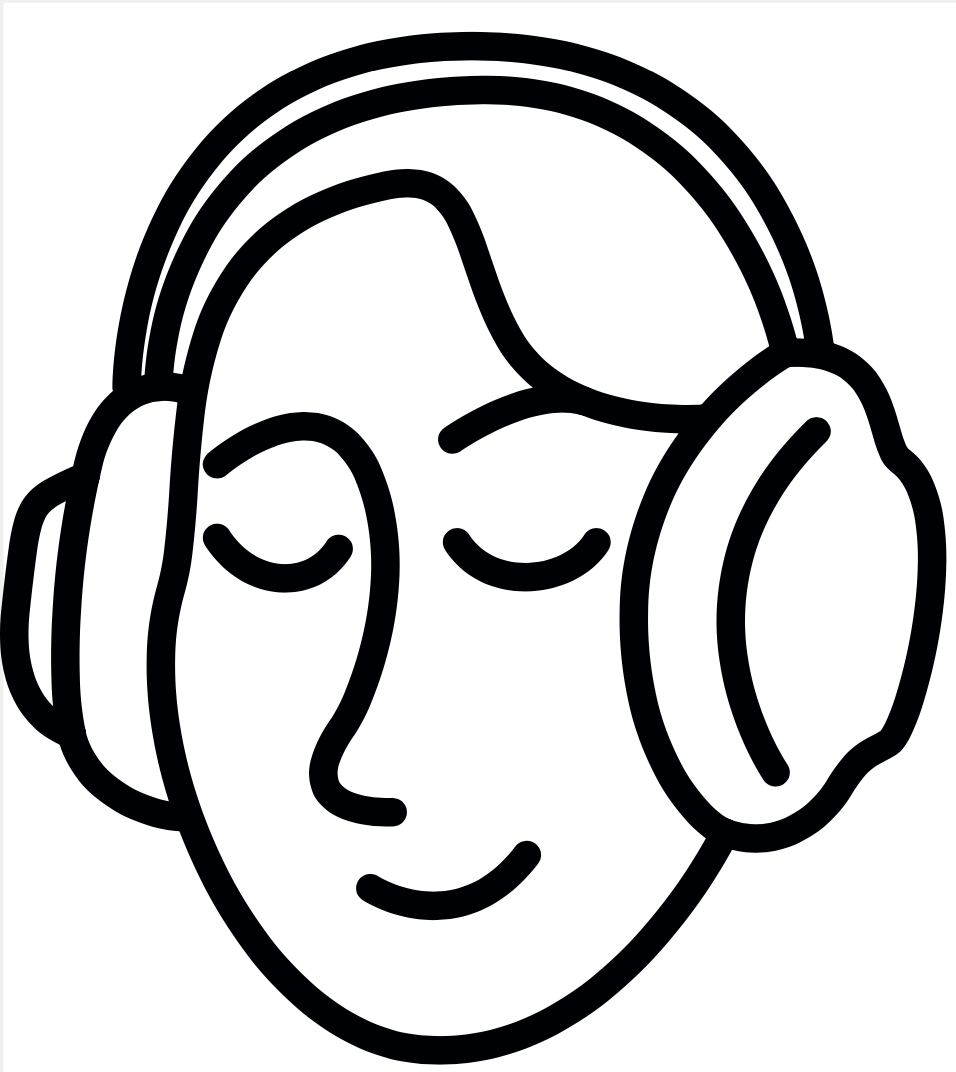
Final logo sent to the client
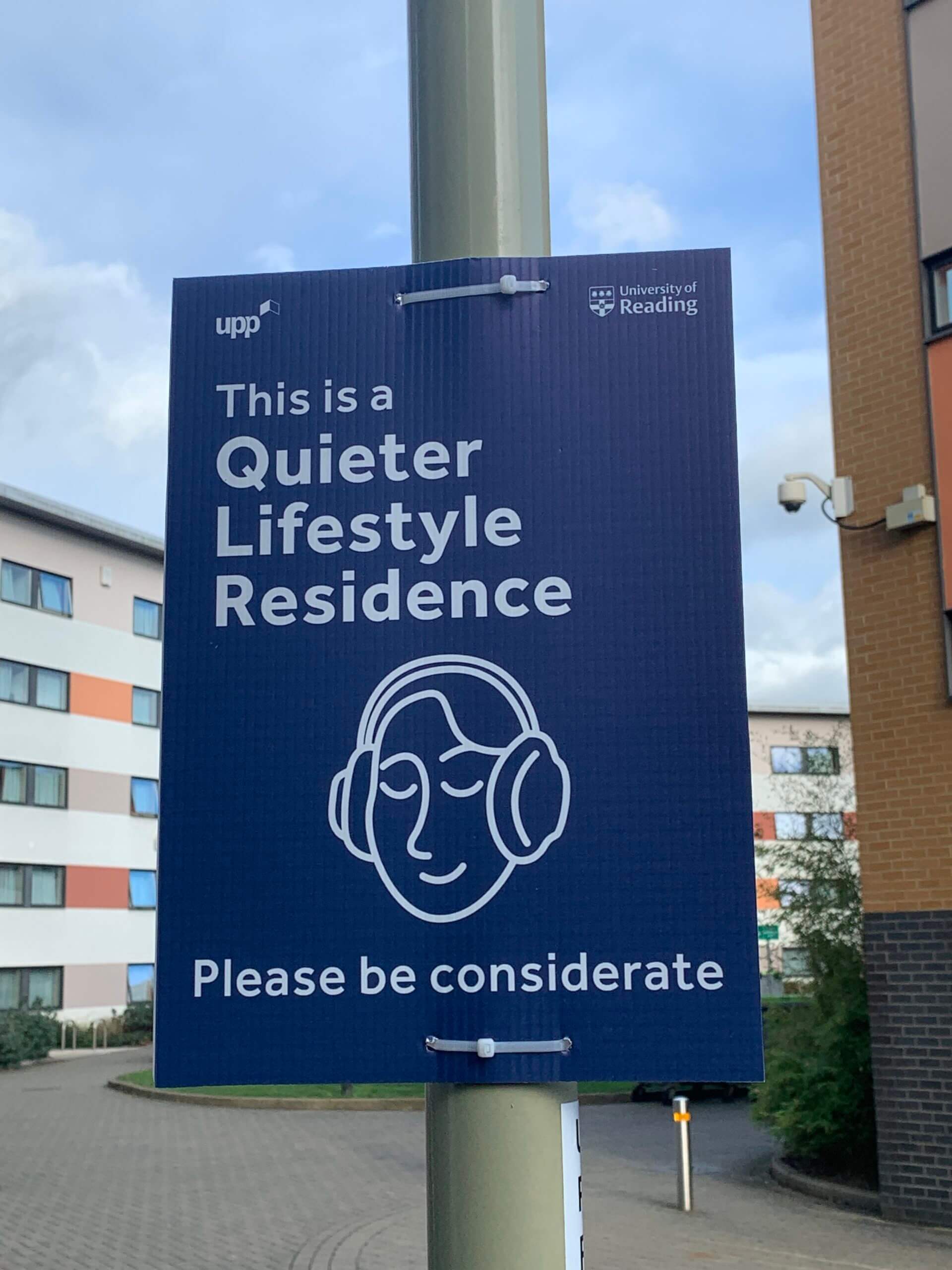
Final logo application
Overall
Overall this was a really fulfilling project. Although it was fast paced, we learnt a lot of valuable skills a long the way. Having not worked on logo designs before we both learnt how important it is to come up with a wide array of designs and to think outside of the box as well as really focusing on who the logo is for. This project has allowed us to build our confidence in logo design and I believe we have picked up skills that would help us not only in future logo design work but also in any branding work as a whole.

