
Design Ideas and Design Process
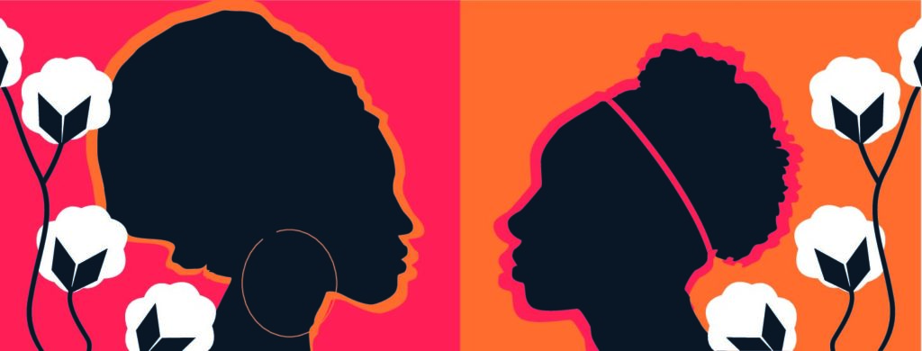
This is the vector drawing I created in response to a brief asking us to design a Facebook banner for the book “Homegoing”. The task required us to base the banner of the existing cover for the book. In order to start generating ideas I pasted an image of the book cover next to my art-board in illustrator. I wanted to have a deeper understanding of the book in order to guide my design ideas. To do this I read about the book on a BBC webpage which gave a brief summary of the themes conveyed in the book. This allowed me to keep my work relevant to the story. I decided to create a sense of duality in my banner as the story is based on two sisters leading very different lives lead and how this effects generations after them. I had the idea to create a banner with two silhouettes (as this would create a similar effect to the existing book cover), facing each other. I also looked at photography of west African women and found photos I could trace to make the banner contextually accurate to the setting of the book.
I started the design process off by using the eyedropper tool to grab two of the colours from the existing book cover and created two rectangles on each half of the art board in these colours. I pasted the images of the women in and flipped one round so that their was a ‘mirroring’ effect. I then began to use the pen tool to trace around the images, I used the command key to edit the handles (fig1). I then filled in the outline with the colour of the mirrored images background, creating a kind of cut out mirror effect (fig2).
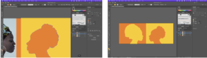
(fig 1-2) showing the use of pen tool to create a mirrored SILHOUETTE effect
To add some detail to the silhouettes, I added a headband to one women and a hoop earring to another, I feel like this also added to representing the characters more accurately with them being of opposite classes in society. I used the shape tool for the earring and edited a circle to fit the shape of an earring and I used the pen tool for the headband. (Fig3-6).
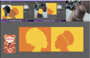
(fig 3-6) showing the use of the shape and pen tools to create a hoop earring and headband
To add some further detail to the banner. I replicated the plants seen on the book cover I did this by using the pen tool to create the rounded white shape, I then used the pen tool again to create half the diamond shape and duplicated this using the option key and dragging my mouse. I then flipped this and combined the two shapes using the shape builder tool. (Fig 7-9). I then used the shape builder tool again, this time pressing the option key for remove, to remove the overlapping shapes going off the art board.(fig 10-11)
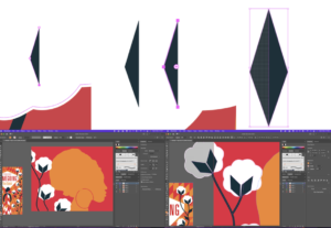
(fig 7-9) using the shape builder to create a diamond shape by combining two halves
(fig 10-11) using the shape builder tool to remove excess shapes
I decided that I wasn’t overly happy with the colours that I had used so I changed the silhouette shapes to match the dark navy colour that is used in the plants. I also wanted to add some more repetition to my design so I duplicated the silhouettes and made them larger behind the first ones to add an outline effect. (Fig 12-13)
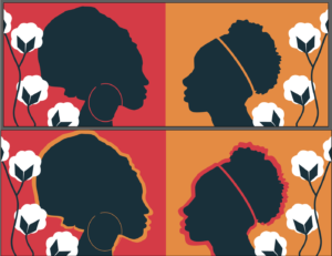
(fig 12-13) adding last touches – changing colour SLIGHTLY and adding a coloured outlines to the SILHOUETTE
Software Tutorials
For this task I found two tutorials. One very broad tutorial/course (https://www.youtube.com/watch?v=Ib8UBwu3yGA&t=10918s) which helped me to understand the software as a whole and was a good outline of the features it has to offer and how these can be used. I also found a shorter and more specific tutorial on how to create a silhouette in illustrator (https://www.youtube.com/watch?v=9EquA6Xje4g&t=443s). I found the illustrator course video on YouTube really beneficial as I feel like it took me through all the tools I needed to get a good grasp of the software. It demonstrated how to use the shape and line tools, the shape builder tool, the curvature tool, the pen tool, the pencil tool, brushes, gradient tool and the pattern tool as well as other features such as liquifying and distorting and bending and warping shapes. I think the most useful part of the tutorial was probably learning about the shape builder tool. This really helped me to realise that I could create any shape I wanted quickly and easily within this software. For example for this task I used the shape tool when creating the navy parts of the plants. I feel like this tutorial taught me that I really needed to practice using the pen tool, which I had aimed to do in this task and I feel as though my use of it was effective, especially in creating the silhouettes of the two women. The second tutorial helped to reinforce the importance of the pen tool in creating complex shapes and this is where I got the idea to trace an existing image.
Resources for Research and Inspiration
One of my main inspirations for this task was the original book cover for “Homecoming” as well as the actual story itself. I wanted to create a social media banner that really represented the themes of the book whilst associating with the style of illustration used on the existing book cover. I learnt more about the book through reading (https://www.bbc.co.uk/programmes/articles/341QFdHDQGDqQzzx5P1BMmc/vote100books-7-novels-by-women-that-deserve-your-attention). I did also take a look at the different covers that had been previously designed to see how other designers had approached this book and its themes. Another strong influence on my work was researching photography of west African women. This allowed me to depict the characters accurately in terms of the hairstyles they would wear. It was also inspiring to see their clothes as this made me think about different patterns I could have used. The last thing I did to gain inspiration for this task was looking at a website that displayed different ways to create a Facebook banner (https://www.canva.com/learn/50-creative-facebook-covers-to-inspire-you/). This website displayed 50 different Facebook covers and was a really good insight into all the possibilities when designing a social media banner. It also helped me to consider things like where the banner wouldn’t be visible behind the profile picture. It was really useful to look at what worked well and what didn’t work well and apply this to my own work. Although it was not related to this particular task it did also help me to consider how the profile picture and banner need to compliment each other and the different ways this can be achieved. Overall all of these things were really influential in my final design.