Background
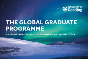
This branding project was for a new and upcoming module established by Daniela Standen, which will be part of what the University of Reading will soon be offering in the new academic year approaching. Our goal was to deliver a visual identity for the client which would essentially promote this new module. Our challenge was to make sure that collectively the final deliverables worked together using the same visual identity to promote and communicate across what the Global Graduates module has to offer for potential and existing students. By taking part, they have the opportunity to improve and extend the asset of skills they already have and take part in activities outside their subject to become a better citizen and stand out to future employers.
Brief
Both me and Hanorah worked on to create a cohesive brand identity across the three deliverables we agreed on with our client Daniela. We knew that to achieve this, we had to remind ourselves of the existing brand identity of the university itself to ensure this cohesiveness was implemented throughout all the final outcomes, whilst echoing the visual identity of the university. The set of deliverables agreed on were:
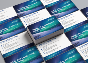
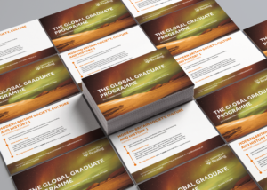
- A set of postcards for each sub-module (x4)
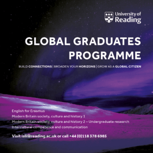
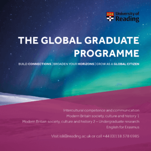
- A website banner (for the page corresponding to this programme on the university’s existing website)
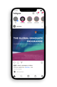
- A social media graphic (to be posted on platforms such as Instagram and Twitter)
These final outcomes were to be displayed ALL digitally, with the exception of the postcards which were to be printed as well to be handed out to new students during Welcome Week.
Research
User personas and needs
Establishing our target audience and generating ideas with them in mind was our first step. These outputs should promote the Global Graduates module to existing, new and global students and increase interest in taking part in this extra-curricular programme to build and enhance skills outside their degree course and academic development. We used the existing identity of the university and the brand guidelines provided by the client to ensure that the final outcomes echoed the identity of the university itself, whilst also bringing in a fresh and innovate design to distinguish the module. This approach ensured we targeted the user effectively – to have a professional design, whilst also keeping it fresh and engaging to attract the young people.
Visual references
To give our client some design overview of what the final outcome could potentially be like, we decided to produce some mood boards for each deliverable. This got both parties to begin to think about appropriate genre, graphic style and typography treatment.
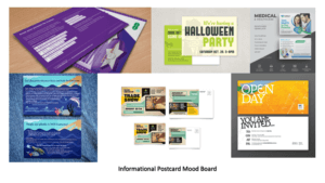
From the feedback we got from our client, she preferred the simpler designs (mood boards 3 and 4) We noticed a set of features used by both of these visuals alongside images we found for inspiration (for the other deliverables) which made them successful:
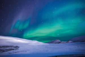
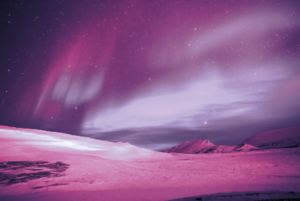
- The background image has the most drama (instantly catches the audiences’ attention making them want to read the information.
- Theme of photography and editing – a consistent style in terms of the imagery used and the way the images have been edited is a common theme. Experimenting with different depths and densities of the hue, saturation and the luminosity of an image can transform the images from looking dull and boring to them looking mesmerising and appealing to the younger audience.
- Consistency of typefaces and sizing (use of the typeface Effra with minimal tracking)
- The use of the different weights in the typeface differentiates the types of information which helps the audience navigate through the information better.
- The use of white as the predominant colour for the typography acts as a nice contrast with the background colours.
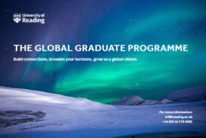
- The use of the university logo (typically placed on the right-hand corner – mood board 6) endorses the identity, again helping the audience to distinguish where it has come from.
Design developments
Postcards
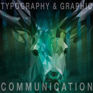
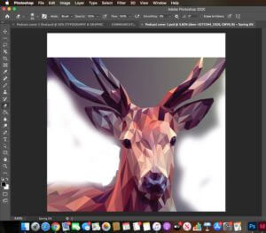
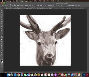
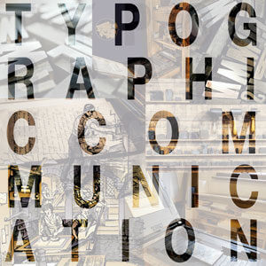
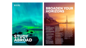
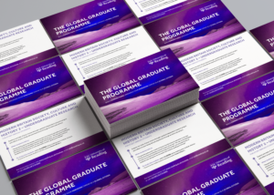
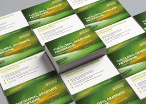
We had to produce a series of postcards which had a consistent visual identity across all, however still being differentiated by the different sub-modules. Our aim for our initial design (version 1) was to try and get all the elements (typography, imagery, logo) on the page. Although this design concept is neat, it was too simple, so our supervisor instructed us to add more innovativity to the design. As well as this, having this same background on all four postcards could make it seem as though they are all the same, when in fact they have different pieces of information behind them. When these are placed on a table at a welcoming event, students can easily assume this too and not pick them up. In light of this, we decided to edit the image we found on Pixabay, using Photoshop, inspired by the mood board we had made previously (mood board 4). After experimenting with different filters and luminosities, and changing the hue and saturations of the single image, we were able to compose four alike, yet different graphics which really helped make a big turn in our design developments (see graphics below).
Postcard 2 shows a different layout of the elements with a more visual appeal. The timeline of the graphics draws the reader in and makes it more exciting to read as they are being guided through the postcard. We transferred the contact information at the back as the client wanted all the attention to be on the heading and slogan. We acted upon our feedback given by our supervisor to do something different with the slogan as the words had the ability to be manipulated in a way to be of more appeal. After capitalising the slogan and separating the phrases, we decided to increase the weight of the words “connections”, “horizons” and “global citizens” Accentuating these words intrigues and engages the audience as they want to have and be all these things. In the final outcome of the postcard (version 3) we also took out the anonymous icon graphic as it leaded towards the design getting overcrowded. We had to remember that when printed, it would be A5 and seeing all of this on such a small card can overwhelm the reader, leading onto them potentially showing no interest at all.


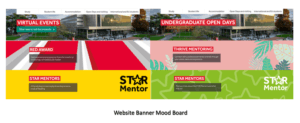
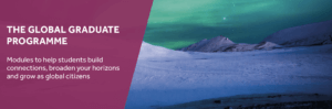
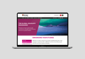
Website banner
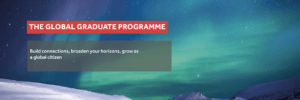
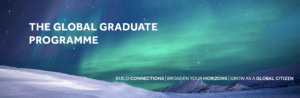
We began the website banner by taking inspiration from the existing page banners from the university’s website and implementing a similar style (website banner version 1) The red box around the heading was something we saw which came up quite frequently, however it did not collaborate, or work well with the design of the postcards. After we removed it, there was still something missing – we did not want to just replicate the design of the postcard onto the banner directly, it had to be a bit different. Therefore, we added a new element (shown in website banner version 3) with a left alignment and a lower opacity of the fill so that the background can show though. This enabled us to place the typographic elements easily also following a left-alignment. We decided to change the slogan as we thought that by writing a sentence would connect to the reader more and would act as an invite to the web page.
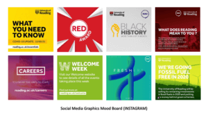
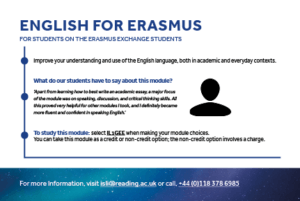
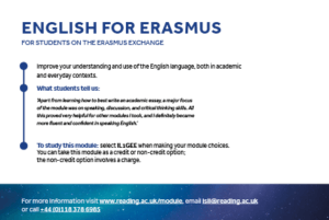
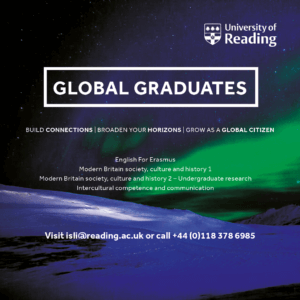
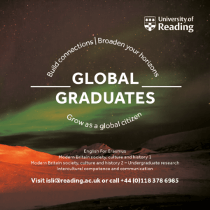
Social media graphic
Designing this deliverable was different as social media platforms need media which is firstly visual and secondly it needs to be easily read and accessible to readers. After completing version 1, we saw that it was difficult to read the small text due to the colour and how it sat on the background. We had taken the idea to surround the heading with a rectangle from the early stages of the website banner, however after being advised that we should use the same heading as the one on the postcard here too, this idea was not possible. Version 2 was also done in the early stages just for idea generation purposes as we felt as though giving the client more ideas to choose from was ideal for a better final outcome. This idea shows typographic manipulation; we wanted to make the shape of a globe, suggesting ‘global graduates.’ However, this idea was dismissed due to the heading we had to change and due to the fact how the white text did not sit right on this background either.
After further experimentation with the background and ensuring it shared the same visual identity as the postcards, we landed on our final idea (version 4) We thought that by introducing a background colour to the smaller text increased the legibility making it easier to read on a platform such as Instagram. All the elements here are left-aligned which cleans the design up, compared to the previous designs we had made which had multiple alignments which sometimes made the design messy and all over the place. We were advised by the client to change the university logo to the coloured-fill as it represented the university better in this context.
Reflection
The series of designs we produced received positive feedback from the client and their team. We believe we have created a series of deliverables that work well as a set, but also fit their current theme on the website through the pink shape on the left (website banner and social media graphics). Our client was so pleased with the work we had completed for them that they made an additional contribution to the Real Jobs fund, which we were extremely proud of!
This job as a whole took a little bit longer to complete than we anticipated it would, however, we were told at the start that the submission date was flexible if the print deliverables were sent before July to work with the printing date. But, the digital submissions could be flexible. We feel as though because our project was over the summer, it was difficult as some people had been out of the office for the summer break. But this was all a learning experience for us, which has prepared us for the real world.