Category: TY1DP1

Work by Part 1 students as part of their ‘Design Practice’ module.

Japan in a Coffee Cup

So for the ideal gifts project i was working with a story about a trip to japan, my partner described Japan as an entirely different world. This got me thinking. How could I actually create another world? The idea i settled on was have a bubble that represented another dimension which contained some symbolic elements of Japan.

I was then given the random word of coffee. I had seen a trend in kawaii Japanese artwork using drinks bottles as containers for their artwork and thought this would be a brilliant way to convey my idea. So here we have Japan as coffee.

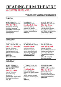
My Film Flyer

My cinema brochure. I experiment a bit with different layouts when it came to making my brochure, however will admit to going a bit off the brief as I wanted to explore looking at a design with the days at headings, as I noted that Tuesday, Thursday and Saturday were the days of film showings. I actually was quite happy with the final outcome, using black, red, and white for the whole colour scheme, as we were told we could add in just one more colour. I chose red of course, as it matches with the feel of a cinema and the red carpet. I do wish I’d perhaps used a bit more red, or had the time to create some kind of logo that linked with the key colours to link my brochure together a bit neater, and a logo always helps to look more professional or branded.

I used different fonts to help separate text, and messed around with using bold as well, as way of highlighting which films had subtitles and audio description, I didn’t want to make this detail too over powering, but enough that it clearly stands out for the reader. I used the red to highlight dates and times, including the ‘Autumn Term 2017’ at the top. As in my opinion, making sure the dates and times are clear, is one of the most important aspects, because if the audience can’t even tell when a film is showing, there is no way they’ll bother to book a ticket.

I definitely could have improved on my design in a could ways, such as at second glace I note there is spacing on the top row, and could have been made to be a lot more even. I did actually enjoy this task more than I thought I would, but to improve would next time want to add some small graphics or illustration.
Reading Movie Time

Reading Film Theater final

The project was to design a Reading movie leaflet for an International audience and family.

It was difficult to try and put all the information in (2) two columns at the same time make it legible and readable for the target audience but over some time I was able to overcome this difficulty.

I originally wanted to follow the University of Reading logo colour red as my background colour but was told from the peers feedback that it was not ‘aesthetically pleasing or easy on the eye’ for a movie leaflet so I choose a darker shade (maroon) as my background colour so that is can have a better contract with the white text.

I use a basic layout of the border around the edge with a white box at the bottom with a maroon colour text so the information would not blend in with the movie listing information and give it a bit of a hierarchy. The result made the text easier to read and stands out the most. Overall, it was effective.

When printing this work I found out I made a lot of little mistakes that I could not notice on the screen such as some spacing issues, line lengths and cutting someone’s name in half. I Should try to make sure to keep a consistent layout and make sure to pay close attention to the detail. Overall, I think I did really good work.

Information design is fun

While doing this task I learned that it can be hard to keep track of all the different types of data you might need to handle when doing information design. I thought that my stylings were sufficient but on closer inspection I missed highlighting a lot of information, such as what language the films is and whether the film has subtitles or not. I also now have a greater appreciation for how hard its can be to get all of your information on one page, as it took a lot of adjustments so that the text fit snugly within the margins of one page. Feedback indicated that my decoration clashed with some of the information for the films, so I increased the transparency so that the text contrasts more with the background decoration.

Safety signs

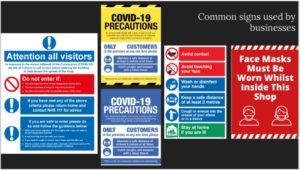
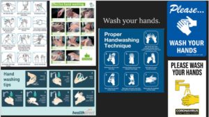
I’ve found that there are different categories that are common withing the signs. Overall, most of the signs were yellow to attract attention and to alert people. On some occasion, the use of a blue and white text was used.  I categorized my work with the message of the sign. There are a lot of signs around shops to make sure that people are following the rules.

The Devil’s in the detail

Brief

1) Choose one of the three suggested fonts. Using the letters ‘c a d b u r y’ draw how you would expect these letterforms to be presented in your chosen typeface.

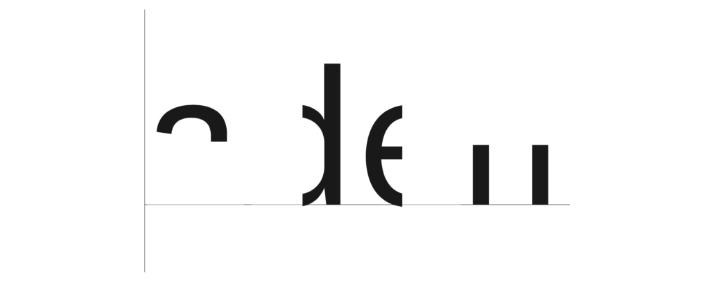
2) Choose one of the three suggested fonts and complete the partially hidden letterforms.


Process

  • Task 1: When recreating this typeface it was really helpful to have a scaled example directly above it. I was able to draw many measured reference lines which helped me to get proportions such as line width and x-height as accurate as I could. Where this helped me with general dimensions such as x-height and tracking, there were some elements of each letter which I did not figure out accurately. For example, I provided the ‘y’ in the first task with a very round and curved descender but this typeface actually has a much more straight descender such as is presented in this blog post. Furthermore, I drew a single story ‘a’ as opposed to a two story ‘a’, which was incorrect for this typeface. Though not perfect, I am quite pleased with the contrast on each of these letters and I think they are rather well proportioned to one another.

  • Task 2: This task I found much simpler. Different sections of each letter were removed and we had to fill in the gaps as accurately as we could. Having observed what many of the letterforms should have looked like after finishing the first task, I had a much better idea of what to recreate here. Similarly to the first task, I drew out reference lines after measuring the scale of these letterforms. Whilst the proportions are quite accurate, I missed some very simple but key details within the letterforms themselves. The crossbar of the ‘e’ is presented slightly too thick. This could have been an error in technique when going over my sketches in fine liner. I also managed to overlook some subtle detail in the letter strokes of the ‘d’ and ‘n’. When compared to the official font, the strokes taper inwards slightly at the ends of the stroke next to where the shoulder joins. Additionally, my letter ‘a’ is too a-symmetrical. This typeface also adds a spur to the ‘a’. I found this to be quite uncharacteristic compared to the rest of the typeface which is why I unknowingly missed this detail.


Reflection

This project taught me to look, look again, then look again harder, especially when something seems rather simple to begin with. There is such a huge variety of typeface available these days, but no two are exactly the same and so it is important to be able to pay attention to the minute detail as it all comes together to create the unique font.

Reading Film Theatre

Every time I add my flyer as media it seems to add a link to the PDF version of it. But anyway here is the link below to click on if you want to have a look.

FLYER BRIEF

I chose to use only black and white, as I felt it differentiated it as a flyer rather than a poster (whilst keeping it simple). I used lines to separate each film and make it easier to read. I used a grid system within the 2 columns, to make the date, rating and time easier to follow and read rather than just a block of information.

I added in about us at the bottom as I believed that it is important to know who to contact and where to go.

A list for Reading Film Theatre

Task C – Cinema Listings

The feedback I was given was pretty positive but I made a few changes to the listing. I added a key for the symbols (cc) and (ad). This is something I chose not to do in my original design as I didn’t think it was necessary with the symbols being well known but after feedback I remembered the brief stating the listing must be suitable for international users. International users may have different symbols for subtitles and audio description so the key is important in this sense. Another criticism was that the text within the film descriptions often cut of mid word onto the next line so this is something I altered.

Bunny cinema listing

Here is my current final draft for the cinema project, my feedback suggested that I re arrange the halloween listing so that it flows down rather than across, and so that the ownership of the heading becomes less ambiguous. I edited my work by placing all the halloween showings on one column, and the regular showings on another.

I considered putting the halloween showings in a box but thought this might not look quite right, so i just moved them and edited the sizing and spacing a little to make it line up. I also changed the spacing between some paragraphs a little by moving the showing time onto the same line as the showing date, widening the space between the paragraphs and the headers.

Although I had a comment that the colour scheme might be visually confusing, I felt that it was what worked best and so kept it as it was. I did change some of the decorate elements as they did seem a little overwhelming, so I removed a few and changed others to give the illusion of more space.