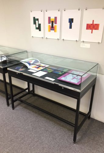
Alison Black, Jeanne Louise Moys, Sue Walker, Gerry Leonidas and Eric Kindel showcased a range of research projects, past and present, to give Part 1 students an insight into the current state of design research.
Category: homepage
Chinese publishing collaboration proceeds
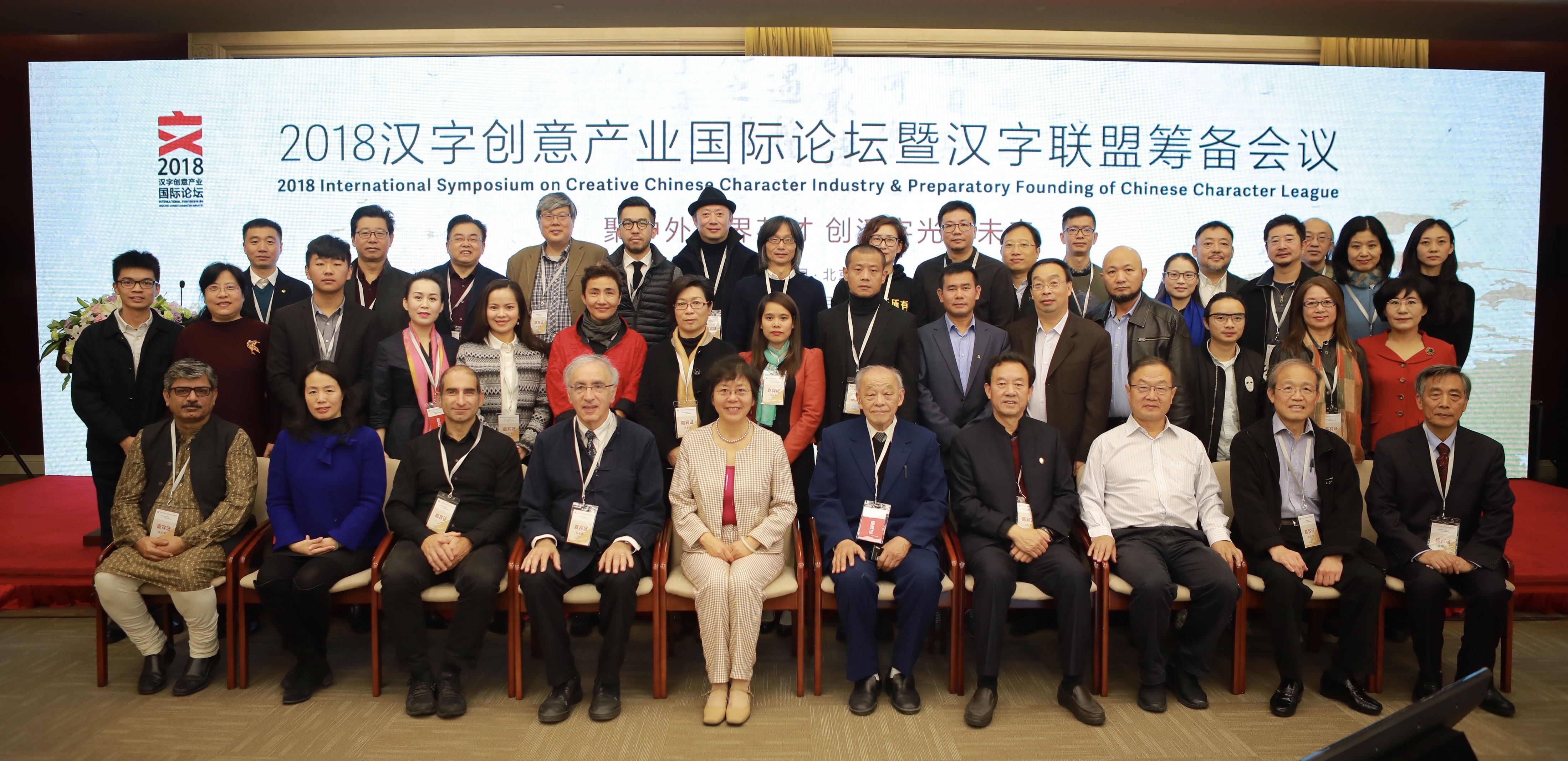
The inaugural symposium of the Creative Chinese Character Industry took place at the Beijing Convention Center on 3 and 4 November. The symposium brought together speakers from different areas of research and professional practice relating to the Chinese script: linguistics, Sinology, typeface design, publishing, and calligraphy. The symposium concluded with the preparatory work for the founding of the Chinese Character League, an interdisciplinary body bringing together organisations and agencies, including the Chinese Character Museum in Anyang.
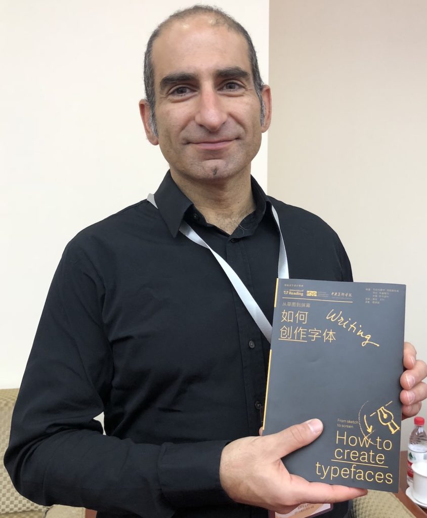
In addition to speaking at the Symposium and being invited to act as guide for the CCL, Gerry Leonidas had the opportunity to update plans for a project, supported by the University of Reading and ATypI, of publishing key typography texts in Chinese. The first title in the series, Jan Middendorp’s Shaping Text, is nearly out of print already; below, Gerry holds the proof edition of the second title, How to create typefaces by Cristobal Henestrosa, Laura Meseguer, and José Scaglione. The series extends to twelve titles, with a schedule of publishing two titles per year.
Making a ZINE: ‘I am, we are… different by design’
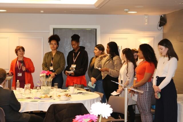
Our second Baseline Shift session was run by Camara Dick, Seniz Husseyin, Malaika Johnson and Martha Macri, members of a group of students who have been working collaboratively over the past year to promote new perspectives on diversity in creative disciplines. Former students of the Department, Ziana Azariah, Fay Biggs and Lily Brown were also part of the team. The “I am, we are” team have been helping reshape some of our teaching, including building an entirely new module for Part 3 students. They’ve also captured a snapshot of key diversity topics in creative industries through the writing, design, and publication of a zine.
The team all share different experiences and opinions of diversity within design, motivating them to come together with the hope of creating changes they can be proud of. They’re challenging the dominant western canon within our discipline, seeking to counterbalance this tradition by broadening our curriculum and introducing new perspectives. As well as opening up new career opportunities, another motivation is to evolve a stronger sense of community within the department and hopefully encourage students to both find their individual voice and move beyond our ‘cultural comfort zones.’
Building a module
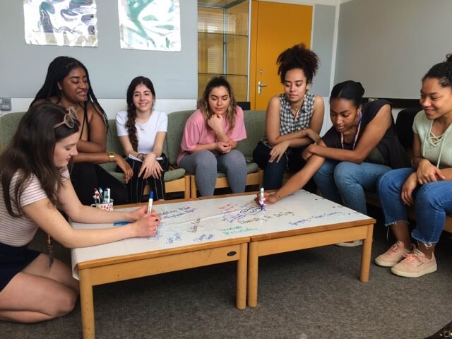
The new Part 3 module, Design for Change, was co-designed between the team and academic staff in order to promote the critical engagement of social issues and the exploration of these through a practical self-selected design brief. This module encourages students to engage with a range of current debates and perspectives on diversity, inclusion and global perspectives in design. Students studying on the module produce a practical project that aims to inspire change by engaging users in a cause.
Engaging students of the future
In order to create awareness and share ideas, the team ran an activity on undergraduate applicant days in which prospective students would share their interests within design. These were then displayed on a series of polaroid-style designs in order to show the vast range of design opinions and passions within the group of applicants. The idea was to start building a community among applicants even before they are offered a place to study here, but also to stress that we welcome people who might define ‘design’ in a range of different ways. In the future, the team plan to use this polaroid scheme with all students, in order to create a discussion about respective cultures and different inspirations.
Beyond Typography undergraduates
Whilst the team are all students within the Department of Typography and Graphic Communication, they have worked with a variety of groups and individuals in order to achieve their outcomes. They interviewed staff and students from all three departments in the School of Arts & Communication Design, as well as graduates and other professionals with links to the University. The insights gained form the basis of their ‘I am, we are …’ zine.
Future goals include:
- encouraging students across the School to embrace their diversity and explore different perspectives within their own creative practices
- diversifying the range of jobs available within the department’s real jobs scheme, with one aim being to reach out to Reading’s refugee community to provide design services with direct benefits to individuals, such as CV formatting.
The zine
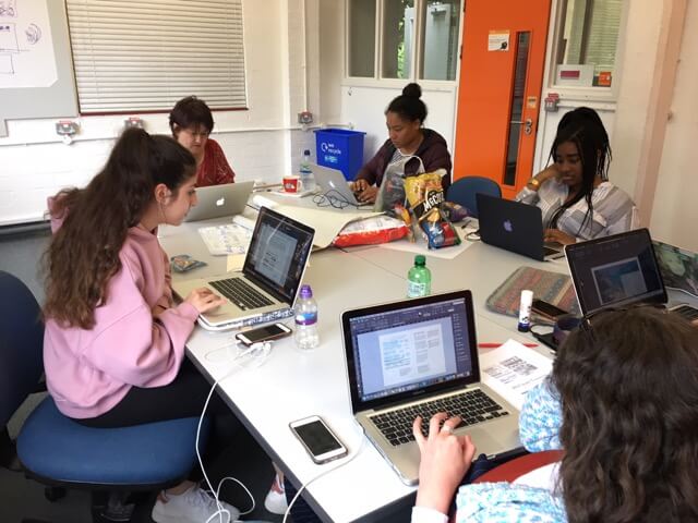
Following receiving funding from the University’s Partnerships in Learning and Teaching scheme, the team decided to publish a zine in order to spread awareness of diversity and inclusion in the creative sector. To showcase a broad range of practices, they decided to include content from members across the School as well as graduates. After interviewing students and practitioners about their work, the team began to put together and design the zine. With budget and time restrictions in mind, the team then began to make decisions including the grid system, format and paper stock. They chose an A5 format as their aim was to print a lot of copies, and this allowed that to be possible whilst sticking within their budget. As there were multiple people working on the zine, it was important to design a grid system with this in mind so that the final pages were consistent and cohesive. In terms of paper stock, they chose a matte finish as they wanted it to stand out against a ‘typical brochure.’
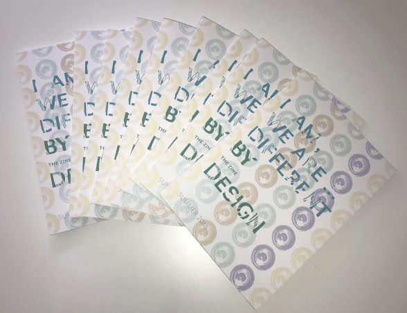
The team said they felt incredibly satisfied and proud with the final outcome, receiving lots of feedback about how inspirational they, and the zine, were. In the future, they aim to create a bigger and better zine, by including more content and space for them to be able to finesse their typography. They also hope to develop a theme for the next zine and extend its publication across print and digital channels so that they can engage a wider audience with diversity in design.
After their Baseline Shift presentation, the team gained a lot of interest from new and current students looking to get involved. Growing the team will allow for the project to continue and evolve.
Moving forward
This talk opened up the discussion of diversity within the department and allowed attendees to gain insight and become involved with how we can shape and develop this project for future students.
“As someone who never really second guessed the lack of diversity in the department teaching and the discipline of Graphic Design as a whole, the talk gave an interesting viewpoint on to this, shining light on the issue. The Zine itself was a great publication, and I hope it continues to be produced, getting better and better each year. I’d also like for the department to showcase speakers from different backgrounds to bring this idea of diversity forward into all aspects of our learning, as I think we have a lot to learn from each other!” – Laura Marshall, Part 3
As a student currently taking the new ‘Design for Change’ module I found it incredibly interesting to hear their thoughts and aims for the module, and have been really enjoying the discussion, debates and different perspectives within the seminars. After the talk, I spoke to other students who had attended and discovered they found it equally fascinating and hope to get involved in future projects.
DK at the University of Reading
Our first Baseline shift Wednesday morning session kicked off this week and Typography students were lucky enough to receive a visit from two members of the design department at Dorling Kindersley’s Knowledge team. Kit Lane, who is alumna of our department, and Karen Self, art director at DK, gave a very interesting talk covering many different aspects of the company, as well as promoting the varied internships they offer to students.
‘It was very useful to have industry professionals come and talk to us so early in the course. It was good to know about internships I could apply for sometime in the future’ – Ruth Bartley, Part 1
The DK difference
DK offered students an insight into the exciting world of publishing, from their own unique perspective as market leaders across a range of areas. They covered their practical design process as well as the design thinking that goes along with everything they do, emphasising the importance of considering the consumer (not just the reader) at every stage. The lasting impression was that DK operates very differently to many other competitor publishing companies. This was exemplified by the fact that the majority of design is done in-house, with comparatively huge amounts of time (often four or five months) are spent designing each book, spread by spread, as opposed to flowing text into a prebuilt specification.

Design challenge
Students were given the opportunity to take part in a workshop led by Kit and Karen in the afternoon. This involved generating ideas for a new book named ‘Urban Detective’. Students worked through a design process starting with some initial research into the theme before sketching out rough ideas for book covers and inside spread layouts.
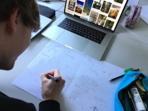
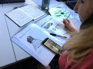

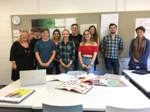
These ideas were then refined through peer discussion and input from Kit, resulting in a handful of clear concepts. A group crit let everyone to receive feedback on their work. Throughout the process, students kept in mind the audience and aim of the book, in true DK style.
‘I enjoyed the workshop, as it made me consider more about book design, than I might have otherwise considered on my current project’ – Alex Ganczarski, Part 1

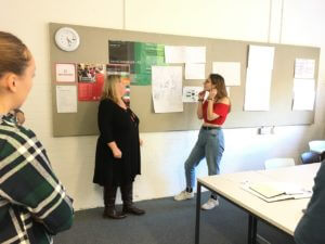
‘I really enjoyed the workshop and am taking away a greater understanding of how to plan my ideas and concepts, as well as how the 2nd and 3rd-year students plan and execute their work. It’ll help me a lot over the next 3 years of the course’ – Rory Tellam, Part 1
Portfolio reviews and interviews
Some students also took the opportunity of having a mock interview and portfolio review with Karen. This gave a feel of what an interview is like in a professional context, preparing them for heading out into the world of design beyond university.
‘Karen made the experience calm and professional, offering great feedback on how to improve my portfolio’ – Laura Marshall, Part 3
‘It helped me to understand the process and content of a professional interview in a relaxed and casual context’ – Fay Rayner, Part 3
‘I am so glad I took on this opportunity. It has made me feel much more confident and prepared for future interviews’ – Jacob Hawkins, Part 3
Overall, our visit from DK was a big success. Around 65 Typography students were offered an insight into what life is like in the graphic design and publishing industry, which will be very useful when considering career paths later on – and much sooner for our students in Part Three!
Science communication for children

A new AHRC-funded project begins today. Transforming science for young people: Marie Neurath and Isotype books for children aims to find new audiences for the approach to science communication taken by Marie Neurath in her books for children, produced in the 1940s and 1950s. The illustrations in these books, in series such as the ‘Wonder world of nature’ and ‘Wonders of the modern world’, were innovative in their approach to the design of complex information.
Following on from Isotype revisited, the project will make extensive use of the materials in the Otto and Marie Neurath Isotype Collection, to identify approaches to science communication relevant to teaching in primary schools today. We will work with teachers and teacher educators as part of the design process to ensure that their ideas and needs are taken into account. Pilot schools will be involved in evaluating the effectiveness of the resources to ensure they are relevant and effective.
An exhibition at House of Illustration in London in summer 2019, Marie Neurath: Picturing Science, will display examples of Marie Neurath’s illustrations from the children’s books, as well as sketches, drawings and correspondence that show the iterative nature of the design process.
Project people and partners
Prof Sue Walker and Prof Eric Kindel, Department of Typography & Graphic Communication, University of Reading
Dr Andrew Happle, Institute of Education, University of Reading
Dr Emma Minns (Project Officer)
Partners:
Activity in Antwerp

Our use of the Lettering, Printing and Graphic Design Collections in the Typography Department, and our distinctive approach to collections-based research, was exceptionally well demonstrated at the 2018 ATypI conference in Antwerp. We enjoyed top quality presentations by Typography staff and PhD students. In a conference with over 550 international delegates, who repeatedly mentioned the ‘Reading’ influence in conversations and comments, it was humbling to realise just how influential and significant our work with collections has been in developing new knowledge about type and typography, and in inspiring people to undertake research.
Typography staff
Fiona Ross and Alice Savoie introduced their new Leverhulme-funded project: ‘Women in Type’
Eric Kindel: ‘Objet-type: the French stencil letter‘
AHRC-funded Design Star PhD students
Riccardo Olocco: ‘The success of Jenson’s roman type‘
Borna Izadpanah: ‘Early Persian printing and typography in Europe‘
Recently graduated PhD student
Emanuela Conidi: ‘Uncovering Arabic type history, informing design‘
Bauhaus typeface revived by MATD student
Adobe’s “Hidden Treasures” programme kicks off the typographic commemoration of the forthcoming centenary of the Bauhaus school by releasing four revivals based on lettering by Bauhaus staff. Drawing on original material in the archives of the Bauhaus Dessau Foundation, a group of current typeface design students were selected to work on digitising the original lettering, extrapolating the missing letterforms and characters to fill out the required character set, and adapt the designs for digital formats. The fast-paced project was led and supervised by Ferdinand Ulrich and Erik Spiekermann, and included in-person meetings in Berlin and Dessau, online collaboration, and a launch event in New York City.

Each of the four typefaces were revived by a student from a typeface design course: Hidetaka Yamasaki, a current MA Typeface Design student, worked on lettering by Carl Marx; Céline Hurka from the KABK on letters by Alfred Arndt; Luca Pellegrini from the ECAL on lettering by Xanti Schawinsky; Elia Preuss from HGB Leipzig worked on letters by Reinhold Rossig; and Flavia Zimbardi on letters by Joost Schmidt. The typefaces are released gradually through Typekit’s subscription service to professionals using Adobe’s dominant suite of applications, and are a superb example of archival material inspiring contemporary design.
Fiona Ross awarded the TDC Medal
The New York-based TDC announced that Professor Fiona Ross, a long-standing member of staff in the Department and Curator of the Non-Latin Collections, will be the thirty first person to receive the prestigious TDC Medal. Fiona joins an illustrious list of past recipients which include David Berlow, Colin Brignall, Matthew Carter, Adrian Frutiger, Gerrit Noordzij, Paula Scher, Erik Spiekermann, and last year our colleague Gerard Unger.
Fiona began her career in type in 1978 working at Linotype, where she rose to lead the non-Latin department as the company’s first female manager. She has been responsible for the design of many typefaces for South Asian scripts that have become the standards for reading matter, and sources for numerous imitations. Her work began with typefaces for newspapers, and nowadays extends to the full range of font resources for text typography, from typefaces for online documents to user interfaces, to webfonts. Notable recent projects include her contribution to the typefaces for the Murty Classical Library of India series by Harvard University Press, the Bengali typefaces for the Anandabazar Patrika (ABP), and the Arabic Markazi Text.
Central to Fiona’s contribution is her ongoing research, and her engagement in the Department of Typography & Graphic Communication. Fiona is a key staff member for our MA Typeface Design programme and TDi summer course, a contributor to the MARes Typography & Graphic Communication and the MRes Typeface Design, and supervisor of many PhDs. She is a key proponent of Collections-based teaching, and in her role as Curator of the Department’s non-Latin Collections regularly leads sessions with archival material for students and researchers at all levels.
More details of the Medal ceremony can be found on the TDC site.
Letterpress: possibilities & practice
Due to popular demand, now on until 20 July 2018
We’re pleased to announce the continuation of our exhibition, ‘Letterpress: possibilities & practice’, until Friday 20 July 2018. Stop by to see a range of innovative letterpress practices and possibilities. To tempt you, two practices in the exhibition are featured below. Read on!
Reconstructing historical typography
Letterpress printing practice encompasses scholarly investigations of historical typography in pursuit of new knowledge. The two examples on display here involve the reconstruction of fifteenth-century relief printing surfaces in an effort to better understand the production of well known incunable works. The type on the left (in the image, below) is a facsimile of that used in Gutenberg’s 42-line Bible, printed in 1455. It has been composed to replicate a page from that book. The type was produced as part a BBC Four documentary, ‘The machine that made us’, on the life and work of Johannes Gutenberg, featuring Alan May alongside Martin Andrews and Stephen Fry. On the right are type and decorated borders and initials that together comprise a speculative reconstruction of the relief surfaces used to print a multi-coloured page from the 1457 Mainz Psalter of Fust & Schoeffer. The reconstruction was part of a research project to investigate Fust & Schoeffer’s probable working methods.


Re-invention of historical technique
This work has been created by the Leipzig designer, Pierre Pané-Farré. It takes its inspiration from compound-plate printing, a nineteenth-century technique that exploited multiple interlocking printing surfaces. Inked separately (in different colours) and then combined, a single impression would be taken from the interlocking surfaces, resulting in precisely aligned multicolour printed images. Pané-Farré has revisited the technique using laser-cut MDF printing surfaces, which produced the various sets of interlocking components displayed here. Ink was applied to each component in the set, either as ‘flat’ colour or in graduated hues. The set was then printed in a single impression to produce the polychromatic prints. The project was accompanied by the publication of Die polychrome Druckerei (Leipzig: Institut für Buchkunst, 2014), which reproduces the prints in four-colour offset lithography. Pané-Farré cites Michael Twyman’s book, Printing 1770–1970 (1970), and Maureen Greenland’s doctoral thesis, ‘Compound-plate printing: a study of a nineteenth-century colour printing process’ (University of Reading, 1996), as starting points for his work.
