Category: events

Marie Boulanger: My life through letters

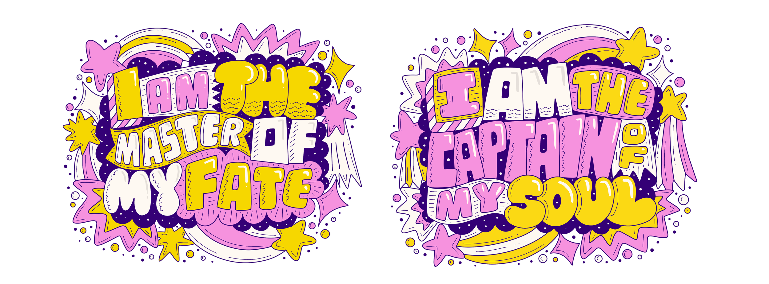
In the final week of Autumn term, we were joined by Monotype’s Marie Boulanger. In this session, Marie described her experiences in type design and how her life has helped to inspire her personal journey through designing typefaces.


Typeface design, exploring lettering and their purpose was always Marie’s passion

Type & expression

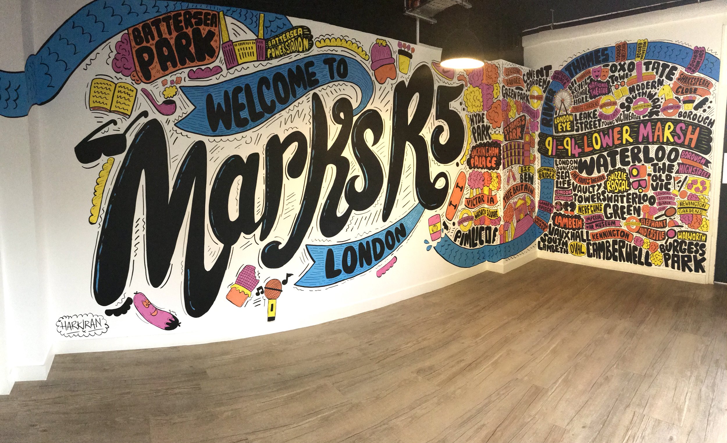
Working for Monotype, Marie’s role as an Art director for campaigns and making a narrative story for audiences was her dream career path. She explained how her love for type design stemmed from her childhood. Being born in Paris, from a young age she was exposed to expressive French lettering and signage. Marie pursued her interests by designing custom lettering for branding while freelancing, and taking part in the 36 days of type challenge, which encourages designers around the world to make a glyph once a day.

Marie felt that designing type was very personal and fulfilling for her, describing how type should be seen as a material and our hands are a tool to express ourselves. This helped to encourage students to find enjoyment in exploring many forms of design that are of interest to them, while being willing to be open to alternative opportunities, especially related to a career in design.

‘Type is a material, and the tools used are our hands’ – Marie Boulanger


The imagery and layout of stamps was always a great interest to Marie, they were one of her original inspirations towards design

‘Get involved in projects that help heal and feel good’ – Marie Boulanger

Conclusion

Marie’s insight into the creation of typefaces and her experience shows us that the journey to becoming a successful designer is through a student’s desire to observe our environment and strive towards designing to make ourselves satisfied. 

‘Very personal talk, which made it very inspiring, my favourite baseline shift so far’ – part 2 student

‘Honestly so many words come to mind, inspiring, encouraging, exciting. The baseline shift sessions always make me feel so inspired to go and make something cool and creative but this one in particular I loved’ – part 2 student

Alumni talks: The beauty of letters and digital design

In week 10 of Autumn term, we were joined by three alumni of the Department: Font engineer Norbert Krausz; Sky Creative Designer, Aanand Tank; and Director at ArabicType, Nadine Chahine. In this session, we were delighted to hear about our alumni’s lives after graduation and what our students can expect later in their careers.

Engineering fonts

Norbert expressed his love for the beauty of letters and their shape and how they drew him into his profession of engineering fonts. It was fascinating hearing about Norbert’s view of the huge variety of script that mankind invented and how it has been evolved through time. He described working in this specialised field as ‘narrow but deep, working with type means you are purely working on the shape of our language’, creating sets of glyphs was rewarding for him and he felt that it was no different to problem solving and finding solutions. Whilst working for Monotype, it helped Norbert discover many technical components behind type design; he described his work as very rewarding towards the development of the human language.

‘Font engineering as a field is narrow but deep. Working with type means you are purely working on the shape of our language’ – Norbert Krausz

Sky Creative

Aanand, became a Digital Designer for Sky. His UX and UI work in Reading and in Germany helped him understand alternative audiences and consider all users. Designing showcases for Sky Cinema, one of Aanand’s roles is to help ‘push out specific shows and movies’ based on genres. His work revolves around layouts on different platforms, like on mobile devices and televisions. Emphasising networking, Aanand encouraged students to explore their options for a future career and to start connecting with designers in the industry, strongly advising us to use Linkedin. Students found listening to a younger designer who recently graduated from Reading to be inspiring, as it showed students what they could achieve in the oncoming years.

Designing showcases for Sky involves tailoring to the specific genre of film or TV series

‘Network and you’ll go far’ – Aanand Tank

ArabicType Ltd.

Nadine described the politics of Arabic type and how there have not been many variations for the Arabic language. Her passion for type design was similar to Norbert’s, where she wanted to help visualise communication in different languages. Neue Helvetica Arabic is one of many typefaces designed by Nadine. It enables the setting of pan-European languages, in addition to Arabic, Armenian, Cyrillic, Georgian, Greek, Hebrew, Thai and Vietnamese. This typeface has been used in various media, most notably in airports in the middle-east to aid the population by having higher legibility for navigation.


Neue Helvetica typeface

‘Design can preserve memories’ – Nadine Chahine

Conclusion

To conclude, having the privilege to hear from our alumni about their careers helped to inspire students and provide insight into what they could achieve.

‘The wide variety of speakers in today’s session was really valuable. Hearing from graduates about their careers immediately after university showed me a huge amount of options and avenues to look into.’ – part 2 student

‘Hearing from an array of alumni was really interesting to hear about their lives after university and what I may experience after graduating.’ – part 2 student


Feedback jam: Real jobs and typeface design

In week 9 of Autumn term, a Feedback jam was held to help students gain additional feedback from tutors on their current projects. Gaining feedback from tutors aids students in directing them towards the next steps of developing their designs. In this post, we’ll focus on two of the unique projects that students brought for review.

Carter’s Steam Fair Real Job

When it comes to Real Jobs, focusing on the audience that we are designing for is key. A part 2 student wanted feedback on their re-designing of a logo for a competition brief set by Joby Carter, who is a highly skilled sign-painter and typographer, and owner of Carter’s steam fair. The brief involved creating a fairground-style logo for a stereotypically conservative brand. This student wanted feedback to guide them towards finalising their logo to create a fairground font for Legal & General.

Rob Banham and Sara Chapman gave pointers on areas to improve; such as considering making the logo more bespoke by adding more variation to each letterform, creating more excitement and fun, while also implying work done by hand – like at a fairground.


Part 2 student’s Real job Legal and General logo redesign

Typeface development

We run an optional Typeforms module in Part 3 of our course, where students create their own typeface. One student during the session asked for feedback on their current iteration. This student took a character in Helvetica and drew points using a grid system. Several versions of this typeface were made using a 6×6 grid system to ensure consistency for their letterforms. Using a pathfinding algorithm, the student connected each point to make an outline of each letter, with this the letters were re-drawn over the connected dots to increase legibility and produce the body.

Claudia Rifaterra proposed that the student could overlay a dotted version over a standard Helvetica character to form a new character. Revising past concepts and combinations of designs teaches students that recognising the significance of making multiple versions of work is important to look back on when making future design decisions.


The dotted version that aided in creating the body of each character

Tracing over the connected dots and lines made in Python, each character was drawn using the dots as guides.

Conclusion

As students we should always consider what needs to be improved with our work and gaining feedback from tutors and other students is always helpful in enhancing our current projects.

‘The personal feedback was incredibly valuable and useful for my Real Job. The opportunity to get additional help for my work by outside designers gives amazing extra support from experienced designers and professionals.’ – Part 2 student

‘It’s always very helpful getting feedback from tutors’ – Part 2 student

Rob Waller: Information, and why it’s designed


In week 4 of Autumn term, we were joined by the President of The International Institute for Information Design, Rob Waller. In this session, Rob supplied students with an insight into the theory of information design and research into documentation legibility.

Anatomy of Information

‘Roughly half the population struggles with reading document literacy’ and information published by sources (like the government), was a focal point of Rob’s lecture. Emphasising the importance of aiding the population with legibility, typography, and layout as a quality of written language playing a key role in people’s understanding of writing. Students learnt that multidisciplinary research of cognitive and educational psychologists, technologists, reading researchers and designers contribute to the comprehension of information and how it is structured to help the public.

‘You have to integrate what you say with why you’re saying it’ – Rob Waller

Rob explained his fascination with page layout and how structuring content is fundamental to readability, saying that designers such as Ken Garland who experimented with type and layout influenced him greatly. Furthermore, Rob talked about how his career has combined academic research from the University of Reading and the Open University with his own commercial agency – the Information Design Unit – and then with Enterprise IG. Working with numerous brands including Barclays, Vodafone, BT, T-Mobile and many more, students were given insight into the importance of research and theory in information design, and how it correlates with helping the population understand complex documents.

‘Ken Garland was a massive inspiration for me’ – Rob Waller

Design work by Ken Garland such as this cover for Railways: A Special Issue, was a great inspiration for Rob as a young designer. 

Source: https://www.pinterest.co.uk/pin/563864815828853674/

Conclusion

Hearing Rob’s passion for information design and allowing documents to be understood by all was inspiring. Emphasising the importance of document legibility, using elements of typography and layout, was relevant for students in understanding what they could use in their upcoming projects. Rob’s work is underpinned by a desire to use research to help people read – and actually understand – some of life’s more demanding texts.

‘Very interesting insight into a huge industry, would never have considered this as a significant industry for design.’ – Matt Perks

‘Listening to the content of an experienced typographer is very informative and interesting for me, as he showed the business side of typography, which will be very beneficial for me after I graduate from the university.’ – Part  1 student

David Pearson: Book design as a language

In week 8 of Autumn term, we were joined by Penguin book cover designer David Pearson. In this session, David exhibited a wide range of exciting book covers, along with many tips for students in brainstorming ideas for designing book covers.

Designing a cover

David emphasised how typography and book covers should be experimented with, and that rejected concepts can often lead to more successful ideas in future. Furthermore, researching past designs can generate inspiration to produce more radical concepts, enriching our options for how we create different moods that suggest the content of books. David’s book cover for George Orwell’s 1984 is a perfect example of this, as he researched previous classic Penguin designs and noticed redacted words. His cover personifies ‘less is more’ with the title being hidden, which summarises the theme of secrecy in the book and gives readers intrigue into the contents.

‘Find a job or goal that works with the way you work’ – David Pearson

David Pearson’s 1984 cover design, which shows the redacted information of the title and the author

Source: https://designgallery.tumblr.com/post/47617395995/david-pearsons-1984-book-cover

‘You should always question your work; you need to constantly feel like your work could be improved’ – David Pearson

David’s lecture was particularly useful for first years, who are just getting into typography, as well as for Masters students, who gained knowledge from David’s years of experience. He encouraged students to follow design trends as well as understand design history, so that readers can recognise the book’s genre, as well as visually digest the content. David also emphasised the importance of working with a diverse group of people, as it introduces different insights and opportunities to experiment with styles, which an individual designer may not have considered exploring. Collaboration is a vital professional skill, as a designer will always be working with other people.


David sharing his thoughts on the Dracula book cover evolution and the personality that can be bought into designs. As well as addressing his personal preference for the older traditional Penguin covers due to their consistent (but subtley evolving) colours and layout.

Conclusion

David’s talk showed students the potential of developing and displaying characteristics in book cover designs for audiences to digest and construct people’s view of the content included.

‘Very good speaker, very engaging, really inspiring and made me think, the images were captivating and the way he thinks outside the box was totally genius’ – Amy North

‘An interesting and engaging presentation, the designs shown were very inspiring.’ – Part 2 student

Nick Sexton: UX and a user’s journey

Profile photo of Nick Sexton

In week 7 of Autumn term, we were joined by Nick Sexton, a Reading graduate whose design career includes working as a freelancer, digital designer at Dyson, and an experience design lead at Jaguar Land Rover. In this session, Nick gave his interpretation of user experience design (UX) and how considering the needs of users is important in the design industry.

Jaguar Land Rover and Dyson

Nick loved recreating websites and designing simplistic movie posters while studying at Reading, as well as ‘starting that old-age dream of being a freelancer’, which he began in order to gain experience in designing for clients. Nick’s talk explained his progress from graduate, to freelancer, to ‘grad scheme’ intern and finally to the senior roles he now occupies. His focus on working in-house, rather than agency-side gave us an insight into how design processes work within two brands with very specific design identities within their industries.

Nick’s experience with UX design for Dyson and JLR is a great example of what companies need to consider when engineering products for their users

‘In the world of work, everything’s collaborative’ – Nick Sexton

The importance of experience

Nick emphasised that in order to succeed in designing for users one must discover, define, develop and deliver; which involves looking at the start-to-finish journey along with the experience. Looking at these details erases problems before someone buys a product, increasing satisfaction. When it comes to designing for screens or pieces of machinery, Nick learned a lot directly from James Dyson: ‘Aesthetics are important, but if it doesn’t work it’s fundamentally not very good’. Focusing on the functionality and purpose is of a higher importance than of appearance, as those who would use a product would simply want to achieve their goal without frustration.

The purpose of ux design is to ensure the journey of users has no problems and achieves what is desired

‘If something is ugly people will get over it. If it doesn’t work, that’s where frustration comes in’ – Nick Sexton

Conclusion

The importance of UX design and the journey that users take to achieve their goal with a product was a driving message behind Nick’s presentation. Students who have projects involving UX found the session especially helpful in understanding what needs to be considered when producing work that would be used by an audience.

‘I thought this was one of the most interesting Baseline shifts I’ve ever been to, I especially liked how it linked to the UX project us part 2s are working on at the moment.’ – Part 2 student

‘Very interesting insight into a huge industry, would never have considered this [the motor industry]as a significant industry for graphic design.’ – Matt Perks

Time management with Rachel Warner and Gerry Leonidas

In week 5 of Autumn term, we were joined online by our Department’s own, Gerry Leonidas and Rachel Warner. It is an annual talk, giving some helpful advice and highlighting the importance of organisation in our careers. As a student, it is reassuring to hear that our tutors feel the same pressures we do, with Rachel confessing to being a procrastinator and Gerry feeling guilty when getting distracted away from a task.

“Sometimes the avoidance of something can be much longer than actually doing the task, they can turn into something huge.” – Gerry

As people we need to work, study, socialize, exercise, and as Rachel puts it, “find time for the boring bits too”. It is an overwhelming task to try and find order in the volume of daily activities in our lives and the time it takes to do them. To counter this feeling Gerry shares his own tactic of time management, being to split every hour into a block. Keeping his workload to a strict limit of these blocks so that he still has time to exercise and relax to avoid counter productivity. For the first chunk of blocks the brain is active and working efficiently, the later hours into the day it teeters off, adding a feeling of pressure and causing a cramming of work at a lesser quality.

Start with the small things you do

Schedule work for when you know you work well, if something requires lots of concentration and you work better at night, save time to work at night. Assigning time for outcomes is important and Rachel will do this by breaking the day in two halves with less straining work in the afternoon as she understands her brain does not function so well at this time of day.

What they use

To help manage her expectation of a day, Rachel suggests colour coding, this way she knows when she has some downtime and helps with anxiety levels. This way, on her calendar; Green blocks are for when she is teaching or running workshops, blue is for meetings, purple for research and so on. Gerry has a similar method with a focus on personal time and family. This will be in red and is strictly scheduled as to allow for time to unwind and clear the head. Unfortunately for Gerry, it took some burnout in his mid-thirties to realise the importance of personal time to destress.

An example that Rachel shared demonstrating her use of colour coding on her calendar

Use techniques that work for you

Burnout is real and with no holiday or break on the horizon, the workload can seem endless and can be daunting. Valuing time with family and friends is equally important to the work to unload. When assigning time for work in your calendars its always wise to build time in for holidays and allow time for slacking with work. It may also help to work in a change of scenery to break free from your daily routine. When assigning time for work, Gerry suggests working backwards from the deadline to the present. “It is easier to predict what will happen in two weeks than it is in two months.” Approaching an estimation of a task duration from both ends can be useful.

“It’s okay to feel as though you don’t have enough time.”- Rachel

The time management talks are always a pleasant wake-up call for students, so much so that they are requested year after year. It especially helps beginners understand where to start as a first-year has commented, creating a sense of unity within the department through our experiences and for some, experiences yet to come.

Here are some of the University resources recommended by Rachel and Gerry from mental health research on time management.

Making weekly and termly plans 

libguides.reading.ac.uk/studying-at-home/getting-organised

Managing your time: 

libguides.reading.ac.uk/time/distractions#s-lg-box-11666001

Dealing with perfectionism 

whatsupwitheveryone.com/perfectionism.php

“I valued the idea that winding down and down time is very important and has to be scheduled”- Tristan Bevan, a Part 2 student

“Tips from the tutors and hearing their reality, and that time management is something they struggle with too was helpful”- a Part 2 student

James Hunter: Boardgames are beautiful

James Hunter


In week 3 of Autumn term, we were joined by editorial designer and co-founder of Senet magazine James Hunter. In this session, James talked about his editorial design industry experience as well as his decision to co-found Senet magazine, based off of his passion for boardgames and fantasy games.

Graduation and Early Career

After graduating from Falmouth University in 2010 with a degree in Graphic Design James was adamant on not wanting to work for a traditional branding agency. James worked at the Guardian newspaper where he loved the “buzz of the newsroom”, which led to his work as an editorial designer for the Times newspaper, where the majority of James’ work revolved around early prototypes of the Times app, editorial design of the daily newspaper and their magazine. The daily deadlines of work to be completed was exciting for James, as it reminded him of university with the deadlines set for him as a student, a work ethic that all University of Reading students could use!

James guided students through more of his career, ranging from the Sunday Times to Frettabladid (Iceland’s most popular newspaper). However, James felt much more drawn to designing magazines and decided to become a freelance designer. Learning about the potential flexibility you have as a designer to pursue a freelance career from originally working as a corporate designer was an enlightening detail to learn about for students.

‘I was kind of being defined as a newspaper designer but I really wanted to design magazines’ – James Hunter

SENET Magazine

The highlight of James’ lecture were his 40 thoughts behind making a magazine and the genre of SENET revolving around his passion for boardgames. There were many important points within the selection, but there were a few that stood out for students. Point 20 emphasised reading the copy, as an editorial designer we are serving the reader so by reading the copy constantly will help designers in linking their work to the copy. Point 31 stated that “you are only as good as your last issue”, which taught students that as soon as one piece of work has been completed, it’s more important to focus on the next big project.

Issue 1 of SENET magazine

Source: https://senetmagazine.com/collections/back-issues/products/issue-1

SENET is a collaborative project made by James and his other colleagues who help to produce, design and sell the magazine. It is focused on boardgames and the fantasy genre, the aim of the magazine is to appeal to those who already have a passion for boardgames, while also inviting a new audience by producing appealing magazine designs.


Issue 5 of SENET magazine 

Source: https://senetmagazine.com/products/issue-5-summer-2021

‘I’ve always loved magazines and always read them’ James Hunter

Conclusion

The key points James regarded as essential for editorial/magazine design aided students in understanding what is important about designing for a specific audience, as well as how to be a successful freelance designer. James showed students that one’s passions can be pursued in their future careers and how working with a team of designers helps strive towards achieving tasks for deadlines.

‘James’ insight into the world of magazine design and detailed, linear description gave an engaging look into his experiences starting up a successful, regular document in printed media.’ – Part 2 student

‘Was very informative and particularly relevant for the TY3DP3 which we’re doing at the minute. Also super insightful about how to go about setting up a magazine.’ – Part 3 student

Malcolm Garrett: Anatomy of album covers

In week 2 of Autumn term, we were joined by Creative Director of Images&Co and well-known album cover designer Malcolm Garrett. In this session, Malcolm provided insight from his successful design career and shared valuable knowledge from his experiences to inspire Reading graduates in what could lie ahead for their future careers.

Student and early years

Enthusiastically explaining his late teenage years, Malcolm elaborated on how his year at Reading’s Department of Typography & Graphic Communication shaped him as a designer and the valuable lessons he was taught. Malcolm spent a year in the Department before transferring to Manchester in 1975, where he reconnected with friends from his A level years whom he was able to work again throughout the rest of his career, especially in the music industry. Malcolm’s interest in design originated from his love for music and pop culture. The specific culture behind his favourite bands inspired him to pursue graphic design as a path. With a particular adoration for the cover of Hawkwind’s second album, In Search of Space, Malcolm spoke about how bands such as Hawkwind, The Sex Pistols, Siouxsie and the Banshees drove his passion for wanting to express the visual aspect of music.

The album cover for Hawkwind’s “In search of space” that inspired Malcolm greatly

Source: Progarchives.com

The counter-culture surrounding the music genre of punk and post punk music influenced Malcolm, as he was obsessed with the overall power of the influence that the music culture had. Furthermore, Malcolm expressed his view of the role of the graphic designer was to act as a “middle-man” to communicate and present people’s thoughts to an audience and bring people together to understand. Students were engaged with Malcolm’s passion towards wanting to design for the public and the punk genre.

‘Album covers should be a vehicle of an esoteric image’ – Malcolm Garrett

The music industry

One of the highlights of Malcolm’s career were his massive contributions towards the Buzzcocks, ranging from the band’s logo to all the promotional material. Malcolm’s reasoning behind why he believes his Buzzcocks design work was as relevant and effective as it was, was because he was the target audience for the band. The music industry needed to tailor its promotional material to the correct audience, so Malcolm designed everything that would suit the punk culture of the Buzzcocks. As a student, it is valuable knowledge that all work should be tailored for users and be created to satisfy the needs of the audience, which Malcolm emphasised throughout.

The album cover for the Buzzcock’s Orgasm Addict

Source: https://www.discogs.com/master/13278-Buzzcocks-Orgasm-Addict

‘I was the target audience for the Buzzcocks’ – Malcolm Garrett


Malcolm has also made iconic and pivotal contributions to Duran Duran’s album covers, especially his most iconic cover for Rio. A theme constantly referenced throughout was the culture and trends surrounding the content is just as important as the design itself. As well as design not having to be limited to digital or only design by hand, which is very insightful for the students as it is helpful to communicate to young designers that there are no limits to constructing design.


The album cover for Duran Duran’s Rio

Source: https://www.discogs.com/release/2040033-Duran-Duran-Rio


Conclusion

Malcolm describing his life as a designer helped students recognise that having to internalise the thoughts and personalities of audiences for design should be considered for all design work, to help tailor the experience to the correct users. Furthermore, Malcolm’s inspiration from pop culture and music was a very relevant and relatable context behind someone’s inspiration, that the undergraduates could relate to.

‘A really high calibre designer with really inspiring work. We got to see some really fun work with historical and cultural value.’ – Part 3 student

‘I valued Malcom’s clear experience and engaging presentation, showing an array of his own life and his design career. Garrett’s passion for his work and clear skill was inspiring to hear about and learn from his expansive career in the industry.’ – Part 2 student 

MagCulture Trip 2022

During the Autumn term, the Department organised and paid for a trip for the Part 3s to go to London and visit the MagCulture. Not only were we immersed in inspiration for our own magazine designs and concepts, but we also enjoyed a talk from Jeremy Leslie about the current state of the independent magazine scene. After the talk and trip were done, the year went out together as a Department social in London. With train tickets provided by the department through the Typography Student Fund we were able to get out of the building and experience magazine world in its fullest form.

During Jeremy’s talk, he showed us a range of current trends and creative ideas… to to the extremes of a single plank of wood being sold as a magazine! He opened up his shop to us, which covered every genre in the magazine world, where we were allowed to browse, take pictures and experience the materiality of these objects firsthand. Take a look at their instagram for inspiration: https://www.instagram.com/magculture/

From all of us in Part 3, I would like to thank Sara and Rob for organising this trip. We’d also like to thank all the clients from Real Jobs who have donated to the Typography Student Fund, making an educational event fun.


Cover Inspo


Inside pages Inspo