
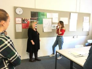
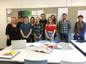
Part 2 students who opted to design book covers for Oxford University Press in their design practice module were lucky enough to be given the opportunity to visit OUP headquarters in Jericho, Oxford.
Category: events
David Pearson: Flowers, Football & Fonts…
David Pearson began his talk to Typography students at the University of Reading citing three things that sum up what really interest him – the first and last having a direct impact on his work as a prolific, award-winning book cover designer. The second he admits, possibly less so…
Pearson recalled his time as a student – the intimidation he felt from who he described as the “gatekeepers” of typography and this impenetrable discipline he initially struggled to work within. Grasping the differing personalities of typefaces was what helped him to understand how they could be best used; the other details seemed to simply “fall away”. The essence and character of type forms is a core tenet of Pearson’s work and is a huge part of why he has been so successful in capturing just the right tone for hundreds of different classic book titles.
Pearson places emphasis on using type as the main image of a design, hence his company name Type as Image. To give an example, one design he enthusiastically cited was his cover for The Gentle Author’s, Cries of London. The ‘C’ is personified as if literally crying out, and the punctuation bursts through the decorative border, bringing a joyful exuberance to the composition.

Throughout his talk, it was clear David wanted to highlight the need to not shy away from collaboration in any facet of design. He described with fondness the “dignity” that the illustrations by Lucinda Rogers gave to Baddeley Brothers, highlighting how valuable the uniqueness of her style was. He then went on to speak about his long-standing partnership with Paul Barnes, a well-regarded type designer (and Reading alumnus) and co-founder of Commercial Type. David’s work often involves manipulating type in extravagant ways, and it was revealing that he often asks for Paul’s ‘permission’ for his more extreme morphing of letterforms.

As designers, there is a risk that we stop sharing our skills and become inwardly focused, quickly becoming disillusioned and frustrated with the work we are creating. By collaborating and sharing our knowledge and skills, we can avoid the common and insidious pitfalls of tropism that David himself confessed to sometimes succumbing to.

The best design, Pearson believes, often comes from an open and honest dialogue not just between designers but also with clients. It came as a surprise when David told us that many of the books he is commissioned to design covers for haven’t even been written yet, thus a dialogue with the author is crucial to understanding what message the book has. This healthy relationship Pearson has built with authors and type designers over the years has given him a greater artistic licence to “bastardise” many existing typefaces and to give them a more appropriate voice.
The biggest takeaway that students had was David’s naked enthusiasm and excitement about the work he is doing. It was extremely refreshing to hear someone talk with such glee about their practice. When you see David’s work and hear him speak about it, it is evident he is a perfect example of someone who is passionate about their career and loves the work they do.
Research introductions
Alison Black, Jeanne Louise Moys, Sue Walker, Gerry Leonidas and Eric Kindel showcased a range of research projects, past and present, to give Part 1 students an insight into the current state of design research.
One letter at a time
Vaibhav Singh's exhibition on non-keyboard ‘index’ typewriters ran in the Department in late 2018. Check out all the details at Contextual Alternate.
The basics: a guide to good writing and referencing
In Typography at the University of Reading, a huge importance is placed on having a good academic writing ability. Week four and five of the Baseline Shift sessions therefore aimed to sharpen the writing skills of students, with talks on professional writing and referencing.
Week four kicked off with ‘Let’s eat Grandma!’, a talk from Kim Shahabudin from Study Advice. This session focussed on academic and professional writing, specifically the role and importance of clear communication.
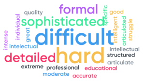
Students were asked to choose one word to describe academic writing and a word cloud was produced. This incorporated the views of all students, with the bigger words representing a larger number of people who all responded with the same word.
From punctuation, spelling and grammar to writing styles and the impressions they give to others, the talk really covered a wide range of points. The importance of appropriate word choice and good paragraph structure was also emphasised.
‘I didn’t expect such basic things to be enforced so much’ – Joanne, Part 1
Typography student’s knowledge was put to the test with an interactive quiz to reinforce the information that had been given, with prizes on offer for the winners!
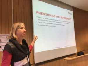
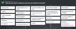
Following this, week five played host to a very important talk on referencing. The talk was led by Karen Drury, one of the Department of Typography’s two Liaison Librarians.
The talk included vital information for students of all years across the department, with as much as 20% of first year essay marks being dedicated to referencing. Even more so for Part 3 students, who are currently working hard on their dissertations.
The talk covered all bases of referencing including how, when and why referencing should be used as well as different styles of referencing, which involves guidelines as to how the information in the reference should be structured (the Harvard style being favoured within the department!)
As a little reminder, the Harvard referencing system is structured as follows:
Author (Last name followed by first initial), year published, title of work, place of publication, name of publisher, pages used
For sources such as journal articles, the publication information is replaced by the journal title, volume and issue numbers. Websites are also slightly different, the date the source was accessed must be included as well as the URL it can be found at.
Talking to some members of Part 1 after the talk, it became clear that, before university, referencing was not as strictly enforced as it is here.
‘I’ve done referencing in the past, but it was never this rigid and strict’ – Joanne, Part 1
Being from a department such as typography, the materials we are required to reference are often different to that in other fields. As well as the more common sources such as books, journal articles and websites, Karen really clarified how we should go about citing materials such as pictures and artworks. She emphasised the basic reference structure which involves four major pieces of information: author, date, title and publication details (such as the place of publication and the name of the publisher although this varies depending on the item being referenced).
Through interactive quizzes, handouts and a variety of examples, Karen really simplified the referencing process, giving students a greater understanding of what is involved in citing correctly.
‘Learning about the specific reference structure to use was really helpful, and the quiz really helped consolidate all of the information given in the talk’ – Ruth, Part 1
Karen also recommended some different tools which are available to assist in referencing such as reference managers (Endnote online, Mendeley and many others). There are also some library guides available as www.libguides.reading.ac.uk which can help in managing and citing referencing.
‘The different tools Karen spoke about will be really helpful, I didn’t know about all of the library resources which are available’ – Caitlin, Part 1
Overall the past two weeks have offered some very key information which is applicable in all areas of study. From Part 1 and 2 essays and reports all the way up to Part 3 dissertations, Typography students at the University of Reading now have a much more solid understanding of how best to structure and communicate written information.
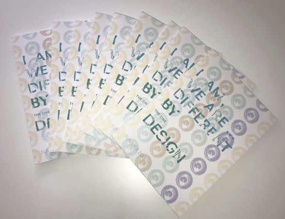
Making a ZINE: ‘I am, we are… different by design’
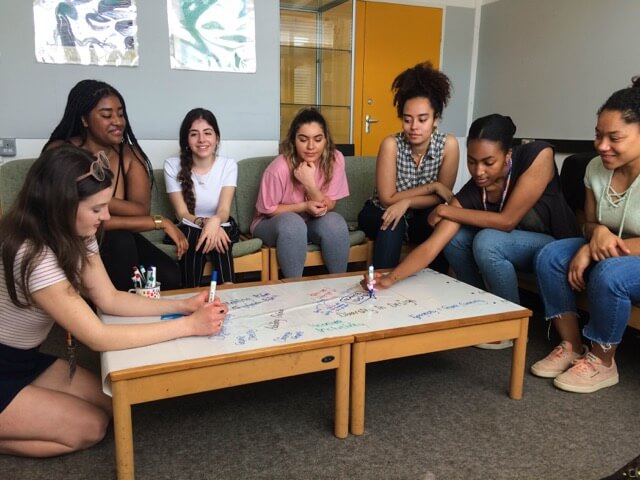
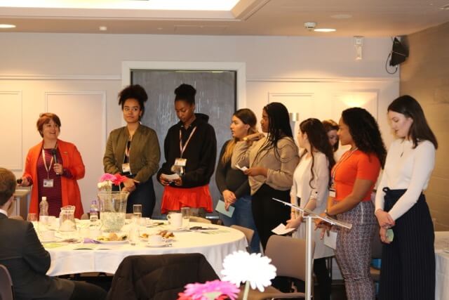
Our second Baseline Shift session was run by Camara Dick, Seniz Husseyin, Malaika Johnson and Martha Macri, members of a group of students who have been working collaboratively over the past year to promote new perspectives on diversity in creative disciplines. Former students of the Department, Ziana Azariah, Fay Biggs and Lily Brown were also part of the team. The “I am, we are” team have been helping reshape some of our teaching, including building an entirely new module for Part 3 students. They’ve also captured a snapshot of key diversity topics in creative industries through the writing, design, and publication of a zine.
The team all share different experiences and opinions of diversity within design, motivating them to come together with the hope of creating changes they can be proud of. They’re challenging the dominant western canon within our discipline, seeking to counterbalance this tradition by broadening our curriculum and introducing new perspectives. As well as opening up new career opportunities, another motivation is to evolve a stronger sense of community within the department and hopefully encourage students to both find their individual voice and move beyond our ‘cultural comfort zones.’
Building a module
The new Part 3 module, Design for Change, was co-designed between the team and academic staff in order to promote the critical engagement of social issues and the exploration of these through a practical self-selected design brief. This module encourages students to engage with a range of current debates and perspectives on diversity, inclusion and global perspectives in design. Students studying on the module produce a practical project that aims to inspire change by engaging users in a cause.
Engaging students of the future
In order to create awareness and share ideas, the team ran an activity on undergraduate applicant days in which prospective students would share their interests within design. These were then displayed on a series of polaroid-style designs in order to show the vast range of design opinions and passions within the group of applicants. The idea was to start building a community among applicants even before they are offered a place to study here, but also to stress that we welcome people who might define ‘design’ in a range of different ways. In the future, the team plan to use this polaroid scheme with all students, in order to create a discussion about respective cultures and different inspirations.
Beyond Typography undergraduates
Whilst the team are all students within the Department of Typography and Graphic Communication, they have worked with a variety of groups and individuals in order to achieve their outcomes. They interviewed staff and students from all three departments in the School of Arts & Communication Design, as well as graduates and other professionals with links to the University. The insights gained form the basis of their ‘I am, we are …’ zine.
Future goals include:
- encouraging students across the School to embrace their diversity and explore different perspectives within their own creative practices
- diversifying the range of jobs available within the department’s real jobs scheme, with one aim being to reach out to Reading’s refugee community to provide design services with direct benefits to individuals, such as CV formatting.
The zine
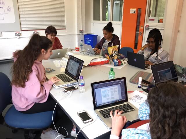
Following receiving funding from the University’s Partnerships in Learning and Teaching scheme, the team decided to publish a zine in order to spread awareness of diversity and inclusion in the creative sector. To showcase a broad range of practices, they decided to include content from members across the School as well as graduates. After interviewing students and practitioners about their work, the team began to put together and design the zine. With budget and time restrictions in mind, the team then began to make decisions including the grid system, format and paper stock. They chose an A5 format as their aim was to print a lot of copies, and this allowed that to be possible whilst sticking within their budget. As there were multiple people working on the zine, it was important to design a grid system with this in mind so that the final pages were consistent and cohesive. In terms of paper stock, they chose a matte finish as they wanted it to stand out against a ‘typical brochure.’
The team said they felt incredibly satisfied and proud with the final outcome, receiving lots of feedback about how inspirational they, and the zine, were. In the future, they aim to create a bigger and better zine, by including more content and space for them to be able to finesse their typography. They also hope to develop a theme for the next zine and extend its publication across print and digital channels so that they can engage a wider audience with diversity in design.
After their Baseline Shift presentation, the team gained a lot of interest from new and current students looking to get involved. Growing the team will allow for the project to continue and evolve.
Moving forward
This talk opened up the discussion of diversity within the department and allowed attendees to gain insight and become involved with how we can shape and develop this project for future students.
“As someone who never really second guessed the lack of diversity in the department teaching and the discipline of Graphic Design as a whole, the talk gave an interesting viewpoint on to this, shining light on the issue. The Zine itself was a great publication, and I hope it continues to be produced, getting better and better each year. I’d also like for the department to showcase speakers from different backgrounds to bring this idea of diversity forward into all aspects of our learning, as I think we have a lot to learn from each other!” – Laura Marshall, Part 3
As a student currently taking the new ‘Design for Change’ module I found it incredibly interesting to hear their thoughts and aims for the module, and have been really enjoying the discussion, debates and different perspectives within the seminars. After the talk, I spoke to other students who had attended and discovered they found it equally fascinating and hope to get involved in future projects.
DK at the University of Reading
Our first Baseline shift Wednesday morning session kicked off this week and Typography students were lucky enough to receive a visit from two members of the design department at Dorling Kindersley’s Knowledge team. Kit Lane, who is alumna of our department, and Karen Self, art director at DK, gave a very interesting talk covering many different aspects of the company, as well as promoting the varied internships they offer to students.
‘It was very useful to have industry professionals come and talk to us so early in the course. It was good to know about internships I could apply for sometime in the future’ – Ruth Bartley, Part 1
The DK difference
DK offered students an insight into the exciting world of publishing, from their own unique perspective as market leaders across a range of areas. They covered their practical design process as well as the design thinking that goes along with everything they do, emphasising the importance of considering the consumer (not just the reader) at every stage. The lasting impression was that DK operates very differently to many other competitor publishing companies. This was exemplified by the fact that the majority of design is done in-house, with comparatively huge amounts of time (often four or five months) are spent designing each book, spread by spread, as opposed to flowing text into a prebuilt specification.

Design challenge
Students were given the opportunity to take part in a workshop led by Kit and Karen in the afternoon. This involved generating ideas for a new book named ‘Urban Detective’. Students worked through a design process starting with some initial research into the theme before sketching out rough ideas for book covers and inside spread layouts.
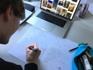
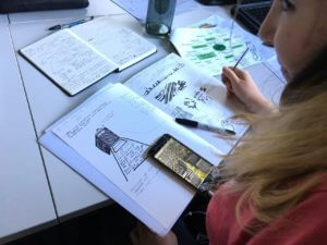

These ideas were then refined through peer discussion and input from Kit, resulting in a handful of clear concepts. A group crit let everyone to receive feedback on their work. Throughout the process, students kept in mind the audience and aim of the book, in true DK style.
‘I enjoyed the workshop, as it made me consider more about book design, than I might have otherwise considered on my current project’ – Alex Ganczarski, Part 1

‘I really enjoyed the workshop and am taking away a greater understanding of how to plan my ideas and concepts, as well as how the 2nd and 3rd-year students plan and execute their work. It’ll help me a lot over the next 3 years of the course’ – Rory Tellam, Part 1
Portfolio reviews and interviews
Some students also took the opportunity of having a mock interview and portfolio review with Karen. This gave a feel of what an interview is like in a professional context, preparing them for heading out into the world of design beyond university.
‘Karen made the experience calm and professional, offering great feedback on how to improve my portfolio’ – Laura Marshall, Part 3
‘It helped me to understand the process and content of a professional interview in a relaxed and casual context’ – Fay Rayner, Part 3
‘I am so glad I took on this opportunity. It has made me feel much more confident and prepared for future interviews’ – Jacob Hawkins, Part 3
Overall, our visit from DK was a big success. Around 65 Typography students were offered an insight into what life is like in the graphic design and publishing industry, which will be very useful when considering career paths later on – and much sooner for our students in Part Three!
Bauhaus typeface revived by MATD student
Adobe’s “Hidden Treasures” programme kicks off the typographic commemoration of the forthcoming centenary of the Bauhaus school by releasing four revivals based on lettering by Bauhaus staff. Drawing on original material in the archives of the Bauhaus Dessau Foundation, a group of current typeface design students were selected to work on digitising the original lettering, extrapolating the missing letterforms and characters to fill out the required character set, and adapt the designs for digital formats. The fast-paced project was led and supervised by Ferdinand Ulrich and Erik Spiekermann, and included in-person meetings in Berlin and Dessau, online collaboration, and a launch event in New York City.

Each of the four typefaces were revived by a student from a typeface design course: Hidetaka Yamasaki, a current MA Typeface Design student, worked on lettering by Carl Marx; Céline Hurka from the KABK on letters by Alfred Arndt; Luca Pellegrini from the ECAL on lettering by Xanti Schawinsky; Elia Preuss from HGB Leipzig worked on letters by Reinhold Rossig; and Flavia Zimbardi on letters by Joost Schmidt. The typefaces are released gradually through Typekit’s subscription service to professionals using Adobe’s dominant suite of applications, and are a superb example of archival material inspiring contemporary design.
A July like any other in Reading
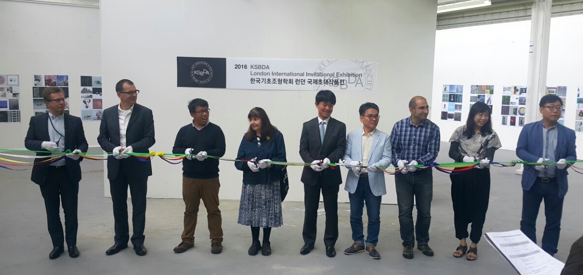
The Department of Typography did not get the memo that July is supposed to be a quiet period. We kicked off the month by hosting the KSBDA International Invitational Exhibition, its first stop after Seoul, and on its way to Katowice, Poland. The exhibition, attended by members of the current Board of the KSBDA and several past presidents, was held with the kind collaboration of the Department of Art. The visitors had the opportunity to examine material from the Collections in Typography, and discuss their use in teaching.
The second week of July saw many staff, research students, and postgraduates fly off to Thessaloniki, to take part in the 6th ICTVC conference. The triennial event is spearheaded by alumnus Dr Klimis Mastoridis and aligns closely to the research strands of the Department. Several members delivered papers, and Emeritus Professor Michael Twyman delivered the opening keynote.

Back in Reading, we marked the tenth anniversary of the Monotype Studentship, a substantial initiative in funding support for our postgraduates. The Studentship is only one element of our deep collaboration with the company, which stretches from research support to technical training.
Over the two last weeks of July the Department was taken over by the annual TDi summer course. The international cohort (with participants from Bangladesh, Brazil, Canada, Dubai, India, Jordan, Korea, Malaysia, UAE, USA, as well as European countries and the UK) spent long days in sessions led by several members of the Department’s staff and student community, working in our studios, with material from the Department Collections, and personal staff collections. Through lectures and seminars, to hands-on sessions with archival material and letterpress equipment, the TDi provides a unique distillation of key areas of the Department’s narrative on typography and typeface design. Marek Jeziorek documented this year’s course in several albums, starting here.
Top of the table
We’re proud to be in the Guardian’s top 5 for undergraduate design courses in the UK. And even prouder that the same table places us at number 2 nationally for graduate employability in design. Find out more at our Open Days on 17 and 18 June.