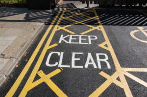
For this task we were sent away with the motive of finding lettering in the environment and capturing it in a photo to later analyse. Every day we look and read 100s of different typefaces that we may not even take a moment to think about normally, so it was nice to slow down and really question things like why did the creators of something chose to do it in this particular way?
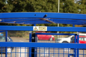
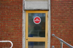
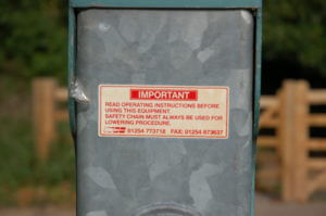
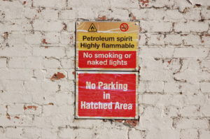
I tried to capture a wide variety of different letter forms, techniques and materials but this began proving slightly difficult with being restricted to campus where they have a distinctive typeface to help brand the university. Over coming this set-back i looked for inspiration in more creative ways like car window stickers and stone drains.
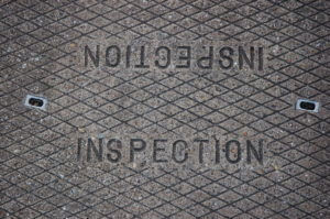
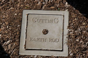
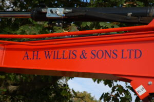
We were then asked to individually group out photos in-whatever way we please and it was really interesting to see the different and creative ways other people chose to group their work. i grouped mine into the different techniques and materials in which the letters were formed which included vinyl/stickers, stone casts, card/posters and carved metal. I feel i approached this challenge head on and to the best of my ability but if i was to do it again i would try harder to think outside the box and be more creative with my ideas.