Category: Student work

Staircase

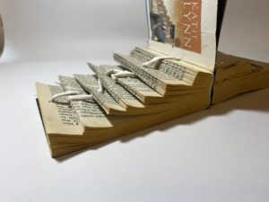
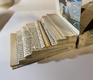
For this mini project I picked the brief of staircases as I wanted to experiment with different levels within a book and how this manipulation would effect the text.

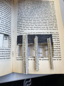
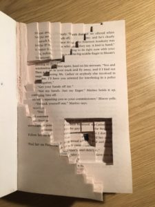
The first thing that I wanted to do was have two different path ways, the best way to do this was to cut the book in half which I did. I did this as I wanted to represent the two sides one being the severely ill and the other more mild illness. I represented the two sides by two different staircases both going downwards. The first staircase has clean lines that go down in an even manner. The string leading down shows that allow although he has a clearer mind it still isn’t perfect and this is shown as adding this has made the pages much harder to read due to the tension. The other set of staircasaes follows a lot more uneven and different variations of steps. I created this by having every step both a different size and different methods, for example one has negative space within the step and another has lots of texture. This staircase represents the people that are most ill so therefore following this path down wouldn’t be a good experience.

Lettering in perspective

For this mini project I decided to focus on the different perspective of letters in the environment. I focused a lot on different angles of the letters and how this made the type even though they where the same look completely different. I took photos from high, low to each of the sides as well as zooming in and out. To really get to understand how the change in perspective happens. Something that I noticed as I focused on the letter B was how the different font, colour, text size and position all allowed for the same letter to look completely different some many times. I was then able to represent my findings on a document displaying how perspective and different varieties that go into the typography change the meaning and visual.

Materials and Context Photography Across Campus

Eric Photography Document 2

For this ‘Photography In the Environment’ task, I focused primarily on the materials the letters were placed on or made from. I became highly interested in the lettering of the mundane, the everyday lettering that goes largely ignored.

The texture, material and condition of the text was also of interest to me – It was an interesting thought process to consider how the lettering had been constructed and how that linked to it’s purpose or task. For example, the concrete lettering found on the base of an outdoor table tennis table is set deep into the supports in a thick, slab serif type. While having connotations of strength and stability, this also links to the lettering’s function, to communicate the brand name of the objects creator. Due to its intended usage being outside, both the material and method were appropriate.

I then began thinking of the condition of the lettering – The ‘Please Close Lid’ sign, found within the Co-op, was immaculately clean and a clear, sans serif type in an assertive dark red shade. While helping to stand out and communicate the desired message, the cleanliness and visible shine over the letters reflects positively towards the shop as a whole. In contrast, the deteriorated, aged letter H found on a nearby block is clearly old and has been left unattended. The texture of the pain crumbling away, revealing the exposed brick underneath, was very different visually from much of the campus, which tended to all be newer lettering.

Looking back at these photos, the context of the lettering could have been explored further, with different distances allowing both the material and context to be shown optimally in separate shots. However, as in the Fire Exit image, I believe that this wasn’t always necessary, as that image captures both the material and context of the letters reasonably well.

Eye Line

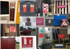
This is a mini project looking at the different types of lettering in the environment. For this project I had a theme of ‘eye-line’ where I took various photos at signs around campus and looked at what features they had.

From looking at the various signs I found that all the signs at eye-line were important or warnings. This was emphasised by bright colours against a plain background and that the had bold sans serif fonts to grasp the viewers attention.

Obsession Through Pages

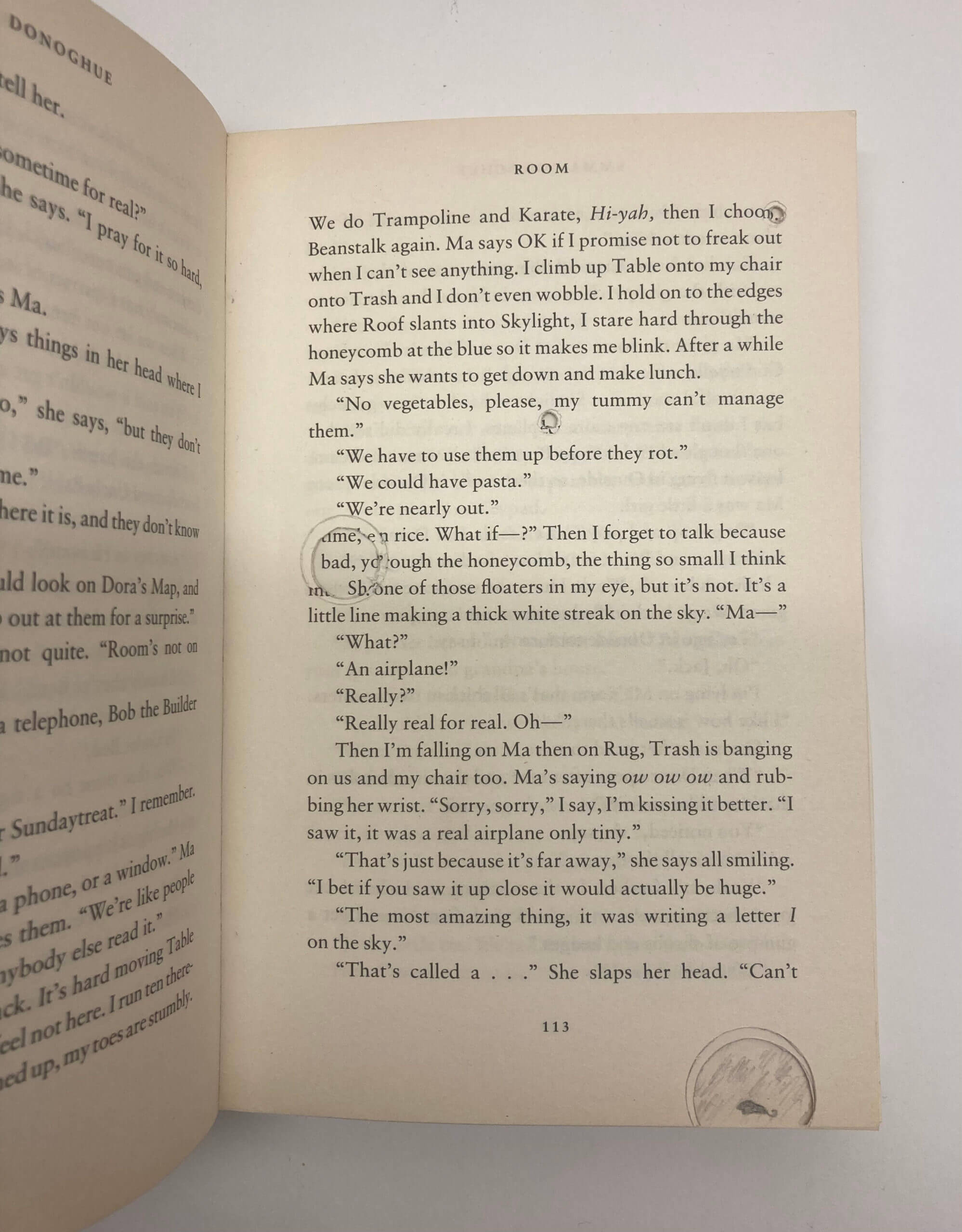
Having looked at the brief lists, ‘Obsession’ immediately stood out to me. I intended to present the gradual progress of obsession, setting in after time and slowly creeping into borderline insanity.

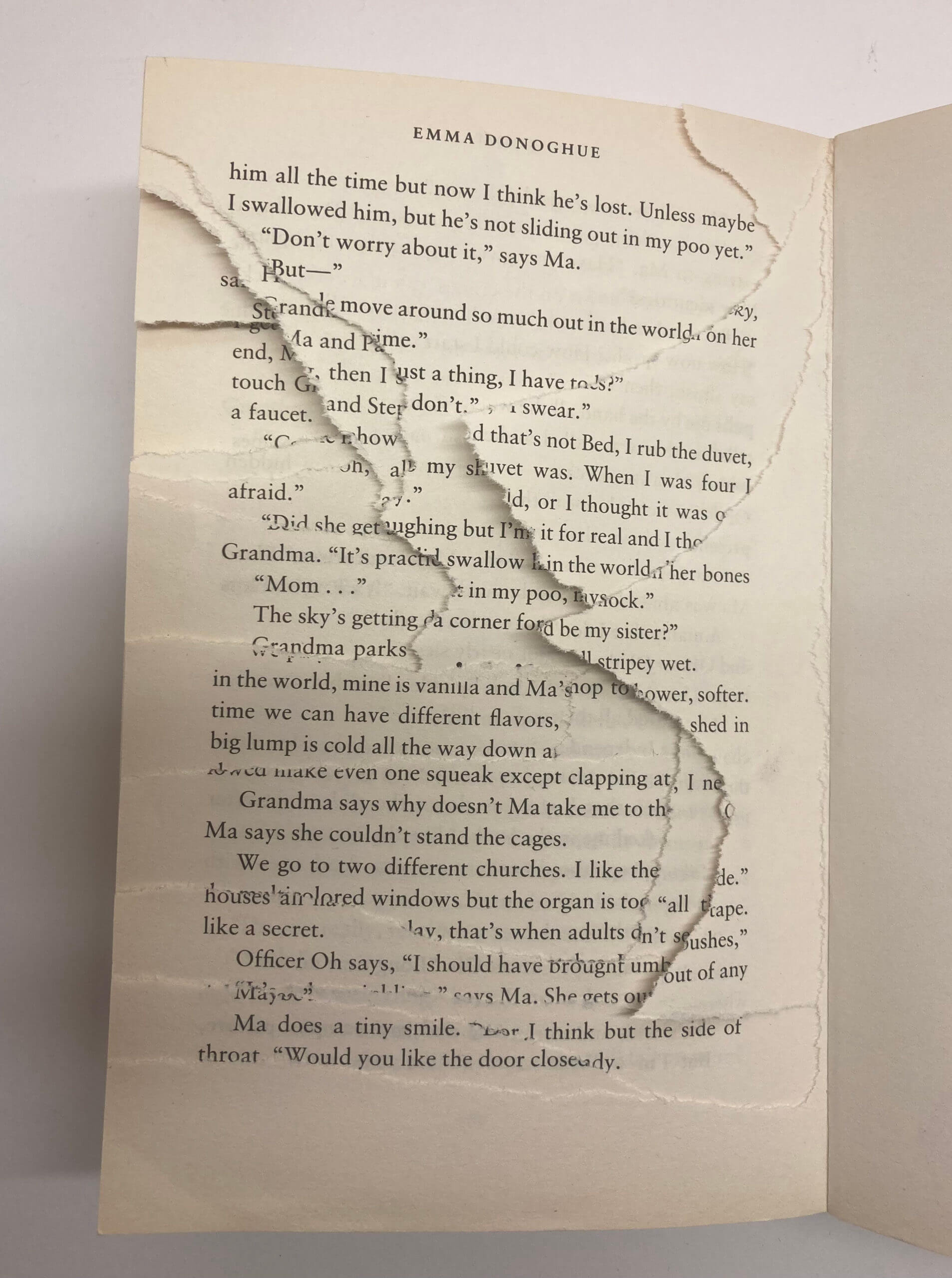
Reflective of the woman happily reading in the library, the first half of the book remains in tact. However, after around half way, I begun to add to the book. I began to scribble over the pages in red pen, firstly just lines and then into words, transitioning from red pencil to red pen and finally a red Sharpie. These became more aggressive as the book continued on, showing the increasing annoyance the woman has in the sounds. As this change is a slow increase throughout the entire book, this is not seen in the images above.

Similarly, I began folding the corners of the pages, becoming more noticeable and regular the further into the book you get. This is to mirror how the woman would keep putting her book down to investigate the source of the noise. Later in the pages, the woman’s written voice appears, first seen in pencil, then pen and finishing with a Sharpie, the same format as the mouse. The coherent sentences quickly turn into almost deranged scrawlings, ending with multiple pages of repeated questioning “Where is it?”, as seen in the first image. In my initial brainstorm, I decided that repetition was a key source of annoyance, which is why every choice is repeated with gradually increasing intensity.

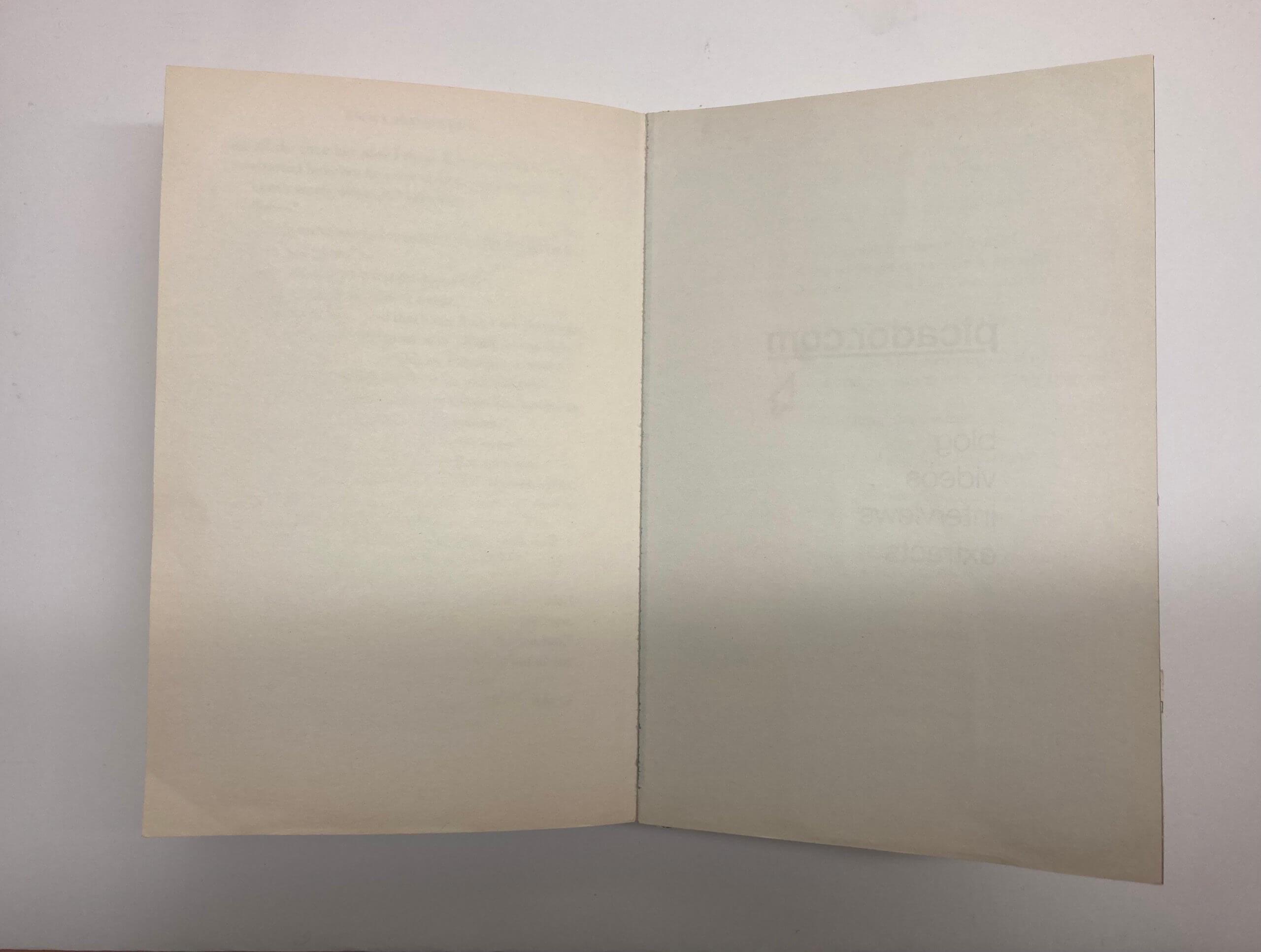
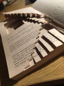
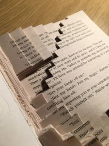
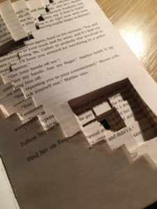
Finally, again mirroring the brief as the woman rips the library apart trying to find the source of the noise, I began tearing the final pages. By  ripping more and more each time, a gradient wave is formed, creating a visually appealing textural difference and adding dimension to the book. The entire back cover is gone, as seen in the final two images, showing this as an endless narrative, the woman never finding the mouse and receiving the closure she desires, pushed to insanity by the noise.
Cambridge Institution

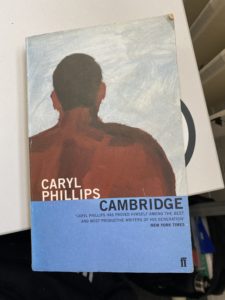
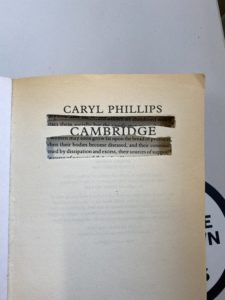
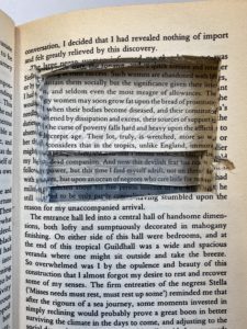
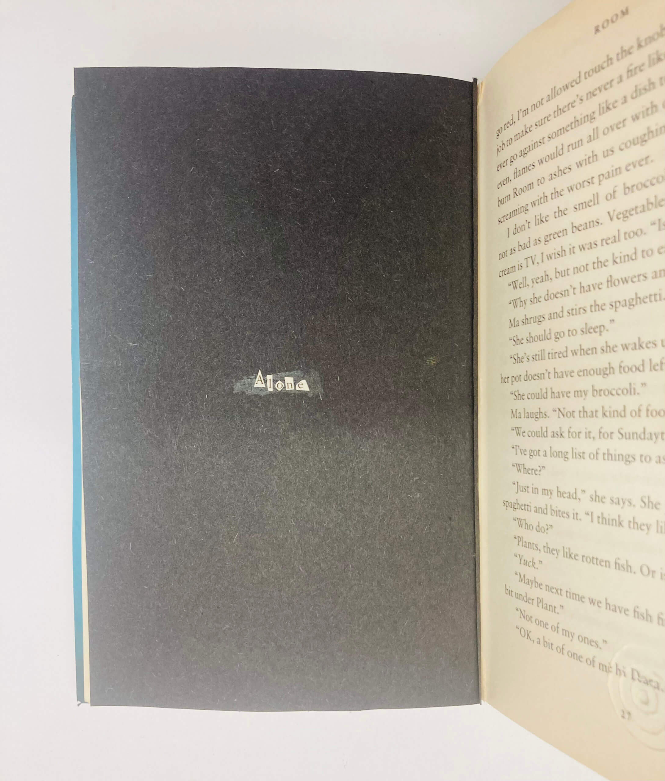
When deciding what brief to choose for Berta’s project I was instantly drawn to ‘staircase’. It was like I had the perfect book to do so, I decided to put my own spin on the project while trying my best to stick to the brief. The front cover is a man looking onto what seems to be nothing, for me this character was at the front of what was the ‘Cambridge Sanatorium’, which is shown from the first two photos.

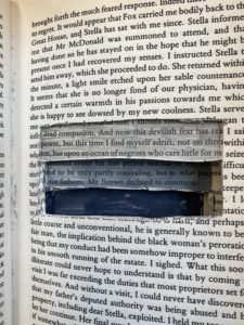
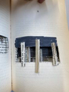
From there you can see a clean descendance into the 7 floors of the Sanatorium, as you get deeper the darker it gets which is reflective of the on goings. As you get right to the bottom you start to see bars, showing the Sanatoriums darker secrets as it is actually more of a prison then anything else. The book itself is based on slavery so I used this as my reasoning as for why the man is being moved down the ‘hospital’, it is because of his race instead of whether he is ill or not. As a result of this I decided to stick racial slurs right at the bottom of the staircase.

Serifs and Texture

Task

For Eric’s project we were tasked with finding Lettering in the environment with a theme in mind. At first I started taking pictures of all lettering that interested me and I started in the typography building. As I was taking pictures, I realised that most lettering were serifs so I decided to make serifs my theme. However, as I was taking the pictures, I realised there was a variety in the serifs as some letters had clear and traditional serifs and others were less clear but still had decorate ends.

As I continued taking pictures, both inside and out the department, I started to take pictures more focused on textured lettering, specifically, texture that had been a result of wear and age. This lead to taking pictures outside because I had found that text was more worn out there due to weather.

We then had to group our pictures into our themes and placed the smooth textured serifs at the top of my page as it was my first theme/idea and moved to textured serifs to textured lettering down the page to mimic the evolution of themes from just serif to textured lettering.

Staircase Book


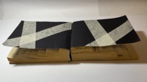
For this brief I decided to pursue the staircase narrative. To represent the idea of the man gradually descending I carved out a variety of staircases which lead you further and further down (or up) the page. Eventually you get to the very bottom which is coloured in black – this creates depth as you cannot tell where the staircase ends. I made the staircases on varying dimensions. This reminded me of M.C. Escher’s illusions.

Signs Observation

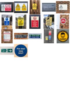
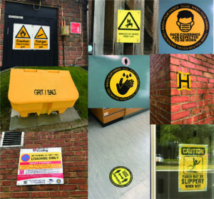
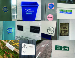
By capturing all the signs found around the typography department, I have been more aware of the environment around that I usually not pay attention to. In these days, variety of signs, logos and numerals were designed to make our life full of convenient unknowingly. More signs are designed. For example, instruction signs designed to remain our behavior of social distancing and washing hands due to virus.

I categorized all the images according to their colors with particular functions. Primary colors that match with black and white letters have contrast effects, as well as use sharp paint to grab people attention.

  • PROHIBITION signs mainly in red

  • WARNING signs mainly in yellow

  • SAFETY signs are in green; MANDATORY signs are in blue with positive instruction

Besides the function of colors, similarities of signs are that it designed as simple as it can by linguistic and symbolic lettering, we can always get the message behind the signs in less than three seconds without hesitation. I compare them with tiny observations:

  1. Simple geometric shapes using in outshape of signs, and common symbols within signs are arrows, banning circle, exclamation triangle and recycling sign.
  2. Font of Sans serif are used in almost every sign due to its readability.
  3. Material and placing position are different between indoor and outdoor signs: Indoor signs are mainly placed on the wall with eye levels and using removable materials like binding metals or stickers, while outdoor signs are mostly bigger in size and use weather-resistant materials, as they are mainly designed for pedestrian and drivers.


Touch Screen T-Shirt for Matt

Touch Screen Spotify T-Shirt

In the seminar, Matt’s interests were:

  • Indie music
  • Edgar Wright films
  • Interesting t-shirts

I wrote out a few ideas for each and then came to the conclusion that my best option would be an idea of combining music and t-shirts.
My initial idea being a series of unique signed t-shirts for bands that he liked, however I ended up making it a bit more interesting and going down the idea of a touch screen t-shirt that would allow you to connect your phone to it and then control/display the music that you’re listening to from the shirt itself.
Another idea would be that when not connected the t-shirt would display preloaded album covers of Matt’s choosing and cycle through them automatically with the option to change manually with a swipe on the screen.