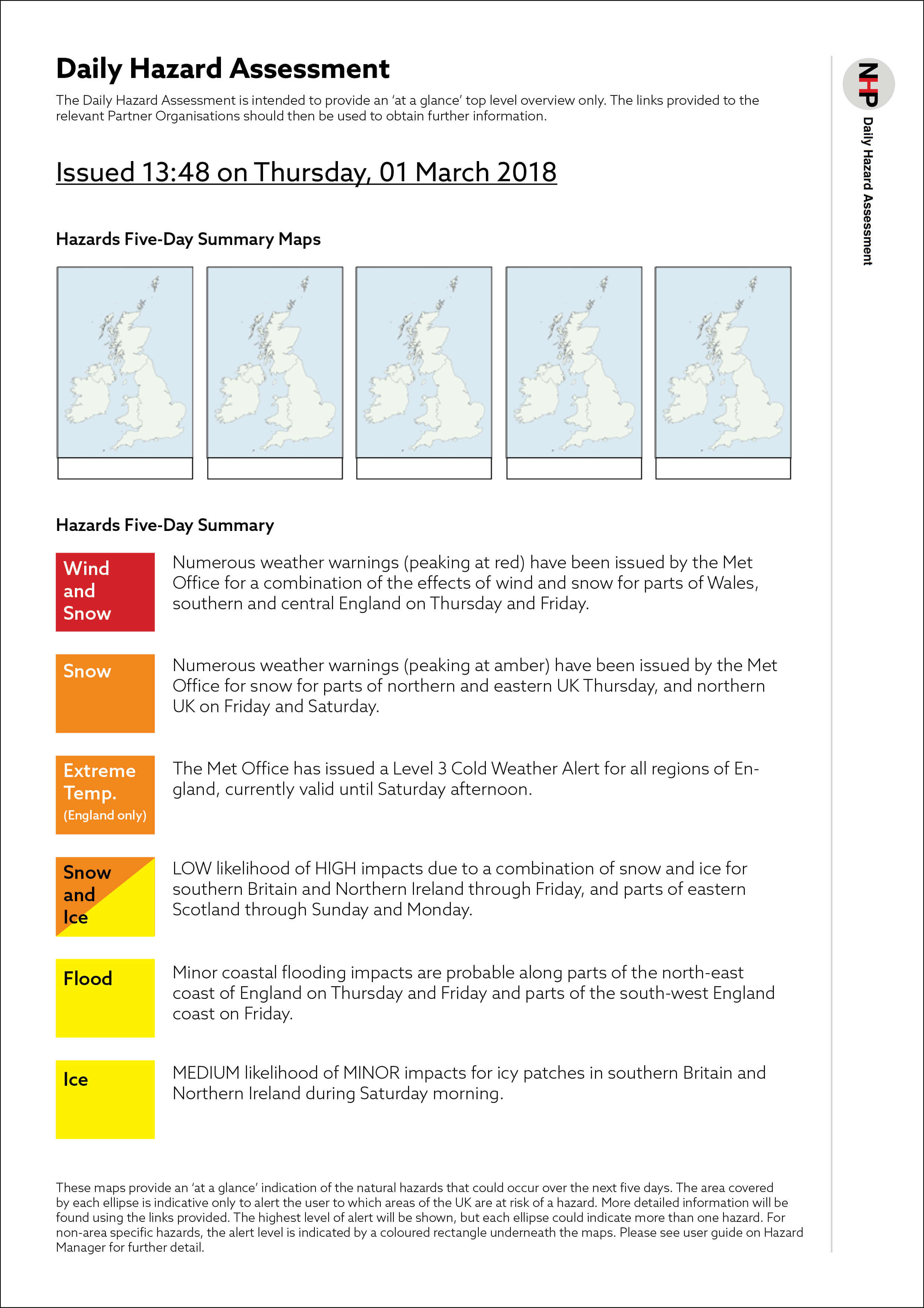
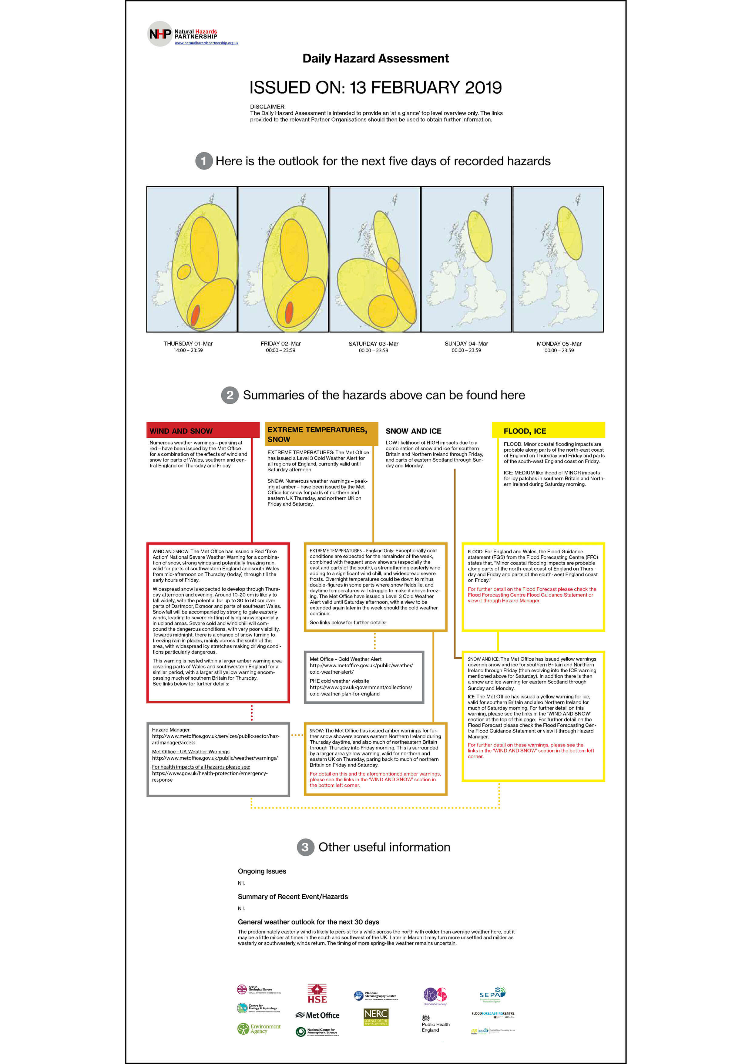
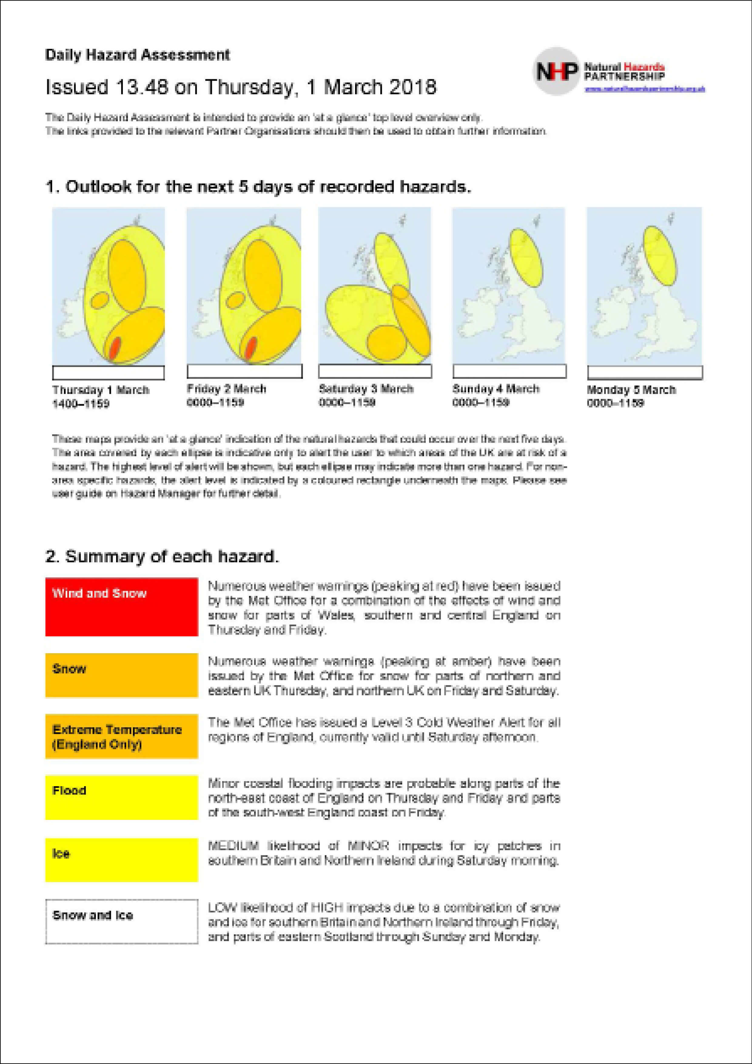
Background
The MERL is a museum, library and archive dedicated to farming and the English countryside, aiming to maintain their relevance. Its collections span objects, archives photographs, films and books. It is affiliated with the University of Reading. Maria McKinney is a Dublin based visual artist. Her collection, Sire, is based on genomics in modern cattle-breeding, where she collaborated with genetic scientists and a pedigree bull-stud farm.
Brief
The Museum of English Rural Life (MERL) approached us to design the promotional and in-gallery materials for their most recent installation by the artist Maria McKinney – Sire. This exhibition consisted of sculptures constructed from Semen straws, to represent different DNA of different breeds of bulls. The exhibition references several themes, such as science, agriculture, and art, so the design had to tap into each of these, whilst respecting the wishes of two clients: the artist and the curator. The deliverables required were posters of different sizes, an in-gallery brochure, A0 foam interpretation boards, postcards, and involved some cropping and editing of images for digital display.
Research
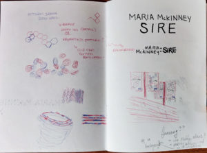
Initially we spoke face-to-face to the artist, to find out more information about her as an artist, what her collection means to her, and her thoughts on how she wanted to be presented as an artist. We took these answers, and produced a document of inspiration for typefaces, zines, posters and illustration styles. The artists in turn gave us opinions on each image, giving us a better idea of her preferences. We also met with the curator of the exhibition who showed us around the exhibition space. This allowed us to visualise where the exhibition materials would be to get a sense of scale that we could consider in our designs.
At this stage, we had a number of ideas for possibly producing illustrations that could later be adapted into animations for digital deliverables, or for producing patterns that could change as part of a series. Eventually, we agreed to focus on the work itself, instead of illustrations, and to pull colours for the identity from the sculptures.
 .
.
The fact that there were two clients with different background overseeing the design, meant that there were two contrasting ideas presented to us. The artist suggested we produce something like Zine – what tends to be more “rough around the edges” – and the curator suggested a glossy brochure, more in-line with the museum and university’s image. To begin with, we chose to research zines, looking at what is commonly done. Our resources included Pinterest, as well as materials the artist sent us herself.
Design process
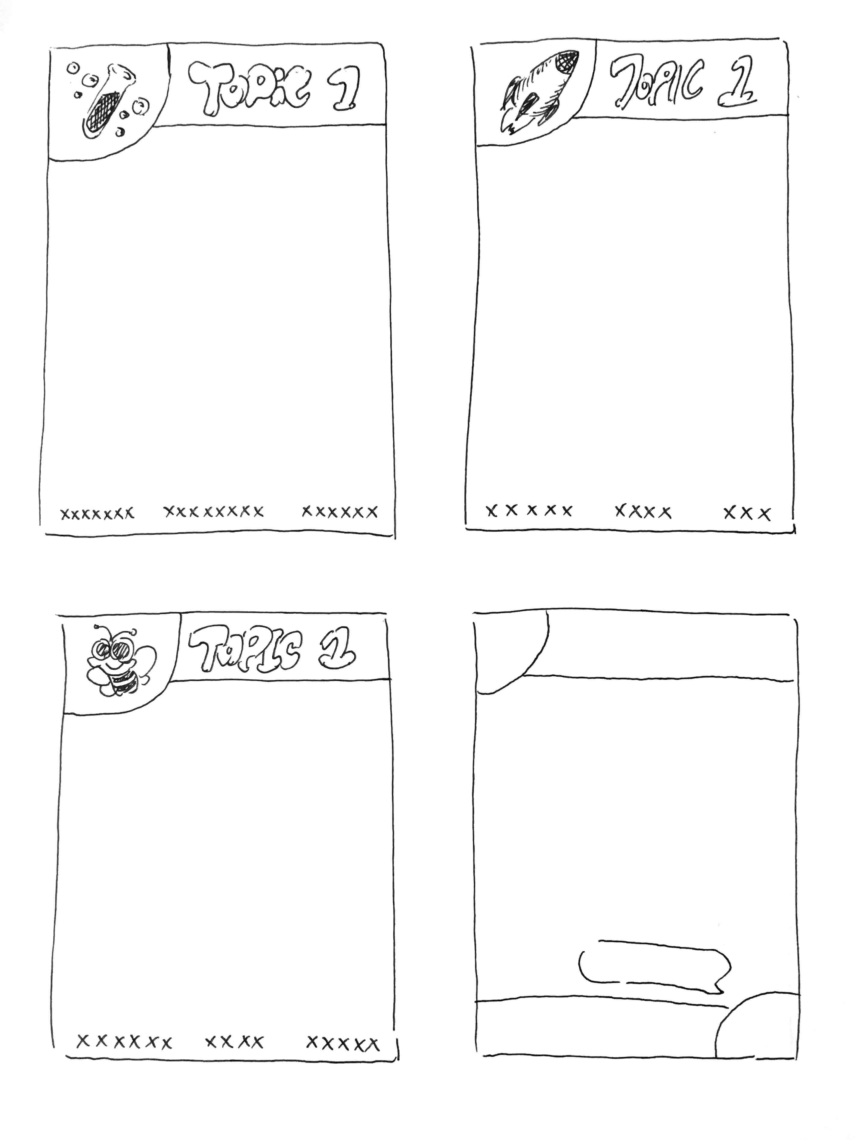
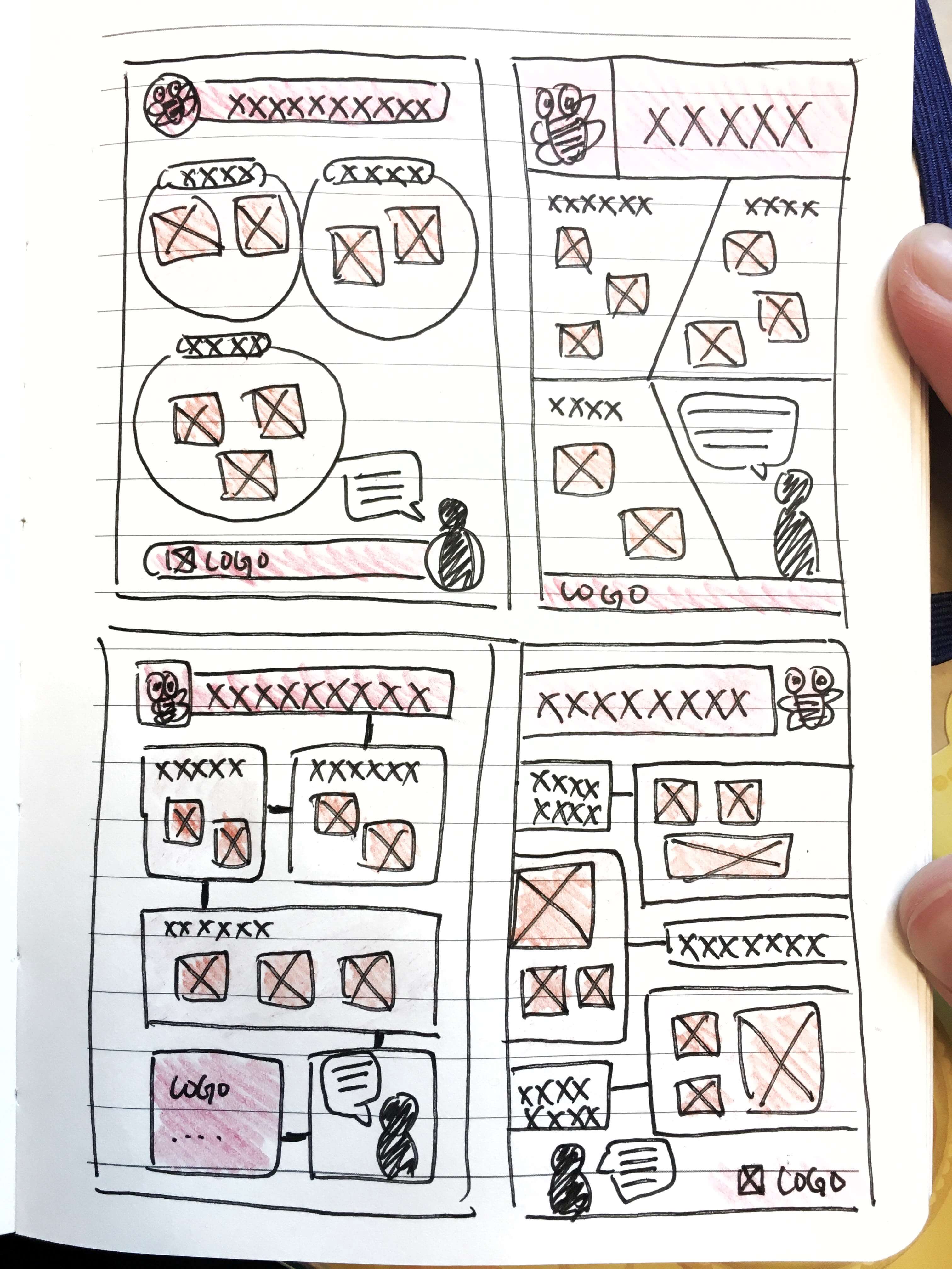
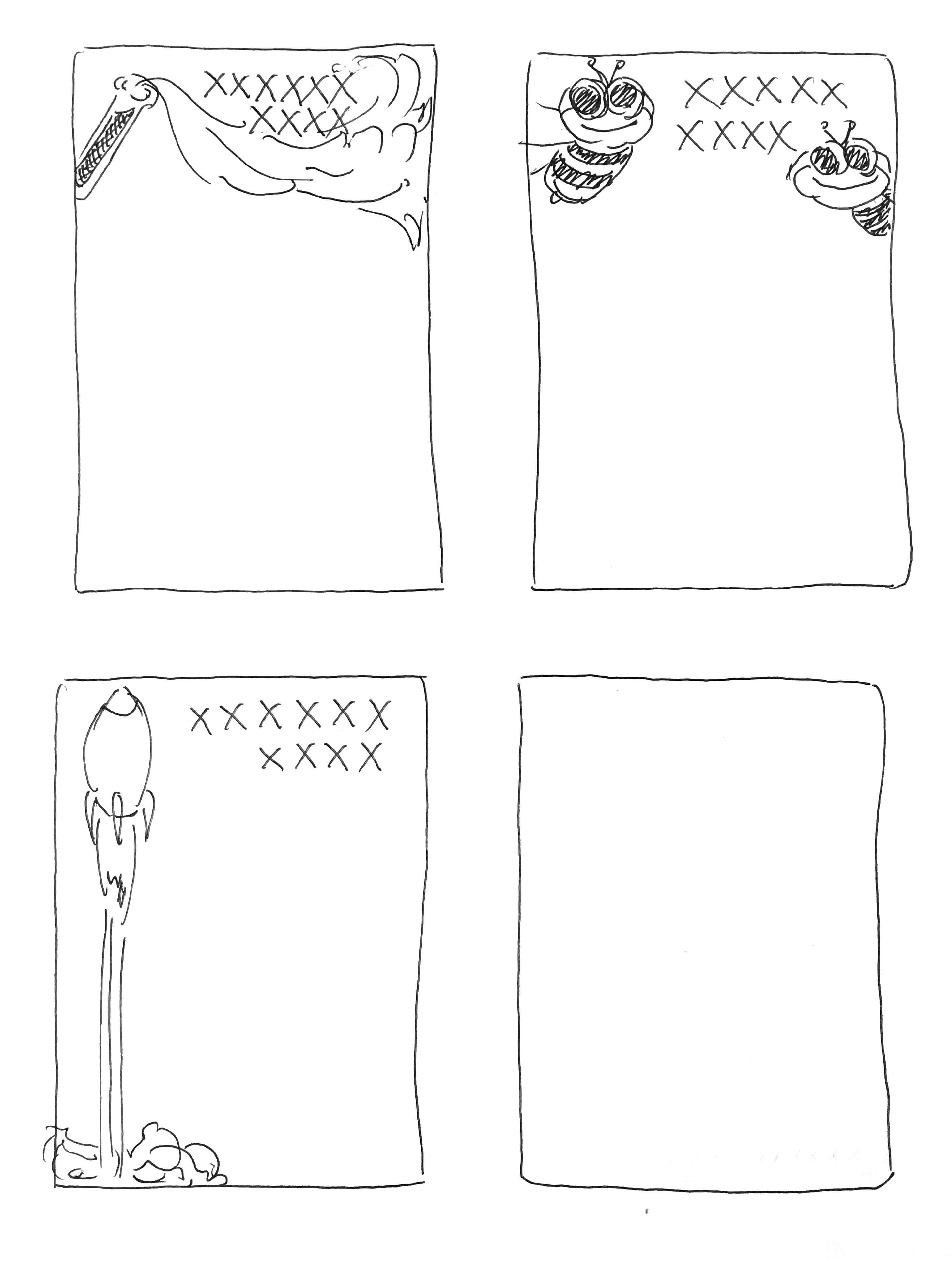
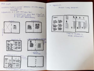
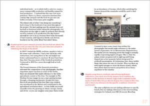
A large portion of the project was designing the brochure for the gallery – it contained a lot of copy and required a flexible but strong layout to accommodate different text lengths and image formats.The compromise with the conflicting brochure ideas, was to produce a glossy brochure, but incorporate hand-drawn elements, and editorial design with more visual interest, such as indents and bold colours. We began by sketching out layout options for each page, before moving on to digital tests.
When presented and justified to both clients, they were pleased with the initial ideas and happy for us to take them forward. One of the suggestions, that was carried forward in a more pared back approach, was to use the artist’s handwriting for the titles in the brochure as well as have the interview section written out in her handwriting. The agreement was that this would present legibility issues, so handwriting was reduced to just one title, on the artist’s interview segment.
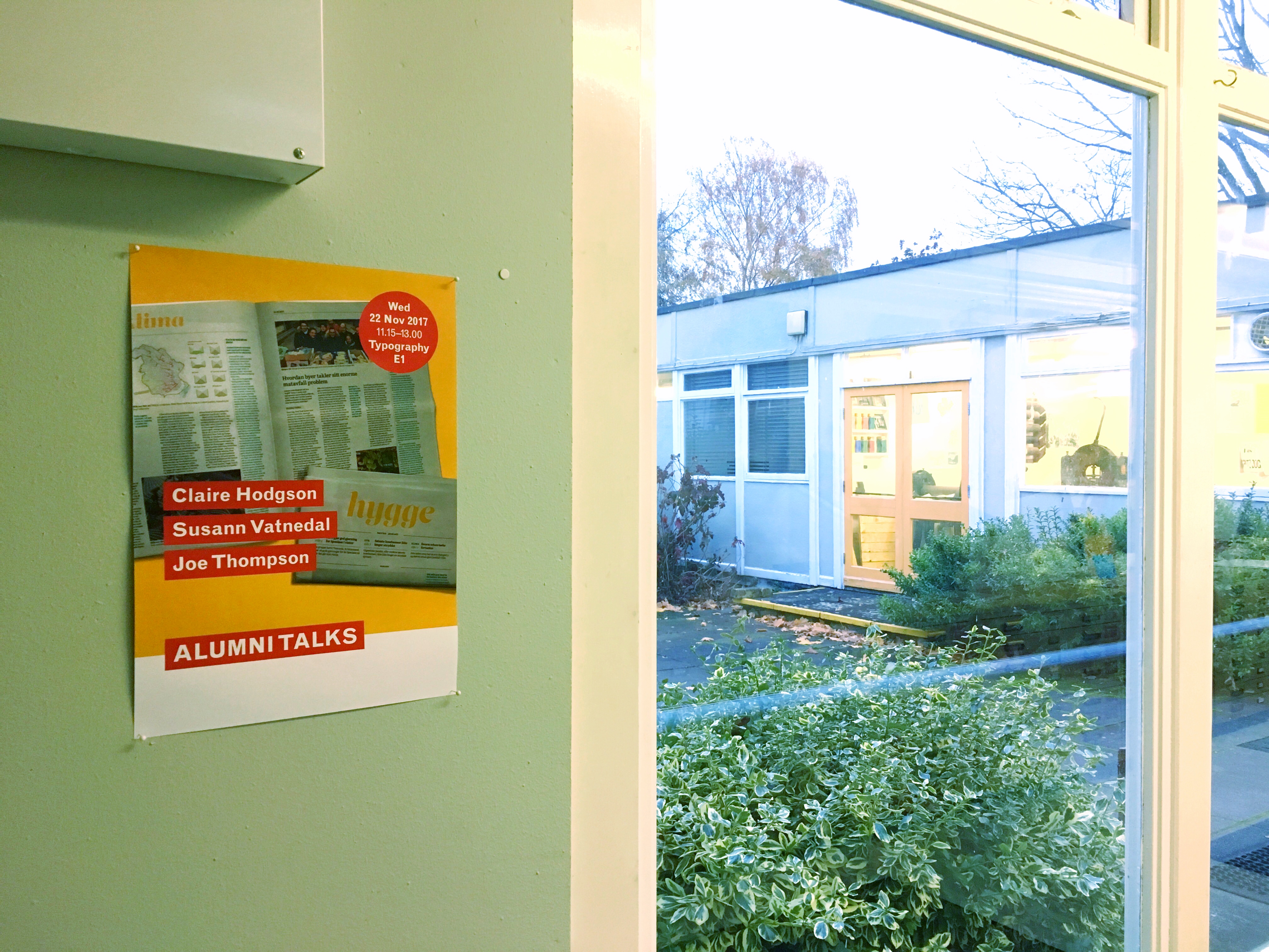
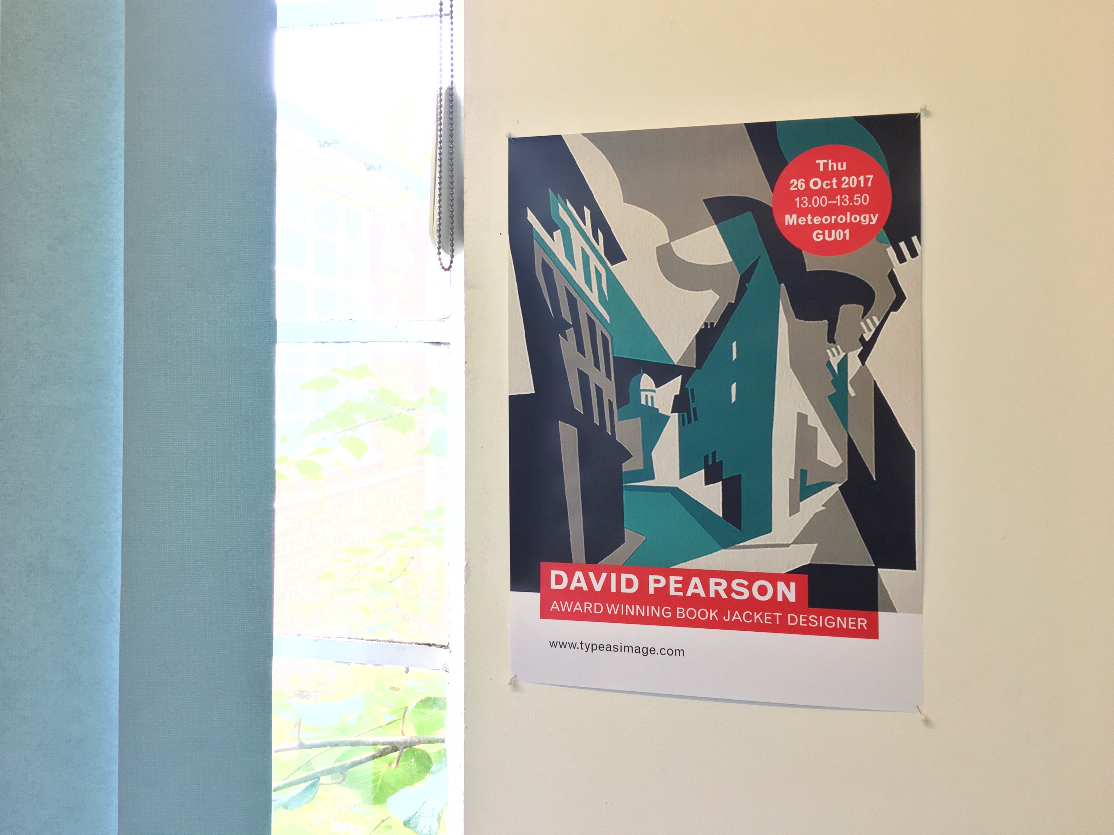
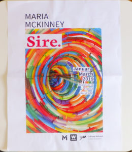
Alongside the brochure, we also produced the posters in different formats. These were shown to the clients in a face-to-face meeting and discussed to establish their best elements.
 .
. 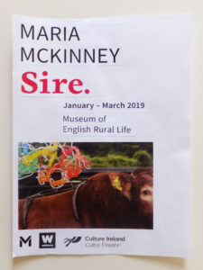
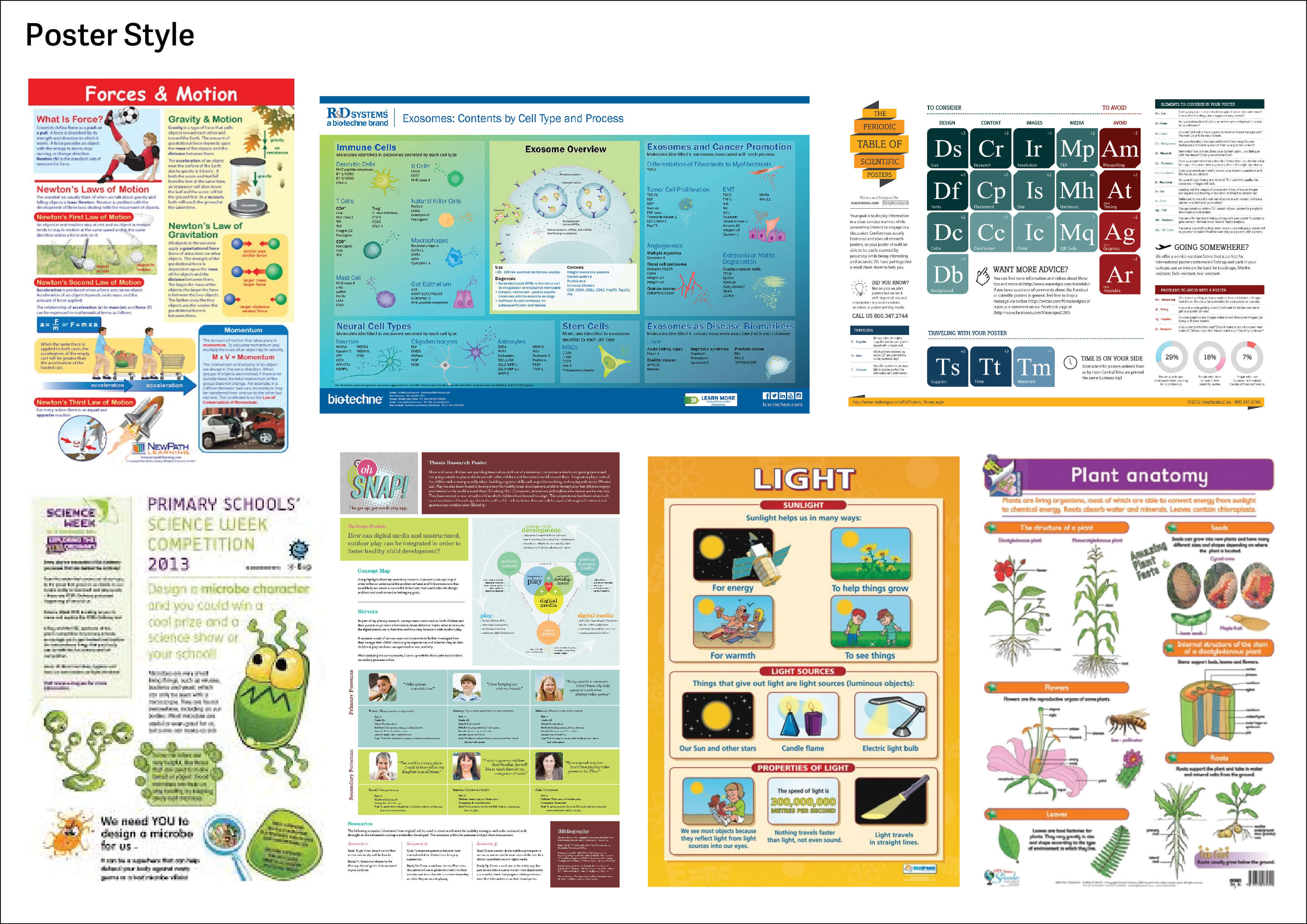
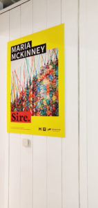
We decided to pull colours from the artist’s sculptures in order to drive the colour-scheme. This ensured the artist felt that the exhibition was representative of her work. The main colours of the materials were yellow and red; this gave us strong colours that would build links between each deliverable and to construct a brand unique to the exhibition being held at the MERL. The typefaces agreed upon were Cardea and Source sans. Once the colours and typefaces were agreed, the arrangement of these elements on the posters could continually be reviewed and perfected, without harming the consistency with other deliverables. Once the brand identity was agreed, we could progress further with the deliverables required for the exhibition, using the key styling throughout. Designs were continually presented to both the project supervisor, and the clients. These took the form of both sketches and more polished documents.
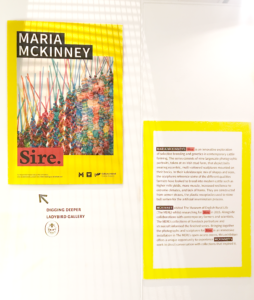
The final deliverables
The final deliverables were as follows:
- Posters in A4, A2, A1
- A5 events diary page
- External banners
- A0 foam boards
- Brochure
- Postcards
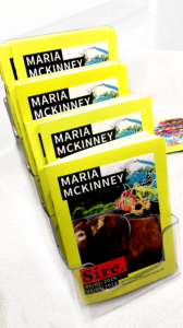
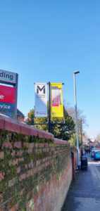
The deliverables were submitted to and used by the client at different points of the process. One version of the posters was submitted early in the process, for use in the university events diary, and larger format posters were adapted and submitted for use during the exhibition period. The external banners were sent to an external printer a few weeks before the exhibition opening so that the museum could install them and promote the exhibit to passers-by. The brochure and postcards were also submitted for use during the exhibition period, and were found strategically placed in the entrance to the museum and at the start and end of the exhibit’s space. These varying deadlines and requirements meant needing to consistently keep up with work, be flexible to sudden changes or requests, and be in constant contact with clients and the supervisor.
Reflection
The long time period of 7–8 months meant that availability between us varied throughout the process. It was agreed that at some stages one person would design, and one would supervise. As well as this, we assessed our strengths, and shared deliverables accordingly. For example, while one was responsible for arranging the brochure layout, the other was responsible for the information design involved. Time management and organisation was also heavily affected by the collaborative element of this project. Deadlines across the project were relatively flexible, but still had to be agreed upon by multiple people each time. This meant that clients and supervisors had to be available to approve work, we, the designers, had to be available to work on the documents regularly and on schedule, whilst relying on each other to supply files, and printers and their deadlines would need to be considered in advance, to avoid last-minute prints. For the most part, this worked well however, as there were many people being relied on at any one point, occasionally deadlines had to be rearranged. Fortunately, the clients were very patient and understanding of the process, and were enthusiastic about the work and the project throughout.
Communication was mostly done by email, this being the most effective way for us to share files and messages with multiple people within a conversation, whilst also being a familiar service for us all. Exceptions were Skype calls and face-to-face meetings, where more in-depth discussions of ideas and feedback needed to be had.
This project brought a lot of new experiences and issues to us. For example, there were lots of deliverables that we did not have previous experience of sending to be printed professionally. With increased pressure for perfection, we had to have a keen eye for detail, as well as have a clear understanding of how the client needed the files to be set up for printing. For each deliverable, these requirements were different. For the large-scale banners for example, the external printer wanted a certain measurement of bleed, and needed an extended design shown, where the banner would fold over at the top and bottom to be attached to the pole.
One printing issue that occurred was that the brochure was originally intended to have a foldout map. Because of the number of pages, the printer called us back and told us this could not be done unless we could add or remove a page. We tried several solutions that would enable the foldout to stay but, they did not seem a comfortable fit for the pace of the brochure. In the end, the foldout was removed however, the client was still pleased with the outcome and grateful for our work.
Overall, we feel that this was a valuable experience which we have learnt from as designing materials for a large exhibition was something we had not been a part of before. This has allowed us to develop our skills as designers and become more knowledgeable in the design and production processes associated within this area. We were also fortunate to be invited to the opening of the exhibition. We met the clients as well as other attendees; here we were given a lot of positive comments of our work which felt like a rewarding end to the project.