Author: Emmeline Hewstone

Question Journal

Background

Gareth Mills from the English Department at the University of Reading and Tabitha Stanmore from the University of Bristol set out to create an academic journal entitled ‘Question’. The main purpose of this journal was to present work created by PhD candidates, in collaboration with the South, West & Wales Doctoral Training Partnership (SWWDTP). The journal will include scholarly articles from humanities courses, as well as some poetry, photography, and paintings. Gareth came up with this idea after noticing that there are currently not any magazines or journals that showcase this type of work that are accessible for the general public. This is why they plan on making the first copy free and available in universities and in bookshops such as Waterstones. The content of the journal will be from PhD candidates from 8 UK universities, including the University of Reading, University of Bristol, University of Bath, University of Southampton, and University of Cardiff.

Restated brief

The brief was to design the first edition of Question. This included creating a logo and visual identity, which will be implemented in both print and digital forms of the journal (including on a website and social media), as well as designing the physical product and sending this to print in time for their launch on November 6th 2017 (a date decided on towards the end of the project). Our clients plan to bring out two editions of Question per year, therefore we needed to create template files with layouts that could accommodate a wide range of content, including academic articles, poems, and images, for future editions as well as issue one.

During our initial meeting with the client, we established several preferred features of the printed product. These features included:

  • matte paper is preferred over glossy paper;
  • a question mark should not be used on the cover but rather perhaps as an occasional detail within the journal;
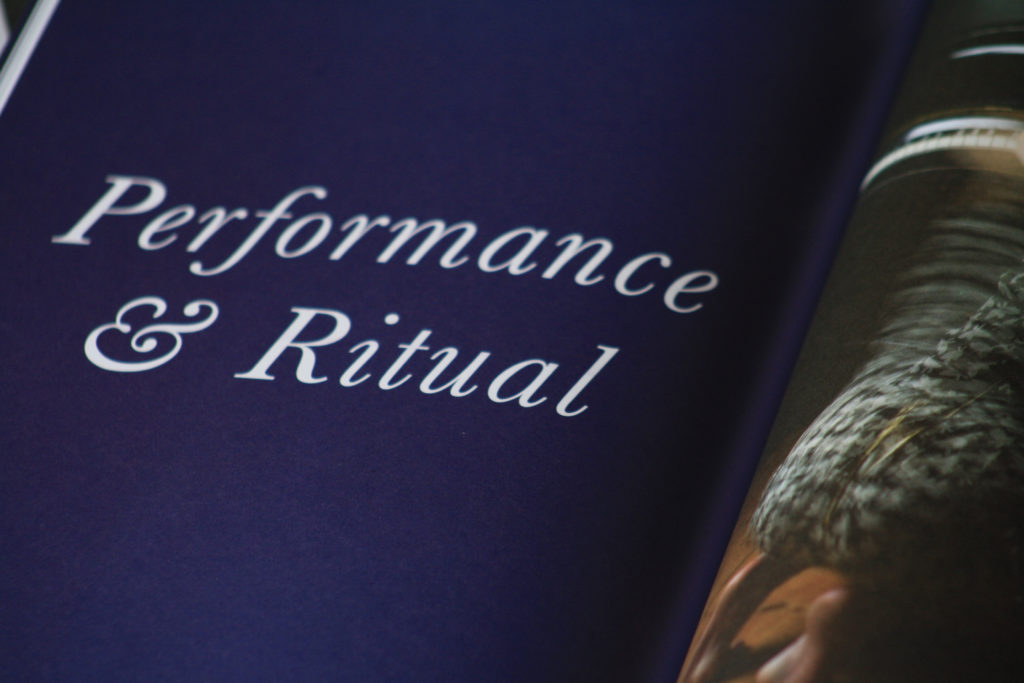
  • dark blue and cream colour scheme (for the first issue);
  • the journal should have a tone that is somewhere between formal and informal – it should be accessible for everyone but still needs to maintain a certain level of formality due to the content;
  • the format at this point was not finalised, but we had agreed on a page size of slightly smaller than A4.

We also agreed on a series of outcomes for Question. These were:

  • A logo and visual identity
  • An abbreviated version of the logo for social media
  • Design and templates for the magazine cover
  • Design and templates for the printed magazine

Research and ideation

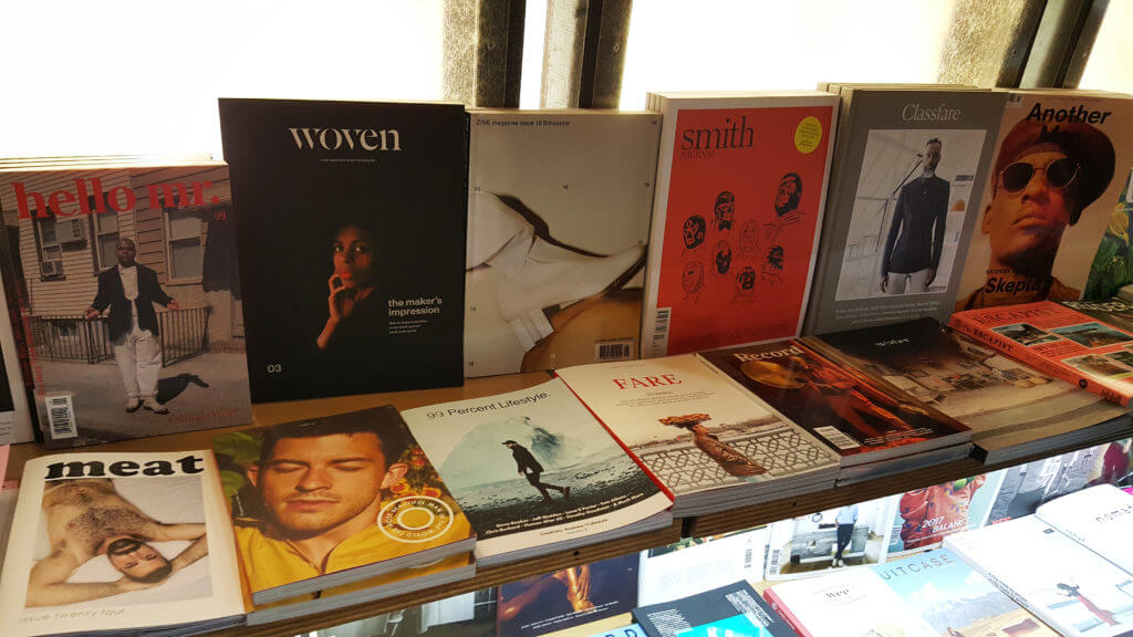
We began this project by looking for inspiration through existing magazines and journals. As Question was such a new and unique idea, it was challenging to find similar publications. However, we looked to stores such as MagCulture and Magma and found many great examples to inspire us, including Cereal, Delayed Gratification, Fare, Makeshift, Migrant, Woven, and The Outpost. These publications all held strong brand identities, and their covers were engaging and effortlessly clear about what the magazine’s purpose was.

A selection of magazines in Magma
A shelf displaying a selection of magazines, including Woven and Fare (Magma, London).

From here we needed to make some decisions about Question’s visual identity and the physical product; its format, stock, and any printing finishes. From very early on, despite the client saying they originally wanted an A4 page size, we thought it would be much more suitable to the type of publication if it were smaller than A4, even if only slightly. This smaller size would make the journal easier to handle physically and make the pages seem less daunting as they would contain complex essays. The purpose of Question is to make these pieces of work available to the wider public, therefore we needed to consider this in every aspect of designing it. With this there came an opportunity to create a nicely designed product in a market where, typically, little attention is paid to the design. The client was happy to agree to this new format after hearing our thoughts, and we settled on a page size of 200mm × 280mm.

Design development

Branding

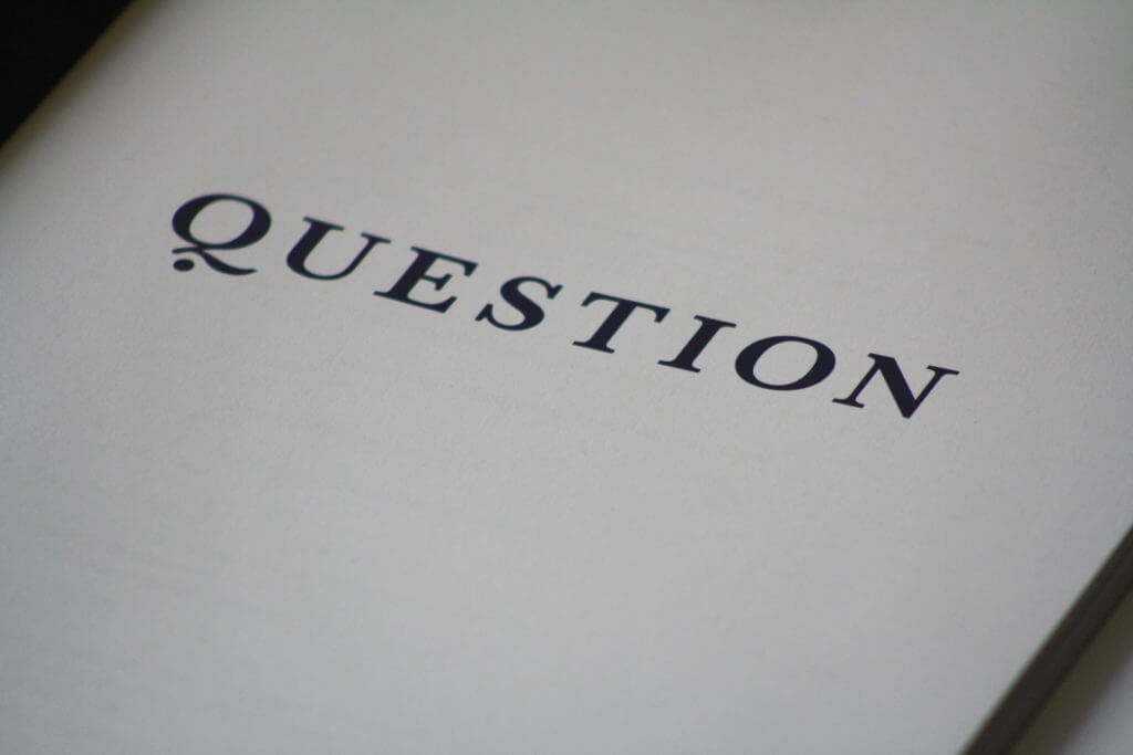
The client had informed us in our initial briefing that they would like a mortar board included in the logo. We tried out a couple of designs using this idea, but immediately felt as though it was too predictable (perhaps even corny). We wanted to create something mature, sophisticated, and instantly recognisable. The most successful mastheads from the publications we looked to for inspiration were the ones that followed a ‘less is more approach’, giving quite a simple but bold typographic logo.

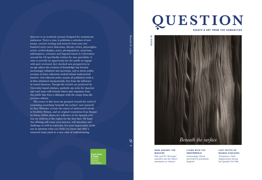
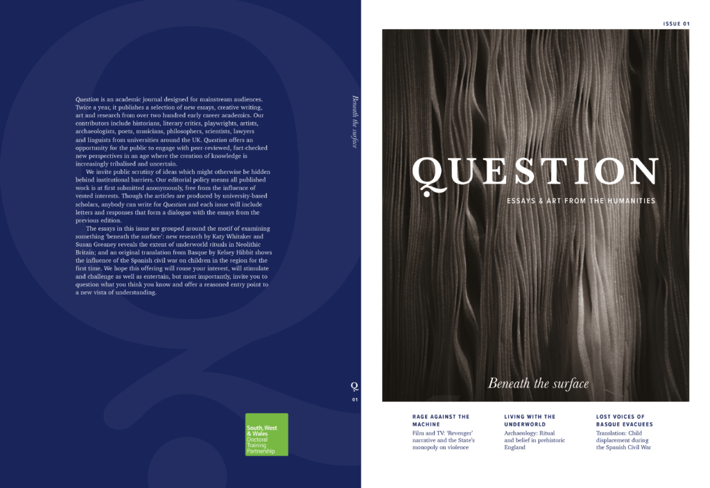
The most important thing for us during the branding phase was finding “the right ‘Q”; it was essential that the typeface that we ended up choosing would have a unique ‘Q’ that we could then adapt to use as an abbreviated logo for the journal, for purposes such as social media icons. We sent a selection of typefaces to our client, to which they said they liked the Baskerville and Goudy Old Style fonts best. We decided to go with Baskerville, because of its capital Q, and also its wide availability making it easier for the client to use consistent branding for things such as Question’s online platform.

Question logo initial idea generation
Question logo initial idea generation, including mortar board concepts
Question masthead typographic logo ideas

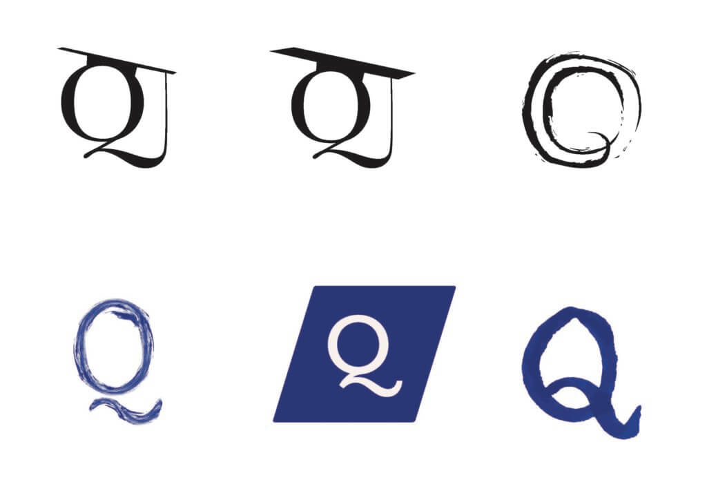
From here, we knew that the masthead needed a little something more. We thought of combining the Q and a question mark, so took the dot from Baskerville’s question mark and it just happened to fit so perfectly beneath the curve of the Q tail. The Q was now strong and distinct enough to stand alone as well as part of the whole masthead.

Question final logos
Final logo designs, both full text and abbreviated versions

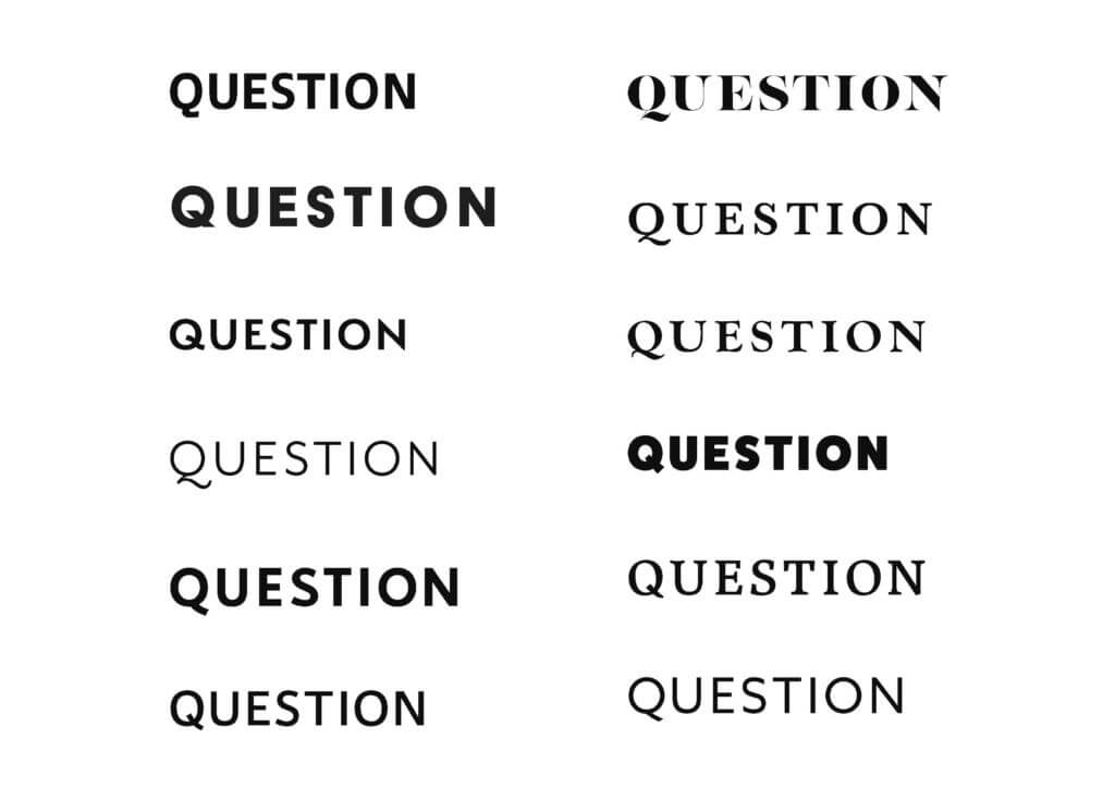
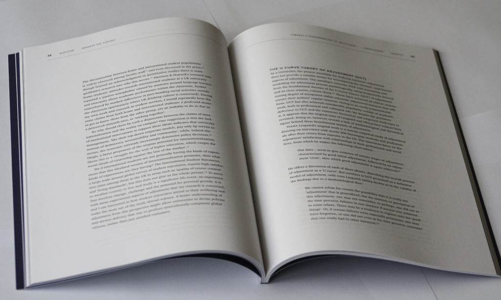
We chose the typefaces Charter and Proxima Nova to accompany Baskerville. Charter was chosen for its large x-height, therefore making the content easier to read and more accessible. Headings and running heads are set in Proxima Nova Condensed, and introductory paragraphs and captions are set in Proxima Nova.

Question's body typefaces: Charter and Proxima Nova
Question’s body typefaces: Charter and Proxima Nova


Front cover

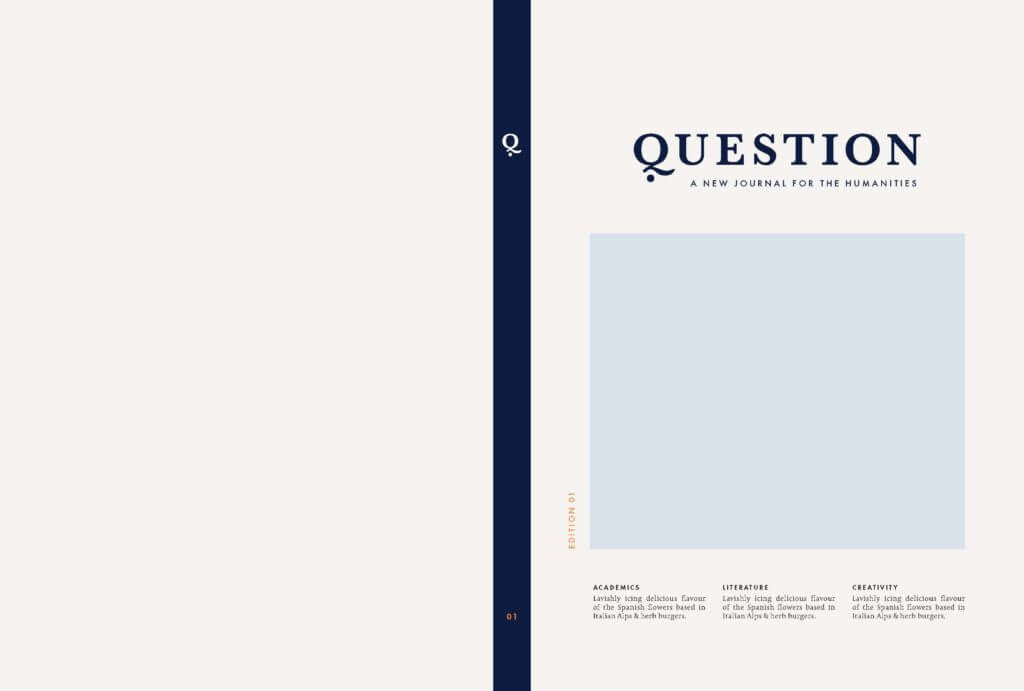
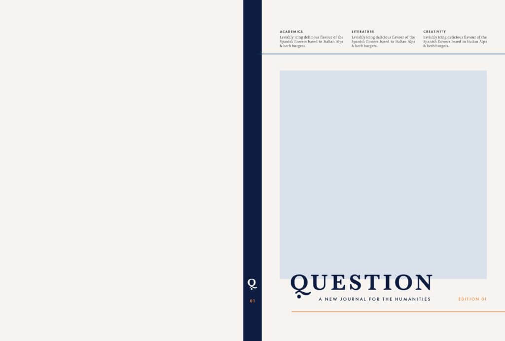
After settling on the logo and journal format, we started to come up with ideas for the front cover template. This was probably the most lengthy process of the whole project. We started off with some wireframe ideas before receiving images from our client, and then worked with different images to find the most flexible solutions, so that the template could work just as well for future editions. There were a few occasions where it was agreed that we had reached a final cover design, only for that to be changed – either by us knowing that it wasn’t the best design we could come up with, or by the client saying that others were not fully satisfied with it. There were a lot of people to impress and we wanted to always be thinking logically about how the journal could work as a series in the long term.

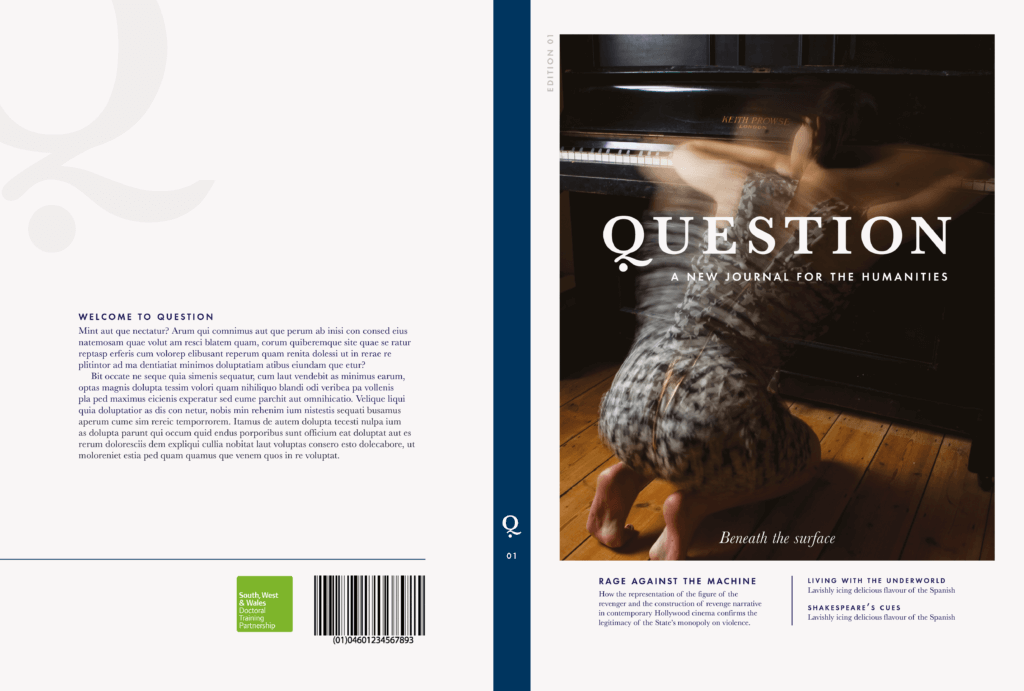
Eventually, our client decided on this cover design and we stuck with a deep blue for this issue’s colour – something we had agreed on from the first meeting. While at the time this was not the design we hoped they would choose out of the ones we created, we believe it suits the tone of the journal well, as it shows both text and images that give a taste of the variety of works that Question includes. It is easily customisable and provides a solid template for future editions.

Question cover template idea
Cover template idea
Question cover template idea
Cover template idea
Question cover idea
Developed cover design
Question cover idea
Developed cover design
Beneath the Surface final cover design
Final cover design for Question Issue 01, titled ‘Beneath the Surface’

Final stages

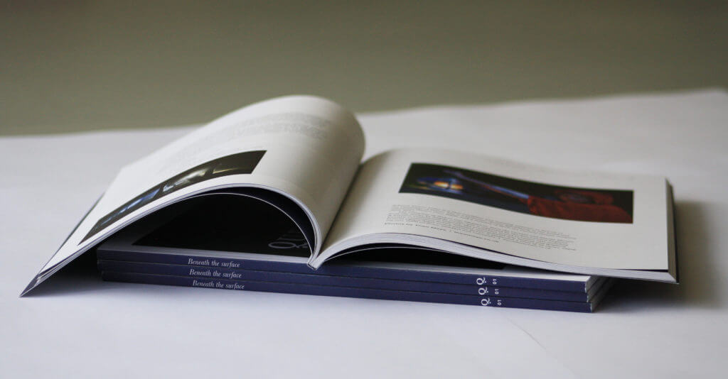
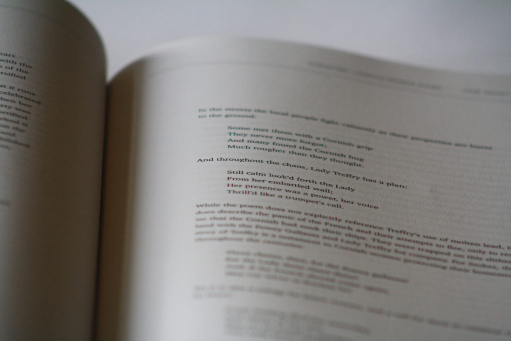
During the development stage, we had not yet been given a submission date for the final deliverables, nor had we received all of the final content to be put in the journal. This set us back in terms of making progress as we could only work with the limited content we had initially received from our client, and did not yet have a wide enough variety of work to see how they would fit in the templates we had created. We explored various layouts for typesetting the articles, focusing on an accessible and sophisticated design. We designed pages with wide margins to achieve this, and our client was happy with this design.

We were then suddenly given everything on a Tuesday (17th October) and told that we had to have the finished files sent to the printers by that same Friday (20th October). This is likely due to an earlier miscommunication where we promised an initial draft of the journal by this date. This was a deadline that we knew straight away wouldn’t be physically possible to achieve, given that it concerned formatting a 100 page journal almost entirely from scratch (minus creating the templates and designing the cover), print-testing it, and presenting it to the client for a final check before sending it to print. We knew that we just had to be honest with our client about the impracticality of this deadline, so we spoke to them and agreed to reschedule the deadline to the following Wednesday (25th October). Through communication with the printer, we were able to push this deadline back as far as possible for the delivery of 1000 copies on November 1st.

We worked on the journal for that week by delegating articles to typeset and finishing other elements in the journal – including contents page, title pages, and endnotes – and made the Wednesday deadline to send it to print, which was received with much praise from our clients.

“You are amazing! The overall look is fantastic – it looks really clean, professional and frankly beautiful. Thank you both so much for all of your hard work, I know it’s been frustrating at times and that you’ve been working flat out over the last few days. It has definitely paid off, though – you’ve created something marvellous.”

– Tabitha Stanmore, Question

Question journal

Question journal

Question journal

Question journal

Reflection

We regularly communicated with our clients as best as we could, through a mixture of face-to-face meetings, emails, and phone calls. However, we often found ourselves waiting around for replies and had to try to use that waiting time as efficiently as possible, although admittedly we didn’t always know how to productively achieve that without essential client feedback. These periods of waiting would have been better put to use sourcing content from elsewhere – as we had an idea of what the client wanted, even if we didn’t have the exact files – so that we could have tested the templates we created and saved ourselves time at the end. This potentially costed us more opportunities for trial and error in the design phase, as we had to design quickly and instinctively in order to meet the deadline. Though in the last week we found ourselves with a pile of work on our hands, we were able to work efficiently whilst maintaining quality and attention to detail.

The allocated budget for the project was not made clear to us at any point, as SWWDTP was ultimately paying for the production. We suggested print finishes like an embossed cover and a spot colour to be printed throughout, but were deemed too expensive. The quote from the printer was higher than expected, and our client was able to negotiate this with SWWDTP. We would have hoped to have these conversations earlier in the project, as some of our decisions were not the most cost effective, such as our decision to have large margins and thereby increasing the page size. In future projects similar issues could be avoided by insisting on establishing a budget earlier in the process.

We received a lot of positive feedback after the journal was printed and sent to various universities around the UK. To see the journal that we helped to create be spread so far and admired by so many people was an incredibly fulfilling experience. We are both immensely proud of what we have created, and feel as though we created a really positive working relationship with our clients during the process, who were full of praise, encouragement, and trust from start to finish.

“The overall setup is leagues ahead of other journals in overlapping areas of interest. It is the best looking academic journal I’ve ever seen. You’ve really done an incredible job and I can’t credit you highly enough for it. Even the endnotes (notoriously ugly) look great.”

– Gareth Mills, Question

Question journal

Emmeline Hewstone & Sigrid Dalland

Anna Fran Designs: Branding a DIY Craft Business

Background

Anna has been creating and selling handmade items in Sydney, Australia for the past few years. Recently, she has officially registered her business, Anna Fran Designs, and now needs a brand to reflect who she is and what she is selling. Her main items include hand-dyed fabrics and clothing, cosmetics bags, dog bandanas, and felt figures, which she often sells at weekend markets.

Restated brief

We aimed to create a cohesive brand identity that could portray Anna Fran Designs in an accurate, professional, and fun manner as Anna continues to broaden her customer base beyond friends and family. This visual identity can then be used across her social media bases, particularly Facebook and Instagram, where she regularly advertises her products. She also planned to create her own website where customers can directly buy her handmade items (she previously only had a blog).

Anna asked that her brand reflect the two main sides of her business – hand-dyed fabric, and superhero themed items. We then looked to create something that both resonated with this, but also with the fact that Anna runs a local, independent business producing handmade goodies. She also said that she would prefer the colours purple, pink, and blue to be incorporated in the design in some way.

We agreed to create these deliverables for our client:

  • Logo
  • Logo stickers
  • Business card designs
  • Banner image for Facebook

Research and ideation

There are many businesses similar to Anna Fran Designs that are thriving through platforms such as Instagram and Etsy. Notable people that Anna has sourced inspiration from include:

After looking through all of these online presences among countless others on Etsy, we have noticed certain features that we believe make the businesses appear stronger and more appealing. These include:

  • Consistent photography – most people have a specific ‘style’ of photography, which enhances the overall appearance of their profile.
  • White or lighter backgrounds immediately make the product the main attraction.
  • Natural scenery enriches a photo and profile, even if not every photo contains a product, it provides a variety of positive things to look at and enjoy.
  • A personal touch: a lot of posts are not just solely about the products, but also getting to know the person behind the work. The majority of people behind these creative businesses are working alone, so it reinforces the fact that they are their own brand and sole driving force.
  • Logos put onto products helps to keep a brand identity alive so that they become identifiable among other similar products. This is seen in Ellison Lane’s Instagram posts, and more famously with Cath Kidston’s range.

The target audience for Anna Fran Designs is pretty wide – anyone who enjoys handmade items, or people who buy them as gifts for others. Most customers are likely to be between 20 and 60 years old. These people are likely to hold values such as supporting local businesses and appreciating handmade, locally sourced items, therefore this gave us some ground for how to appeal to them. For instance, a stamped logo, or one that is in Anna’s handwriting, can give a sense of an authentic ‘organic’ business, as opposed to a more polished, ‘corporate’ looking logo. A stamped logo also means there is flexibility of colour, so Anna has the freedom of choosing and changing the colour as she pleases. This will help to emphasise the ‘uniqueness’ of each of her products, because each label can look slightly different.

Design development

The logo

After beginning with numerous sketches and ideas being thrown around, we started exploring different typographic styles, mostly using existing typefaces, but also creating handwritten style logos. Of the ideas shown below, the first felt much too ‘corporate’, and too refined in the shapes of the letters and the clean-cut image it conveyed. The next concepts became more reflective of the crafty nature of Anna’s business. However, they still lacked the strong presence of a logo.

Initial branding concepts for Anna Fran Designs
Initial branding concepts

We decided that the best reflection of a local crafty business would be to go down the handwritten route. We also chose to focus on the logo stamp idea, as this was something our client was really keen on pursuing. After researching logo stamps and seeing that they were often circular – and this would indeed suit Anna’s desires for stickers to put on her products – we developed digitally handwritten logo designs that could fit on a circular stamp. Whilst this wasn’t technically using the client’s handwriting, it still created a sense that it very well could be, and immediately turns thoughts away from any kind of corporate business due to the rounded bubble-type letters. We refined this idea until we reached a logo that was both practically suitable for a stamp, and also as a logo to stand alone when featured in profile pictures online.

Anna then ordered two sizes of this stamp and used them to print her logo on bunting (to be displayed on her market stall), stickers, and bags. She also expressed that she was pleased with the flexibility they brought, as she could use any colour inks, and mix colours together to create interesting patterns within the stamp.

Logo development
Logo development
Anna Fran Designs logo
Final logo design
Anna Fran Designs market stall
Anna’s stall at Balmain Market, Sydney
Bunting displayed on Anna’s stall, printed with the logo stamp
Anna Fran stickers
Sheet of logo stickers ready to be stuck to Anna’s products

Business cards

For Anna’s business cards, we came up with the idea of making a selection of different ones – all following the same format but containing different leading images. This was to reflect both the nature of Anna’s range of unique handmade goods, and the range of customers that her goods appeal to. This solution meant that her customers, whilst enjoying the freedom of picking their favourite handmade item, could also enjoy the choice of which business card appealed to them most. It emphasises the idea of custom goods tailored to individual preferences, even if that only stretches to the question ‘which colour do you prefer the most?’ We discussed with our client the likelihood of an extra cost that would come with printing four separate business card designs, and she agreed that despite the cost it was a good idea to continue with.

We asked Anna to send over a selection of high quality images of fabric that she has hand-dyed, from which we then picked the four best and most different designs to feature on the fronts of her business cards, along with the logo. These images showed the hand-dyed fabric, but also each held their own colour scheme. This aspect subtly hints at the colour schemes associated with superheroes – each have their own undeniable identifying brand, almost always consisting of bright explosions of colour. Around this point there was then a fairly long period of slow communication, due to all parties having other commitments causing work on this project to take a back seat in our lives.

We created a quick design just so that Anna could have something, but it was by no means anything substantial, and the only real interesting part of it was the front. However, due to poor communication and time limits, Anna had to send this design to print as she had several big market events coming up. This wasn’t a design that we were overly proud of, just because it lacked the fun and charm that was so essential to the Anna Fran Designs brand. However, we understand that it was the only choice she had at that time, so she had to make a decision on her own terms in order to get her business cards printed in time.

Business cards
Initial business cards design – only the blue version was printed for the first run due to money restrictions

Once we had a little extra time, we designed backs of the business cards, inspired by other craft businesses’ cards that we had seen online. This new design, using the typeface ‘Terfens’, was now more interesting, but also a fun way of effectively communicating everything a customer needs to know about Anna Fran Designs – the website, social media, and email, all in one easy-to-follow diagram. Our client was pleased with this new design and said she would print it for her next run of business cards.

The new design also allows for a variety of printed options – the coloured prints are accompanied by text that matches the stand-out colours of each design. It also allows for black and white printing; we thought one way to really appeal to Anna’s customers would be to use recycled card for the business cards. These could then simply be printed one-sided with black ink for the information, and then her logo can be stamped on the other (shown below). This gives both Anna and her customers several of options to choose from, sparking interest and excitement when visiting her market stall.

Final business card designs for Anna Fran


Logo stamp business cards
Business cards concept using purely black ink and recycled card

Social media

Anna used the logo we designed as the profile picture on Anna Fran Designs on both Instagram and Facebook, as well as on her own website (annafrandesigns.com). In addition, she has posted updates of her use of the stamp, which have been received with a lot of positive praise from fellow Instagram users. We also created a simple Facebook banner design using a photo of one of Anna’s dyed fabrics. However, we figured it would be best to show a photograph of some products on display at her market, so it would be better to get professional photography of this set up in order to capture the essence of Anna’s stall to feature on her Facebook cover photo.

Anna Fran Designs Instagram posts
Instagram posts showing the logo stamps being used with different coloured inks to print onto materials
Anna Fran Designs' Instagram page
@annafrandesigns on Instagram
Facebook page showing banner design
Anna Fran Designs Facebook page

Reflection

Anna has received largely positive feedback in response to her new brand identity. We believe that we have created a logo that is extremely flexible and therefore suitable to be featured amongst her colourful creations – one that can stand alongside them and not get lost amongst the noise, but rather simply reinforce the brand and the creator behind these products.

The job as a whole took much longer to complete than we anticipated it would, and this shouldn’t have happened as the deliverables were very straightforward, but we can only really accept fault in the delays and learn to improve our time management skills from this. Additionally, this would have meant ideally coming up with many more ideas in the later stages – particularly for the Facebook cover photo, as by the end we simply ran out of time and had to just create something, even if it wasn’t the perfect solution. Not all of our earlier design ideas for the logo and business cards were included in this report, as they were scrapped for various reasons.

One thing we have learnt from this project was to not be afraid to look to other people’s work for inspiration. It may sound a little silly, as this is what all designers tend to do, but through fear of directly copying others’ ideas we were hindering our progress. In fact, the right solutions for Anna’s branding were already scattered around through various people’s work – we just had to find the right elements and fuse them together to create something that perfectly portrayed Anna Fran Designs.

Emmeline Hewstone & Ziana Azariah

Typography promotional banners

The brief

The department of Typography & Graphic Communication asked for two banners that will identify key areas of the department. The topics for the banners are Inclusive Design, and the Real Jobs scheme.

Each banner needs a striking headline along with a short piece of informative and engaging text. The objective was to appeal to prospective Graphic Communication students, but also their parents. They need to be memorable, inspiring, and interesting enough to spark conversations, inviting our visitors to learn more about what we can achieve. These banners would then be displayed in the Department for visitors to view during Open Days and portfolio review days.

Research and ideation

I started by sketching ideas then transferred them into digital mockups. These designs were intended to be fun, simple portrayals of the Real Jobs and Inclusive Design schemes. My client, after reviewing these designs, suggested that we use photography for the banners. Her ideas for the Real Jobs banner were fairly flexible; mainly just asking that I include real examples of students’ work from the scheme in the photographs. For the Inclusive Design banner, my client asked that I included photographs of students wearing simulation glasses and gloves – accessories used to imitate what it’s like to live with visual impairments or arthritis. She initially sent me some pictures that she had taken of students interacting with these items, however they seemed a little out of focus and not quite right to be blown up to such a huge scale. We would therefore need photoshoots for both Real Jobs and Inclusive Design shots.

Initial ideas
First layout ideas for the banners

We set up a photoshoot trying to get images of students acting out meetings that could be used for the Real Jobs banner. At that time, we didn’t have the simulation gloves or glasses, so just took pictures for Real Jobs. I mocked up a few designs using the photographs we took. The client said that the photos didn’t really portray the scheme enough, and there wasn’t enough emphasis on the work, so we had to do another photo shoot. She also mentioned that, while the University brand guidelines should be adhered to, we could use them more flexibly than I was currently using them in order to fit the needs of advertising a Graphic Communication course (stressing that the banners should look creative). At first this feedback was slightly confusing to me, as I wasn’t sure where the line was on how creative to be whilst still sticking to the strict guidelines of the University’s banners templates, but I gained clarity after asking for more specific guidance.

Real Jobs banner early draft
An early design for the Real Jobs banner, featuring a photograph from the first shoot

In this initial stage I also contacted DPS, who would be printing the banners, and got quotes for how much these would cost to print. This needed to be factored in as the Head of Department would have to consider the costing when approving the job for print.

Design development

Photography

We did another set of photoshoots – now including the simulation glasses and gloves. The results were much better than before, as I used a zoom lens this time which created a greater depth of field, helping the photographs to look more dynamic and pull the viewer in. In this photoshoot I took more control, having a clearer vision and therefore knowing the types of photographs we could get and how to achieve this. I had a lot of fun conducting these photoshoots and this is something I have realised I would like to continue with more somehow in the future. My client was very satisfied with these new photographs.

Photograph for the Inclusive Design banner
Students wearing simulation glasses and gloves whilst using laptops, showing one of the ways the Department teaches about inclusive design.
Photograph taken for the Inclusive Design banner
Students wearing simulation gloves
Photograph for the Real Jobs banner
Students discussing a Real Job (designing booking forms for Wynkyn de Worde)

Illustrations

After brainstorming on how to make the banners look more representative of a creative course, I proposed to my client that we include three icon-style illustrations in circles at the base of the photograph, which she responded enthusiastically to. This was in-keeping with the University’s design rule of ‘threes’ (separating banners into three columns and three rows), and worked nicely with the first bit of copy given to me for the Real Jobs banner (‘Real clients, real challenges, real achievements’).

Creating the illustrations was by far the hardest part of this job. I am by no means a strong illustrator, and found it difficult to create a consistent style which managed to both get the message of each illustration across clearly, and use the same or similar colour palettes as much as possible. In addition, my client and I struggled to come up with ideas for the Inclusive Design banner as easily as we did for the Real Jobs banner. These were concepts that were more difficult to portray to people unfamiliar with the subject.

For Real Jobs, I proposed that I illustrate a handshake for ‘Real clients’, a mountain to illustrate ‘real challenges’, and a trophy for ‘real achievements’; all fairly straightforward concepts. My client, after seeing them, felt that the mountain was too metaphorical, and not quite representative enough from a design perspective. We agreed that perhaps a graph would be a better solution. However, after creating this illustration, I felt that the mountain was the better option; it shouldn’t matter much that it doesn’t directly represent ‘design’, because it is still a designed icon that represents challenges, and does so more universally than a graph might.

Design development for the Real Jobs banner
Developing ideas for the Real Jobs banner. My client pointed out that, from an inclusive design perspective, we should not use capital letters for any of the text (mainly referring to the Inclusive Design banner, and therefore applying it to this one as well as a rule of consistency). We also decided that there were perhaps too many unnecessary colours going on in the illustrations, so I stripped them down to only what they needed.
3 illustrations for the Real Jobs banner
Final illustrations: representing clients, challenges, and achievements, for the Real Jobs banner

For the Inclusive Design banner, there was a lot of back-and-forth about what the illustrations should involve. We knew from early on that we wanted to include the gloves and glasses, but struggled on what the third icon could be, and what it could represent. We suggested a representation of hearing impairments, like illustrating braille or a hearing aid, or a guide dog to represent visually impaired people, or a mobile phone showing large text. Eventually we decided to include a non-latin character, as this would reflect the Department’s focus on typography and specialist research into non-latin typefaces.

Design development for the Inclusive Design banner
Design development for the Inclusive Design banner. My client pointed out that it would be more effective to connect with an audience if the simulation glasses were illustrated as being worn by someone, rather than just floating on their own. She also emphasised that, when illustrating people in any way, it is important to portray racial diversity so that the banners don’t unintentionally send the wrong message.
Illustrations for Inclusive Design banner
Final illustrations: representing simulation gloves, non-latin typefaces (using the Devanagari character क), and simulation glasses for the Inclusive Design banner

Final designs

Breaking down Barriers banner design
Final design for Inclusive Design banner (the colours have faded after being exported – they are supposed to be more vibrant)
Real Jobs banner final design
Final design for the Real Jobs banner (the colours have faded after being exported – they are supposed to be more vibrant)

Reflection

This was probably the most challenging Real Job for me. There came a lot of moments during it where I felt like I wasn’t the right person for the job (particularly with the illustrations), and that it would have been better executed by someone else. I think this also was largely to do with the fact that the banners were intended to represent the Department, and that brought with it a lot of pressure to do it ‘right’ – even more so than most other design jobs I have completed. I felt throughout that the job would have been more efficiently fulfilled if it was a collaborative effort – I felt strong and capable with the photography, format, and typography, but believed the illustrations should have been created by someone more comfortable with creating groups of icons. I mentioned this to my client, but in hindsight I should have tried harder to communicate what I thought, and then made more of an effort to find a suitable illustrator to help out.

That being said, I have learnt a lot from this job, including how to conduct and take charge of a photoshoot, to be assertive in the decisions that I feel passionate about, and that communication and honesty with the client really is key to producing the best possible outcome.