
Background
Anna has been creating and selling handmade items in Sydney, Australia for the past few years. Recently, she has officially registered her business, Anna Fran Designs, and now needs a brand to reflect who she is and what she is selling. Her main items include hand-dyed fabrics and clothing, cosmetics bags, dog bandanas, and felt figures, which she often sells at weekend markets.
Restated brief
We aimed to create a cohesive brand identity that could portray Anna Fran Designs in an accurate, professional, and fun manner as Anna continues to broaden her customer base beyond friends and family. This visual identity can then be used across her social media bases, particularly Facebook and Instagram, where she regularly advertises her products. She also planned to create her own website where customers can directly buy her handmade items (she previously only had a blog).
Anna asked that her brand reflect the two main sides of her business – hand-dyed fabric, and superhero themed items. We then looked to create something that both resonated with this, but also with the fact that Anna runs a local, independent business producing handmade goodies. She also said that she would prefer the colours purple, pink, and blue to be incorporated in the design in some way.
We agreed to create these deliverables for our client:
- Logo
- Logo stickers
- Business card designs
- Banner image for Facebook
Research and ideation
There are many businesses similar to Anna Fran Designs that are thriving through platforms such as Instagram and Etsy. Notable people that Anna has sourced inspiration from include:
After looking through all of these online presences among countless others on Etsy, we have noticed certain features that we believe make the businesses appear stronger and more appealing. These include:
- Consistent photography – most people have a specific ‘style’ of photography, which enhances the overall appearance of their profile.
- White or lighter backgrounds immediately make the product the main attraction.
- Natural scenery enriches a photo and profile, even if not every photo contains a product, it provides a variety of positive things to look at and enjoy.
- A personal touch: a lot of posts are not just solely about the products, but also getting to know the person behind the work. The majority of people behind these creative businesses are working alone, so it reinforces the fact that they are their own brand and sole driving force.
- Logos put onto products helps to keep a brand identity alive so that they become identifiable among other similar products. This is seen in Ellison Lane’s Instagram posts, and more famously with Cath Kidston’s range.
The target audience for Anna Fran Designs is pretty wide – anyone who enjoys handmade items, or people who buy them as gifts for others. Most customers are likely to be between 20 and 60 years old. These people are likely to hold values such as supporting local businesses and appreciating handmade, locally sourced items, therefore this gave us some ground for how to appeal to them. For instance, a stamped logo, or one that is in Anna’s handwriting, can give a sense of an authentic ‘organic’ business, as opposed to a more polished, ‘corporate’ looking logo. A stamped logo also means there is flexibility of colour, so Anna has the freedom of choosing and changing the colour as she pleases. This will help to emphasise the ‘uniqueness’ of each of her products, because each label can look slightly different.
Design development
The logo
After beginning with numerous sketches and ideas being thrown around, we started exploring different typographic styles, mostly using existing typefaces, but also creating handwritten style logos. Of the ideas shown below, the first felt much too ‘corporate’, and too refined in the shapes of the letters and the clean-cut image it conveyed. The next concepts became more reflective of the crafty nature of Anna’s business. However, they still lacked the strong presence of a logo.

We decided that the best reflection of a local crafty business would be to go down the handwritten route. We also chose to focus on the logo stamp idea, as this was something our client was really keen on pursuing. After researching logo stamps and seeing that they were often circular – and this would indeed suit Anna’s desires for stickers to put on her products – we developed digitally handwritten logo designs that could fit on a circular stamp. Whilst this wasn’t technically using the client’s handwriting, it still created a sense that it very well could be, and immediately turns thoughts away from any kind of corporate business due to the rounded bubble-type letters. We refined this idea until we reached a logo that was both practically suitable for a stamp, and also as a logo to stand alone when featured in profile pictures online.
Anna then ordered two sizes of this stamp and used them to print her logo on bunting (to be displayed on her market stall), stickers, and bags. She also expressed that she was pleased with the flexibility they brought, as she could use any colour inks, and mix colours together to create interesting patterns within the stamp.


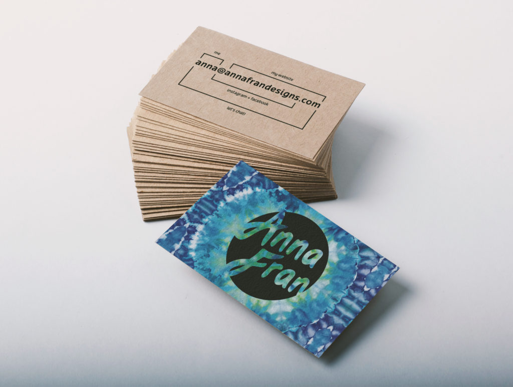
Business cards
For Anna’s business cards, we came up with the idea of making a selection of different ones – all following the same format but containing different leading images. This was to reflect both the nature of Anna’s range of unique handmade goods, and the range of customers that her goods appeal to. This solution meant that her customers, whilst enjoying the freedom of picking their favourite handmade item, could also enjoy the choice of which business card appealed to them most. It emphasises the idea of custom goods tailored to individual preferences, even if that only stretches to the question ‘which colour do you prefer the most?’ We discussed with our client the likelihood of an extra cost that would come with printing four separate business card designs, and she agreed that despite the cost it was a good idea to continue with.
We asked Anna to send over a selection of high quality images of fabric that she has hand-dyed, from which we then picked the four best and most different designs to feature on the fronts of her business cards, along with the logo. These images showed the hand-dyed fabric, but also each held their own colour scheme. This aspect subtly hints at the colour schemes associated with superheroes – each have their own undeniable identifying brand, almost always consisting of bright explosions of colour. Around this point there was then a fairly long period of slow communication, due to all parties having other commitments causing work on this project to take a back seat in our lives.
We created a quick design just so that Anna could have something, but it was by no means anything substantial, and the only real interesting part of it was the front. However, due to poor communication and time limits, Anna had to send this design to print as she had several big market events coming up. This wasn’t a design that we were overly proud of, just because it lacked the fun and charm that was so essential to the Anna Fran Designs brand. However, we understand that it was the only choice she had at that time, so she had to make a decision on her own terms in order to get her business cards printed in time.

Once we had a little extra time, we designed backs of the business cards, inspired by other craft businesses’ cards that we had seen online. This new design, using the typeface ‘Terfens’, was now more interesting, but also a fun way of effectively communicating everything a customer needs to know about Anna Fran Designs – the website, social media, and email, all in one easy-to-follow diagram. Our client was pleased with this new design and said she would print it for her next run of business cards.
The new design also allows for a variety of printed options – the coloured prints are accompanied by text that matches the stand-out colours of each design. It also allows for black and white printing; we thought one way to really appeal to Anna’s customers would be to use recycled card for the business cards. These could then simply be printed one-sided with black ink for the information, and then her logo can be stamped on the other (shown below). This gives both Anna and her customers several of options to choose from, sparking interest and excitement when visiting her market stall.


Social media
Anna used the logo we designed as the profile picture on Anna Fran Designs on both Instagram and Facebook, as well as on her own website (annafrandesigns.com). In addition, she has posted updates of her use of the stamp, which have been received with a lot of positive praise from fellow Instagram users. We also created a simple Facebook banner design using a photo of one of Anna’s dyed fabrics. However, we figured it would be best to show a photograph of some products on display at her market, so it would be better to get professional photography of this set up in order to capture the essence of Anna’s stall to feature on her Facebook cover photo.


Reflection
Anna has received largely positive feedback in response to her new brand identity. We believe that we have created a logo that is extremely flexible and therefore suitable to be featured amongst her colourful creations – one that can stand alongside them and not get lost amongst the noise, but rather simply reinforce the brand and the creator behind these products.
The job as a whole took much longer to complete than we anticipated it would, and this shouldn’t have happened as the deliverables were very straightforward, but we can only really accept fault in the delays and learn to improve our time management skills from this. Additionally, this would have meant ideally coming up with many more ideas in the later stages – particularly for the Facebook cover photo, as by the end we simply ran out of time and had to just create something, even if it wasn’t the perfect solution. Not all of our earlier design ideas for the logo and business cards were included in this report, as they were scrapped for various reasons.
One thing we have learnt from this project was to not be afraid to look to other people’s work for inspiration. It may sound a little silly, as this is what all designers tend to do, but through fear of directly copying others’ ideas we were hindering our progress. In fact, the right solutions for Anna’s branding were already scattered around through various people’s work – we just had to find the right elements and fuse them together to create something that perfectly portrayed Anna Fran Designs.
Emmeline Hewstone & Ziana Azariah