Background
I am, We are… Different by Design is a student-led group from the School of Art and Communication Design advocating for diversity and inclusion within our creative field. For the last two years, we were kindly presented with the opportunity to host a workshop at the Tate Exchange in the Tate Modern. The Tate Exchange is a programme which encourages the connection between society and art. It invites the public and their associates to share a collaborative space where they can explore the impact of art on individuals, communities and societies. This year, as the new leaders of I Am, We Are…Different by Design we were responsible for organising and planning a two-day workshop.
Brief
This year, the school had decided on the theme of ‘Power’ for the Tate Exchange. There were multiple different directions they were thinking of taking this: power as an individual (people’s understanding of the word), power as a community (how power related to a group of people individuals are in), power in technology (how power is distributed to technology), and power in art (what power does the value of object have and is art powerful?). Our job was to relate diversity in design to one or more of these aspects. What we did was completely open, we were allowed to decide our activity and our audience. This real job is different from any other one you’ll come across since it wasn’t about physically designing an object but creating an event for the public to give them access to design.
Planning
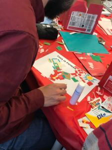
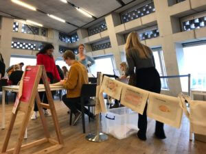
When we were first given the theme we were working with, the entire team immediately saw potential. There are many different meanings of power, and empowerment is often linked to diversity. When trying to come up with different ways we can interpret the specifics of power, we realised that we can allow people to show off their own idea of power and when they feel powerful for everybody to see. With the success of last year’s idea of the public making a design and us printing it on tote bags for them, we decided to keep that aspect. It is much more fun for people to show off their creative work and express their diversity than to just make something for themselves and keep it inside the Tate Exchange.
The whole event was planned through weekly meetings. This was a crucial step in the project. We got together with as many people on the team and our supervisor to discuss our developments and how to continue with this. Because of these weekly meetings, we had many opportunities to bounce ideas off of each other and fine-tune things as well as ensure we were on track. Without these weekly meetings, we probably would not have been as prepared as we were and would have been panicking to get everything done in time.
We will admit that we probably had it a little easier than the leaders did last year. Most of the basics had been rolled over from the previous time we helped at the Tate Exchange. However, it did still teach us how we have to adapt and update things, and it shows how it often works in the real world with the first person doing something having the most work. A basic budget and item list had already been made, but we had to update this with new suppliers and other materials that we didn’t need last time. Further, the technical aspect of the printer setup had also been created last year. But there were also many things we had to do differently, whether it be an improvement to last year or a different aspect we had to include.
Due to the success of last year’s event, we were given more dates to do our workshop. For this, we had to check with our other teammates what would be best suited since it would take place during a weekend and we all still had other coursework. Choosing to do two rather than three days and giving ourselves the Sunday for other commitments was what we agreed would work best for everyone. In the end, we also got some volunteers to help because others had to cancel. The numbers worked out perfectly as we had more people available on the Saturday when it was busier compared to the Friday.
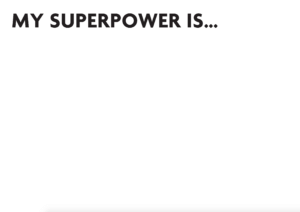
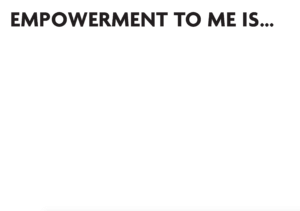
Another change we decided to make was creating templates to help guide the public in creating their visual definition of power. These templates had prompts that allowed people to think about it further rather than just taking the first idea they had along the lines of power. We had noticed last time that some people would derail or not stay within the size constraints due to the printers and wanted to keep it more under control this time. The templates used the font from the zine we made last year, however, we kept away the many bright colours we used. This way it was still neutral and wouldn’t take away from the individual’s design while still keeping our group’s identity.
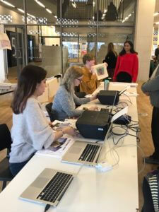
Lastly, we changed the way we presented people’s designs while we were at the Tate Exchange. Last year we put images into a grid and displayed that on a large screen. This wasn’t very dynamic, and many people didn’t even notice it. We tried coming up with different solutions, such as a dynamic grid. However, with how busy it gets and with limited time, we decided a simple PowerPoint that automatically loops through the slides was the most efficient way to do it. It worked out great, we occasionally had groups of people pointing out different designs to each other and it was funny to see kids wait for theirs to show up and then get very excited when it did. Using PowerPoint did mean setting up the laptops a bit differently, but we did all this beforehand.
As said before, this real job is different from most. Because of that, we also had to work with different kinds of equipment and required a health and safety briefing. We managed to get together the entire team and all the volunteers to have the briefing at the department a few days before the Tate Exchange. We all needed to know what to do since we were using technology and extreme heat in public. It’s something you don’t often consider when you are creating something yourself but suddenly becomes very important when there are liabilities.
Outcome
Based on positive reactions and engagement we can safely say the outcome of our workshops was a success once again. There was constant public engagement with our workshop throughout both days. The audience truly enjoyed the workshop. We saw excitement from people of all ages and backgrounds ranging from children to adults. While waiting for their bags many people expressed how cool the idea was and some even returned to the busy tables to create a second design. All the time and effort that went into the success of those two days at the Tate seemed to pay off as the reactions expressed by our teammates were also positive despite the long hours of working and travelling. Being able to provide people with a creative outlet, and seeing their excitement was rewarding in itself. It was also nice to receive positive feedback from Eric who praised the success of our workshops and our brilliant teamwork.
Reflection
Although the outcome was successful there were things we could learn from and have done differently for the process to run smoother. As it got closer to the date some members of the team had to commit to other responsibilities and so were unable to attend both dates. Therefore, our biggest issue became ensuring we had enough volunteers for both days. We had to find a way to quickly recruit volunteers at short notice. To prevent such an issue from occurring we could have made a list of volunteers and roles earlier and continuously updated it to identify where we were lacking people. This careful preparation would have prompted us to look for volunteers sooner.
Planning, organisation, communication, time management and leadership are key skills which apply to most typical real jobs. However, due to the nature of this real job the skills translated differently, especially in terms of communication and planning. As the Tate Exchange was in collaboration with the School of Art and Communication Design, learning to liaise efficiently between groups and individuals was essential. Also, directly interacting with the audience required a different kind of professionalism and manner where you must be mindful of the way you speak and behave when delivering the workshops from start to finish. Planning for this real job was different in the way that you must be thorough and prepare right until delivery as there is not a stage for trial and improvement. As meticulous as you are with planning, it is impossible to predict exactly what will happen on the day.
We were challenged to truly consider the perspective of the audience and learned to empathise with them. We built confidence in our communication skills and teamwork and learnt to be responsive and adaptive to changing situations. The skills gained from this real job can benefit and assist us in becoming well-rounded designers in the future.