
Background
The annual ASSETS conference explores the use of computing and information technology to benefit older adults and those with disabilities, such as visual impairments, hard of hearing and other sensory impairments. ASSETS 2018 was chaired by Dr. Faustina Hwang, a professor of Biomedical Sciences and Engineering, with a specialist interest in designing technologies for older people and people with disabilities, at the University of Reading. The main purpose of the conference is to provide a place for professionals in the industry to share their current research. The conference is organised by SIGACCESS, a special interest group focusing on accessible computing. The conference location differs internationally each year, and therefore the branding changes each year making it specific to each location.
Restated brief
The brief was to brand the ASSETS 2018 conference held in Galway, Ireland, in October. The visual identity produced will reflect the location of the event and intends to integrate both the subject of the conference and its location. This branding will be used throughout the ASSETS 2018 website and a range of printed materials. The client has a focus bringing ease of use and accessibility to computers, and it is therefore important that users can interact with the logo and flyer with similar ease. To allow for easy interaction for those with visual impairments, it would be appropriate to explore textures and Braille for use on printed flyers. Furthermore, colours and levels of contrast need to be taken into account.
Deliverables
- Logo and brand guidelines
- Web banner
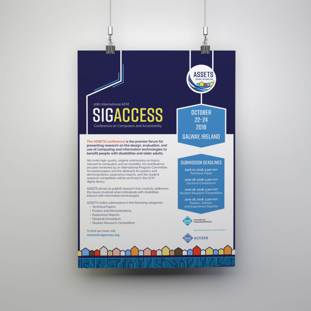
- Poster
Secondary deliverables
Although these deliverables were not originally outlined by the client, the adaptability of the branding has been displayed by this merchandise which was later added to the brief.
- Tote bag
- Movie tickets
- Drinks tokens
Research and ideation
Initially, we began meeting with Faustina, as her broad knowledge of the field gave us an insight into designing with a high consideration for the needs of those who are less able. Due to the nature of the conference, a large proportion of the audience are those who experience accessibility impediments, and therefore the main focus of research before designing was to explore potential techniques and other considerations for inclusive design. The client promoted large areas of contrasting colour, bold outlines and minimal intricate details for those who struggle with visual impairments, such as colour blindness or otherwise. Faustina introduced us to swell paper and its benefits to visually impaired individuals. Swell paper is a material which, once heated, creates an embossed surface area allowing those with visual difficulties to interact with the printed design using their sense of touch. An example of this printing technique in use is shown in the figure below. In addition to this, seminars run by our supervisor were also very beneficial in making us aware of the consideration that we needed to have in designing for a demographic that has specific requirements. She showed us glasses that mimicked the effects of different visual impairments as well as more physical impairments such as arthritis, which was particularly helpful in demonstrating what design decisions would work and not work in regards to more diverse design.

Further research was carried out through analysing previous ASSETS conference branding through exploring the relationship between the event and the conference location. As a response to this, it was important that the branding reflected an iconic landmark in Galway, Ireland. Through looking at previous conference branding, it became clear that many of the conferences have been held in America, meaning that we were keen to ensure that the contents of the brand were unique to Ireland as much of the audience were likely to be unfamiliar with the area.
Design development
Logo
We started with the logo design, as this would inform our design decisions on all the other deliverables. This took into consideration all the suggestions from our client regarding both the location and the specific accessibility requirements. As well as our own research into illustration styles and typeface decisions. The initial logo development shows our exploration of the iconic features that are unique to Galway. These include the Galway Hooker, the Long Walk at Galway peninsula and the Claddagh Ring.

When reflecting on our initial designs, it became evident that intricate designs, such as the Galway Hooker, had scalability issues, meaning that it was unclear at small sizes, as well as being inaccessible to audience members with visual impairments. From this, we decided that the housing along the Long Walk was iconic of Galway. Its simplicity and lack of intricate details meant we were able to implement contrasting colours and bold outlines to adhere to the special requirements of the conference demographic. As seen in the figures below, small adaptations were made to the logo in line with directions from the client. We provided the logo in both colour and black and white, to allow for flexibility of use by the client.


Web Banner
The web banner is intended to be an extension of the logo design, utilising the row of houses as a motif that stretches across the width of the desktop. The repetitive nature of the banner also adapts to the responsive nature of the website. The banner is also where the computing element of the conference is integrated with the location of Galway. As the water is made up with the same pattern as found on a circuit board.

Poster
The client requested that we produce a poster which provided the key dates for submission deadlines for the call for papers as part of the conference. The poster will be seen at associated conferences, work offices and presented online. In order for the poster to be fully accessible by all conference attendees, we were required to adapt the digital version of the poster to allow blind individuals to have full access to the information that was presented. This came as a challenge as our supervisor had not encountered this process before and therefore could only give us minimal advice. After much research, it was found that the poster required tagging using Adobe Acrobat, which enabled blind users to have the contents of the poster read aloud by their device.

Tote Bag
Due to the client’s satisfaction with the originally briefed work, we were asked to produce additional merchandise which was used to help with the promotion of ASSETS conferences in the future. We supplied the client with four initial design for the bag. The client favoured the full-colour logo, however, after consulting with other chair members, it was found that funding limitations meant that the client required the design to use black only in order to reduce printing costs.


Movie ticket and drinks token
Similar to the tote bag, these were requested due to the clients satisfaction with the branding, these were made up of elements that had been previously established on the other deliverables. For example, the banner features along the bottom of the movie ticket and the drinks token makes use of the logo. As well as all the text being set with the same typographic styling.
Reflection
Although there were some challenges over the course of the job, which was inevitable since this was the first real job for all three of us. However, this process has definitely informed how all three of us went on to approach future jobs and projects.
The most notable challenge faced was communication between us and the client, especially when one of our members went on study abroad to Australia, due to the difference in time zone. However, upon explaining the situation to our client, she was very understanding and accommodating, which on reflection is a testament to how important the maintenance of communication between designer and the client is when undertaking a job. In this situation we also benefited from intervention from our supervisor who helped us remain on track, reminding us when we needed to make certain communications with the client.
However, overall our design for the logo and other deliverables was met with praise from the chair of the conference for that year, which was a very rewarding outcome to the project.
‘I just wanted to say how much I love this year’s ASSETS logo. It’s beautiful, cheerful, simple, clear and evocative of Galway, as is the whole website theme. I think it’s the best one we’ve ever had. Really well done. Thank you!’
– Shari Trewin, SIGASSESS Chair
Since it meant that we were successful in our aim in creating an inviting and accessible brand for the event. The branding being further complimented by the logo being featured on a cake.
by Emma Chard, Charles Parish and Jessica Downie