

Background:
Introduction:
The project was initiated in the first semester of 2017 by two groups of second year geography students who required a brand identity, presentation design and logo for their water management companies as part of their module project. This brand identity was to be translated to their presentation template design and throughout the presentation itself. This job was taken on so as to improve my skills within the world of brand identity and logo design as well as a first step into the world of work and the designer-client-audience relationship.
Briefs:
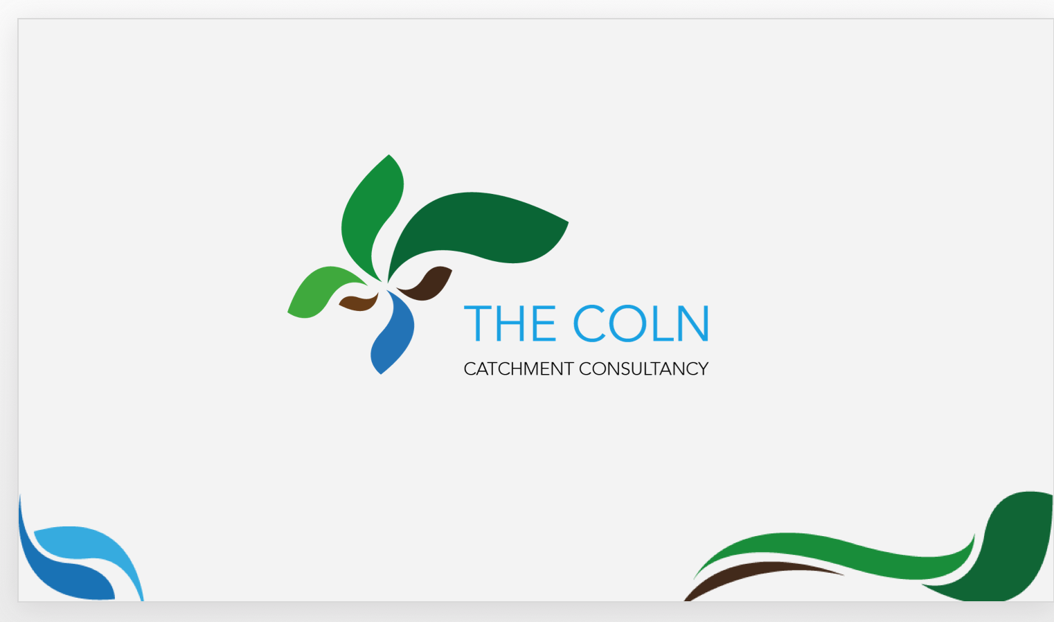
Group 1 were researching into, and set to propose to an external company, the use of herbal leys as a means of flood prevention. Therefore, they asked that the general branding was to be based around greenland areas and water and the logo was also to contain similar imagery. They also asked for a presentation template design that was to contain more realistic imagery like rivers and houses. The logo and presentation design needed a professional and clean feel whilst still putting across the area of focus and research of the group.
Group 2 desired a brand identity that focused solely on water and protection of animal and human life. Again, the imagery presented to me was fairly realistic and didn’t fit the general consensus for a corporate brand identity and logo.
Response to briefs:
Whilst the imagery proposed by group 1 & 2 was useful in providing further ideation for the overall branding, both the imagery and desire for professionalism and clean design conflicted. A compromise was then met whereby the areas of research were put across within the logo and branding, but within a simpler design style so as to maintain professionalism.
Design:
Logos:
After researching into the external company for more information on audience and gathering all of the mood boards, I began designing initial concepts for both logos. After presenting the logo for group 1 to my project supervisor, I was advised to stick to solid colour rather than gradients due to the gradients being somewhat outdated for corporate identity. Although my clients took a liking to this design, they agreed that maximising professionalism for the external company was of upmost importance. therefore, solid colour was taken forward for their brand identity.

My clients also really liked the abstract design as it put across ideas of land use and flooding through the more abstract, clean design approach that we discussed earlier on in the project.
Initial concepts for group 2 presented little in terms of protection of animal/human life. After consulting my supervisor, a suggestion was made to incorporate aquatic life into the logo. My clients also felt that the logo was missing a key aspect of their research and welcomed the addition of aquatic life.
Presentation templates:

An issue that I ran into when incorporating the presentation template into the presentation itself was general placement and interaction with the images and text that my clients had already added. I presented figure 4 to group 1 and agreed that the addition of the template shown in figure 3 would be lost and also obstruct the text. Therefore, a decision was made to remove the template from pages with larger images and text that ran into the area of the template. However, overall group 1 were pleased with the simplicity of the design as well as its clear connection to the logo.


Similar to group 1, the presentation template design was removed from slides that contained large images that extended to the bottom of the page. Both groups also suggested that the template be removed form slides with diagrams and tables. In doing so, there would be less of a distraction from the information itself.

A suggestion was initially made by some individuals within group 1 to add the company logo and name in the corner of each slide, acting as the presentation template design itself. This caused somewhat of a friction between the group members who could not come to an agreement on the matter. This experience brought out an opportunity to improve my communication skills. A decision was made to keep the logo and name to the first slide as constant re-enforcement would become tiresome for the external clients and somewhat obnoxious (figure 8).
Final steps:
In order to provide a complete, smooth experience for my clients, the Microsoft powerpoint fils were tested on multiple projectors, as well as the projector in the room that they were presenting in. A tip that has been promoted greatly by my supervisor was to make sure any files being shared to my clients were accessible and fully functioning so as to prevent any problems from occurring.
Reflection:
My first encounter with real clients and a real job environment was insightful and extremely helpful. One learning point to take away is that preparation and organisation is key when working with a larger group of clients. To assume that your opinions and ideas will somehow be translated to each clients minds in the same way is foolish. Perhaps one client member cannot make the feedback session? If so, how will you be on top of that? Simply put, when working in the world of work, you’re not simply a graphic designer, you’re a manager, co-ordinator, communicator, translator etc. Your job does not stop after you exit your adobe software on a Friday night. I managed to deal with this issue by contacting each individual group member separately, a well as a group and working through the feedback sessions so that everyone was on board with the current situation. This worked well on occasions where the next goal was clear and obvious. However, it felt short when the specifics and intricacies of each feedback session needed to be expressed. For this to occur, it was important that I had the entire group with me. It was also apparent to me that the amount of time spent working through the typographic capabilities of other software packages (powerpoint) was minimal. The simpler the software, the more complicated the design of the typography and sense of hierarchy became. This did mean that a little extra time in Microsoft powerpoint was needed to understand its capabilities.