Background
Each year, Penguin opens their Student Design Award competition, which provides participants with an experience of dealing with real cover design briefs first-hand. From the three possible book categories I chose Children’s, the selected book being Wonder by R. J. Palacio.
Brief
The brief was to redesign the cover of Wonder, to bring the book to new readers as well as ensuring it remains a ‘must-read for every child’. It must ‘encourage children to pick the book up and buy it for themselves and should also engage adults to want to buy it for them’. Specific criteria for a winning design were outlined as follows.
The cover needs to:
- have an imaginative concept
- be an original interpretation of the brief
- be competently executed with strong use of typography
- appeal to the broadest possible audience for the book
- have a good understanding of the marketplace
- have a point of difference from other books that it will be competing against in the market
- be able to sit on the shelves of a supermarket or ebook store as easily as it sits on those of more traditional bookshops
The book
Wonder is a book which follows the journey of August Pullman, a boy who was born with a facial deformity, who has been home schooled for his whole life so far. The book follows the different points of view of August, his sister, her boyfriend and his classmates, as August ventures into mainstream schooling for the first time. Themes of isolation, personal growth and friendship are explored as August slowly is understood by those around him and is seen as more than the boy with the deformed face.
The existing cover
Several versions of the cover already exist, due to the release of the film based on the book. The most famous cover, featured on the left, has a simple hand drawn feel, with hand lettering for the title and author name. The face on the cover is incomplete, showing only one eye, which perhaps hints at the facial deformity of the main character. However, the ominous face, which looks slightly to the left, creates a subtle feeling of unease. This causes the reader to fixate on the face, which highlights the staring that August faces on an everyday basis.
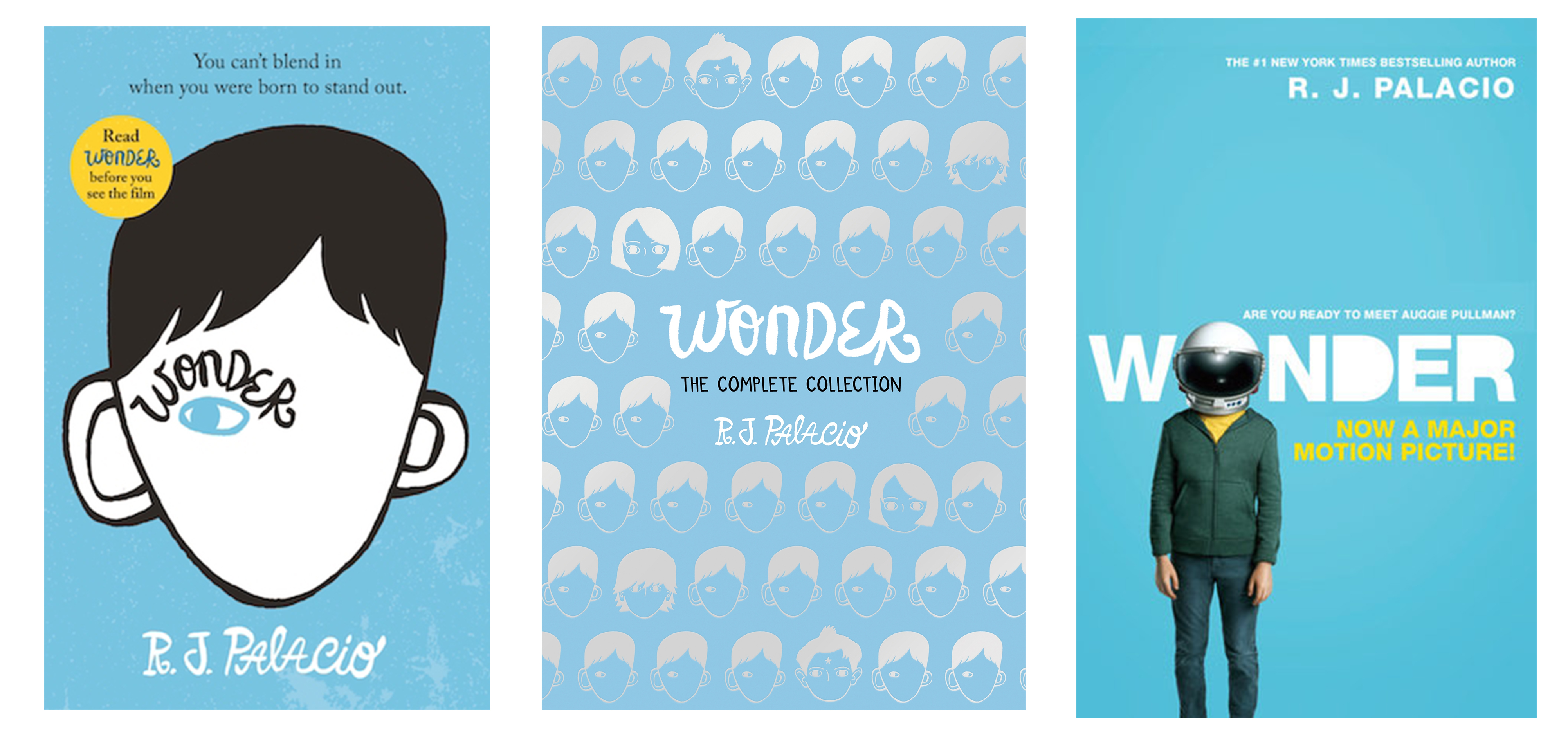
As this cover is so iconic, I feel it is important to veer away from an overly simple design, as well as the face of August. However, depicting one of the main themes or ideas of the book, in a way that does not give away much of the plot, is important, to grab the attention of the reader.
Research and ideation
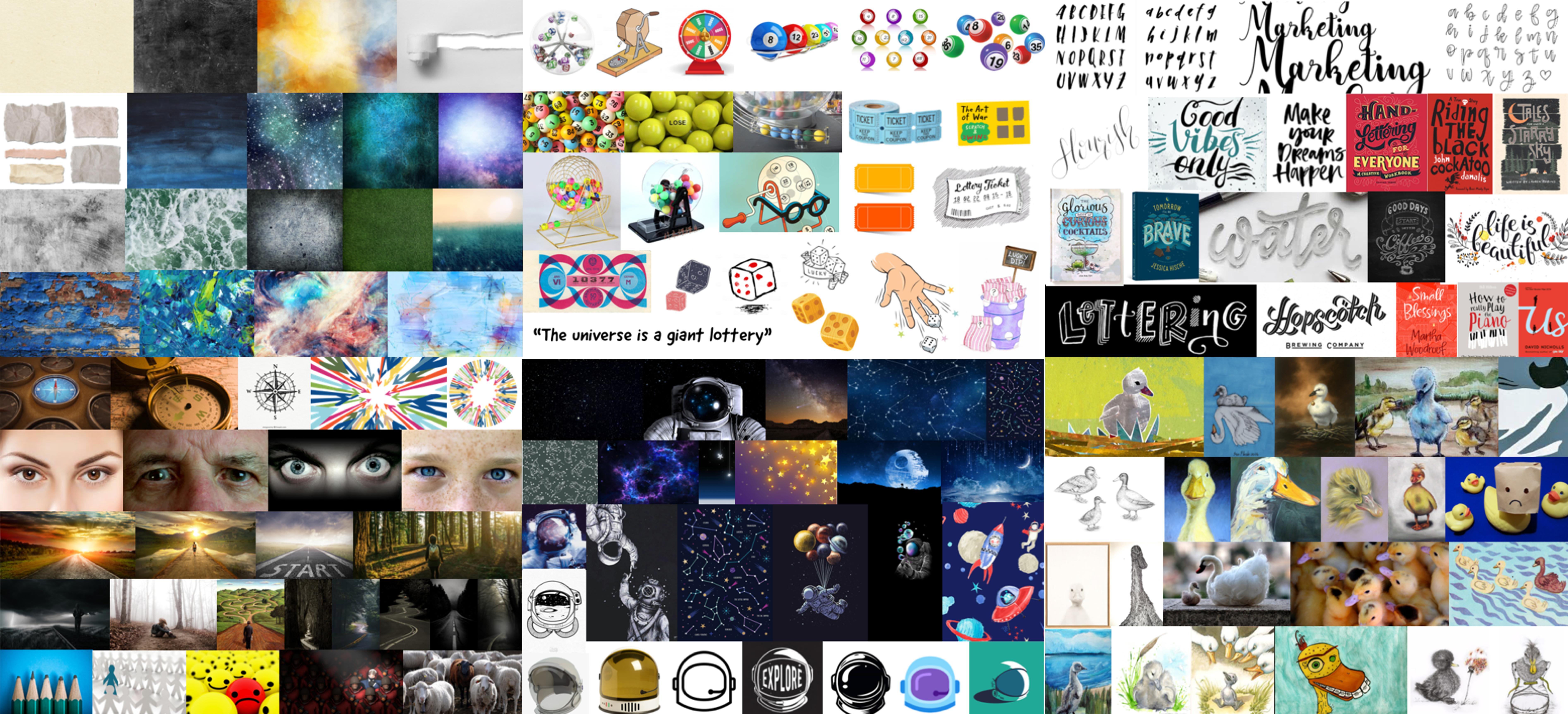
Before I started research, I attended a session with Fraser Muggeridge, which explored ways to help the ideation process. He explained the importance of sketching and experimenting with texture to create compelling covers. I first started by reading the book and watching the film, sketching and writing down ideas and quotes as I did so. I wanted to portray the main themes using metaphoric imagery or illustrate a cover based on a specific quote. The tagline from the cover ‘You can’t blend in when you were born to stand out’ is a key part of the plot, so it was important to consider this when brainstorming ideas. Other quotes that stood out to me as I read the book were as follows:
- ‘The only reason I’m not ordinary is that no one else sees me that way’
- ‘When I was younger I used to wear an astronaut helmet everywhere I went’
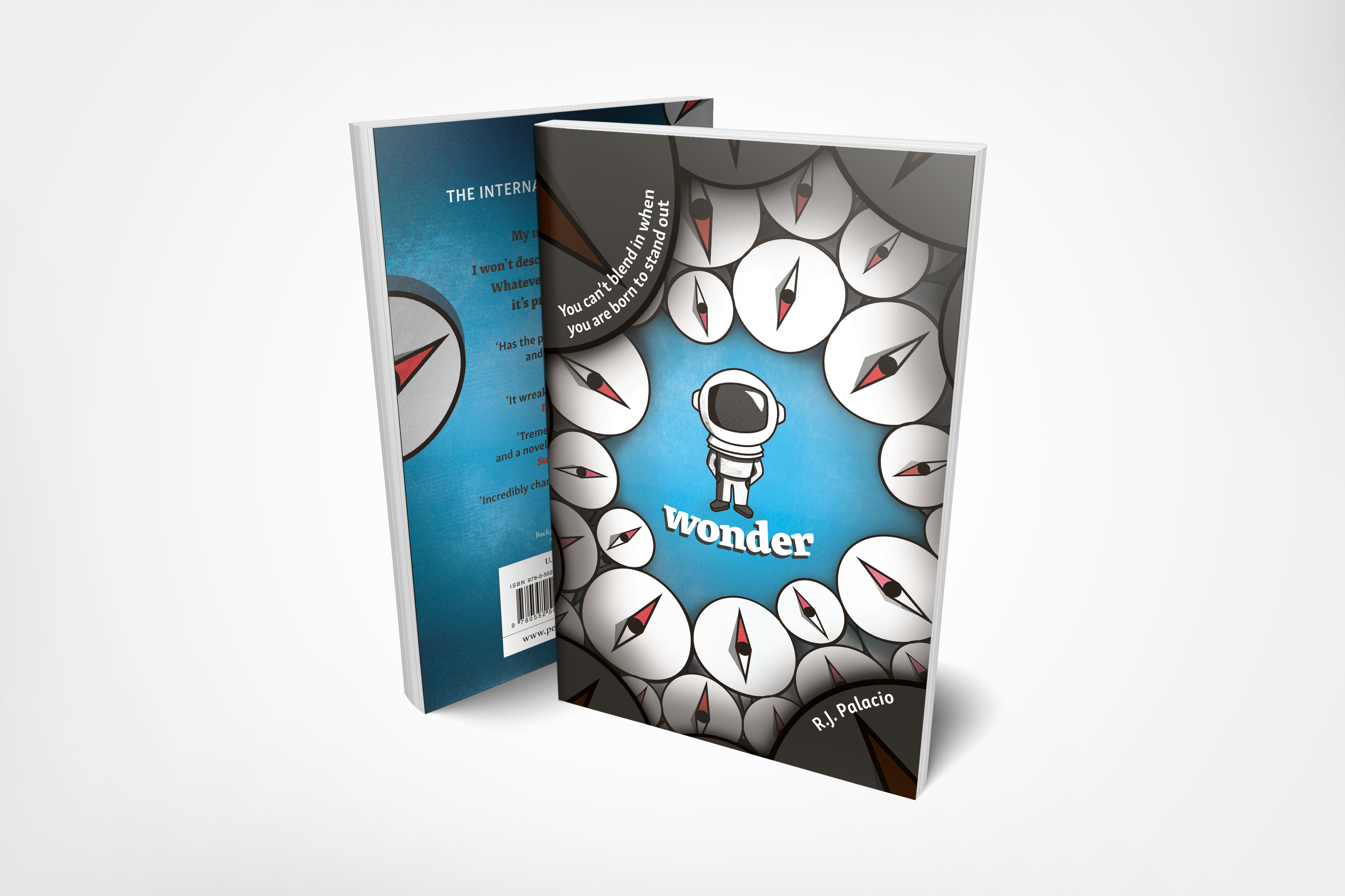
- ‘All those eyes are like compasses, and I’m like the North Pole to them’
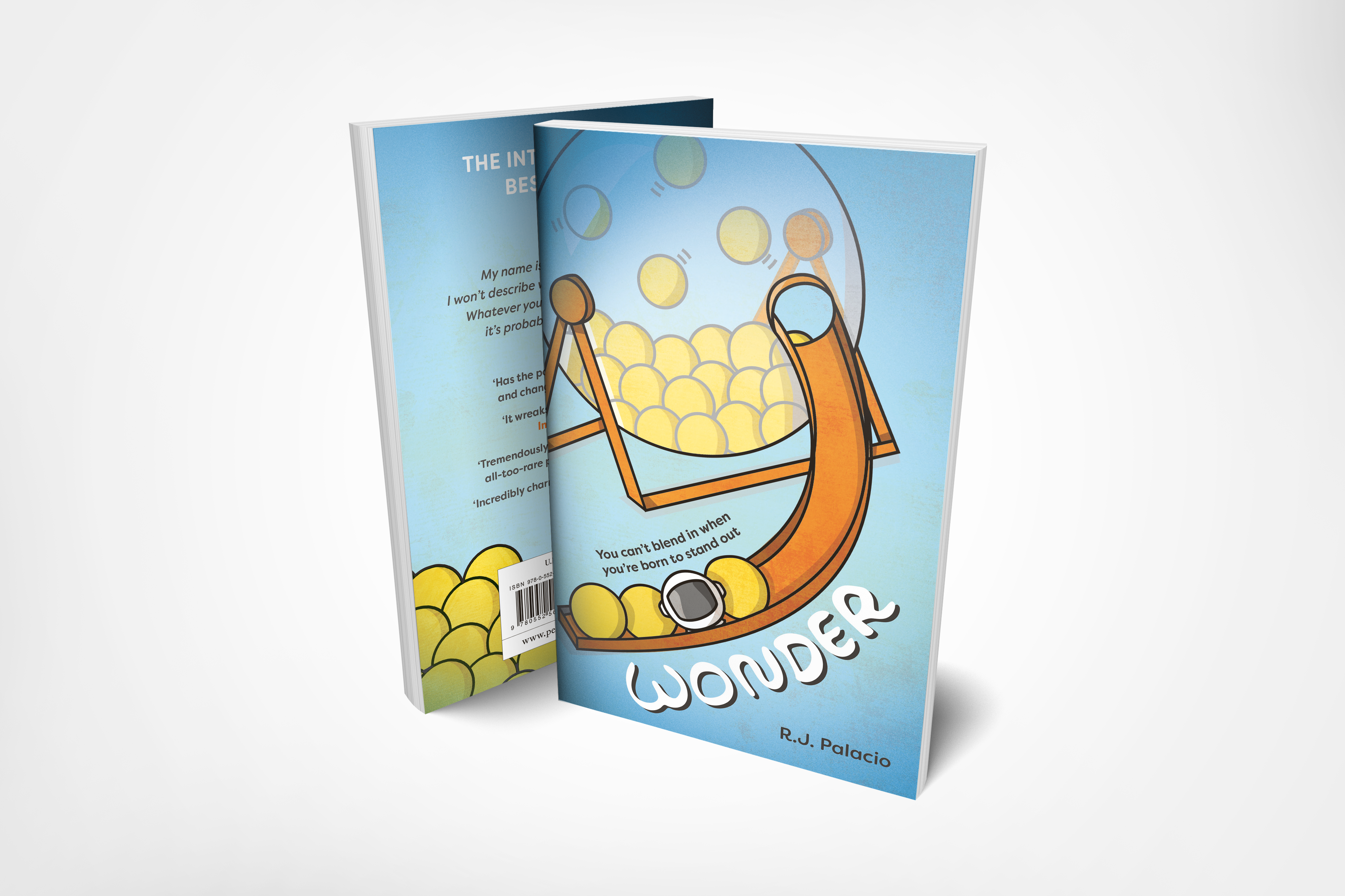
- ‘The universe is a giant lottery’
- ‘One in 4 million’
- ‘The ocean sound that was always in my head had been getting louder’
- ‘It was drowning out people’s voices like I was underwater’
Initial ideas
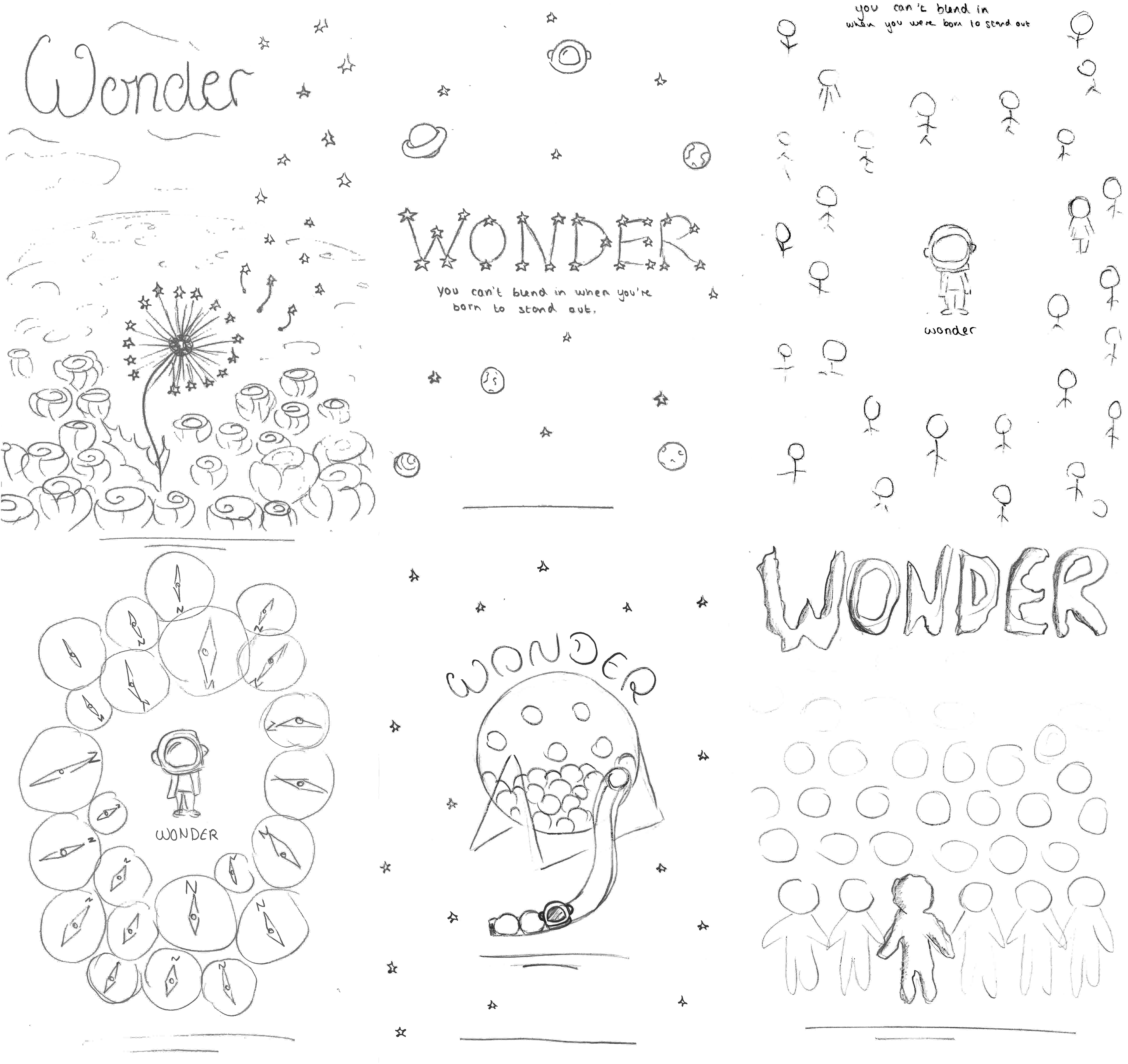
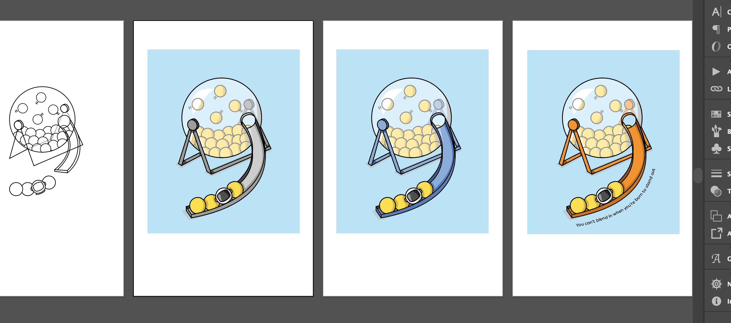
Based on the tagline, I considered the blending or contrast of colours, to represent the themes of fitting in and standing out. The ideas of crowds, ripped paper, shadows and silhouettes also instantly came to mind. After delving more into the book and the film, I then thought of metaphors and images that depict these themes, such as a weed which grows in the roughest conditions, or the idea of the ugly duckling. Some quotes directly led to ideas, such as compasses to represent the staring of people, or a lottery machine to indicate how rare the condition is. Based on these ideas, I created mood boards, before sketching out 6 different ideas inspired by imagery examples.
Design development
I then began the design process, translating my sketches into colourful and textured illustrated works. Illustrator was mainly used for creating the base illustrations, while Photoshop was used to add texture and depth through shadows and light. Finally, inDesign was used for the typographic detail and to create the overall composition.
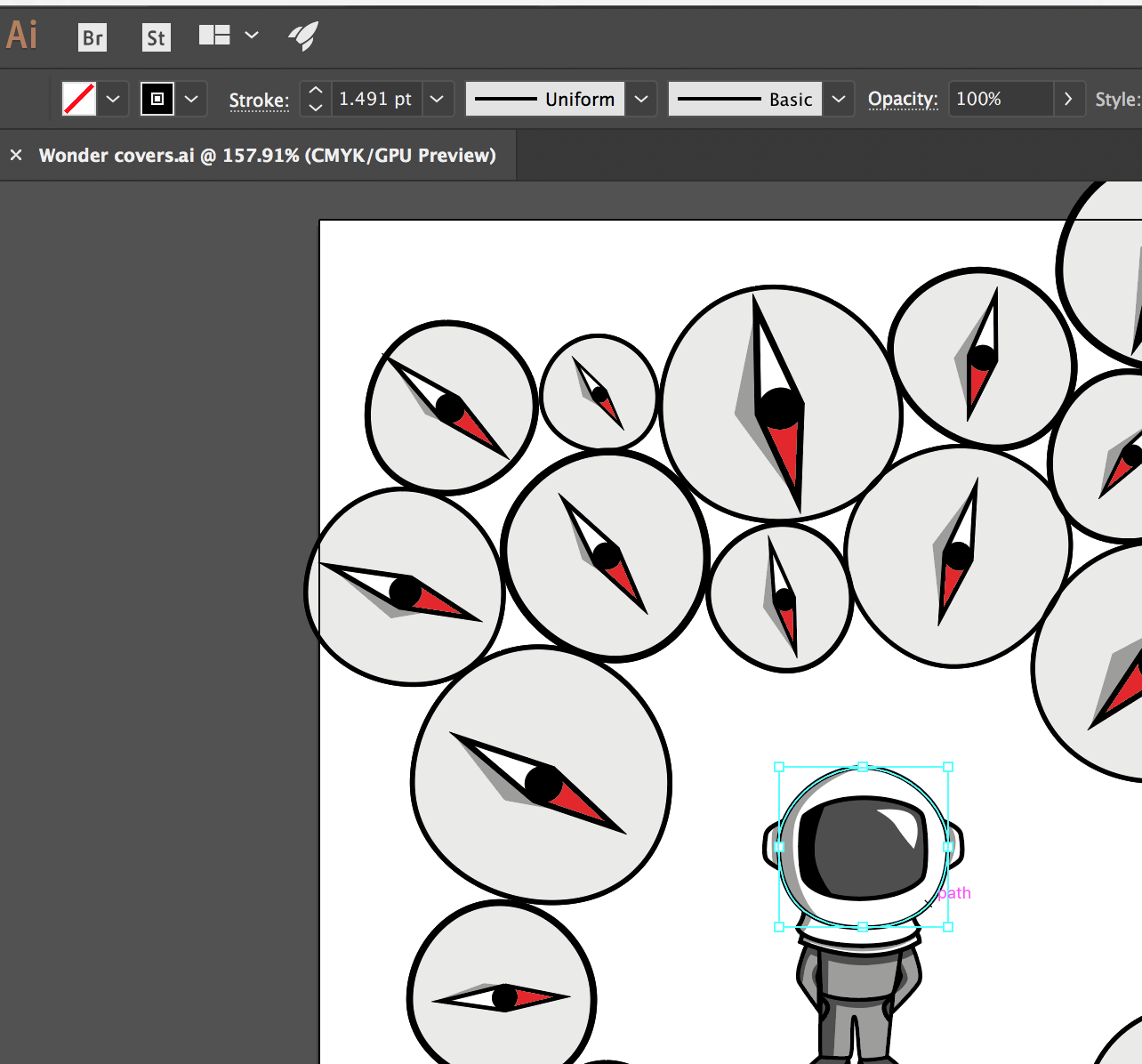
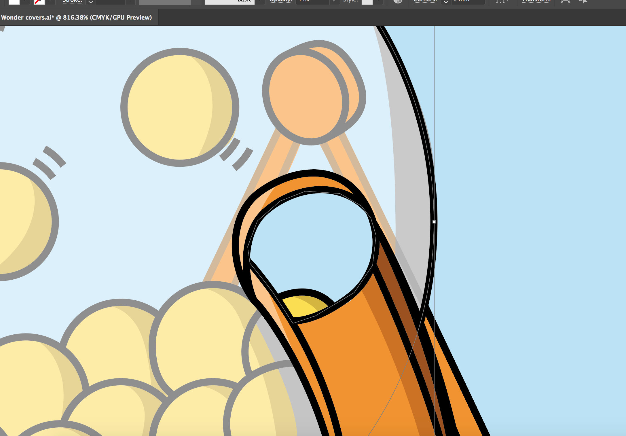
During Real Job meetings, I was pushed to make the colours more vibrant, and to ensure that my covers were suitable for the target market. In particular, my compass design lost its vibrancy when printed, which highlighted the importance of multiple proofs of the design, even though the final deliverable was to be submitted as a PDF. Proofs were then printed to show at the following real jobs meetings.
Final stages
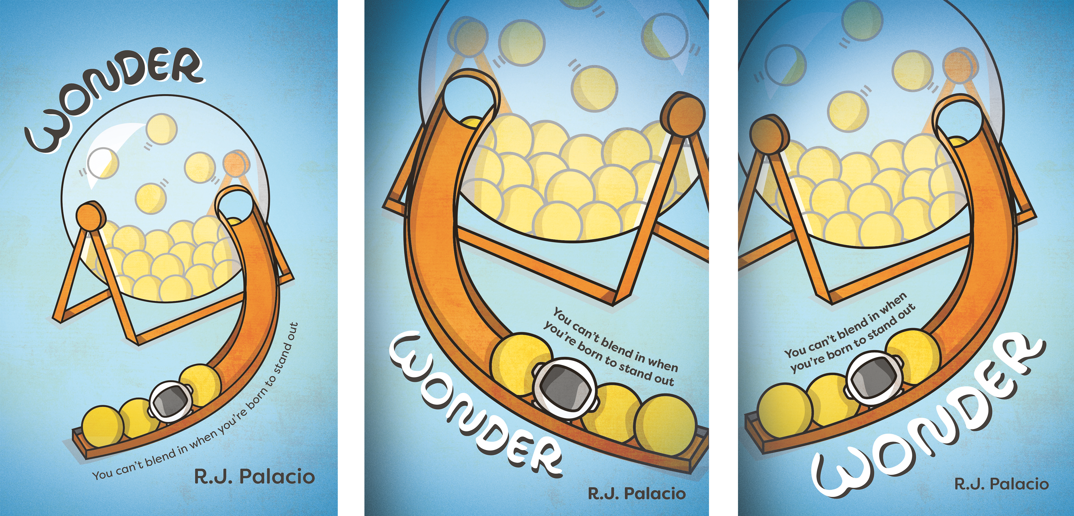
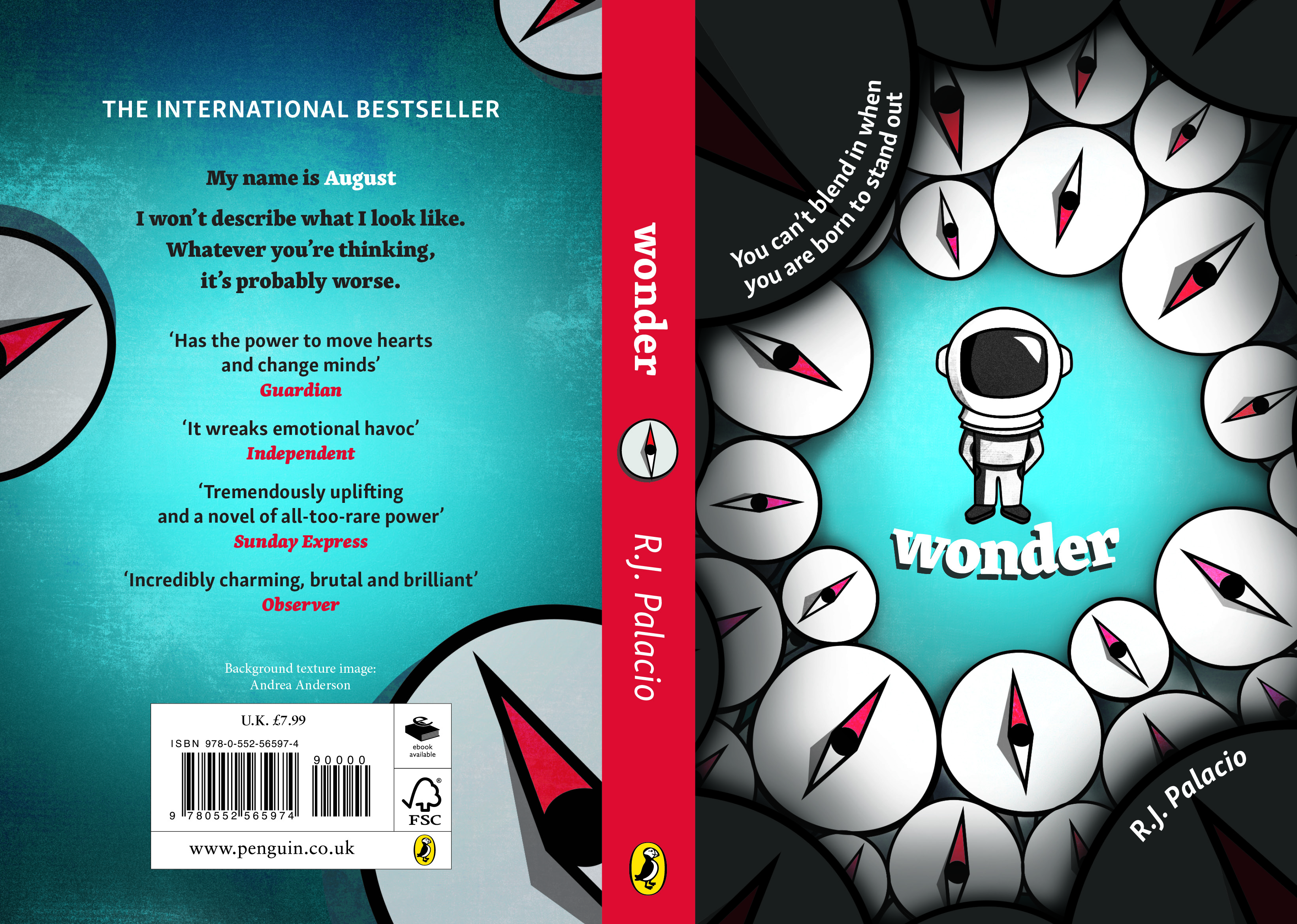
After attending several meetings and working on the vibrancy and detail in my illustrations, I decided to focus on the compass design for the competition itself, as the lottery machine is perhaps a little bit niche and may cause some confusion. James, my supervisor, was happy with the overall style and concept, which allowed me time to fully explore compositional elements, including the title and text position, to ensure they stand out when the cover is viewed at a smaller scale. Another point discussed by people in the meeting was the vignette around the cover, which seemed to be less favoured. I explored ways around this that still allowed for the text to be legible, including: adding a row of darker compasses on top of the existing layer, creating a black border in the shape of an astronaut helmet to make the viewer feel that they are in August’s shoes, and finally, creating more intensely shadowed compasses at the borders of the covers, which are dark enough to house the text. These designs allowed me to experiment with the placement, size and colour of the title, as well as the positioning of the tagline and authors name.

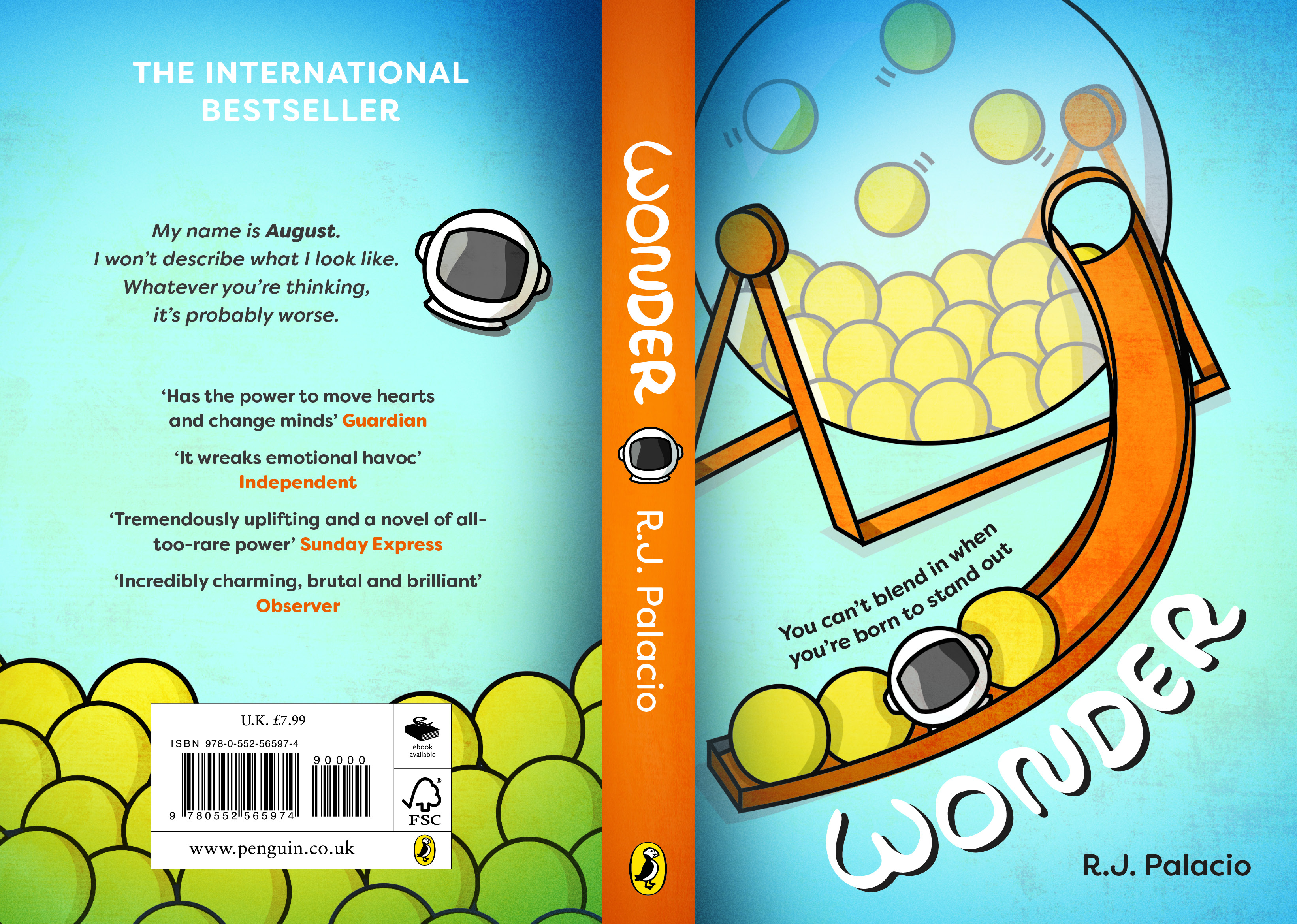
Finally, I chose the design with the more asymmetric appearance, as this adds more flair and interest to the final cover. I then also explored the other cover design, to use as a portfolio piece, using a crop of the lottery machine to reduce the white space and symmetricity of the cover.
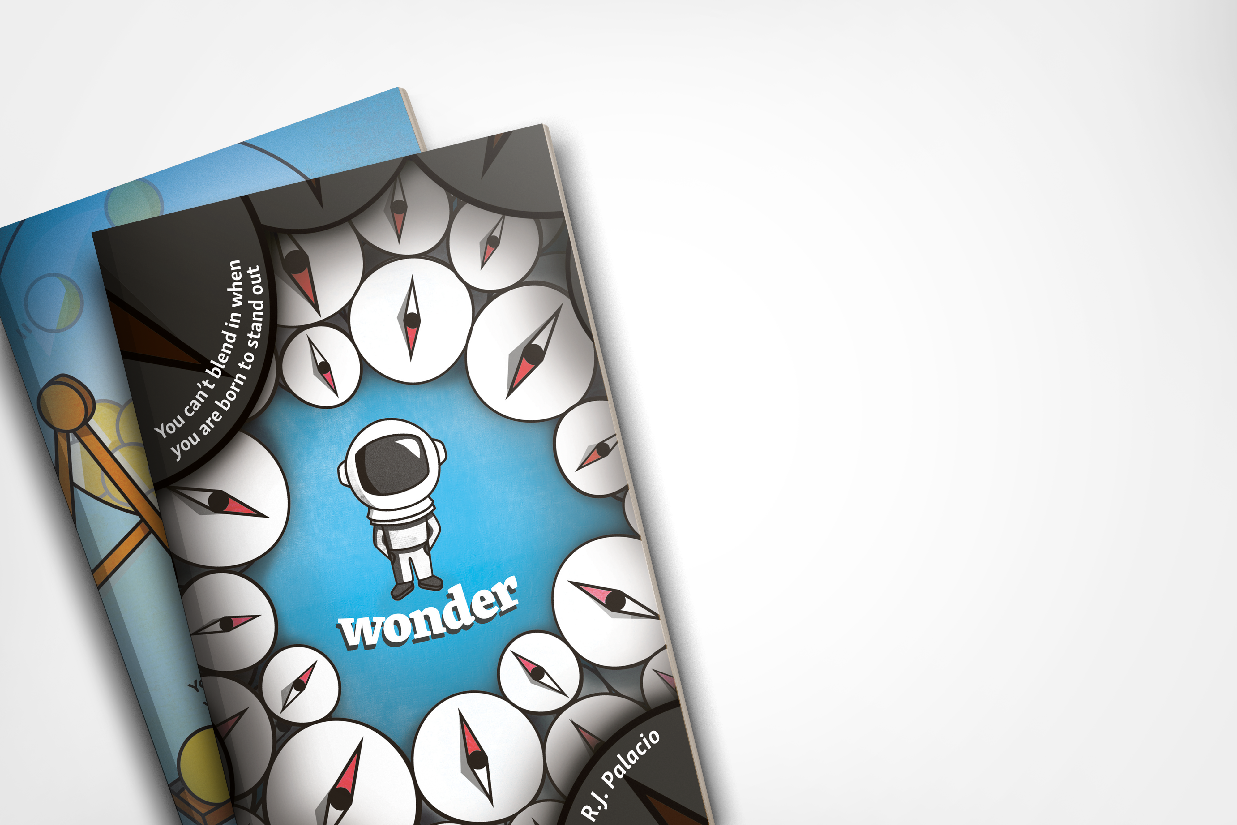
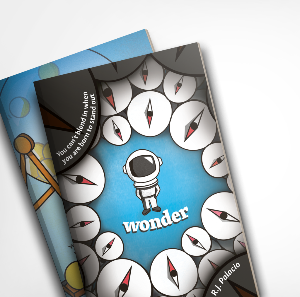
Final covers
Reflection
Overall, I am happy with the appearance of the cover designs and am proud of what I achieved in around a month, less time than I have had to complete other cover design projects. My supervisor also remarked on how my Illustrator skills have improved dramatically since the start of the course and felt that both of the covers would have been suitable to submit. Creating vectors with smooth and unbroken curves is a skill I have developed through this course, and I was happy that my improvement was noticed. I also feel that the covers suit the target audience but remain suitable for the subject matter of the book.
Looking back at the requirements of the brief, I feel that my concept is both imaginative and an original take on the brief, as it focuses in on a specific quote in the book that other entrants may not have read / thought about. The colour schemes fit the darker nature of the book, as well as looking gender neutral in palette, which is important when trying to market the book to a wide target audience.
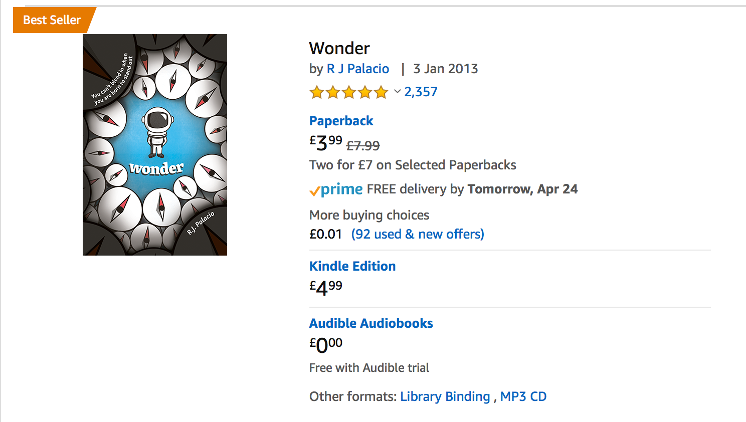
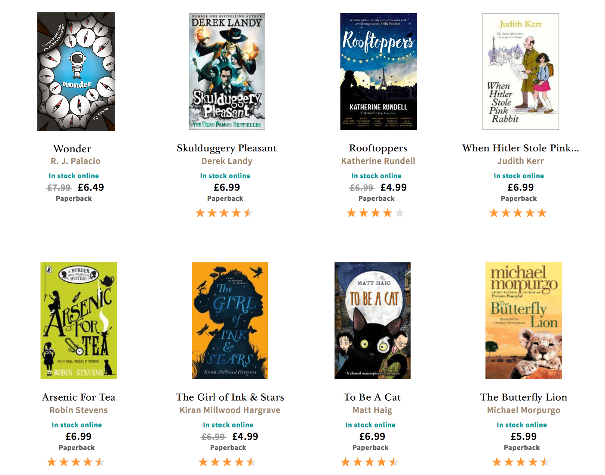
In order to test the book against its competitors, to see if it has a clear point of difference, in addition to standing out on a book shelf as well as at thumbnail size, I mocked up the cover on Amazon, and also Waterstones website, to see if my design met these two criteria. On Amazon, I feel that the integrity of the design holds up even at small sizes, and when directly compared to the other books, I feel it stands out due to its subtler typography and composition. However, using dark tones and shades of blue is quite common in books for this market, which may either highlight the success of the colour scheme for the age group, or indicate that it may be too similar to other books around it. In order to explore this further, I feel that it would be necessary to physically mock up the book and place it on a shelf within a bookshop, to see whether it stands out or recedes backwards when compared to other covers.
With more time, I would love to physically make these two covers, as well as exploring print finishes that could give these designs an extra pop. I think that adding a spot varnish to areas of the compass design, on the compass points for example, would help the staring ‘eyes’ stand out more. On the other design, I feel that spot gloss or white foiling on the astronaut helmet would help this stand out more from the other yellow. After submitting my chosen design, I still have doubts surrounding whether I chose the right variation or concept to submit, as I liked several variations as well as the lottery machine concept. However, I feel that both concepts tackle the brief differently, which will form a useful addition to my portfolio going forward, especially as my dream is to work in the publishing industry specialising in design for children.
Mock ups