Background and initial briefing
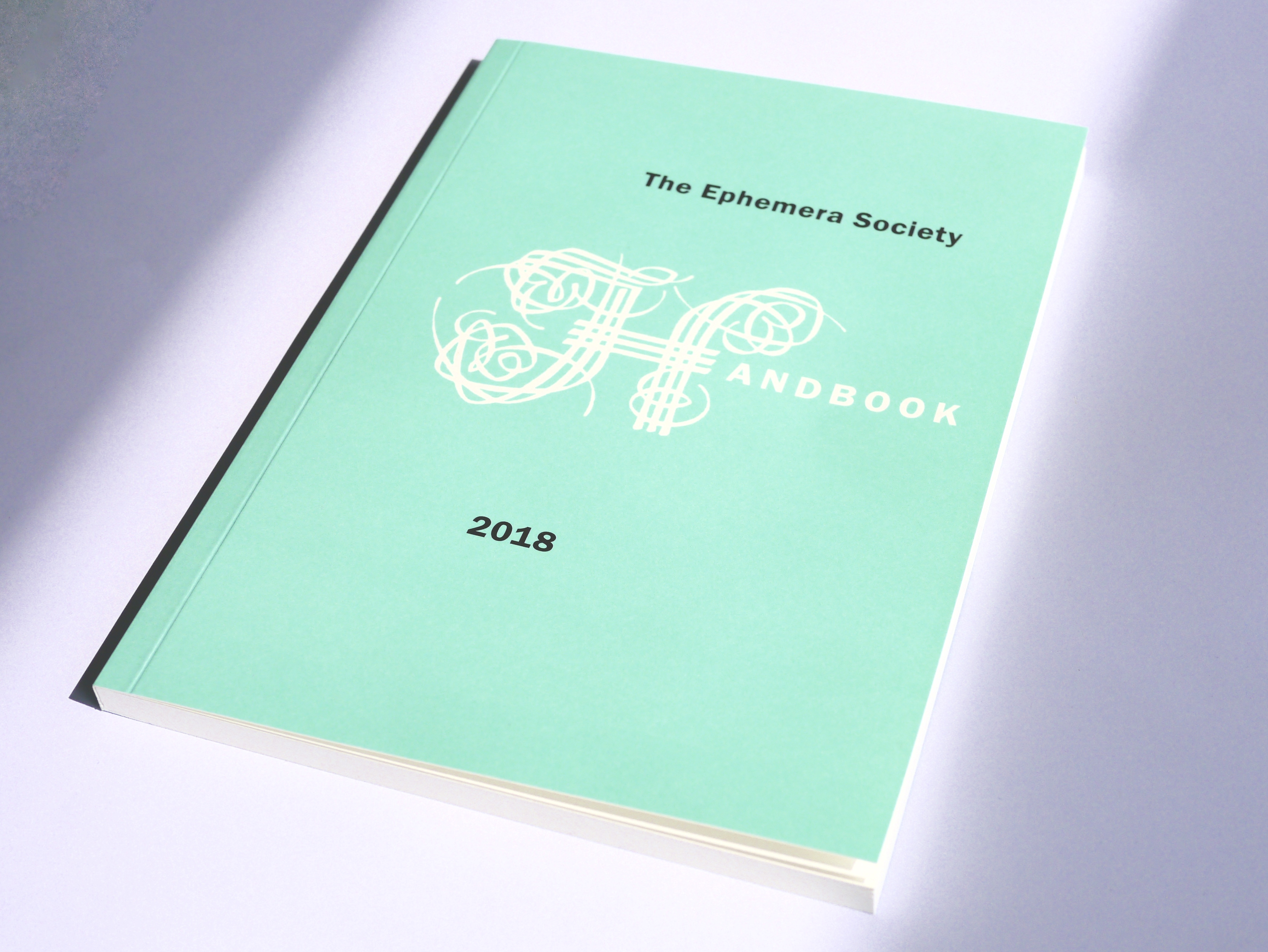
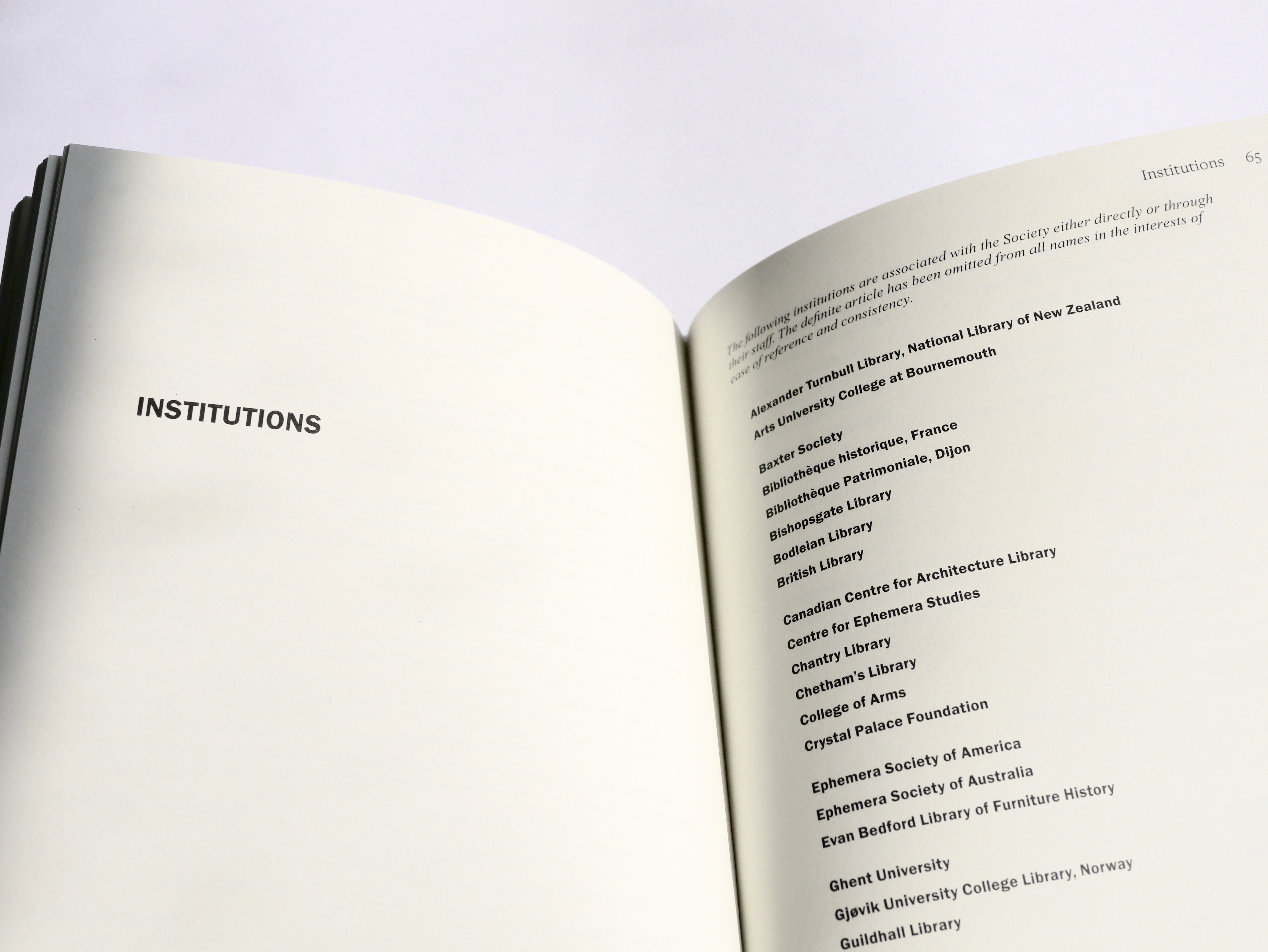
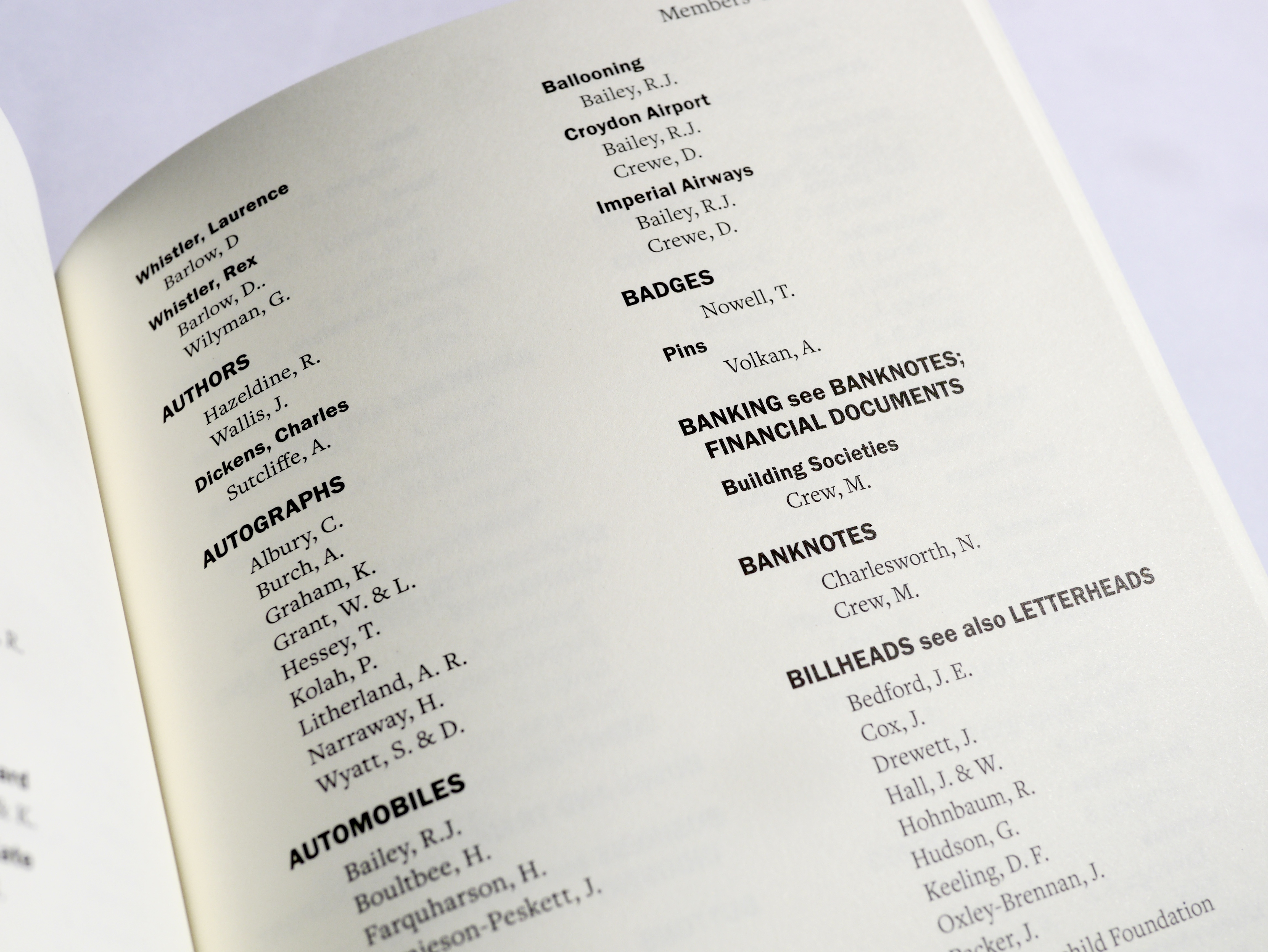
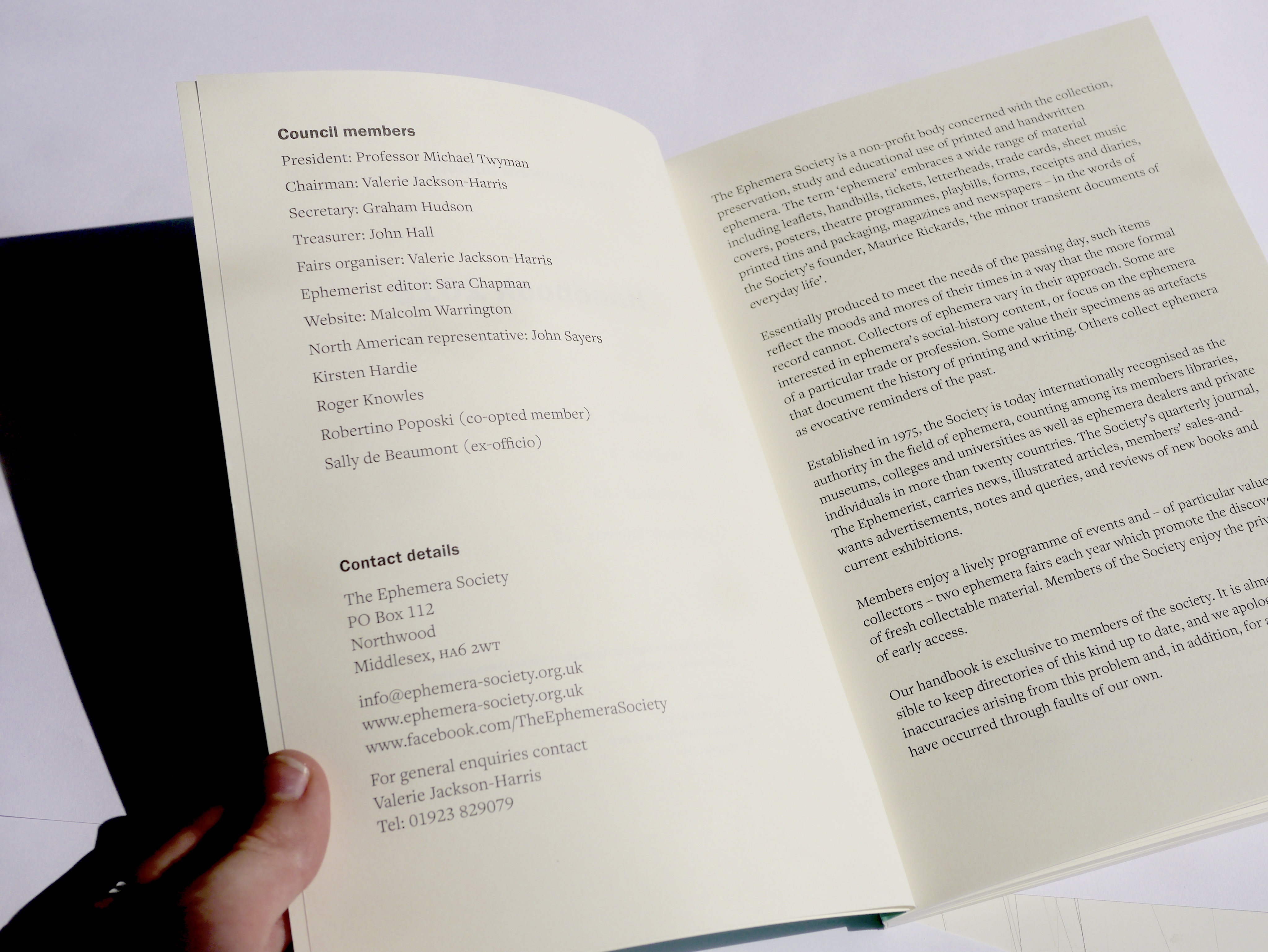
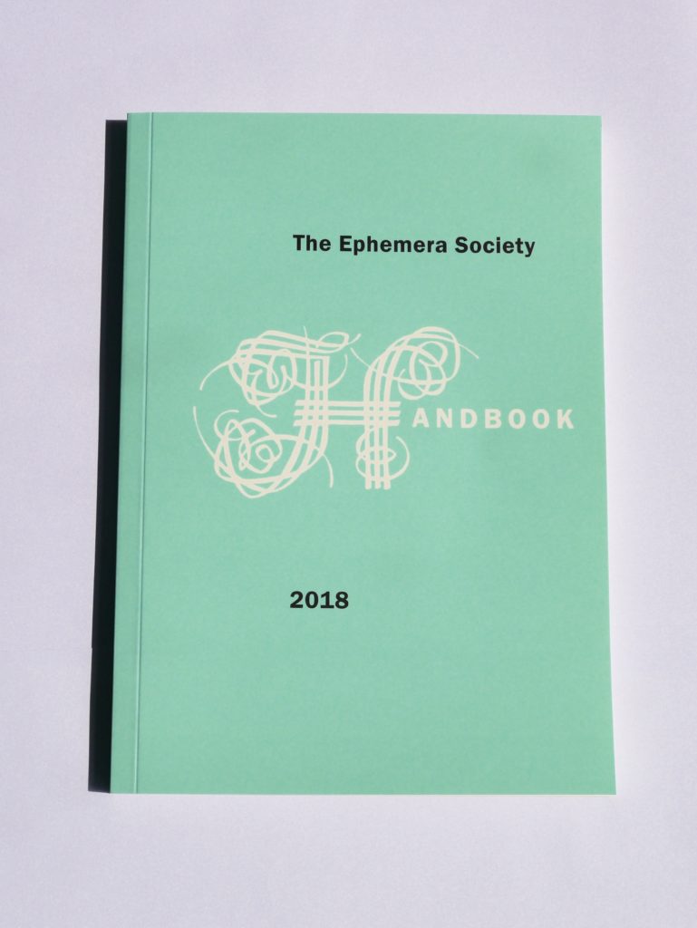
The Ephemera Society is a non-profit body devoted to the collection, conservation, study and educational uses of handwritten and printed ephemera. A handbook is produced annually, including the list of current members, their interests and institutions, and is sent out to all the members of the society. My brief was to use the existing style of previous copies of the handbook to create the 2018 edition. The style and layout should remain the same, while the colour of the front cover was to be changed.
Expectations vs reality
From the brief, I assumed this would be a simple task of replicating the layout and stylesheets of the previous handbook, and inputting the new text into these. However, there were obstacles that meant that the process was more complicated than I first assumed, making the job more complex, but ultimately allowing me to gain more from this experience, in terms of altering briefs and reasoning with clients. In the future, therefore, I will be more willing to have my expectations confounded as I believe that can make the final outcome more valuable for myself and the client.
Font
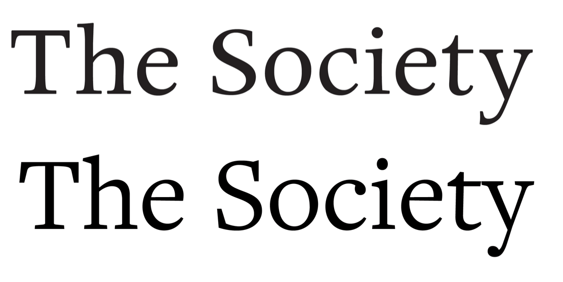
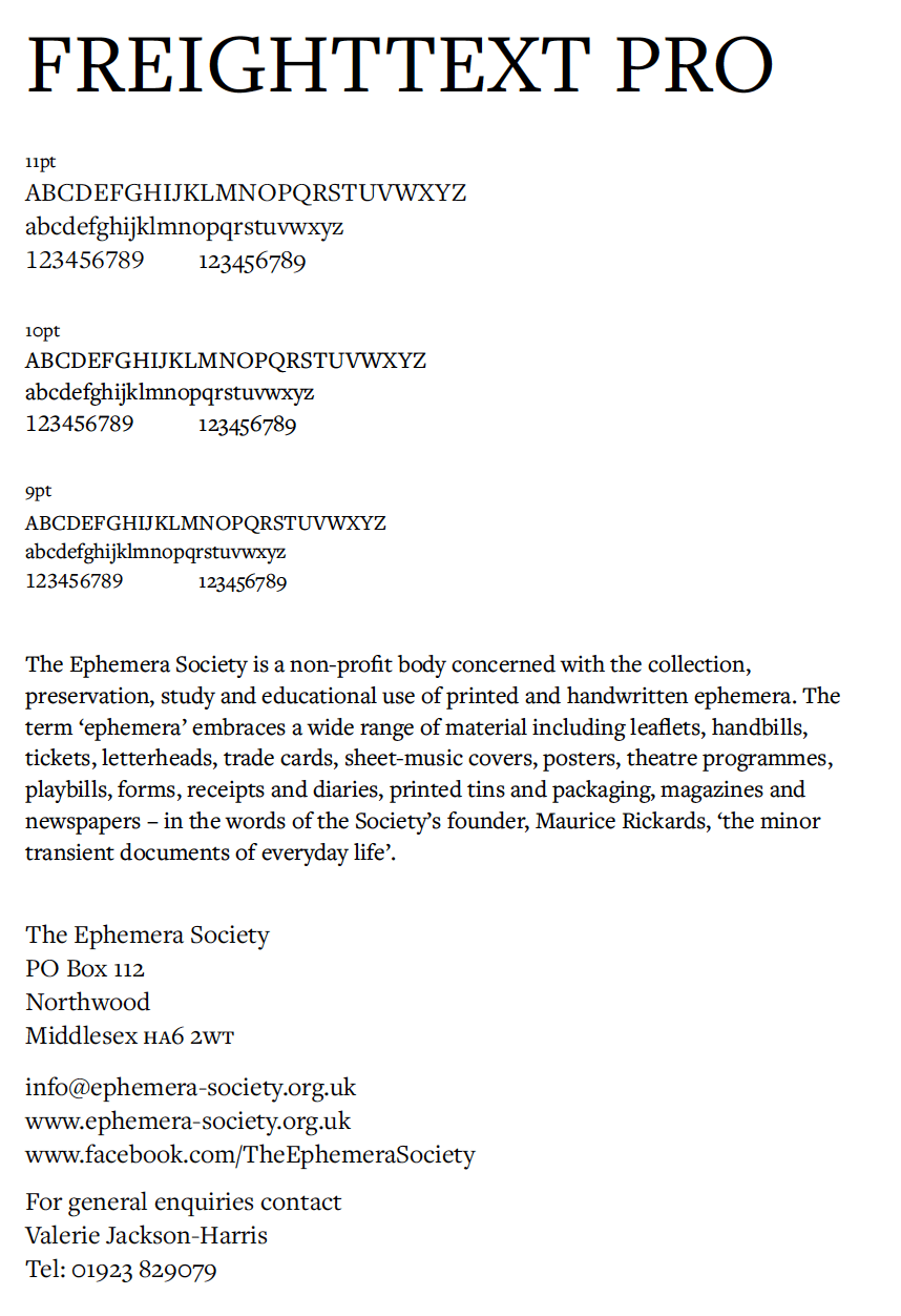
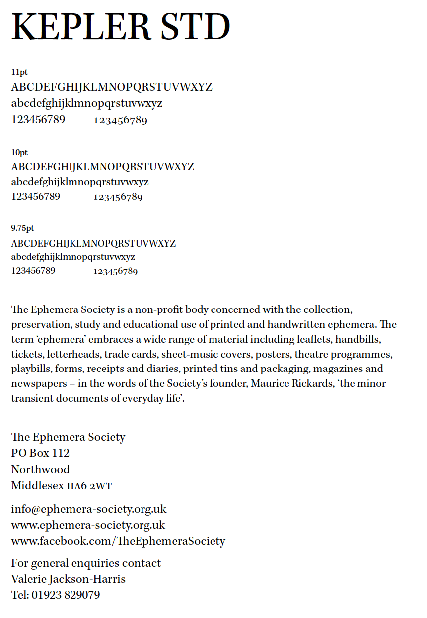
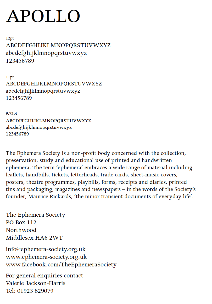
The font previously used in the handbook was Apollo MT (TT). This became an issue after realising that this exact font was not available on Adobe Typekit or on the typography server. As well as this, its replacement, Apollo MT Expert, is not an Open Type font, and differed slightly from the original. With support and advice from my supervisor, I began searching for a similar typeface in terms of density and physical characteristics. After sending several options to my client, we decided on FreightText Pro for the body text throughout the entire document, a clear and legible typeface with a similar weight to Apollo, as well as slightly more interesting serifs and tails on each letter, adding visual interest to a spread of text.
Other improvements
Oldstyle numerals
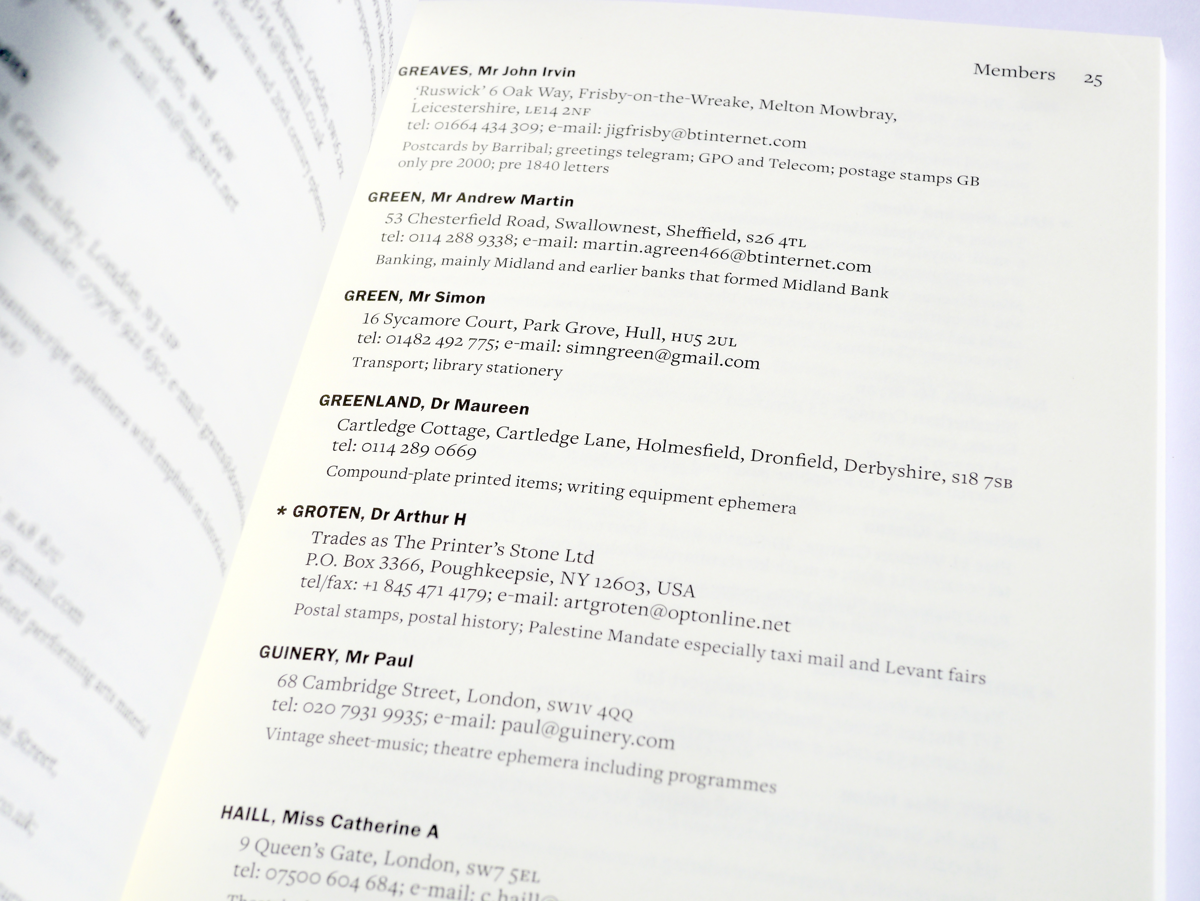
With FreightText Pro the new body text for the book, there was a lot more choices that could be made in terms of how the text was differentiated. Unlike Apollo MT (TT), FreightText Pro has both lining and oldstyle figure options. This initiated the discussion with my supervisor on which figure style is deemed more appropriate for each scenario where numerals are used, and what rules should be put in place to ensure typographic consistency.
The use of numbers throughout the text:
- House numbers
- Postcodes
- Phone numbers
- Numbers within email addresses
- Dates (years)
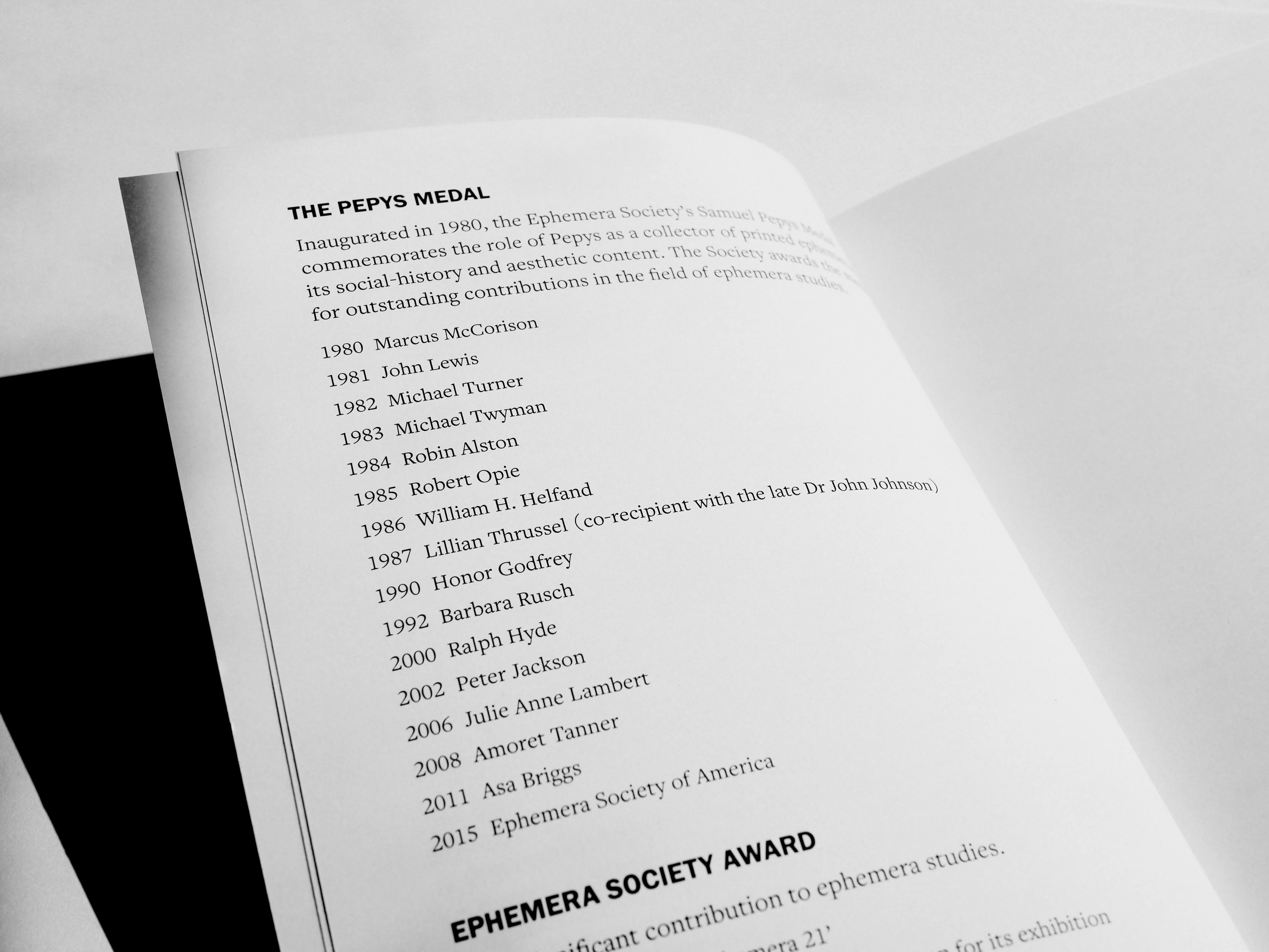
Oldstyle numerals are arguably better in continuous text, as they sit comfortably within lower case and draw less attention to themselves compared to lining numerals. This is why it was decided that phone numbers, as well as numbers within email addresses, should be set in oldstyle figures. Postcodes, despite not always occurring in continuous text, also suited the use of oldstyle figures, as this made it sit more quietly within the overall address. House numbers on the other hand, were set in lining numerals, as these are arguably one of the most important parts of the address, therefore need to stand out. This also suits typographic convention, as it is usual for house numbers to be lining. Dates (years) were something that was a little harder to decide on, however, as the dates existed mainly as markers for important events (The Pepys Medal and the Ephemera Society Award), I felt it was best to keep these lining to help them stand out. Also, as the dates were on top of each other in the form of a list, it was more successful this way rather than having descenders interfering with the line below.
A challenge within this decision making was deciding the treatment of foreign addresses. As they differed in format from English addresses, it was sometimes hard to tell which part was postcode equivalent, and some addresses had other numbers that English addresses do not have. In these cases, it was necessary to research into typographic conventions for different addresses in the world. Overall, all numbers except for house numbers were in oldstyle numerals.
In this case, the issue of the font not being available, and its replacement being outdated, allowed for a lot more thought to be put into the typographic detailing of the spread. This meant that specific pieces of information could be highlighted, improving readability and the ability to pick out specific information throughout the book.
Optical symmetry
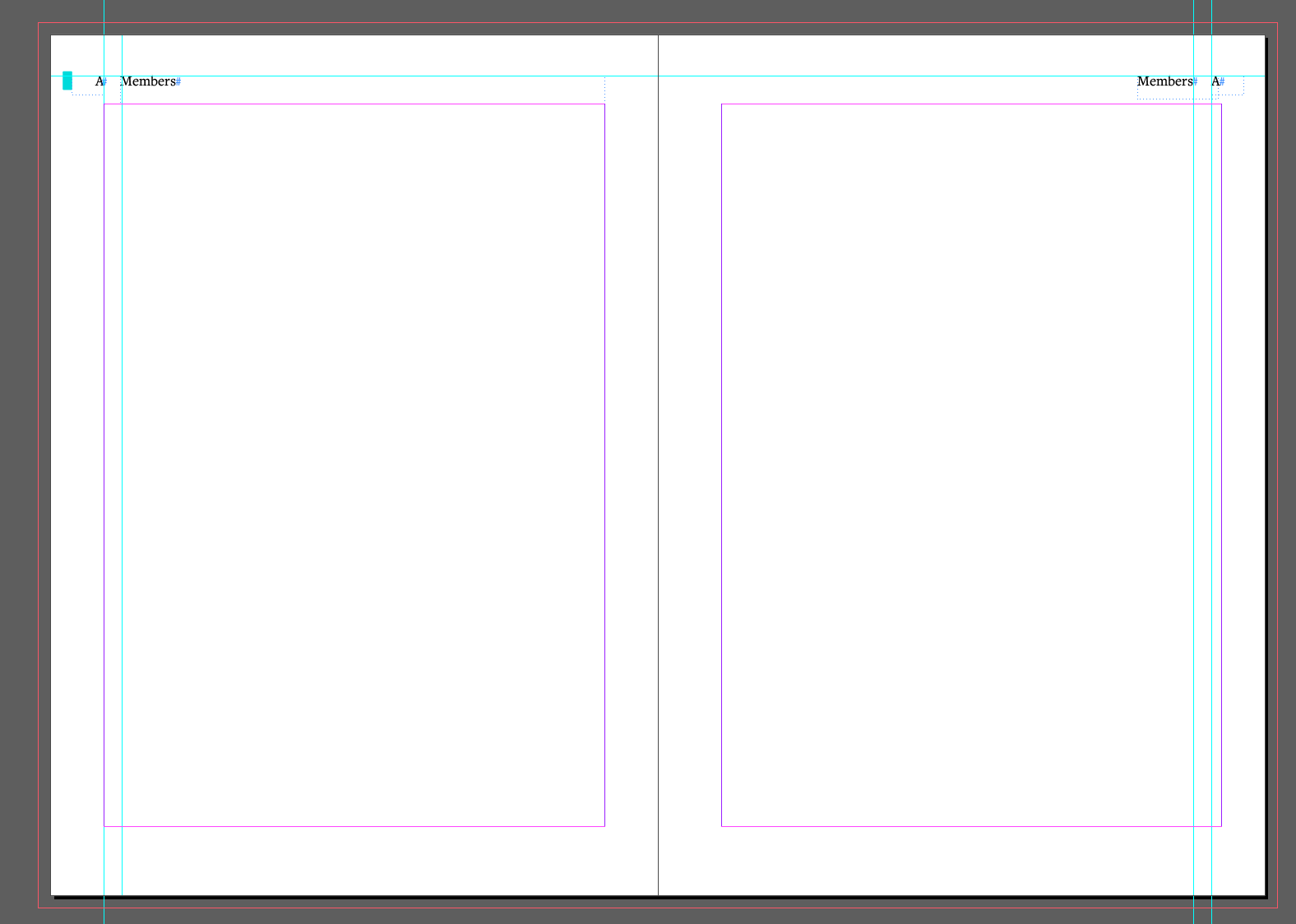
As the member entries are quite short, and list-like in appearance, it created a strong sense of space on the right-hand side of each page. This made the spreads look uneven, so the margin on the right pages was increased from 13mm to 15.5mm to allow for more optically symmetrical design. This was a change from the previous handbook, which used the same sized margins across a two page spread.
Using InDesign effectively
It was vital to use tools within InDesign efficiently, to ensure accuracy and avoid errors throughout the document. As this was my first document with over 100 pages, for the first time I could appreciate the convenience and necessity of these tools, in creating a book free of errors.
Find/Change tool
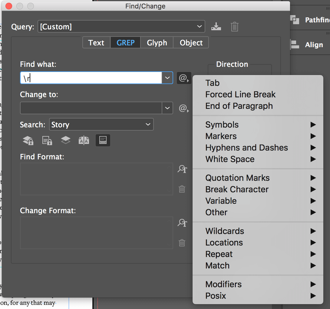
Despite using this tool previously, it was fundamental in the completion of the handbook. My supervisor showed me the GREP function, which I was unaware of previously, only using Find/Change for searching for specific words within the document. This was a vital tool as the whole document was full of multiple tabs / double spaces, used in the clients original document to show differentiation between different parts of text. This was also used to replace some hyphens incorrectly used with en dashes.
Column breaks
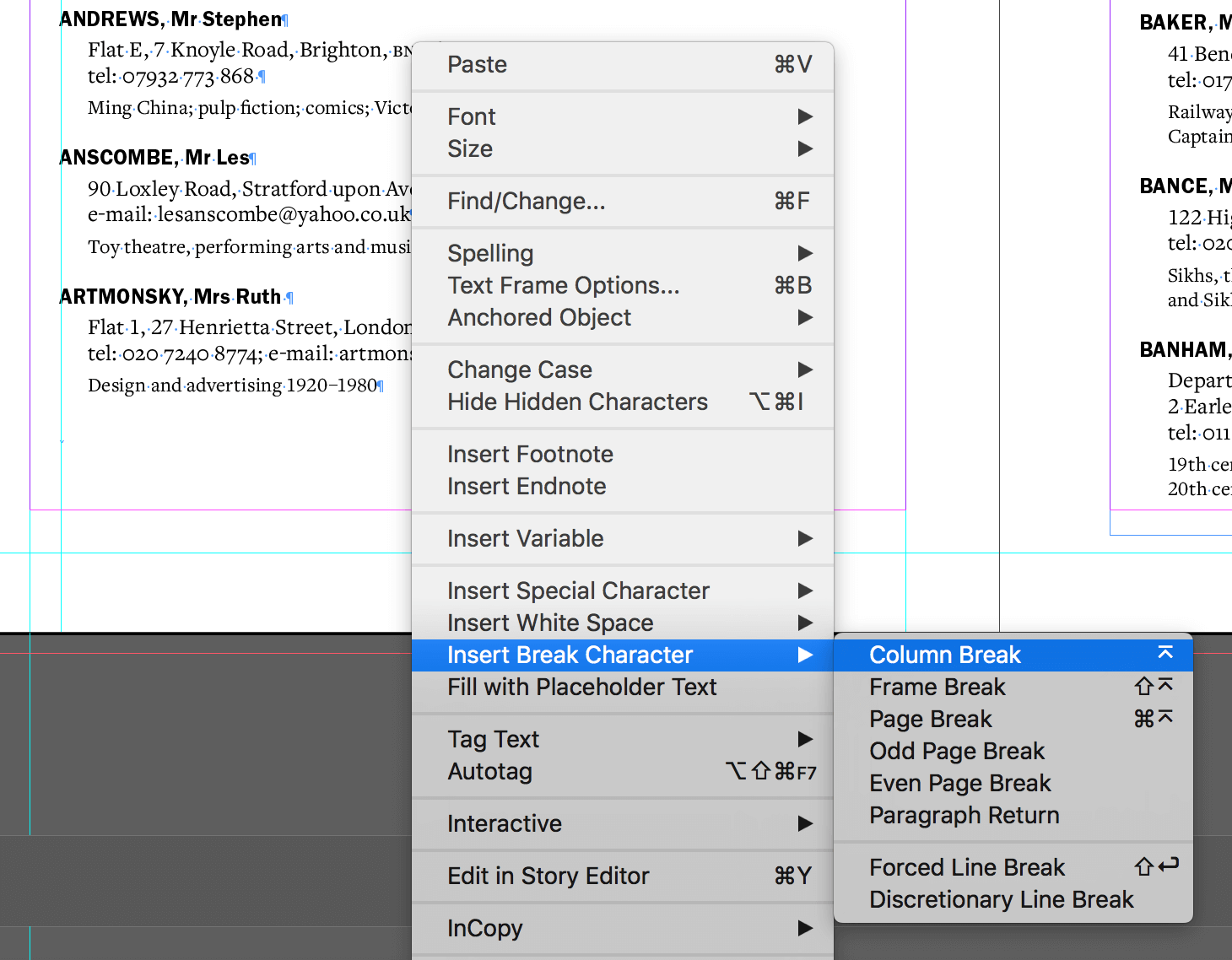
Before this project, I manually used returns as well as altering the text box to change the break of the column. This became problematic during feedback as the smallest change could alter where the column break needed to be, which had a knock-on effect throughout the whole document. Supervisor feedback advised the use of the column break character which made the rest of the project a lot more straight forward.
Personal review using feedback from supervisor and client
Overall, this project ran quite smoothly, especially at the start when restating the brief and agreeing the schedule with the client – “From our point of view you were good at communicating and keeping us abreast of the progress of the project which made us feel confident the handbook was in good hands”. For a while at the beginning of the project, I was running ahead of schedule, which gave me more time to focus on the small intricate details of the book.
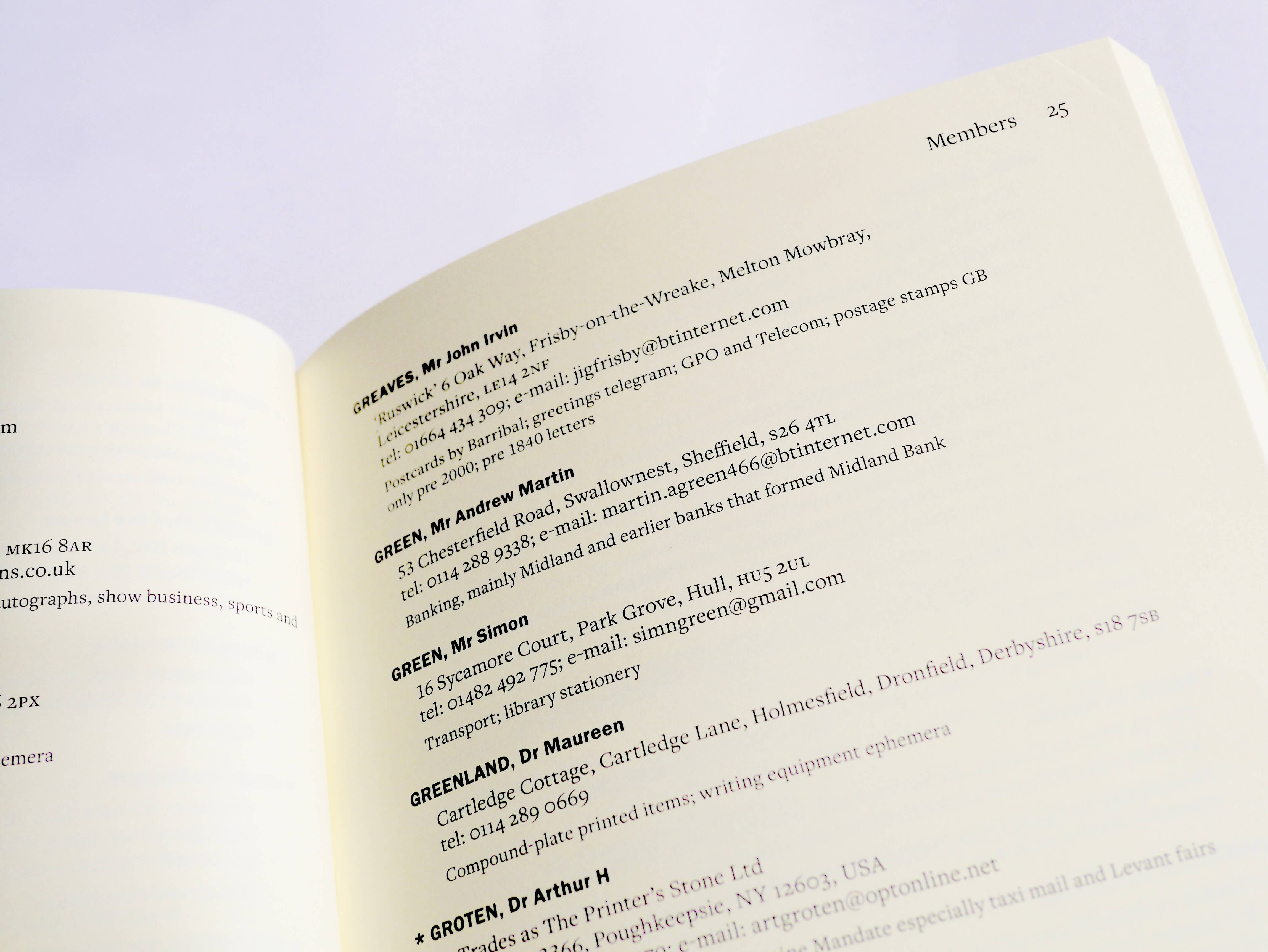
Throughout my project, my supervisor was confident in my abilities, pushing me to improve the handbook typographically and spatially from the previous edition. Despite this going against my instincts, as the client wanted the handbook to stay the same, the changes in margins, typeface and typographic differentiation have greatly improved the legibility and usability of the handbook from the previous version.
However, despite the main success points, there was a small miscommunication at the end of the project, where I found it hard to manage feedback from my client and supervisor. Whereas my client pointed out small mistakes where things were in the wrong style, my supervisor had bigger plans, including changing the margins for optical symmetry, and altering the spacing which would affect the whole document. This occurred very close to the already extended deadline, meaning I struggled to complete these changes in time. This resulted in me sending the client a “finished document”, which they approved, only to be given more changes by my supervisor. This concerned my client and caused me stress, as I felt I had let them down.
From this miscommunication, I have learnt not to be too hasty about submitting a final version of a document to the client, and instead, to take a little more time (if the deadline is flexible) to ensure the document is correct, and approved by my supervisor, before sending it through. Luckily, my client was very understanding, and despite their concern, were happy with the final printed handbook.
“The only hiccup was near the end when an out of date file was sent to us for review which caused some confusion and consternation, but this was quickly corrected. We were delighted with the outcome”.
Malcolm Warrington
Final outcome
Overall, both myself and my client were happy with the final print of the handbook. This project has taught me to consider a brief more openly, thinking around it and how to improve upon it, rather than see it as concrete initially. The setbacks and miscommunication errors that occurred in this project gave me a more realistic expectation of a project in industry, and prepared me for more challenges in future projects, as it is rare for a task to run smoothly from start to finish. Problems will always occur, but sometimes fixing these problems can make a finished project even better than expected.
