
Background
I will be working with two different teams in this project. This project is to help the clients create a professional image for their formal investigation. The investigation is about exploring multiple benefit delivery within the Emm Brook river corridor for an environmental agency and Loddon Valley residents. Through their research, they aim to discover the advantages of the ecosystem services around the Emm Brook river corridor. The clients will be creating a report and formal presentation for their findings.
Brief
In order to achieve the desired image of their team, different deliverables were set for each team. After our discussion, we concluded that a logo and presentation template will be created for both teams. Team C would also benefit from having a report template as they want to achieve a higher consistency in branding. The aim of the designs varies according to the deliverable. Since they are student teams, it was decided that the designs will be tailored to the content of their project instead of the team themselves. The logos aim to create a sense of identity and to give a brief idea of the project. The presentation and report templates aim to show consistency between their project’s output, presenting a more professional image. They should also support the content of the project outputs while adding a decorative touch. The clients have also asked to include the logo in the presentation and report to further enforce the project identity.
The project outputs should look like a series visually instead of separated items.
Design Process
In order to create the right image for each team, we discussed what feeling they would want to give the environmental agency through this investigation. After some discussion with the help of mood boards, We came to the conclusion that Team C would like to create a professional image through a minimalistic approach while Team P would like to create a more sleek and modern image.
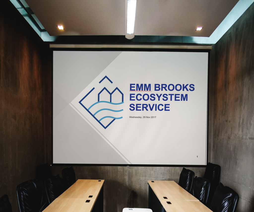
logo
Since the logo will be representing the investigation as a whole, it should reflect the theme and results of their investigation. For Team C, the logo should reflect the close relationship between the Emm Brook river corridor and the local community. I created some sketches with houses and water motions to symbolise the two. After the first sketches, I then continued to explore different ways to capture the form of the river. To match the desire minimal visual style, we decided that the waved lines version would be the most suitable.

For Team P, their project focuses more on the natural ecosystem near the Emm Brook river corridor and how they have underlying effects on each other. The client also requested that the logo include a shield to represent the protection element they covered in their investigation. Since the main focus of the logo remains to be the relationship between the river and the ecosystem, I incorporated the shield element more subtly through using it as the shape of the logo. To highlight the natural elements, the design was created in a style that imitates woodcut. A richer colour palette is used to create a more sleek and professional image.

Powerpoint template
The design of the presentation template should be visually consistent with the logo. Since a large number of images and data will be presented, the layout options should also be suitable for presenting large use of pictures while the report template should be suitable for both pictures and
statistics. Therefore, I created a table style for consistent data presentation. Layout options with images as the main focus are also designed to aid better presentation.


For Team C, the design kept the animalistic approach of the logo using the same colour palette as the logo. Grey colour is also used to help hold information on the page visually while the two shades of blue from the logo acts as the accent colour.
Here are some layout options created for Team C:
For Team P, the design used the pattern of the river from the logo as the header to maintain a higher consistency throughout the different outputs. The layout option for the slides is the same as that of Team C as their presentations consist of a similar genre of information.


Report template
A report template is created only for Team C. Since there will be complex data and a high level of information hierarchy, I created a template with minimal decorations to ensure the content of the report is clearly delivered. The visual design remains consistent through using the same colour palette and fonts from the logo and the presentation slides.

Reflection
Looking back on the experience with both teams, many stages of the process was different for each team even though the project content is highly similar. There was a concern before I start the design process that Ithe designs I create for the teams will be very similar since the main content is the same. However, after meeting with both clients and understanding more about their needs and the content of their work, I learnt that the design and the development process depends on the needs of the clients. Therefore, the design solution and the results will never be the same.
This real job also gave me valuable experience in project and time management. Since there are two clients on the same project, it is essential to keep all records, communication, and the design process organised. There was one time where I made a mistake and sent a file from another team to the client. I understand that it is a severe mistake in a real workplace. I am delighted that this experience trained me to organise all related materials in a better system which became very helpful in the following years of my studies.
Apart from the points mentioned above, I believe that if there is one take away from this experience, it would be the importance of having a friendly and professional relationship with the client. Being able to understand the client’s situation and vision really helps to better the communication with the designer, which brings positive results in terms of the design process.