
Background
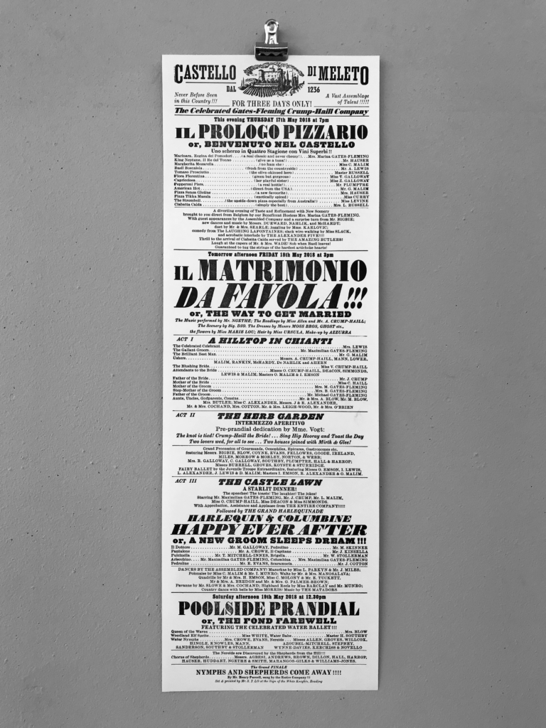
I decided to take on this project despite the quick turnaround because the subject matter was something I particularly was interested in. My client was Cathy Haill, who approached the department with a brief to design and produce a printed keepsake for her daughter’s wedding. The client works at the V&A and has knowledge of 19th century printed paraphernalia, and wanted me to create a playbill for her daughter’s wedding happening in Chianti, Tuscany. The playbill would be a pastiche of 19th century theatre playbills, and content (supplied by the client) would list the entire guest list of the wedding.
Restating the brief
Because of the nature of the project my supervisor, Rob, and I agreed that we would begin the design work as we formulate and confirm the restated brief. This project was straightforward, with a single deliverable, and the client knew what she wanted. These conditions were appropriate for me to begin research on 19th century commercial types and begin drafting the playbill’s design ahead of finalising the restated brief. I maintained constant communication with the client and provided drafts of the design for her to check and make changes to. Another element that made it challenging to formulate a restated brief was that the client was working to finalise the guest list as we worked on the design.
Design process
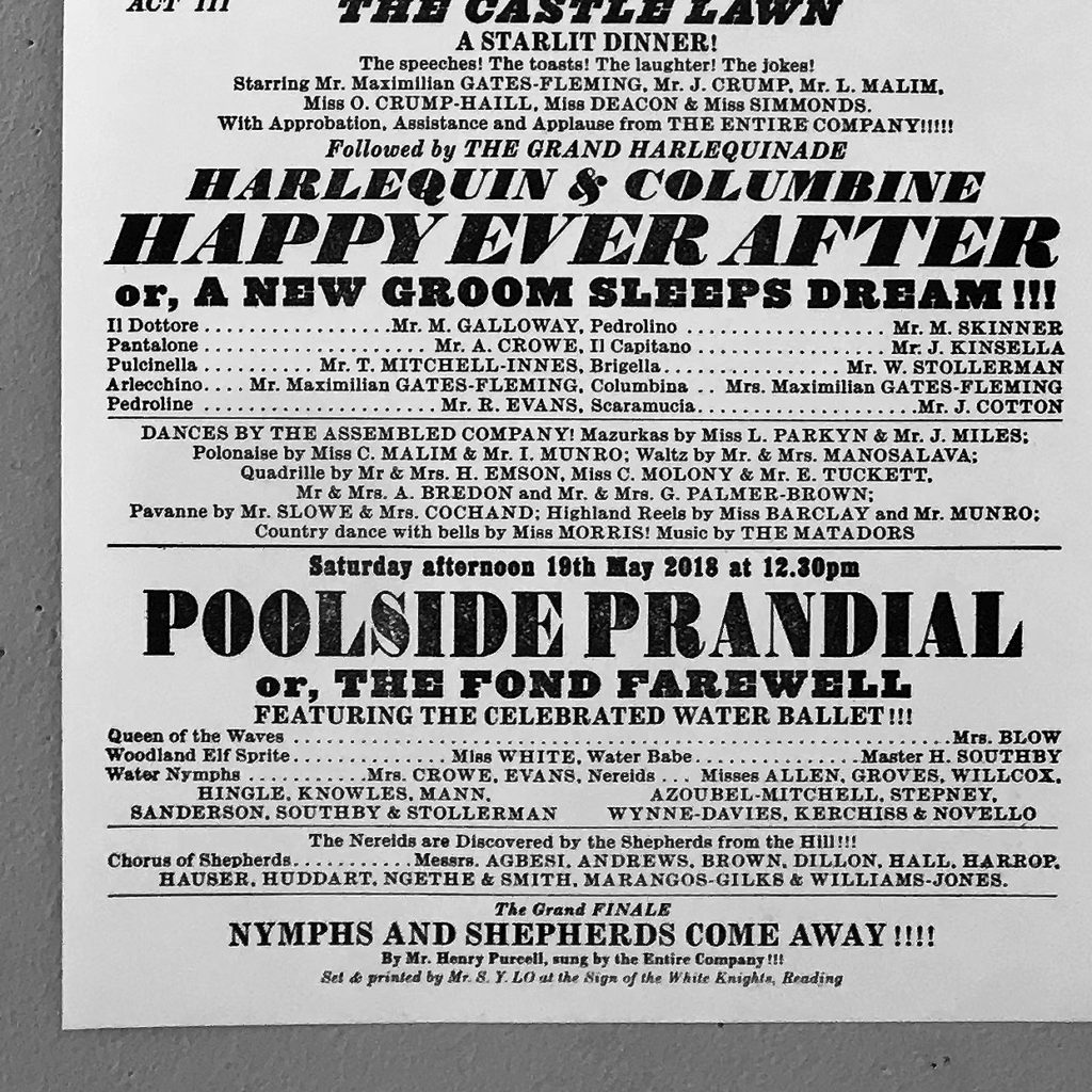
The design process began with some research on theatre playbills and the type designs popular during the time they were produced. Having the technical knowledge from Rob was also key in shaping the final design. Rob helped me make adjustments to the typographic treatment of different elements on the playbill so that they would be sympathetic to the way these playbills were produced in the 19th century. While we were fully aware that this playbill would reflect the present technology it was created with, we felt it was still important that it honoured typographic tradition it was inspired by and based on.
An early iteration of the playbill had type in too many sizes. Letterpress printers then would not have the same display face in many sizes, and my playbill design had to reflect this constraint. Furthermore, the early design had too much variation in the types of rules used. The spaced ellipses separating content on the same line was also unusual for the time. Both these elements were pared back in the final design. Rob also suggested I adjust the kerning settings to make the spacing between letters look ‘wrong’. This would reflect the way letterpress printing created slightly more irregular spacing between letters as they would not have been kerned the same way they are in desktop publishing softwares.
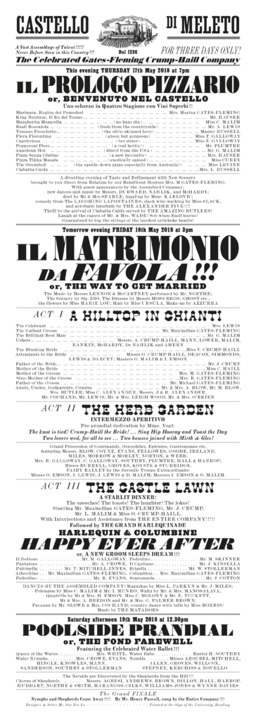
When the design was more or less finalised, I suggested to the client to consider having the playbill letterpress printed. In order to achieve this, I explained to the client that we would have to order the plate for printing from Lyme Bay Press early to allow a few days for delivery and for me to produce the playbills in the print workshop. This change in production method spurred the client and myself to work towards agreeing on the final design and make all content changes necessary quite in advance.
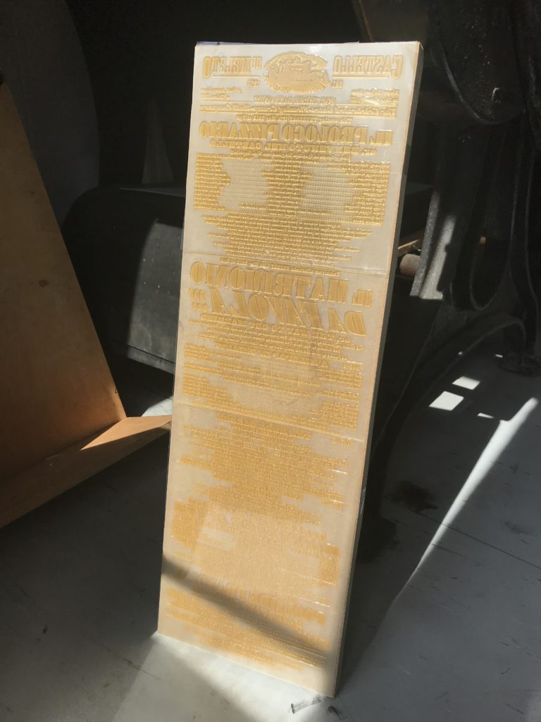
The final design of the playbill was letterpress printed from a single block specially made by Lyme Bay Press for this project. The photopolymer etched plate we ordered was delivered to us at type height, ready too print with, and was able to capture the tones of the small image at the top of the playbill. A few tries and adjustments with ink application and quantities was needed to create a print that was richly black but still showing slight imperfections unique to the letterpress process.
Learning points
Through working closely with the client on this project, I was able to appreciate the level of detail and motivation the client was working with. Cathy was very enthusiastic and complementary in her communications with me, but was still very firm and clear in her instructions and wishes. In a way, working to such a tight deadline and so closely with the client really pushed me to want so much more out of this project than I initially expected. By throwing myself fully into this project, I became fully invested in achieving the best possible outcome I felt was realistic for the timeline, and I did not want to let down the client in any way.
I was given the freedom to invest all my attention into the design from when I was assigned this job instead of finalising the restated brief before beginning work. I understand that not all jobs should be approached this way, but both Rob and I felt it was appropriate to move on with the design work early on.
My largest takeaways from this project were the knowledge I’ve gained from supervisory advice and feedback from Rob regarding 19th century commercial printing types, and the close working relationship I had with the client that drove the design process and made the project enjoyable.