
The context
Our client is a working artist and art lecturer at the University of Reading, Christine Ellison had a continuing interest in exploring the relationship between the digital and the traditional, taking digital symbols out of their context and how they can enable new experiences or interpretation of the same symbols. This continued exploration has lead to her previously collaborated with dancers and musicians in performance art pieces, and wanted to move on to explore how the same brief would be interpreted by a graphic designer.
The brief
The brief was to produce a series of booklets that would act as scores, which could be interpreted by choreographers for dancers and musicians. The client’s previous work was inspired by the mechanisms of digital interfaces, for instance, how things move digitally, the language of digital commands and how they translate when they are out of their context without digital tools. The idea came to her from looking at structures instead of graphical screen interfaces, and through observing the different physical qualities of objects on and off screen, for example, how on screen there is no gravity and things can scroll almost infinitely. Christine wants to produce a designer’s response to her work, applying concepts of digital mechanisms to traditional formats of print and paperwork.
Aims
- Create a performative graphic score in response to the client’s previous work, offering a designer’s view and therefore a different perspective to the client’s chosen subject matter; digital movement translated through print and paper finishes.
- Create dynamic printed booklets that explore concepts of digital movement through paper folding and print.
- Show how taking digital symbols out of their context can enable new experiences or interpretation of the same symbols
- Create a series of booklets that can be interpreted by musicians and dancers.
Proposed outcome
Our final proposed outcome was a series of 5 booklets, each one depicting a different action found on a digital interface:
- Loading
- Drop Down
- Scroll
- Mute and Unmute
- Maximise and Minimise
All booklets fit to an A5 format when folded and held together with a belly band. It was required that each booklet exploring the way paper folding and cutting can mirror the titular actions.
Research and ideation
The brief went through many iterations before we settled on the final design and format of the score. Both of us had never been involved in a project that was so experimental before and so it was both a challenge as well as very interesting having to adapt our normal way of working through a brief, to fit with the way our client would work through projects as an artist. As an experience, this benefited us greatly, as it encouraged us to explore a new way of working as designers, developing our practice.
In our first meeting with the client we discussed her influences and inspirations for the project, in order to gain a clearer grasp on the outcome she was striving for. A key influence for the project being avant-garde scores, examples of which were created by artists such as:
- George Maciunas
- Allan Kaprow
- Cornelius Cardew
- Pauline Oliveros,
- Post-digital Print, a publication by Alessandro Ludovico
- Traumgedanken: A physical hyperlink book by Maria Fischer.

In this initial meeting with Christine, she showed us her cut out digital symbols, and how she was using them to create layers and backgrounds. At the beginning it was a bit difficult to understand her way of thinking and how we will be able to use these symbols to create an outstanding deliverable. Therefore we found it very beneficial to research the work she had undertaken as part of the project before, thus we watched her previous performances and she talked us through them in order to help us understand how she was currently experimenting with the subject matter. With a project that was so vague we found that frequent communication and meetings with the client and our supervisor were incredibly valuable in ensuring that everything was progressing and travelling in the right direction.
Design process
Due to the nature of Christine’s practice as an artist, this real job did not follow the usual structure, since her interest was to produce a collaborative project between artist and designer. Therefore a majority of the process for this brief was experimenting backwards and forwards between us in order to establish what worked and what did not.
In the preliminary stages of the project, the idea was to include all processes within one product. Each sheet of paper representing a different element; symbols, grids, desktops and colours. The colours to be RGB (red, green and blue), as the symbols are digital and we thought it would be the most appropriate to include digital colour versions.
This however would have needed to be printed on A1 sheets of paper, due to the scale of each mechanism within the paper. Printing to this scale proved to be way beyond the client’s budget. As well as the interaction and movement of the paper at this side being very clunky and overwhelming, this was agreed upon by both our supervisor and client. It was through realising this, that we gained an understanding for the compromise that is often necessary in design, balancing the budget with producing interesting printing details and production.

Due to how overwhelming the digital processes were when they were all combined into one format. We developed the format into a series of booklets, separating out all the different movements.
Loading
The target with this booklet was to use the assembly of cuts and folds to mimic the turning and spinning of the loading symbols. This is also an example of how we utilised transparent paper in order to creating a more dynamic and interesting visual, creating more depth to the design.


Drop Down
The drop down booklet uses the same spinning mechanism as ‘Loading’, however, we used the arrow split in half as a prompt to complete the action.


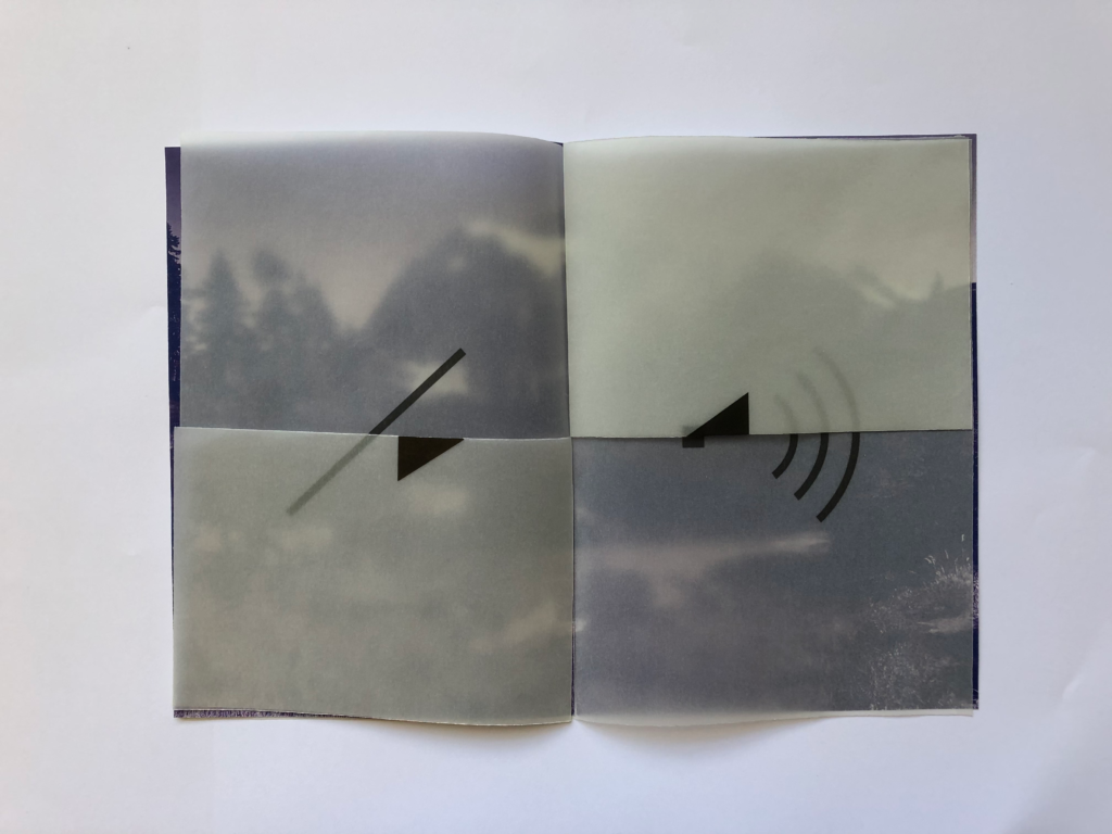
Unmute
The Unmute booklet works to mimic the changes between sound and mute as it appears on a computer when changed. The user is encouraged to jumble the different shapes to create new and interesting iterations of the shapes that make up the mute and unmute symbols.


Maximise/Minimise
This booklet simply increases in size as you see the maximise symbols and then decreases as you see the orange and red minimise and close signs. This is supposed to be a direct translation of the way these buttons work on screen. The simple folds into quarters means that this is interpreted very simply yet it still creates an impact.


Scroll
Again the folds are used to detract and increase the size of the canvas in order to mimic the actions the booklet is portraying. In this case; ‘scroll’ and ‘snap to grid’. Both sides showing images that grow or shorten depending on how it is folded.


Each booklet featured one command, which would also be the only word(s) featured. All other directions and instructions would be guided by arrows or left to interpretation by a user. We established a consistent graphic style through the collection through the use of Helvetica (a default typeface associated with digital interface), at only two sizes, as well as consistent use of the same symbols and illustration styles across all booklets. Overall, we tried to strike a good balance between the digital and the traditional, the texture in the paper and handmade symbols, representing the traditional, whilst the clean and clear typesetting and styling integrated a more formal digital element.
When it came to finding a way to still connect all the booklets, we settled on a belly band featuring the name of the project, it acted as a binding agent for all the booklets as well as a cover for the collection, giving suggestion for its intentions and use.
Overall reflection
We worked well from the beginning to build a good relationship and communication with the client. Through this project we tested our time management skills, and we managed to stayed on top of it as we worked regularly and met weekly with the client, with new ideas and corrections each time, and she was able to give us feedback. Throughout this project a huge help was our supervisor, as this was no regular project with well structured steps. He was helpful in reminding us to push for progress and gave us suggestions and tips to help navigate a brief that was so different and new to anything we had explored before.
As has been suggested before, the main challenge was continuing to push the project forward, since the brief was quite open, the client was keen to explore as many avenues as possible, however, the overall time frame did not allow for so much time spent experimenting with ideas.
Due to the continuous nature of the project, the client did not have a set deadline for this project, to create a clear and structured schedule we set a deadline to finish the design process at the end of March. Unfortunately, this was not met as we felt it had more potential and we decided to extend it for May.
Chrystalla Panayiotou & Jessica Downie