
Real Job: Our students asked if they could build and manage an Instagram account for the Department. https://www.instagram.com/uortypography/ @_timwatkins @UniofReading
Category: Real Jobs
A History of Sport at Reading
This is a progress update report for a project being completed for University of Reading’s SportsPark, which is still ongoing at the time of writing. Though the original intention was to submit this project complete at the end of my degree, the interruption to the academic year and closure of public resources (caused by COVID-19) have impacted the concluding stages of the project. As the project is not yet fully complete, this report not only reflects on the progress up to this point, but also highlights the future intentions for the ultimate conclusion of this project.
Initial Steps
After being allocated the job, arranging to meet with the client in person was a top priority. I needed to introduce myself to the client, as well as gain an understanding of who I would be designing for. With a number of parties involved in the production of the publication on the client side (including a researcher, writer and project supervisor), I requested that we had an initial meeting with all parties present. This would allow us all to build a foundational understanding of what each person would be responsible for and ensure everyone was on the same page. It also provided the possibility to share opinions and thoroughly talk through initial ideas through verbal conversation that emailing back and forth would have complicated.
The Restated Brief
Restating the brief before diving into designing is good professional practice and is a key aspect of the design process when completing any project. By restating the brief, the designer can establish exactly what is required and expected from them, both from a design aspect as well as in a professional capacity. It is key for showing the client – and yourself – that you have understood what they are after; and if not understood, it means any misinterpretation is addressed before designing starts. It also provides the client and designer alike with a point of reference throughout the design process, keeping the project focused and on track with a mutual agreement stating how the job will ideally progress. With an initial face-to-face meeting with my client lasting over an hour and then follow up emails providing additional information to questions raised but not able to be answered at the time, creating an accurate and comprehensive restated brief was made easier.
The brief was to produce a commemorative short run booklet along the same lines as the 80 Years: University of Reading booklet, approximately 40–48 pages in length, about the history of sport at the University of Reading between 1892–2018. Commissioned by UoR SportsPark and overlooked by the Director of Sport, the booklet would be written by a retired professor of English at UoR based on the research conducted by a retired UoR Historian. The goal is to hand out the booklet to anyone who attends the launch of the new active campus strategy during the second induction to the sporting hall of fame in the summer of 2020; at which there will also be three celebrity ex-athletes in attendance. It must communicate the University of Reading’s rich sporting history with incredible sporting success and will help encourage and promote the improvement of health of the young, as well as academics, through sport.
Although outlining the required deliverable was made relatively straight-forward due to the initial in-depth consultation, one of the more challenging aspects of restating the brief was creating a prospective schedule of deadlines. The project had an open and distant deadline, one much longer than I have been restricted to in the past. This made it hard to know exactly how long I should be giving for each stage of the design process. I learned that starting by outlining what would be required on the completion of the project and then working backwards from the final deadline was a useful way to tackle this challenge of a long deadline. This process not only made me have to consider my own time and project management skills, but it also pushed my leadership qualities as it would be my scheduled timeline that the client would work to when holding up their end of the project.
Design Process
It was my challenge to create a traditional and classy design with a modern twist. The historic and academic aspects lend themselves to a traditional style of book design, however, the sport aspect gave the opportunity for exploring an experimental, modern and dynamic piece of editorial design. The design process can be slit up into 5 key sections: Research, Document Setup, Copy, Imagery and Cover Design.
Research
Upon meeting the client, it was made apparent that most of the thorough research regarding the content of the booklet had already been completed. However, the writing of the prose had not yet been finalised, with refinements and fact checking still being completed. Although not provided with the text in the early stages, I was provided with copies of some of the raw research files to get started. While I was awaiting the writing of the final copy, I took it upon myself to do a bit of background reading of the research notes and started to think about the potential feel of the booklet, as well as source some of the easier to find images referenced in her findings. Through doing my own research using resources such as the Reading University Boat Club website, I in fact raised the issue of some discrepancies in a couple of areas of research, identifying where dates had been miswritten and some facts were mistakenly repeated for multiple dates. This meant the mistakes could be addressed before designing occurred, elevating a potentially larger knock on affect. This taught me that being proactive in the early stages of the project, even in a time where there is seemingly little to do, in fact is useful to the progression of the project later down the line.
When thinking about the possible design of the booklet, I was informed that there were no University branding guidelines to be adhered to. Having said this, the client was very keen for the booklet to take inspiration from the 80 Years: University of Reading booklet. It was indicated that the client was after a similar composition; utilising a comparable timeline system as well as the manipulation of images, captions and pull quotes. This gave me a great starting place in researching potential formatting through an existing publication. I first read through the booklet leisurely to get a feel for the style, before then looking back over the design with a critical eye and trying to identify the underlying grid system and paragraph styles.
Document Setup
The client specified in the briefing that they would like the design of the booklet to resemble that of the 80 Years: University of Reading booklet. This was helpful for me as it not only gave me a clear structure and template to follow, but it also meant I had the possibility to start setting up the document before I was supplied with content. In preparation for the copy, I set up the file to the fullest extent I could including: page size, margins, the grid, a few paragraph styles and furniture. I also thought about the rough composition of how text and image elements interact. Having this prepared in advance of receiving the copy was hugely beneficial, as it meant I could simply feed the copy in as and when it was provided.

Copy
Allocated this job in June 2019, at the end of my second year of studies, my hope was to get a first draft of copy set before going back to study for my final year. Knowing I would be hit with a lot of university work from October onwards, it was my aim to spend my 4-month summer break working on the booklet to get as much done before returning to study, however, this was not to be. Unfortunately, I was informed that the copy was still being written and initial draft copy would not be available until October 2019. While this still gave a fair amount of time before I would have to ultimately submit in the spring of 2020, dedicating time to designing the booklet would now have to be fitted in around five other projects and dissertation writing. While this disrupted my initial plans, it encouraged me to develop my time management skills by allocating a set time every week to work on this job.
Once I got the copy, there was a lot of ‘cleaning’ required with an abundance of random tabs, double spaces and incorrect use of punctuation such as en dashes – sifted out by using the ‘Find and Replace’ feature. This kept me busy for a while as I tried to get each element of the text ready for flowing into the .indd template I created. My primary focus was ensuring the type was set perfectly with paragraph styles, before worrying about addressing the flow at a later date. I also knew the copy was subject to change through revisions, so did not want to spend long adjusting the flow only for it to be changed. When the copy was revised by the client, the full word document was sent me, instead of just indicating the changes. To help identify what the changes were, I utilised Microsoft Word’s compare documents feature which clearly highlighted differences between the two documents. This meant that I could manually enter the small changes directly into the .indd file, instead of having to repeat the process of cleaning and formatting everything from scratch again. This was a new technique that I learned on this job and it helped to drastically improve my work rate.
Only when I received acknowledgement from the client (after multiple copy revisions) that all the copy was final, other than possible minor spelling or grammar fixes, I began to address the flow of text across each spread. After setting the text as desired I showed the progress to my supervisor who said “It’s coming along nicely, but refinements are still possible” regarding the typographic detailing. I then went through the copy with a fine-toothed comb to pick out all the fine typographic details originally missed as well as improve the overall aesthetic of the text blocks. This included instances of tweaking hyphenation and justification for certain occasions, manually inserting thin spaces where required and inserting forced line breaks to make a text blocks visually flow better. This process helped to improve and develop my understanding and application of good typographic practise.
Imagery
Although the primary research was complete, it was my job to trace the images referenced as well as source my own images where required. Sourcing imagery was one of the most challenging tasks of the whole project. While some relevant images were referenced in the research files, many of the images were originally published in newspapers and were too poor quality to scan and reproduce. Although I sourced some images at the beginning, I would not know exactly which images would be useful until I set the copy and identify how it ran in the booklet. Because of this, I decided to wait to source further specific images until I had the copy set. While it was important to source as many images as possible before beginning designing, the research phase of collecting content was an ongoing constant in this project, sourcing images as and when they were required.
With the copy set, I could begin adding in some of the images already collected where relevant. This left me with a clear indication as to what images would still need to be sourced for which pages. To help source some of my own images not referenced, I was introduced and given access to the UoR asset bank, an image catalogue new to me. This resource proved vital for sourcing and downloading high resolution and loyalty free University of Reading images. I also used other image banks such as the Reading Museum’s archives as well as university associated websites such as the RUBC website. This process of trawling through archives to find, often obscure and low profile, images of historic events dating back to the early 20th Century significantly improved my knowledge of image sourcing. As well as this, a lot of the images needed correcting to become clearer and to appear visually consistent throughout the booklet. An example of a before and after is shown below.


While sourcing images was going well, I decided I would pause my search to focus on completing other university projects. My intention was to return to finalising imagery by sourcing books referenced from the collections at London Road once I had some free time after submitting my other projects. However, the three months I put aside for this have been scuppered by the current circumstances of COVID-19. I have been left unable to access all the initial research files and my personal notes on the project left at my university address before the ‘lockdown’ but still tried my best to source the images. Due to the closure of public resources including libraries, it was not possible to access a book in the collections, from which a number of the images were referenced. I did not let this hold me back though and strived to see what I could do to acquire the resource. I found what I thought was the referenced book online and ordered it for delivery to my home address. Unfortunately, it would appear that it was in fact a different publication with the same title and did not contain the required images – although by chance, one image which was useful. At a time in which I was unable to access physical collections, I had to return to the internet as a key resource for sourcing images. However, this was not without its frustrations too, with access to the key resource of the asset bank unavailable due to maintenance for the past two months. In order to get the book closer to being finished, for the purpose of submitting as complete project as possible for my degree, I had to unfortunately use some sub-par images. Some images are currently placeholders until I can regain access to a better solution. This has left the imagery in the booklet in a position of looking complete in terms of no missing/blank pages, but it is my full intention to replace these when times return to normal.

In hindsight, I could potentially have alleviated the issue of having to source replacement images had I made a conscious effort to source more of the images earlier. However, I do not believe I could in any way have accounted for three-month disruption caused to the time I set aside for this project at the back end of my studies. The most notable point from this is that, even if you plan your time well, unforeseen circumstances can still occur. Instead of giving up, it is important to show commitment to the task at hand and continue to find different possibilities to resolve issues and strive to complete the work to the best of your ability.
Cover Design
While the cover of any publication is important, in this instance, there was slightly less pressure for the cover to sell the publication as it would be given out at the event. Having said this, creating an intriguing and striking cover would set the mood for the rest of the publication. The current cover design is a nod to the Sports Hall of Fame housed in the Sports Pavilion on University of Reading’s main Whiteknights campus. This ties the cover visually to the event at which it will be distributed while still being slightly ambiguous to intrigue the audience. The current cover is shown here but is possibly subject to change further down the line.


Production
Due to the present circumstances, I am currently unable to send the booklet to print, not only due to additional image sourcing still required, but also the fact that printers are currently not operating. I did however still learn new production skills as I had to complete a print specification in order to receive an estimate for the job. Although production is often seen as the final stage after the design is signed off, this process taught me that it is integral to the whole process. Acknowledging aspects of the production such as physical format, stock materiality, printing processes, binding methods, print run and costs is vital to influencing design decisions.
Unable to print and photograph the completed publication, I have created a series of mockups to showcase the prospective final deliverable in a manner which resembles its ultimate intended format.


Reflection
Client Communication
It was vital to establish how best to stay in contact with the client right at the start of the project. It was agreed that emailing regularly would be the best way to keep up to date with progress reports and for the client to provide me with content. We also arranged to conduct meetings in person at various landmarks in the process. While it was possible to send over basic queries and reports, the most useful conversations happened in person. It was possible to send over PDF files to provide context to a question, but assessment of the final feel of the book could not be asses like this. For this, we had multiple physical meeting in which I delivered draft spreads trimmed to the eventual size for us to be able to evaluate together. This meeting in person helped to forge a strong client–designer relationship and was a good way to assure the client that the project was under control.
With an open deadline, it is very easy to have the mind set to put the project aside, forget about it and worry about it at a later date. To ensure this did not happen, I made sure that I stayed in regular contact with my client informing them of my progress. While progress was slow at times, I made sure to email my client to let them know where I was with the project to keep them in the loop. I believe I stayed in contact well with the client throughout the long process by communicating clearly, effectively and professionally on a regular enough basis.
Overall Success
As of writing this report, there are still further details that I need to continue to address, however, I believe the current submission is a comprehensive representation of the final intended outcome. In evaluating the outcome, I believe I have created a polished booklet which, with a few minor alterations, will be exactly what the client requested. This project strongly helped me to continue to develop my advanced editorial skills with a number of typographic and pictorial variables and challenges tackled.
Although not currently finished, I believe I can be proud of how I have worked throughout the process up to this point. I have thoroughly enjoyed the pleasure of being able to work on a project with a topic which I have a genuine interest in and feel a personal connection to having competed in sport during my time at University of Reading. While this project has been submitted in an incomplete state for the purpose of my degree, I fully intend to continue to improve this project to deliver the client with exactly what they are after. I am motivated to not only prove to myself that I can do an improved job, but also to deliver the client with the perfect publication that they deserve.
I learned a lot from this project, not least that working to a distant deadline can in fact be just as difficult – if not more – than a short one! This job has tested my commitment levels and I believe I have passionately shown my pledge to providing my client with what they want, no matter the circumstances.
A zine to create awareness and celebrate diversity
Real Job: Martha and Seniz led Typography's diversity project this year, culminating in the production of the second issue of our 'zine for the creative industries. @UniRdg_Diverse
Communicating with Care Homes About the Usage of Antipsychotics in Dementia
Real Job: Izzy Bahrin developed an information poster to raise awareness of issues around the prescription antipsychotic drugs for dementia patients. The project supported the work of @PDonyai at @RSofPharmacy @UniofReading
>A-Z Degree Show 2020 (Website)
Real Job: Amrita and Chia-yi created the site at https://greater-than-a-to-z.co.uk . Their report makes clear the value of learning how to communicate effectively with IT professionals in order to bring a design vision to life. Special thanks to @UniRdg_IT for supporting this project throughout.
Adherence to medication – interactive designs
Adherence to medication – interactive designs (RJ00394) Report
Background
The client for this project was a PhD student named Othman, who I was not in contact with directly. Instead, I was communicating through the Director of Pharmacy Practice at the Reading School of Pharmacy, Professor Parastou Donyai. Othman was seeking a graphic designers’ input into the formatting of cards, posters, and/or booklets, created to change the way in which health professionals and patients interact when discussing medicines. Initially, the specific focus of Othman’s work was breast cancer hormonal treatment, and its wide range of side-effects. However, in the later stages of this project, the scope was broadened to cover multiple medical issues and procedures.
Restated brief
This project required a booklet which could incorporate icons and words to help patients and doctors communicate efficiently in the short time frame they have together. This particular booklet is designed for a PhD student from Reading University. Both he and his supervisor, Professor Parastou Donyai, were very flexible and open to any form of layout, design, and images used. As such, and given the broad specifications given for this project, there was considerable scope for experimentation.
Aims
- Design a form of visual communication between doctor and patient which would look good in both colour and black and white;
- Design a booklet that works in printed context;
- Design a system of icons to facilitate easier communication for those who are unable or struggle to communicate with their doctor.
Audience
The audience for this ‘Real Job’ project could be a range of different people, as there are many different reasons why a patient may not be able to communicate with their doctor easily. One common example is where a patient’s first language is not English, and therefore struggles to understand or relay information effectively to their doctor. Other people who may find this helpful could be those with learning disabilities, whereby icons may open up a more accessible means of communication with their doctor. Another group of people that may also benefit from a booklet like this are those with memory problems, with the booklet providing a useful place to record previous symptoms and what steps should be taken next. I therefore expect the audience to range in age and ethnic background, which is something I will keep in mind when designing the icons, as I would like them to be inclusive to all. However, the treatments referred to within these booklets are only prescribed to women, and therefore men are not included.
Expected Deliverables
- Medical icons
- Booklet for icons
Personas
Name: Georgia
Age: 19
Needs: Georgia has a learning disability, so loses concentration during doctors’ meetings. She therefore needs something which uses imagery rather than words, so that Georgia can easily recognise and retain the information she has received.
Wants: An image-based communication system so that she can remember the next steps in her treatment and understand clearly what the doctor is describing to her.
========
Name: Grace
Age: 61
Needs: Something either she or a doctor can write notes on when she attends appointments, so she does not forget what has been said and what she is to do next. She also needs clear text or large images as her eyesight is not very good.
Wants: A place she can write any notes prior to and after doctor visits, as these are short meetings and she is worried that she will forget important information that has been relayed to her.
========
Name: Sara
Age: 45
Needs: English is not her first language, so she is often unable to know what was said in her doctor’s meetings, and therefore needs information to be translated for her.
Wants: An easy way to communicate to her doctor what is wrong without the use of words, and for her doctor to easily describe the next steps and possible treatment(s). Either images or a place for her and/or the doctor to write notes to be later translated would be most beneficial for her.
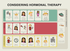
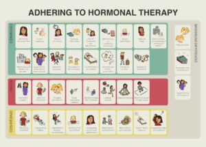
Research

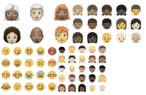
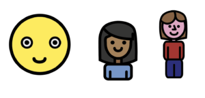
The above images display the original icons and layout that the information was relayed in. To begin my research I used this set of images, created by my client, as a base to work from and to improve on. From here, my research into this project continued by exploring different icons and the shapes used in them. This included the widely used emojis, which are mostly viewed on smartphones and screens. I therefore had to be mindful of the fact that these might not be suitable for the booklet, which needed to utilise larger, more complex, and printable icons. An example is these more unsuitable emojis are seen below:
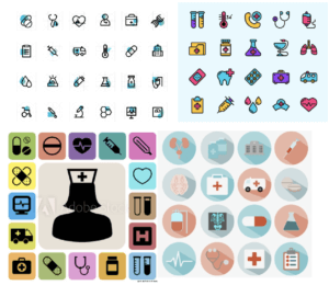
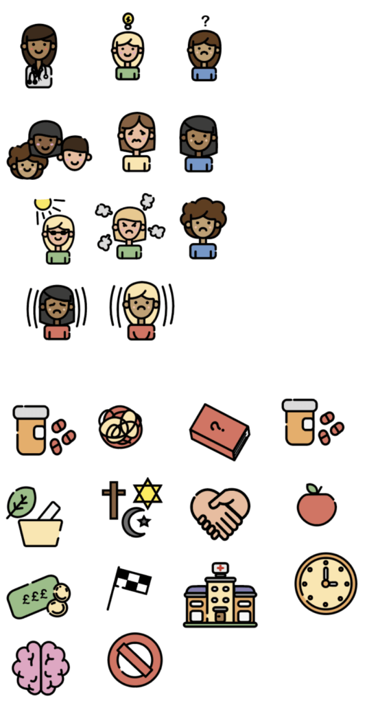
I then expanded my research to discover other forms of icon design. This led me to explore formats for icons specifically used within a medical context. I kept my research very broad originally to help me explore this area widely, from colours which stood out, to shapes which were appealing; as shown below:
Icons
From this research, I went on to draft a few hand-drawings of how I wanted the icons of people to look. I started with drafting these as I felt they would be the most used and essential to the overall look and feel of the booklet. It was important that these face icons could be easily adapted to be inclusive to all. As such, I tried to keep the detail limited, and incorporate the rounded cartoon features I had discovered from my previous research (as seen below).
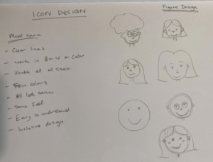
I then went on to transfer a few of my hand-drawn images into digital form, as seen below in the form of Concept 1, 2 and 3. Concept 1 is very limited in its design features, and has taken inspiration from emojis used on phones. This would mean that patients may already be slightly familiar with how these looked, and would therefore find communicating through these easier. However, I concluded that the lack of detail in this concept was too limiting, and may not reflect complex issues well. Concept 2 was designed upon reflection of Concept 1, through increasing detail, then adding some style aspects to be replicated within the rest of the icons. I then went on to create Concept 3, which had more detail and displayed a full body look. I felt this was too complex and may not work so well at smaller sizes. I decided to use Concept 2 as the one to base my other icon designs upon for my booklet. I then developed Concept 2 further to create the final look – as seen in Concept 2 (developed) below as the final icons.
Concept 1 Concept 2 Concept 3
Final Icons
Layout
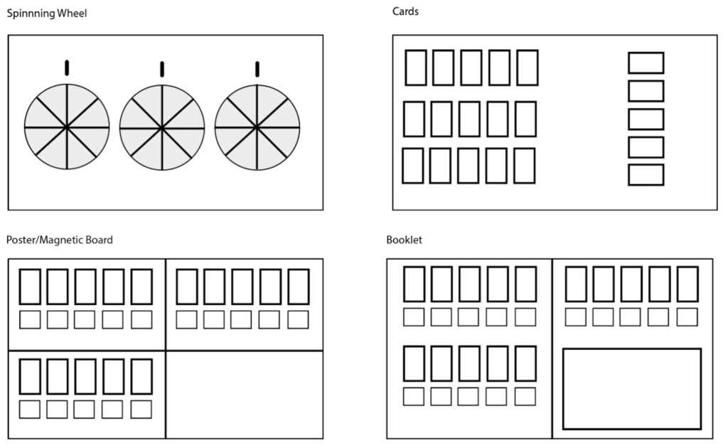
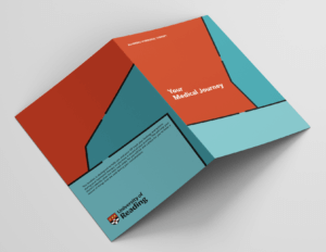
After further developing my Concept 2 to create the final icons, I discussed with my supervisor, Mathew, how best to create a layout and display these most effectively. Originally, my client had portrayed them in the form of a poster, however, they were open to any experimentation (which we discussed extensively) to work out what would suit the patients and doctors best. I designed many different layouts, including a spinning wheel design, a different poster layout, cards, and a booklet (as seen above). My client liked the idea of a set of cards or a spinning wheel best, however, when discussing the practicality of these with nursing students, as well as some research into doctors appointments, I found that these layouts may not be so suitable. The spinning wheel I felt would be too childish and make their symptoms and appointments appear like a game. Similar feelings were felt towards the cards. Another issue with using cards is that they could be easily lost, and when coupled with the expense of printing, it was deemed unfeasible given that they needed to be distributed to both doctors and patients. After this research into the layout, I found the booklet format to be the best for both patients and doctors. I decided to keep this as a format which could be printed on any at-home printing device, hence I decided on an A4 format to be folded into a booklet. The hand-drawn evolved design concept for the booklet can be seen below:
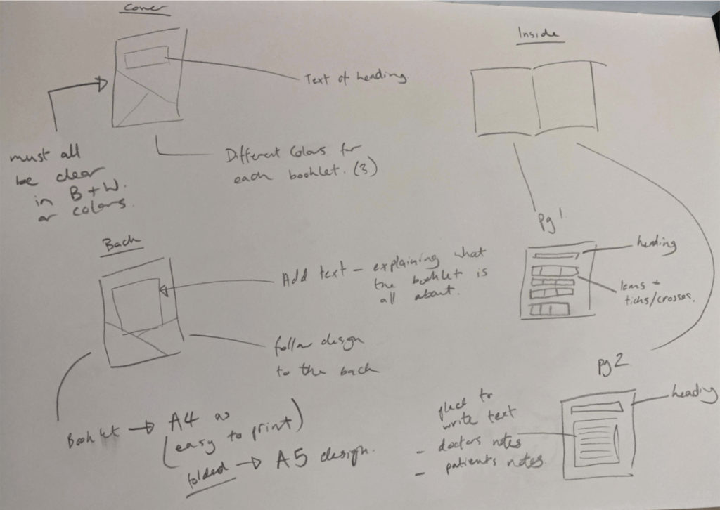
I wanted a design which, when printed, would be clear as to where it should be folded to create the A5 booklet. As such, I went with cover design 2, as this had different shapes on each side which helped display a clear line to fold along for doctors and clients who had printed this file out.
Inside the Booklet
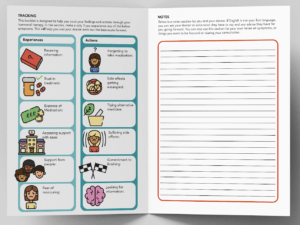
The typeface I decided to use was ‘Avenir’ in Black and Roman. I felt this was easy to read and very clear. From my research, I found that a ‘san-serif’ typeface was best for easy-reading, and as my main users would find reading English challenging, I decided to use this font, which comes in varying forms to create a good hierarchy within the text.
The text I used inside the booklet consisted of:
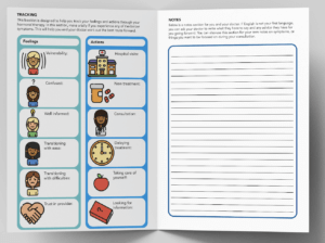
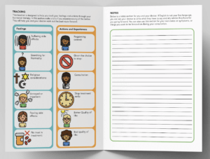
Tracking
This booklet is designed to help you track your feelings and actions through your hormonal therapy. In this section, make a tally if you experience any of the below symptoms. This will help you and your doctor work out the best route forward.
Notes
Below is a notes section for you and your doctor. If English is not your first language, you can ask your doctor to write what they have to say and any advice they have for you going forward. You can also use this section for your own notes on symptoms, or things you want to be focused on during your consultation.
Final Design
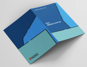
The final design of the booklet was then divided into three different designs, depending on the need for them. These different categories were the same as the three original posters supplied by my client, being: ‘Considering Hormonal Therapy’, ‘Adhering to Hormonal Therapy’, and ‘Stopping Hormonal Therapy’. All the booklets also have a main title which is the same for all; being ‘Your Medical Journey’. I felt this name helped best describe what each booklet was for in a broad sense, without sounding trivial.

Reflection and conclusions
I handed this project in on 25th May. However, I feel this project could have taken less time if I had more contact time directly with the client, instead of conveying ideas through his professor. I also had the added difficulty of Professor Donyai going on leave for a period of time, which resulted in slower communication via email. This ultimately meant that whilst all the ideas and concepts had already been discussed face-to-face, finalising the job was very difficult and time consuming. Having said this, I did have a very good relationship with my client’s Professor, Parastou, and when she was not on leave we scheduled regular meetings, and she seemed very pleased with the final work, (although I am yet to hear back from my original client, Ottman). One main obstacle I faced while undertaking this job was the desire by my client to use a layout which, with respect, I felt was inappropriate. I overcame this by compiling further research to present to her, which helped sway the decision as to the final product. From this, I have learnt to not show or discuss all my ideas before I have more thoroughly researched what I am doing. Furthermore, I have also learnt that I should not present ideas that are not practical or fully considered; as it may be better to present fewer, but more developed concepts, in order to prevent the difficulties experienced from happening again.
APPG on the Microbiome Leaflets
Real Jobs: Chris Lewis and James Ollig worked infographics for a PhD student researching the Human Gut Microbiome on behalf of the All-Party Parliamentary Group on the Human Microbiome @AppgMicrobiome
The DEL Feedback Action Plan
Background
The English Department at the University of Reading required full size A1 laminated posters which addressed feedback and assessment issues in English Literature. The brand identity of the University of Reading was required for example, the Effra typeface and University of Reading logo. One problem reported by students is that they are unable to locate and read their feedback on Blackboard. To help address this, TEL produced some images to use for the posters (and digital posters). These posters are to be displayed in the English department in order to help the students.
The purpose of the A1 posters were to inform the students on how to locate their feedback and how to submit their work. This is due to the lack of guidance on how to use Blackboard and Turnitin. The posters should have a lasting impact on the students so they remember the steps and refer to this throughout their studies at the University. Another key aim of the job was to decode the existing content as, it was extremely confusing. There was not much clarity in the steps and this needed to be condensed into a few posters.
I was allocated this job for a quick turn round in order for the client to gain the correct funding for printing and get the posters up within the department. This ultimately benefitted myself because it meant I experienced the realistic time constraints of a design job.
Restated brief
The Deliverables:
- Feedback and assessment posters. A1 posters, the number of posters required was determined by the design process.
- A digital copy of the images.
A challenge that arose with the brief was the quantity of posters as this was not specified by the client as they were unsure how much of the content would fit onto one poster. When discussed with the clients they advised me to analyse the content initially to understand it well enough to identify how many posters are needed. This helped to narrow down the exact content which is needed and what steps are linked. This meant that I required 2 posters to accommodate all the information, one regarding the feedback and one on the assessment submissions.
Research
Research into existing student faced posters helped to understand the style and stance the content should have in order to draw attention to the posters. Initially, I gained background knowledge on the university brand guidelines from speaking with my clients. They helped me to take into consideration a certain typeface and to ensure the university logo was on the posters. In order to understand where in the department the posters would be placed and whats would be situated around them, I asked my client. I found out that the colour scheme in the English department is blue and the corridors where the posters would be placed are painted a shade of blue. This therefore, enabled myself to experiment with complimentary colours and identify what colour scheme would work. I intended to educate myself on the aims of the client, what they are trying to achieve on a wider scale and how this can be inputted within the posters.
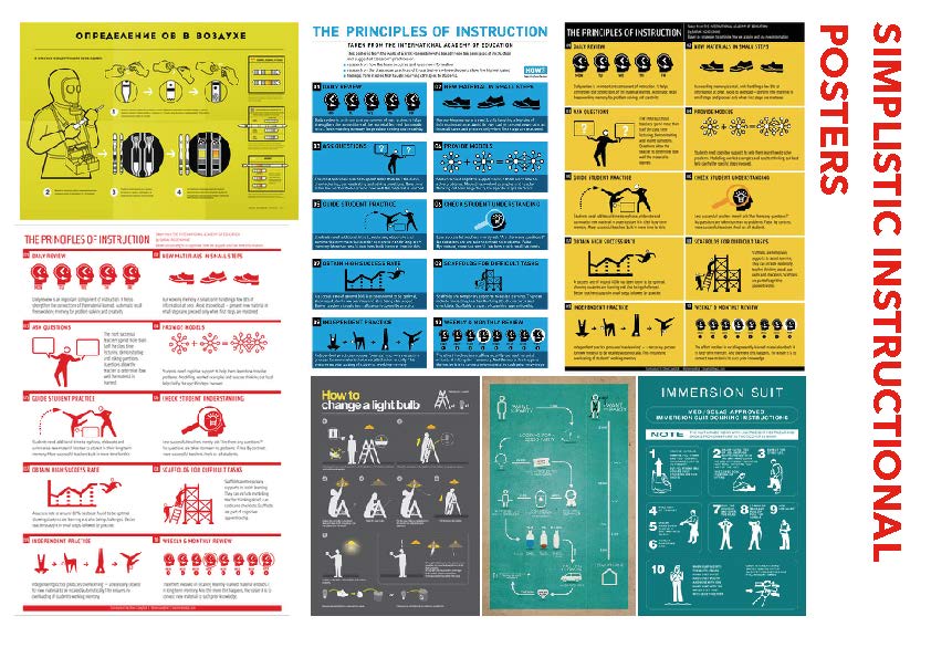
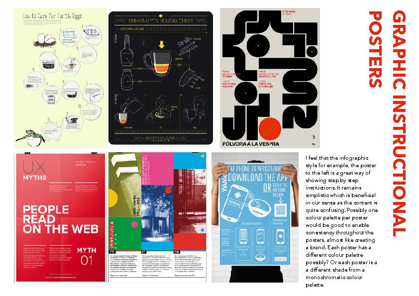
A way in which I collated ideas and displayed them for the client was by creating mood boards. The boards were sectioned into, existing simplistic instructional posters, graphic instructional posters, illustrations, images and icons and typography and brand. The boards allowed me to identify what the client preferred and what direction I should take in terms of style. The clients found this useful as they were able to suggest what they preferred, which gave me an insight to proceed with the designing aspect.
From the feedback from the client I gathered that they preferred a monochromatic blue colour scheme to match the doors within the department. They also suggested for the poster to be a step by step simplistic instructional poster. Selecting some of the images I had included helped me to understand the style they required. However, one problem was that the style did not matter until the content had been organised and re structured. This was a problem due to their being too much content for example, three pages were to be condensed into one poster. Nevertheless, once I had analysed and throughly reorganised the content, the sections became clearer and I was able to divide and produce a plan. Another limitation was that there was only one typeface ‘Effra’ to work with, making it hard to create differentiation between content.
Design Development
The design style the clients wanted were uncluttered, step by step structured posters with a monochromatic blue colour scheme with innovative digital images where necessary.
Primarily, using the style guides I created sketches of how to section the content in a visually appealing way. From these sketches I went on to develop the concept using triangles to section the content. The idea of triangles to direct the user to the next step was developed further. After showing my supervisor my design ideas, he suggested that the differentiation between different sections was still unclear. The titles seemed to get lost within the background colour. The clients seemed to be very fond of the design, however the hierarchy was still unclear and visually confusing like the copy provided. The triangular design was restricting the typographic clarity therefore, I removed them creating a new layout which included new illustrations and column layout. This worked much better and from here I further developed the design. Within a limited amount of time I sent variations to the client, I had to work efficiently as the client needs the posters before a certain date in order to cater for printing. I would gain feedback from the clients as well as my supervisor frequently in order to get a better understanding of what direction to take the posters. Due to the global pandemic of Covid 19 I was unable to show physical design deliverables however, consistent and frequent updates were communicated to the client through email. The client was unsure what size the posters should be once the posters had been completed however, I suggested for it to remain A1 due to printing costs being cheaper as opposed to a custom print. A size are more economically efficient. The client agree and this format has remained.
Final Outcomes
The client has invited myself back to the departments where the posters will be put up to have a look and view people interacting with them. The posters have ultimately been a success and will hopefully show this through their functionality. The clients particularly commented on the clarity and the visual identity of the posters from the colour palette to the typeface. The clients commented that the posters were clear and helpful for students and would fit in perfectly with the department.
Reflection
Challenges were met throughout the process of this job. The biggest constraint being the amount of content being placed into one poster alongside the restricted typeface choice of Effra. This consequently created difficulties in regard to hierarchy, which is extremely fundamental in an informative poster. I overcame this by continuously developing the structure and layout of the poster using space as the factor for differentiating sections and information. Furthermore, due to Covid 19 I was not able to show physical deliverables to the client ultimately making it hard to envision the designs. Although there were challenges the posters were sent of to print at the clients request and at the correct time and I learnt new skills such as working so closely alongside a client in difficult circumstances as well as communicating effectively.
Overall, the job was successful and I thoroughly enjoyed working alongside the clients and was delighted to hear all the positive responses from the client. Not only was the feedback good but it further emphasised that although many challenges could come in the way of the job a professional demeanour and design process is to be retained.
Open Digital Seminar in Eighteenth-century Studies Logo
Real Job: In a month-long project, Ella Griffiths worked with @rebeccabullard, Convenor of @ODSECS1, to update the branding for this online seminar series.
Reading Assembly – Power at Tate Exchange
Real Job: Charlotte Frost created a typographically complex leaflet to outline a series of events led by staff from @UniRdg_Art #ReadingAssembly