The person who’s ideal gift I designed had the following 3 facts:
- Born in Pakistan, moved to the UK at age 16
- Love make-up and fashion
- Want to travel
At first I came up with various ideas e.g. a suitcase which cleans and folds all the clothes and stops them from getting wrinkles, a make-up kit which never runs out of supplies, etc.
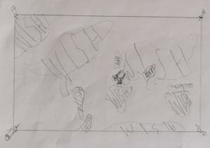 So I developed my ideas and found that the originally most basic idea of a map showing the places they’ve traveled had the most meaning behind it. It shows you where you’ve been and where you’re still going to go.
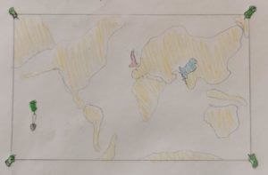
I continued to develop my idea. Turning it into a world scratch map, so only the countries they’ve been and the one they are in stand out.
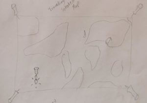
Building on that some more the map gained to ability to transport the person to the country they scratch. So when they scratch Italy for example they will automatically be teleported to Italy.
My 3 random words were as follows:
- cycle
- paintbrush
- vulture
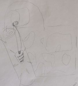 In order to incorporate “cycle” I gave the map it’s own traveling case, with a button-strap in the lid so they can attach their scratching pick. This traveling case also protects the map from all the elements (e.g. water) as well as being the perfect size to fit into a bicycles’ water bottle carrier.
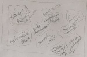 Having successfully incorporated “cycle” I began to think about how I could incorporate “paintbrush”. I began thinking about what a paintbrush is used for rather the brush itself. This lead me to the idea that this magical gift map could show the person some landmarks in the current country to educate them a bit, as well as look pretty. Hence the back of the map will now show them some of the amazing landmarks in the UK, until they travel abroad in which case it may turn into the Sagrada Famila or the Coluseum, etc.
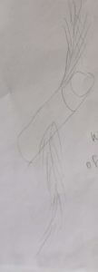 Short of adding a “vulture” painting on the back or front I soon realised I needed to again not think of the vulture directly in order to incorporate it into the gift design. After a while I got thinking about the ideas of vultures flying, so what’s to say this magical scratch map couldn’t do so as well? Taking a bit of inspiration from the golden snitch as well I turned the map’s wings into feathers. To ensure this magical map couldn’t get lost or stolen it will come to the owner when they want it and only opens for them.
Thus came to be the Traveling Map gift idea.

 In June 2016 the British public voted to leave the European Union. Leading up to this people all over Europe participated in a kissing chain to demonstrate their love for Great Britain, there were Brexit protests in London, buildings had the Union Jack lit up on their sides. It was a protest as loving as they come in many ways.


