During the 2nd week of mini-projects I was honoured to meet Eric Kindel who presented me with the brief, that, unlike many others, involved going out and exploring real-life examples of eye-catching type around us. These could have been photographs of logos, singular letters/numbers, 3D type etc. Quite luckily that day the weather was quite good, hence providing us with good lighting and subtle shadows that accentuated any raised type.
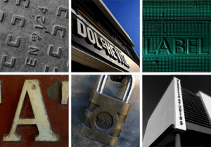 While outside I focused on finding hidden type, one that wasn’t visible straight away, or its features weren’t as obvious from the distance, as opposed to up close. I also tried photographing these examples of type from different angles, especially if it was raised, to see whether that affected how we see it. After we have taken the photos in the given amount of time, we were asked to produce visual collages based on the common similarities between the typography we have taken photographs of.
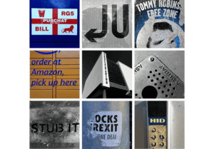 Beforehand, I edited any images I wished to use in this mini project via Adobe Photoshop, which allowed me to emphasise some of the features, and make sure that all images within the collage look visually similar to one another. In some cases, I have also straightened up the photographs, making sure that they have some logical perspective, and are overall pleasing to look at.
Working outdoors really reminded me of what it means to be a graphic designer. Having spent a year in London last year, I learnt that working from home is a challenge, as the best and easiest source of inspiration is the world that surrounds us. During this activity, I also consolidated my skills as a Typographer, as it taught me to explore and type that I haven’t paid much attention to in the past.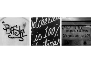

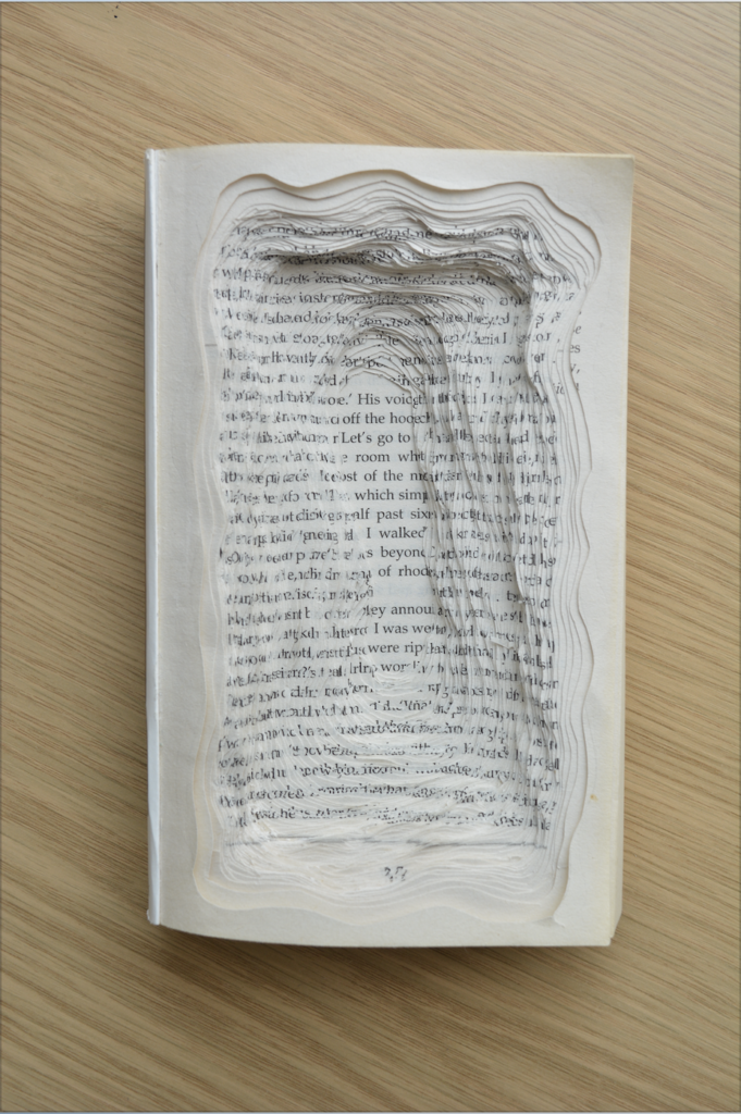
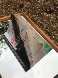
 My chosen theme was labyrinth , in order to emulate that theme, i drove to make my book appear as if it has travelled through a vortex, a journey that can be seen throughout the layers of the book itself. To create texture i shaved down the sides of the pages and carved a whole all the way through to the other side . Furthermore, i singed and burned pages to represent the journey the characters of the book go through . It is distressed with a sense of hope , as there is light at the end of the tunnel i created with a torch , this is able to shine through the book as a whole as creates an interesting aesthetic . I would like to make some altercations such as removing the text of the book from the front cover to create more ambiguity .
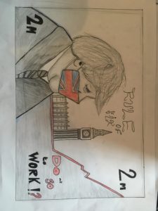 With the design brief , Britain in mind, I thought , as opposed to depicting Britain in a traditional sense, such as with big red buses and telephone boxes, i would display Britain in its current climate during the coronavirus pandemic. This image is a recreation of the British £5 note , with a covid 19 era Boris in place as the key figure on display , using a Great Britain facemask. As a famous landmark, always featured on notes , Big Ben can be seen , this is also to further familiarise the audience with its setting on Britain .The base on Big Ben transitions into the chart for infections on the rise. Further alterations to the original £5 design are the , 2m instead of £5 , in referance to how people had to keep a 2 metre distance from each other during lockdown. The rule of six text replaces, the Bank of England.The final element of text ‘ DOnt go to work ‘ has colour to emphaise how the quote can mean either do or do not go to work , a reflection of the confiusion caused by the Prime ministers speeches.Colour i used sparingly as a display of the dark times we are living in , however, some colour shows that there is still hope . A final addition i wished to have made was to feature a map of Britain in the background behind Boris and Big Ben in the upper half of the note .
 While outside I focused on finding hidden type, one that wasn’t visible straight away, or its features weren’t as obvious from the distance, as opposed to up close. I also tried photographing these examples of type from different angles, especially if it was raised, to see whether that affected how we see it. After we have taken the photos in the given amount of time, we were asked to produce visual collages based on the common similarities between the typography we have taken photographs of.
 Beforehand, I edited any images I wished to use in this mini project via Adobe Photoshop, which allowed me to emphasise some of the features, and make sure that all images within the collage look visually similar to one another. In some cases, I have also straightened up the photographs, making sure that they have some logical perspective, and are overall pleasing to look at.
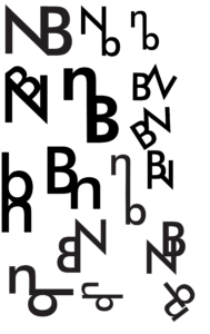 As mentioned previously, the aim of this task was to create a monogram – a combination of two letters, using either Garmond or Futura typefaces. I personally chose Futura, as I am more attracted to the ‘orderly’ aspect of sans-serif typefaces. Initially, I started sketching out some ideas on my iPad, however, I then decided to go back a step and start designing on paper. Personally, I found this a lot more helpful as I noticed that I was generating more ideas while working on physical paper. After generating some sketches in pen etc, I then decided to go back to working digitally. As we were designing monograms (logos for our initials essentially) I decided to use Adobe Illustrator for this task. I first began recreating some of the sketches I have done previously to see what works best alongside the Futura typeface. The first ideas were quite simple and straightforward, a either one or both letters were upright and looked like two letters put together (literally). It wasn’t until I started looking at more abstract versions of my monogram, I began designing monograms that
  had some interest to them. The 2nd photograph on this page presents the design development process based on one of the more abstract ideas I have created previously. First I started by rearranging the orientation of these letters, seeing what works and what doesn’t, and then once I was satisfied with the result, I began rotating the monogram in order to see if it looks different/more effective when looked at from a different perspective. My hypothesis was quite right, presenting the monogram at a slight angle made it look more stylised, almost lik
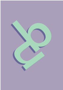 e a logo.
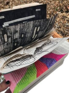
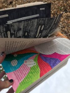
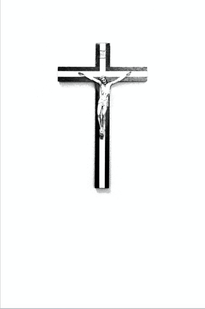
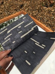 For todays task we were given the freedom to let our creativity flow in this Broken narratives activity. We were given the choice of four themes. I chose the theme ‘stairs’. As stated in the brief a man has been hospitalised for an unnamed disease, the hospital has 7 floors for people like himself, the lower floors are for the more ill patients. He is moved the lower floors as the day goes by he moves further down along the way he reaches a state of hysteric and therefore begins to hallucinate. He eventually reaches the lowest level and therefore death.