Category: TY1DP1

Work by Part 1 students as part of their ‘Design Practice’ module.

The Voyage of Argo

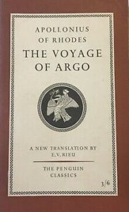
As a part of this project, we were also asked to create our own book cover using our template of ‘The Great Gatsby’ book cover and to interpret this into our own concept whether it be a book or movie as our inspiration. For this, I chose ‘The Voyage of Argo’ as my book.

I wanted to include the Greek flag into my book cover so initially I put two white rectangles in the blue boxes so that each stripe was equal in weight however this made the cover look too busy and very white heavy with the text. As well as this, the text at the bottom and top could not be easily read with the strips of white and blue. To improve on this, I made the white stripes thinner to frame the text and images on the top and bottom of the book cover. This was successful because it is more visually appealing.

I made the decision to remove the cartouche at the top as I felt it was did made the cover too white-heavy. However, I now feel as though this was not the best idea as it does not reflect the original poster.

For the text, I used Superclarendon as I felt it was the most similar to the original cover. I then put a boat at the bottom instead of the penguin to relate to the story and I put the penguin at the top with ‘Penguin Books’ beside it.

PDF: The voyage of argo 01

OK Design Logo

70s furniture inspo

Attached is some research that I compiled into moodboards before starting my logo design task. I wanted to draw inspiration from the 70s aesthetic of smooth curves and very colourful palettes. The warm tones of orange and yellow are prevalent, and typography was also very colourful, with accents of blues being popular too.

I started by sketching out some motifs and patterns that could aid my design process: IMG_0060.HEIC  IMG_0061.HEIC
In these sketches, the model of a “K” became the focal point and I developed it into a vector on Illustrator, which was then matched with an “O” I drew. The counter of the “O” was comprised of the flower motif I drew as a response to the research and my own personal knowledge of the decade. 70s retro logo

I laid out the business card in a few configurations to see how text-heavy I wanted it to be. The final design contained my name, my email, and my logo design. The design behind it was a simple wavy design in 3 different colours to match the colour story from my inspiration.

Gemini Designs

For this project, we were asked to brand ourselves. I had chosen 70s retro style as my theme for my brand and I started by creating a moodboard of images from this theme that inspired me. I decided to name my brand after my own horoscope, which is gemini and this led to me find images of horoscopes designed in the 70s art style as well as horoscope designs from the 70s. I was especially inspired by the circular logos and the horoscopes in the circular drawings.

My first version was inspired by the abstract images from the moodboard and I made an oval shape with two alternating colors with my logo in the middle. However, as much as I liked the shape and text of the logo, I did not like the colors as I felt they did not fit the theme even though they were from the moodboard so I went back to look for more 70s color schemes and decided that brighter colors would fit my logo better.

I changed the colors to blue and pink in the logo shape instead of the muted tan colors and this both looked better and fit the theme better. This was successful because the the logo was more vibrant and stood out more.

i also made another version of my logo but in a circle shape however, I felt this was not funky enough for the 70s retro theme.

For the text, I used Marker Felt as my font as it fit the theme. I added multiple outlines to my text as it was common in 70s text. For this,  I used the same colors from the logo shape.

My 90s Logo

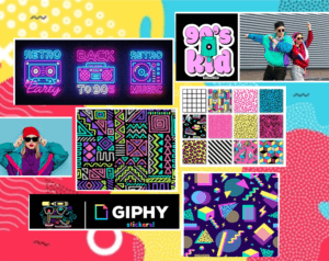
I was inspired by the 90s graphic designs that was full of abstract graphic elements and patterns influenced by fashion and the colorful 80s. It is appealling to me with its combination of colour palette and geometric shapes. Therefore, I create a mood board that shown above, in which I want my logo to have an energetic and colourful effects and adapt them in my final logo design.

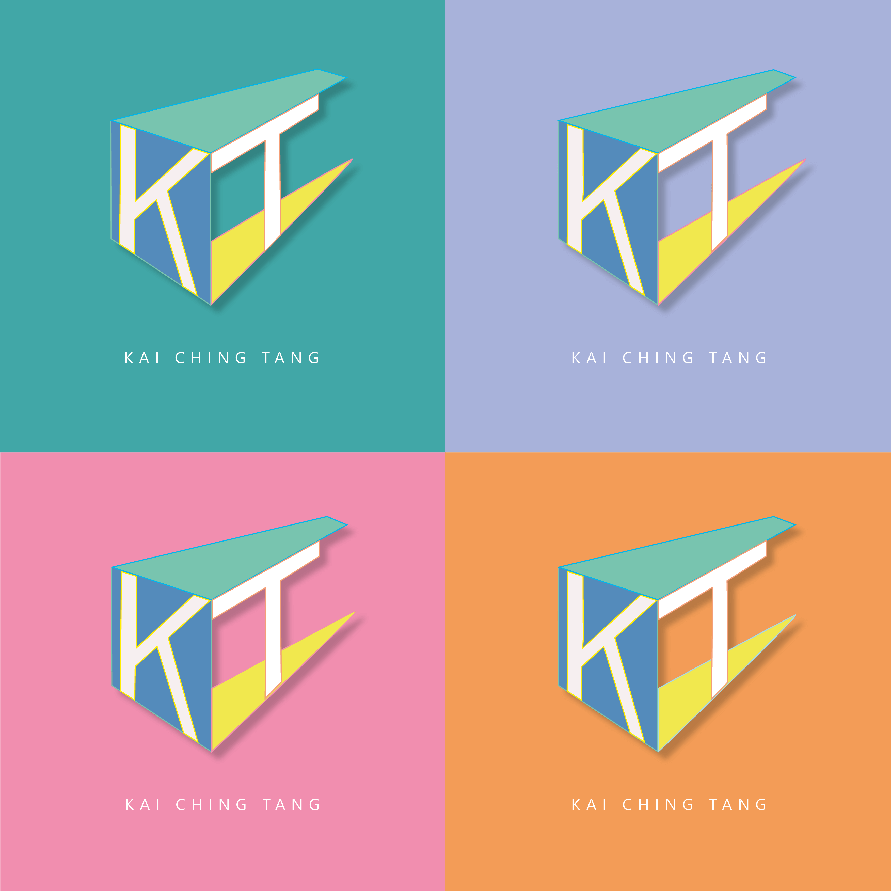
  • Vibrant colors with bright yellow, pink, cerulean blue, etc, as to achieve a bold and eye-catching effect
  • Abstract shapes with bold, abstract, geometric shapes
  • Making the logo three dimension by dropping shadow behind.

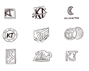
Besides with the 90s style inspirations, I also tested out different combinations to my logo of my initials ‘KT’, and I finally choose the one which is more geometrical and recognizable.

Colour in the Wild

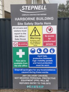
For my research, I went around campus looking for colourful type/signs that either catches your attention immediately, or blends into the background and go unnoticed. I found the main use of colour was for warning and informational signs, something to be expected when it is more likely to draw the eye to it.

This was an interesting task because signs are utilised by most members of society,  but they are very easily overlooked when overwhelmed with other signs. For example, there was a construction site on campus that had a sign board with many different signs that were all competing with each other. The use of the board isn’t to guide the general public, but its still an insight into how design aids attention to important messages and notices.

Kitchen cleaning elephant

My ideal gift for my partner is an elephant that is trained to clean the floor next to the sink! my partner has an incredibly annoying habit of spilling water all over the floor when he washes his dishes! And everyone in the flat walks into the puddle and end up getting wet socks. so this elephant is trained to suck up the puddle and put it into the sink. i decided on this idea as my random word was an elephant. No more wet socks. (:

A walk into madness

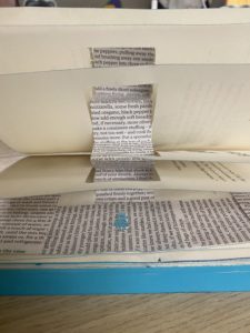
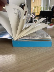
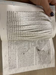
When assigned this project I wanted to turn my book into a series of immersive chapters that makes the user feel as though they are at one with the story character. I wanted to make the user feel lost and feel like they have lost a sense of clarity. My first decision was to create a stairway leading into the story labyrinth. The stairway is to act as an introduction for the story and it gives a good idea to the reader about what they are getting into. After the reader has completed their venture through the first chapter they will be met with a portal into a deep state of loss. After the portal, I decided to give the reader some pages of clarity. I wanted the reader to feel like some sense of clarity was restored because I thought it would give them false hope into believing the loss of clarity is over. Though of course, it isn’t over. Immediately after tricking the user, I threw them into a state of absolute chaos. On the left page, I used my crafting knife to make twenty vertical lines through the paper. This makes the page incredibly hard to read yet you can still make your way through the text, just like the character would find it hard to navigate a labyrinth. On the right page, I used my nails to scratch at the page and I crumpled up the page. This had the same effect as the incisions, though it portrayed how things become blurry and distorted in your mind. and finally, we make it to the last two pages of my experiment. You find a patchwork page mixed with aged and new book paper. This is supposed to be a metaphor for how time can become mixed up and lost in a labyrinth.
Overall, I was happy with how my experiment went. If I had a second attempt I would experiment more with 3D aspects of my book as I found it to be quite immersive which would entice more readers to use my product.

The Secret Garden

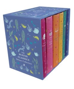
After creating the original penguin book cover, I thought of ways to make it different. I have been inspired by various illustrated collections, the Puffin in BloomPenguin Clothbound Classics and the Puffin Classics Deluxe Collection.

To begin with I changed the background to a green to reflect nature, and the garden. To further add to this theme I drew a leafy floral line illustration, over the top of the cover, to show the overgrow garden and that it cannot be contained. 

I lastly changed the penguin to a robin, since is a key piece of symbolism in the book, and helps Mary to locate the secret garden. 

Simon says no?

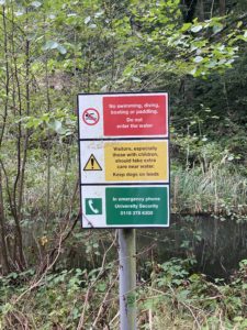
When tasked to explore the university campus looking for use of typography in a 3d environment, I decided my focus would be on caution signs and what they have in common
with each other. It took no time at all to find a sign of interest as they can usually be found everywhere. The first thing I noticed after finding a few signs was the use of the traffic light colouring system as shown in this image on the right. The red signifies a blunt stop sign, it is to act as a harsh message to stop anyone from doing what the message says. Though when we look at the yellow sign we can see that yellow signifies a caution message. It is less brutal than the red text though it gives a warning to the user rather than an order. And finally, green light. showing a message for advice the green light does not give any orders or warnings. It is to provide help if you were to need it.

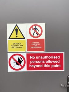
If we compare this image to the next, we can see some similarities. Maybe not with colour but with the font used. There seems to be a universal style that these signs follow. From what I can gather these signs all use a bold sans serif font like gill sans. This is a very effective font to use as it is extremely easy to read. its legibility couldn’t be better