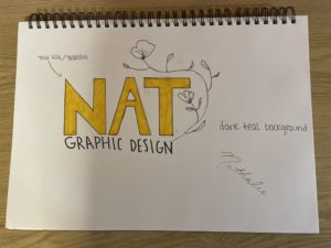
For this project, I decided to go with a minimalist branding approach. I love how clean this style is, and with the right color combinations, font, and graphics, you can create something that is eye-catching, yet simple. I feel as though a lot of “minimalist” brands these days look the same, so my goal was to keep these elements by adding texture and unique colors. The font I decided to go with was a bold Sans Serif that was all upper-case. The reason I decided to go with this instead of something thinner and lower-case was because the goal would be to use a gold foil/gradient effect for the letters. Additionally, I love the look of line drawing, so to add something extra, I decided to incorporate a flower that would frame the entire logo. As for colors, I think the gold foil details would look great with a dark teal background as featured in the mood board. The combination of all of these elements give a natural and organic look which is what I wanted to achieve with the photographs that I included as well.
Category: TY1DP1
Work by Part 1 students as part of their ‘Design Practice’ module.
70’s Retro
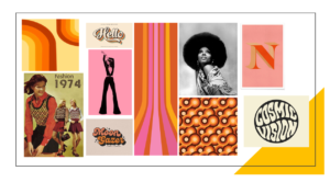
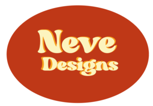
I decided to chose the theme of ’70’s Retro Style’ for creating my logo, as I wanted to experiment with in aesthetic of the 70’s as its still considered iconic for its fashion, patterns, colours and how even music influenced the style of typography. For my mood board I was looking into the different uses of colour and pattern, both vibrant and neutrals. Even though my mood board displays more vibrant colours and shades of pink I focused on the popularity of browns, reds and yellows. When creating my logo, I wanted to copy the 70’s use of shapes and swirls, so I chose an oval shape and tried to represent the classic 70’s shade of brown. For the text, I chose a font that was not on Adobe’s Illustrator and layered two pieces of different coloured text to create a 3D 70’s effect.
Everyday signs
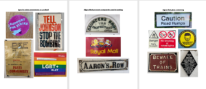
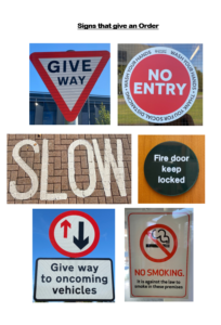
I didn’t solidify a theme for my investigation into the presentation of letters in our environment, instead I focused on signs that we see on everyday and don’t realise how the use of typography effects us.
I initially focused on the letters presented on signs that raise awareness for charities or a protest. I noticed that they mainly used sans serif fonts to be eye-catching, clear and to present their urgency for change. I then used the resources already in the typography building, looking at the old signs for businesses and compared their traditional branding identity with Serif fonts, with modern day branding. The first theme that came to my head when reading the brief was road signs, as they are some of the most important pieces of information and orders citizens are presented with, so the lettering has to be clear and simple. I found that the road signs only used sans-serif fonts to portray this and uses simplistic colours such as black, white, red and sometimes yellow to get peoples attention.
Nature Inspired Logo
My chosen theme was Organic Materials. I collected lots of inspiration for my mood board, and organised them into two sub-topics Plant Decor or Sustainable/Eco-Friendly. 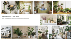
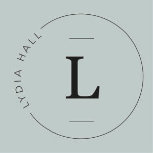
When brainstorming my main icons forced around leaves, flowers and a neutral colour scheme. This is the first logo I created without the floral elements. It has a minimalistic and clean look, but doesn’t yet reflect the organic theme.
I came back to my brainstorm and experimented writing my name in a calligraphy style. I liked the flow that occurred in my first name of up, down, up from the lowercase ‘l’, ‘y’ and ‘d’. However my surname “Hall” didn’t carry this fluidity and looked all rather the same; which is why I have chosen to have my surname in capitals under my first name.
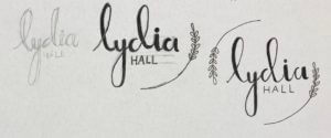 In keeping with the original circle logo idea, I simply drew the leafy elements, following the outline of the circle.
I did experiment with a blue colour but changed it to a neutral green to complement the aesthetics of a natural theme. 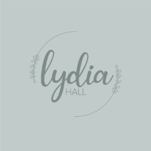
The overall logo does tick the box of a logo inspired by Organic Materials, but I think that the thickness of “Lydia” contrasts the thin outlines a bit too much, and is out of balance.
Abstract Logo
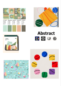
For my logo design I decided to take a more abstract approach. I started off with my mood board where I collected images that sparked my interest. Most of the images I found had lots of vibrant colours and lots of geometric shapes. My mood board then inspired my logo as I incorporated bold bright colours all throughout. The starting point for my logo was my initials which are done in bubble writing and overlap each other. I then went onto add different shapes all through out the bubble writing.
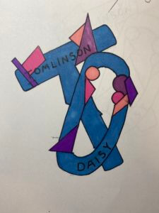
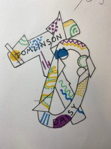
To experiment with colour I created a few versions of the same design but used different variations of colour and patterns throughout. This allowed me to figure out which version I liked the best, I chose the grey back group logo as my favourite as I like how well all the primary colours stand out from the background.
Although this is only a paper drawing it allows me to see and understand what I would design on the computer having a higher ability to change up features. For example would off my ideas I wanted to try was to have the lettering inside the bubble writing white so it stands out from the colour better.
Self Branding
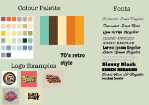
For our design class on 14/10/2021, we were joined by Sophia White who taught us about logotypes and the trends surrounding it. We were asked before hand to look at 10 of the themes she had given us and choose one that we liked. For me, I went with the 70s retro style and based on that, I did some prior research on the style and came up with these results:
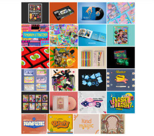
Sophia showed us some of the brands she had worked with and the process of creating for those brands, and we were taught a master class on creating mood boards, which was the first process in terms of creating something, as mood boards help with giving inspiration and visual ideas of what a theme is and so on.
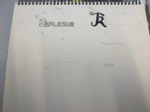
After creating mood boards, I went straight to sketching ideas for logos for branding myself as this was the task given to us, however, I soon decided that I wanted to go straight onto InDesign to create my designs, but nevertheless, I did sketch some ideas on my sketchbook.

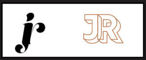
For my first design, I started out with using my initials and I used the font ‘Lust Script’, which I downloaded from Adobe fonts. I typed out my intials in different ways:
- all uppercase
- all lowercase
- normal
Then I proceeded to kern the letters together until they merged together. After this, I used the gradient tool to give colour to the design. I used a random colour I liked instead of using the colour palette for the retro style, as I was just experimenting with the elements.
Here is another design I did, where I also used my initials, but using the font ‘rig solid’ in bold and used one of the colours from the retro style colour palette. Similar to my first design, I also kerned the letters here until the letters merged to each other side to side.

 Onto my third design, I used the font ‘Narly’ in outline, and this time, I typed out my first name as I felt it would look much more nicer in this font. I really liked this design as I felt it expressed the retro style very effectively and was also simple in the same time. I had also tried it out using my initials as well and made two different versions using different colours from the colour palette.

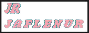
I had also edited these designs and filled them in using the bucket tool on photoshop to test out how the design would look like when coloured in and I was satisfied with the results. I had used a colour wheel to find complementary colours to the outline of the words to fill the letters in.
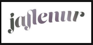
For my fourth design, I took a different approach and tried to type out the letter in a curved shape. For this, I firstly used the ‘pen tool’ to draw out the line and using the move tool, shaped my line and then used the ‘type on a path tool’ to type out my first name on it. I had used the font ‘Lust Script’ for this. I was quite impressed with the results as this was something new I had tried out and for a first try, I believe I had done a good job in doing so.
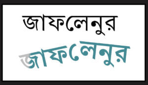
For my fifth and last design, I took a whole different turn by designing my brand in the Bengali language, as it is my second language, and is reflective of my cultural background and ethnicity. I was quite shocked to find an Adobe font for the Bengali letters, and immediately thought of making a design using the font. First, I had typed out my first name and then I used the same process I used in my fourth design to create the branding design. It is quite simple but I do like it as a first try in terms of designing logos.
Overall, this session was very enjoyable as I was able to learn about the different steps of designing logos for brands, as well as got to try out different apps in the Adobe softwares. Although I think most, if not none, of my designs don’t reflect the 70’s retro style, I think this was a good practice for me for future projects.
Link to the PDF file of all of the designs together:
Labyrinth
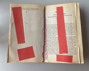
I interpreted my prompt as a family who move into a new house and get stuck trying to navigate their way through to the ending. As you go through the book the pages get darker and more creepy, and eventually it ends with the family finding the unknown victims that came before them. It starts off innocent (as seen in second part) but there are warning signals all around them.
The book has doorways cutout to get through the story but they get progressively more unusual and abnormal for the family to get through. Without time constraints, the goal would be to finish each room in the house and develop the backstory. I would have explored more ways to display the sense of despair in the family’s house and shown that through different means of paper craft, like cutting holes into each page to mimic the feeling of being sucked in.
The brief with the backstory was a great way to practice my physical design.It had little purpose, but a lot of meaning that could be inferred through artistic methods, something I thoroughly enjoy about design.
Bravo Two Zero
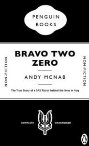
This is a remake cover of the action packed true story of ‘Bravo Two Zero’.
I decided to use a black & white colour scheme for this cover to represent the SAS Uniform and its badges. Not to mention that serious forms and documents use only black & white, which emphasises how serious the topic is surrounding this book and the events that took place within it.
I thought to match the same font as ‘The Great Gatsby’ due to the fact that it is a bold sans serif typeface. I feel this was appropriate as the soldiers who endured the events within this book were both bold and brave as individuals and as a unit, but also to link with the font on the face of the SAS Badge which states “who dares wins”.
I did make some slight changes to the cover where the iconic penguin logo was replaced by the SAS badge and changing ‘Fiction’ to ‘Non-fiction’ as this book is based on true events.

