
I decided to look at how the different countries in Europe responded to Covid-19, did some put their message across clearer? What could be done better? To narrow down the countries I chose Italy which was the epitome of the pandemic for a while as well as Spain which also went into quite a drastic lock down in comparison to the UK. In addition to this I also included Germany in this, as in my mind Germany is a very pragmatic and effective country.
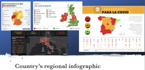 Looking at the different infographics showcasing the pandemic is interesting. Whilst they all broke the country into regional areas (apart from Italy) They all use different colour coding, and yet they all have the same principle – red is the highest danger. In addition to this most countries use the traffic light system to put their message across to the general public very effectively. Spain does take this a step further and show various other categories for each region using pictograms. Italy also does more than Germany and the UK by giving a list of the most impacted areas and showing the survivors as well as deaths and people who tested positive for coronavirus.
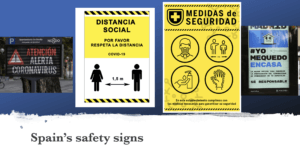
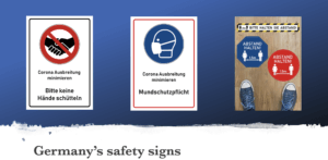
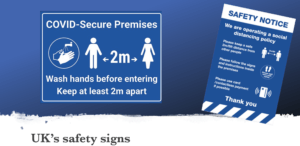
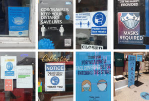
When looking at the general colours used in these official signs in the various countries it’s quickly apparent that the preferred colour for this is blue. Though Spain seems to prefer using yellow, whilst Germany uses both red as well as blue equally. I think this might be due to the road sign rules, where blue means instructions. This makes a question about how effective the Spanish road signs really will be.
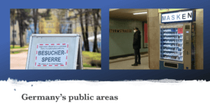
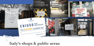
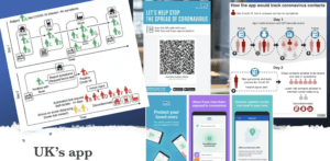
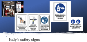
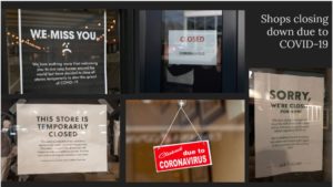
Looking at how countries handled public areas & shops the UK seems to be more effective with it than the rest. This is mainly due to the NHS app, though it does rely on everyone having a mobile phone which can scan QR codes, which isn’t always the case… Nonetheless through the app people are more likely to be notified about potential exposure to Covid-10 than in the other countries like Germany, where they have forbidden visitors from entering a public area (shown above) as a precaution. Having said this Germany does have mask dispensers in public areas so no one will have an excuse for not wearing a mask on public transport, shops, schools, etc. Moreover, Italy has got an official government issued template for restaurants. Very interestingly the only word in yellow (the rest is blue) is “DELIVERY” which, as we know, is an english word. This could mean the locals and tourists all understand that they have to call the number listed bellow (once filled in) to order, as they are only available for deliveries. No other government has issued templates as such for shops and restaurants so this might be something worth looking at to implement as well as the mask dispensers.
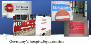
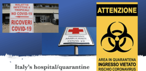
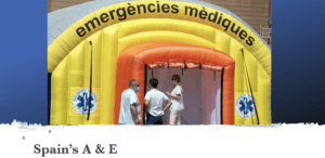
Another thing I noticed with foreign countries is the hospital and quarantine signs. Whilst I didn’t find english coronavirus quarantine signs the remaining 3 countries are worth looking at. What these signs indicate is that the Covid-19 is in the same area as a hospitals A&E generally, which I think is the worst place. The most vulnerable people in critical conditions closest to the virus? Spain resolved this problem by putting up a temporary A&E tent though this is obviously not ideal, until a better solution is found this is acceptable. Moreover, looking at the quarantine signs Germany opted for stop and no entry signs which very clearly portrays their intent. Italy on the other hand took it a step further. Instead of the everyday stop signs they modified the universal toxic sign into a quarantine sign for Coronavirus, making it highly effective as people will definitely take notice of a sign usually portrays mortal danger. We will make time to read what the pseudo toxic sign says, even if we cannot speak the language the “coronavirus” at the bottom makes its meaning clear to everyone.
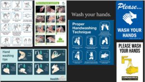


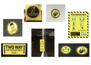
 Sue and Emma’s project was all about gathering real-life examples of COVID images around us. Since it’s been months since the first Corona outbreak, it’s fair to say that we all got used to the repetitive posters and announcements that routinely remind us about the laws put in place to stop the spread of coronavirus in the UK. Having said this, a lot of us stopped paying attention to the posters themselves. I highly valued this experience as it’s not often that I look or analyse real-life examples of information design. It has taught me a lot about features found in Covid imagery, from the choice of colour to the specific fonts and typefaces.
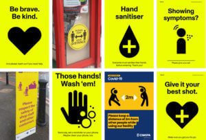 of the posters were also accompanied by icons and vector images that illustrated what was stated on the posters.
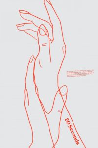


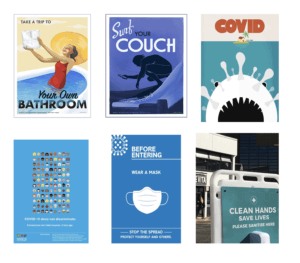
 When first given this project I want on the site Pinterest an image-sharing app to look at images related to Covid 19 at first no results where shown cause the website did not want to risk false info about covid 19 sharing on their platform.
 Another important thing I like about this Illustration is cause it is funny and allows the viewer to learn about covid but still escape the harsh realities of this pandemic.
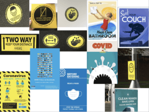
 The images are different from those of the usual yellow signs that grab the attention of viewers and remind them to wear a mask. The illustrations are not people friendly and stricter on their information.


