Background
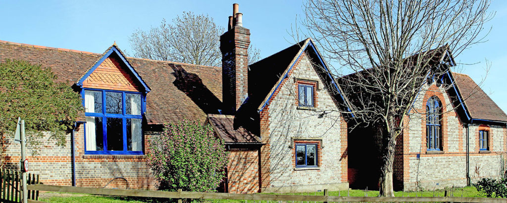
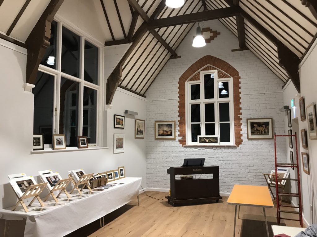
David Woodward, the head of the Dunsden village hall charity needed a website redesign. The goal was to drive traffic and promote the many services and amenities the village hall has to offer. The charity survives on donations as well as the halls profits, however, increasing the halls profits is a primary objective of this project. Whilst functional and rigorously built, the current website lacks many features that could really benefit the halls success, and the overall design style does not compliment the newly refurbished, yet wonderfully historic building (fig. 1, 2). As no one had taken this project for some time, David did not prescribe a completion date. The brief is very thoroughly laid out in terms of what features are desired, however, the nature of this project gives me the opportunity to do some critical background and user research to establish how the website can best achieve its goals. My supervisor for this project was James Lloyd.
Research
Dunsden & Eye
Dunsden and Eye are both villages north-east of Reading. They are part of a collective of satellite villages, each with rich historic backgrounds. On my walk there for the first client meeting I found walking through Sonning Eye and Dunsden to be calming. It’s a quiet, well connected community. David even informed me that many prominent figures own real estate there such as George Clooney, no doubt for its serenity. Eye and Dunsden specifically is a parish with an estimated 500 people residing there, meaning this project will be geared towards a very close-knit community with an emphasis on repeat custom. Wilfred Owen is a local poet who was born and raised there. Before being lost in the first world war he wrote many poems in Dunsden and often about the surrounding places and events. The surrounding area has adopted this heritage, amenities such as the Wilfred Owen trail have been founded in his honour. This is one of the many cultural influences of the hall itself.
The village hall
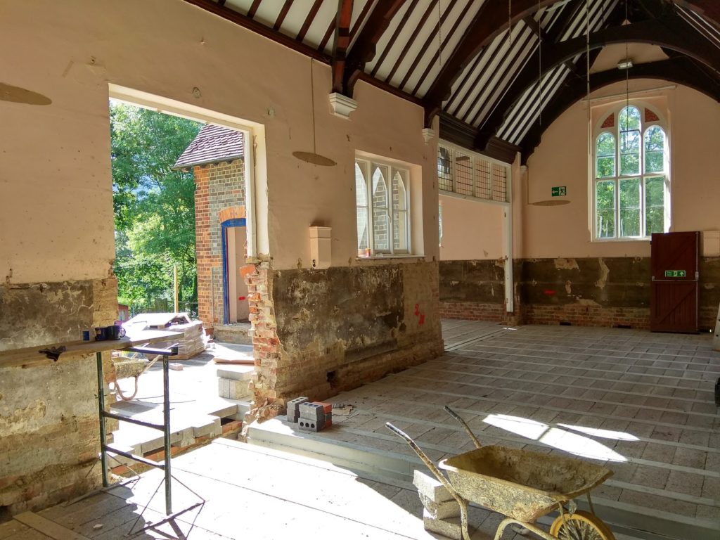
The hall began as a school, however over the years the property became disused until it eventually converted into a town hall (fig. 3). It now uses its two main halls, large outdoor space, and kitchens to provide community services. These services include regular activities such as Pilates and yoga as well as renting out hall space for events. From my early understanding the majority of the hall’s profits come from weddings, which typically rent the entire space for full and sometimes multiple days. That being said the income from renting to regular classes and activities is also critical to the charities cashflow. A final aspect of income is a two-story rental property attached to the main building itself. After a £400,000 refurbishment paid for by the charity as well as council funding, the hall has the opportunity to maximize its profits, all it needs is a modern website to promote the profitable areas of the hall. The hall itself is available to anyone, however, its primary catchment is the surrounding villages of Dunsden, Eye and Play Hatch. Nearby villages (and their town halls) have similar websites which leant itself massively to the research phase of this project. A bust of Wilfred Owen features in the main foyer, he has become very much a symbol of Dunsden and of the hall itself. The brief specification also includes a trail information page about a hike in tribute to the poet. I felt fortunate to be able to engage with a full UX task with such a rich cultural and historic background.
User research
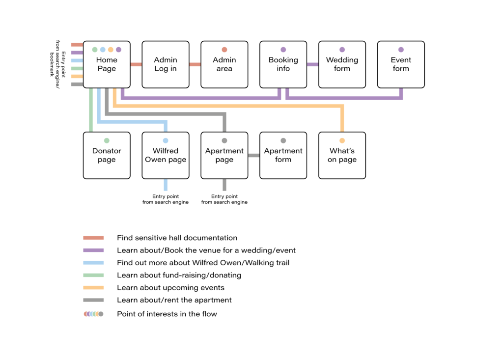
The original brief gave a very clear outline for the website’s functions as a direct result of the needs of its existing users. This left the opportunity to explore the user groups and design the website in such a way that it increases the halls popularity rather than just providing for the users it already has. The first user group was defined as locals looking to engage with activities. The second was opportunistic renters looking to rent the hall for events such as weddings, birthdays, and regular activities. The third was those looking to rent the apartment on site. The final was charity members looking to access important documents regarding the hall. Secondary, less frequent users include those looking to fund raise for the hall and those who have found the hall because of the Wilfred Owen trail. These groups were used to outline the main user needs and mapped onto a plan of the website (fig. 4). This exemplifies the journeys these users would need to take to achieve their goal. James praised this method and agreed that it would be beneficial to giving the client confidence and clarity. Trying to combine the client specification with extra user research proved to be challenging, however, the user journeys helped incorporate both my own research and that provided by the client.
Market research
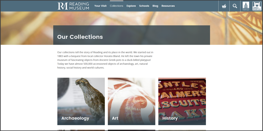
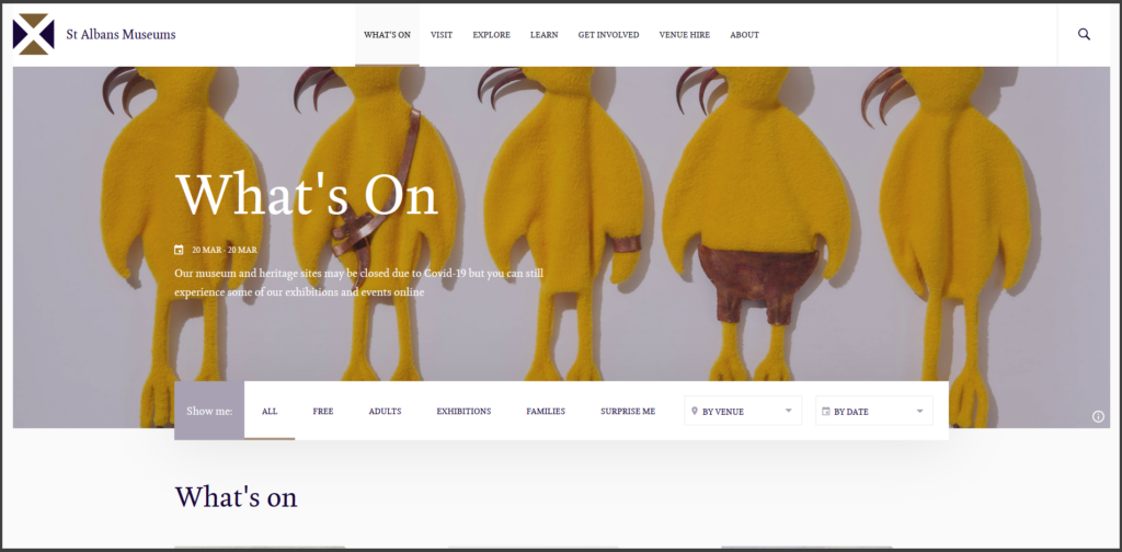
Many local villages and towns have professional websites, the client sent some to me as a form of early inspiration. Many of these websites were, however, limited to simple functionality such as blogs and galleries. The most useful market research was found in museum websites, many museums offer activities and rental space like the hall, and many of their design directions are promotional and drive admittance. Reading Museum was one such example as it organizes complex information and updates the home page frequently to promote repeat custom (fig. 6). Another valuable example was the St. Albans museum website (fig. 7), which uses a very controlled appropriate brand as well as organizes complex information using elegant panels and white space. All of the examples looked at used forms such as email inputs to encourage user engagement.
Restated Brief
The research phase very much fed into the restated brief. Whilst the thoroughness and professionalism of the client brief eased this process, the restated brief altered the specification in such a way that more features and interactions would be present per page. The background and descriptive text were kept mostly consistent as it summarized the history and needs of the website very well. I worked closely with David to ensure the brief met all the requirements of the website. James also offered some valuable feedback, including consolidating the idea that doing my own set of user research was valuable to this project. The client brief was intimidating to say the least, there were many aspects within it, such as calandar intergration, that I had never encountered before. The task of reworking it in conjunction with the client really benefitted my understanding and my confidence in tackling this project, and it made the intimidating sections feel sigificantly more manageable.
Deliverables
The primary deliverable of this project is a website. The client also wanted some signage to be designed to label rooms inside the hall as well as floorplans of both the hall and the apartment. These plans would need to be designed graphically to be useful to prospective renters/hirers.
Home page
- Live Instagram, Facebook and Twitter feeds.
- News updates
- Must be interesting for returning users.
- Events page
- Access to the events calendar.
- Contact details for event organisers.
- Contact details for hall staff.
- Directions/map to the hall.
- Photographs of the hall space.
Hiring page
- Potentially a separate page for weddings.
- Photographs of the hall space.
- Floor plan of the hall space.
- Access to the events calendar.
- Hall booking form.
Donor page
- Access to fund raising documents.
- Updates on how donator money is being invested.
- Access to the donation system.
Admin/committee page
- Private entry form.
- Access to the events calendar
- Access to paperwork/documentation.
Wilfred Owen trail information
- Links to Dunsden Owen association.
- Photographs and details of the statue.
- Notes on hall access.
Designing
Wireframing
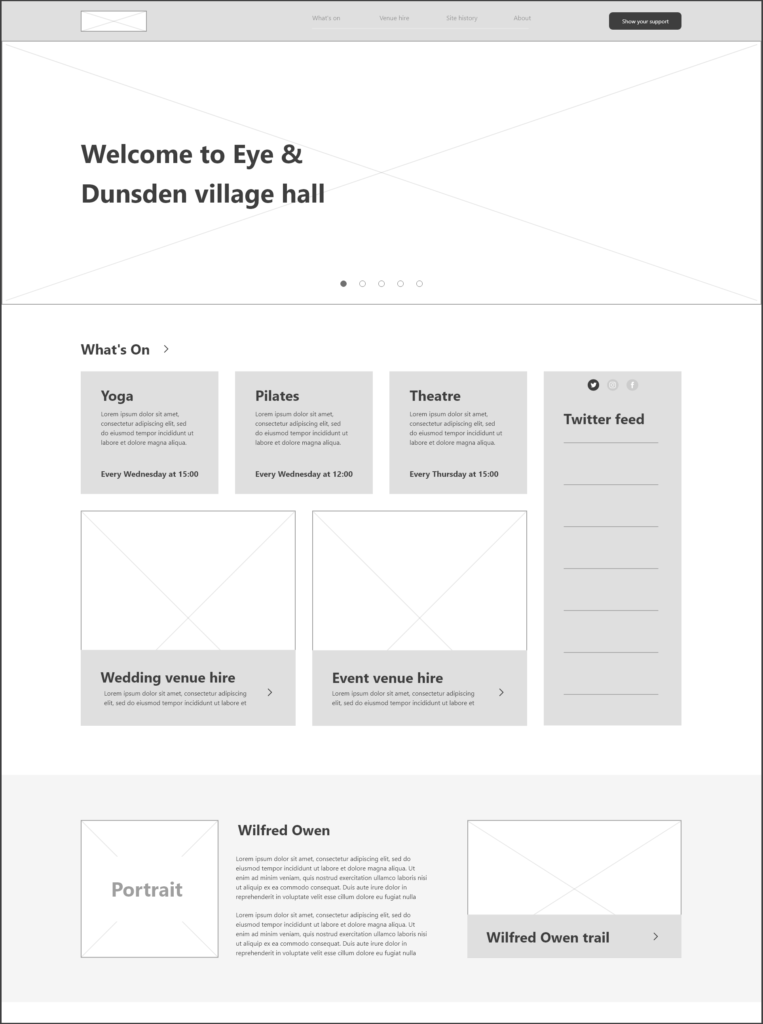
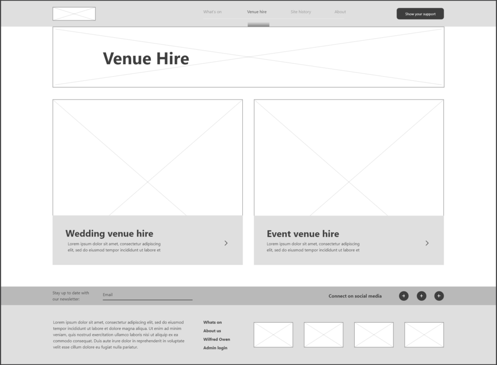
The Wireframing phase was made easy by the thoroughness of my user research. This task was massively enjoyable as it simply took the website plan and adjusted it screen by screen to ensure every feature was included in the most user-friendly way. My initial rapid wireframes were used to brainstorm layouts for each page. After selecting the strongest options, a digital wireframe was made for each page in Adobe XD. The reason for this was to make the wireframes interactive so it can be used as a test prototype at the next client meeting (fig. 7, 8, 9, 10).
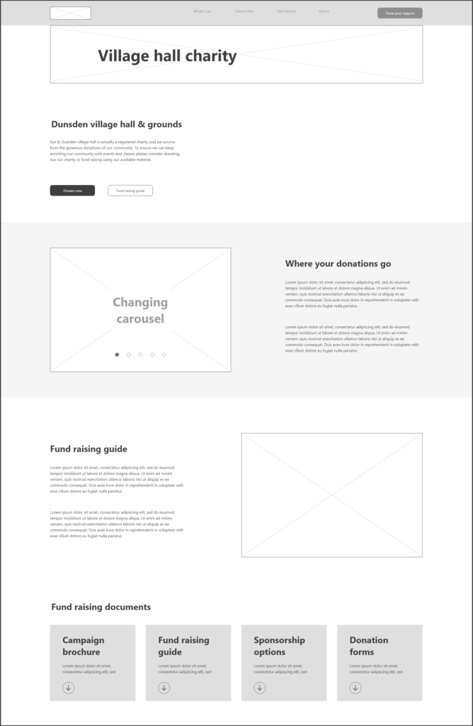
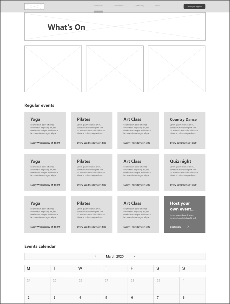
Test prototype
Due to the Covid-19 lockdown, this meeting was held over Skype and I finally had the chance to meet the rest of the team. It was exciting to listen to- and engage with the inter-politics of the charity, it was clear that all the members were passionate about their roles and the hall itself. Skype lent itself nicely to demonstrating the interactive prototype, however, I would have loved for the clients to test it themselves in person. The feedback was mostly good, they whole team was impressed by the quality of the prototype and from the feedback I knew the project was moving in a direction the clients were happy with. One of the main client sentiments was that the way the website was designed, it would need high quality photography, however, the clients discussed arranging a professional photographer to do so in the coming months. After over an hour of exploring the test prototype and recording feedback from each of the members, I left to adjust the prototype, ready to begin moving into WordPress for the final design.
Client meetings
As mentioned, there were existing politics within the charity of the hall that affected the course of the project. It was by and large great to see how engaged the members were with their roles, however, there were some disagreements that arose. David and I both agreed that google would be the best option for an integrated calendar as it meshed nicely with WordPress and is simple to use. The member who managed the calendar was unsure about this option due to potential security risks and despite frequent discussions, no conclusion has yet been met.
The initial meeting was in person. It was fascinating to walk through the surrounding area as much as it was to meet David at his home for tea. Shortly thereafter we travelled to the hall and I was able to take photographs and investigate the hall. Being there in person put the magnitude of the project into perspective, this would be a complicated website for a real charity, and I knew then that the project would need extensive research and development to be done right. David contacted me later thanking me for my professionalism and offered me some helpful advice for getting started with WordPress.
The next client meeting was the one held over skype. Whilst it was critical to moving the project forward, I would have preferred another in person meeting. As this project progresses and the lockdown comes to an end, I will travel back to meet the charity members in person and hopefully even engage in some of their regular activities to learn more about the hall and more importantly the community.
Still to come
There are still many aspects of this project I am looking forward to exploring. The floorplans need to be created and rendered in a graphically useful way which will tap into my knowledge of branding and information design. The graphical style of the website has yet to be established as well. Whilst there is already a brand to base this off, the current brand is limited to a logo, colours and a typeface which grants me immense freedom to explore usability and accessibility. Currently I am experimenting with WordPress to establish this graphical style. Not only this but I have only just began learning WordPress as an application and it has become clear how vast and powerful this website building tool is. I hope to complete the project by the end of June and the client has been supportive with extending the deadline, given the covid-19 lockdown.
Outcomes
Whilst this project has yet to be completed, there were already many valuable outcomes. I learnt the importance of communicating my progress as well as any delays, keeping the client informed has allowed the project continue despite unavoidable circumstances. It has additionally kept the clients confident that the project will continue. I also learnt that research provided by the client is valuable but should never mitigate doing my own research. Finally, I learnt the importance of getting to know your client beyond the reaches of the project. Understanding the politics of the hall and the relationships between the members would have sped the design process up by ensuring each member had the opportunity to communicate their needs and concerns
Reflection
Working with clients on such a personal level was a new experience. Previously I had engaged in mostly corporate environments and working with a charity has been immensely rewarding. Conveniently, the client has knowledge of the design process as well as website building so being able to collaborate on this has been a fantastic learning experience as well. I have learnt to explain my rationale in a variety of ways that adheres to all levels of technological capabilities and my confidence pitching design work to non-designers has grown.
Unfortunately, the Covid-19 situation has affected all parties differently and has left the project delayed beyond the agreed time plan. Other deadlines have been affected and time management and prioritisation has been critical to ensuring the project will be completed to the highest standard. Thankfully, the client is fully understanding, and we have maintained contact throughout the lockdown to ensure progress continues where possible.
Overall, the project has been a valuable learning experience in growing my confidence as a designer and as a person. I have never felt more engaged in a real job and look forward to completing this project over the coming month.


