This week, we were joined by Miho Aishima, Design Director at Design Bridge and Partners, for an inspiring Baseline Shift session. Miho shared her expertise in branding and the creative process behind building visual identities, offering a deep dive into a few case studies.
Design Bridge and Partners
Miho has been at Design Bridge and Partners for around six years (previously working at Superunion before their merger) specialising in branding. The team is made up of 90 designers, split across three teams, and while this can appear overwhelming at first, Miho made it clear that there is a lot of inspiration to be found by working around and connecting with other designers.
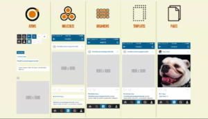
Not being restricted by a set house style, Design Bridge and Partners works with a range of clients, ranging from packaging for a Mondelez client, to a communications campaign for Heineken, and even to NASA.

Study and early career
After Miho had completed a degree in economics (despite this not being her passion), she sought a creative path and soon found herself graduating from Central Saint Martins with a BA (Honours) in Graphic Design. This was a time that allowed for a lot of creative exploration, before she began immediately looking for a job. Within a year of getting her first job after graduation, Miho was made redundant, which lead her to freelancing, landing a place at design studio, Johnson Banks.

Design outside of the studio
Miho’s immersion in the creative world does not end at the studio; she has also engaged in talks, judging for D&AD, and various events that go beyond the studio. One of these events is ‘Rye Here Rye Now’, a monthly networking group for creatives in Peckham that Miho and her friend Kat Garner created. This was an excellent lesson for the students – that design thinking can be applied outside of the studio, all that is needed is a problem area and you can propose a solution.

Case study 1 – Evri
When Hermes had their sight on an ambitious business expansion, they approached Design Bridge and Partners for a rebrand with the aim of better reflecting and connecting with the consumers. It was quickly discovered that the beauty of Hermes was the diversity of their customer base and the coming together of different communities that this encouraged. This is where the name Evri derived from, and the idea to have over 194,481 variations of the logo, perfectly representing the idea behind this concept; ‘Every parcel, every person, everywhere’. It was valuable for students to see that branding can be dynamic and multifaceted, rather than confined to a single, static logo; especially when a more flexible approach better captures the essence of the brand.

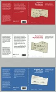
Case study 2 – Precise
Miho moved on to speak about her and her team’s work with ‘Precise’, a specialist lending company, who were identified as the ‘plain and simple’ in a sea of over-complicated and unclear companies within that sector. It was important for the students to see how the brief was analysed with a fine-tooth comb, much like we are encouraged to do here on the Typography & Graphic Communication course. Extraordinarily, it was one highlighted word in the brief that went on to shape the entire vision of the brand – vanilla. This single word embodied the key feature of simplicity that gives Precise their individual identity.
Miho then showed the students some of the alternate routes that were explored for the Precise branding before the client selected one design concept. It was important to see how vastly different each route was from one another, displaying the breadth of solutions that designers can generate based on a single brief.

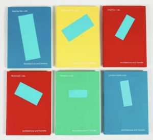
Case study 3 – Shelter
Finally, Miho spoke about a rebranding project that was centered in activism, protest, and advocacy for Shelter, a charity dedicated to tackling homelessness and unsafe housing. With the designer responsible for developing the original (beloved) branding for Shelter, being Miho’s previous boss, there was a lot of pressure to deliver on this project, and deliver they did. The branding that was shown was built on one simple shape, echoing the shape of a roof. As well as representing a roof or a shelter, the symbol can function as an arrow, a replacement for letterforms, and in various other contexts. The sheer versatility that was shown within this project was inspiring and perfectly illustrates the difference between designing a logo and designing a visual identity.

Our key takeaways!
- Design thinking can be applied outside of the studio, all that is needed is a problem area and you can propose a solution.
- Branding can be dynamic and multifaceted, rather than confined to a single, static logo; built on one single idea, it can have flex and still maintain the essence of the brand.
- Consider how your design will be used in real life. It’s not just about how it looks on paper or a screen; consider how your design will come to life on merchandise, in stores, or on social media to ensure it’s versatile and impactful.
- While AI tools and technology are becoming essential in the design process, human creativity and strategic thinking remain crucial.
- Not every idea will be selected, but every piece of feedback is an opportunity to improve. Learn to take constructive criticism and use it to refine your work.
– Written by Tommy Molnar
– Photography by Oscar Dudley