Category: TY1SK

Work by Part 1 students as part of their ‘Skills for Design Practice’ module.

Diving deeper into the world of photoshop

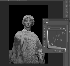
­­­­­­­­­Design ideas and design process:

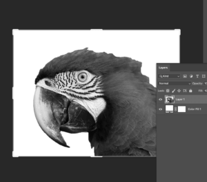
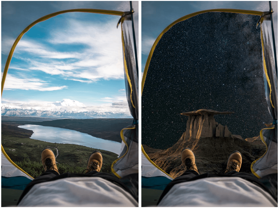
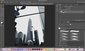
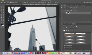
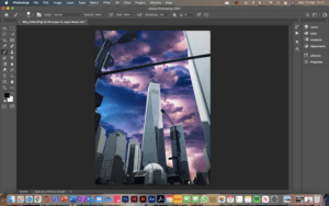
For this design, I used my own photograph that I took whilst in New York. I chose this image as it was of high quality, and the composition was interesting. I also chose this because the background didn’t have too many buildings in it so I knew it wouldn’t be too complicated to isolate as this was my first time using the software. I first used the selection tool to select the sky and parts of the background that I wanted to remove, adjusting the size of the tool in order to get my selection as accurate as possible. I then used inverse selection to select the buildings and everything else that was in the foreground of the image so that I could make that selection a clipping mask therefore removing the background. I then fixed some details further on the clipping mask layer with the paintbrush tool using black to take away and white to add back some of the image, again adjusting the size of the paintbrush as and when I needed to. I then went back in with the clone stamp tool to get rid of some of the thin wires that were running across the buildings, as I had removed them along with the sky in the background. The results of this removal can be seen in figure 2.

Figure 1. New York image with the background removed
Figure 2. cables and telephone lines over the buildings, removed

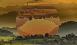
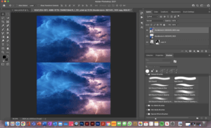
Once I felt I had accurately cut out the background I then went on to place the new background image into the file. I used ‘place embedded’ to do this. I scaled the new background image to half the size and duplicated it so one was on top of the other shown in figure 3. This then allowed me to merge the 2 images into one layer so that I could then use the clone stamp tool to blend them together. Once I had blended the background images, I then moved the layer below the original photograph, leaving that as the new sky for my New York image.

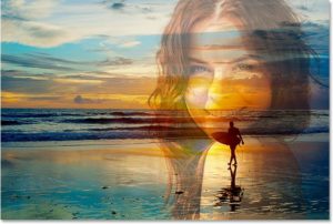
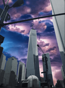
I chose to edit the foreground image as, in real life, if the sky was really that colour you would see pinks and blues in the reflection of the buildings. I first increased the contrast which you can see in figure 5. I then adjusted the colour balance. I left the mid-tones as they were, added more blue and cyan to the shadows and then added more magenta and red to the highlights of the image. This can be seen in the feature image at the top of the post.

Figure 3. The background image prior to blending
Figure 4. The blended background image
Figure 5. Image with adjusted contrast

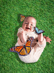
For my second design, I removed the background of the original image using a layer mask and then placed the 3 butterflies I wanted on to the image. They originally had a white background, so I selected the butterfly using the object selection tool and then made it a mask layer. I then scaled and rotated the butterflies to sit on or around the baby. Next, I placed an image of grass in the file in a new layer making sure it was the very bottom layer. I then edited the contrast and blending effect of the grass so that it fits in well with the rest of the image. Finally, I added drop shadows to both the babies and the butterflies. This is because the original image of the baby had light coming in from the right and so I wanted this to be reflected in the rest of the image, making sure it was consistent and didn’t look like multiple images put together.

Figure 6. Design 2

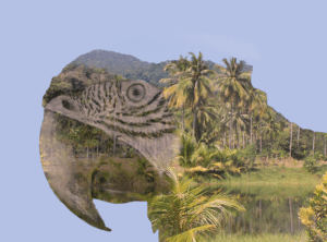
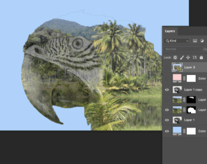
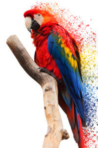
For my third and final design, I kept it quite simple. I duplicated the image layer and on the new layer selected the parrot and branch to make it into a layer mask. I did this so that I could get the paint splatters close and packed together near the parrot without it going over the parrot itself. I then placed paint splatters using the brush tool around the right-hand edge of the parrot taking colour swatches from within the parrot.

Figure 7. Design 3


Software tutorials:

https://helpx.adobe.com/photoshop/how-to/composite-photo.html This was a given resource. As photoshop was still a fairly new software to me, it was necessary to teach myself exactly what a composite image is and see how I could potentially go about making one myself. I felt it was important to understand this before beginning my ideation for the edits so that I could start this task in the right direction and with a full understanding of what it was that I was creating.

https://www.youtube.com/watch?v=NnjOEcfK52E This again was a given resource that was particularly useful for the New York edit. From the beginning of the creation of this edit, I knew I wanted to remove the background of the image, but I wasn’t sure how to go about it. This taught me, not only how to remove the background, but to remove the background with as much accuracy as I could. It did this as it showed me how I could remove part of a selection by holding down the option key as well as how to use black and white with the brush tool on a mask layer.

https://helpx.adobe.com/photoshop/how-to/clone-stamp-remove-object.html I used this tutorial for a task in a previous week. However, I re-watched it to refresh my memory as I knew the clone stamp tool could help blend the 2 sky images together, as well as fix the reflection issues I had in the New York edit.

I think I have largely improved my photoshops skills from completing this task and using the tutorials to aid me. Although there is always more to learn and so to continue growing my skill set, I will use photoshop when I feel it is appropriate with my projects in other modules. I will carry on with experimentations and if I see an interesting image, I will be sure to be inquisitive in terms of how it was produced and even try to recreate it myself with the help of some adobe and YouTube tutorials.

Resources for research and inspiration:

https://www.thrillist.com/entertainment/nation/the-avengers-battle-of-new-york-joss-whedon

For my edit of New York, I got inspiration from the brief as it suggested to replace the background of an image and straight away I knew I wanted to do this to a city scene so it looked like a scene from a supernatural movie that uses special effects, such as Avengers. This was helpful to look at for the New York edit as it is what made me consider editing the image in the foreground with the buildings as I noticed the reflection of the green and blue light from the sky in the buildings. I think this really helped to tie my image together rather than look like two images layered on top of one another.

Going forward, it would be interesting to explore beauty photo editing in photoshop. I think learning the tools and techniques used for beauty editing will give a new perspective to offer to the conversation about whether it’s ethically right to be editing beauty photos at all, especially when it comes to advertising and beauty products.


Working with InDesign Tables

Tables come in many shapes and formats. Although there are many programs in which you can create tables, InDesign allows the designer to be in control of all the elements in a table. For this task, I was challenged to create an effective layout that utilised a table. Since I’ve never worked with tables before, this task was quite tricky at first. After countless trial and error attempts, I feel like I got the gist of the essential features.

Design ideas and design process

Figure 01
Figure 01

To start this task, I first imported images I wanted to use in my design. I decided to use the existing book covers and adapted them by changing the colours and removing the text to leave a clean image. I then pasted the photos into the file and arranged them on the page. I locked the image in-place to ensure that it does not get in the way while I work on the table.

Figure 02
Figure 02

To set up my table, I first created a simple ‘grid’ to help me position the title and the rest of the text (Figure 01). I placed a text box inside the grid I created and used the table tool to create a 12 cell table (Figure 02). Using what I learnt through my research, I started customising the table. This process was mainly based on trial and error since I did not know what to do. Having said this, however, I eventually managed to achieve the look I wanted to.

Figure 03
Figure 03

For the cell style options, I changed the cell inset sizes to make sure that the table does not appear crowded, and the information is easy to read (Figures 03). The use of space in this example is vital as I have not intended to use any rules between the columns and the rows. I created this effect by adjusting the ‘stroke and fills’ settings found in the cell options (Figure 04). To remove all lines I selected both vertical and horizontal strokes and set their colour to ‘none’. Figuring out how to use this feature was quite tricky, but as I worked my way seeing what works and what doesn’t, I eventually got the gist of it.

Figure 04
Figure 04

After I was happy with the table I created for this design, I started to format the text. I decided to put the dates at the top as this seems like one of the most crucial information to the intended user. For the dates, I chose to use the all-caps type because I wanted the information to be easier to find and comprehend. Furthermore, I simplified the dates so that they are easy to understand within seconds but also to save space. For the descriptions, I used the regular font since this information is the least important.

Idea 1
Figure 05
Figure 05

For my second design idea, I wanted to experiment with the table in a different format – portrait. While working on this idea I tried to focus more on arranging information, rather than focusing on the visual aspect of the design. I first made a text box and followed the same steps as my previous design. By choosing a portrait format, I realised that I could utilise more space and make the information more readable. Unlike in my previous design idea, I did not have to worry about maths and try to work out how many columns and rows I need. Instead, I created eleven rows an three columns: first for the date, second for the general information and third for the duration of the podcast (Figure 05).

Since the cells in this design were much narrower than in my previous design idea, I decided to add strokes to make sure that the information is not mixed up. After experimenting with the table and cell styles, I learnt how to use cell styles to recreate this effect. Using a feature found in the top bar menu, I could select the individual column and row strokes and change their weight as well as style (Figure 06).

Figure 05
Figure 06

To use this feature, I picked the columns I wanted to format. In this example, I highlighted the first column and highlighted the strokes I’d like to format. Once I chose all the elements to edit, I changed the colour/weight and saved the formatting in a new cell style. I repeated this step for the rest of the rows until I was happy with the result. 

Idea 2


In my final design idea, I decided to combine the two styles into one. Both designs were equally good; however, I noticed that each had flaws In them. By picking out the favourite elements from each design, I managed to create a table that is legible but also visually appealing. Since this is a form of advertisement, It was important to me that the designs I created were eye-catching; this was not the case with my second design idea with lacked ‘decoration’.

Final Design Idea


Software tutorials

The tutorials I found on the brief were pretty useful since I lacked even the most basic knowledge of tables. The tutorials, however, were a bit too basic and I wanted to challenge myself during this task. Over some time I allowed myself for this task I watched several videos on Linkedin learning. These were very useful as they not only explained the basics of using tables but also had an in-depth demonstration of the other tools. Since I am only used to working with text; therefore, the character and paragraph styles, I was surprised that tables have styles as well. I was quite happy to realise that they work in a very similar way. What I learnt through Linkedin Learning was very useful, as it allowed me to style every single element of my table. This is unusual to me because I am used to creating tables on PowerPoint or Excell, where the styling of the tables is limited.

On the other hand, a lot of the tutorials I watched were quite outdated. For example, one of the videos dated back to 2015. Adobe updates its programs on regular basis, meaning some of the features in the version of the program I’m using, were not discussed in the tutorials. Because of this, I’d like to further explore new features related to making, styling and formatting tables. Often, the features introduced by Adobe have a goal of speeding up the designing process. Working under pressure is something that I struggle with; therefore, it would be useful to know some tool that could speed up my design process.

Resources for research and inspiration

Because many of the videos watched as part of my research were fairly old, I found them quite uninspiring in terms of what I can achieve using InDesign. Having said this, I looked at examples of modern tables and noted some key features that are not seen in older table designs. One notable key feature is the use (or lack of it) of horizontal and vertical strokes. It was quite common for me to come across works, in which the stroke seems to be the major contributor to the overall design of the table. Another notable feature was the use of colour in these tables. The main purpose of the stroke is to identify between the different columns and rows in a table. Although they are functional, often they are styled in a specific way: e.g. light, dark, dashed or dotted. In my last design idea, I experimented with the different stroke types. After trialling the different styles, I concluded that I liked the look of the dashed line. At first, I struggled to recreate this idea, because of my basic knowledge of this feature. Eventually, I became much more confident and my experimentation leads me to create this effect.
I also researched the book itself. Although this was unnecessary I didn’t know anything about the book; therefore, I felt quite uninspired. The only images I could find are that of the book cover. By analysing the branding features on the book cover, I figured out what style I’d like to use for this design. Learning what the book is about has also influenced my design decisions – at first, I found it difficult to think of any ideas; however, after reading reviews of the book it was easier for me to decide what I’d like the design to look like.

Building confidence with Photoshop

Design ideas and design process

Golden Statue

This idea was to help me develop techniques for manipulating light and material on photoshop. Here, I have turned a stone statue into gold. For a graphic designer, I imagine it is an invaluable skill as it breaks free from the restrictiveness of the materials of the photographed object.

I began by isolating the statue and placing it against a black background. I then used curves to make the stone appear to be metallic. Apparently the best way to do this is to manipulate the curve into a zig-zag pattern.

I have used the quick selection tool and the solid colour fill adjustment layer to isolate the statue.

The final step in the process is to use colour look-up, which I have become quite familiar with in the past few weeks. I selected the EdgeAmber option, which was surprisingly simple. I wonder if that is all there is to creating the illusion of material.

I have used curves to change the brightness of different tones in the image. This makes it look more metallic.

Autumn Mountains

Using colour look-up again, I have created an intriguing image that shows one section in two different states. As such, it would have a lot of potential for a travel-based podcast.

The first step to achieving this was using command+J to duplicate the background layer. I then used the ellipse tool to draw a circle between them and turned the top layer and the circle into a clipping mask. This circular cutout could now be repositioned over the original image.

Using a clipping mask allows for repositioning of the selected area.

I used colour look-up and curves to change the colouring of the cut out so that it looked more autumnal, creating some contrast in the image.

The image was cleaned up with the brush tool. This is just before I used colour look-up.

Tropical Rainforest

This design crams a lot of detail into a very small space. When considering a podcast image, this is an important consideration, as you’d want the images to make sense on a small display like a phone screen.

Like with my gold statue idea, I began with the selection tool and a solid colour adjustment layer to isolate a section of the image. I decreased the saturation down to -100.

The isolated image is desaturated using adjustment layers.

I turned the parrot’s head into a clipping mask after placing an image of a rainforest on top. After that, I used the eyedropper tool to recolour the background so that it matched the sky.

The parrot just before the eyedropper is used.

The finishing touch was done by changing the blend mode to multiply, so that the colour was richer.

Software Tutorials

The “Midas Touch” Filter in Photoshop! (Gold Effect)

I used this tutorial to create the golden texture. In a previous week I used a similar tutorial to manipulate light within an image. This tutorial on the other hand, helps me to manipulate material. My next step is, logically, to combine both techniques. This will allow me to progress beyond the constraints of the images I am working with.

Photoshop tutorial – How to make photo effect “Geometric Reflections”

Clipping masks seem an integral function of photoshop, and this tutorial has really helped me build confidence with them. This tutorial in specific involved flipping the clipping mask over, which I did not know was possible. There is clearly a lot more for me to learn about even the most basic aspects of this software. Moving forwards, I should experiment with clipping masks further, so that I can know the true extent of their use.

Double Exposure Effect – Photoshop Tutorial

I had been recommended this tutorial on YouTube for quite some time, so I am glad I finally viewed it for this task. Like the last tutorial, this involved clipping masks, but in a way that was much more complex. I think this technique is more technically impressive, so in future I will have to layer clipping masks up so that I can make even more impressive designs. To obtain true mastery over this software, I should combine everything I know, form the lighting and materiality effects to the more technical clipping mask techniques.

Resources for research and inspiration

For this Photoshop task, I used only images that were available through Pixabay. I used them primarily as a source of inspiration, so that I could then look on YouTube to find techniques. I have found that the high-quality images found on sites like Pixabay and Pexel are a great source of free images for use in artwork. I hadn’t actually used these sites before this module, so I now feel like I am no longer constrained by which images I might have on my camera.

  • https://pixabay.com/photos/rain-forest-palm-trees-river-273780/
  • https://pixabay.com/photos/macaw-colorful-parrot-animals-5952965/
  • https://pixabay.com/photos/statue-monaco-antique-figure-4115144/
  • https://pixabay.com/photos/mountains-village-trees-hills-615428/

A great advantage of using images like this is that for most purposes, the number of images available are unlimited. There is also a huge number of images for any one topic, so there is a high chance that you can find one with just the right angle, colours  and lighting. This way, if your skills on photoshop are limited like mine are, these websites can do a lot of the work for you.

Another week, I also used Pexels, which is a similar site. I think using these websites has really helped me build confidence with photoshop as I feel a lot less limited by what I know how to do. Compared to software like Illustrator, Photoshop seems a lot more resource based, so it is important to have a supply of images I know I can dip in to.


Homegoing Banner

Design Ideas and Design Process

This is the vector drawing I created in response to a brief asking us to design a Facebook banner for the book “Homegoing”.  The task required us to base the banner of the existing cover for the book. In order to start generating ideas I pasted an image of the book cover next to my art-board in illustrator.  I wanted to have a deeper understanding of the book in order to guide my design ideas. To do this I read about the book on a BBC webpage which gave a brief summary of the themes conveyed in the book. This allowed me to keep my work relevant to the story. I decided to create a sense of duality in my banner as the story is based on two sisters leading very different lives lead and how this effects generations after them. I had the idea to create a banner with two silhouettes (as this would create a similar effect to the existing book cover), facing each other. I also looked at photography of west African women and found photos I could trace to make the banner contextually accurate to the setting of the book. 

 I started the design process off by using the eyedropper tool to grab two of the colours from the existing book cover and created two rectangles on each half of the art board in these colours. I pasted the images of the women in and flipped one round so that their was a ‘mirroring’ effect. I then began to use the pen tool to trace around the images, I used the command key to edit the handles (fig1). I then filled in the outline with the colour of the mirrored images background, creating a kind of cut out mirror effect (fig2).

(fig 1-2) showing the use of pen tool to create a mirrored SILHOUETTE effect


To add some detail to the silhouettes, I added a headband to one women and a hoop earring to another, I feel like this also added to representing the characters more accurately with them being of opposite classes in society. I used the shape tool for the earring and edited a circle to fit the shape of an earring and I used the pen tool for the headband. (Fig3-6).   

 (fig 3-6) showing the use of the shape and pen tools to create a hoop earring and headband 


To add some further detail to the banner. I replicated the plants seen on the book cover I did this by using the pen tool to create the rounded white shape, I then used the pen tool again to create half the diamond shape and duplicated this using the option key and dragging my mouse. I then flipped this and combined the  two shapes using the shape builder tool. (Fig 7-9). I then used the shape builder tool again, this time pressing the option key for remove, to remove the overlapping shapes going off the art board.(fig 10-11)

(fig 7-9) using the shape builder to create a diamond shape by combining two halves
(fig 10-11) using the shape builder tool to remove excess shapes


I decided that I wasn’t overly happy with the colours that I had used so I changed the silhouette shapes to match the dark navy colour that is used in the plants. I also wanted to add some more repetition to my design so I duplicated the silhouettes and made them larger behind the first ones to add an outline effect. (Fig 12-13) 

(fig 12-13) adding last touches – changing colour SLIGHTLY and adding a coloured outlines to the SILHOUETTE


Software Tutorials

For this task I found two tutorials. One very broad tutorial/course (https://www.youtube.com/watch?v=Ib8UBwu3yGA&t=10918s) which helped me to understand the software as a whole and was a good outline of the features it has to offer and how these can be used. I also found a shorter and more specific tutorial on how to create a silhouette in illustrator (https://www.youtube.com/watch?v=9EquA6Xje4g&t=443s). I found the illustrator course video on YouTube really beneficial as I feel like it took me through all the tools I needed to get a good grasp of the software. It demonstrated how to use the shape and line tools, the shape builder tool, the curvature tool, the pen tool, the pencil tool, brushes, gradient tool and the pattern tool as well as other features such as liquifying and distorting and bending and warping shapes. I think the most useful part of the tutorial was probably learning about the shape builder tool. This really helped me to realise that I could create any shape I wanted quickly and easily within this software. For example for this task I used the shape tool when creating the navy parts of the plants. I feel like this tutorial taught me that I really needed to practice using the pen tool, which I had aimed to do in this task and I feel as though my use of it was effective, especially in creating the silhouettes of the two women. The second tutorial helped to reinforce the importance of the pen tool in creating complex shapes and this is where I got the idea to trace an existing image.

Resources for Research and Inspiration

One of my main inspirations for this task was the original book cover for “Homecoming” as well as the actual story itself.  I wanted to create a social media banner that really represented the themes of the book whilst associating with the style of illustration used on the existing book cover. I learnt more about the book through reading (https://www.bbc.co.uk/programmes/articles/341QFdHDQGDqQzzx5P1BMmc/vote100books-7-novels-by-women-that-deserve-your-attention). I did also take a look at the different covers that had been previously designed to see how other designers had approached this book and its themes. Another strong influence on my work was researching photography of west African women. This allowed me to depict the characters accurately in terms of the hairstyles they would wear. It was also inspiring to see their clothes as this made me think about different patterns I could have used. The last thing I did to gain inspiration for this task was looking at a website that displayed different ways to create a Facebook banner (https://www.canva.com/learn/50-creative-facebook-covers-to-inspire-you/). This website displayed 50 different Facebook covers and was a really good insight into all the possibilities when designing a social media banner. It also helped me to consider things like where the banner wouldn’t be visible behind the profile picture. It was really useful to look at what worked well and what didn’t work well and apply this to my own work. Although it was not related to this particular task it did also help me to consider how the profile picture and banner need to compliment each other and the different ways this can be achieved. Overall all of these things were really influential in my final design.

Exploring The Creation of Surrealism Through Photoshop

Design Ideas and Design Process

For the photoshop creative images task, we had the option to pick our own theme, whereby I chose the topic of surrealism. In my first design, I focused on demonstrating the ability to create a design that appears to be altered from reality. The design is focused on the illusion of being able to see into the subject’s head, which is accentuated with flowers and leaves sprouting from the cut outs. The design process heavily explored layering, depth and shadow. For my second design, I followed the objective to create an image where the background has been altered from the original. I used a photograph of a tent and replaced the opening with an image of the galaxy to reinforce the surrealist theme. I explored using the lasso tool in this design to remove the preferred area and challenged myself with the concept of the subject being outdoors.

Design outcome 1
Design outcome 2

In my favourite and final design, in response to the objective to create an image that combines black, white and colour, I created a design where I was able to experiment with depth and perspective. I used a stock image of a rendered statue and used the lasso tool to copy and paste each section onto separate layers to allow me to move them with full control. I then used the same tool on new layers to create the inside broken area to the statue. This was a challenging process as I had to experiment with creating the right depth and perspective however I was able to create the desired effect. With the new layers, I used the gradient tool to create colour for the image. Once I was happy with the composition, I wanted to challenge myself further to incorporate more colour in order to compliment the overall outcome. On a separate layer, I created a range of circles and lines with the shape tool and again the gradient tool in reversed colours, I then proceeded to use the smart filter tool and blurred the edges to create a blended effect.

Design Process and Outcome 3


Design Process and Outcome 3

Software tutorials

Across the planning and design process of the task, I utilised a range of software tutorials to support the development of my ideas. Based on my plan, I had a sense of which tools I would require in order to complete the design. I made use of a wide variety of materials such as articles, videos and tutorials. A range of provided resources were used across the designs, beginning with a YouTube tutorial entailing ‘editing in a non-destructive way’. Watching this video helped me construct my designs in a manner that made the surrealism theme not appear obviously edited but interesting to look at. In addition to this, I used another provided resource, in which being a video tutorial explaining how to use the lasso tool to accurately select image areas which was helpful in retaining control of my cut outs in all three designs.

I further gained knowledge from other resources I found which focused more specifically on my designs including a YouTube video detailing the recreation of Magdiel Lopez designs. I was able to learn which tools were best to use for my designs and how to appropriately apply them. After watching the video, I was able to splice content and create realistic 3D effects without relying on a 3D tool which allowed more flexibility. The tutorial further helped me with the usage of colour and gradation. I also used a website called Digital Arts Online which offered a range of article tutorials which helped with all of my final designs in terms of layering, colour and composition. From this photoshop task, I have been able to learn new skills and identify areas where I would like to advance them and obtain new ones. Across my research, I have identified my interest in surrealism, and I would like to explore complex designs which require more layers and closer inspection to detail.

  • There Is One Statue – Photoshop CC 2019 https://www.youtube.com/watch?v=Fau0NEatvOc&t=445s
  • https://www.digitalartsonline.co.uk/features/illustration/best-photoshop-tutorials/#2

Resources for research and inspiration

Before beginning the task, I devised a plan for all three designs to enable me to pre-identify research and inspiration I would need in order to for fill the design process. Upon researching different artwork on surrealism, I came across digital artist Magdiel Lopez, who I am already familiar with due to previously being inspired by him in another project. I found this task would be a great opportunity to use the newly found skills I have obtained to challenge myself to create outcomes emulating his collections. I was inspired by his portfolio due to the inclusion of colour, layering, composition and of course surrealism. I found all three of my final designs inspired by his work, most particularly my statue design. It was a good opportunity to challenge myself with experimental layouts and backgrounds.

In addition to my artist research, I also referred to Pinterest as a general ground of inspiration due to the wide array of posts available. The most influential search was “surrealism digital art photoshop” where I was able to note down the common attributes of different artists work and what makes their work surreal. I found the commonalities included the use of bright colours, therefore I made sure for this to be a strong element in my final designs. Another commonality was the general aura of the designs being unnatural but engaging. Observing these characteristics was beneficial in helping me develop my design ideas as it allowed me to step out of my comfort zone and try pushing my designs further at times where I would usually finish them. I had not really explored backgrounds and how they can influence the main object/attribute of the design so this experimental process was an insight into how they can transform the final piece so this has become a topic I would like to explore in the future.

Magdiel Lopez
  • https://www.magdiellopez.com/
  • Pinterest.co.uk


Dear, Typography

Design Ideas & Design Process

Firstly, how did I come up with the title, “Dear, Typography” you may ask. A letter is a type of typographic piece of work; specifically the most dearest one to me. Another reason why I thought this choice in title was the best fit for this post is because of the play on words – we see a ‘deer’ visually on the final design, right?

DESIGN 1

Design 1 (final design)

My first design (Design 1), which ended up being my final design, consists of the combination of 2 separate images. my goal was to make it look like as though the image originally had come like that. This required me to research how to blend 2 images together in Photoshop as well as experimenting myself using the different tools available on the software. I used the eraser tool (shown in screenshot 1) to remove the background of the deer in the original image so that I had something feasible to work with in order to blend the crop of the deer in my desired background of the forest. I chose the luminosity filter (shown in screenshot 2) – this made the colours of the background come through into the deer making the 2 images blend together effortlessly. I then played around with the levels of the opacity for the typography and the images making sure both were balanced and legible.

Screenshot 1: removal of background using eraser  tool
Screenshot 2: applying the luminosity filter

DESIGN 2

Design 2

Whilst working on my second podcast cover, I developed a new skill. I had a vision of seeing a collage of images through the outline/fill of ordinary text so I hopped onto Youtube and found some content which helped me achieve what I wanted. I was introduced to a new feature I previously was not aware of before – a layer mask. This enables you to reversibly hide parts of a layer. In this case it was the fill inside the text which made the imagery behind seep through. The fill colour of the layer mask was a sold white, but I wanted to show more of the imagery so I decreased the opacity to show it through the mask (shown in Figure 3) The collage of the images behind (shown in Screenshot 3) relate to the Printing Press and the arrangement of the type on top reflect the topic of the podcast. I experimented with the size, leading and tracking of the text to make sure each letter looked equally spaced out. The knowledge I have gained from the TY1INT module has helped me massively here as I now know how to experiment with the different typographical variants effectively (size, leading and tracking)

Screenshot 3: soft light filter applied on text and inverse/outside area selected with a translucent, white fill
Screenshot 4: collage of background images

DESIGN 3

Design 3

My third idea also taught me a new technique. In my previous experience with Photoshop, I have always used the quick selection tool to remove the background of images, however I discovered through my research that with more simpler images, you can do this easily by just clicking a button. I used the object selection tool along with selecting ‘select subject’ (shown in screenshot 5) Photoshop selected the area which it thought I wanted – the simpler outline. Afterwards, I used the select and mask option to soften any rough edges and to double check that the software had removed and kept what I wanted. I used the vivid light filter on this which gave an abstract look and then placed the hand on a ‘nearly’ black background. I used the image and action of the hand writing as I think it reflects the subject well and to go with it I added repeated text onto the background. I was inspired by this repeated text from my previous design but I wanted to show it in a different place: the background. The repeated words replicate the appearance of a word search, which was my intention. I noticed that due to the filter applied to the hand, it made the text show through on top of it even though the layer was beneath the layer of the hand. To correct this, I used the eraser tool to remove the additional text which was present on the hand. Screenshot 6 shows how the text ended up after I erased the text on top of the hand – you can see that it has made an outline where the hand was. After arranging the layers, I put the hand at the front as I think this is the most vital aspect of the podcast as it displays the theme.

Screenshot 5: removal of the background with the object selection tool
Screenshot 6: shows the text after using the eraser tool without the hand layer

Software Tutorials

From previous experience with PhotoShop, I was able to perform the basic techniques such as: adjusting image quality, combining and layering images. However, with each design I made, I learnt a new skill. Not only this, I practiced, reviewed and consolidated the previous skills I already knew. This has developed my understanding in PhotoShop further. In my first design, when I removed the background on the picture of the deer, I learnt how before you convert an image to a layer, when you upload an image into PhotoShop, it comes as a smart object – with this you are unable to edit it. I discovered shortcut keys to make the brush of the eraser tool bigger and smaller which made it extremely easier as the job was done faster. To make the two images blend together, I used a mixture of varying the opacity and made the use of a filter from the effects option. The next thing I want to work on is blending 2 images in a linear manner. For example, combining 2 faces together, using one side from each individual. I want to use this technique in the TY1DP1 module for our film poster production. *Online resource used: https://www.youtube.com/watch?v=US3NZc_pmSI&ab_channel=VerticDesigns

The tutorial I used to help me with my second design enabled me to experiment with text, which I found to be necessary as previously I worked with images. During my A – Levels, I never really understood the concept of a layer mask, however after working on this design, I secured my understanding. The two most important pieces of information I took away from the tutorial I used was choosing the correct blending option (soft light) and selecting the inverse of the text; in other words the outside area of the text. Now, I was able to make the adjustment layer, before choosing the white solid fill and decreasing the opacity, which gave me my desired finish. *Online resource used: https://www.youtube.com/watch?v=bG5r5TM5e2o&ab_channel=PhotoshopTutorials%7CPhotoeffects

My third design was where I sort of combined all the techniques I had learned through this task together. It also taught me a new, and an alternative technique to remove the background of an image. As mentioned previously, the object selection tool is an extremely clever way of PhotoShop helping you to perform the action you want to do. The tutorial taught me how to refine and neaten the edges after the crop was made. This is essential as the last thing you want is to have rough edges surrounding your image. To further develop my skill set in this area, I want to practice using the different background removal tools such as: the eraser tool, quick selection tool and the object selection tool with different images varying in complexity. *Online resource used: https://www.youtube.com/watch?v=DWSa5SYzZu8&ab_channel=VerticDesigns

Resources for Research and Inspiration

Inspiration for Design 1; https://www.pinterest.co.uk/pin/560768591086535921/
Inspiration for Design 2; https://www.educba.com/transparent-text-in-photoshop/
Inspiration for Design 3; https://www.pinterest.co.uk/pin/267190190374863377/

These three images inspired me to make my designs. I came across the first two images when I was searching through PhotoShop edits. The reason why these images stood out to me was how both of them have manipulated the subject of the work. The designer’s have chosen a specific perspective to show the main picture through whether it be through a completely different image or through text. I wanted to learn and understand how to do this in my own work and use it in other areas in this module, as well as the other modules in this course. The third image is part of a big ‘umbrella’ of magazine covers. Many magazines place their mastheads behind their model. They do this because they know that their target audience are aware of about their publication. I was inspired by this idea, therefore incorporated it into my design but in a different style. In the future, I would like to explore this topic; constructing magazine covers and magazines in general. However, I know that a text like a magazine should be ideally made in Indesign.

Reflection

I improved my skills in using the different layers efficiently; photograph editing; using tools such as the eraser and selection tool and experimenting with opacities. I have realised that there are multiple ways to do one thing in Photoshop – some are easier than others. However, each skill/tool results in a different finish.

I feel like I need to improve more on image manipulation and how I can combine images in different ways other than collages and blending. The next thing I want to work on is blending 2 images in a linear manner. For example, combining 2 faces together, using one side from each individual. To further develop my skill set, I want to practice using the different background removal tools such as: the eraser tool, quick selection tool and the object selection tool with different images varying in complexity.