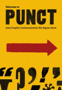
The Cowsey is a large (around 20 hectares) public site in the heart of Whitley, a neighbourhood in the south of Reading. It consists of a variety of unmarked trails in a mixture of both woodland and grassland. For this project, we were asked to develop a series of maps that could be used for large boards situated around the site, orientating users and showing the opportunity to interact with the green space around them. To engage with the local community, we joined Nature Nurture, a community interest company, with students from the New Directions College to evaluate and comment on proposals for the map; we further joined a research group from the University’s Department of English Language and Linguistics to hear of people’s opinions of using the Cowsey. Fully meeting the client’s expectations, we have now been approached by them to take on more mapping work in other areas in Reading.
Restated brief
Aim for the project
For this project, we wanted to improve how people experience and navigate through the Cowsey Woodlands area. This distinction between experience and navigation is interesting – whilst the woodlands require mapping for the basic navigation, we also wanted the experience of the woodlands to be one that created a sense of place and interest. By designing a welcoming and accessible wayfinding system, we help encourage exploration and develop the sense of place, helping visitors understand where they are but also where they could go.
Deliverables
Initially, the brief proposed a range of deliverables, including signage and a map of the green space. As the project developed, and the budget and scope were defined, the deliverables became more refined. The final deliverables evolved into three main outcomes:
A detailed user-tested map of the Cowsey
A framework for an external designer to use for ‘lecterns’, displaying a specific route available within the area
Information boards to showcase the entire map at the entrances of the woodlands area
Timeline
Main points in the timeline of this project included:
Thursday 22nd May
We visited and mapped the core paths of and around the Cowsey area using Strava so that we could start digitising almost immediately. (see Mapping)
Thursday 29th May
We joined Nature Nurture and Sylvia Jawoska in a focus group to involve and ask the community for feedback on the area. (see Research)
Wednesday 11th July
We participated in an event alongside students from New Directions College to get feedback on our draft map. Their feedback was astonishingly useful and guided most future developments. (see Research and Mapping)
Design taken to the New Directions College event to receive feedback on our draft map.
Monday 14th July
We revisited the Cowsey after feedback to plot all the paths that were missing as a result of feedback from the students and staff of the New Directions College. (see Research and Mapping)
Friday 15th August
We revisited the site once again to plot the three trails that appear on the map – the ‘Wild Walk’, ‘History Hike’ and ‘Memory Lane’
MapCanvas allows greater customisability and allowed us to map the paths.
Mapping
Mapping the area was a brand new skill to both of us and we relished the challenge of learning new software and adapting our skillset to develop a strong outcome. We started off by sketching the map physically and using Strava to plot our course, specifying that any path that appeared clear and large enough would feature on the map. Initially this was effective at showing the routes we thought were necessary.
Our route which we traced from Strava. Feedback indicated that our tracing was excessively smooth.
Following on from our engagement with the New Directions College, whose campus is situated close to the woodland site, we received extensive feedback that the paths were drawn incorrectly. Part of the reason that we drew them ‘incorrectly’ was because we had, at some points, excessively smoothed the paths to the point that they no longer resembled the paths which physically existed. The main issue, however, was that the criteria that we selected the paths (in retrospect, ‘clear’ and ‘large’ are poor criteria) with was completely unclear to the end user, leading them to suggest – quite understandably – that they had been given a map that was unrepresentative of the site. This directly led us to the conclusion that all navigatable paths should be shown, even if they lead to dead ends (which ought to be noted graphically). To map them this time, we used actual GIS data from an app called MapCanvas.
Research
The research phase of our project was illuminating. As documented by the research project conducted by Sylvia Jawoska, a general consensus that the Cowsey was ‘unsafe’ and ‘unwelcoming’ was advanced by many participants, citing illicit drug use, confusing pathways, and few features to create a sense of place; for example, in later research, we concluded that there existed only two benches in the whole area. Whilst constructing benches for this project was not our responsibility, wayfinding improves the sense of place immeasurably, and we were satisfied that the development of a map would be beneficial to the community.
Development
Addition of minor paths
Following feedback from New Directions College students, minor and secondary paths were added to the map to ensure accuracy and reduce confusion while walking along the routes.
Expanding the map
The map had to be extended to fit the scale of the information boards which led to increase in number of roads and buildings.
Map reorientation
The map was reorientated to align with the visitor’s position on side, making it easier to understand the direction in which they will start their walk.
Delivering the maps
Delivering the maps to the client proved to be another exercise in packaging files correctly, which we again seized upon. The client required three ‘focussed’ maps (i.e. maps documenting the walks) and two maps showing the whole area, differentiated by their orientation.
History Hike Lectern
Wild Walk Lectern
Memory Lane Lectern
We had designed the maps in such a way that they could be resized freely right up to sendoff. This enabled us to use the same core files in multiple different environments; the focussed maps for the three separate walks, for example, use the same underlying file with a simple blur to focus the user’s attention.
The extraordinary weight of the files (with a wide variety of effects, shadows and lines) led to difficulties being experienced with exports, with some exports taking over 5 minutes at a time. To prevent this from affecting the external designer, we rasterised the file such that the effects were ‘flattened’. This meant that we could rapidly deliver iterations to the client.
Both orientations of the information boards depending on where the user is situated
Reflection
This project was a valuable real-world design experience. Engaging with Nature Nurture and members of the local community throughout helped to ensure that outcomes met everyone’s needs. One of the most rewarding aspects was seeing how user feedback directly influenced the final design decisions.
This project also had some challenges, particularly around accuracy and making the map simple enough for the users to understand without excluding any details. It required multiple iterations and back and forth refinement with the client to provide the best possible outcome.
Overall, this project strengthened our confidence in working with real clients, responding to feedback, and designing for public spaces. The skills gained from this project will directly inform all our future design work including a further freelance relationship with Nature Nurture to redesign further places in reading with the same style as our Cowsey map.
For our academic cohort, the last project of second year revolved around The Global Goals, a collection of 17 interlinked targets that tackle a range of environmental and cultural issues. In the project, each student was assigned one of the seventeen goals, with the task to design a cohesive campaign across an A2 poster, DL leaflet and D48 billboard animation. Although the goals might seem daunting to complete by the provisional target of 2030, outcomes needed to remind audiences that there is still hope, especially with meaningful action.
Our job, as the Real Job team, was to bring together both digital and physical outcomes to form an in-house exhibition – celebrating the work involved and shining a light of hope on global issues.
Restated brief
It was important for us to expand beyond the typical restated brief by including measurements (and visuals) of the panels within the exhibition space. Luckily, this was something we could obtain from Geoff, so we didn’t need to measure each panel ourselves, which would’ve proved a challenge over the summer vacation period.
Our greatest struggle was finalising deadlines, especially since we were collaborating virtually over the summer. Luckily our production dates were solidified from the get-go, but other dates including caption collection and file gathering depended on the cooperation from students and staff. We overcame this through frequent communication via email and text message, and this was often actioned months in advance.
Throughout the project, the brief didn’t change drastically, and our deliverables remained the same:
Introductory panel ( 280 x 118 mm )
Summary panel ( 224 x 118 mm )
Prosperity, People and Planet categorisation panels ( 50 x 118 mm )
Leaflet (14.8 x 19.9 cm )
Digital exhibition with animation showreel
Social media post
Research
Initially, we looked at what the previous year did with their Global Goals exhibition. This was a necessary precaution since it prevented us from copying their concept and helped us identify their successful, and perhaps less successful components. Additionally, we looked at similar student showcases, identifying presentation methods of both artwork and corresponding copy within captions.
Design process
We began the design process by thinking of concepts and ideas for creating a brand image using the global goals branding. Our aim was to incorporate elements of their brand but it not to be a complete replica or a copy of last year’s exhibition. We had meetings with our clients, Rob and Greg, over the summer to which we presented our initial ideas across deliverables.
Initial logo ideas
Some of our initial ideas presented to our client.
The strongest concept was one that used the global goals colours within a tetris-based design of different blocks. Greg suggested we create a narrative for our concept that fits with the work that is showcased in the exhibition. This is when we came up with HOPE: Designing for the future. The tetris blocks shows everyone’s individual efforts, the students’ responses to the global goals, and when put together we can tackle all issues as part of a bigger community.
Developed logo for our concept of Designing HOPE for the future.
Developed ideas for the summary panel that utilise the initial tetris designs.
This design was then improved in Illustrator to get a clearer, more unified visual result. We continued to receive feedback from our client, suggesting improvements along the way. One big change we made was the designing of the tetris blocks, originally they were all very similar and rotated in different ways so it was hard to distinguish between different goals. Instead, we created a unique shape for each of the 17 Global Goals so it could be distinguished on its own – linking back to our narrative of individuals coming together. We also experimented with hand-drawn textures as it could be said that the shapes felt a bit too neat and could do with a bit of humanity and warmth. After exploring this idea, we found that the concept was strongest with its perfect shapes and lines.
Once we had established our concept of the tetris blocks, we then explored this through the different deliverables. We experimented with the different ways that the tetris could be positioned and created. The introduction panel shows it building upwards, suggesting growth towards the 17 Global Goals and bettering the planet through design. Further connotation is seen through 29 present shapes – each representing a student and response to the brief. The summary panel shows the lock up of all 17 Global Goals together to show the unity among them, together they represent everything that the Global Goals strive for.
Exploring different arrangements of the tetris.Exploring creating imperfect versions of the shapes.
We decided to group our responses into three categories – Prosperity, People and Planet. The first category, Prosperity, highlights the goals that strive for innovation and new global opportunities. The second category, People, looks at the human population and how their lives are impacted by worldwide issues. The third and final category, Planet, shines a light on the goals that express a concern for maintaining natural resources and Earth’s environments. To introduce these sub-categories, large panels were created to highlight the further aims of each goal. We experimented with no tetris, tetris on the bottom, and finally came to a unanimous decision of presenting a tetris pattern on the top that utilises the colours of the goals involved.
Initial Prosperity, People and Planet panels
Developed Prosperity, People and Planet panels
The tetris design was then explored and continued on through the leaflet. The three different categories allowed for a 3-panel leaflet, each panel showcasing a category of students work. We looked at a few different ways to present the tetris concept on the front side of the leaflet but finalised on one that links back to the idea from the introduction panel, it bleeds across the back of the leaflet suggesting that we continue on having hope for the future through design.
Experimenting with arrangements of the tetris for the leaflet deliverable.
Installation
Final installation took place on Friday 19 September. A useful tool that we used was an InDesign document with the exact measurements of each panel. This helped us in planning the flow of the exhibition as well as keeping equal distances between the posters (and captions) on each wall.
We applied the large introductory and summary panels first since these needed a group effort. Then we applied the smaller categorisation panels alongside the posters and captions. We heavily relied on using the laser level to ensure all wall assets were stuck on straight. All deliverables were printed on UTACK, a sticky-backed vinyl which meant all we needed to do was remove the backing and stick them to the walls. The adhesive backing was strong and durable, so if anything was applied at the wrong angle, we could easily readjust and restick.
Using the laser level on the final Planet panel to make sure all wall assets were stuck on straight.
Throughout the summer, we had expressed a disinterest in displaying the DL leaflets since they differed across the academic cohort, with some students producing exciting tri-folds with die cuts and other special finishes. However, once the posters and animations were up in T-Spur, we felt that the centre of the corridor was too empty. It was then at this point, we decided to bring in three glass vitrines to display the student submissions. Having the leaflets further establishes the cohesiveness of the campaigns on display, and adds more interactivity for the visitor.
Final products
Physical exhibition space
Introduction panel, situated in front of the main entrance to the Department.Summary panel with half of the responses to the Prosperity category.The primary exhibition space, with the leaflets at the centre within the glass vitrines.The digital display with the animation showreel on loop alongside the physical leaflets.
Leaflet
Front page of the leaflet.Inner spread of the leaflets, showcasing the posters in the order in which they appear in the exhibition space.The outer pages of the leaflet.
Promotion and awareness
In its initial weeks of opening, we gave in-house tours of the exhibition to Part 1 and Part 2 students. In these tours, we talked about the visuals on display and the benefits of completing an exhibition-orientated Real Job. These tours were a great way for us to distribute our leaflets and allow students to digest the campaigns, deliverable by deliverable.
In addition to the in-house talks, we were also given the opportunity to speak to design students from Cox Green sixth form. This allowed us to expand on our in-house talks, giving us the platform to talk about the course and Real Job experiences to an audience who are unfamiliar with the scheme.
We also created social media posts to promote the exhibition on the department’s LinkedIn and Instagram accounts. This also linked users to the digital exhibition, to which we followed the frame of last years for. This showcased all the posters along with the animation showreel. Our digital exhibition can be viewed at: https://typography.network/globalgoals/
Social media post seen on the Department’s LinkedIn.
Self-reflection
Upon reflection, our exhibition could’ve strayed away from the typographic branding of The Global Goals, especially since the colours do most of the heavy lifting. This change would’ve differentiated our exhibition from the previous year, and perhaps would’ve elevated a sense of uniqueness with our work.
Additionally, we think that the project could’ve benefitted more from in-department contact hours. It was difficult to organise this due to the summer holidays, but with us all living close to Reading, it was perhaps something we could’ve done more often. This would’ve helped to finalise print decisions more efficiently.
Emma
As someone who was well-engaged with the project at the end of second year, it was a great honour to be a part of the team to put it all together in the department. Planning, designing and installing this exhibition greatly improved my problem-solving and communication skills – especially when we had the opportunity to talk to students about the work involved. This exhibition is not only a memorable outcome for the Real Job team and I, but also something the whole year can reflect upon and feel proud of.
Hannah
My favourite module of the year was unquestionably the Global Goals module, which motivated me to join the real job team. I developed in a lot of ways while working on the exhibition, from being more comfortable sharing my ideas to communicating and working with others. The whole experience was genuinely enjoyable when watching everything come together and seeing people’s excitement when they saw their work.
Josephine
This was such a great project to be a part of, not only learning how to design and set up an exhibition but also having the opportunity for this to showcase our own work. It pushed my boundaries, overcoming challenges and building my communication skills. This project has definitely sparked a personal interest in exhibition design and I am so happy with the final outcome, along with its impact.
We began our search for speakers by identifying the most effective channels through which to approach and engage them. These included attending external speaker events, exploring professional networks such as LinkedIn, and gathering recommendations from lecturers as well as student suggestion forms. One particularly valuable resource was St Bride’s annual Design Conclave, where we had the opportunity to hear from speakers including Micaela Alcaino,Kate Dawkins, and Carolyne Hill. Inspired by their professional journeys, we approached each of these speakers and invited them to deliver a talk at the University of Reading. LinkedIn also proved to be a useful tool, enabling us to identify connections to the department through mutual contacts. This process was further supported by our supervisor, who helped connect us with alumni and provided strong recommendations.
Micaela Alcaino talking at St Bride Foundation event
Speaker communication
Before diving into the rebrand, one of the most important focuses of Baseline Shift was maintaining an exceptionally high standard and consistent communication between the team and speakers. This ranged from tailoring email templates and being immediately available to answer any speaker questions, to organising pre-talk Microsoft Teams calls to personally guide speakers on what to expect. To reinforce this consistency, we introduced a new rule requiring that every email be signed off by at least one team member via an informal group chat before sending. This process supported newer team members, ensured high-quality written communication, reduced errors, while maintaining individual autonomy.
Screenshots of speaker feedback via email post-talk
Logo Design
Logo
In a departure from the previous year’s logo design that featured a shift key symbol, the 2024–25 team began individually sketching new, more appropriate concepts, developing the logo gradually with each round of iterations. One early sketch (marked with a red dot in the image below) represented the idea of ‘baseline shift’ in its most literal form, achieved by shifting the baseline itself. This concept was then developed further, with the underlining rule evolving into the outline of a speech bubble in order to more clearly communicate the event’s focus on speakers. A summarised overview of the development process, from this iteration through to the final design, is shown below.
Initial sketches for logos completed by the teamLogo development / refinement
In our search for a typeface with a strong sense of personality, we selected Fractul Variable, which became the first step in establishing the brand identity. The typeface informed the development of a speech-bubble motif featuring a sharp top-right corner, reflecting the letterform of the ‘a’ in the Fractul typeface.
Visual to show the connection between the speech bubble shape and letterforms in Fractul
Logo in context
The logo was designed for use across multiple contexts, including an email signature developed and implemented for the 2025–2026 season. As communication with speakers is a key part of Baseline Shift, this application helps establish a sense of professionalism, cohesion, and trust for potential speakers.
Example of branded email signature
Another example of the logo in context can be found in the header on the Baseline Shift page hosted on typography.network (which the clickable email signature links to). This page houses the Baseline Shift blog posts as well as the digital timetable.
Example of web header above blog post thumbnails
Poster Design
Ideation
When researching previous Baseline Shift posters, we found that the most successful and engaging designs tended to use atypical layouts. In response, several of the concepts we developed explored the idea of a modular poster system, which would allow for easy editing to accommodate the inevitable changes that occur within a guest speaker series.
One proposed design, shown below, featured each speaker presented on an individual title card, with the cards overlapping to form a cohesive series. Each week, the previous speaker’s card would be removed, revealing the upcoming speaker at the forefront of the poster. While this concept initially appeared effective, feedback from our supervisor highlighted that physically removing the cards was a destructive design approach and resulted in the loss of an archive documenting that year’s speakers.
In response, the concept was further developed into a system in which the speaker cards were mounted on runners, allowing them to slide past one another. This iteration retained the intended ‘reveal’ interaction while also preserving a complete archive of the speakers throughout the series.
Initial sketches for poster designs 1
Initial sketches for poster designs 2
Digital ideation
With the modular poster system established, the design was developed in InDesign to explore initial visual layouts. The first concept used the four CMYK colours and emphasised the event date, speaker image, and a quote; however, this approach was later identified as clichéd. During the week of each talk, the relevant speaker card would be spotlighted, initially revealing the session number with the speaker’s name integrated into the numeral. Through iterative feedback and refinement, the information hierarchy was simplified to better serve user needs, leading to the relocation of the speaker’s name to the speaker card and the removal of elements such as quotes and descriptions. A key functional change was rethinking the reveal mechanism: rather than exposing the already apparent session number, the final design reveals a piece of the speaker’s work, resulting in a stronger pay-off for the user. Some early poster concepts, as well as the final digital designs for both years can be seen below.
Early poster concept (with placeholders)Further developed early poster concept (with placeholders)Final digital design of Baseline Shift poster (visual is for years 2024–25)Final digital design of Baseline Shift poster (visual is for years 2025–26)
Materiality
Before printing and crafting these modular posters, a (slightly rudimentary) small-scale prototype was created to check that the idea was feasible and that the individual cards worked together as a series.
Rudimentary prototype for modular poster
Considering the materiality of the posters was very important for a printed item that needs to be both durable and functional, as well as sleek and portable. After experimenting with several material options, we decided on a backing of 3mm foamboard, mountboard for the runners, and 250gsm cardstock for the speaker cards. The final crafted poster proved to be effective, and very user-friendly when it came to moving and replacing speaker cards after each Baseline Shift talk.
Final poster for the Baseline Shift 2024/25 lineupMateriality details for Baseline Shift poster
The vibrant choice of colours against the sleek black frame of the posters meant that it was difficult for students to walk through the corridor of the department without stopping to look, and the tactile nature on top of the abundance of scannable elements on the poster encouraged a lot of interaction from curious students. To explain a few of those elements further, the QR codes that feature on each speaker card direct the user to a live webpage featuring links to the speaker’s portfolio before their talk, and a written blog post after their talk. The vibrant colours assigned to each speaker were picked in reference to the speaker’s image of their work, and once chosen, these colours became an important part of the branding.
Close-up of speaker card featured on the Baseline Shift poster
Business Card & Timetable Design
Business cards
To accommodate changes to the Baseline Shift lineup and timetable, the physical, printed timetables used in previous years were replaced with an editable, digitally hosted PDF. To ensure easy access for students, we designed a business card featuring a QR code that links directly to the digital timetable. Many ideas were considered before landing at the final concept for the business card.
It was important that this was a well-considered deliverable as the user is a design-orientated student familiar with printed artefacts and trained to analyse and critique designs they are presented with. With this in mind, alignment was carefully considered, and the final concept ensured that the design of the front lines-up with the design on the back when flipped horizontally or placed side by side. The elements that are lining up are blown-up outlines of the speech bubble shape with a gradient applied. The gradient is made up of the colours that were assigned to the individual speakers, representing a culmination of speakers, industries, and backgrounds, which is the core essence of Baseline Shift.
Visual showing the iteration that went into the business card design
Business card prototypes
Before getting these sent off to print with soft-touch laminate and UV-varnish finishes applied, we needed to test where best to apply the UV-coating, so we developed a crude but workable prototype, painting clear nail varnish over a printed version of the business card.
Rudimentary prototype of spot-varnish business cards
Distribution of business cards
The distribution of the business cards was vitally important to making this brand successful as we wanted students to appreciate the quality and craft of the cards themselves. We achieved this by personally handing each student a card and allowing them a few moments to observe the special finishes applied and scan the printed QR code to browse the timetable. This year’s rebrand was about so much more than just the deliverables, but also about ‘shifting’ the mindset of the students.
Materiality details of business cardsFinal business cards that line up when placed in series
Digital timetable
The design of the digital timetable also required careful thought, considering how much and in what way the information is presented. After a short ideation process, a tall, scrollable design was decided on with interactive elements, directing users to the same web page that the posters link to, where the speaker blog posts are posted.
Digital, editable timetable for the Baseline Shift 2024/25 and 2025/26 lineupVisual to show timetable in context
Social Media Design
Ideation
Upon deciding on the design for our poster and printed assets, we came up with ideas on how to structure our social media templates in the style of our poster design to ensure consistency across deliverables. To maintain a regular social media presence and keep students updated during the Baseline Shift seasons, we proposed five templated posts:
Introductory post
Pre-talk speaker carousel
Post-talk speaker carousel
Pre-talk story
Feedback post
We began by sketching ideas for posts and arranged group feedback to decide on which designs work well and which are less successful.
Initial sketches for social media templates
Introductory post
We created the initial introductory post not only to introduce Baseline Shift to new first year students who were previously unaware of the module, but also to highlight to existing students that baseline shift was back in their schedules. Again, as our users are design-minded and design-trained individuals, it was important that every small detail was considered, including a seamless carousel transition.
Baseline Shift introductory Instagram post
Pre-talk speaker carousel
The main purpose of the carousel posted before a speaker’s talk is to promote and inform. Expanding on the assets used in the poster, this template finds the right balance between displaying enough information, giving the audience enough of a peek into the designer’s work and career, while also leaving enough mystery for them to look forward to the talk. To connect the last two slides of the carousel, the speaker’s assigned colour was used as a block-colour background, adding an on-brand pop of colour as the user swipes the post.
Baseline shift speaker carousel Instagram post (Miho Aishima)
Post-talk speaker carousel
To allow for a focus on the photography as well as a summary celebrating the speaker’s talk, the post-talk carousels could be less designed and use far fewer assets. We deemed it appropriate, to let the photography speak for itself and stripped back the carousel to just the three images, placing the Baseline Shift logo in the bottom of the post to tie back into our branding.
Baseline Shift speaker carousel Instagram post (Kate Dawkins)
Pre-talk story
The story posts followed a similar format to the pre-speaker carousel, however, to differentiate these from the speaker’s posts we made sure to schedule these a day before the talk as these have a time limit as to when the posts expire. The purpose of this templated post is to act as a reminder for students, that the talk was taking place the next day. We also decided to include a further piece of the designer’s work to give some context to who the students will be listening to. This idea of drip-feeding images of designer’s work across different platforms (poster, main-feed posts, story posts, etc.), keeps content relevant and new and gives students a reason to stay tuned.
Baseline Shift reminder Instagram story (Nitya Thawani)
Feedback post
The final template that we designed for the Baseline Shift socials was for regular feedback posts. Students were presented with a QR code directing them to the feedback form on the big screen at the end of every third speaker session. In case they missed this, or simply wanted to access it later, this post acted as a reminder for students to provide feedback. It also served as a step-by-step guide on how to access the form when presented with a QR code via a main-feed Instagram post.
Baseline Shift feedback form Instagram post
Posting consistently
To ensure a regular social media presence and avoid conflicts with the T&GC department’s existing schedule, we liaised with the department’s social media team to establish agreed-upon posting days. As part of the handover of responsibilities to newer team members, we refined existing templates and developed tutorials, alongside collaborative training sessions, to clearly outline expectations around content, tone, and posting timelines.
In line with our email review process, we also implemented a sign-off system requiring at least one additional team member to approve each post prior to publication, ensuring consistency, strong execution, and a high standard of grammar across all content.
Visual to show a range of social media posts in context
Animation
For the 2025–2026 season, we set a task for the future Baseline Shift leaders to create an animation to display both on the screen in the department and across social media. Due to time constraints and limited knowledge of software, after storyboarding their ideas they were only able to execute the introduction, and we happily stepped in to assist with finishing it off. We wanted the team dynamic to have clear roles and responsibilities, while also acknowledging that if something was ever beyond anyone’s capabilities at the time, there were always other team members to reach out to for support.
The following animation was designed with sound in mind, to be posted on social media:
While the next animation was designed to be played without sound on the promo screen in the department entrance (with the difference between the two animations being in the smoothness of the introduction) :
Blog posts
Writing about our speakers
For this season of Baseline Shift we focused on improving and maintaining the consistency and quality of our blog posts celebrating each speaker. To achieve this, we ensured that for every session, all team members had clear responsibilities: one person taking notes, another capturing photos, another setting up the tech and another introducing the speaker. This preparation meant that when it came time to write the posts, we already had all the content and assets we needed. Each blog was either written or edited by one of us two, ensuring a consistent style and high standard of writing across the series. Our blog posts can be read here.
Example of blog post (Carolyne Hill)
Outcome
The 2024–2025 Baseline Shift sessions have been a great success, seeing a skyrocket in attendance and an overwhelming amount of positive feedback from students, staff, and speakers alike.
We are both incredibly proud of what has been achieved, and are so committed to the future of Baseline Shift that we have agreed to continue our involvement beyond the completion of the Real Job itself. Our hope is to carry forward the legacy of Baseline Shift and to keep delivering outstanding industry talks for students of the Typography & Graphic Communication course.
Baseline Shift’s increase in attendance since we stepped up to co-lead the team in 2024 has been visualised below, (it must be stated that these increases are also impacted by first and second years being required to write learning journals on the sessions, however, there are no other causal factors for the increase in third year attendance other than our drive for promo and devotion to the project).
Baseline Shift’s increase in attendance
Feedback
Client feedback
“I don’t think I have ever seen such a successful example of a student team in action. Through thick and thin (a lot of stuff happens in a year) they have supported each other and made the whole Department proud. I now have a new baseline of excellence in how these things should work. And my teaching observation is that I can’t really take the credit for that. Instead, it comes the fact that every year – somehow – tremendously able young people find our course in BA Graphic Communication and sign up (not quite knowing, I think, what to expect). When the most able among that group then feel ready to take on the biggest challenges, I think maybe the best I can do is get out of their way, and just be there when they need to talk.”
– James Lloyd
Reflection
Baseline Shift has exceeded the regular boundaries of a Real Job and has become a passion project that the two of us have devoted hours, weeks, and months of our lives to. We have nurtured it into something that we are deeply proud of and excited to pass on, hopefully continuing the legacy and the bar we have raised it to. There have been challenges throughout the project, often regarding how to work on such an involved project fairly as a team of students with varying levels of time and commitment. We overcame this by considering everybody’s individual needs and adjusting the workload accordingly. We didn’t want to design deliverables that would only be successful for one season, instead, by designing a system, an identity and template after template, we created a well-structured framework, that can easily be handed over to the next generation of students – that to us, is a new legacy for Baseline Shift.
The premise of this job was to continue the work of our recent branding project, in our design portfolio module, for the East Reading Federation. The client was so pleased with our pitch that they decided to expand the brief through the Real Jobs scheme. East Reading Federation is a newly formed governing body of two local schools: Alfred Sutton and Redlands Primary school. Their aim is to bring both schools together under one management team to deliver excellence across two different schools. After completing a brand identity for them, the client wanted to continue the partnership with The Department of Typography and Graphic Communication through the Real Jobs scheme and asked for the four of us directly. Although we knew we had a limited window of time to complete the job, we stayed together for the client and got involved in booking meetings with the client and our supervisor and, soon after, restating the brief.
Restating the brief
Following initial meetings with both our clients and supervisor, we were able to create a restated brief that established the project’s details, such as the exact deliverables and their requested formats. We began by establishing our roles and responsibilities to manage our time efficiently and guarantee clear understanding of what was expected from us. The short project time was acknowledged by ensuring clear detail of desired outputs and member allocations of such. A weekly schedule was devised to make sure that each member and output would regularly progress to fulfil our close deadline at a manageable pace, without compromising quality. Our restated brief was quickly approved by our clients and supervisor, both describing it as ‘spot-on’.
Deliverables and design identity
Due to the nature of the Job, we were working off our own brand guidelines, which made the design identity easy to follow and with little scope for creativity. Despite this, we could still experiment with various layouts and formats with the only constraints being colour, typography and use of logos.
The deliverables for this project were:
Complete Website on WordPress
Email footers
Branded slide templates
Letterhead
Lanyard
The client did not request photography as an extra deliverable but because this was added to the content of the other deliverables. It allowed us to go beyond the scope of the brief and deliver a folder of well-produced imagery of their lovely school buildings and areas for them to use as they desire.
Research and collecting resources
We already had an extensive knowledge of what the East Reading Federation was and their visions and aims, due to our research in the Branding Project. However, more research was done through the form of meeting the client to discuss their aims for the deliverables, such as attending both schools to gain a better understanding of the buildings, the environment and the teachers. While at the schools, Olivia was able to photograph the buildings, playgrounds and equipment, as well as inside some of the classrooms and the corridors. This collection of photos not only gave us a better understanding of the schools but aided the development of the website.
Photo examples:
Development:
Website
As one of the hardest deliverables, the development of the website meant that we had to learn to navigate a new software: WordPress. It proved to be quite hard to understand and, although the photos below in the items delivered section show some development, we were unsuccessful in completing this deliverable. It was a decision made due to a conversation with the client regarding the successful completion of the website. The discussion with the client determined that in order to complete the website successfully within the timeframe, the job would have to be passed over to someone with more sufficient knowledge of WordPress. However, due to the relationship we had with the client, they decided to allow Olivia to continue to build the website outside of the project timeframe while learning and navigating WordPress and solidifying a new skill.
The developments made on the website within the project timeframe can be seen in the images below. Olivia learnt the ability to create headers and footers which could then be applied consistently across the website. She applied some of the photos to the website as seen in some of the examples later on.
Email footer
The email footer design was refined through multiple layout experiments for the East Reading Federation. The use of red bricks was reduced to prevent the red from overpowering the federations colour palette. The type size was also adjusted to improve legibility, and the typography was refined for greater cohesion, resulting in a more polished and accessible design.
Several versions were created to suit the two schools within the federation, Alfred Sutton and Redlands. The highlighted text and colour schemes were adapted to match each school’s identity, making the designs feel more personalised and thematically consistent. The designs were created using Canva to ensure ease of use for the client, allowing staff names and other details to be updated quickly and independently as needed.
Slides
Multiple versions of the title slide, table of contents, and several internal pages were developed to accommodate a range of presentation needs for the East Reading Federation. To maintain consistency throughout, the federation’s logo was used as a running head on each page, alongside a cohesive used of typography, colour palette and the signature red brick motif.
The layouts were intentionally kept open and adaptable, allowing clients to customise the content as needed. To further enhance usability, the final slide designs were converted into PowerPoint format, making it easier for the federation staff to edit and repurpose the templates independently.
Letterhead
In order to create a visual identity that represents both individual schools and is consistent with our branding, Alice’s role in this project was to create a letterhead for the federation required coming up with a visual identity that complemented the overall branding while representing the two separate institutions. The original idea was to combine the architectural features of each school’s watercolour paintings to create a single, coherent depiction. A change in strategy was necessary, nevertheless, because the initial attempts at applying watercolour effects did not match the federation logo’s brand look. The design was improved by matching the logo’s stroke width, and after multiple iterations, an asymmetrical pattern was selected because it felt dynamic and organic. To maintain uniformity and strengthen the brand identity, the same green on the tree and red bricks from the logo were used.
Figure 1. The first attempt on watercolour and sketches.Figure 2. The second attempt on watercolour and sketches with human figures and red bricks.Figure 3. The third attempt on stroke and simpler style.Figure 4. The fourth attempt with different perspective of the individual schools.Figure 5. The fifth attempt on clearer illustrations.Figure 6. The sixth attempt with symmetrical school illustration and experiment on adding tree.Figure 7. The seventh attempt on illustrating oat tree and cooperate red bricks coherent with the email footer.
Personal Reflection
Olivia Moors
Despite the quick turnaround of the project combined with all my other projects due at the same time, I am glad I was able to retain a relationship with the client and deliver new assets of the brand identity we created. I am upset that I wasn’t able to complete the website within the timeframe, but I am grateful the client has offered me the experience to learn a new skill and develop an impressive portfolio piece. The skills I learned during this project are expandable and will develop as I continue with the website. The fast pace of the project meant that organisation skills were a top priority, and the use of the Trello board was an important tool for project management, I made sure to make use of the all the features such as deadlines, check boxes and file uploading. As team leader I ensured that my team kept up to date with each section of the Trello.
Alice To
That the client liked our branding project concepts and chose us for this actual task made me very happy. Despite the somewhat hurried nature of this actual assignment, I’m delighted that my group members and I worked well together and submitted on time. Since the client expressed how much they enjoyed the watercolour artwork from the person’s school, I first had a lot of trouble deciding on the appropriate style for the letterheads. Using all of the colours seen in our federation logo, I was able to produce the final version after consulting with my group members and our supervisor.
Vivien Lee
It was a great honour to have the clients decide to use our pitched branding for their federation. Our group worked well to overcome the short time frame we had for this project and successfully produced outputs we’re proud of; we’ve learnt valuable time management and communication skills as a result. Reflecting on this project, our skills in using WordPress have room to improve, and this will greatly benefit us for future projects that require UI and UX design. This project has encouraged branding to be a possible sector for me to pursue professionally in the future.
Aina Zain Azrin
Working on the East Reading Federation project really pushed me to think beyond just aesthetics, I had to understand who we were designing for, what the federation stands for and how to communicate that through every detail. I learned how meaningful design can support identity and connection. It’s been challenging but rewarding experience that made me more confident in my ability to design with purpose.
The client is a non-profit company whose mission is to “unite education and business to inspire and equip our future workforce for tomorrow’s workplace.” EBP are re-branding to modernise their current identity with the aim to appeal to both corporate and young people alike. The client aims to relaunch with their new branding for the upcoming academic year starting September 2025.
Restated brief
Aim of the project
The client aims to move away from the current, ‘dated’ logo and create a modern, professional, and trustworthy feeling through updated branding.
Objectives
Through a detailed analysis of both the client’s current branding and that of their competitors/comparators, new branding will be developed with the aim to create a more positive impact for the different stakeholders.
Deliverables
A logo
A set of clear and easy to use brand guidelines
Five editable Canva templates for social media
Linkedin Banner
Facebook Banner
How the deliverables will be measured:
Client feedback will determine the reception from internal and external stakeholders both throughout the design process and when the new branding and logo launch.
User needs:
The new logo and branding should aid in the business appearing modern, trustworthy and professional to the user. The client has two very different stakeholder groups, one being corporate professionals and the other being young people who may benefit from the charity. Both of these user groups’ individual needs must be considered and met within the re-brand. Some key needs are to be approachable, friendly, and empowering, while also being professional, reliable and sleek.
Notes from initial client meeting:
The client has explicitly stated that there are a few things to avoid while re-branding. These include: Primary colours and clip-art-style imagery.
The client has already brainstormed some elements that the new logo could take inspiration from, such as bridges (bridging business and education), business, and people.
EBP’s brand values as stated by the client are to be reliable, trustworthy, professional, and to have a positive impact to both businesses and education.
The client mentioned that while EBP is a charity, they are also providing a service for businesses (e.g. by helping them to meet their corporate social responsibilities).
The client was open to investigating the current strap-line and potentially suggesting alternatives.
Schedule
Fig 1 – EBP re-brand schedule
Research
Branding workshop
After receiving the brief for this job, our team were fortunate enough to be invited along to a workshop run by Chris Washington-Sare, specifically on re-branding charities and non-profit organisations. This is where we were introduced to brand archetypes, symbolic colour interpretations, and some ‘deceptively simple brand questions’ that can be used to dive into the meat of what the brand really stands for, who they are, and who their target demographic is.
Comparator and user research
After using some of these questions and techniques in our initial client meeting, we began to research brand comparators (fig 2), and develop user personas for the different types of stakeholders involved (figs 3–4). This brief had the challenge of targeting both corporate and young people alike, so developing these different personas was key to understanding the requirements of both.
Fig 2 – EBP comparatorsFig 3 – User Persona (Jason)Fig 4 – User Persona (Sarah)
Logo sketches
Initial sketches
After reviewing the meeting notes, we began sketching some initial logo concepts, keeping the clients’ words in mind (fig 5). There was a recurring theme of ‘bridging’ education and business that came up throughout our initial client meeting, which was something that we incorporated in a few of the sketched concepts. When presenting these sketches, instead of showing them in their natural state (pen & paper), we took them into illustrator, as advised by our supervisor. Taking the concepts digital and placing them in contextual mockups at this stage helped us to refine some of the ideas and make the message clearer for the client to understand (fig 6).
Fig 5 – Initial logo sketchesFig 6 – Developed logo sketches
Developed sketches
After presenting the client with the six refined concepts, the clients decided to move forward with ConceptsD, and E, (fig 7) combining the two, with the clients requesting one logo using the full organisation’s title ‘Education Business Partnership’, and one using its shortened acronym ‘EBP’. It was at this stage that the client mentioned that different sectors of the organisation are currently separated and categorised by four assigned colours. As redesigning the organisation’s website was out of the scope of this project, the client asked if we could incorporate four different colours in the developed concept. This prompted the idea to add a third element to the bridge icon (fig 8), meaning that, including the colour of the type, a total of four colours would be incorporated in the new logo concept.
Fig 7 – Logo concepts D & EFig 8 – Logo tri-colour
Logo refinement
Refining logo structure
After deciding to add the third element into the icon in the form of a shadow along the bridge, we moved to looking at the overall silhouette of the logo, in both its short and long format. After feeling like the long-format logo was a little heavy/busy with the icon running along the entire length of the type, our supervisor, Greg Bunbury helped us come to the ideal solution of shrinking the icon, so that it still hugs the letterforms and allows the type to stand on its own (fig 9).
Fig 9 – Refined horizontal logo
Colour variations
After finalising the format and structure of the logo variations, it was time to experiment with colour palettes. We then presented the client with five options (fig 10), and Concept B (fig 11) was chosen as the colourway for the final branding.
With the logos finalised, it was time to begin considering EBP’s social media and working on some templates that the clients can use moving forward. After investigating the organisation’s existing social media, it became clear that they would need posts to, advertise their volunteering events, showcase work experience opportunities, post quotes from stakeholders, and display general photographs taken from various events. Templates were created for each of these on Canva (fig 12), which brought with it the challenge of not being able to use our chosen typeface, Satoshi. We considered creating the templates in Figma, and providing instructions for the client, however, after a discussion with the Real Jobs team, it became clear that choosing a suitable alternate typeface on Canva was the most logical solution to allow for ease of use for the client.
Fig 12 – Editable social media
Introductory assets
While editable post templates were important to provide the client with, we also pitched three pinned posts for the organisation’s Instagram page, as well as LinkedIn and Facebook banners, to act as introductory assets when users land on their socials (fig 13). As the rebrand is due to be launched after the time that this blog post was written, we have included a mockup of what the organisation’s instagram would look like with the templated social media posts (fig 14).
Fig 13 – Uneditable social media postsFig 14 – Instagram mockup with templated posts
Brand Guidelines
File sizes
With all of the individual deliverables designed and finalised, we put together a brand guidelines document for the client to refer to and potentially provide to other designers in the future if they decide to rework their site with their new brand identity. Throughout the project, due to large file sizes, we were using WeTransfer to send over deliverables and documents. James Lloyd offered the insight that while this was okay for transferring folders and deliverables, the brand guidelines document being such a large file would make it very difficult for the client to send around internally. After this feedback, we compressed the document into a small enough file to comfortably send via email. This was a good lesson – that when designing, it is just as important to consider the client’s user experience in handling the internal documents, as it is to consider the end-user and stakeholders’ experiences.
While a full redesign of the organisation’s website was out of the scope of this Real Job, the client still wanted to implement their new colour palette and logos into their existing website. The WordPress website was previously designed by an external designer, so the client did not know how to go about changing the colours of certain areas of the site. This was an exciting challenge for us to investigate, and once we had come to the conclusion that the coloured headers and footers were controlled through WordPress themes along with some custom CSS, we created a simple set of instructions (fig 17) for the client to follow to go about making these changes without impacting the rest of the site.
Fig 17 – Website instructions page
Feedback
Client feedback
“Tommy, Creamy and Diogo worked with us to come up with a re-brand for our charity. From the initial meeting, the team were excellent, professional and demonstrated a good understanding of our requirements. The work produced was of a high standard, they listened and acted on feedback and maintained good communication throughout the process. They demonstrated a high level of professionalism at all times and we were absolutely delighted with the final designs selected. We would not hesitate to recommend them for any future work and wish them all the best in the future.”
– Kate Barrow (CEO of Education Business Partnership)
Reflection
Our experience
Working on this project has been incredibly rewarding, and we are extremely grateful to have had such communicative, active clients who are deeply passionate about their organisation and the rebrand. While we believe that our scheduling and organisational skills were very strong, if we were to redo this project, we would book in specific dates and meetings ahead of time with both the clients and supervisor, to give fixed communication points. It is very easy when working alongside other responsibilities to leave enough time for one another to review the designs before they reach the client, but it is also vitally important to ensure that there is time for the supervisor to review the design work, and this is where we could have improved.
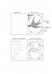
The Craftsman’s House is a new small business which creates and renovates bespoke upholstery pieces. The brand is a sister company of an existing local furniture business, which produces items for the hospitality, office, and commercial sectors. The Craftsman’s House instead seeks to work directly with customers and offer the following services:
Bespoke reupholstery of customers’ existing furniture items
A range of second-hand items which the company has sourced and renovated
The ability to create upholstered items to match customers’ furniture
The company want to produce custom, high-quality pieces that will last for years and can become family heirlooms. Each item will be handcrafted by experts with forty years of industry experience, to offer an exceptional finish and specialist guidance. Sustainability is a core focus within the business, as their services preserve existing or second-hand furniture items, in addition to using sustainable materials where possible.
Restated Brief
To support the new business, this Real Job involved creating a cohesive brand identity which conveyed their commitment to producing artisanal, sustainable, and high-quality furniture pieces.
Creating flexible brand assets was critical to the restated brief, as these would be applicable when launching The Craftsman’s House via an Etsy shop, and later an online store. Furthermore, the branding assets would ideally be applicable to other print and digital spaces as the business grows, such as social media posts, letterheads, etc.
The client expressed that they would also be interested in deliverables which help to promote the new business and create brand recognition over time. As each item they create is unique and designed to last for years, incorporating a way for customers to recognise their products was a priority.
Therefore, we agreed on the following deliverables for the project:
A branding system (including brand colours, typography, and a logo set)
A business card to distribute to potential customers
A fabric label to be applied to each piece of furniture
Research & Ideation
To develop a visual strategy for the deliverables, user personas were created to represent potential customers. This process identified how the deliverables could respond to customer needs, such as emphasising the range of different services offered, the company’s unique products, and conveying their longstanding industry expertise.
(Above) Three user personas developed to identify user needs
Conducting competitor analysis revealed that many existing upholstery companies overuse visual tropes such as sofas and armchairs in their logos, with often plain, sans serif typography. The logos struggle to separate themselves from one another and often convey corporate identities which creates distance from consumers. Conversely, the moodboard for The Craftsman’s House concentrated on curating a brand identity which highlighted their handcrafted products, and the personality of a small, artisanal business.
(Above) A selection of competitor logo designs , which often lack illustration or rely heavily on sofa and armchair imagery
(Above) A moodboard reflecting the style and tone for the logo design and printed deliverables
To avoid the typical chair and sofa logos on the market, I created a mind map of different symbols that could reflect the industry and brand values of The Craftsman’s House.
(Above) A mind map of visuals relating to the company’s brand values
The initial sketches shown below expanded these concepts by experimenting with typographic combinations, vintage border styles, and hand-drawn illustrations. Some symbols referenced the eponymous ‘Craftsman’s House,’ through a house, door, door knockers, etc. Others included upholstery tools (scissors, tack hammer, etc) or signifiers of the business’ countryside location, such as deer and hares.
(Above) Initial sketches for the logo design
Design Development
When translating the designs into digital formats, typography was the first element to be developed. Various logotypes and monograms were made with script and serif typefaces, and combining both types helped to convey the handmade nature of the business, whilst also signalling quality.
(Above) Initial experiments with typographic combinations
(Above) Initial experiments with monograms
(Above) Initial experiments with vintage border styles
My supervisor suggested exploring classic British typefaces for the logo, which led me to setting the type in King’s Caslon, an Old-Style serif which originated in Britain in the 1700s. The supporting text was also set in Lamar Pen, a flowing script which references the handmade nature of the products from The Craftsman’s House.
(Above) The refined logo typography, featuring King’s Caslon and Lamar Pen
Matching the typography with an appropriate illustration proved more challenging, as vector logos (such as the deer and hare silhouettes below) proved too modern for the rustic style of the business. By contrast, my initial hand drawn illustrations of the door, lion door knocker, and upholstery scissors were too fine and presented legibility issues at small scales.
(Above) Initial vector logo designs
(Above) Initial hand-drawn logo designs
From discussions with my supervisor, I was able to rework the illustrative component and focus on more abstract visuals to spur customers’ imagination, rather than obvious motifs which were repeated in the logo name (house, doors, etc.). I found that designs with the hares were more successful, as they depicted the countryside location of the business whilst evoking quality and elegance.
Revisiting the hare illustrations allow me to develop two distinct styles: one a looser, pen-like illustration (logo set 01), and the other a more traditional, line-based approach (logo set 02). In addition to the main logo, I experimented with a complementary emblem. By using circular borders, the designs mimic leathermaking stamps, which are closely linked to upholstery practices and reflect craftsmanship.
(Above) Development of the first illustrative style
(Above) Development of the second illustrative style
(Above) Refined logo set 01
(Above) Refined logo set 02
The client expressed a preference for second logo set, commenting that it conveyed a sense of heritage and therefore felt the most suitable for the brand. I additionally noted that the second logo set offered more flexibility for variations, as the linear style was more legible at small scales, or when cut in half and combined with other elements. With this agreed, I developed the following final logo set, offering different logo options for print and digital applications. For example, the primary logo would be ideal as a letterhead, whilst the simplified logo mark would suit the business’ profile pictures on their social media and Etsy store.
(Above) Final logo set
To support the logo set, various colour palettes were tested. The final colour palette includes mainly rich neutral brown shades, which convey a premium, classic brand, as opposed to a trend-led business. Moreover, the two subtle green tones in the palette reflect the brand’s focus on sustainability. Each colour in the final palette has sufficient contrast with black or white and can be combined with one another to offer additional flexibility.
(Above) Brand colour palette experiments
(Above) Final brand colour palette
Further Deliverables
The above assets were combined to develop the brand’s business card and fabric label designs. In the initial restated brief, the client had asked for a ‘thank you’ card to be supplied with each customer purchase. However, due to the brand only just launching, we agreed that a business card could be more appropriate to generate interest in the brand at this early stage.
With this amendment in mind, the client expressed an interest in the business card and fabric label using a variety of assets, as opposed to the same design over and over. Therefore, the initial business cards experimented with various combinations of assets, typography, and brand colours.
(Above) Initial business card designs
Despite the colours reinforcing the brand identity, the consistent colour on the front and back of the cards lacked contrast. Consequently, the revised designs incorporated a different background colour on the front and back to create more visual interest. This allowed the client to select the final design, which featured inverted green and cream shades on either side. The final deliverable also combined the primary, secondary, and emblem logo assets to add detail without appearing repetitive.
(Above) Business card design iterations
(Above) Final business card design
In contrast to the business card, the fabric label needed to adopt a much more minimal design. This was due to the fact that it would be applied to each furniture item, so ensuring that the label wouldn’t clash with any surrounding fabrics was a priority. Hence, the simple primary logo (design 01) felt the most appropriate solution, as an easy way to allow customers to recognise a furniture piece from the company.
(Above) Fabric label design options
(Above) Final fabric label design
Final Designs
In summary, each of the assets fits into a broader design system which can be combined in different ways as the brand grows. To support the client when using the assets, a set of brand guidelines were developed. Each component of the design system is referenced, with both a justification and suggested applications. Mock-ups were also incorporated to help the client visualise the final products (business card, fabric label, digital assets) in practice.
(Above) Final brand assets
(Above) Sample spreads from ‘The Craftsman’s House’ brand guidelines
(Above) Mockup of final business card
(Above) Mockup of final fabric label
(Above) Mockup of brand assets being used on the Etsy store
Reflection
In summary, I found this Real Job to be a highly valuable experience. As this was my first official branding project, it was a fantastic opportunity to learn and follow the appropriate processes to build a brand identity from scratch. I found creating each of the assets particularly rewarding and appreciated being able to start with a completely blank canvas on this project. Whilst this required some research on my part and many attempts and revisions to the illustrations, I believe that we have reached an outcome which is cohesive, appropriate, and avoids the overdone sofa logo of many competitors.
The feedback from both my supervisor and client were integral to the process, and it required me to be adaptable in accommodating changes to meet all stakeholder needs. Furthermore, this project allowed me to appreciate the importance of designing for different applications, from clear, minimal fabric labels which support brand recognition, to a more dynamic business card which seeks to draw in customers. As a result, this Real Job has produced design assets which support an artisanal, high-quality, and sustainably-focused small business as it launches and grows in the future.
KateMustSew is a self-made quilting business based in Reading, specialising in workshops, trunk shows and quilted artwork. Kate required a profile-raising rebrand and website design to elevate her business and reputation as an artist from a hobby quilter to a more professional level.
Restated brief
In our initial meeting with the client, it was clear that she wanted a rebrand but was unsure of what deliverables to ask for. Together we ran through her business model, noting the platforms she primarily operated on and the ways in which she communicates with her customers. This offered us insight into her business and allowed us to suggest deliverables which would suit her specific business style. Our main aim with this process is to ensure our deliverables help Kate to achieve her goals through the rebrand.
The agreed deliverables were:
Three logo designs (One portrait, one landscape and one circular)
The range of logo options offers the client flexibility across platforms whilst maintaining the house style.
Business cards
Designed for the client to hand out at open houses, workshops, trunk shows.
Introduction sequence for her videos
Visually aesthetic introduction sequence to be used on YouTube tutorials and online workshops.
Website pages (gallery, home page and contact page)
Simplistic and clean website pages to emphasise Kate’s professionality to potential galleries and trunk show bookers, as well as customers looking to book classes.
Research
Before we began the ideation process, we spent time researching Kate’s business and competitors to ensure we could fully understand her user’s needs and how we could support these through the deliverables. We were particularly interested in how similar individual artists presented their brands, especially on their websites. We analysed how these artists chose to present themselves; looking at the website styles, colour schemes and imagery/ illustrations used across the brand. Through this process, we discovered that many artists within the same field as Kate chose sleek and clean website layouts. We also noticed that a lot of quilting artists logos felt cliche and passive.
After looking through these online presences, I compiled a list of features that we found appealing and believe to enhance the presentation of these businesses.
White backgrounds and simple layouts – these help draw the user’s focus to the artwork which is the artist’s primary goal.
Large images and scrolling image carousels on the home page – show a range of the artists different works and styles with minimal user effort.
Well lit images shot from above with white / removed backgrounds – high quality images ensure the detail is maintained and white backgrounds make the product the main focus.
Personal ‘About’ pages – this offers artists a way to add a personal touch and convey their motivations and passion for their work. This also creates a parasocial relationship between the customer and the artist in which they understand their passion, likely encouraging customers to purchase more to support the artist.
Audience
The client’s audience is primarily over 50s and with the inclusion of a professional website, it will broaden to art galleries and exhibitions that wish to include her work. It is important that Kate’s work also appeals to a younger target audience as Kate hopes to expand her audience and recognition as an artist through this rebrand.
Design Development
Logo
For Kate’s logo, our aim was to create a visually impactful design which represented her quilting work in a simple yet sophisticated manner.
Initial logo sketches
With our initial sketches, we explored a range of different approaches with some typographic and others more shape and pattern focussed. The client’s response made our next steps clear; she liked bright, bold colours with a playful edge—but not too much—as she wants her business to appear serious. She also emphasised that she dislikes the abbreviation ‘KMS’, cursive/ threadlike typefaces and cliché sewing iconography (such as thread spools). Furthermore, it felt important to capture the client’s love for 70’s typography and the colour hot pink in my future developments.
Examples of how I integrated the client’s work into logo ideas
Digital Developments
Our supervisor helped us to narrow down and alter the logos above before presenting ideas to our client. For my designs, our supervisor suggested to focus on executing the typography better which I agreed with. She saw potential in C2, however commented that the overlapping type became too much with the organic shapes of the lettering. C4 was a favourite amongst us and the idea of adding ‘stitching’ to link to the business was suggested, however I was unsure whether the client would see it as too cliché considering her previous comment.
Approved logos we showed the client
The client rejected Ben’s geometric ideas as she felt they looked too corporate and therefore not representative of her values and business. However, she was very keen on my square ideas (C5–7). As I predicted, she disliked the stitching around the edge but liked the large block of pink and the organic feel of the rounded corners and slightly wonky text, which are representative of the handmade nature of her work. We agreed that the next steps would be to experiment further with typefaces and colours, using C5 as the base design.
Typeface options I showed the client
I offered the client a variety of typefaces inspired by 70s typography which she mentioned in our initial meeting, however after deliberation she selected the original typeface, in its original form. Although this resulted in no change, the process was insightful as it allowed comparison and highlighted how effective my original design was.
Colour options I showed the client
Of the colour options I offered the client, she was most keen on those including the original hot pink colour that she favoured. We discussed creating an additional black and white version of the logo for monochrome print-outs, however since the majority of Kate’s branding appears digitally, she decided that there was no need, especially as the bright colour is part of what makes the logo so appealing. Kate liked the colours on the top row and asked for white text with a coloured full stop, to emphasise the imperative ‘Kate must sew.’
Final iterationsFinal LogoLandscape variation of logoCircular variation of logo for profile pictures
Both the client and I am really happy with the final logo and variations. I feel that the typeface represents the quirky and handmade nature of small businesses and the colours capture the brightness and energy of her quilts. The chosen colours have helped to identify Kate’s brand colours which are continued across the business cards, website and video. Kate posted a sneak peak of her new logo to her Instagram account where she recieved an overwhelmingly positive response.
Business Card
My initial business card designs
My original business card designs were lacking, which I understood through supervisor feedback and personal reflection. Through discussion with our supervisor, my next steps were clear;
work on the typography, try Sweet Sans (classy)
work on alignment of elements across the front and back
try to avoid mixing imagery and the logo
find less clunky social icons
The concept of idea 1 however was popular with both our supervisor and the client. During the research stage of the process, I was inspired by one Kate’s Instagram stories where she had embroidered on a card. I thought this would be a great way for Kate to promote her business if this was something she was prepared to do. Being able to offer potential customers a hand-sewn business card would almost definitely ensure that people kept the mini artworks and remembered her, boosting her artist awareness and customer base. Kate loved the idea, however decided that a design which she could sew on, but could also stand alone was the best option.
My solution to this was to ensure that my future designs had enough negative space which she could embroider over, but were still visually effective alone.
My developed business card designs
For my developed designs I experimented with the recommended typeface Sweet Sans. Although I agree that the clean shapes of the letters works well to create a balanced design, I was not sold on this specific typeface and neither was the client. The client was happy with the size of the logo but did not want her face on the front as it felt unnecessary and cluttered. She also asked me to bring the icons back for social links. She liked the idea of having 10 images to highlight her varied works, however my supervisor usefully pointed out that the size of these would likely be too small when printed.
To resolve this issue, I suggested printing the business cards with a set of different background images allowing potential customers to pick their favourite and browse the other designs while doing so. The client was keen on this idea, and my supervisor recommended the website Moo.com which specialised in this process, which I passed on to Kate.
Final business card design with a few of the different back images
As the client had expressed she liked the stacked style of social links, we chose that for the final design. I also hand-drew the icons to represent the handmade nature of Kate’s business and to create visual interest against the clean and simple sans serif typography. The client selected 8 different images which she plans to print using Moo.com for different backgrounds and may sew over some in the future.
Although I struggled along the process of designing my business cards, this was largely due to it being my first time making one. The hardest part for me was working out how to balance the card when there is so little information to go on it. To resolve this I researched other business cards throughout the process for reference.
As a result of this process I now feel a lot more confident in my ability to design business cards as I’m really happy with the final design and my unique ideas and I know the client is too.
Video Introduction
To understand the clients wants and needs for the video intro, we booked a meeting to discuss.
My notes include:
Transferrable, can be used for YouTube videos and Online workshops
Just needs logo and her name
Visually quick and punchy, not ‘floaty’ or ‘lazy’
Creating the video introduction was a surprisingly straightforward process, considering we had previously been worried about how difficult and time-consuming AfterEffects can be. Of the 4 initial ideas we presented to the client, she was instantly sold on my second concept. The animation features a pink square sliding in, with the text scrolling across from the left. At the end the full stop shrinks in, creating the punchy effect Kate desired. The whole animation occurs within 6 seconds, ensuring it is quick and straight to the point.
As our client was clear on the concept she wanted, our next steps were to develop the animation. Our supervisor suggested subtly bringing in the theme of sewing and my partner Ben came up with the idea of adding a sewing machine sound behind. The client was very happy with this idea and helped us to select a specific sound.
The final video:
Our final video satisfies all of the clients needs for it; it is suitable for a range of uses, straight to the point, punchy and quick. It is also visually coherent with the rest of Kate’s branding, meaning that when customers click on a video they will instantly recognise Kate’s brand and know they are in the right place.
Website
Since the client has never had her own website before, and operates her business primarily on Instagram and through Crafty Monkies, she was initially unsure of what to ask us for. My research for the website process included re-visiting the websites we had intially identified as effective and reviewing our user personas, noting down their different needs. As the website is hosted on Squarespace, I also played around with the tools, identifying some of the limitations and advantages of this platform.
Limitations:
Non-customisable fonts
Limited nav bar customisation
Advantages:
Elements such as buttons are customisable (padding etc)
Can design pages differently for mobile and desktop (Logo can be different)
Figma Wireframes I designed
We then designed wireframes on Figma, so the client had a chance to visualise the pages and layouts we were suggesting. My designs feature image heavy pages to show off the client’s work. I chose to use the landscape logo to maximise page space and went with mainly left-alignment. I also used a restrained colour scheme of the client’s recognisable pink colour and simple black and white to draw customer’s attention to her work.
I also explained to Kate how my design plans to satisfy the needs of the personas I created. For example;
Persona 1: Barry, 53, UK, Works on the hiring team at a trunk show.
Goals
Find a quilting artist open to presenting at a trunk show
Learn more about Kate and her work
Find how to book and contact Kate
Frustrations
It can be hard to find artists websites from their other socials
It is not always easy to find how to contact artists
Instagram DMs often go unnoticed or not seen as serious enquiries
Technology
Confident on websites and email
Partially confident on Instagram
How our design work / deliverables could aid Barry
Website pages- About me with interesting and engaging information about Kate to help people get to know her and her personality Gallery page highlighting her favourite and recent quilts
Easily findable contact page linked from homepage to save Barry time
Link to website in Instagram bio and on business cards to ensure potential employers can locate Kate’s website easily. Website offers multiple ways to contact, email and phone (for quicker contact)
Persona 2: Lily, 21, Los Angeles, Student.
Goals
To find an artist who offers online/ remote craft classes
To get inspiration on her Instagram timeline
To expand her skill and creativity
Frustrations
Not many in person craft classes where she lives
She doesn’t have friends with similar interests
Technology
Digitally confident
Primary social media is Instagram and TikTok
How our design work / deliverables could aid Lily
Logo and clean website design, creates a continuous style between platforms as she goes to book a class. Obvious that she is on the right website. Builds confidence and trust for customers, encouraging them to purchase services.
Youtube intro- maintained style, when she browses to look for craft tips and inspiration she will recognise the branding. Seeing videos on her suggested, she’s more likely to click them if she recognises and already trusts the brand.
Business card – N/A she is accessing Kate’s business remotely
Analysis of the client’s original website designScreengrabs of pages from the final website design
Overall, the final website satisfies the needs of Kate’s customers through the easy navigation, shortcuts to the contact page, shared house style and simple, straight to the point design. Having user personas made this process a lot easier as I could frequently reference their needs and explain to the client my thoughts behind the design. Although the client was initially unsure about what to feature on her website and what pages she wanted, her feedback suggests that she feels a lot more confident now. However, the client still remains unsure of whether she wants a shop page on the site or not as she is not currently selling quilts. To resolve this we designed the page but hid it so it is not published and she has no pressure to use it until she wants to.
A video run-through of the final website design can be accessed here.
Evaluation
When approaching this Real Job, the client’s main aims were to increase her profile as an artist and grow her audience, to help her turn her side hustle hobby into a career. We sucessfully helped her to achieve this through professional and eye-catching branding which is coherent across assets and platforms. We worked alongside Kate and with her help thought strategically about her user’s needs, creating personas and allowing us to create visually appealing and advantageous deliverables. I feel that the final deliverables are very sucessful and will aid the client’s business and I look forward to checking back in a few months to see the effect of our work.
Although initially challenging, learning how to communicate professionally with clients and recieve constructive feedback was the most valuable part of this process for me. I look forward to using these skills in my future professional roles and am grateful for the lessons this project taught me, which can’t be taught without firsthand experience.
The main lesson I am taking away from this project is the importance of time managment and keeping to schedule. We had to push the inital deadline back twice and although the client had no issue with it as she wasn’t working to a deadline, it resulted in the project dragging on and us losing motivation at points. The main issue came from our initial misunderstanding of how long the process of contacting our supervisor and client would take and we soon learnt that it was imperative to allow more time to fit with everyone’s schedules (especially as our client has young children). In future projects I will bear this in mind and try to get a better understanding of the client’s weekly schedule before creating a project schedule.
This project also forced me to take a group leader role which pushed me out of my comfort zone as I usually would avoid this role. Although I found this challenging, as a result I now feel a lot more confident in my ability and hope to develop this skill further in the future.
We had the privilege to work alongside the Reading Museum and the English Department to celebrate the 250th anniversary of the birth of Jane Austen. This celebration would consist of six A1 information boards and pull up banners with text provided by the English students. Reading has many connections to Jane Austen and her family, the boards would be displayed at the Abbey Quarter and Abbey Gatehouse where Jane and her sister attended school. These are available to go visit until October 2025 book now on the Reading Museum website.
Restated brief
Aim for the project
For this project we plan to honour Jane Austen’s legacy and provide an educational and visually engaging way for audiences to learn more about her story.
Deliverables
Outline of Jane Austin’s life
Her 6 major novels
Female accomplishments at the start of the nineteenth century
Early 19th century education
Austen country (in the Berkshire area)
The Abbey Gatehouse schoolroom
All these information boards will be reformatted to pull up banners.
Schedule
Friday 10th January: Send off restated brief to supervisor and make any necessary changes.
Monday 13th January: Carry out initial research if needed, plus start on rough sketches of ideas for the boards, finalise restated brief based on feedback
Tuesday 14th January: Submit restated brief for final approval from supervisor
Wednesday 15th January: Send the restated brief to the client and organise a meeting to present initial sketches and discuss their feedback.
Thursday 16th January – Friday 17th January:
Update initial designs based on client feedback
Monday 20th January: Begin designing the information boards in InDesign, schedule weekly feedback meetings with the client
Friday 24th January: Present the first set of draft designs (for e.g. 3 boards) for feedback
Friday 31st January: Submit drafts for all six information boards
Monday 3rd February – Friday 7th February: Incorporate feedback into designs and finalise designs for five pull-up banners
Monday 10th February 2025: Final review with the client to make any final adjustments
Friday 14th February 2025: Submit print-ready designs for approval
Research
In terms of initial research, we visited Jane Austen’s house in Chawton where Jane lived for the last 8 years of her life. This helped us gain an insight to the visual aesthetic of the period. The visit gave us more of an understanding of the architecture during Jane Austen’s life, we were particularly moved by the colourful wallpaper used throughout the house. There were also mannequins showcasing garments and jewellery that would have been worn by Jane and her sister, consisting of delicate silks and embroidered fine muslins. Being able to see real, physical letters written by Jane taught us that typography during this period was mainly handwritten. However, Jane’s handwriting is lively and in a beautifully neat, calligraphic style which we though would be a good addition to the our designs.
Moodboard of images taken at the Chawton house for inspiration.
Development
Before our first client meeting we sketched and created mockups of the information boards incorporating the Chawton House wallpaper to the designs. The clients agreed that adding a part of Jane’s personal life was an effective connection the anniversary of her life. Some feedback we received included making the boards portrait not numbering them as there was no specific sequence for the boards and the education board was going to be placed at her school.
Our initial ideas
Once a rough idea for the layout and design had been agreed on, we started digitising our ideas in InDesign. We split the design work between the two of us, where each one of us was working on three of the information boards. Having weekly feedback with our supervisor Gerry and our Clients was very useful and helped us throughout the development process. Seen below are our first and last iterations of one of the boards after adjusting the design based off of the feedback received.
First and final outcome of the board ‘Polite Accomplishments’
Outcome
The outcome of the information boards were produced and installed by the museum itself. As seen below they are hung on a brick wall in Reading Museums Abbey Gatehouse. The typeface of the title incorporates Jane Austen’s handwriting, inspired by the books and letters stored at Chawton House.
Client Feedback
“Your professionalism has been evident from the start, your communications with us timely, polite, and well-informed, and the work itself is stunning. We’ve been particularly impressed by your commitment to the project, most notably in taking the time to visit Chawton. This trip has proved really decisive in ensuring the quality and distinctiveness of the final product, and it will tell in ensuring that visitors to the Schoolroom get a much more tangible sense of Austen’s period, and her own life. You’ve been very responsive to the project brief, and to our suggestions as the work has progressed, and you’ve communicated very clearly the parameters within which you’re working, and the practical considerations that we need to bear in mind. It’s been a real pleasure to work with you. Thank you both very much.”
Paddy and Gail, English department of University of Reading.
It was a pleasure to work with Paddy Bullard and Gail Marshall from the English department here at Reading University, they offered us a responsive and engaging client experience that will benefit us greatly in future jobs we partake in.
Reflection
This project was our first real job, it taught us the importance of understanding the brief and clear communication between us and the client at all times. Our client was very happy with the deliverables and it was very rewarding to go and see our work installed at the Abbey.
Picture of us reviewing our work at the Abbey Quarter
Although we were happy with the outcomes we were faced with a few challenges. For example we had to revise the body text and remove some images due to the layout and format we had chosen. These changes went through our clients first and were approved and welcomed to provide the best results. Another main challenge we faced was improving the resolution of the wallpaper backgrounds. Since the deliverables were being printed at a large scale, particularly the banners, we had to ensure the images were of high enough quality to avoid any blurriness. To solve this, we learned to use a new software tool, ‘Topaz’ which is an AI based programme that enhances the resolution of images and scans. As a result of this real job we feel we have both become better designers and we will apply all the skills we learnt into all our future projects and jobs.
This project was a valuable learning experience, and the outcomes were extremely rewarding and a great success for the exhibition in Reading Museum’s Abbey Gatehouse, celebrating the 250th Anniversary of Jane Austen’s life. The information boards capsulate elements from Janes home in Chawton, where she spent her final years, resulting in a more personal and historically accurate outcome.
Nicola Wilson is the author of the book Recommended! A book that
follows the Book Society and the literary influences that highly
influenced the reading during the interwar period. Wilson would like
ephemera such as: a bookmark, postcard and book plate to supply at
book shop visits during the book launch of Recommended!
Aims and objectives
To create cohesive ephemera that reflects the nature of the book and
the time period that it focuses on, with some contemporary elements
To experiment with typography from the 1930s
Find images through the collections to use/utilise in my work
Deliverables
Bookmark
Postcard
Book plate
Qualities of deliverables
The user will need to be able to see a clear connection between the
content, book and the ephemera. They will also need to be able to read
the text displayed on all of the items.
Research
My research will consist of meeting Emma in collections to look at all
of the ephemera from the Book Society. I have also been supplied with
the manuscript so I can read it, so that I can understand the content
of the book further and what I need to be representing with my
designs.
Research
The research for this project was extensive. I contacted Emma in collections so that I could look at vintage bookmarks and bookplates. The research was extremely valuable as previously to this project, I had no idea what a bookplate was. I spent a long time sat looking through the archives of both the bookmarks and bookplates and photographed any that I felt would be appropriate to base some ideas off. It also was instrumental in the physicality of the deliverable, as I was able to feel the paper that was used then, to make sure mine was authentic as possible in comparison. Thee colours used in the 1930s were quite limited, and although the client wants to match the colour of the book cover, I may suggest slightly editing the colours of my deliverables to be more historically accurate.
Development
To start the design process was quite daunting as I soon realised that this would be a heavily illustrated project. I started with showing the client different sketches for possible designs for each of the deliverables. After client feedback I redrew some of the designs before digitising them (see in fig. 1-3).
Figure 1: Sketch of design for bookplate.
Figure 2: Sketch of design for bookmark.
Figure 3: Sketch of design for postcard.
After digitising them in Illustrator I started working on different colour combinations to see which was most effective. I then test printed to ensure that the colours transferred well in print, so had to make some final adjustments. The final digital versions are shown in figures 4-7.
Figure 4: Outside of bookplate.
Figure 5: Inside of bookplate.
Figure 6: Front of postcard.
Figure 6: Back of postcard.
Figure 7: Front and back of bookmark.
Printed Deliverables
I made sure that my Illustrator files were vectors and all of the files were in the CMYK colour space to ensure the best quality for printing. During the production process there was a slight mishap with the printing, meaning that the bookplate didn’t fold exactly in half. I learnt that contacting the client and acknowledging this mistake shows your professionalism and care for the work, even when its now out of your hands. Otherwise, I was extremely pleased with how the printed deliverables turned out (see fig. 8-11).
Figure 8: Printed postcard.
Figure 9: Printed postcard (detail).
Figure 10: Printed bookmark.
Figure 10: Printed bookplate.
Reflection
I really enjoyed this project, it was something completely different to anything that I had previously done. This real job was heavily illustration based and that through me out of my comfort zone , in the best way. I have grown a lot of confidence in my illustration skills and have learnt a valuable skill which I can utilise in the future.
Each year the department of Typography and Graphic Communication hosts a graduation show to celebrate the work the graduating students have made during their time on the course. The branding and design of this show is vital, as it sets initial expectations of the show for visitors and reflects the ethos of our course and students. Through developing a strong brand identity, we aim to draw in potential employers for the graduates and create a memorable experience for all attendees.
We began the project by identifying team member’s strengths and areas for development, to ensure we all got the most out of this project whilst producing a strong design. The roles we established were (but not limited to):
Jony Hodgson: Team Leader
Celeste Clift: Social Media manager
Finn Lewis: Lead UX designer
Aaron James: Creative Director
Ben Sturgis: Graphic Designer
To identify the key deliverables, we held meetings with our supervisor/client. This included open discussions, as well as reviewing the work produced for past years shows. As a team, we physically mapped out the exhibition space and reviewed what areas we could expand into, including those that previous years had not. The final list included:
Physical Invites
Digital Invites
Entrance panel
Interactive Stamp Panel
Rubber stamps
Window decals
Table marquees
A-boards
Wayfinding signage
Exhibition panels
Social media
Website
Theme
We explored a range of options for the theme of our degree show before settling on ‘Punct’. The basis of our theme is a combination of the Punk design style and the use of punctuation, which reflects the typographic focus of our course. We developed a mission statement to explain our theme, which we used across our assets:
‘Punct is the 2025 BA Graphic Communication degree show — punctuation + punk inspired graphic design. Work on show will demonstrate how specialist typographic skills can be applied to the turbulent world of graphic design, in which we seek to be catalysts for change.’
Research
The research we conducted for this exhibition covered many bases as we wanted to ensure we fully understood the parameters of hosting an exhibition before we began designing.
In the summer the team attended a few design shows to explore how other exhibitions utilised space and wayfinding symbols, as well as getting inspiration from the branding and advertising. These shows included the New Designers London 2024 Exhibition, UWE Bristol graphic design degree show, Curtin University graphic design degree show, as well as full team attendance at the UoR Emergence 2024 degree show.
Following the previous year’s exhibition, we published a survey asking attendees for feedback on their experience of the show. We received useful insights, such as the rooms being too small/cramped. Primarily attendees had a ‘good’ experience (average response score was a 3.5/5 star experience), however they would have liked a more spacious area to better show students work and feel more communal. We attempted to rectify this by reserving extra exhibition space and moving our branding elements into the hallways. This makes the show feel more connected, rather than the branded bar being outside and then the students work all the way in T3 and T4. Whilst students work had to remain in T3/4, we could encourage people to spend time in communal areas and engage with our designs to give the feeling of extra space.
We held team meetings looking at the archives of previous year’s exhibition deliverables. This enabled us to establish exactly what we needed to create, as well as identifying what was successful, and where we could improve.
Once the theme of punctation and punk inspired graphic design had been identified, we looked at several sources of visual styles. A key source of punk graphic design used was Fanzines: the DIY revolution, a book that contained an extensive collection of punk style graphic design in rebellious magazines. We also looked at modernist design from the 20th century. While modernist design is not inherently punk, it uses colour and simple elements very effectively to create impactful visuals, we hope that in combination the two styles will achieve a visual style that is both punk and highly impactful.
Research moodboard
Design Process
Branding
Establishing the brand identity began with a theme and a name for the show. Our idea originated from focusing on micro typography and punctation, celebrating the departments significant contributions on research in the field typography, as well as typography being a key skill of the department’s graduates. Focusing in on punctation, shortened the word to ‘Punct’, a play on words which nods towards punk inspired graphic design.
As a visual brand we decided we didn’t want to establish one particular logo, and instead we set out to create a highly impactful and recognisable visual style. This visual style combined scanned in punctation marks from letter pressed wood blocks, and impactful colours. These scanned prints created texture reflective of a grungy punk style, and the punctation marks showcasing the theme of punctation.
Establishing a strong colour scheme was key to creating an impactful and memorable brand identity. We explored many colours, starting with the cliché punk pink and yellow, infamous from the Sex Pistols ‘Nevermind the Bollocks’ album cover, however, while this reflected punk graphic design, it did not feel like our course. Instead, we found yellow, black, and red to be a suitable decision. This restraint colour palette follows the visuals from our research and produced a memorable element to our brand further than the scanned in punctation, contributing to our string brand identity. This colour pallet also balances our theme of punk inspired graphic design with a striking yellow, while maintaining a seriousness and clarity reflective of the work produced by the department.
Following these decisions, we created a concise set of brand guidelines, ensuring our assets remain consistent across channels.
Physical Invites
A vital part of our visual identity was the use of punctation marks. We wanted a way to elevate this visually, and using the letterpress to create authentic texture was a great way of reflecting the punk theme, while also representing a core part of our course teachings, highlighting the focus of historical and physical printing. Scanning these prints in allowed us to replicate the texture on our digital assets.
When designing the physical invites we focused on the user experience. We wanted there to be impact when opening the design, as this invite is one of the first branded elements that our invitees would see. We discussed stock options with the printers, choosing GF Smith Colourplan ‘Citrine’, on 350gsm, a heavy stock which colour matched our brand. We made the design A6, ensuring the physical invite was concise and, in combination with the heavy card stock, it had a solid feel. We ordered black envelopes, as this stood out as a more significant letter than that of regular white envelopes. This black also highly contrasted the Citrine stock, complementing our design.
On the opening side of the invite there is a single red exclamation point, which aimed to create intrigue and excitement when the user takes the invite out of the envelope. The back of the invite included a pattern design of punctuation marks and a short entry of text inviting the user. Designing the physical invite forced us to explore all aspects of the process, even ones we hadn’t considered before this project. For example, we chose to order peel and seal envelopes, hugely speeding up the packaging of envelopes so we the team could send them to our invitees by the deadline.
Front and back sides of invites on black envelopes
Email invites
As per the brief, email invitations needed to be designed and sent. The main challenge for this task was learning the software Mailchimp. This included learning the technical limitations of Mailchimp and working around these to best display our branding.
The team reviewed email campaigns from previous years teams to clarify tone and key information to be included. Reviewing these campaigns also helped us identify the previous teams’ shortcomings. For example, many teams sent emails too late, not allowing for multiple chances for recipients to update their details. We combatted this by staggering the releases of our emails, so recipients would not be flooded with emails right before the show.
Another challenge was the scale of the email invites. Sending a design to over 1,500 recipients felt intimidating for the team, adding pressure which heightened our attention to detail, as well as highlighting the importance of sending each other test emails.
Social Media
The main purposes of the Punct Instagram page (@punctdegreeshow) is to build excitement for the show, share key information and promote the student’s work.
We began by researching the main ‘rules’ of Instagram, as none of us had experience in running a professional account. We learnt the importance of posting consistently, something we have done throughout the project timeline (and continue to do) with our posting schedule keeping us accountable to this. We also utilised Instagram tools such as countdowns, polls, collaborative posts and hashtags to increase engagement and help Instagram users who may be interested in our show find the account. These techniques proved effective, and our account had a high level of engagement which can be seen through the account insights.
Instagram Insights panel showing the engagement with our page
One of the challenges was balancing how much to share – we wanted to build excitement and show off the fun things we had planned, however we had to make sure we didn’t give too much away. To resolve this, we posted story posts of a sneak peak of the invites being sealed, but waited until all recipients would have received them to post a reel of the full invite design. Through these posts we built excitement for our show, but also promoted a link for users to receive a physical invite next year.
We circulated a OneDrive link amongst our classmates to gather mock-ups and images of their work for the Instagram teasers. In our initial research, we evaluated the previous year’s Instagram pages and decided that the 3 posts format was effective for this. To carry the brand style into these, we chose to introduce our recognisable yellow with the addition of our letter press typography. Showing the students’ name on their portraits was a change we made from the other years, as it allows followers to identify each student immediately. Another difference in our Instagram was allowing the students to ‘collaborate’ on the post, sharing it to their Instagram page too. This was popular, with most students accepting it, as it helps to build their personal design Instagram and promotes their participation in the show to their own followers.
Posts of student work with our applied branding
We also posted 3 main information posts, sharing the location, date and time details and explaining our theme. We pinned these to the top of the page, meaning they are easy to find and do not get lost amongst the student work.
Three pinned Instagram posts with key information
We are continuing to consistently post student’s work 3 times a day until 11 June. We also plan to post any stories necessary on the day of the degree show, such as reposting key information. At the degree show we will ensure that we take images and videos to post in the following days to celebrate the graduating class and thank visitors for coming.
Website
The website shall serve as a virtual exhibition space, intended for users that could not attend the show, or visitors of the show that want to look again at student work/ find contact details.
The main page of the site showcases a piece of work from each student, each of these works have been chosen by us, the team, to best represent our course. Across the selection of works we aim to showcase works from all projects as evenly as possible, with the inclusion of magazines, packaging, UX, editorial, word and image, and typeface design. Upon clicking these selected works the user is taken to page of the respective student.
Each student page includes their name, portrait photo, an introduction about themselves and where applicable a link to each of the following: portfolio website, LinkedIn profile, and Instagram profile, as well as their work.
The website is still in the production stage, whereas other deliverables needed to be done weeks in advance before the show, so that we could post out physical invites, announce the show across emails and social media, this really doesn’t want to go live until the day of the show. By delaying the publishing of the full site until the day of the show, it ensures that people font see the work in advance and choose to no longer attend.
Below you can see the current design for each student works page, we intend to bring more of the Punct branding to these pages, as currently it solely has small heading banner of our brand, and little else.
Student work landing page
Student work introduction
Student work projects
Exhibition Materials
Map with final deliverable positions
Entrance and Stamp Panels
The entrance panel functions as a welcome point, providing information about the degree show and essential directions. The panel needs to quickly communicate directions for new visitors unfamiliar with the space. It highlights the show name, key branding and includes key information for visitors such as toilet directions. One challenge in the design of this entrance panel was ensuring that the type size used could be read comfortably from varying distances. We did multiple print tests at full scale to trial type size as well as effective resolution of our scanned in prints. Doing these tests allowed us to realise our initial letterpress scans were not high enough quality, allowing us to rescan them at 10,800 dpi.
Entrance panel design
The ‘stamp’ panel introduced a more experimental concept. It shall allow attendees to engage with the show by stamping a panel with a mark of our brand, as well as writing personal messages. This aims to create an interactive element engaging visitors and improving their experience.
Stamp panel designPunct stamp design early mockupThe wall as it appeared after the show, with contributions from visitors
It is important that this interaction doesn’t interrupt the flow of the exhibition but rather adds to it. To avoid unnecessary congestion around the student work areas, we have placed this panel away from the work. We made sure the design was unintrusive, with a simple instruction ‘Make your mark!’ on the bottom right, leaving the emphasis on the printed marks. We also decided that as students we should start the process of writing and stamping the board, which would act as a guide and encouragement for attendees.
We chose to make ten different 3x3inch stamps that the attendees could use on the ‘stamp’ panel. This is to maintain a good variety of messaging and design throughout the show while also not straying away from our Punct branding which includes letterpress type throughout its identity.
Rubber stamp designs
The arrow posed a vital element in not only our main entrance panel to guide people to the degree show, but also other facilities around the building. To highlight key points of the panel we used red, creating effective wayfinding.
Window Decals
The window decals were highly visual assets marking the entrance to the show. The decals used scanned punctuation marks cut as a negative from a yellow block colour. We decided to make these punctation marks as cutouts as we wanted the light to shine through the yellow background and the cutout shape, hoping to create interesting shadows in the main entrance hallway. We ensured these decals reflected our brand, but didn’t include any direct brand references like the name of the show, which will allow these graphics to stay up after the show had finished, continuing to be complimentary elements to the department.
Window stickers mockup
Table Marquees
The table marquees shall help to create a continuous branded experience from the exterior of the building into the show, bringing branding to the outside bar. These designs remained relatively plain, being primarily yellow with a punctuation pattern running along the bottom. The table top is plain yellow because it will have a lot of distracting physical objects on it like cups and drinks.
Table marquee side panel design
A-boards
The A-boards were designed to be complimentary branding assets and wayfinding materials. We intend to place them as confirmation the attendees have arrived in the right place, and as wayfinding to our main, and accessible entrances. These designs use the same pattern for both entrances, with the larger A-board being used at the back entrance as that needs more visual confirmation than the main entrance.
A-Board design
Hanging Sign
We made a hanging sign to direct attendees down the hallway if they entered through the back entrance. This used our wayfinding arrow and the letter scans, directing attendees up the hallway toward the main entrance
Hanging Sign Design
A–Z signage
Finally, outside the two exhibition rooms, there is signage for the two rooms. This signage indicates that both rooms are being used as exhibition spaces, and shows which students are in each room.
A-Z signage design
Conclusion
To conclude, the team is very happy with the direction of this project. We feel that the show’s core branding elements reflect the course and our graduating year, both as designers and in the skills we have learnt.
We look forward to seeing the show in action. Upon reflection, this project has expanded our knowledge beyond regular submissions, as we found we had to consider many unknown aspects of designing for physical spaces and building up a brand whilst slowly revealing it, all whilst remaining fully engaged with the production process.
———————————————————————————————————————–
If you would like to view the 2025 degree show, visit our website Typography Degree Site 2025 or check us out on Instagram @punctdegreeshow

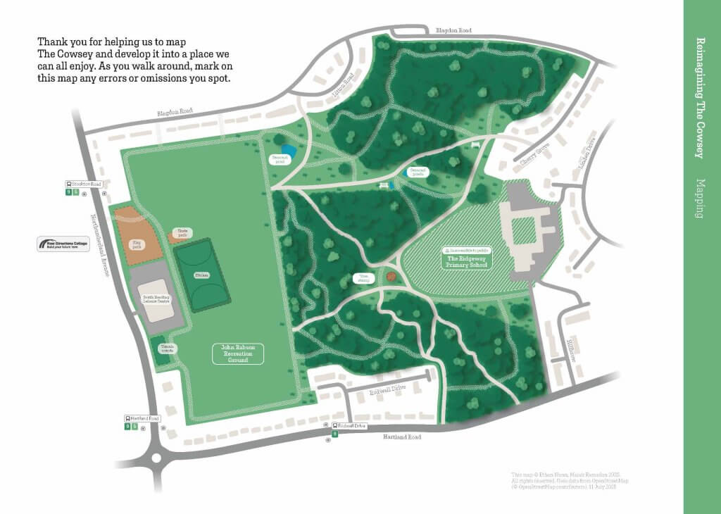
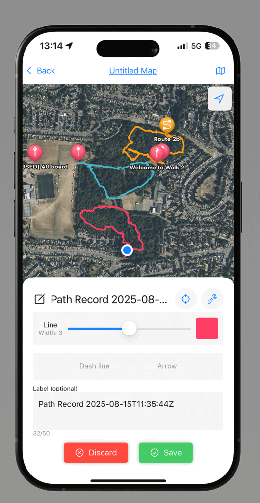
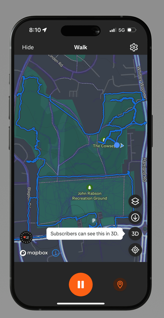
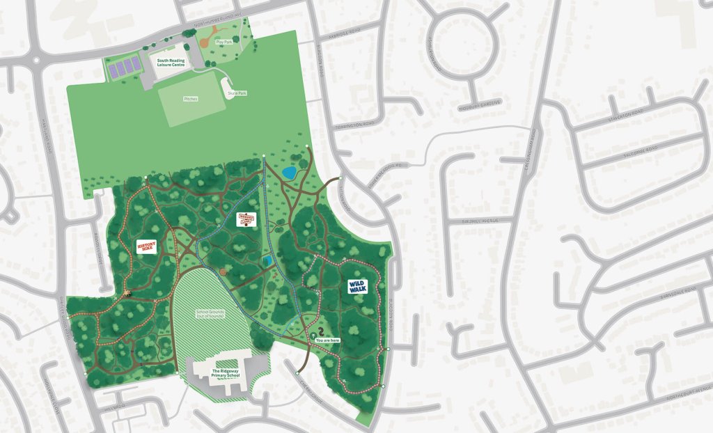

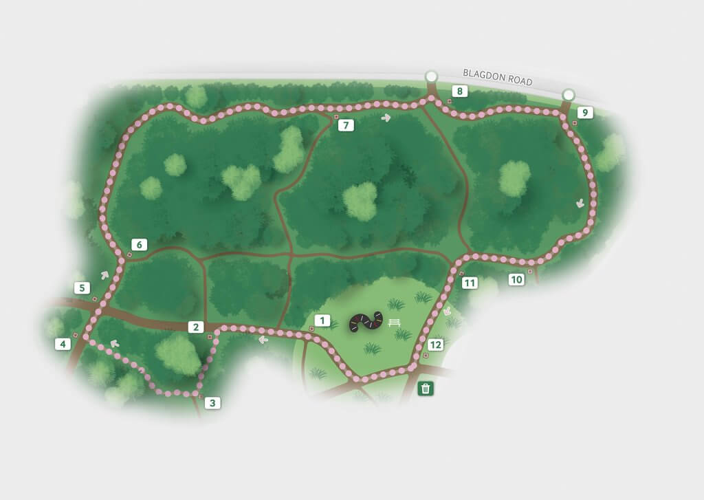
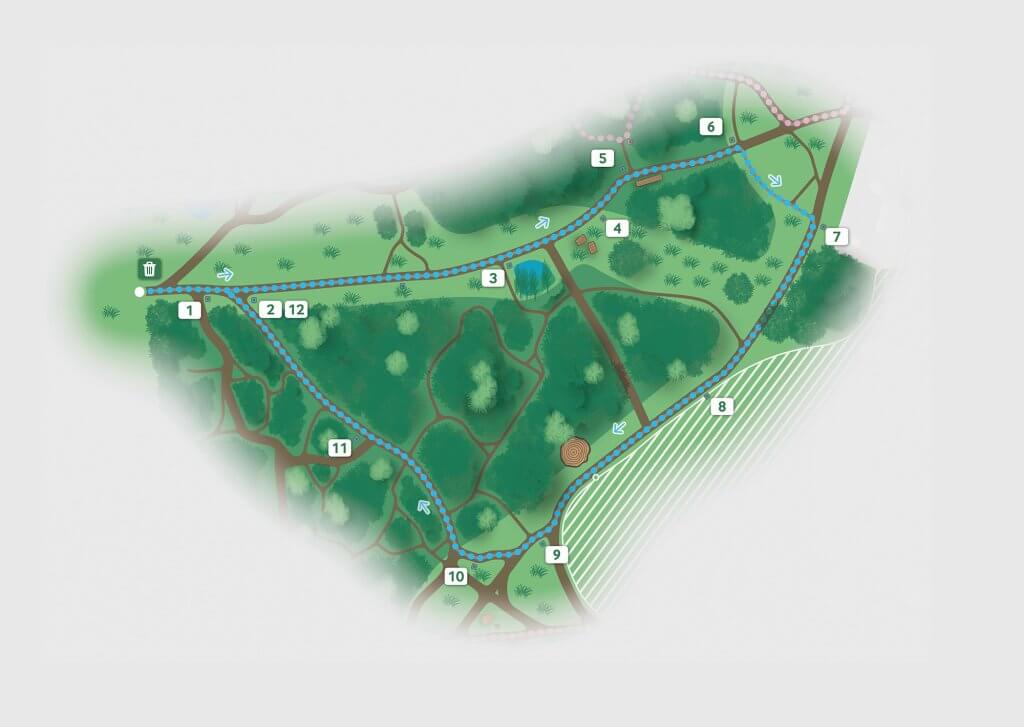
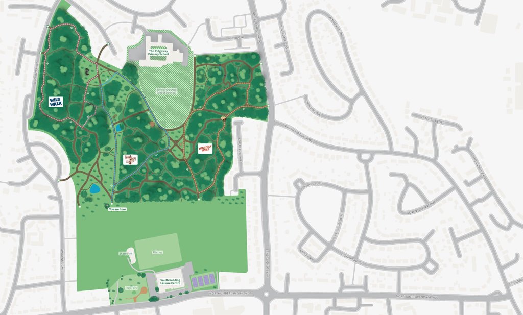
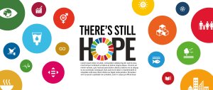
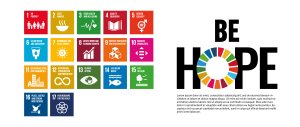

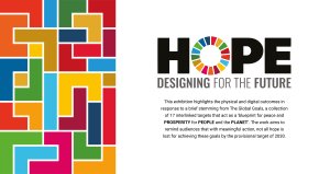
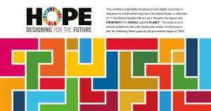
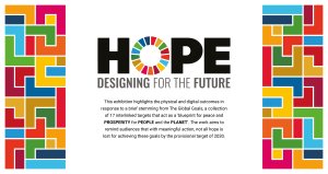
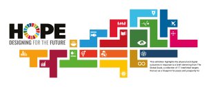
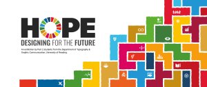
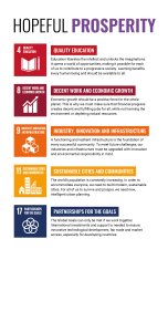
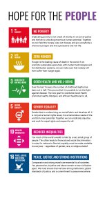
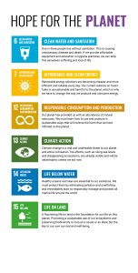
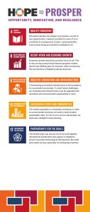
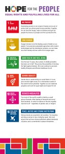
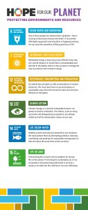
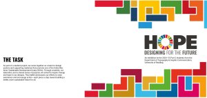
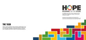
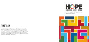
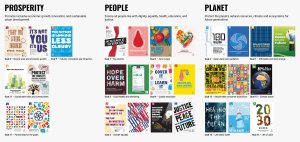
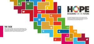
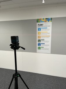
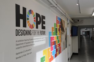
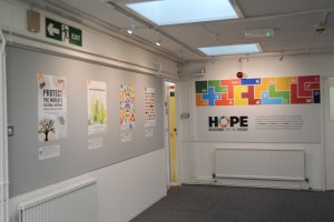
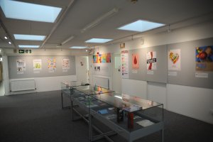
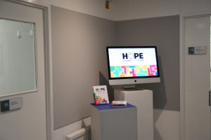
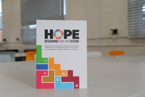
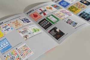
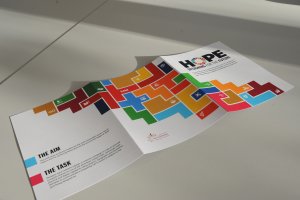
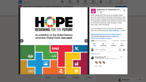
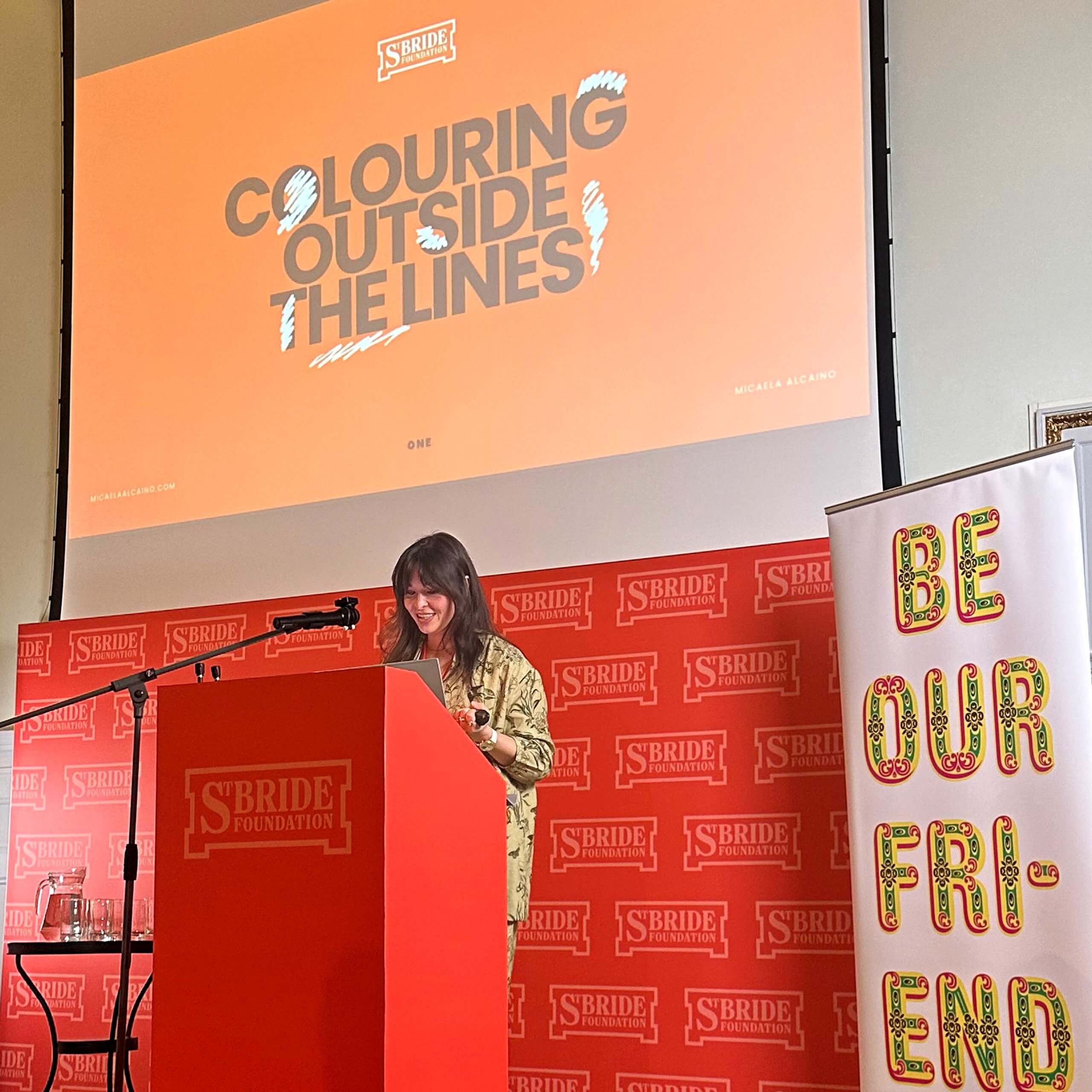
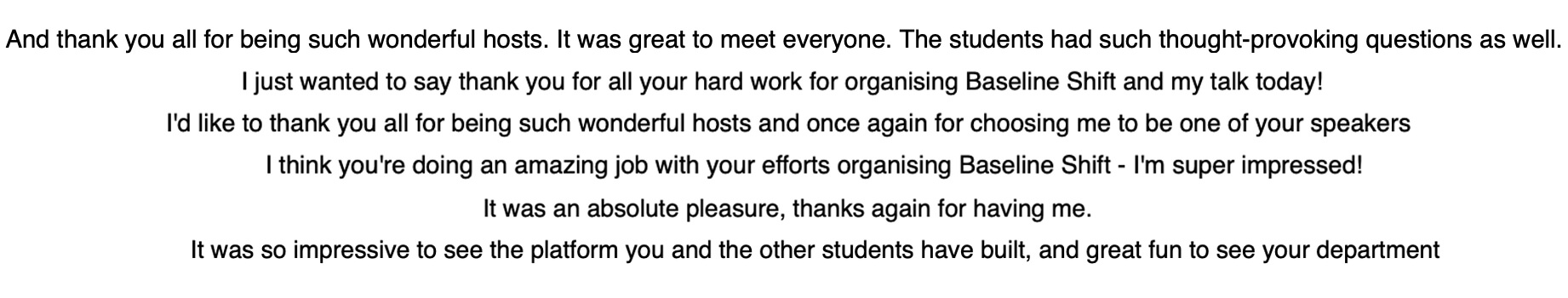
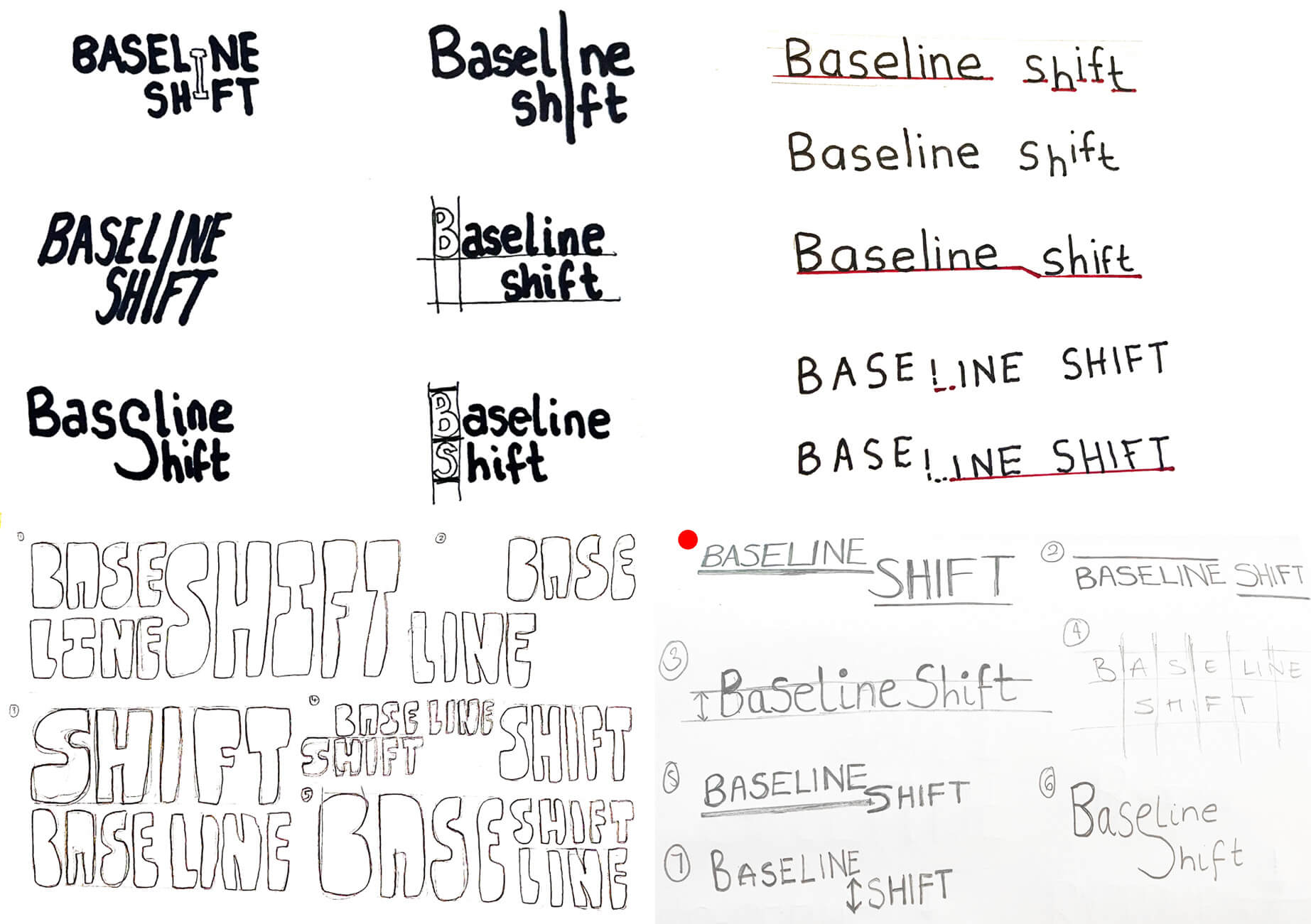

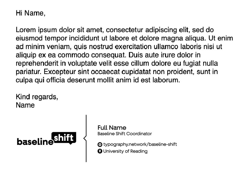
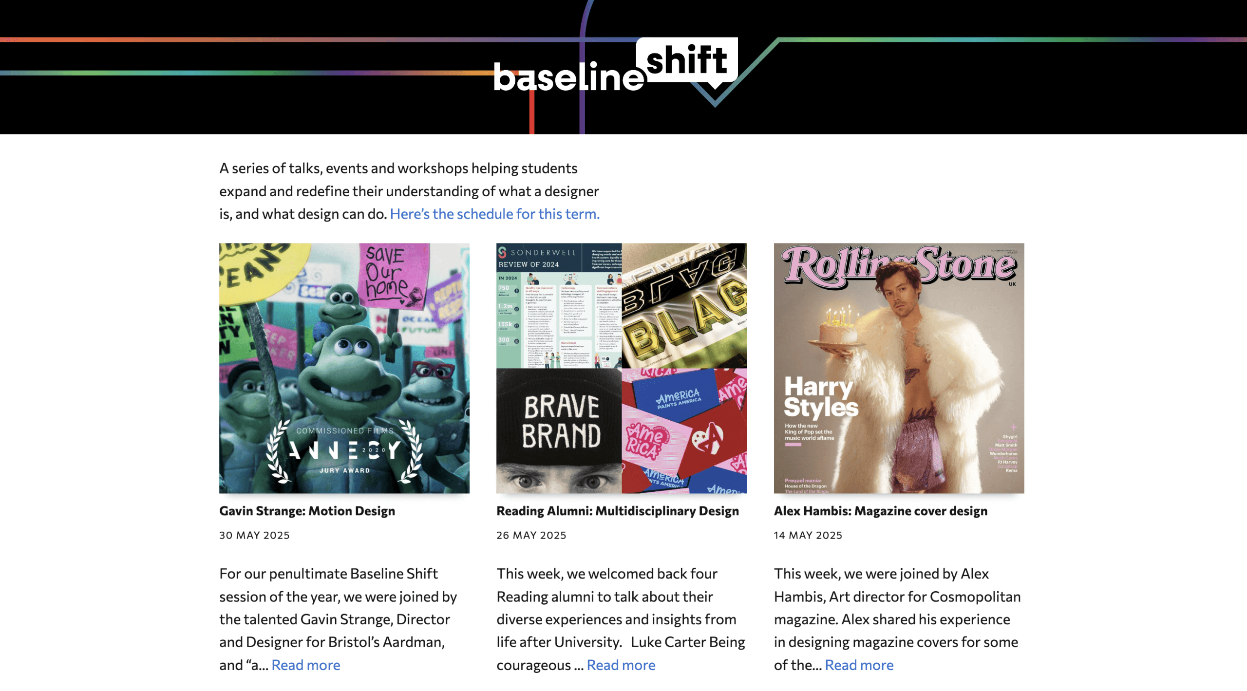
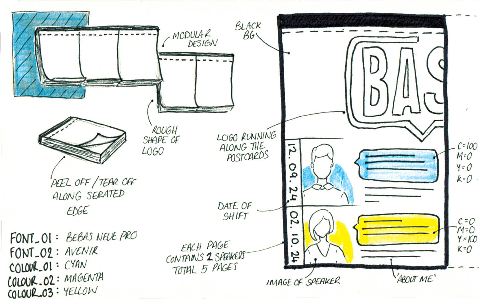
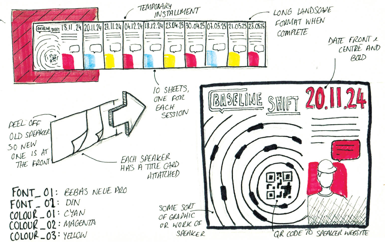
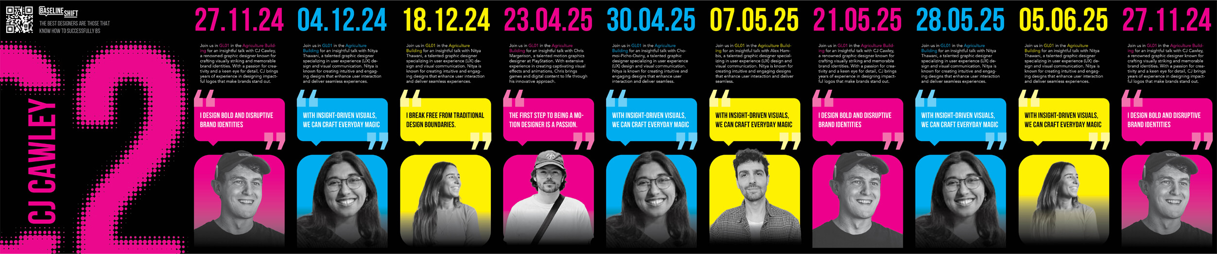
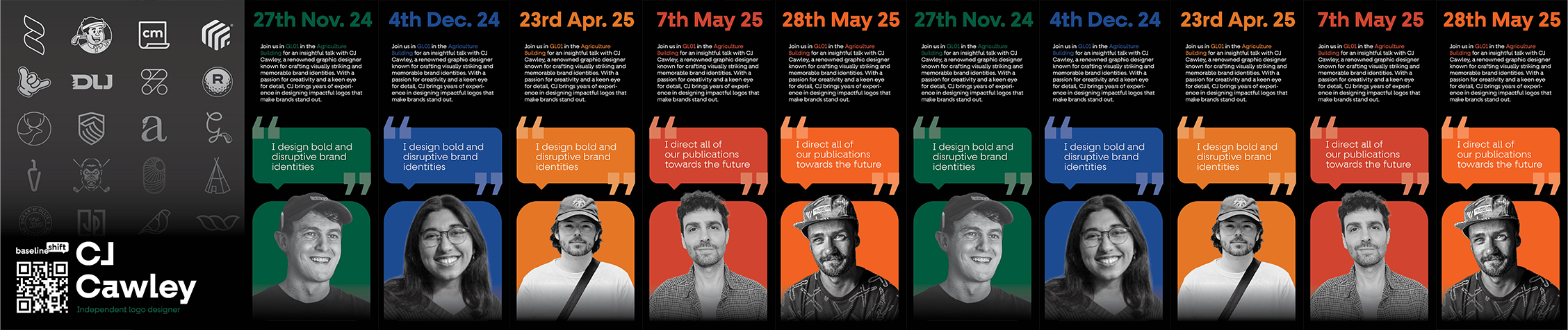

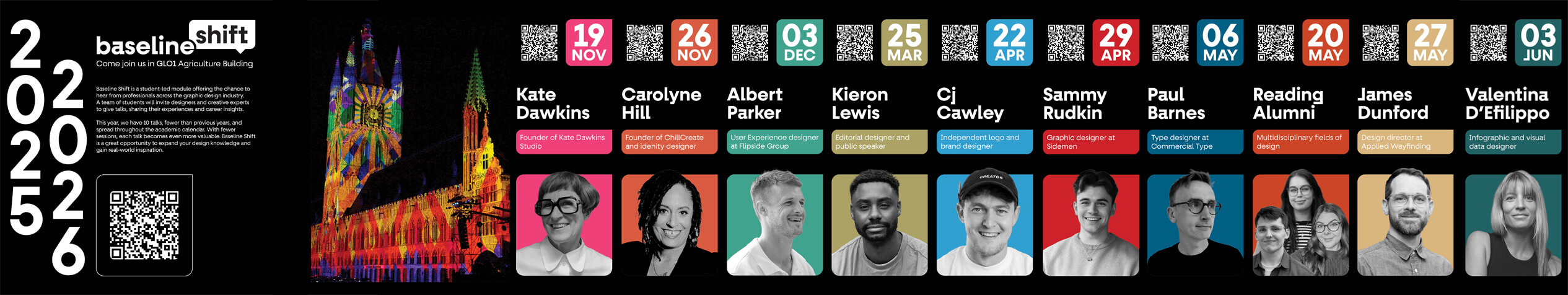
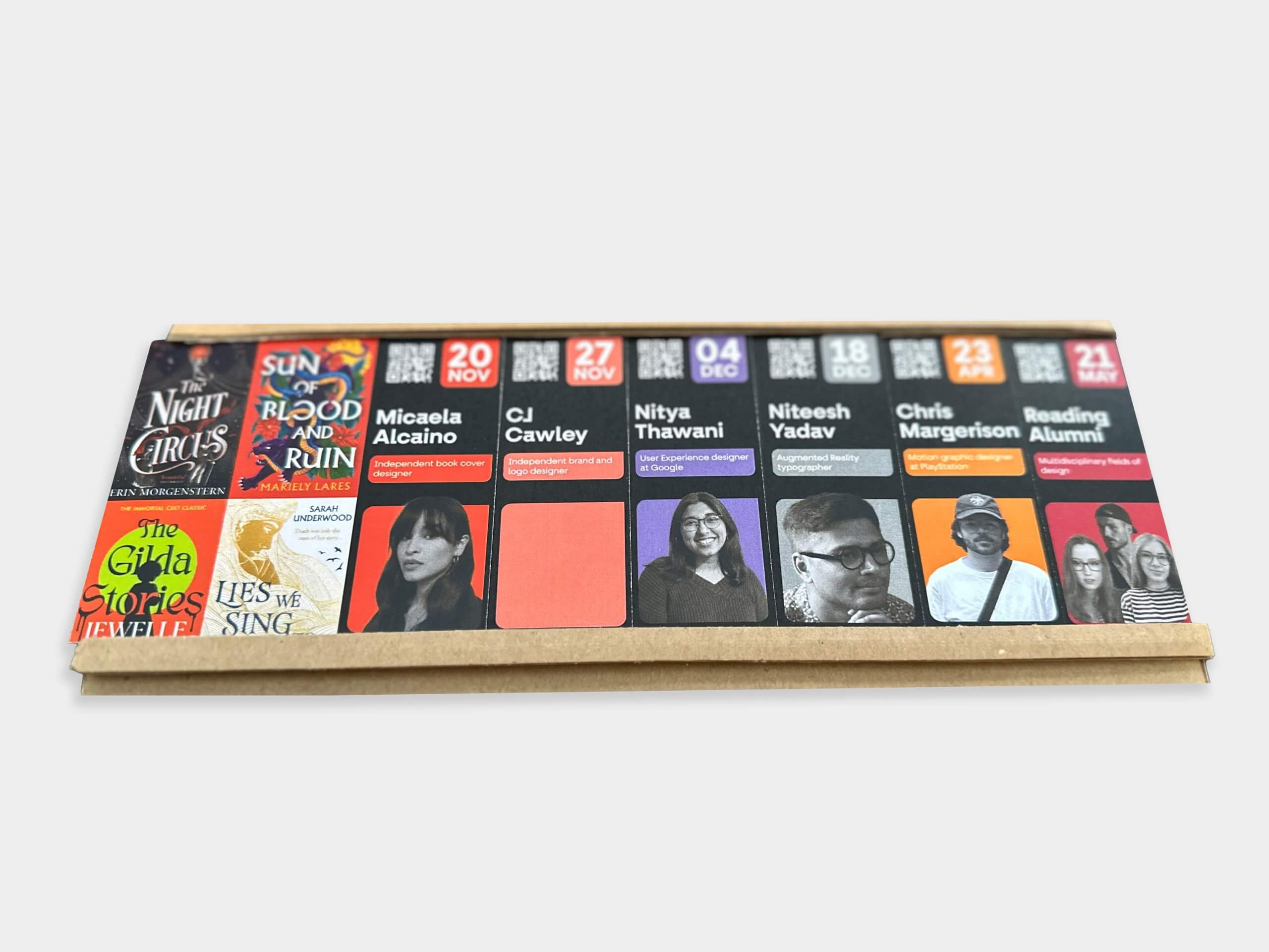
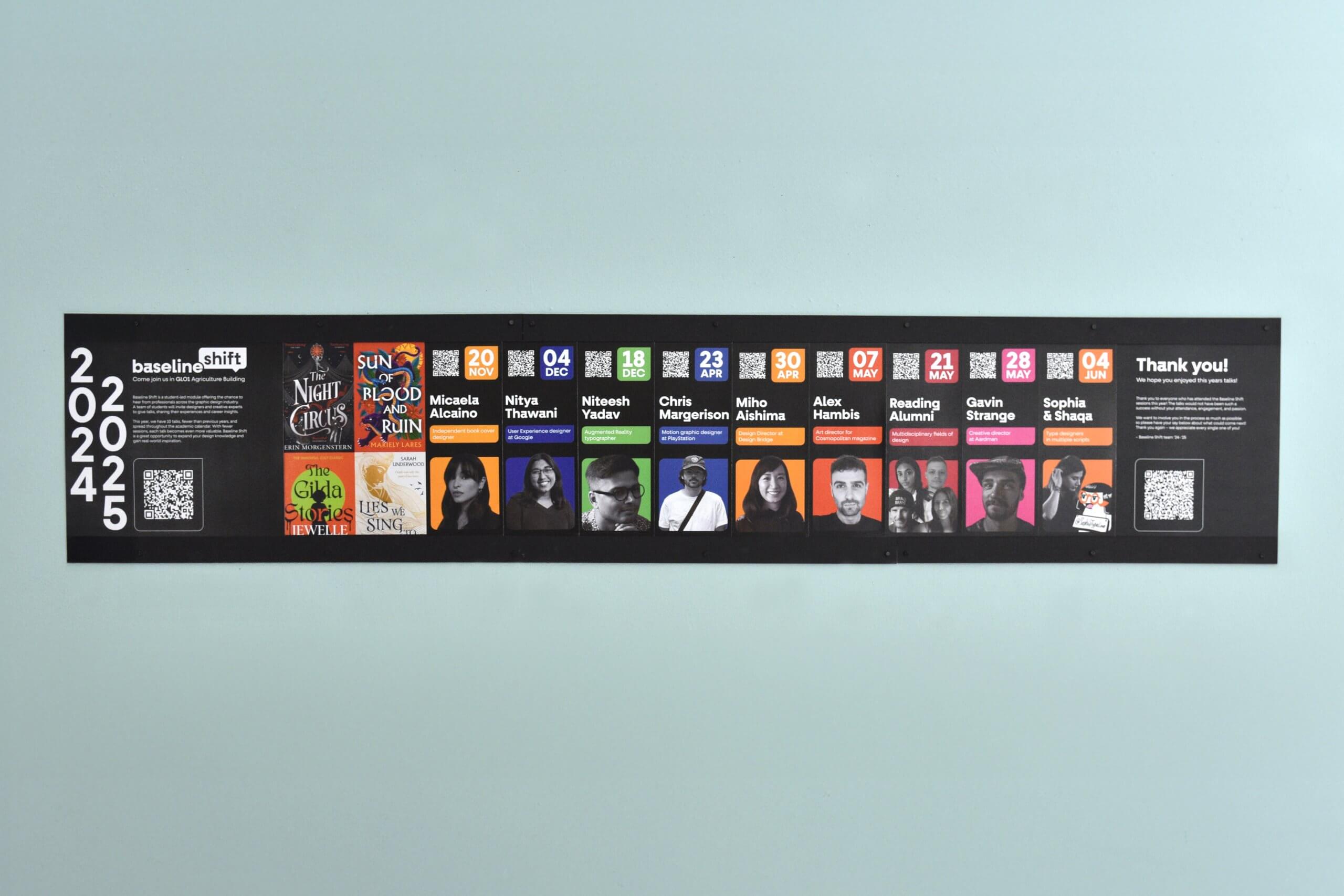
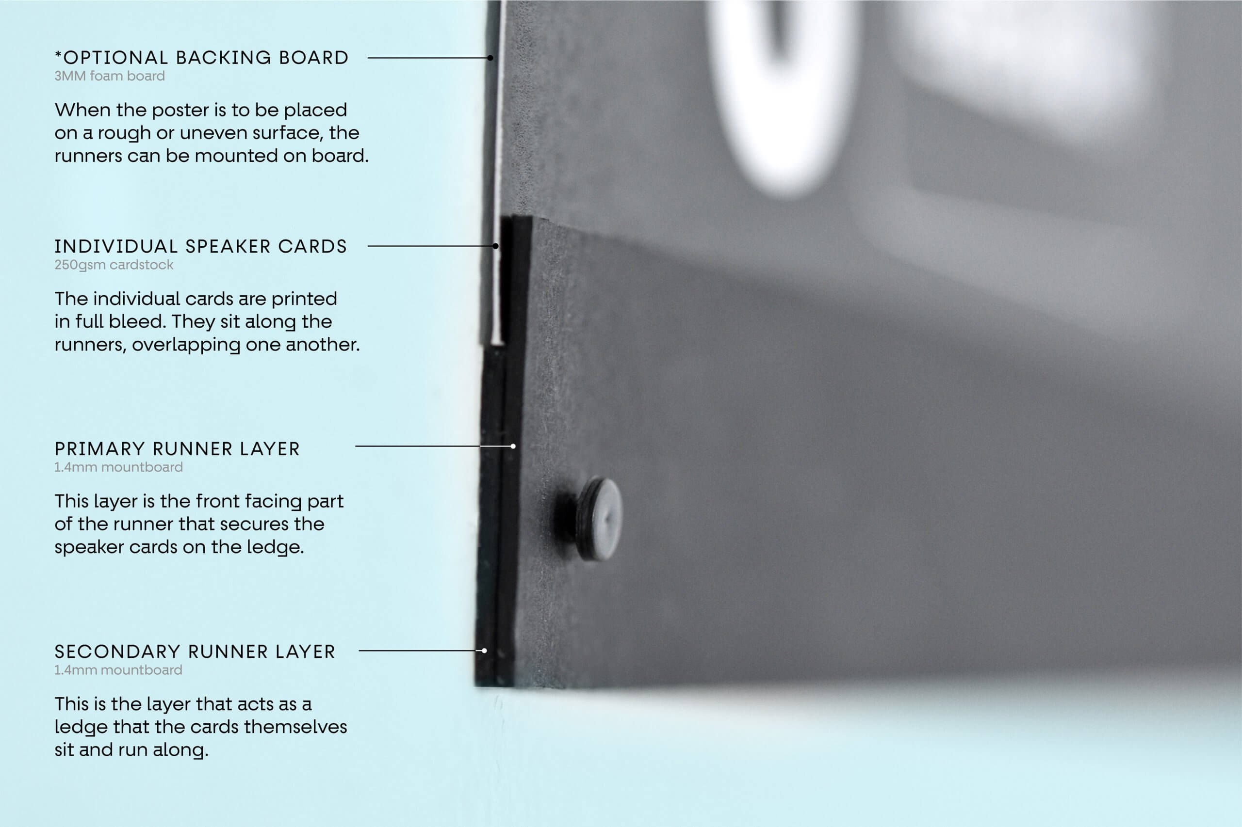
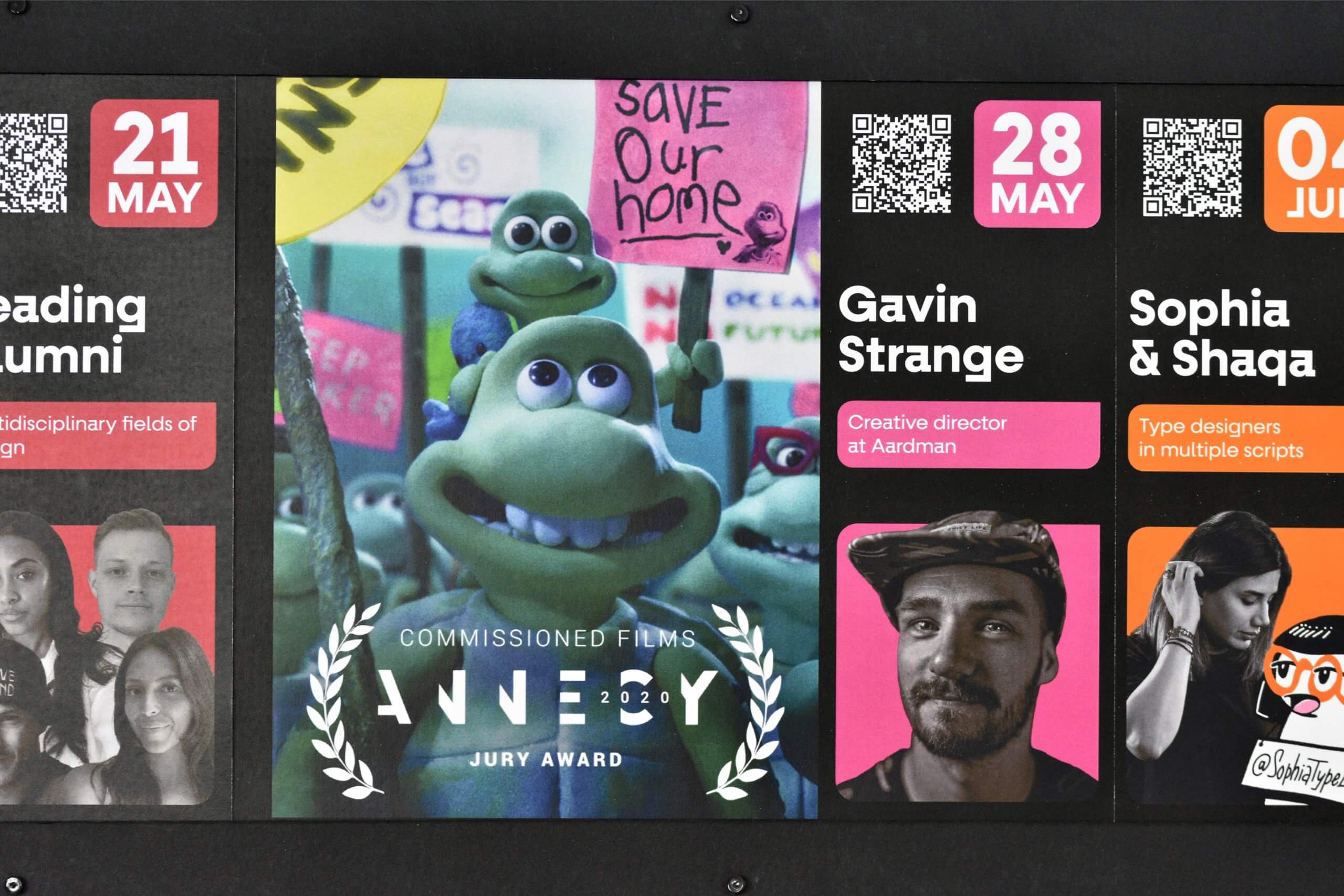
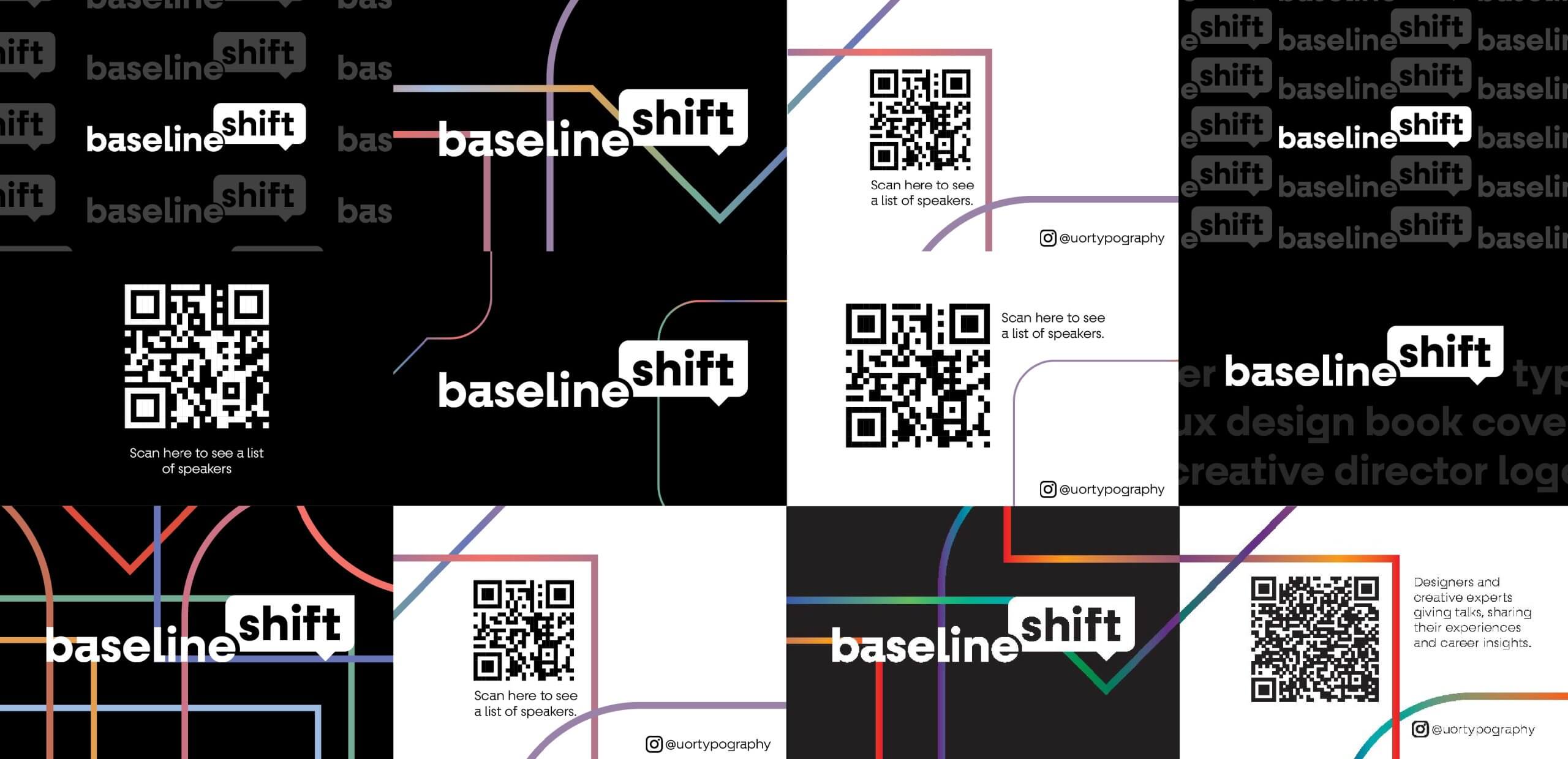
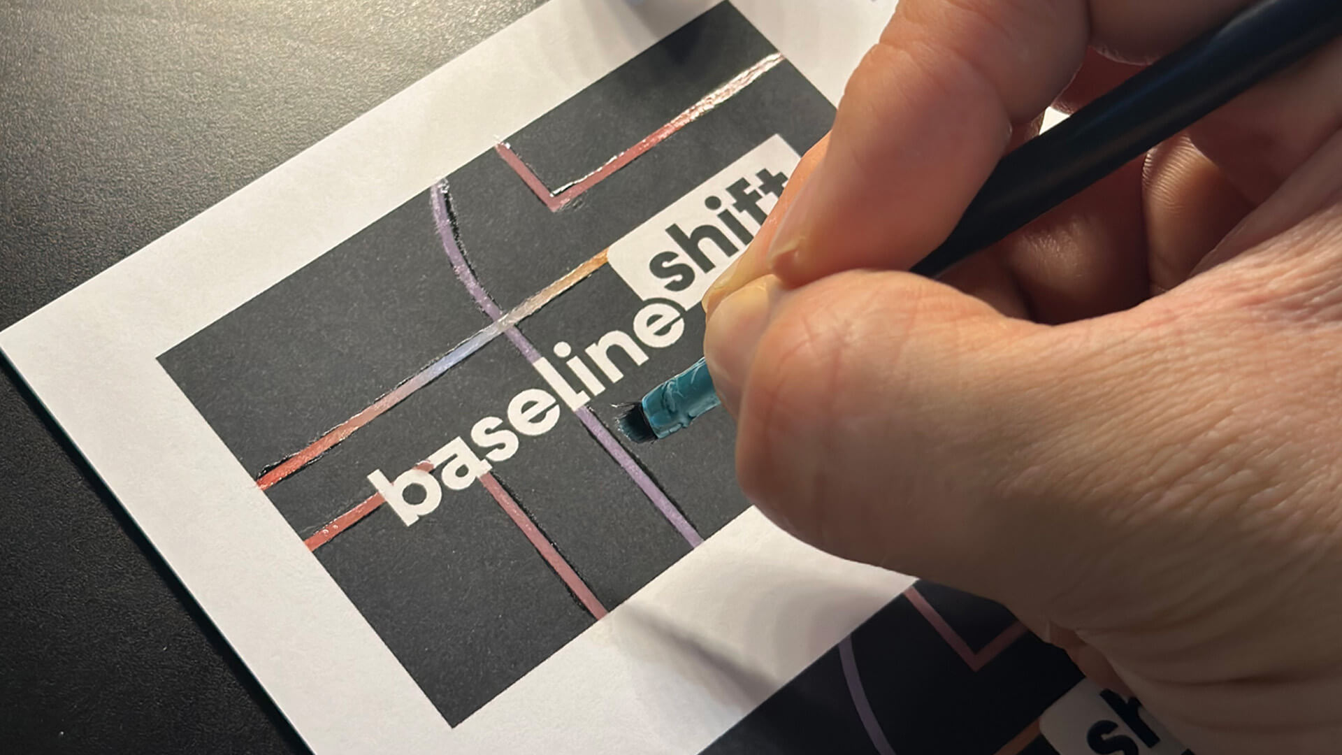
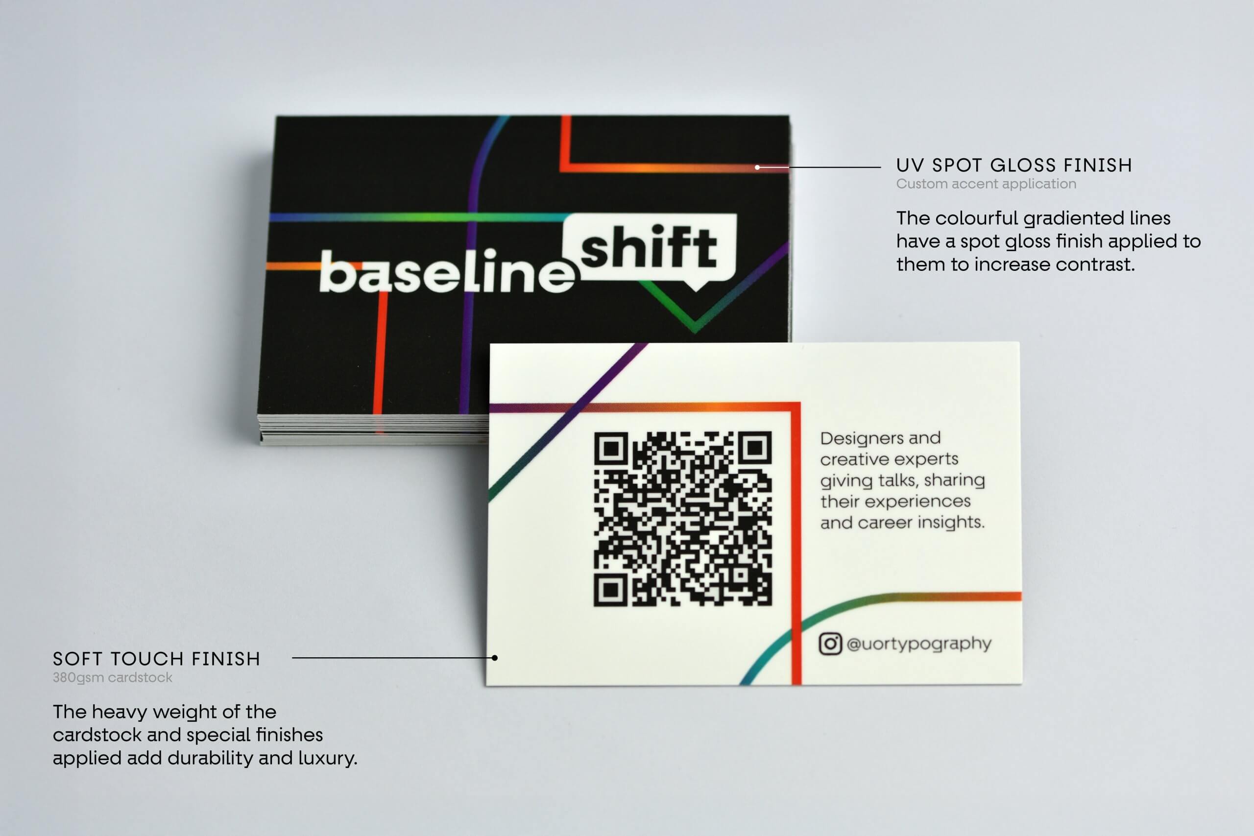
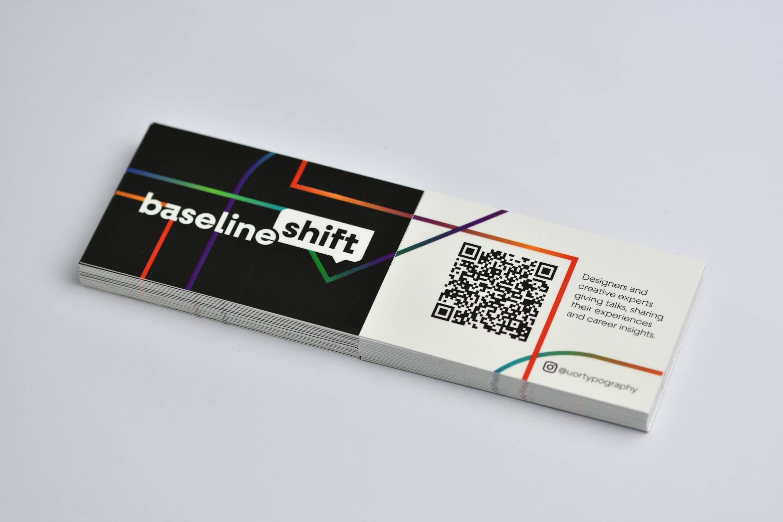
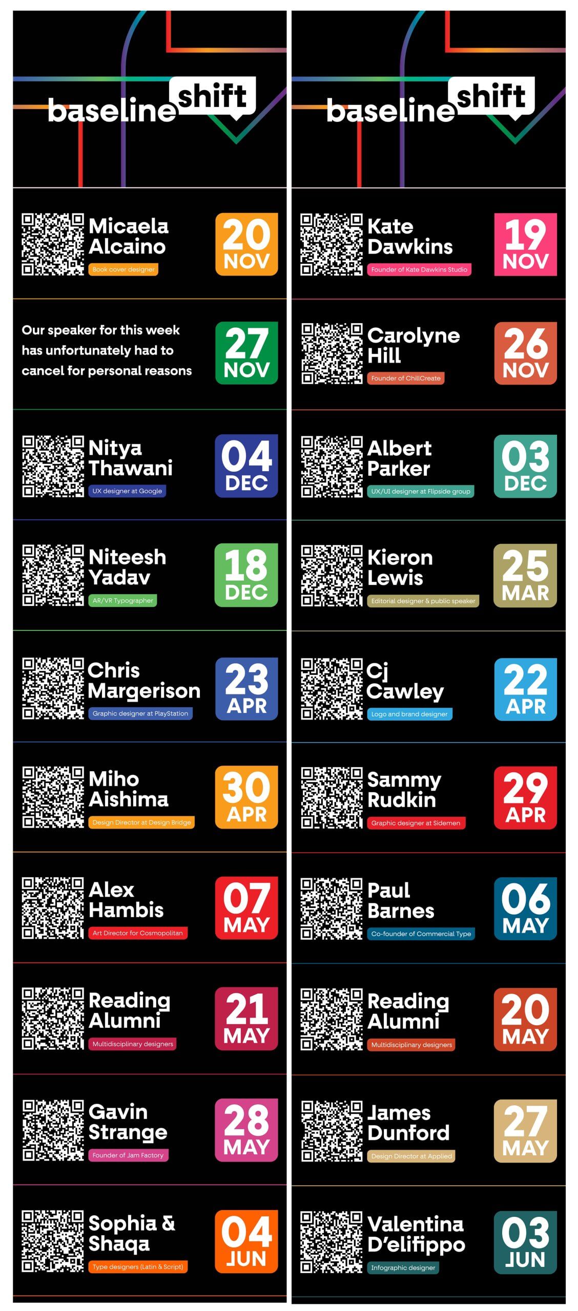
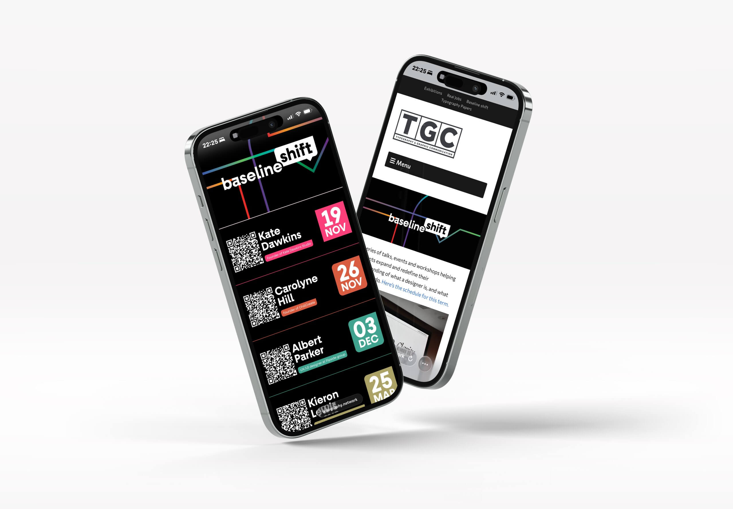
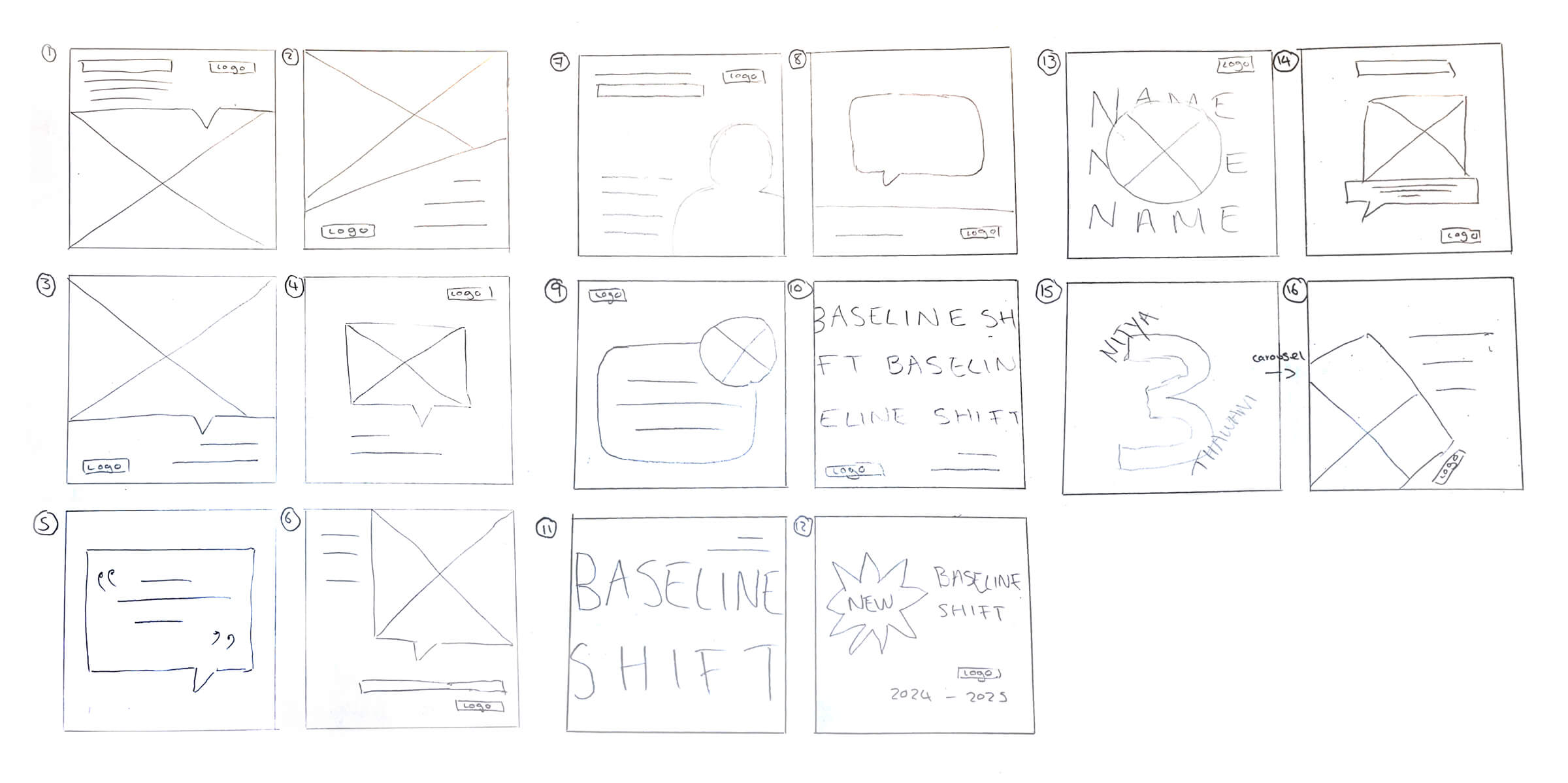
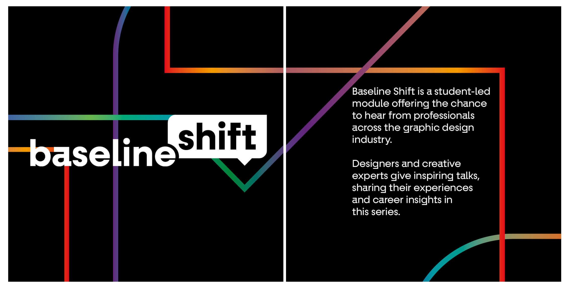
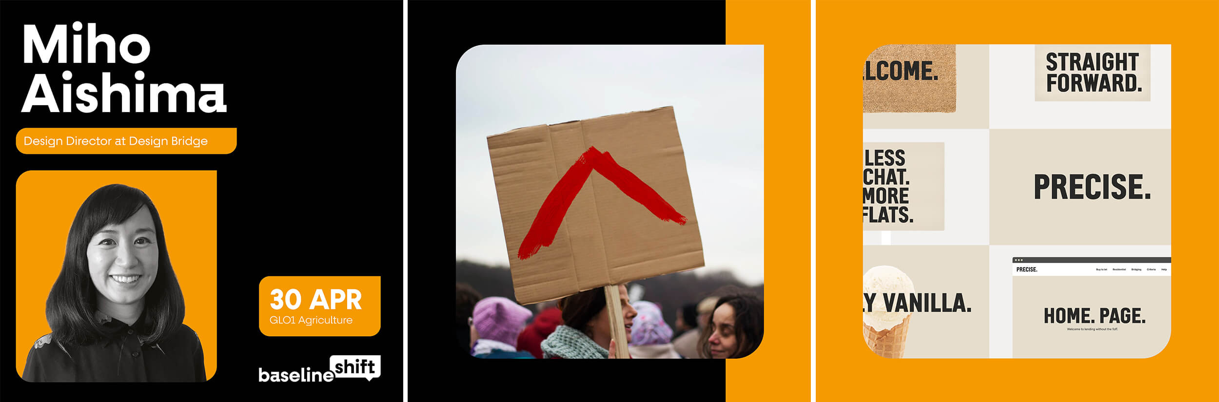
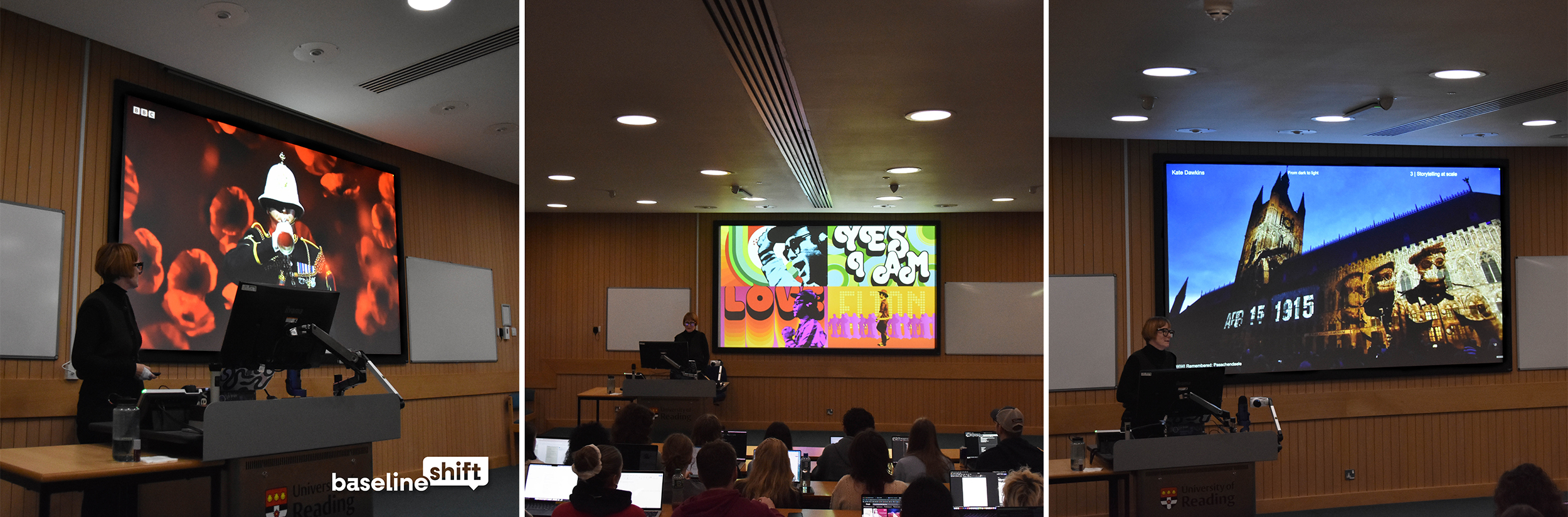

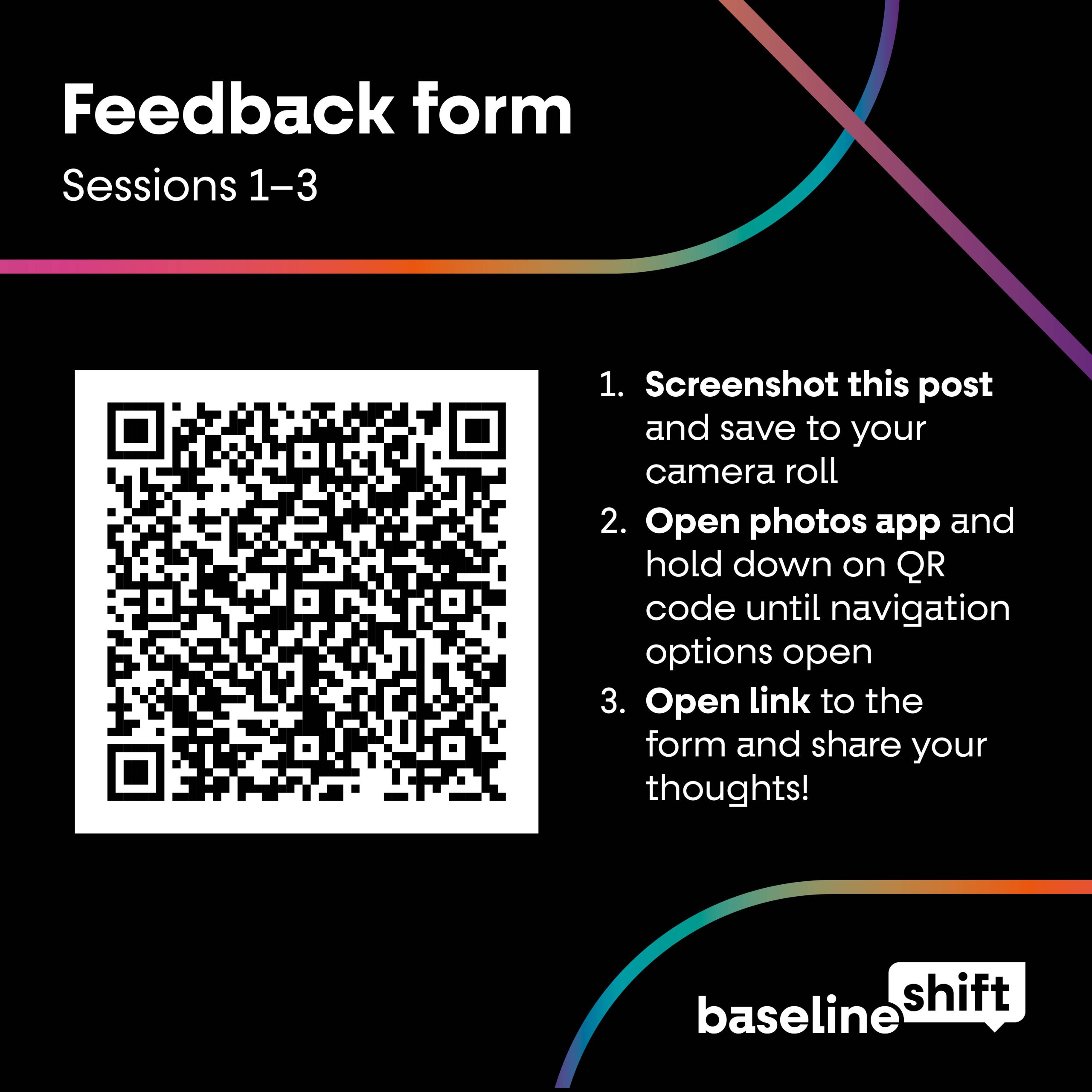
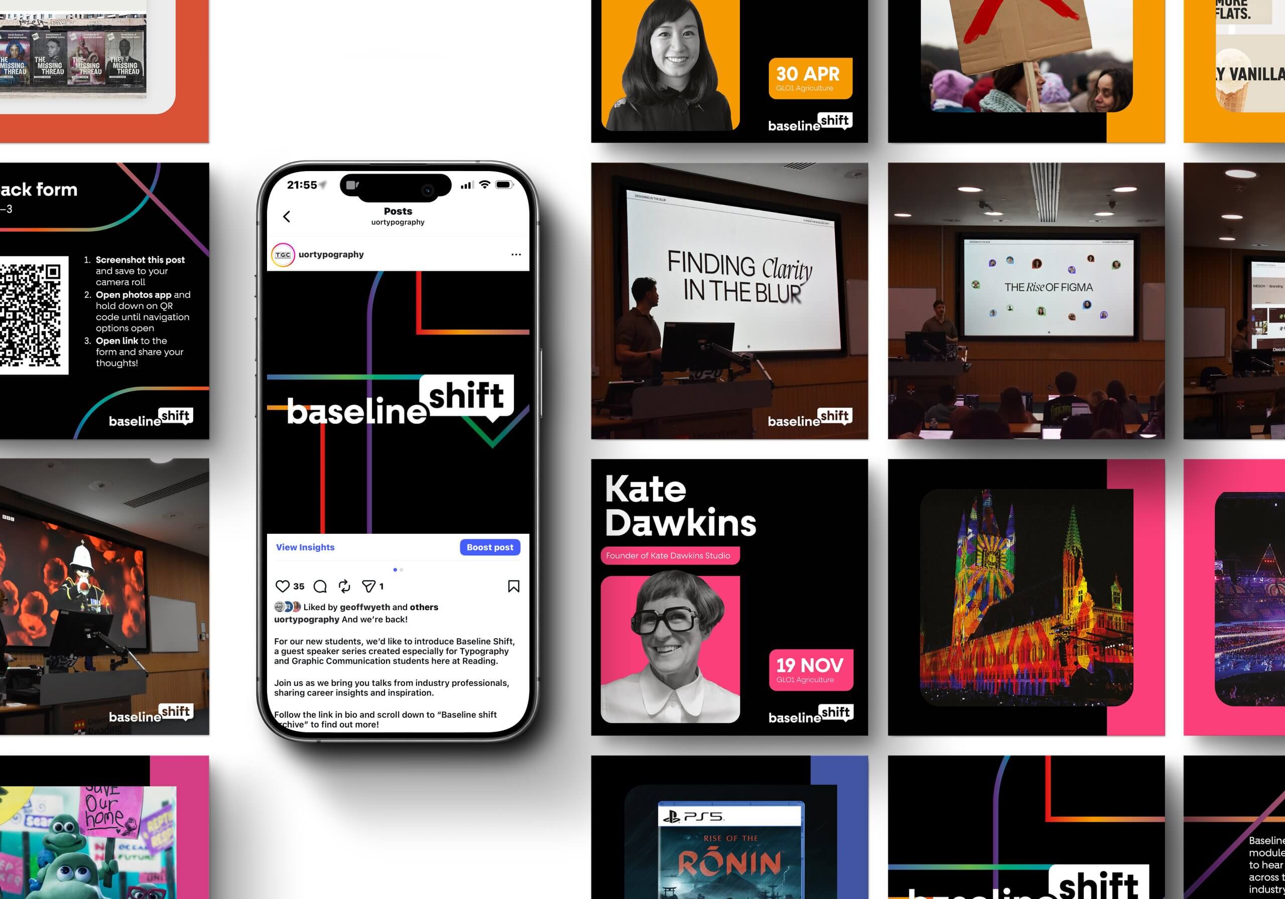
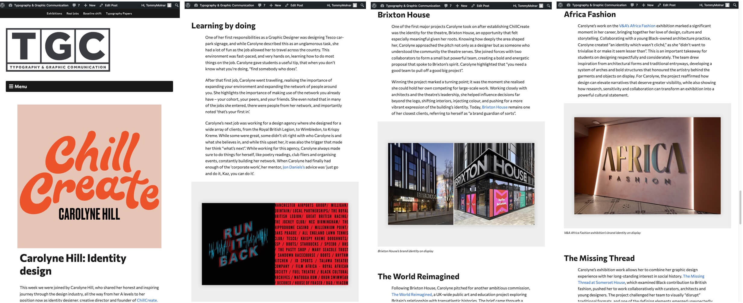
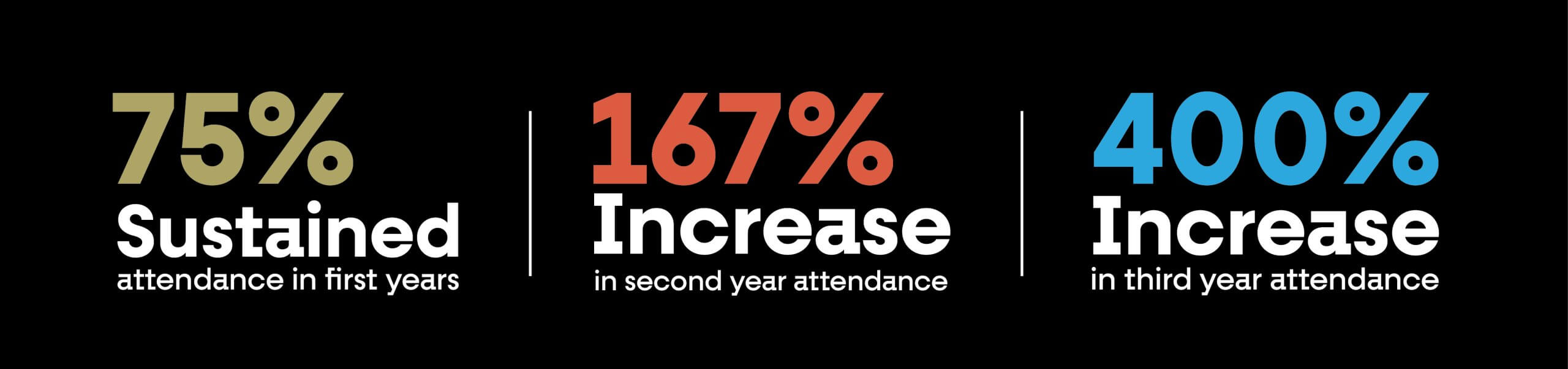

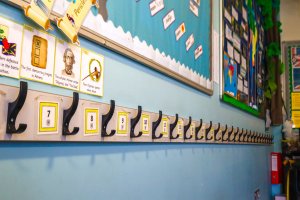

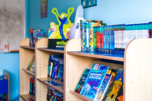

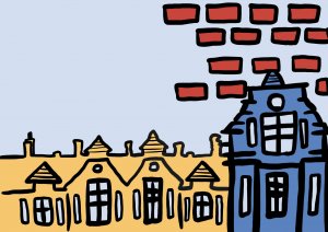
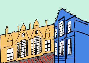
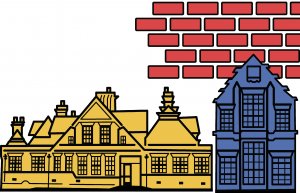
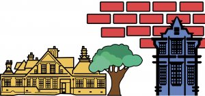
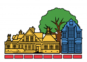
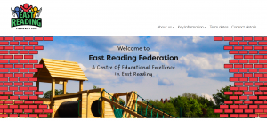
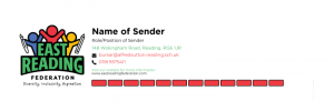
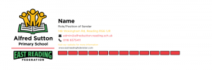
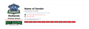


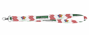
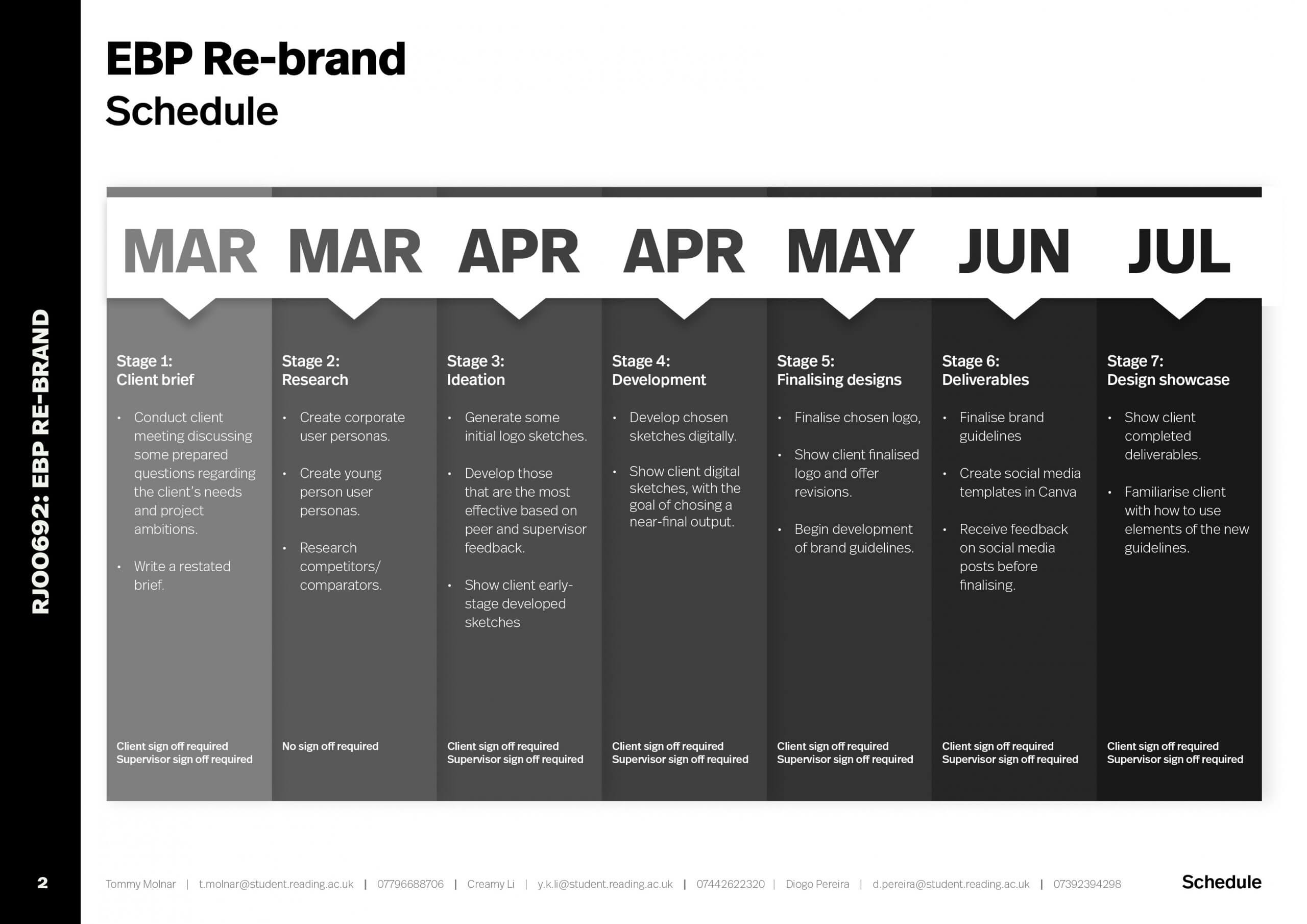
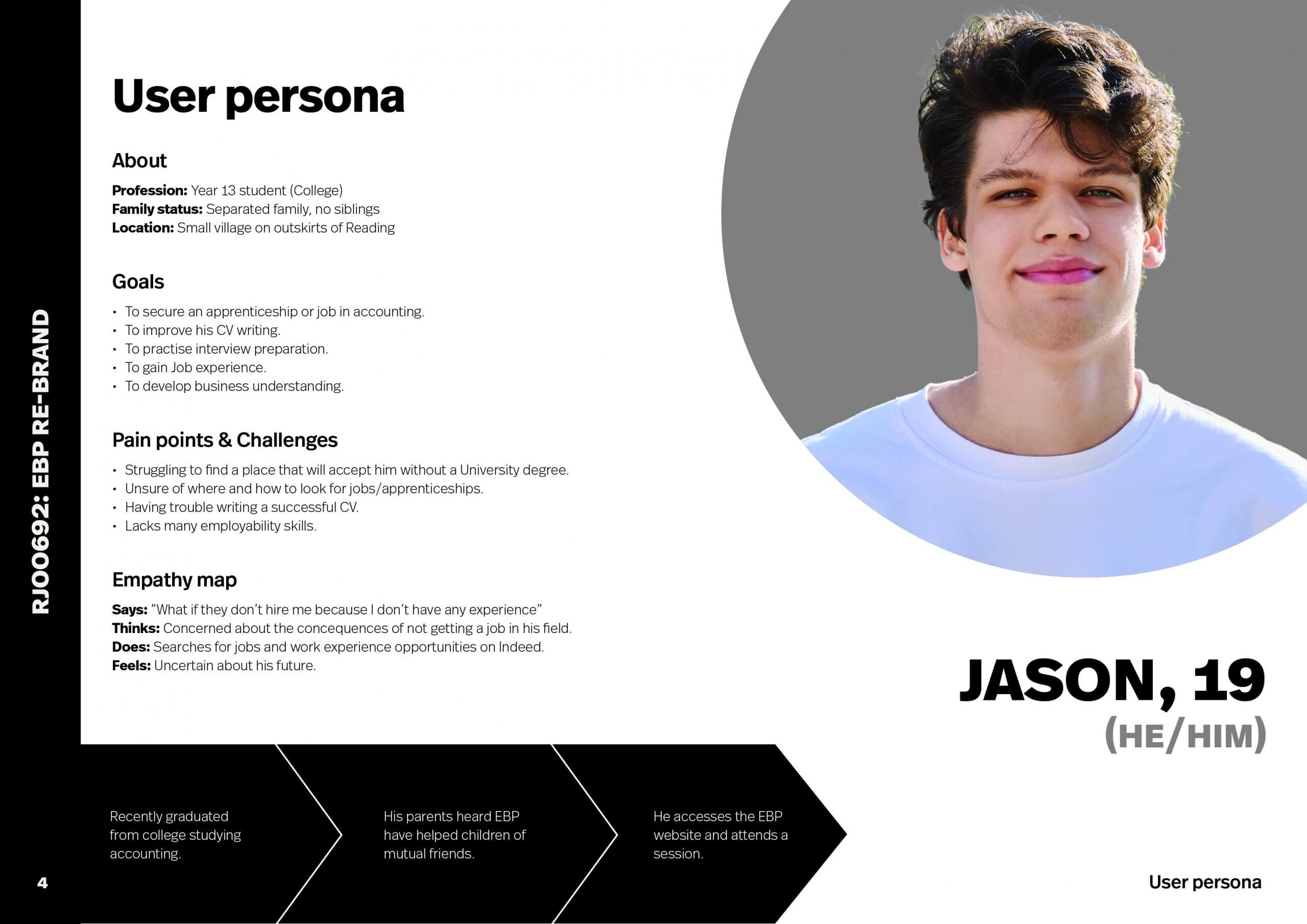

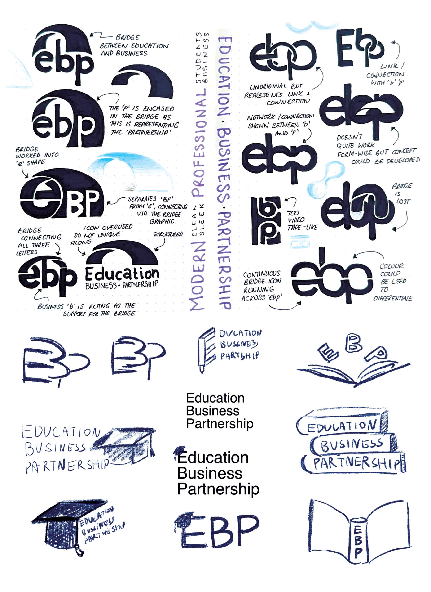
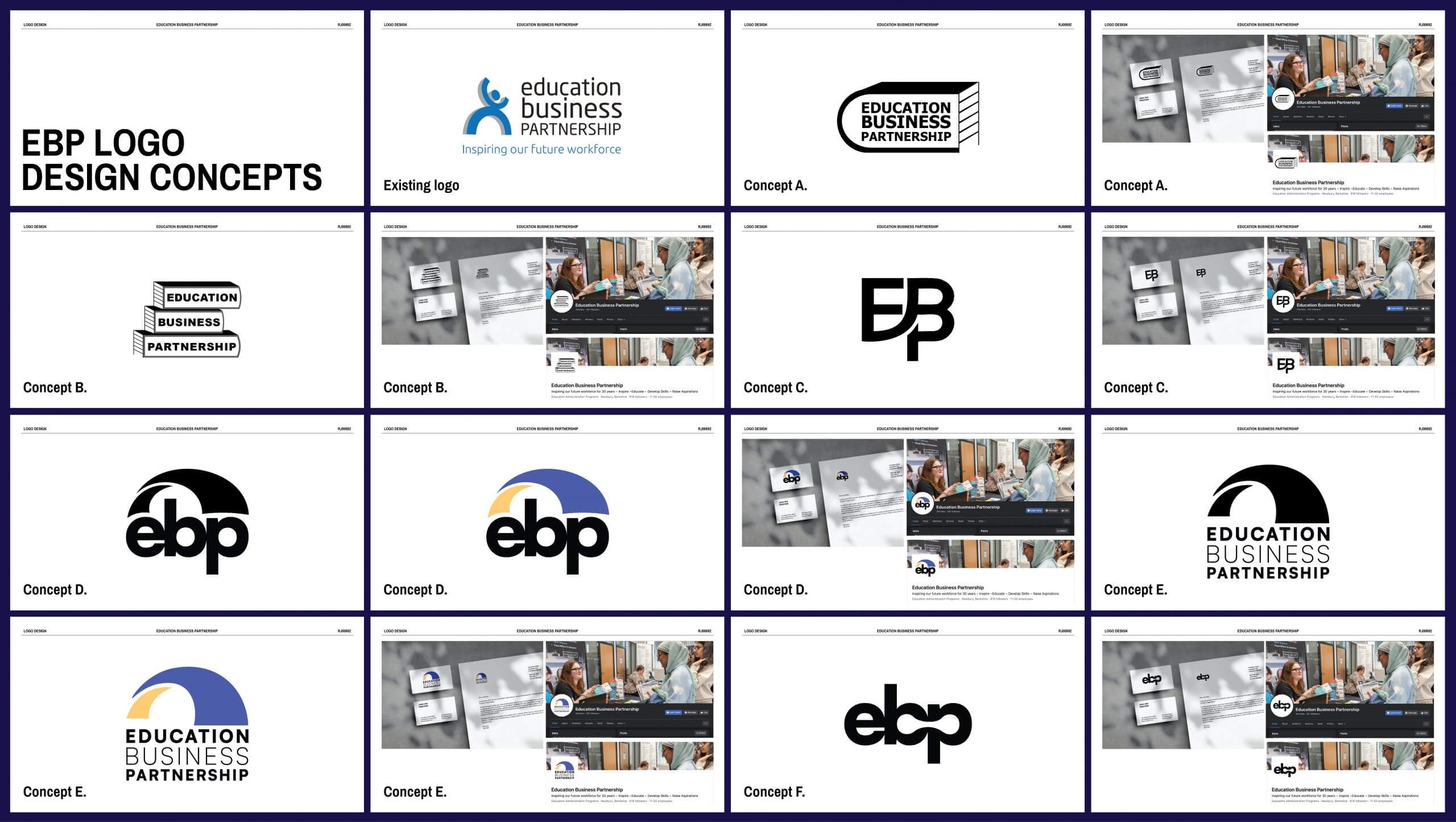
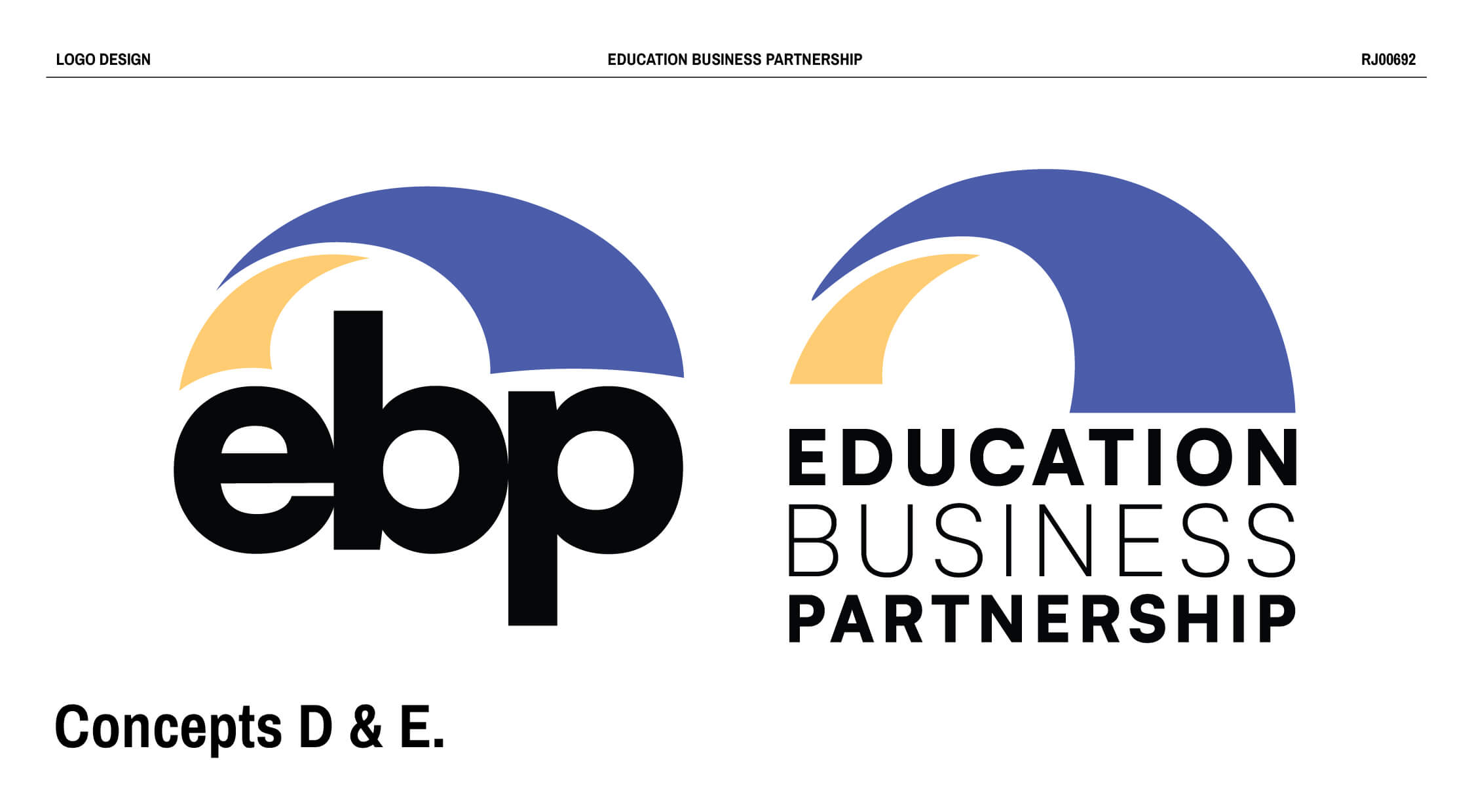
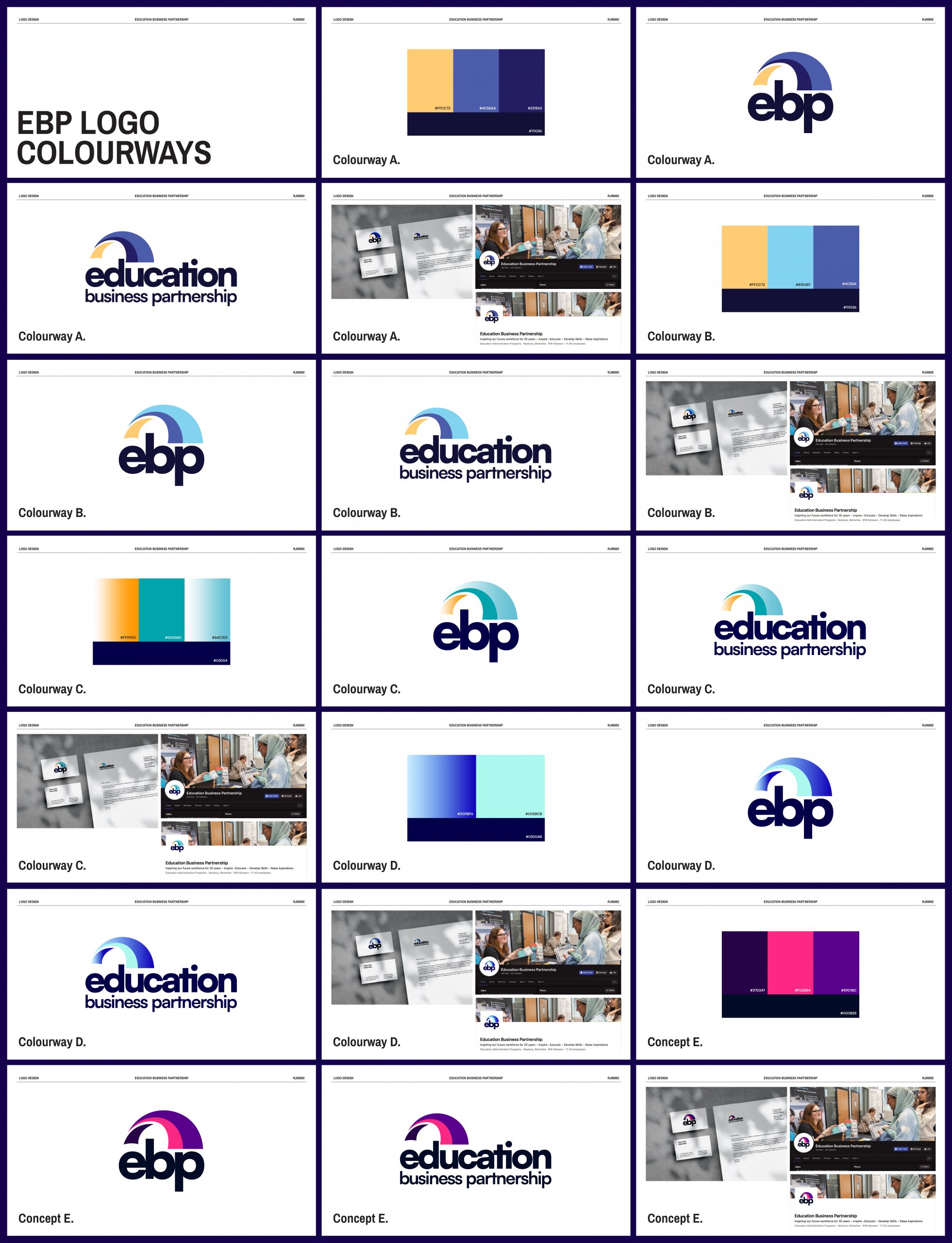
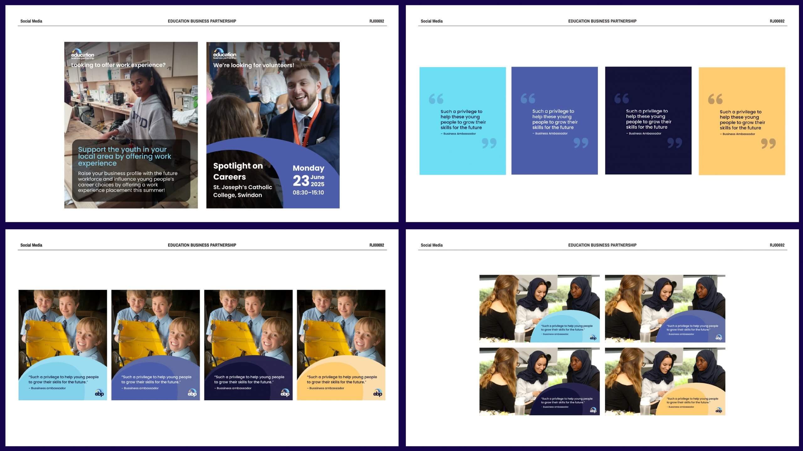
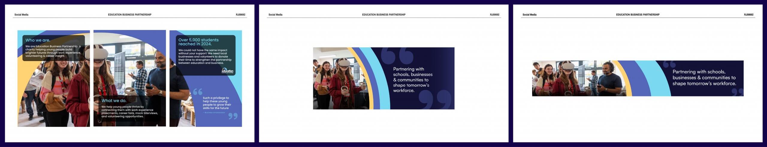
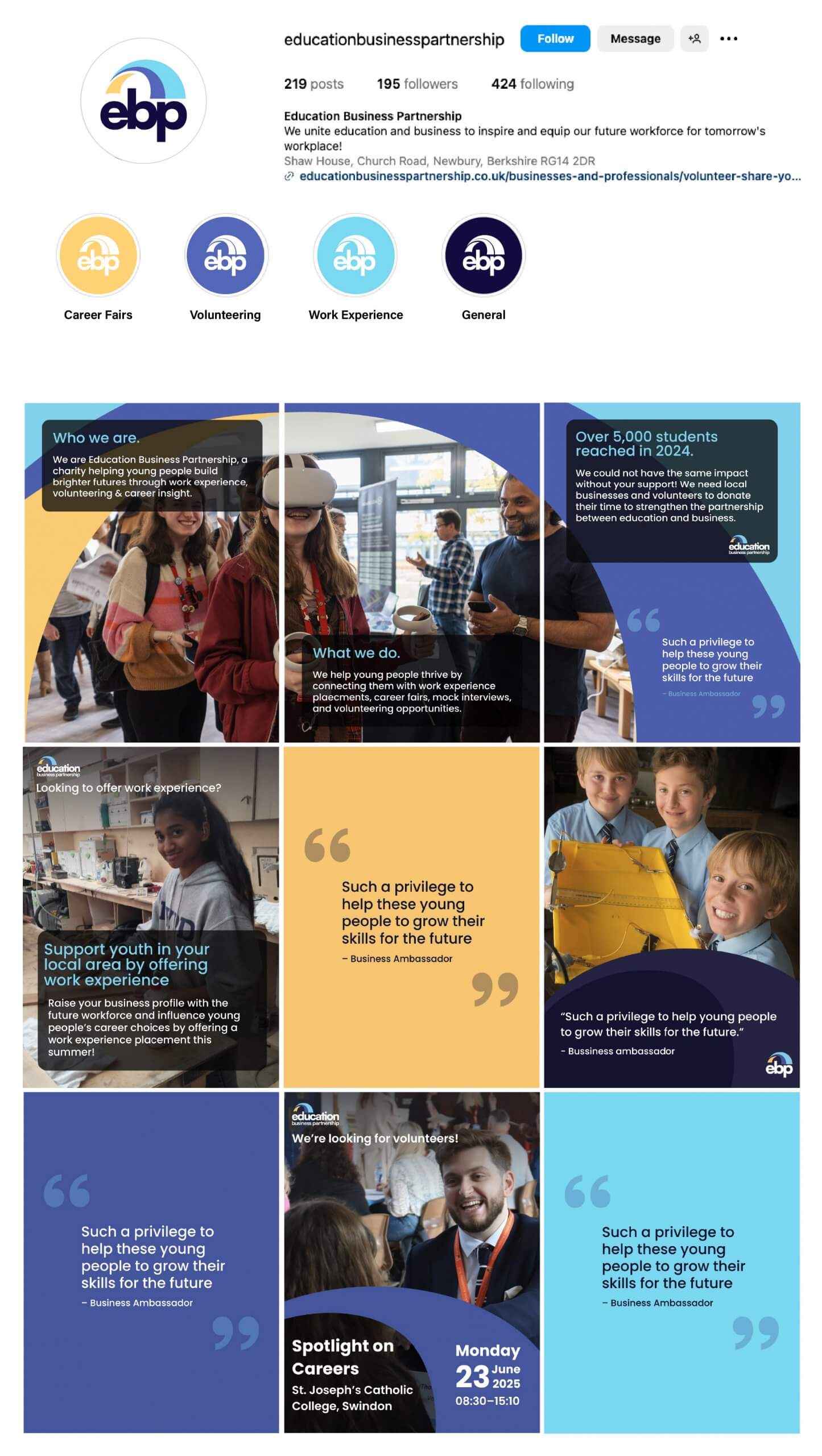
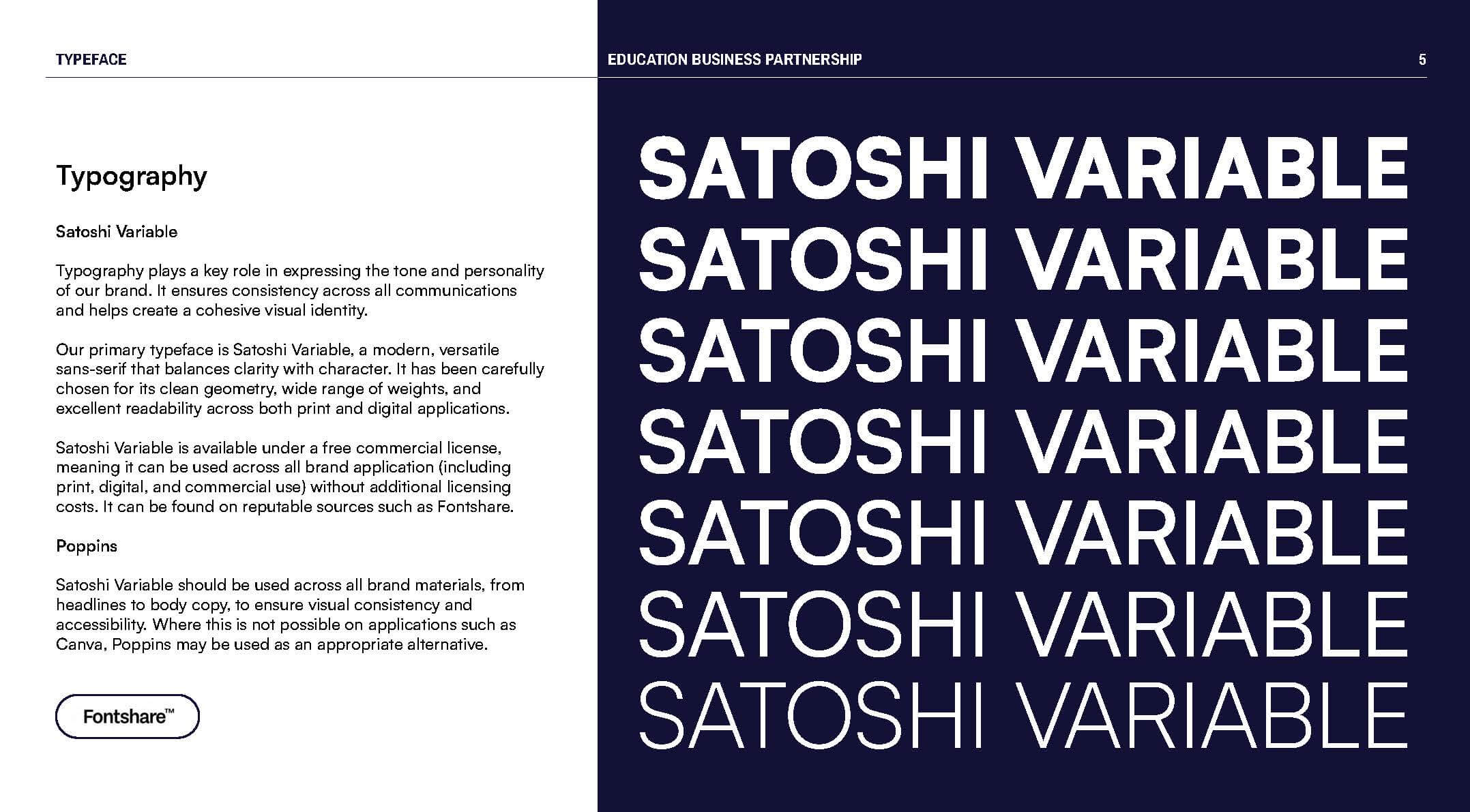
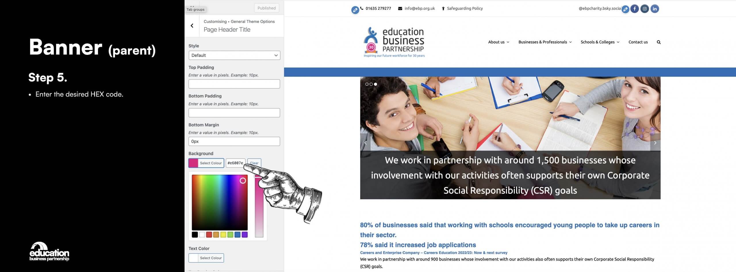
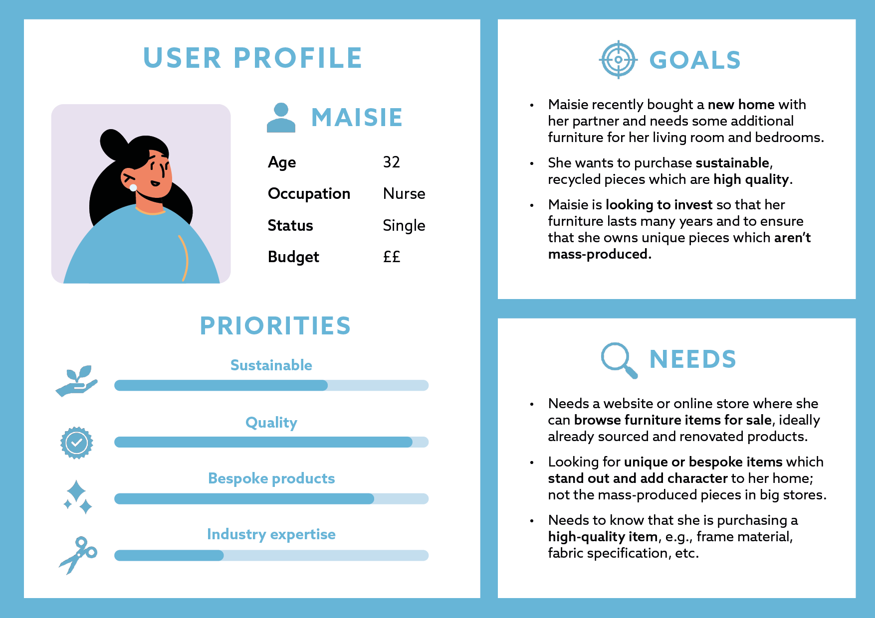
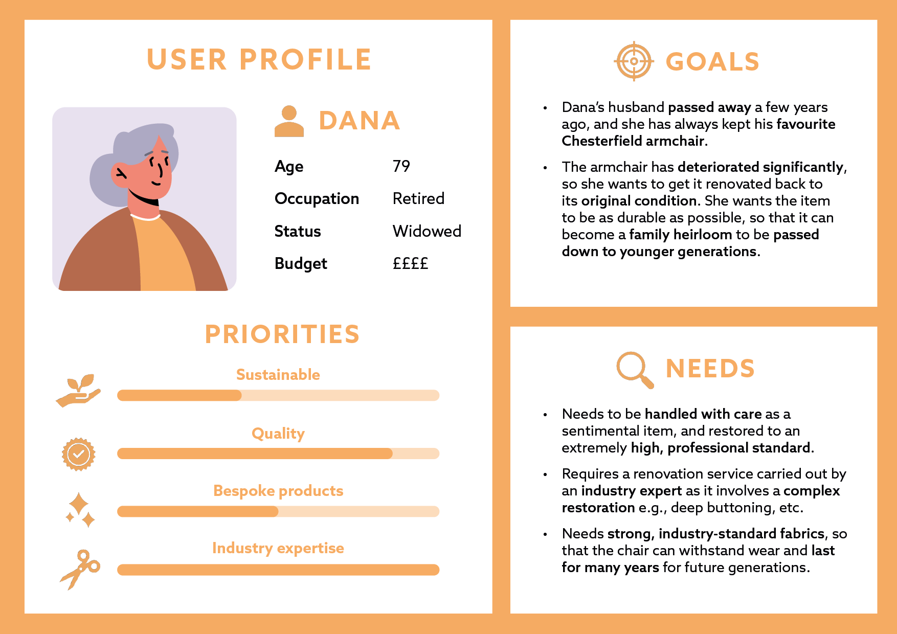
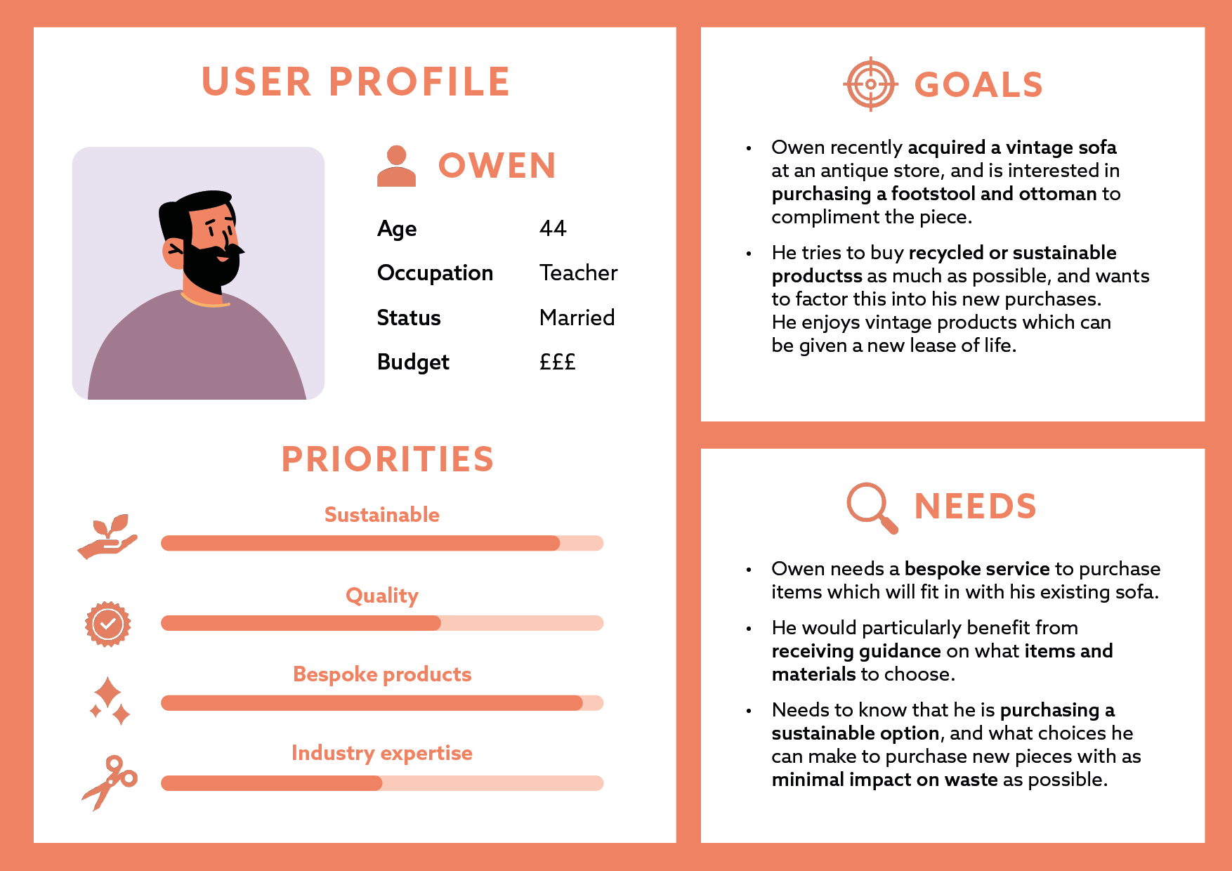
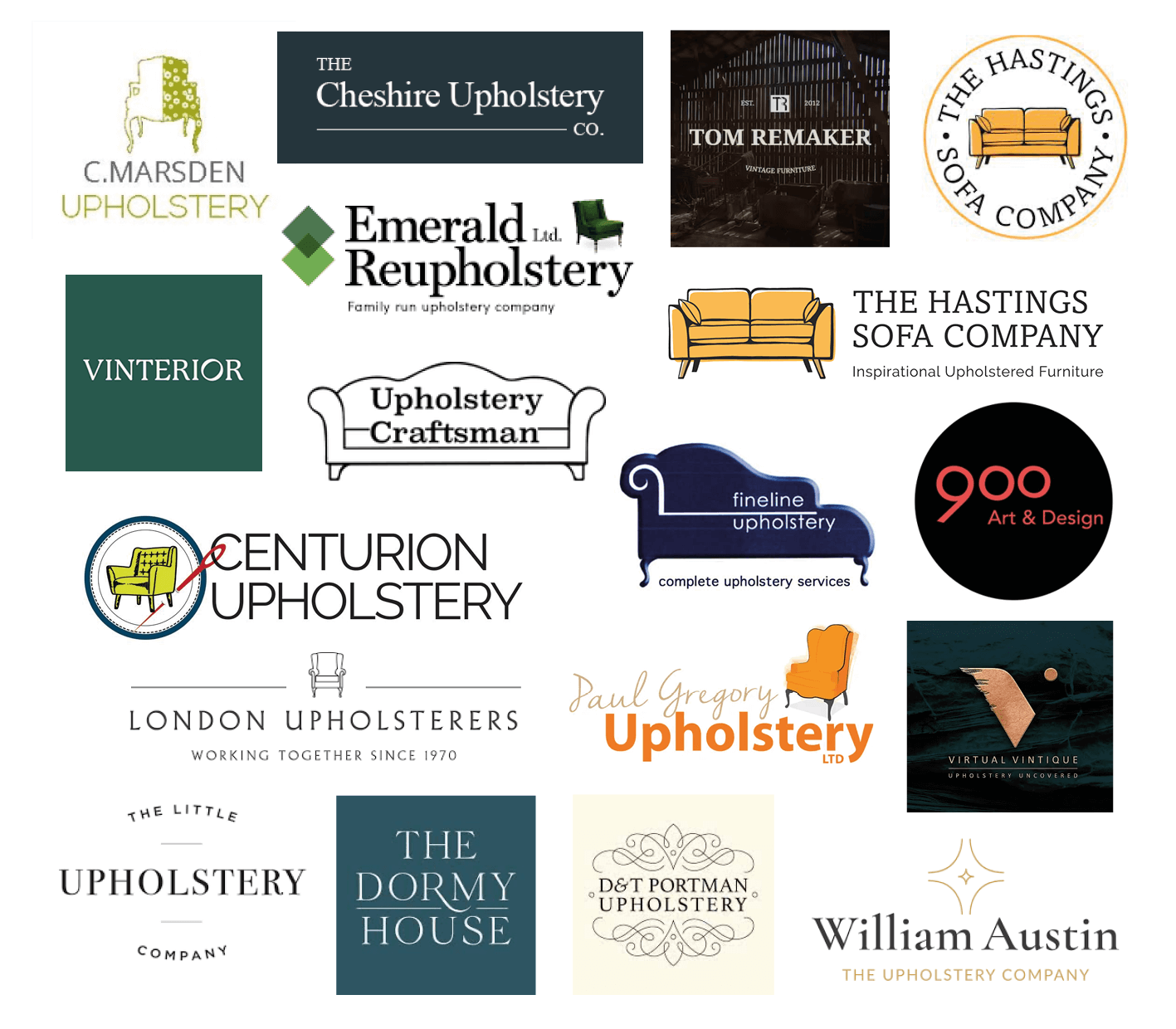
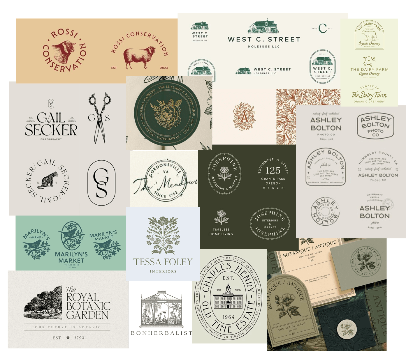
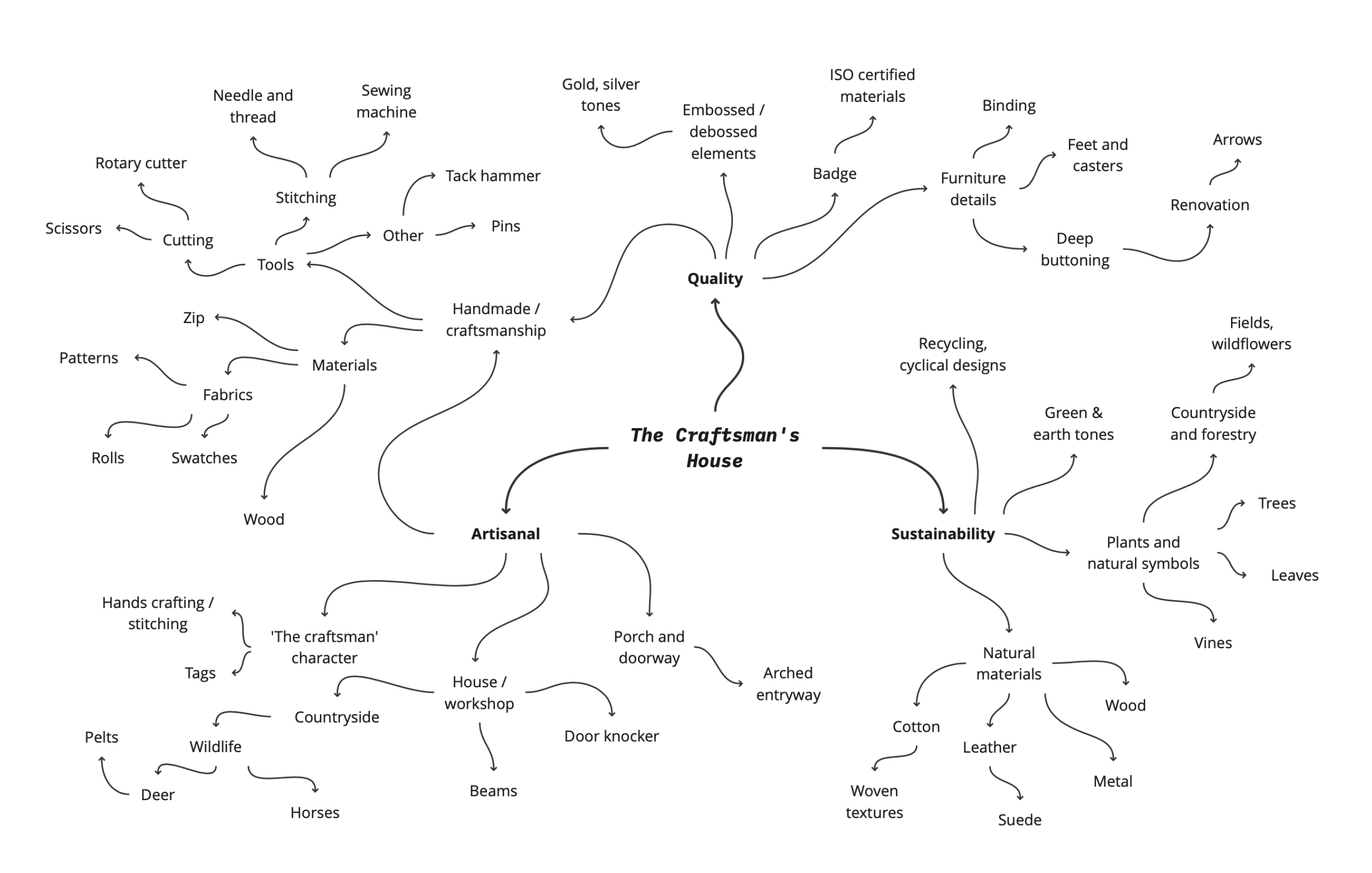
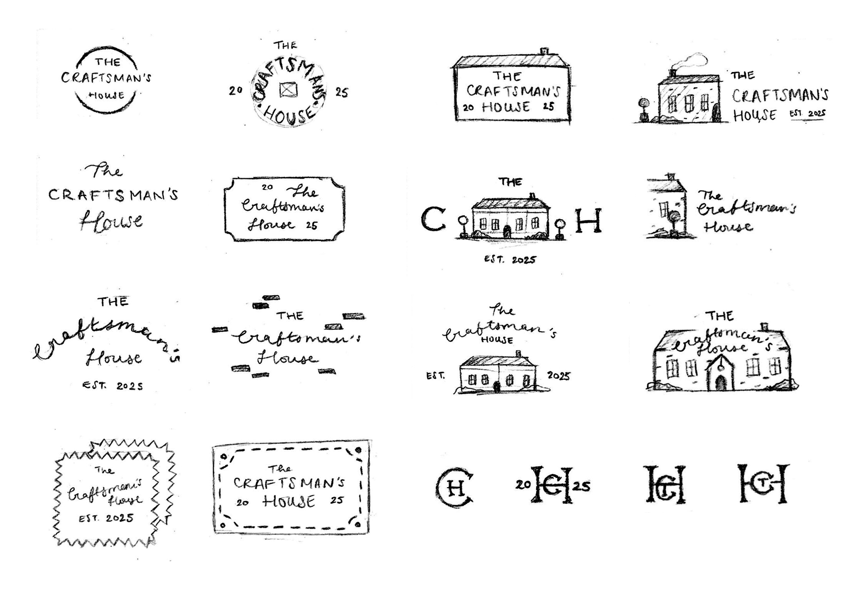
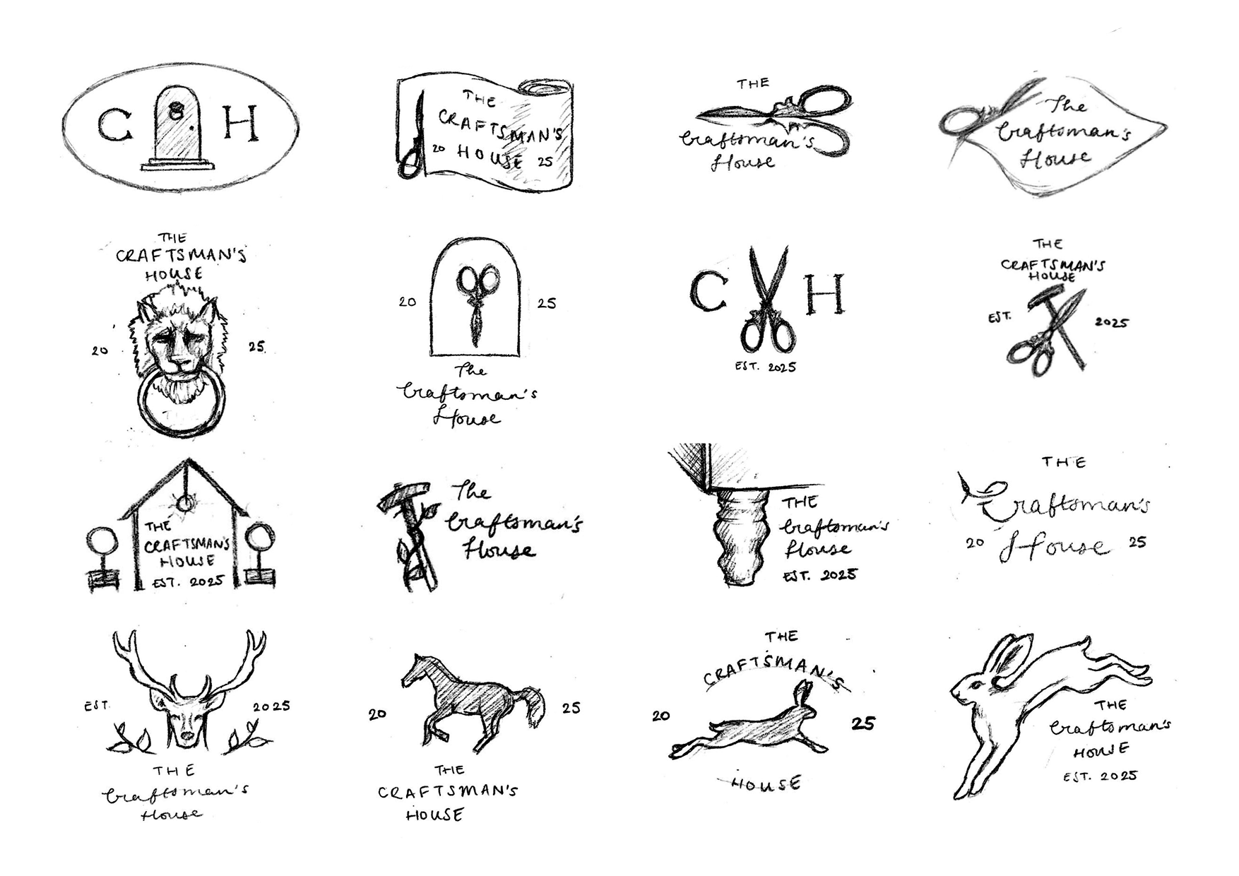
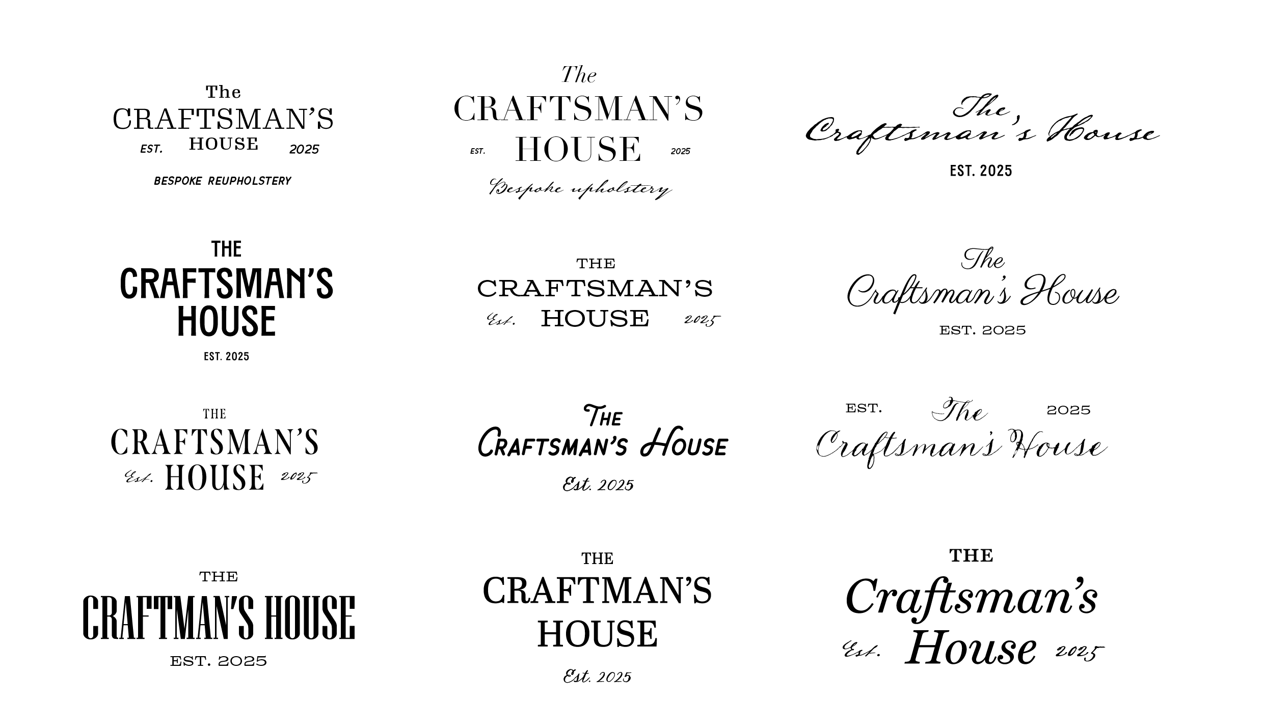
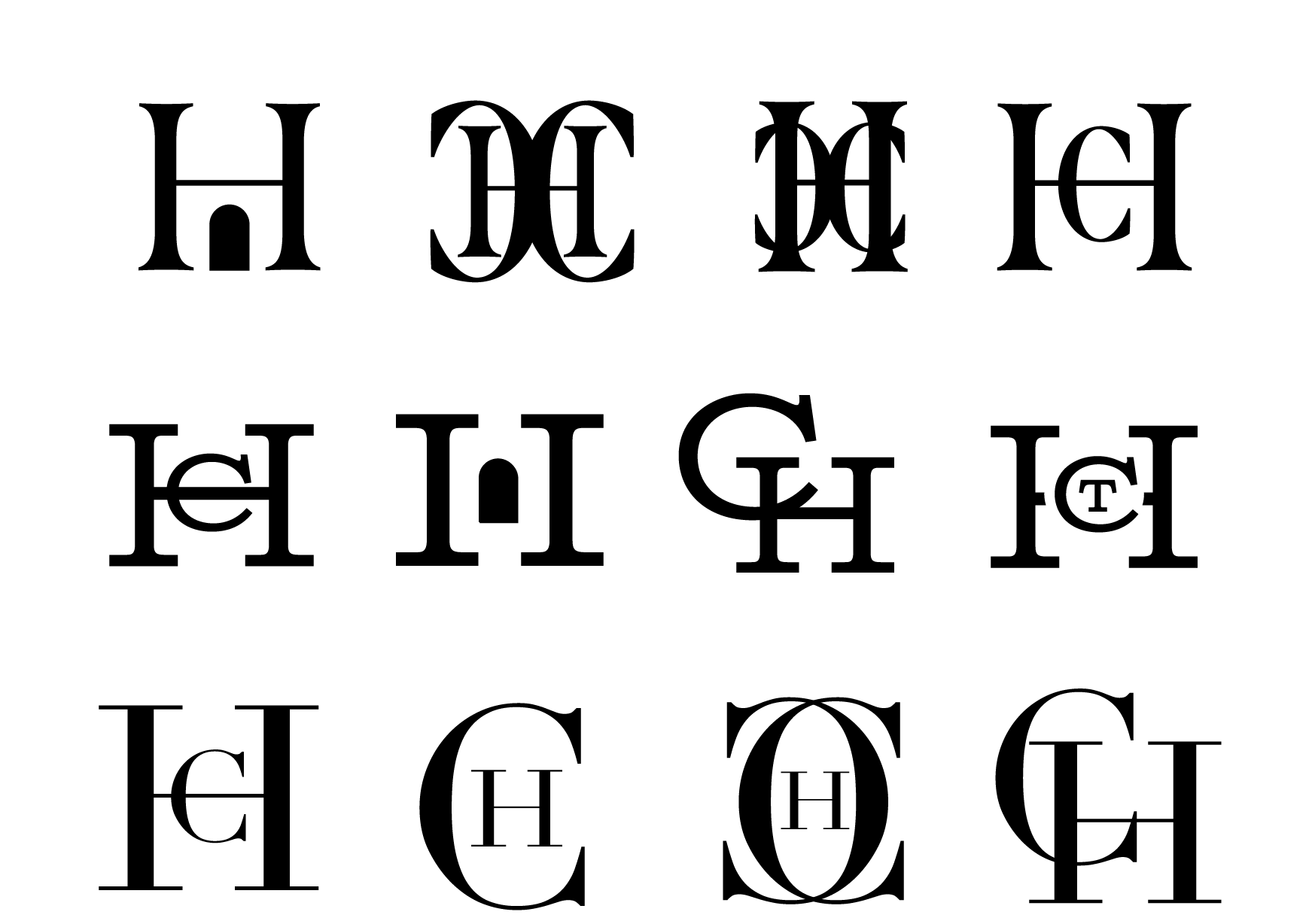
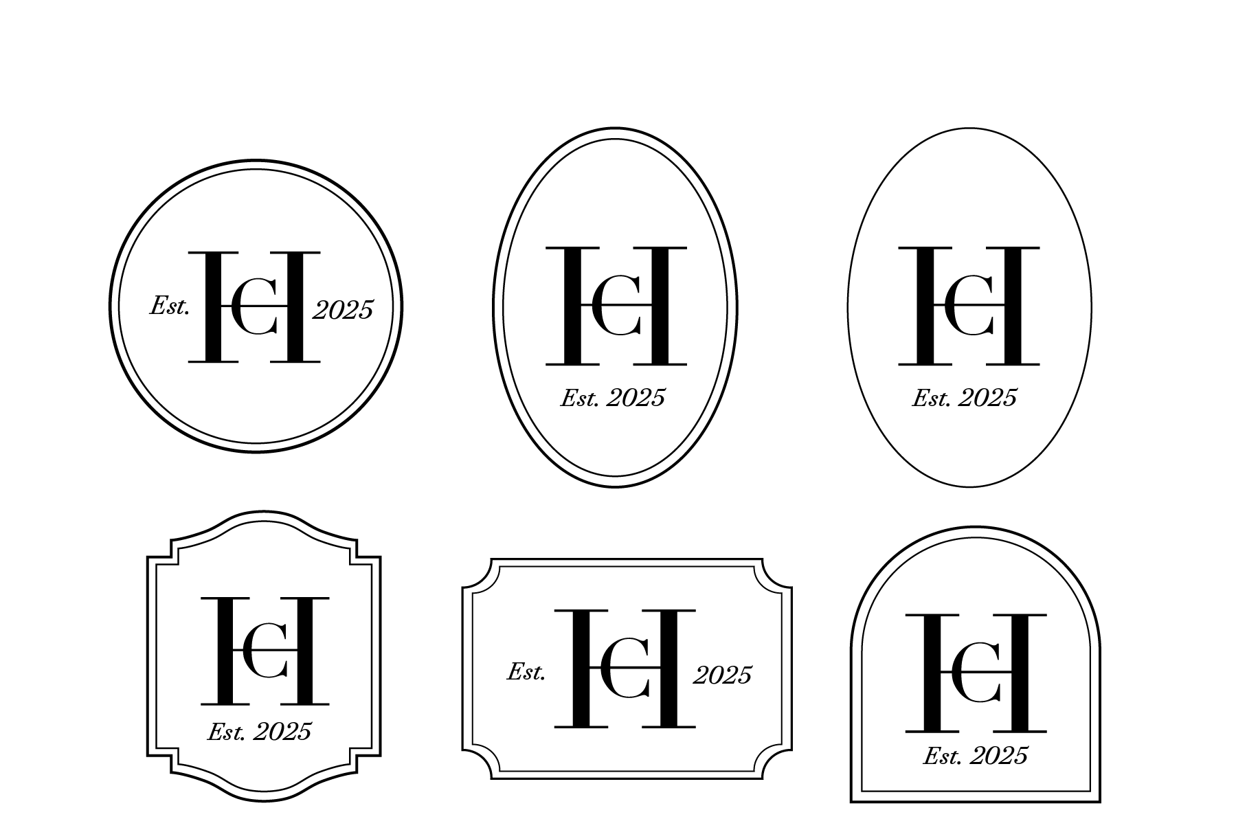
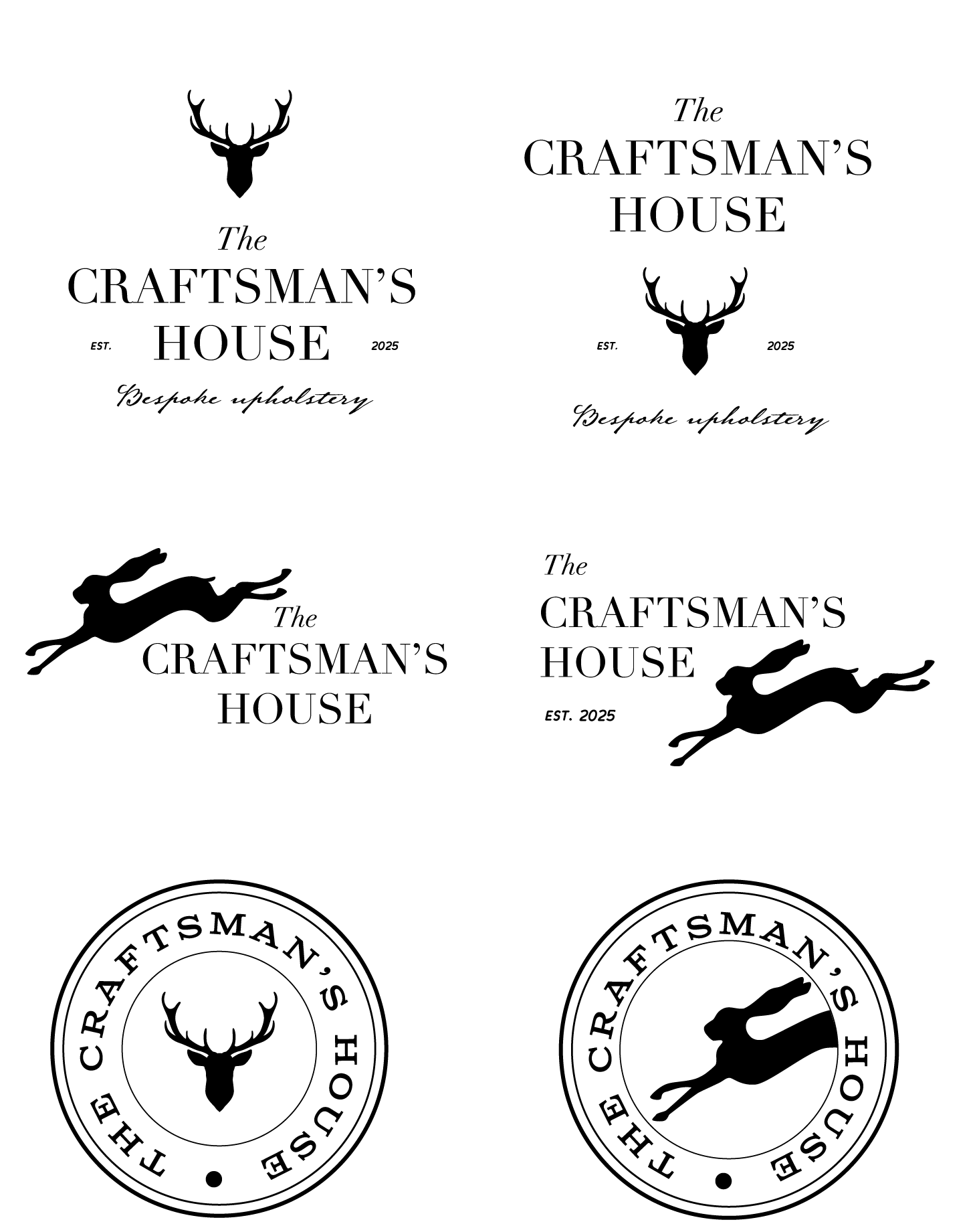
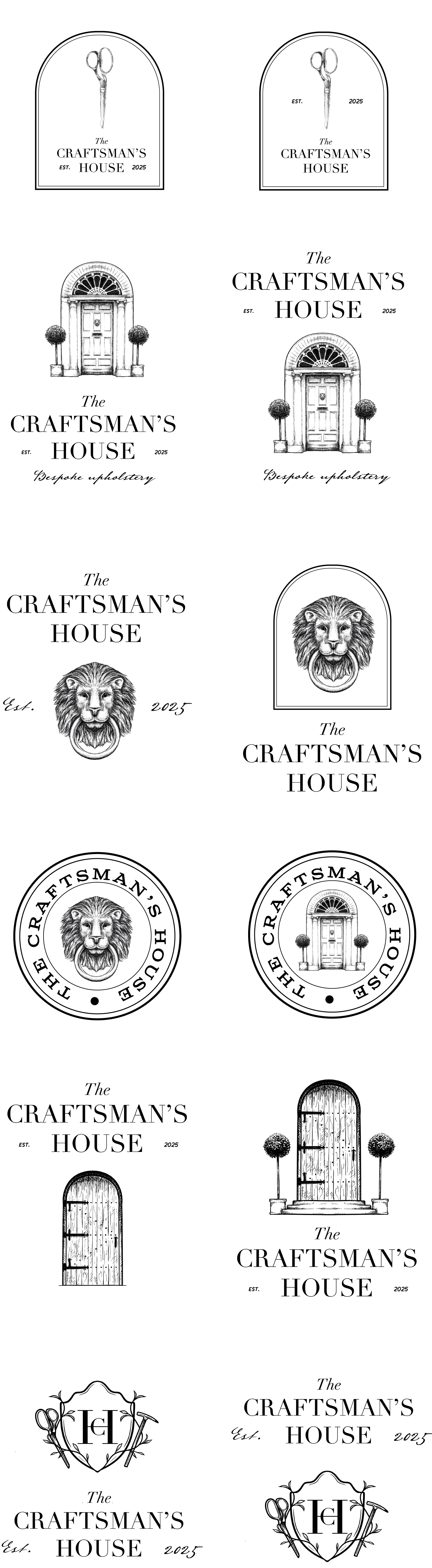
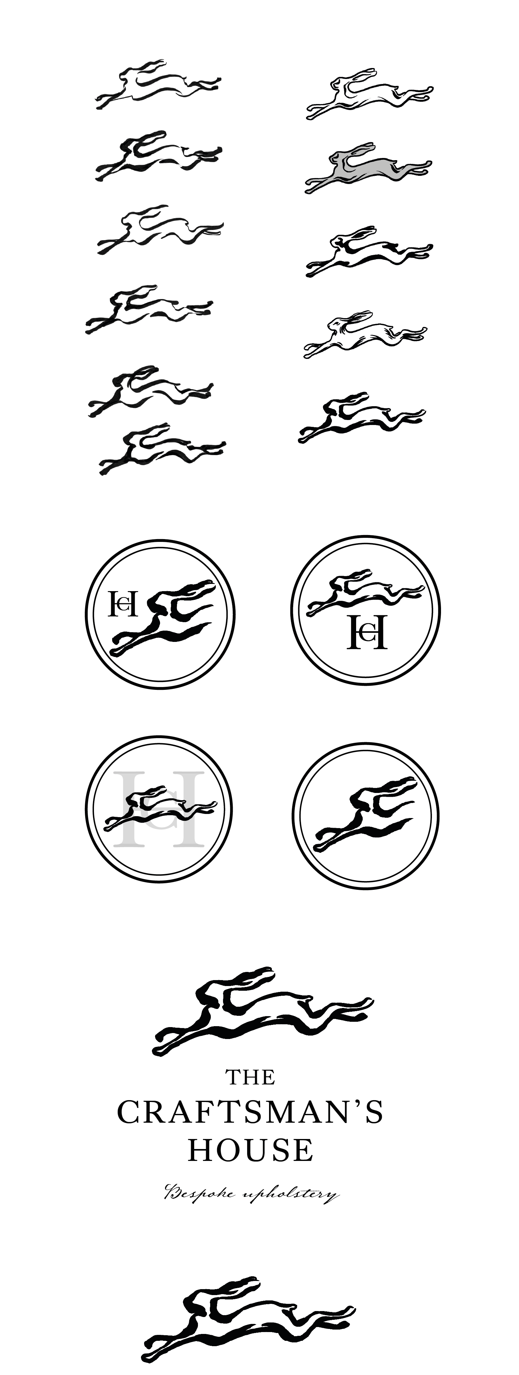


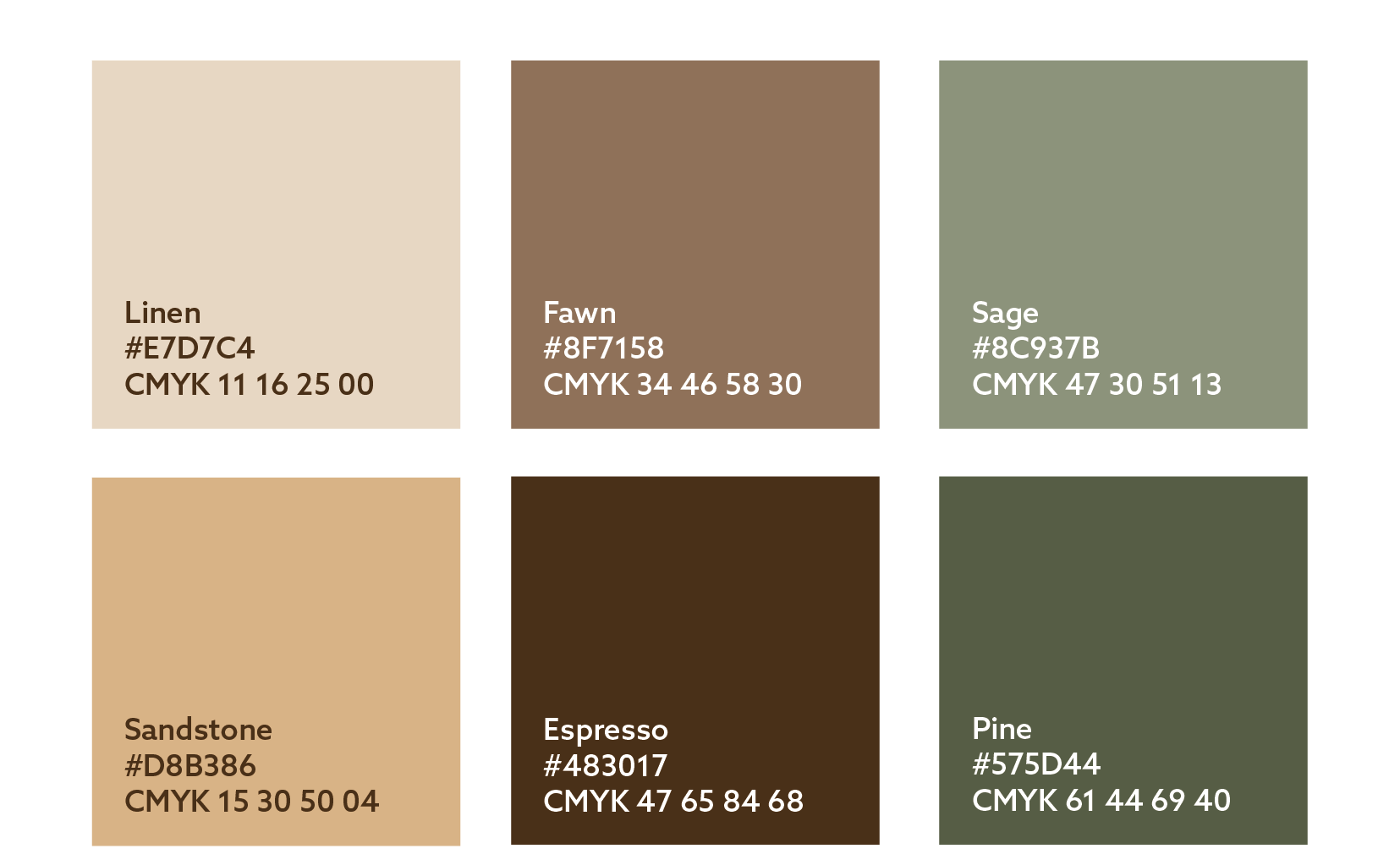
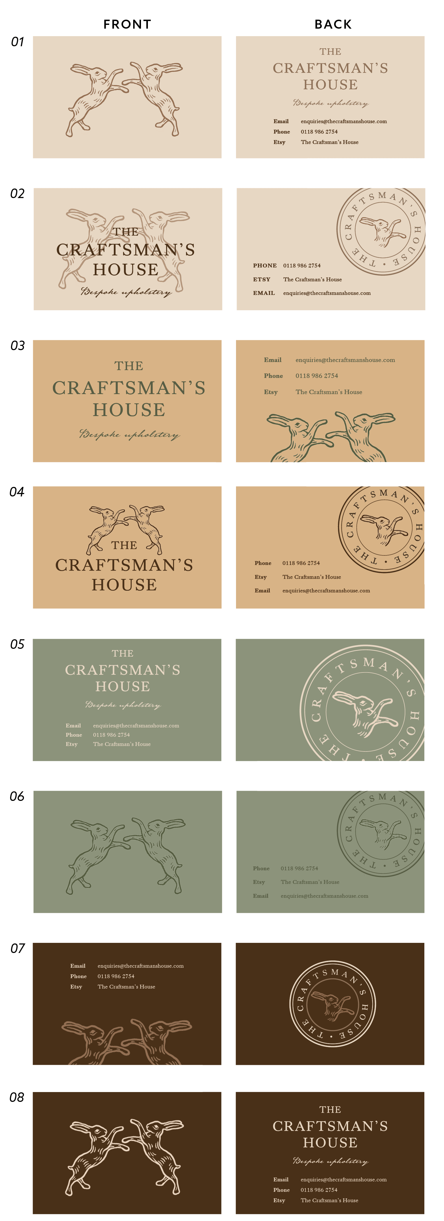
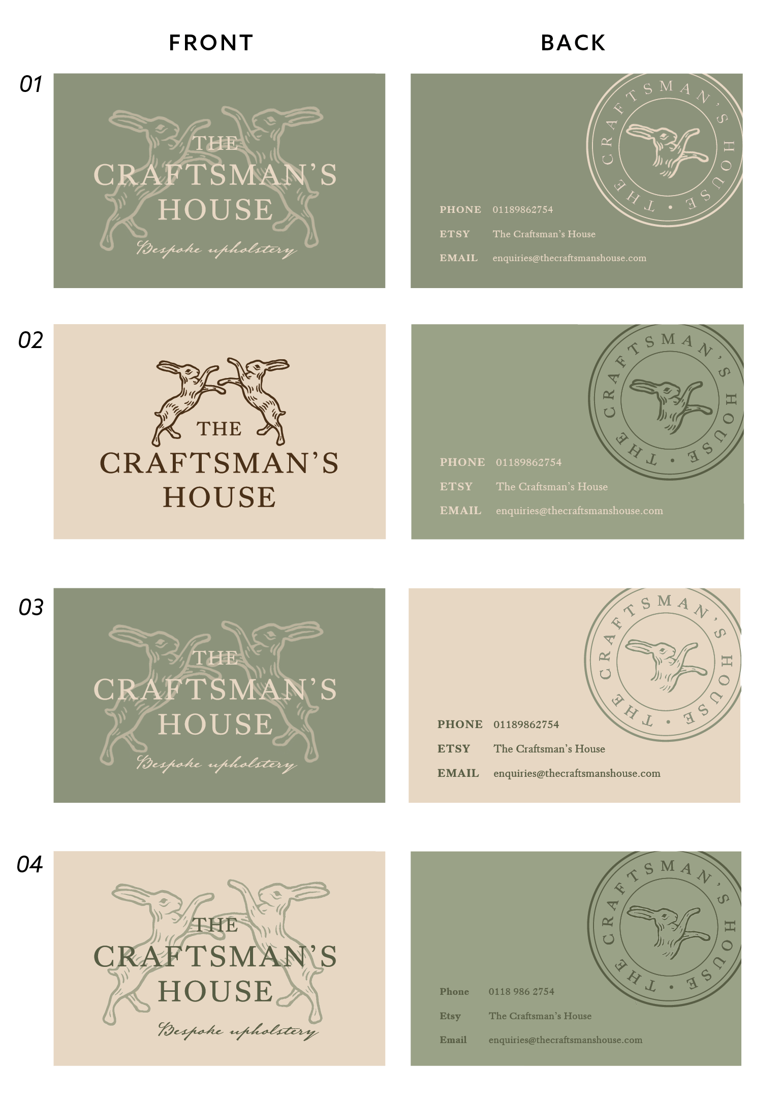
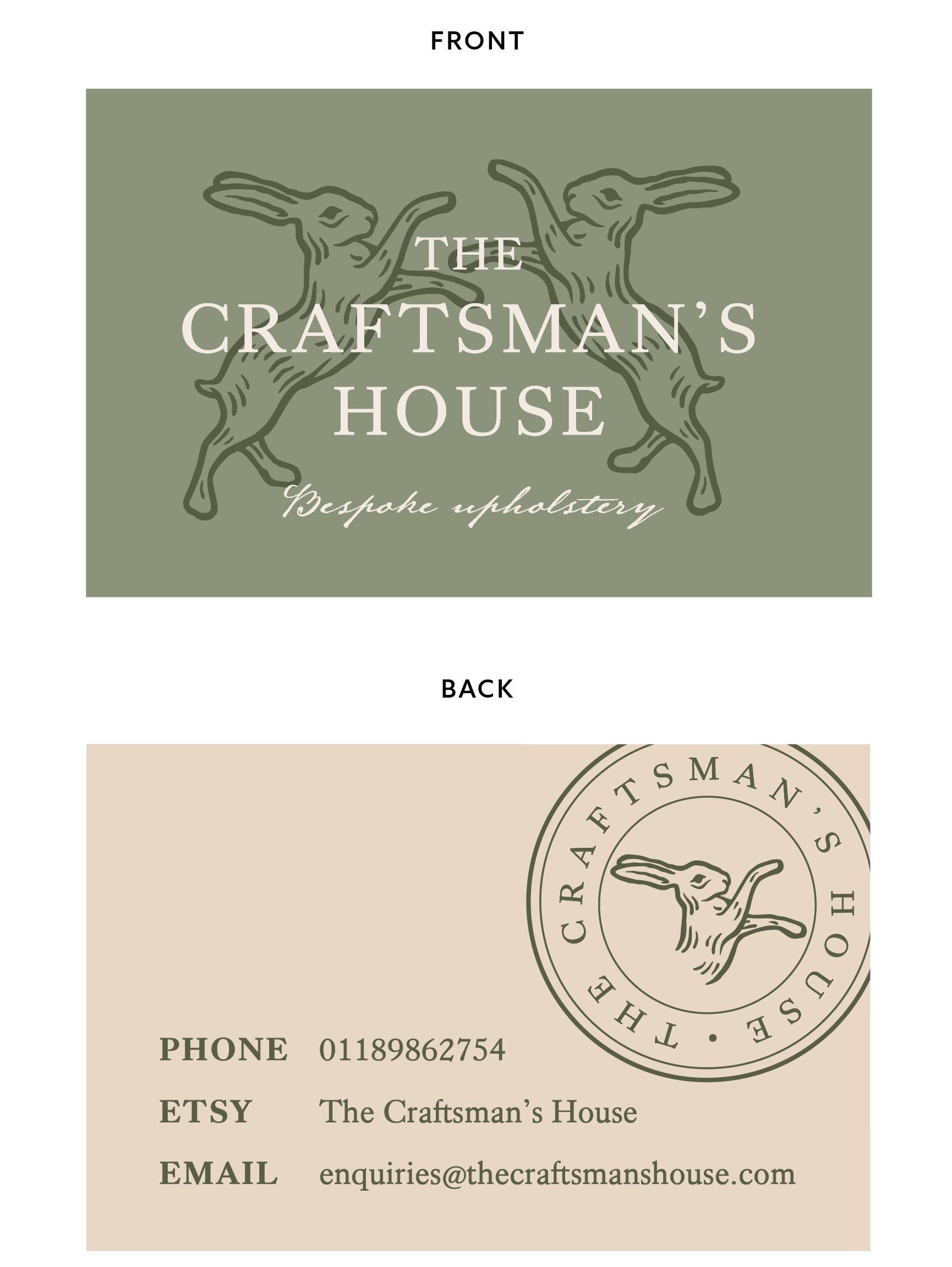
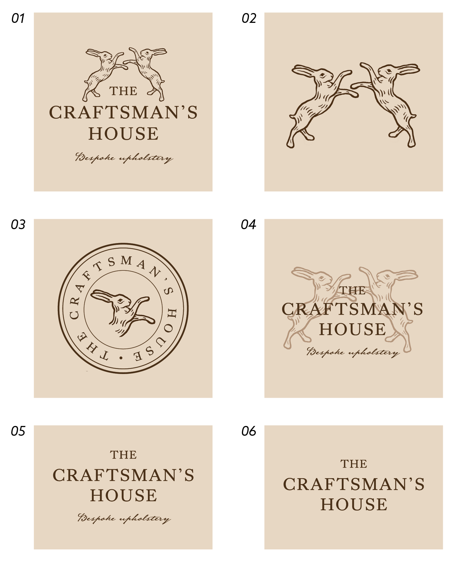

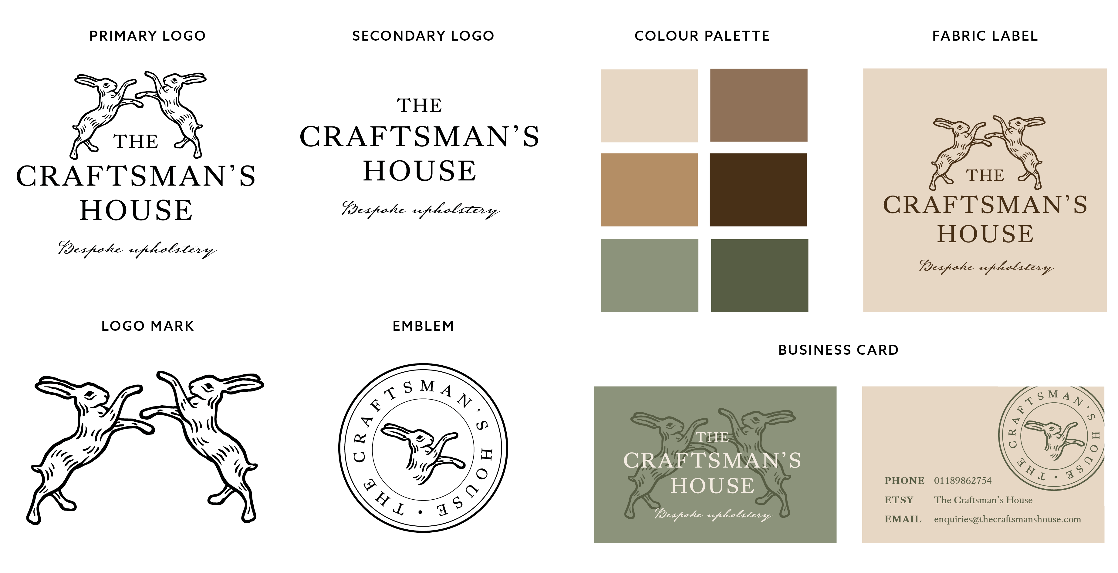
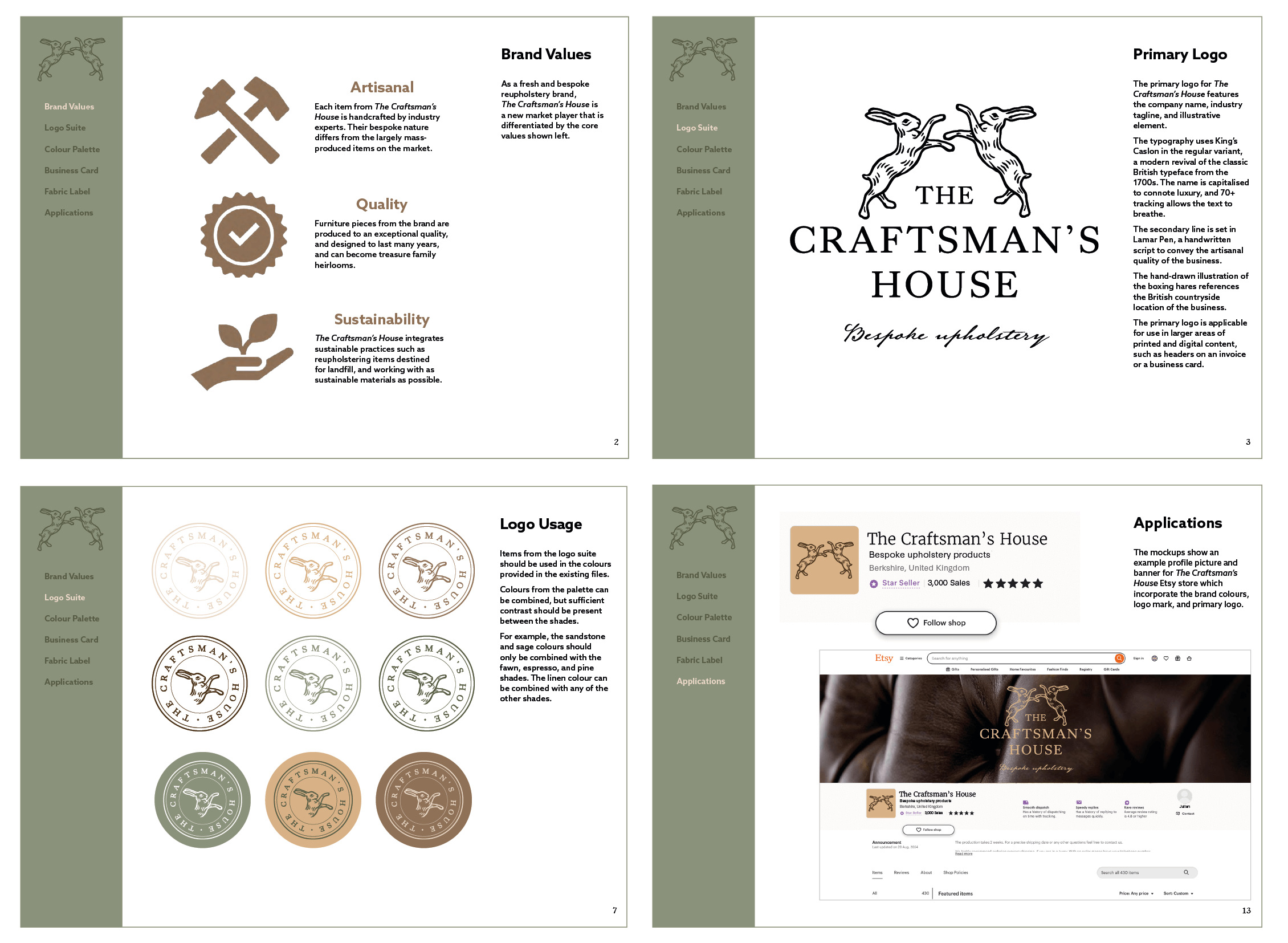
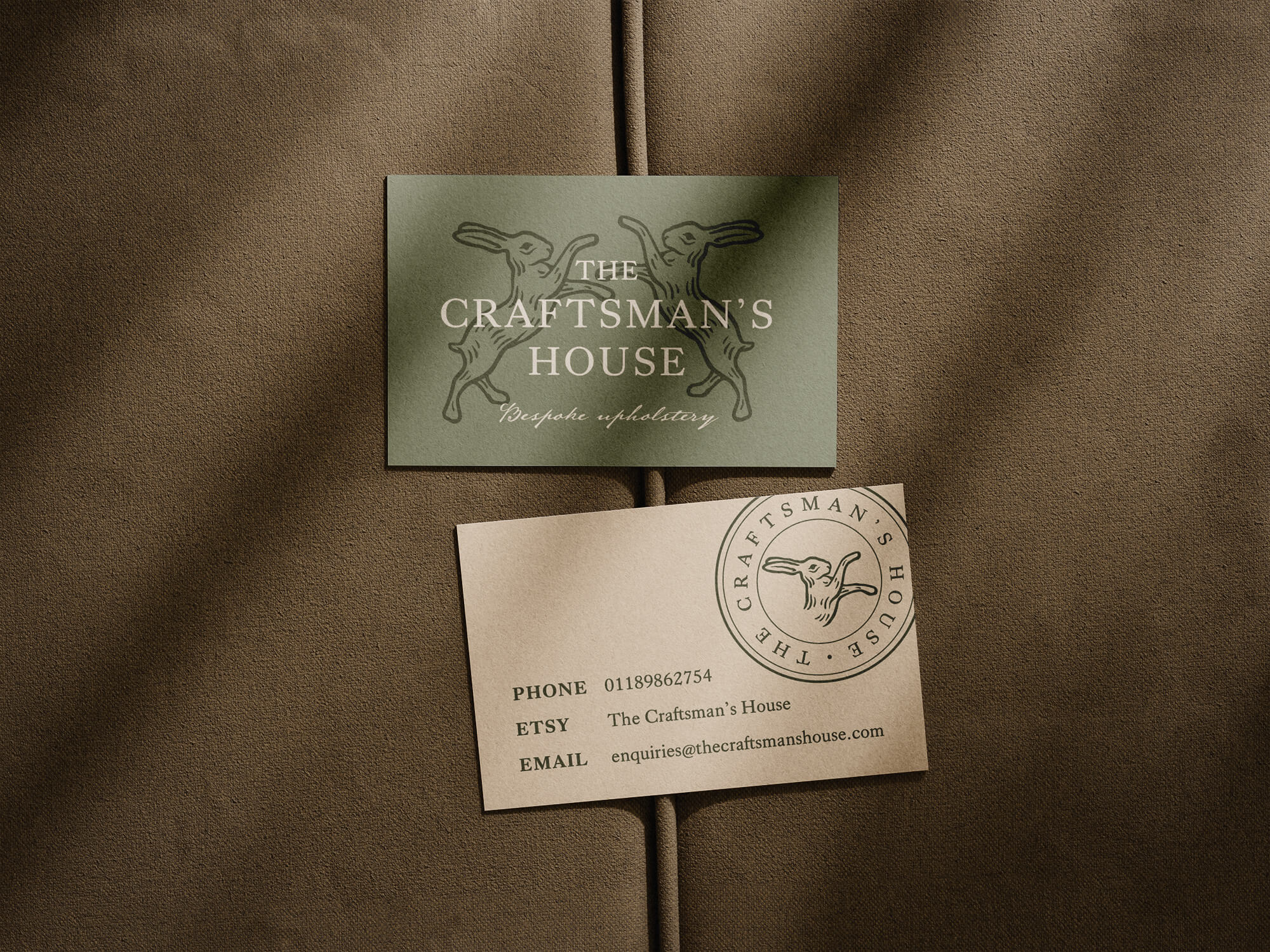
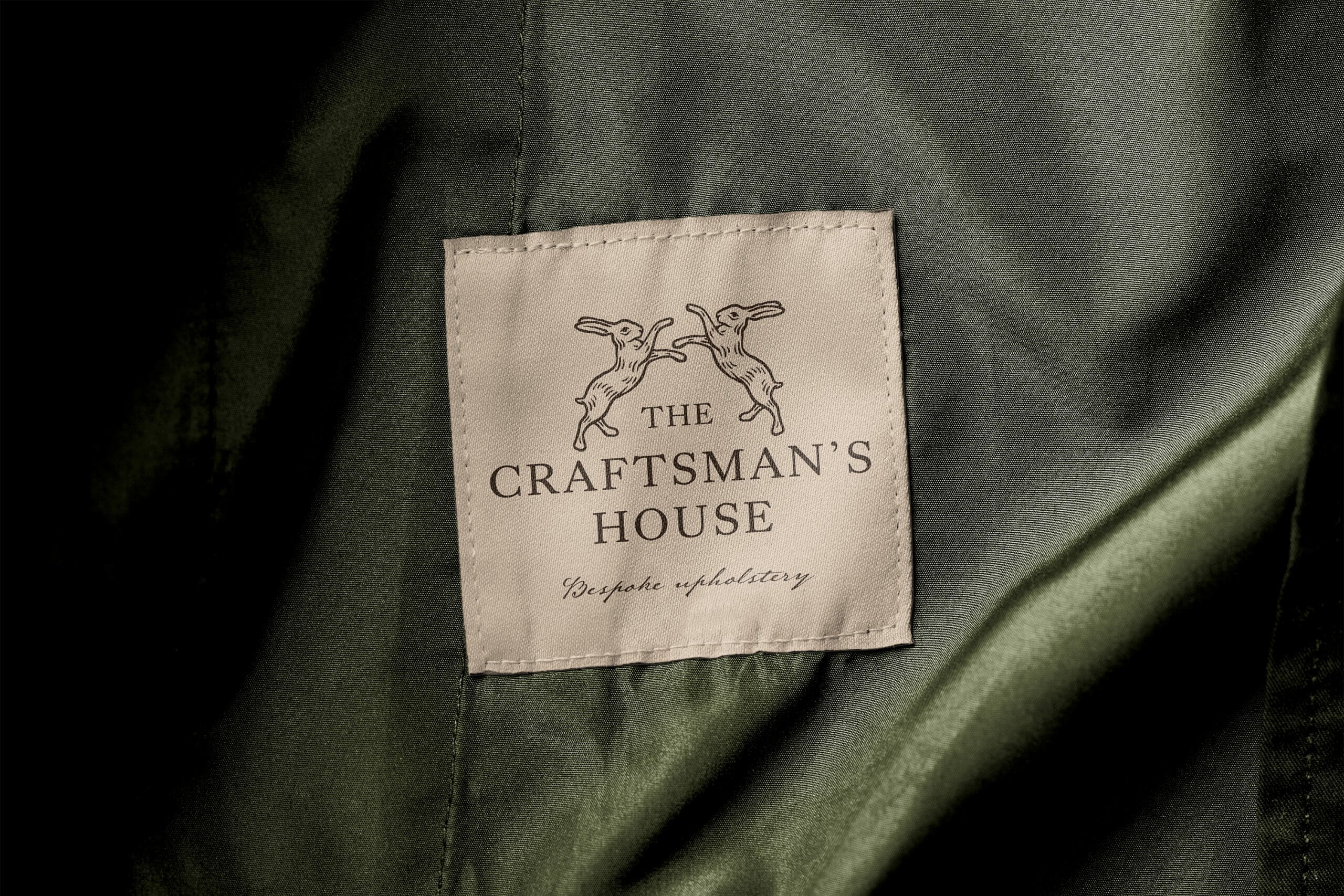

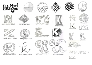
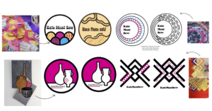
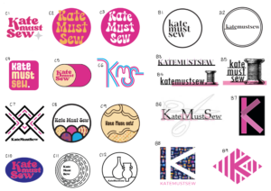
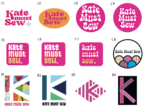
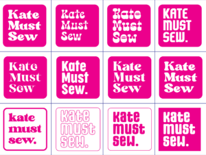
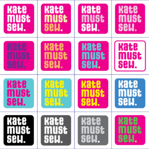
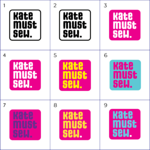
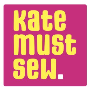
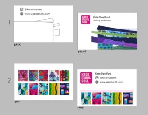
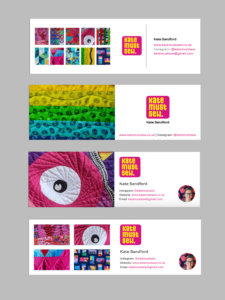
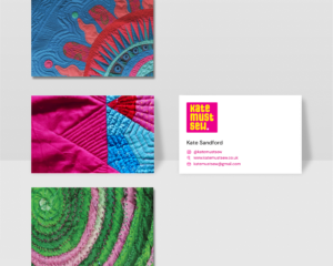
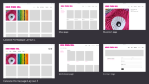
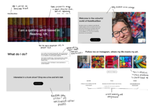
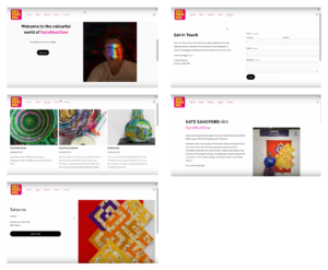
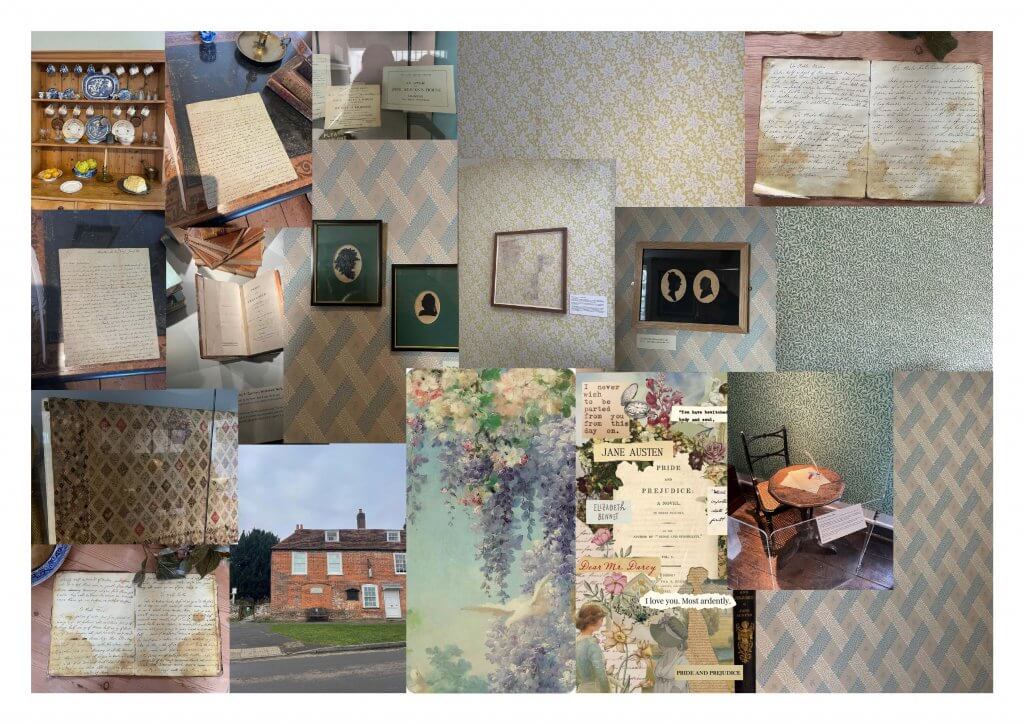
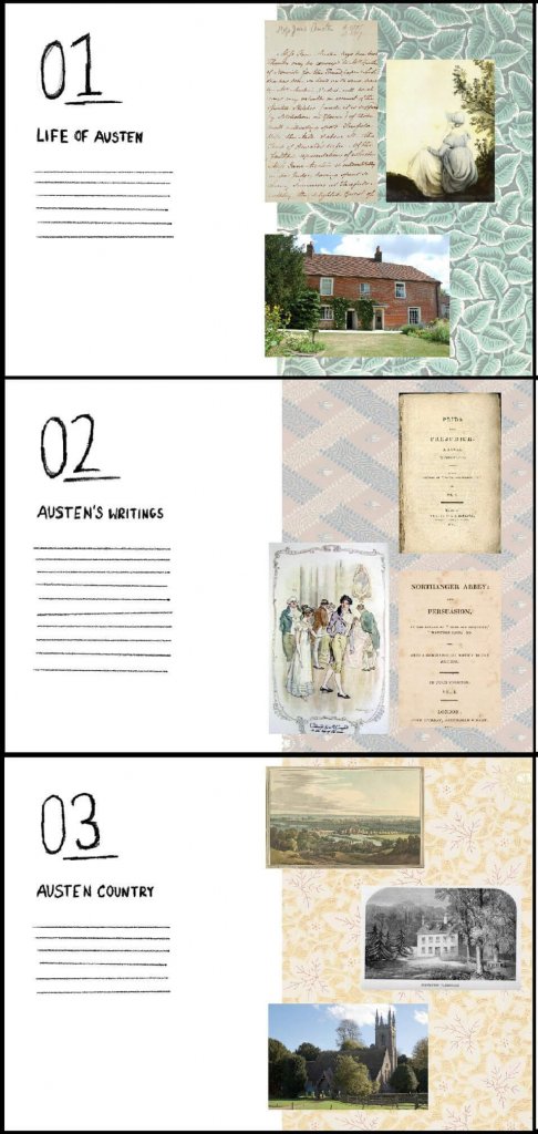
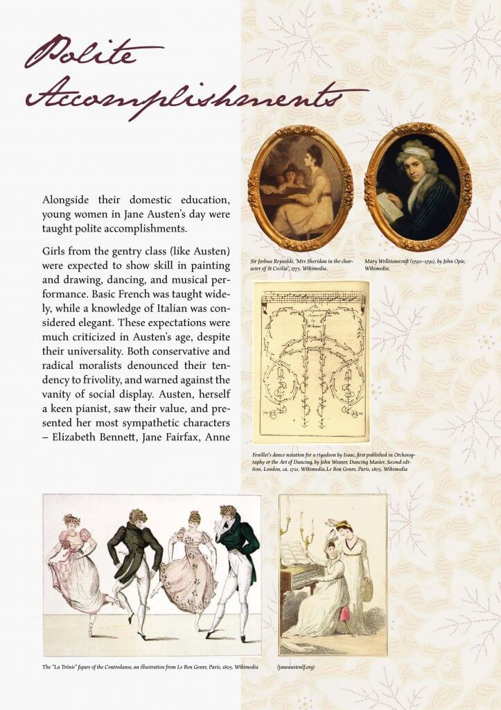


 Picture of us reviewing our work at the Abbey Quarter