Overview
The premise of this job was to continue the work of our recent branding project, in our design portfolio module, for the East Reading Federation. The client was so pleased with our pitch that they decided to expand the brief through the Real Jobs scheme. East Reading Federation is a newly formed governing body of two local schools: Alfred Sutton and Redlands Primary school. Their aim is to bring both schools together under one management team to deliver excellence across two different schools. After completing a brand identity for them, the client wanted to continue the partnership with The Department of Typography and Graphic Communication through the Real Jobs scheme and asked for the four of us directly. Although we knew we had a limited window of time to complete the job, we stayed together for the client and got involved in booking meetings with the client and our supervisor and, soon after, restating the brief.
Restating the brief
Following initial meetings with both our clients and supervisor, we were able to create a restated brief that established the project’s details, such as the exact deliverables and their requested formats. We began by establishing our roles and responsibilities to manage our time efficiently and guarantee clear understanding of what was expected from us. The short project time was acknowledged by ensuring clear detail of desired outputs and member allocations of such. A weekly schedule was devised to make sure that each member and output would regularly progress to fulfil our close deadline at a manageable pace, without compromising quality. Our restated brief was quickly approved by our clients and supervisor, both describing it as ‘spot-on’.
Deliverables and design identity
Due to the nature of the Job, we were working off our own brand guidelines, which made the design identity easy to follow and with little scope for creativity. Despite this, we could still experiment with various layouts and formats with the only constraints being colour, typography and use of logos.
The deliverables for this project were:
- Complete Website on WordPress
- Email footers
- Branded slide templates
- Letterhead
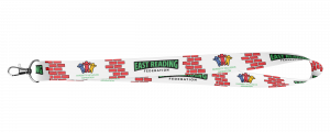
- Lanyard
The client did not request photography as an extra deliverable but because this was added to the content of the other deliverables. It allowed us to go beyond the scope of the brief and deliver a folder of well-produced imagery of their lovely school buildings and areas for them to use as they desire.
Research and collecting resources
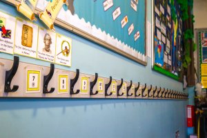
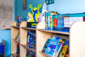
We already had an extensive knowledge of what the East Reading Federation was and their visions and aims, due to our research in the Branding Project. However, more research was done through the form of meeting the client to discuss their aims for the deliverables, such as attending both schools to gain a better understanding of the buildings, the environment and the teachers. While at the schools, Olivia was able to photograph the buildings, playgrounds and equipment, as well as inside some of the classrooms and the corridors. This collection of photos not only gave us a better understanding of the schools but aided the development of the website.
Photo examples:


Development:
Website
As one of the hardest deliverables, the development of the website meant that we had to learn to navigate a new software: WordPress. It proved to be quite hard to understand and, although the photos below in the items delivered section show some development, we were unsuccessful in completing this deliverable. It was a decision made due to a conversation with the client regarding the successful completion of the website. The discussion with the client determined that in order to complete the website successfully within the timeframe, the job would have to be passed over to someone with more sufficient knowledge of WordPress. However, due to the relationship we had with the client, they decided to allow Olivia to continue to build the website outside of the project timeframe while learning and navigating WordPress and solidifying a new skill.
The developments made on the website within the project timeframe can be seen in the images below. Olivia learnt the ability to create headers and footers which could then be applied consistently across the website. She applied some of the photos to the website as seen in some of the examples later on.
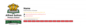
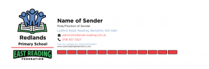
Email footer
The email footer design was refined through multiple layout experiments for the East Reading Federation. The use of red bricks was reduced to prevent the red from overpowering the federations colour palette. The type size was also adjusted to improve legibility, and the typography was refined for greater cohesion, resulting in a more polished and accessible design.
Several versions were created to suit the two schools within the federation, Alfred Sutton and Redlands. The highlighted text and colour schemes were adapted to match each school’s identity, making the designs feel more personalised and thematically consistent. The designs were created using Canva to ensure ease of use for the client, allowing staff names and other details to be updated quickly and independently as needed.
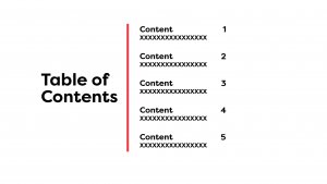
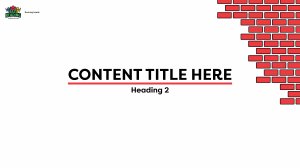
Slides
Multiple versions of the title slide, table of contents, and several internal pages were developed to accommodate a range of presentation needs for the East Reading Federation. To maintain consistency throughout, the federation’s logo was used as a running head on each page, alongside a cohesive used of typography, colour palette and the signature red brick motif.
The layouts were intentionally kept open and adaptable, allowing clients to customise the content as needed. To further enhance usability, the final slide designs were converted into PowerPoint format, making it easier for the federation staff to edit and repurpose the templates independently.
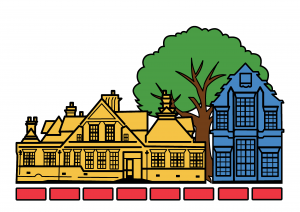
Letterhead
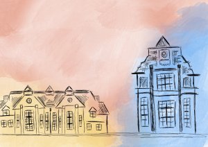
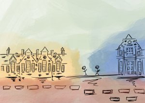
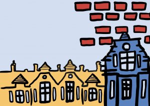
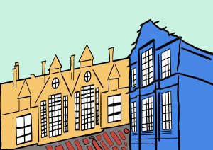
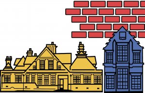
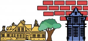
In order to create a visual identity that represents both individual schools and is consistent with our branding, Alice’s role in this project was to create a letterhead for the federation required coming up with a visual identity that complemented the overall branding while representing the two separate institutions. The original idea was to combine the architectural features of each school’s watercolour paintings to create a single, coherent depiction. A change in strategy was necessary, nevertheless, because the initial attempts at applying watercolour effects did not match the federation logo’s brand look. The design was improved by matching the logo’s stroke width, and after multiple iterations, an asymmetrical pattern was selected because it felt dynamic and organic. To maintain uniformity and strengthen the brand identity, the same green on the tree and red bricks from the logo were used.
Personal Reflection
Olivia Moors
Despite the quick turnaround of the project combined with all my other projects due at the same time, I am glad I was able to retain a relationship with the client and deliver new assets of the brand identity we created. I am upset that I wasn’t able to complete the website within the timeframe, but I am grateful the client has offered me the experience to learn a new skill and develop an impressive portfolio piece. The skills I learned during this project are expandable and will develop as I continue with the website. The fast pace of the project meant that organisation skills were a top priority, and the use of the Trello board was an important tool for project management, I made sure to make use of the all the features such as deadlines, check boxes and file uploading. As team leader I ensured that my team kept up to date with each section of the Trello.
Alice To
That the client liked our branding project concepts and chose us for this actual task made me very happy. Despite the somewhat hurried nature of this actual assignment, I’m delighted that my group members and I worked well together and submitted on time. Since the client expressed how much they enjoyed the watercolour artwork from the person’s school, I first had a lot of trouble deciding on the appropriate style for the letterheads. Using all of the colours seen in our federation logo, I was able to produce the final version after consulting with my group members and our supervisor.
Vivien Lee
It was a great honour to have the clients decide to use our pitched branding for their federation. Our group worked well to overcome the short time frame we had for this project and successfully produced outputs we’re proud of; we’ve learnt valuable time management and communication skills as a result. Reflecting on this project, our skills in using WordPress have room to improve, and this will greatly benefit us for future projects that require UI and UX design. This project has encouraged branding to be a possible sector for me to pursue professionally in the future.
Aina Zain Azrin
Working on the East Reading Federation project really pushed me to think beyond just aesthetics, I had to understand who we were designing for, what the federation stands for and how to communicate that through every detail. I learned how meaningful design can support identity and connection. It’s been challenging but rewarding experience that made me more confident in my ability to design with purpose.
Items delivered to the client
Website
Email footers
East Reading Federation
Alfred Sutton
Redlands
Slides


Letterhead
Lanyard