Autumn term Feedback Jam, hosted in Week 7 of term with tutors Sara Chapman, Josefina Bravo and Geoff Wyeth was put in place to assist students with upcoming deadlines towards the end of term. A valuable Baseline Shift to obtain extra advice along with tips and tricks on how to improve before final submissions!
Part 3 Students
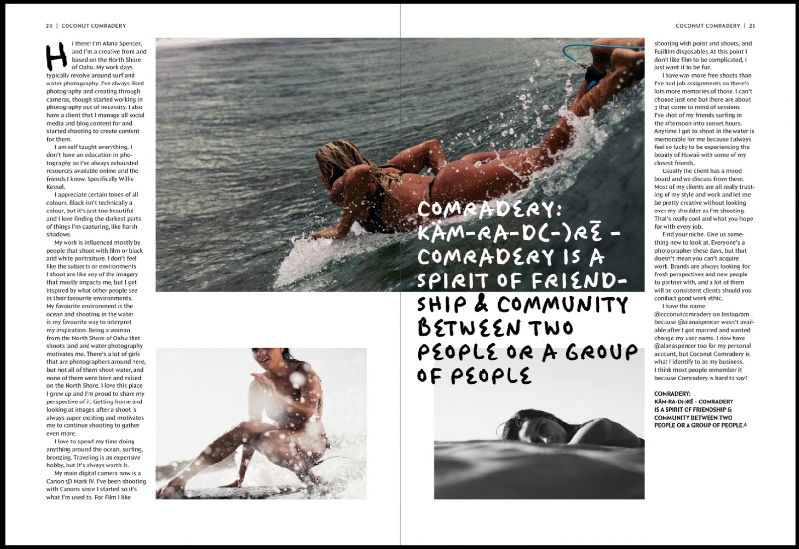
The session kicked off with Part 3 student, Mia, showing her Publishing Platform module work of her magazine spreads and covers for the chosen topic of surfing for women. This brief was to create spreads for three different articles, as well as interview, contents, and full sleeve cover – for a self-chosen topic. Tutors appreciated the handcrafted typography used for quotes however suggested the width of the stroke may not fit the overall aesthetic a surfing magazine might aim for. Linking to this, Mia was advised to ‘have more fun’ with layout and placements so that it doesn’t appear as linear and is more fit for surfing itself.
Mia’s main article opening spread, featuring hand-lettering.
Mia’s photography article text spread.
‘Experiment, rough it up a bit more!’
‘Be bold!’
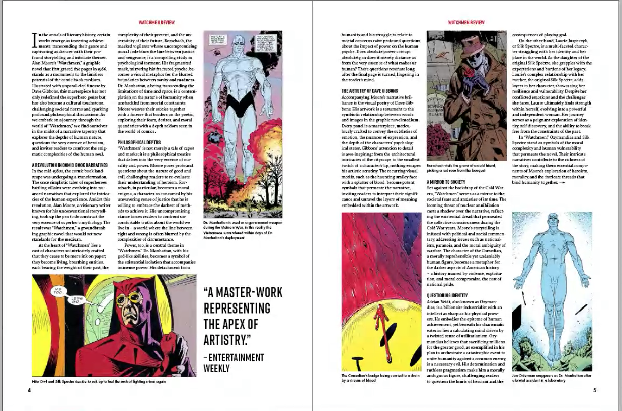
Similarly, Part 3 student Ben presented his magazine spreads for the same project with his topic of graphic novels. Based on the layouts of graphic novels themselves, Ben’s cover incorporates this idea of how image is split to create a more interesting visual element. Both students and staff praised the connection between type and imagery, however felt the grid to feel quite forced and looking like something wanted to fill in every gap. Peers also noticed how the same character was shown in three spreads and and questioned if this was necessary. Geoff enforced the importance of production concerns when placing graphic elements over the centre of spreads which could be lost due to the binding and therefore lead to misalignment, perhaps even causing issues with how information is communicated.
Ben’s ‘Watchmen’ spread.
Ben’s Magazine cover
‘White space is so important!’
‘You want it to be serious but not the same.’
Part 2 Students
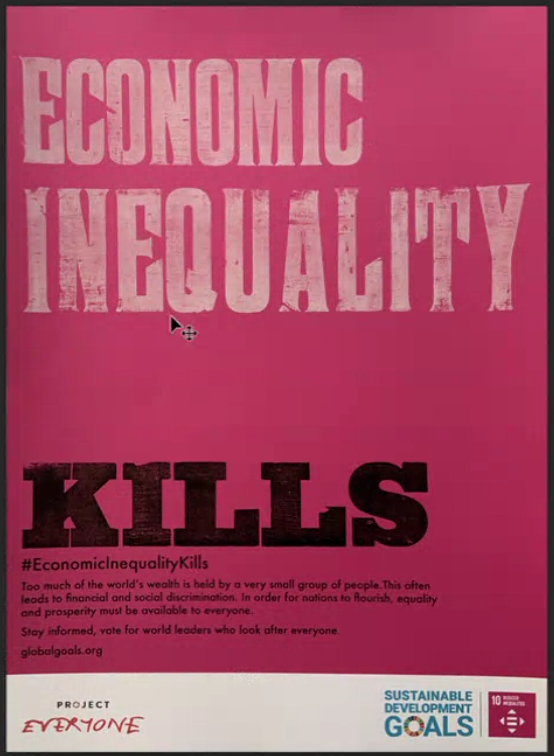
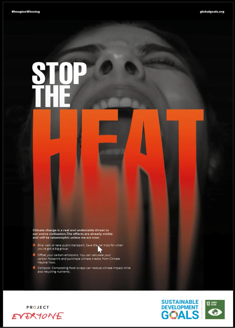
Second year student, Finn presented his posters for feedback working on a campaign project for sustainable development goals. Using wood type lettering, Finn was advised to consider the spacing between words, as the sentence was read differently than he intended. It showed the importance of hierarchy when placing text on a page.
Finn’s poster design which features wood-lettering , printed with the help of Geoff.
‘Create a link between concept and message’.
Matthew also presented his work for the same project and received feedback on his image and how effective it is in communicating the message – It risked overpowering or competing with the type. Tutors also suggested the call for action could be amended to exploit the space more, and to visually match the content and what it communicates.
Matthew’s poster design.
Part 1 Students
Finally, first year Ethan showed his work for a book design project where the brief was to format text in either a modern or traditional style and compliment this with a foreword, table of contents and end matter. Discussing indents and spacing, Ethan learned about italics and how this can be used to differentiate between hierarchy of text, for example a letter in which he was presenting within the main body of text.
Ethan’s book design, looking at formatting a letter within the book text.
Conclusion
It is so important to gain insight into your work from a different perspective outside the regular classes. Sometimes we can be biased towards our own design or be too hard on ourselves. Fresh insights go a long way. As a designer, we should always be willing to receive new opinions and advice to enhance our current and future projects.
’The session is so helpful!’
‘Even though I didn’t show my work, it’s always great seeing my peers and using similar advice for my own work.’
In Week 8 of Autumn Term, we were joined by Greg Bunbury a Graphic designer and consultant, as well as a sessional lecturer here at Reading. In this session, Greg spoke of real-life experiences, gave the students interactive elements throughout his presentation and really engaged with why ethical design is so crucial to today’s industry.
What is ethical design?
Greg began by approaching the students with the trolley problem. This warmed them into understanding the most drastic form of moral principle. Greg states that as designers we do not always see the consequences of our ethical choices. Things get complex, and that is why Ethical design is so important.
Ethical design is all about respect – using a broad approach to design products/services or experiences that priorities moral principles/values. Ethical design is not just about something looking good or doing its job– it must also contributes positively to society. Ethics is considered a route to advocacy and activism but in itself it is a different construct. Ethics can lead to advocacy and activism but that isn’t what ethics is. Most humans have a moral compass allowing them to be respectful and honest. However, this doesn’t stop them from being ignorant when it comes to understanding world issues to allow for ethical progression.
‘Design is about intention not delivery’ – Greg Bunbury
A good guide to follow is the ethical pyramid which represents respect beginning with human rights, leading to human efforts, and onto human experiences. Greg says that ‘ethics is not politics. It is moral human behaviour, a study of right and wrong.’
A screenshot from Greg’s presentation explaining what design is.
Why is Ethical design Important?
Unethical design causes harm. Unethical design affects people in many different ways: physically, through financial strain, sleep deprivation, or the taking of personal data. People can feel betrayed by design, and can be affected emotionally and financially. Exclusion by design can be extremely debilitating for some people. For example, making a building inaccessible to wheelchair users by excluding ramps and lifts and disabled toilets is cruel. Design can also be ageist, biased, racist, employee greenwashing, or generally conceal rather than reveal truths.
Dark patterns are a seriously unethical way of mistreating humans basic rights, issues such as hidden costs, opting into handing over data to use their sites, roach motel, forced continuity and covert spam. Design should be clear and ethical and this is the key to great design.
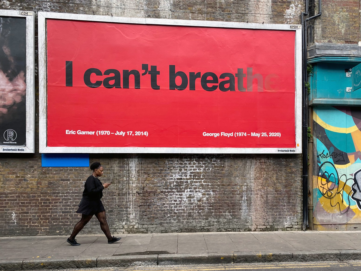
‘ I can’t breathe’ billboard designed by Greg Bunbury.
How can you bring ethics into your design work?
Learn what you think – there’s nothing worse than having an opinion but no understanding of why you hold this opinion. People challenge and question you in life and you need to be prepared with why you think what you think.
2. Learn to ask powerful questions – question the suppliers you chose, the printers, your advisors, the images that you choose.
3. Learn to say ‘no’ – If something isn’t right or ethical say ‘no’, avoid dark patterns and choose a better path.
‘WHY?’ is such a strong question to ask yourself and others it challenges us to understand our choices and the choices of others. So next time you go to say ‘yes’ to something think about why your saying yes in a deeper perspective.
Never lose sight of your purpose and values in design.
Conclusion
Greg offered an extremely insightful talk that every student learned from. He made it clear how important being ethical in your design work is and the success to being more ethical. He covered a wide range of topics within his presentation such as the trolley problem is unrealistic and you will not necessarily see the effect that your design has on people but questioning why will be key to being as moral as you can be. Design is so much more than being creative it is about portraying a message, being inclusive and making it user friendly. Greg’s work and words are truly empowering and his passion and honesty in his journey and experience is inspiring to young designers searching for their place in design.
‘ I really liked how Greg highlighted and warned people of the potential mistreatment of freelance designers so that students can be more wary when handling clients should they choose to be freelancers, issues such as no credit of the work or even denying the work you created and not paying etc.’ – Part 2 student
‘Seeing the emotional side of design and also seeing Greg’s work was amazing’ – Part 2 student
‘Greg’s insight into ethical design should be mentioned much more along this course’ – Part 3 Student
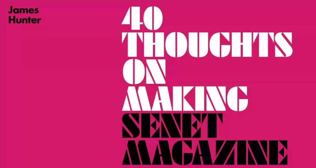
In week 3 of Autumn term, we were joined by editorial designer and co-founder of Senet magazine, James Hunter. In this session, James talked about his editorial design industry experience as well as his decision to co-found the magazine, based on his passion for boardgames.
Graduation and early career
After graduating from Falmouth University in 2010 with a degree in Graphic Design, James was adamant about not wanting to work for a traditional branding agency. Instead, he began working at the Guardian newspaper where he loved the “buzz of the newsroom”. Later in his career, James worked as an editorial designer for the Times newspaper, where the majority of his work revolved around designing early prototypes of the newspaper’s app, editorial design work for print, and their magazine. During his time at there, he found the daily deadlines of work exciting, reminding him of his time at university, and motivating him to work consistently – a work ethic that all students could use! This work for daily newspapers inspired him to create his own magazine based on his passion for boardgames. James brought SENET magazine to life, after collaborating with many other like-minded people together to conceptualise the magazine.
‘Make a magazine about something you love, treat it like a magazine, not a business’ – James Hunter
40 thoughts
The highlight of James’s lecture was his 40 thoughts behind making a magazine. There were many important points that students took with them to apply to their current projects; especially for the third year students who were working on a magazine design project. Point 21 advised students that the design of a magazine should be a response to the content that is being presented for audiences. This directly linked to point 22 which encouraged reading the the copy many times. This is because as an editorial designer the visuals and overall design needs to suit what has been written, therefore reading the copy is integral in helping make content and visuals compliment each other. Another point he emphasised was to ‘approach your magazine with a beginner’s mind, to keep it fresh’, telling students to design with an open mind when making an issue of a magazine as it would create new avenues to explore when designing instead of creating new concepts based on previous work.
SENET is a collaborative project made by James and his other colleagues who help to produce, design and sell the magazine. It is focused on boardgames and the fantasy genre, the aim of the magazine is to appeal to those who already have a passion for boardgames, while also inviting a new audience by producing appealing magazine designs.
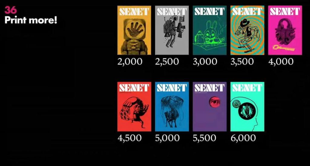
SENET has enjoyed a growing circulation.
‘I’ve always loved magazines and always read them’ – James Hunter
Conclusion
Students were given valued advice from James’ talk for developing their projects further as the term progresses. Third year students especially benefitted hearing the 40 thoughts of designing a magazine, providing guidance to improve their current magazine designs, as well as being able to apply James’ principles to their own work.
‘I really enjoyed how James established his work and career and then transitioned into how that informed Senet magazine. I also liked the level of detail he went into about the magazine that has to do not just with the design but all the logistical, financial, and business sides of self publishing.’ – MA student
‘It was inspiring to hear James’ insight into magazine design, his talk has been really helpful for the upcoming magazine project.’ – Part 3 student
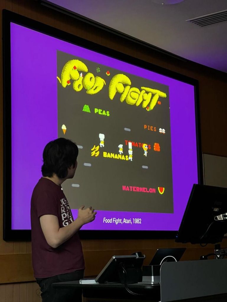
In week 2 of Autumn term, we were joined by typeface designer, Toshi Omagari. In this session, Toshi presented a wide range of enthralling videogame typefaces showing how they function to immerse users, along with providing students guidance on how to expertly produce typography for different projects. Followed by an 8×8 pixel type workshop and a fun retro arcade style party!
Arcade typography
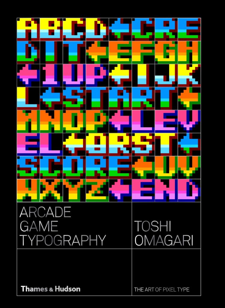
Toshi presented many retro arcade typefaces, explaining the evolution of how type was designed since the start of videogames, emphasising the importance of type’s legibility and its interactive elements. His passion for arcade game typography came from Toshi being surrounded by arcade games in Japan whilst growing up. The wide variety of gaming’s colourful and animated type strongly influenced Toshi’s existing interest for fonts fonts and the characteristics of typefaces. This love for typography and videogames inspired him to research and write his book on Arcade Game Typography. The book contains a plethora of arcade game typefaces that Toshi researched to show how type in videogames interact digitally and how type is designed to present messages to audiences on screen.
Arcade Game Typography by Toshi Omagari.
Students were interested in how type has developed over time with the evolution from black and white to a wide array of colours and the introduction of drop-shadows, gradients and the progression of multi-lingual type. Toshi explained that ‘these fonts have been with us the whole time, but there was no comprehensive effort to document them. Maybe because it was not considered a serious subject by professional typographers, or maybe too technically demanding.’ But as he had shown students, there is no subject too broad or niche to explore when researching graphic design, which is comforting information for the part three students writing their dissertations.
Toshi Omagari analysing pixel typography and how type interacts with the videogame on screen.
Pixel workshop & pixel party
Students were engaged in various pixel typography exercises.
The department held workshops lead by tutors after Toshi’s lecture. Students practiced colourful Lego letter-pressing pixel styled letters, as well as creating fonts using post-it notes where students won some great prizes!
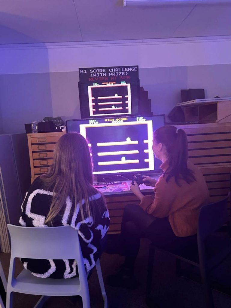
After the typeface workshops, the dance-mats and arcade games came out for a fun night of music, food and drink in the department. From games like Pac-man, Streetfighter and Mortal Kombat, students had an array of games to play while socialising with their course-mates. To conclude, all students and lecturers had an exciting day learning about retro typography and having the opportunity to play some classic arcade games.
Students loved playing all the retro-arcade games!
Conclusion
From arcade game typography to the pixel party, students adored this week’s Baseline shift. Students gained a lot of insight into producing typography along with the fun of playing against their classmates in retro arcade games.
‘His presentation was so intriguing and the passion behind Toshi’s work was incredible! ’ – Part 1 student
‘This Baseline shift was very interesting! I loved it.’ – Part 3 student
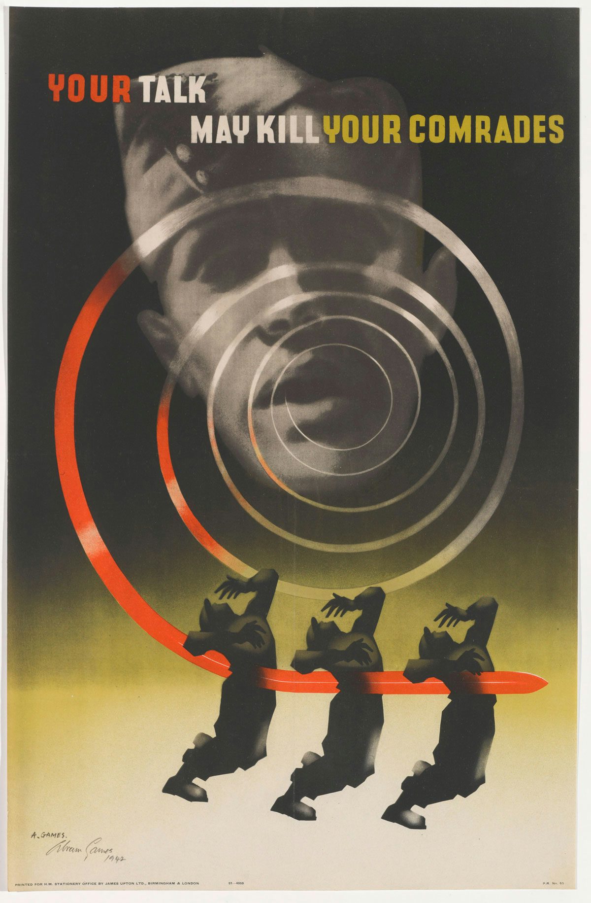
In week 8 of Spring term, we were joined by Naomi Games, the daughter of Abram Games, who was one of Britain’s most famous designers. Naomi told students about Abram’s life as a graphic designer during World War Two, along with memories of her father during his career, and his wish to become the most successful designer in Britain.
Developing skills
Naomi explained how her father was taught airbrushing and photography by his father. He became highly skilled and began to build a portfolio of posters. After his time at St Martins School of Art, Games taught himself to draw, which he often practiced whilst staying with his father. Expanding knowledge and skills with different tools and building a professional portfolio was his focus, which is still relevant to how students dev elope and show off their abilities today. Games was told he would never achieve his dream of becoming the greatest poster designer in Britain by his headmaster; but he pursued his talents and work with pride, as all students should.
‘Curiosity courage and concentration’ – Naomi Games
Inspired by the likes of Mckinght Kauffer, Games continued to produce posters, winning various competitions. When war broke out, he was commissioned to design posters to encourage more men to enlist. During the talk, students learned about Games’ effort to communicate simple messages with intense emotions through the combination of photography, typography and the use of his airbrush. Learning to combine a multitude of useful techniques opens many pathways for students when trying to produce unique solutions.
‘His posters were visceral and realist, making his work hard to look at but more noticeable’– Naomi Games
Conclusion
Naomi bringing her father’s work to life was inspiring for students. Games’ work showed us ways of harnessing current technology to create emotion and impact in design work. This talk taught students to pursue their passions along with developing new skills to create more (and more innovative) solutions to design problems. Listening to Naomi speak about her father’s work, one of the greatest poster designers in Britain’s history, was motivating for students working on their own projects.
‘Her experiences through seeing her father’s success was heart-warming to hear.’ – Part 2 student
‘She let us look at the examples of work and the airbrushes. It was amazing. Really loved this session. Glad it was in person.’ – Part 2 student
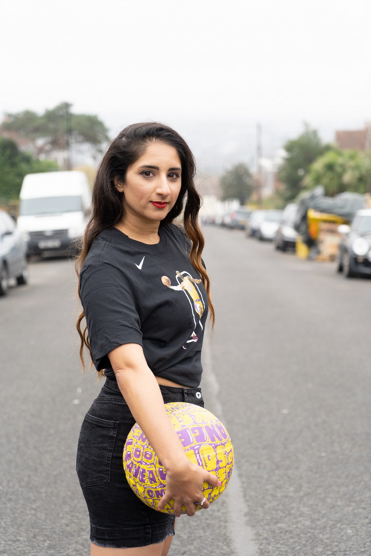
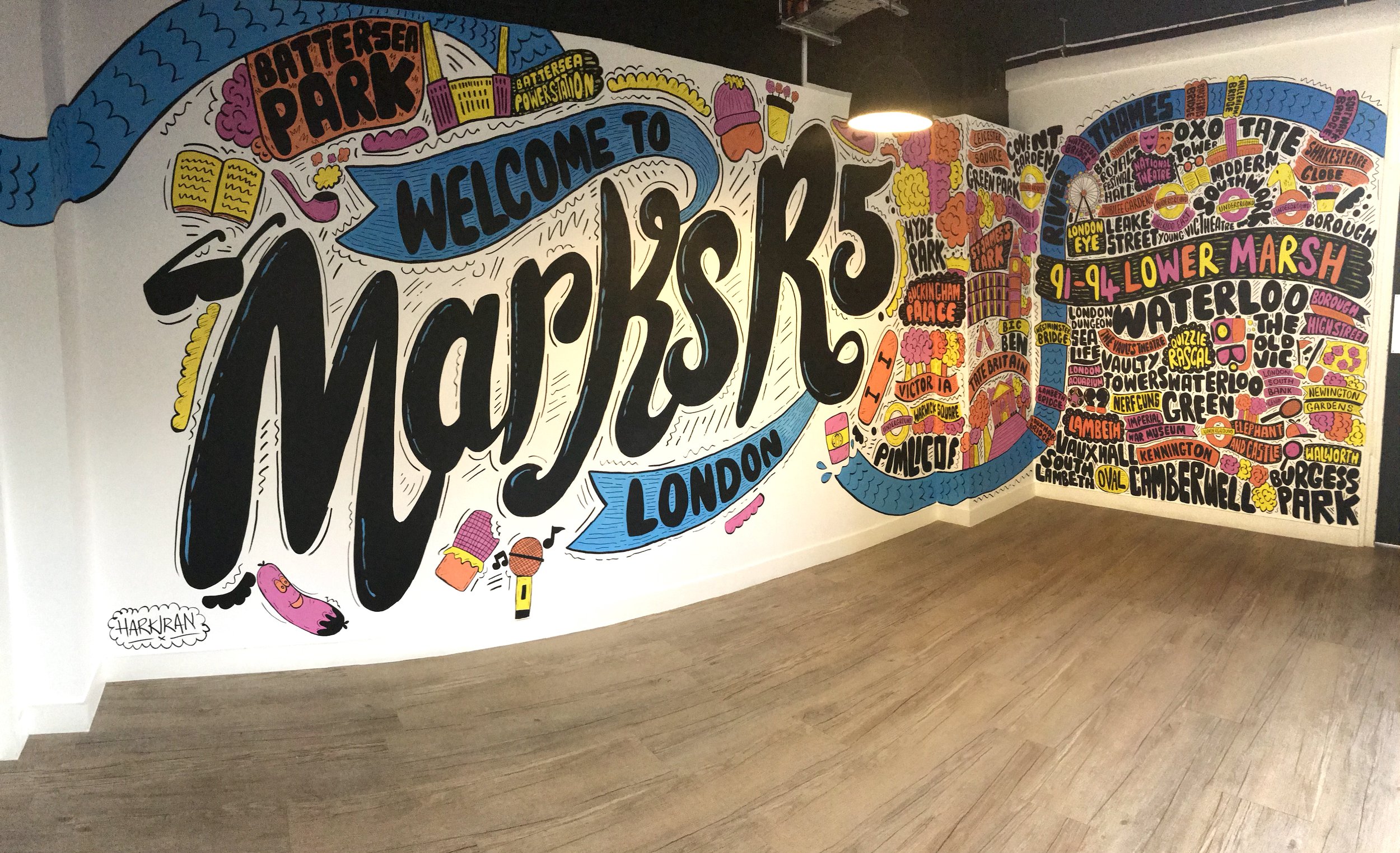
Week 5 of Spring term brought us Harkiran Kalsi (Harky); designer, illustrator and hand letterer who has worked with companies including The BBC, New Balance and EA Sports. Harkiran took us through the journey of her career in design and taught us the importance of determination and stepping out of your comfort zone.
Breaking into the industry
Lettering by Harkiran Kalsi
Harky was introduced to the world of Graphic Design through her Art Foundation course at Coventry University. As a Graduate she struggled to break into the London-based industry she dreamed of being a part of, interviewing for a spectrum of jobs and failing. She stressed the importance of taking failures in your stride – with every failure is another open door with different opportunities. Eventually, an opening at Comic Relief allowed her to break through.
‘Failure is always going to be a part of it… Embrace it!‘ – Harky
Harky’s lettering series to on the topic of ‘gratitude’ opened her up to opportunities with companies like Footlocker and The London Marathon. Her love for running plays an important role in her networking, with her running group ‘Run Dem Crew’ introducing her to many opportunities for commissions when she would eventually become a freelancer.
Harky with her ball design for the Footlocker X NBA collaboration
Making the jump into freelance
While moving to freelance work was a big decision to make with no agency work to show, she quickly secured her first gig despite the doubt she and others had. In fact, she found she was booked constantly on a variety of projects. She has worked on website assets, social posts and documentaries in the past few years. Now, Harky has begun mural painting. She believes that, as an artist, it is her duty to spread messages she believes in and stand up for communities.
Mural by Harkiran
Conclusion
Harkiran’s talk was a massive dose of positivity, showing us that – no matter how dark times get – you should never give up. Step out of your comfort zone, experiment and embrace being imperfect. Her determination to make her way into the industry proved that the problems do not define you – you can achieve your goals too.
‘Loved seeing her work and her journey, I found it really inspiring.’ – Part 2 Student
‘Harky’s authentic and real talk of her struggles in design were incredibly interesting, giving a sense of the life of a designer without just presenting the good parts. It’s really great to see that the path through work isn’t perfect.’ – Part 1 Student
‘I’d definitely want Harky to speak again next year. Her outlook and honesty was hugely inspirational.’ – Part 1 Student
In week 3 of Spring term, we were joined by information designer and Reading graduate, Sol Kawage. Her love of typography and passion towards informing students about the beauty of designing for a purpose was inspiring for students.
Sol Kawage’s design for a postcard and social media graphic for Tennesee Blend, advertising a theatre production
‘I liked the incorporations of her own struggles with ADHD and how it has taken her on this journey’ – Part 2 student
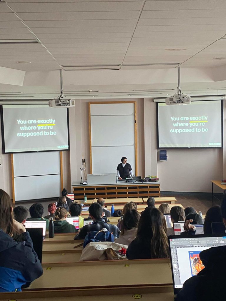
Being an information designer, Sol said she loves investing her humanity into her work. Earlier in her career she believed her biggest weakness was her ADHD, but she learned over time that because of this she has an advantage by having a different perspective than most designers. By viewing weaknesses as advantages, students were taught that there is nothing holding students back when designing for their projects. Sol reminded students how lucky they were to be studying at the university and how students should make the most out of the course, as it will bring many beneficial opportunities for their future careers.
Sol made students aware that every student is exactly where they’re supposed to be by studying at Reading.
‘The plan will not be right when the time comes to execute it. It is the activity of planning that prepares us for whatever transpires.’ – Sol Kawage
Sol showed students that even if one doesn’t feel confident in their abilities or skills to execute something towards a project, any problem can be overcome and be seen as positive. Her inspiring words were very relevant for all students to hear as they progress with their work for modules.
‘I liked hearing how you use real life problems when designing, for example using the ski goggles will affect how the colours come across. It’s not something you would think to consider normally.’ – Part 2 student
‘The presenter’s honesty and the personal tone of the talk. So much fun!’ – Staff
In the first week of Baseline shift Spring term, we were joined by Co-founder of Design De Plume, Meggan Van Harten. In this session, Meggan explained her focus on inclusive design and presenting indigenous culture using design as a voice to educate society.
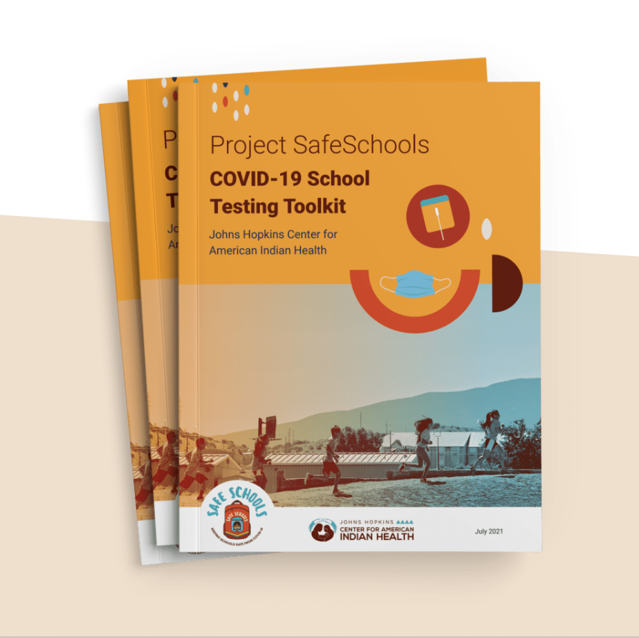
To support Native American schools, John Hopkins University produced a COVID-19 safety toolkit. Design De Plume designed for the toolkit that included infographics and other information, like how to use a self-testing kit. https://deplume.ca/johns-hopkins-university
Representation through design
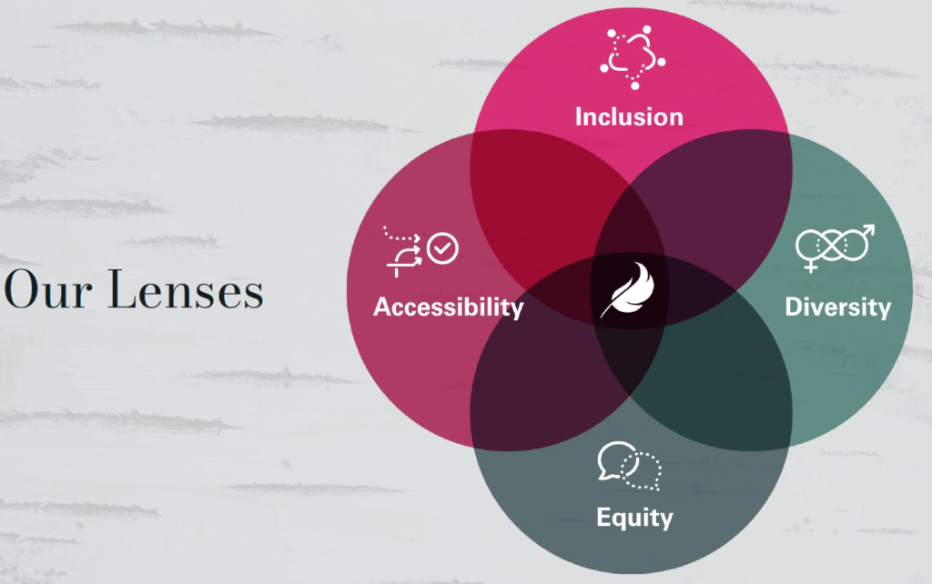
Design De Plume is invested in authentic indigenous artwork and the culture surrounding it. Working with indigenous audiences and informing people on more than 600 First Nations who speak 50 languages are Design De Plume’s main intentions when designing. The company strives to ensure inclusion, accessibility, diversity and equity in all design projects, and they are proud of being different with their design intentions. From illustrations to web design, the company honours the indigenous groups of Canada and their voices through consultation and how they can present their culture. Inclusive design can help students in approaching a new spectrum of ideas for existing projects. Meggan believes it is necessary to consider all audiences because ‘good design goes beyond what you can see.’
‘Good design is accessible.’ – Meggan Van Harten
Design De Plume use four lenses that show the four main focuses when collaborating with their clients
‘When you design with inclusivity in mind, the results can be beautiful.’ – Meggan Van Harten
Conclusion
Meggan’s perspective into the importance of diversity and how designing for such unique audiences takes an approach that is usually overlooked was inspiring. This presentation taught students how to develop their work into being more inclusive with all audiences in mind.
‘Nice to hear from designers who aren’t British, hearing about different cultural perspectives on design.’ – Part 2 student
‘Considering inclusivity throughout her presentation and design thinking for her work is an interesting perspective when it comes to designing for clients.’ – Part 2 student
‘I valued her idea of inclusivity, the way she introduced herself in an inclusive way to help potentially non sighted people understand her appearance.’ – Part 1 student
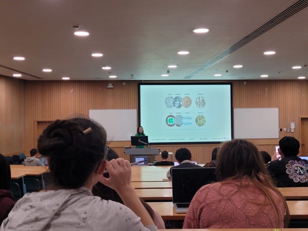
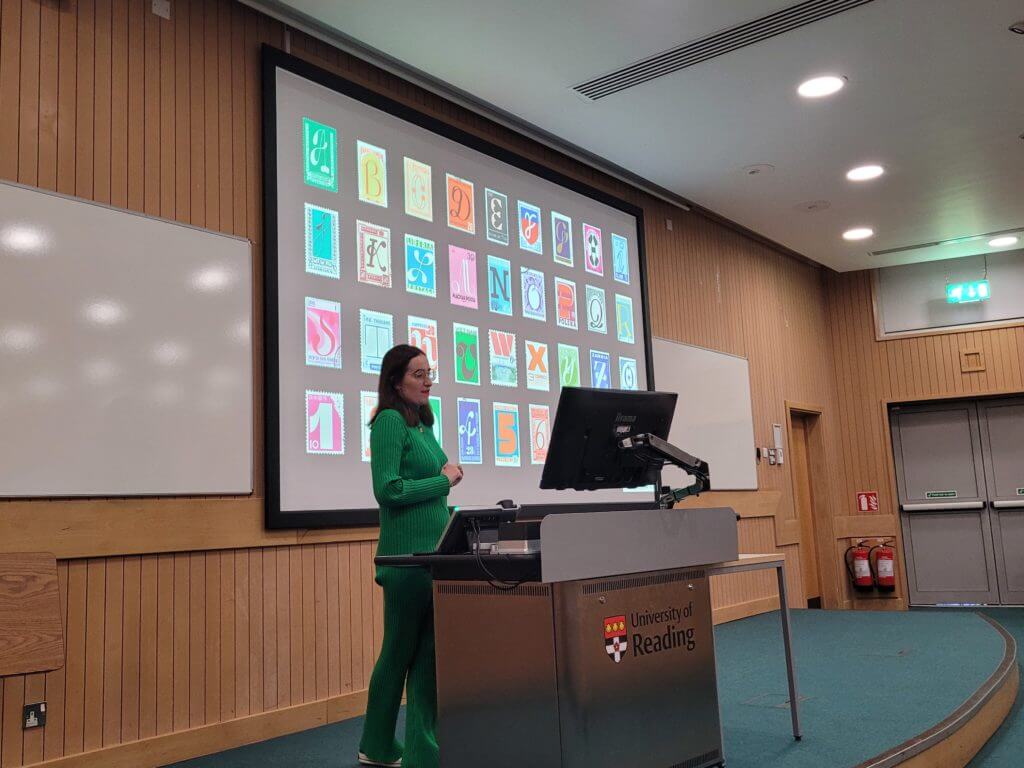
In the final week of Autumn term, we were joined by Monotype’s Marie Boulanger. In this session, Marie described her experiences in type design and how her life has helped to inspire her personal journey through designing typefaces.
Typeface design, exploring lettering and their purpose was always Marie’s passion
Type & expression
Working for Monotype, Marie’s role as an Art director for campaigns and making a narrative story for audiences was her dream career path. She explained how her love for type design stemmed from her childhood. Being born in Paris, from a young age she was exposed to expressive French lettering and signage. Marie pursued her interests by designing custom lettering for branding while freelancing, and taking part in the 36 days of type challenge, which encourages designers around the world to make a glyph once a day.
Marie felt that designing type was very personal and fulfilling for her, describing how type should be seen as a material and our hands are a tool to express ourselves. This helped to encourage students to find enjoyment in exploring many forms of design that are of interest to them, while being willing to be open to alternative opportunities, especially related to a career in design.
‘Type is a material, and the tools used are our hands’ – Marie Boulanger
The imagery and layout of stamps was always a great interest to Marie, they were one of her original inspirations towards design
‘Get involved in projects that help heal and feel good’ – Marie Boulanger
Conclusion
Marie’s insight into the creation of typefaces and her experience shows us that the journey to becoming a successful designer is through a student’s desire to observe our environment and strive towards designing to make ourselves satisfied.
‘Very personal talk, which made it very inspiring, my favourite baseline shift so far’ – part 2 student
‘Honestly so many words come to mind, inspiring, encouraging, exciting. The baseline shift sessions always make me feel so inspired to go and make something cool and creative but this one in particular I loved’ – part 2 student
In week 10 of Autumn term, we were joined by three alumni of the Department: Font engineer Norbert Krausz; Sky Creative Designer, Aanand Tank; and Director at ArabicType, Nadine Chahine. In this session, we were delighted to hear about our alumni’s lives after graduation and what our students can expect later in their careers.
Engineering fonts
Norbert expressed his love for the beauty of letters and their shape and how they drew him into his profession of engineering fonts. It was fascinating hearing about Norbert’s view of the huge variety of script that mankind invented and how it has been evolved through time. He described working in this specialised field as ‘narrow but deep, working with type means you are purely working on the shape of our language’, creating sets of glyphs was rewarding for him and he felt that it was no different to problem solving and finding solutions. Whilst working for Monotype, it helped Norbert discover many technical components behind type design; he described his work as very rewarding towards the development of the human language.
‘Font engineering as a field is narrow but deep. Working with type means you are purely working on the shape of our language’ – Norbert Krausz
Sky Creative
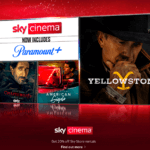
Aanand, became a Digital Designer for Sky. His UX and UI work in Reading and in Germany helped him understand alternative audiences and consider all users. Designing showcases for Sky Cinema, one of Aanand’s roles is to help ‘push out specific shows and movies’ based on genres. His work revolves around layouts on different platforms, like on mobile devices and televisions. Emphasising networking, Aanand encouraged students to explore their options for a future career and to start connecting with designers in the industry, strongly advising us to use Linkedin. Students found listening to a younger designer who recently graduated from Reading to be inspiring, as it showed students what they could achieve in the oncoming years.
Designing showcases for Sky involves tailoring to the specific genre of film or TV series
‘Network and you’ll go far’ – Aanand Tank
ArabicType Ltd.
Nadine described the politics of Arabic type and how there have not been many variations for the Arabic language. Her passion for type design was similar to Norbert’s, where she wanted to help visualise communication in different languages. Neue Helvetica Arabic is one of many typefaces designed by Nadine. It enables the setting of pan-European languages, in addition to Arabic, Armenian, Cyrillic, Georgian, Greek, Hebrew, Thai and Vietnamese. This typeface has been used in various media, most notably in airports in the middle-east to aid the population by having higher legibility for navigation.
Neue Helvetica typeface
‘Design can preserve memories’ – Nadine Chahine
Conclusion
To conclude, having the privilege to hear from our alumni about their careers helped to inspire students and provide insight into what they could achieve.
‘The wide variety of speakers in today’s session was really valuable. Hearing from graduates about their careers immediately after university showed me a huge amount of options and avenues to look into.’ – part 2 student
‘Hearing from an array of alumni was really interesting to hear about their lives after university and what I may experience after graduating.’ – part 2 student

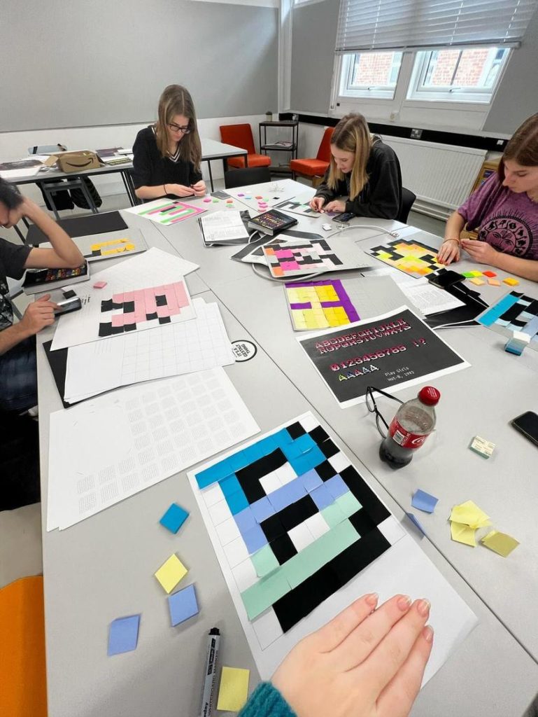 Students were engaged in various pixel typography exercises.
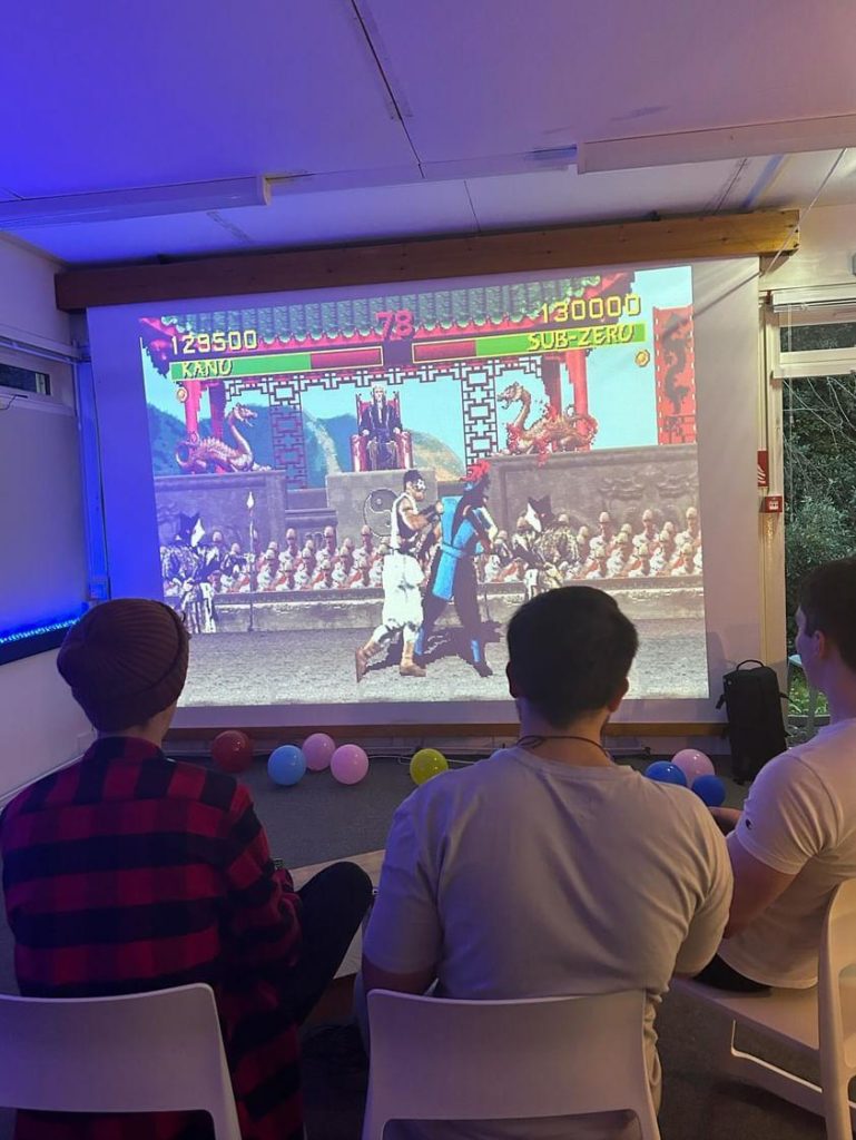

 Design De Plume use four lenses that show the four main focuses when collaborating with their clients