Author: Laura Marshall

Ephemera Society Handbook

Background and initial briefing
The Ephemera Society is a non-profit body devoted to the collection, conservation, study and educational uses of handwritten and printed ephemera. A handbook is produced annually, including the list of current members, their interests and institutions, and is sent out to all the members of the society. My brief was to use the existing style of previous copies of the handbook to create the 2018 edition. The style and layout should remain the same, while the colour of the front cover was to be changed.

Expectations vs reality
From the brief, I assumed this would be a simple task of replicating the layout and stylesheets of the previous handbook, and inputting the new text into these. However, there were obstacles that meant that the process was more complicated than I first assumed, making the job more complex, but ultimately allowing me to gain more from this experience, in terms of altering briefs and reasoning with clients. In the future, therefore, I will be more willing to have my expectations confounded as I believe that can make the final outcome more valuable for myself and the client.

Font
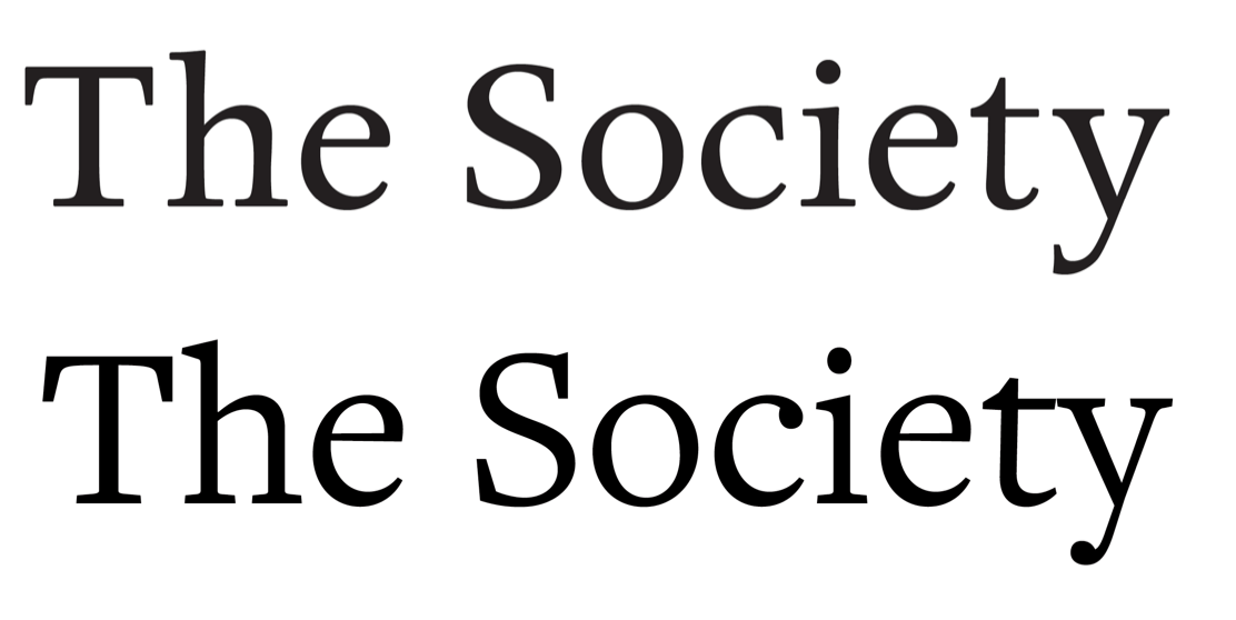
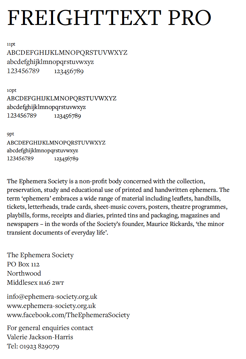
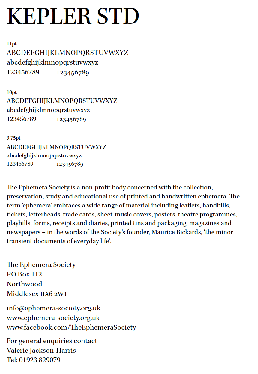
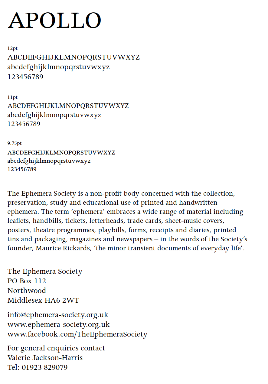
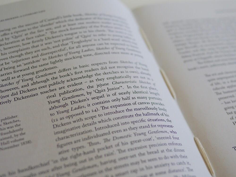
The font previously used in the handbook was Apollo MT (TT). This became an issue after realising that this exact font was not available on Adobe Typekit or on the typography server. As well as this, its replacement, Apollo MT Expert, is not an Open Type font, and differed slightly from the original. With support and advice from my supervisor, I began searching for a similar typeface in terms of density and physical characteristics. After sending several options to my client, we decided on FreightText Pro for the body text throughout the entire document, a clear and legible typeface with a similar weight to Apollo, as well as slightly more interesting serifs and tails on each letter, adding visual interest to a spread of text.

A comparison of the original typeface for the handbook (first line), compared to FreightText Pro, the chosen typeface for the handbook.


Type specimens of a replacement typeface used for body text. The client chose FreightText Pro out of the 4 options I sent to them.

Other improvements
Oldstyle numerals
With FreightText Pro the new body text for the book, there was a lot more choices that could be made in terms of how the text was differentiated. Unlike Apollo MT (TT), FreightText Pro has both lining and oldstyle figure options. This initiated the discussion with my supervisor on which figure style is deemed more appropriate for each scenario where numerals are used, and what rules should be put in place to ensure typographic consistency.

The use of numbers throughout the text:

  • House numbers
  • Postcodes
  • Phone numbers
  • Numbers within email addresses
  • Dates (years)

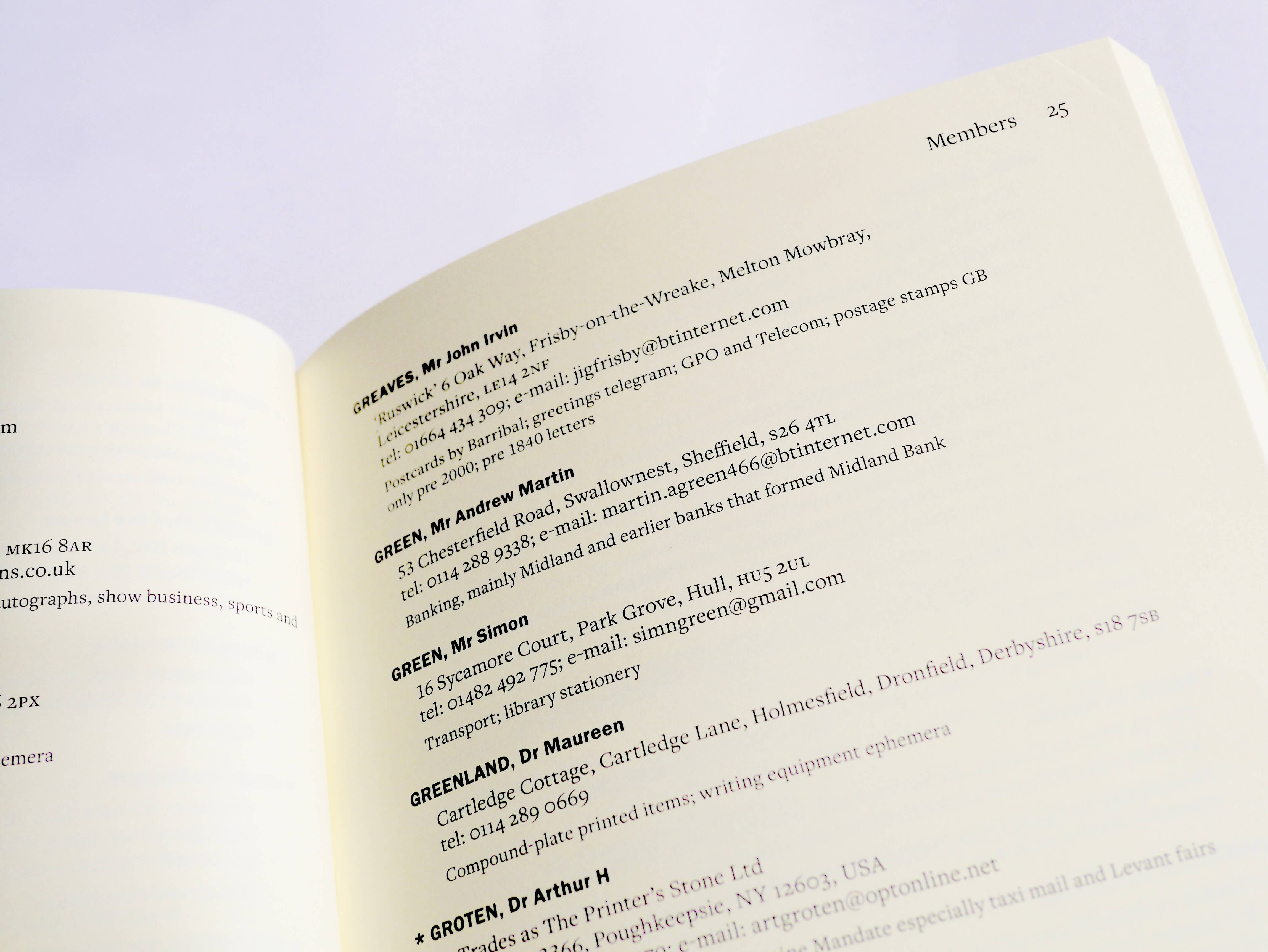
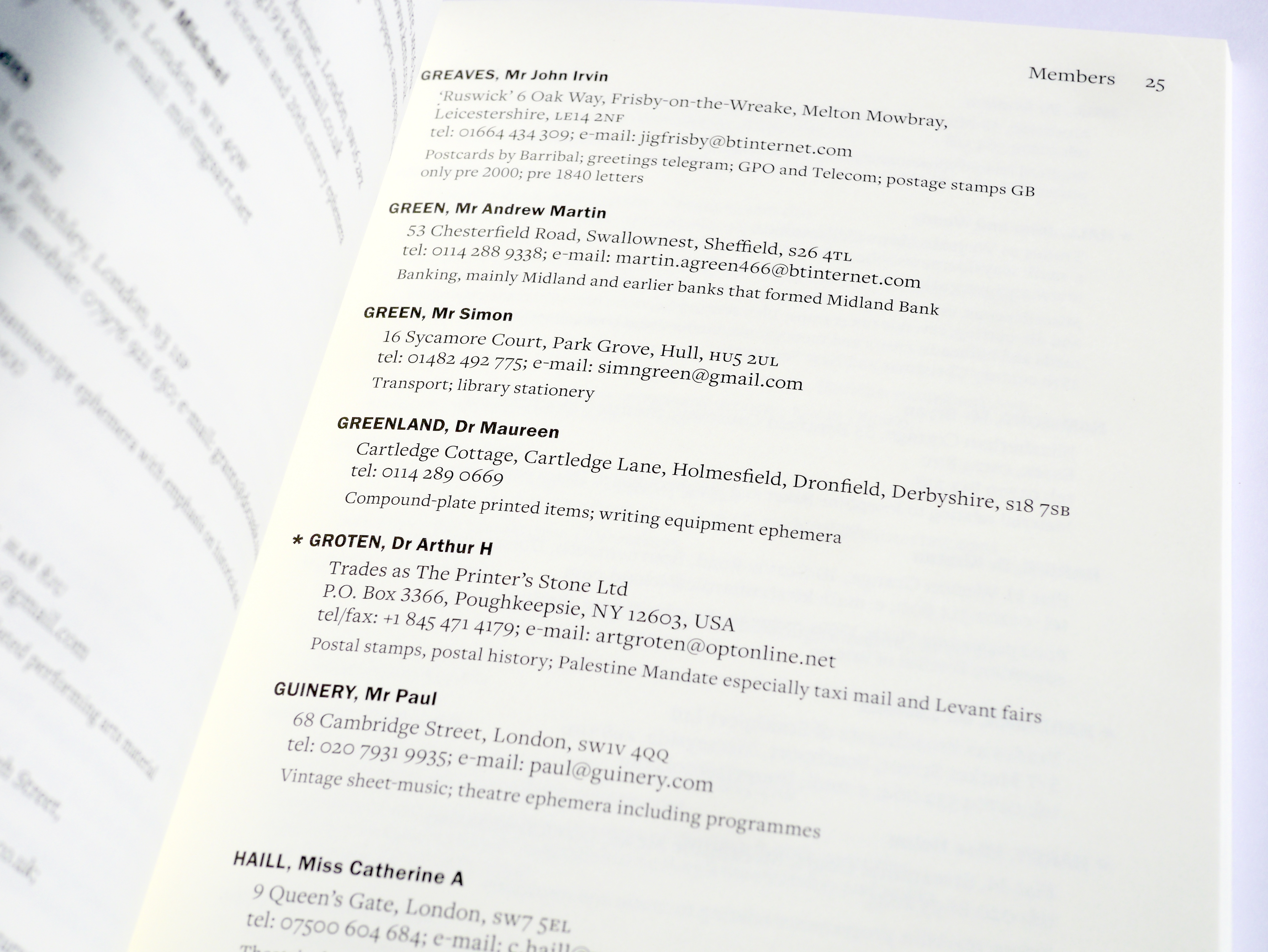
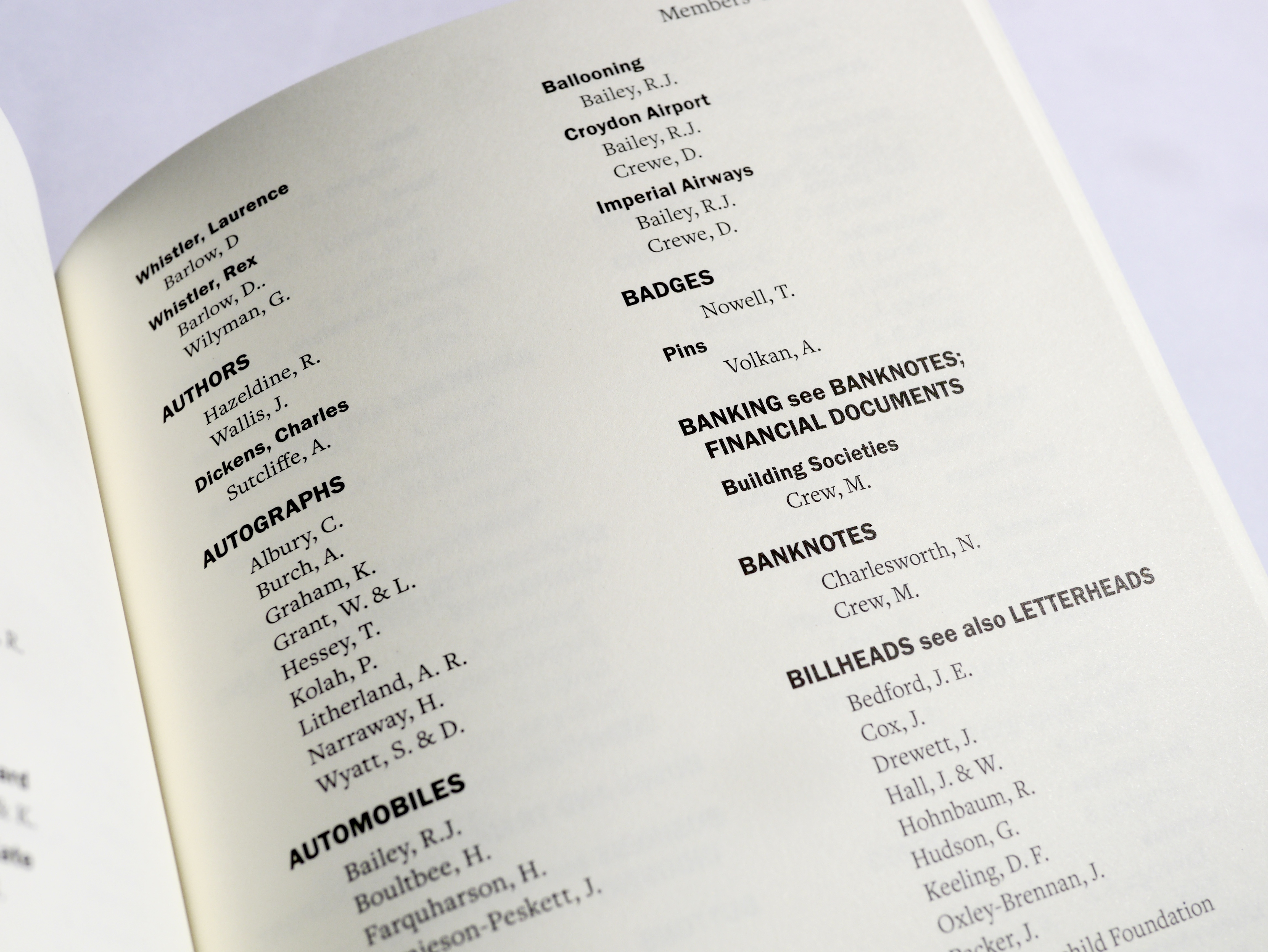
Oldstyle numerals are arguably better in continuous text, as they sit comfortably within lower case and draw less attention to themselves compared to lining numerals. This is why it was decided that phone numbers, as well as numbers within email addresses, should be set in oldstyle figures. Postcodes, despite not always occurring in continuous text, also suited the use of oldstyle figures, as this made it sit more quietly within the overall address. House numbers on the other hand, were set in lining numerals, as these are arguably one of the most important parts of the address, therefore need to stand out. This also suits typographic convention, as it is usual for house numbers to be lining. Dates (years) were something that was a little harder to decide on, however, as the dates existed mainly as markers for important events (The Pepys Medal and the Ephemera Society Award), I felt it was best to keep these lining to help them stand out. Also, as the dates were on top of each other in the form of a list, it was more successful this way rather than having descenders interfering with the line below.

Use of lining numerals for the dates of The Pepys Medal

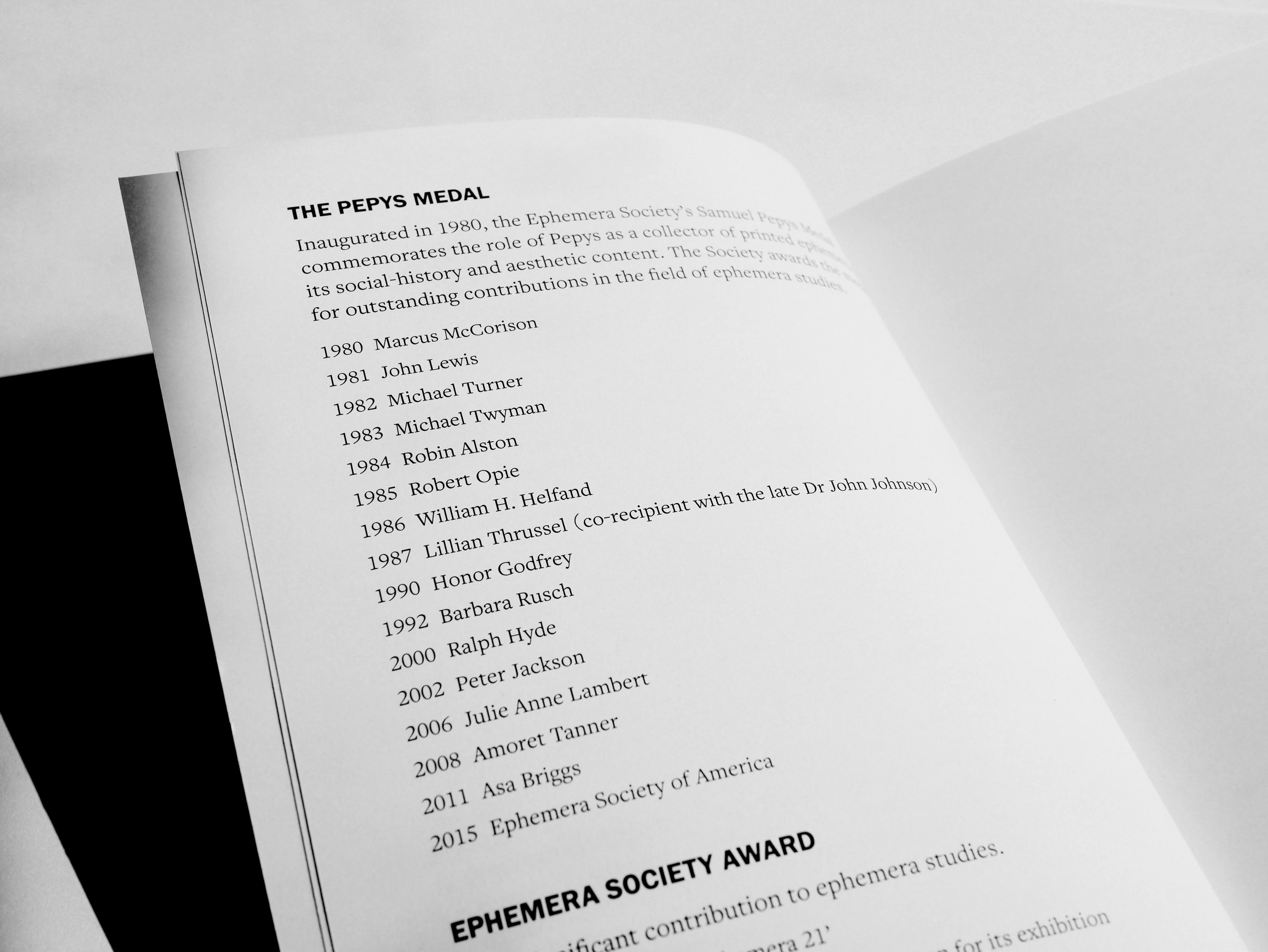
A challenge within this decision making was deciding the treatment of foreign addresses. As they differed in format from English addresses, it was sometimes hard to tell which part was postcode equivalent, and some addresses had other numbers that English addresses do not have. In these cases, it was necessary to research into typographic conventions for different addresses in the world. Overall, all numbers except for house numbers were in oldstyle numerals.

In this case, the issue of the font not being available, and its replacement being outdated, allowed for a lot more thought to be put into the typographic detailing of the spread. This meant that specific pieces of information could be highlighted, improving readability and the ability to pick out specific information throughout the book.

Optical symmetry
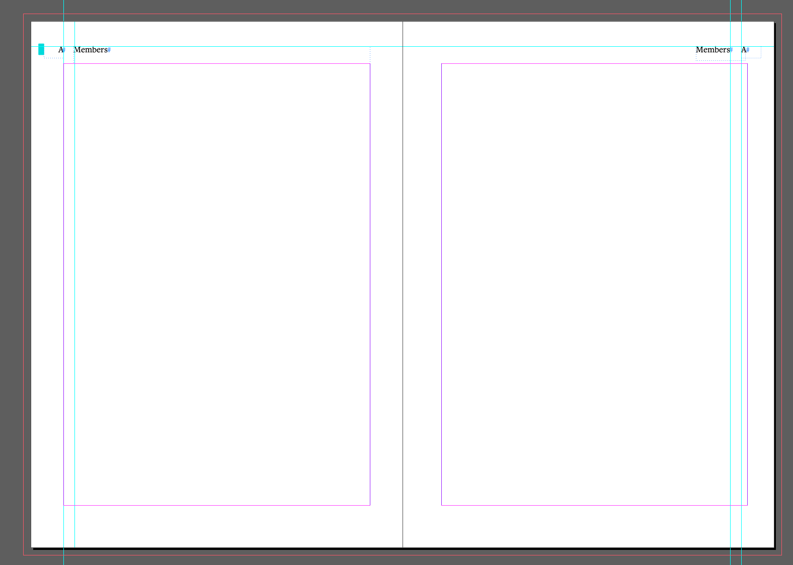
As the member entries are quite short, and list-like in appearance, it created a strong sense of space on the right-hand side of each page. This made the spreads look uneven, so the margin on the right pages was increased from 13mm to 15.5mm to allow for more optically symmetrical design. This was a change from the previous handbook, which used the same sized margins across a two page spread.

The inner margin on the right hand page was increased by 2.5mm, to balance out the spacing on the right hand side of the left page.

Using InDesign effectively
It was vital to use tools within InDesign efficiently, to ensure accuracy and avoid errors throughout the document. As this was my first document with over 100 pages, for the first time I could appreciate the convenience and necessity of these tools, in creating a book free of errors.
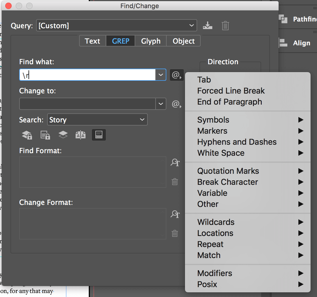
Find/Change tool
Despite using this tool previously, it was fundamental in the completion of the handbook. My supervisor showed me the GREP function, which I was unaware of previously, only using Find/Change for searching for specific words within the document. This was a vital tool as the whole document was full of multiple tabs / double spaces, used in the clients original document to show differentiation between different parts of text. This was also used to replace some hyphens incorrectly used with en dashes.
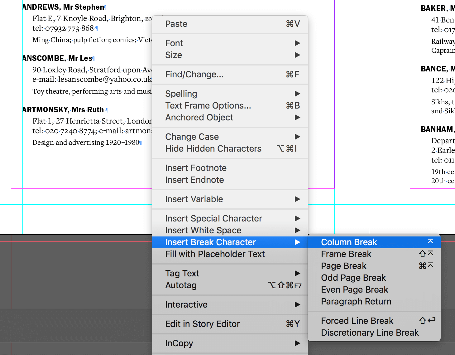
GREP function: used to find unwanted white spaces, tabs and returns.

Column breaks
Before this project, I manually used returns as well as altering the text box to change the break of the column. This became problematic during feedback as the smallest change could alter where the column break needed to be, which had a knock-on effect throughout the whole document. Supervisor feedback advised the use of the column break character which made the rest of the project a lot more straight forward.

The column break tool made it easier to alter parts of the document without causing alterations to the whole document.

Personal review using feedback from supervisor and client
Overall, this project ran quite smoothly, especially at the start when restating the brief and agreeing the schedule with the client – “From our point of view you were good at communicating and keeping us abreast of the progress of the project which made us feel confident the handbook was in good hands”. For a while at the beginning of the project, I was running ahead of schedule, which gave me more time to focus on the small intricate details of the book.

A spread showing the intricate typographic differentiation of the handbook.

Throughout my project, my supervisor was confident in my abilities, pushing me to improve the handbook typographically and spatially from the previous edition. Despite this going against my instincts, as the client wanted the handbook to stay the same, the changes in margins, typeface and typographic differentiation have greatly improved the legibility and usability of the handbook from the previous version.

However, despite the main success points, there was a small miscommunication at the end of the project, where I found it hard to manage feedback from my client and supervisor. Whereas my client pointed out small mistakes where things were in the wrong style, my supervisor had bigger plans, including changing the margins for optical symmetry, and altering the spacing which would affect the whole document. This occurred very close to the already extended deadline, meaning I struggled to complete these changes in time. This resulted in me sending the client a “finished document”, which they approved, only to be given more changes by my supervisor. This concerned my client and caused me stress, as I felt I had let them down.

From this miscommunication, I have learnt not to be too hasty about submitting a final version of a document to the client, and instead, to take a little more time (if the deadline is flexible) to ensure the document is correct, and approved by my supervisor, before sending it through. Luckily, my client was very understanding, and despite their concern, were happy with the final printed handbook.

“The only hiccup was near the end when an out of date file was sent to us for review which caused some confusion and consternation, but this was quickly corrected. We were delighted with the outcome”.
Malcolm Warrington

Final outcome
Overall, both myself and my client were happy with the final print of the handbook. This project has taught me to consider a brief more openly, thinking around it and how to improve upon it, rather than see it as concrete initially. The setbacks and miscommunication errors that occurred in this project gave me a more realistic expectation of a project in industry, and prepared me for more challenges in future projects, as it is rare for a task to run smoothly from start to finish. Problems will always occur, but sometimes fixing these problems can make a finished project even better than expected.

Penguin Student Design Award Covers

Background
Each year, Penguin opens their Student Design Award competition, which provides participants with an experience of dealing with real cover design briefs first-hand. From the three possible book categories I chose Children’s, the selected book being Wonder by R. J. Palacio.

Brief
The brief was to redesign the cover of Wonder, to bring the book to new readers as well as ensuring it remains a ‘must-read for every child’. It must ‘encourage children to pick the book up and buy it for themselves and should also engage adults to want to buy it for them’. Specific criteria for a winning design were outlined as follows.

The cover needs to:

  • have an imaginative concept
  • be an original interpretation of the brief
  • be competently executed with strong use of typography
  • appeal to the broadest possible audience for the book
  • have a good understanding of the marketplace
  • have a point of difference from other books that it will be competing against in the market
  • be able to sit on the shelves of a supermarket or ebook store as easily as it sits on those of more traditional bookshops

The book
Wonder is a book which follows the journey of August Pullman, a boy who was born with a facial deformity, who has been home schooled for his whole life so far. The book follows the different points of view of August, his sister, her boyfriend and his classmates, as August ventures into mainstream schooling for the first time. Themes of isolation, personal growth and friendship are explored as August slowly is understood by those around him and is seen as more than the boy with the deformed face.

The existing cover
Several versions of the cover already exist, due to the release of the film based on the book. The most famous cover, featured on the left, has a simple hand drawn feel, with hand lettering for the title and author name. The face on the cover is incomplete, showing only one eye, which perhaps hints at the facial deformity of the main character. However, the ominous face, which looks slightly to the left, creates a subtle feeling of unease. This causes the reader to fixate on the face, which highlights the staring that August faces on an everyday basis.

Three of the existing covers, with the most iconic being on the left.

As this cover is so iconic, I feel it is important to veer away from an overly simple design, as well as the face of August. However, depicting one of the main themes or ideas of the book, in a way that does not give away much of the plot, is important, to grab the attention of the reader.

Research and ideation
Before I started research, I attended a session with Fraser Muggeridge, which explored ways to help the ideation process. He explained the importance of sketching and experimenting with texture to create compelling covers. I first started by reading the book and watching the film, sketching and writing down ideas and quotes as I did so. I wanted to portray the main themes using metaphoric imagery or illustrate a cover based on a specific quote. The tagline from the cover ‘You can’t blend in when you were born to stand out’ is a key part of the plot, so it was important to consider this when brainstorming ideas. Other quotes that stood out to me as I read the book were as follows:

  • ‘The only reason I’m not ordinary is that no one else sees me that way’
  • ‘When I was younger I used to wear an astronaut helmet everywhere I went’
  • ‘All those eyes are like compasses, and I’m like the North Pole to them’
  • ‘The universe is a giant lottery’
  • ‘One in 4 million’
  • ‘The ocean sound that was always in my head had been getting louder’
  • ‘It was drowning out people’s voices like I was underwater’

Initial ideas
Based on the tagline, I considered the blending or contrast of colours, to represent the themes of fitting in and standing out. The ideas of crowds, ripped paper, shadows and silhouettes also instantly came to mind. After delving more into the book and the film, I then thought of metaphors and images that depict these themes, such as a weed which grows in the roughest conditions, or the idea of the ugly duckling. Some quotes directly led to ideas, such as compasses to represent the staring of people, or a lottery machine to indicate how rare the condition is. Based on these ideas, I created mood boards, before sketching out 6 different ideas inspired by imagery examples.

The mood boards explored texture and style, calligraphy, as well as images which linked directly to themes or quotes within the book.
Sketches of the six ideas. Images 3 and 4, based on the quotes ‘All those eyes are like compasses, and I’m like the North Pole to them’ and ‘The universe is a giant lottery’ were chosen to be developed further.

Design development
I then began the design process, translating my sketches into colourful and textured illustrated works. Illustrator was mainly used for creating the base illustrations, while Photoshop was used to add texture and depth through shadows and light. Finally, inDesign was used for the typographic detail and to create the overall composition.

Screenshots from the Illustrator file during the design process. Illustrations were then placed into Photoshop to add depth and texture.

During Real Job meetings, I was pushed to make the colours more vibrant, and to ensure that my covers were suitable for the target market. In particular, my compass design lost its vibrancy when printed, which highlighted the importance of multiple proofs of the design, even though the final deliverable was to be submitted as a PDF. Proofs were then printed to show at the following real jobs meetings.

Final stages
After attending several meetings and working on the vibrancy and detail in my illustrations, I decided to focus on the compass design for the competition itself, as the lottery machine is perhaps a little bit niche and may cause some confusion. James, my supervisor, was happy with the overall style and concept, which allowed me time to fully explore compositional elements, including the title and text position, to ensure they stand out when the cover is viewed at a smaller scale. Another point discussed by people in the meeting was the vignette around the cover, which seemed to be less favoured. I explored ways around this that still allowed for the text to be legible, including: adding a row of darker compasses on top of the existing layer, creating a black border in the shape of an astronaut helmet to make the viewer feel that they are in August’s shoes, and finally, creating more intensely shadowed compasses at the borders of the covers, which are dark enough to house the text. These designs allowed me to experiment with the placement, size and colour of the title, as well as the positioning of the tagline and authors name.

Development of concept 1. Initially, the design looked too dark yet the legibility of the tagline was not ideal. The final 4 images show composition variations.

Finally, I chose the design with the more asymmetric appearance, as this adds more flair and interest to the final cover. I then also explored the other cover design, to use as a portfolio piece, using a crop of the lottery machine to reduce the white space and symmetricity of the cover.

As I decided not to submit this design, there was less experimentation with composition and arrangement. However, the illustration was refined and it was decided that the slide should curve to the left as this creates more space for the authors name.

Final covers

Reflection
Overall, I am happy with the appearance of the cover designs and am proud of what I achieved in around a month, less time than I have had to complete other cover design projects. My supervisor also remarked on how my Illustrator skills have improved dramatically since the start of the course and felt that both of the covers would have been suitable to submit. Creating vectors with smooth and unbroken curves is a skill I have developed through this course, and I was happy that my improvement was noticed. I also feel that the covers suit the target audience but remain suitable for the subject matter of the book.

Looking back at the requirements of the brief, I feel that my concept is both imaginative and an original take on the brief, as it focuses in on a specific quote in the book that other entrants may not have read / thought about. The colour schemes fit the darker nature of the book, as well as looking gender neutral in palette, which is important when trying to market the book to a wide target audience.

In order to test the book against its competitors, to see if it has a clear point of difference, in addition to standing out on a book shelf as well as at thumbnail size, I mocked up the cover on Amazon, and also Waterstones website, to see if my design met these two criteria. On Amazon, I feel that the integrity of the design holds up even at small sizes, and when directly compared to the other books, I feel it stands out due to its subtler typography and composition. However, using dark tones and shades of blue is quite common in books for this market, which may either highlight the success of the colour scheme for the age group, or indicate that it may be too similar to other books around it. In order to explore this further, I feel that it would be necessary to physically mock up the book and place it on a shelf within a bookshop, to see whether it stands out or recedes backwards when compared to other covers.

With more time, I would love to physically make these two covers, as well as exploring print finishes that could give these designs an extra pop. I think that adding a spot varnish to areas of the compass design, on the compass points for example, would help the staring ‘eyes’ stand out more. On the other design, I feel that spot gloss or white foiling on the astronaut helmet would help this stand out more from the other yellow. After submitting my chosen design, I still have doubts surrounding whether I chose the right variation or concept to submit, as I liked several variations as well as the lottery machine concept. However, I feel that both concepts tackle the brief differently, which will form a useful addition to my portfolio going forward, especially as my dream is to work in the publishing industry specialising in design for children.

Mock ups  

Part 2: Editorial Design

Staff have asked a team of Part 2 students to publish reflections on the work they produced for taught project over the past 12 months. This is the first in a series aiming to showcase our work.

In 2017 a substantially reworked Editorial Design module was re-introduced into the part 2 syllabus. We completed this module at the end of part 1, while everyone on other courses was finished and celebrating the end of their exams. At the time this was a little bit infuriating to say the least, but looking back at it now, I think my peers would agree that it was great to get 20/120 credits of the year out of the way before we started part 2!


What was this project about?

This project was the first time the majority of our year had handled a large amount of continuous text, as well as fully exploring the editorial features on InDesign. After completing a small editorial task in part 1, we had the basis to fully immerse ourselves in this larger and more life-like brief. It was also about using InDesign effectively – we had to imagine we were typesetting the whole book, and how to use tools to make this task more efficient. Master pages and stylesheets were crucial to success in this project.

As well as receiving weekly feedback sessions which were vital to our success and development, the supporting readings for this course were essential in applying theory to practice, and understanding why certain typographic conventions exist. These included books such ‘Elements of Typographic Style’ by Robert Bringhurst, and ‘Designing books, practice and theory’ by Jost Hochuli.

We were provided with text from the book “Charles Dickens: a literary life”, as well as the specified book format of 170 x 245mm. From there, we had freedom in the typesetting of the document, paper stock, as well as a cover design. Some of my peers took it a step further, adding dust jackets and patterned endpapers to their book.

We also were taught how to perfect bind our books. This is where a block of single pages is glued down the spine to hold the book together. Book binding was another new skill to learn, as previously we had only worked with a few spreads. Some of my peers experimented with different binding techniques, using visible stitching to bind their pages, or showing the binding on the outside of the book. This included Fay Rayner, who used a more traditional technique for her book: “I really wanted to reflect on Charles Dickens and his history, therefore I did not use perfect binding but the more traditional technique of section sewn binding, as I believed it better reflected Dickens and the era in which he lived. In addition, I used a symmetrical layout with large margins and added marbled endpapers, which were typically used in Victorian books”.

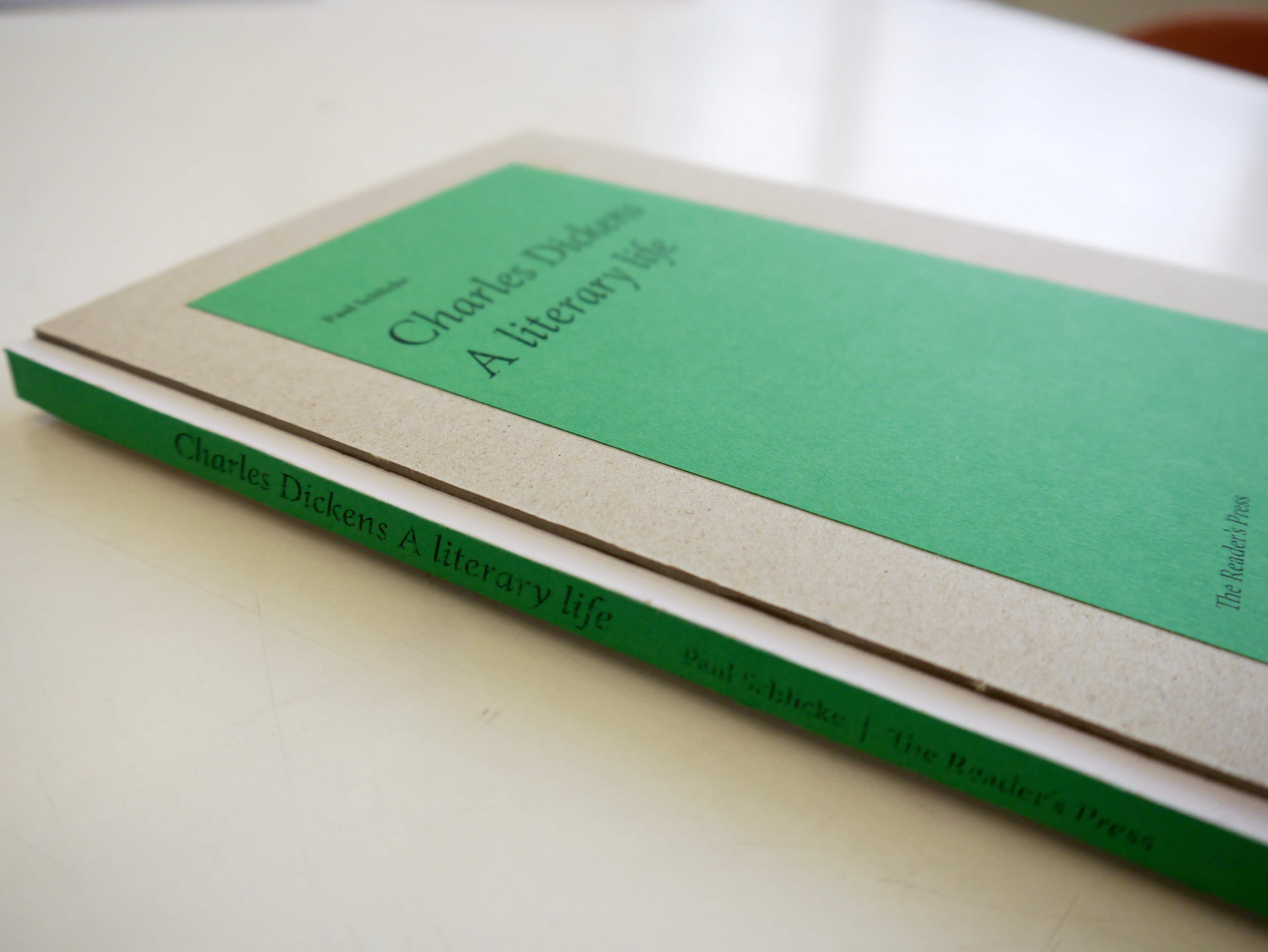
Maciej Bykowski: Visible binding on the spine with a grey-board cover

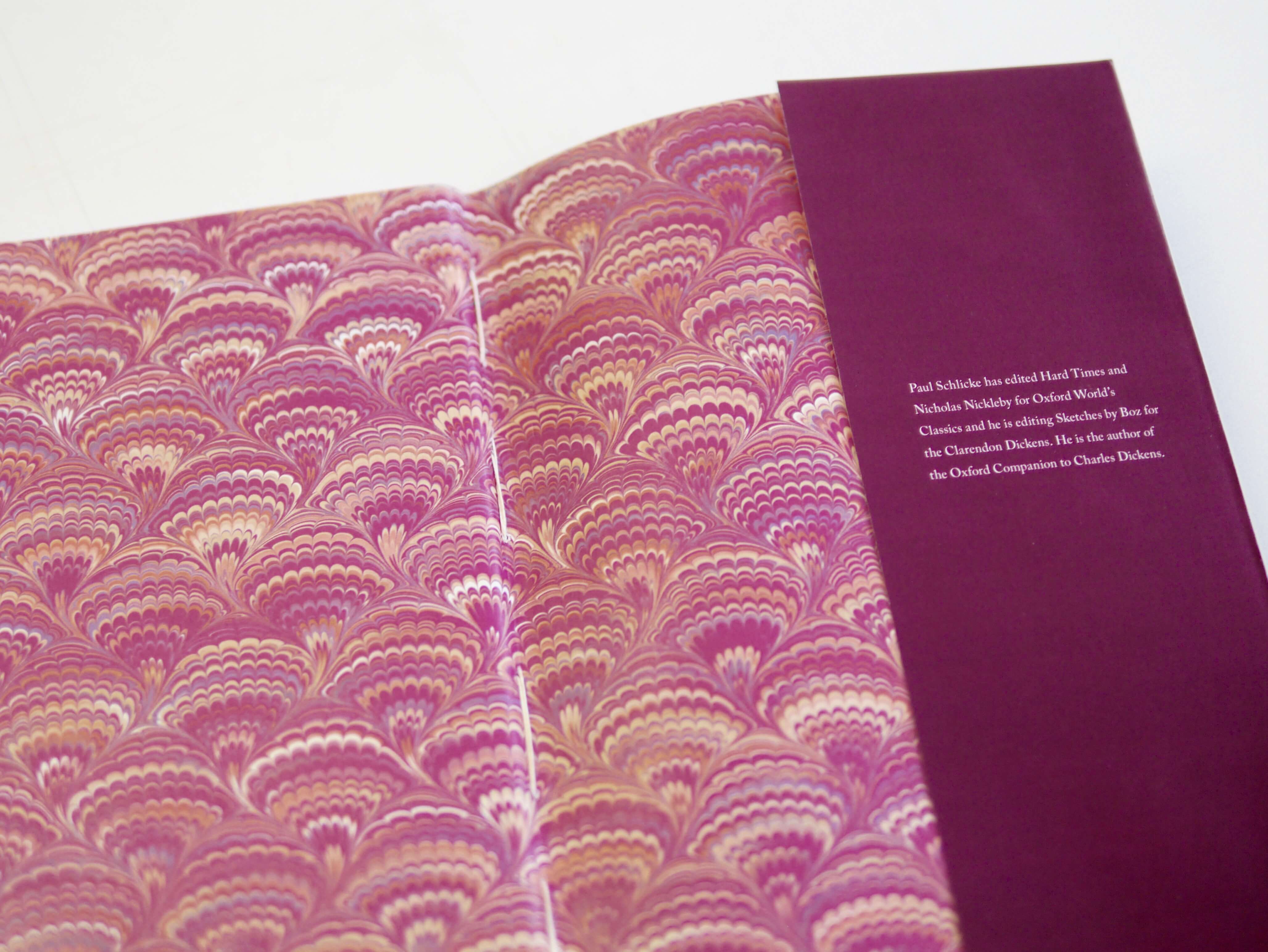
Fay Rayner: Decorative endpapers and hand sewn binding

How did I find the project?

Personally, I found this project to be my favourite so far. I fully enjoyed having the freedom of typeface choice, as well as deciding a typographic hierarchy system for the book. It was a big leap from the first typesetting project we did in part 1, but I feel that it has helped prepare me for future editorial design projects. It has also potentially decided my career path: editorial design, as I enjoyed this project so much.

Overall, my peers seemed to agree that  this project was a huge help in getting to grips with the InDesign software, as well as learning binding techniques. Jacob Hawkins commented: “Although at first I thought this project would be less interesting, it turned out to be very rewarding and has taught me the importance of typography, such as how the smallest detail can have a huge impact on your design. I have thoroughly enjoyed this project and it has sparked my interest in book design. I’m excited about upcoming editorial and typographic projects next year.”

Examples of student work

Detailed typography on chapter 1 and cover design by Charles Parish.

An elegant spread alongside decorate endpapers by Jacob Hawkins.

Laura Marshall’s yellow dust jacket alongside her chapter opener.