Staff have asked a team of Part 2 students to publish reflections on the work they produced for taught project over the past 12 months. This is the first in a series aiming to showcase our work.
In 2017 a substantially reworked Editorial Design module was re-introduced into the part 2 syllabus. We completed this module at the end of part 1, while everyone on other courses was finished and celebrating the end of their exams. At the time this was a little bit infuriating to say the least, but looking back at it now, I think my peers would agree that it was great to get 20/120 credits of the year out of the way before we started part 2!
What was this project about?
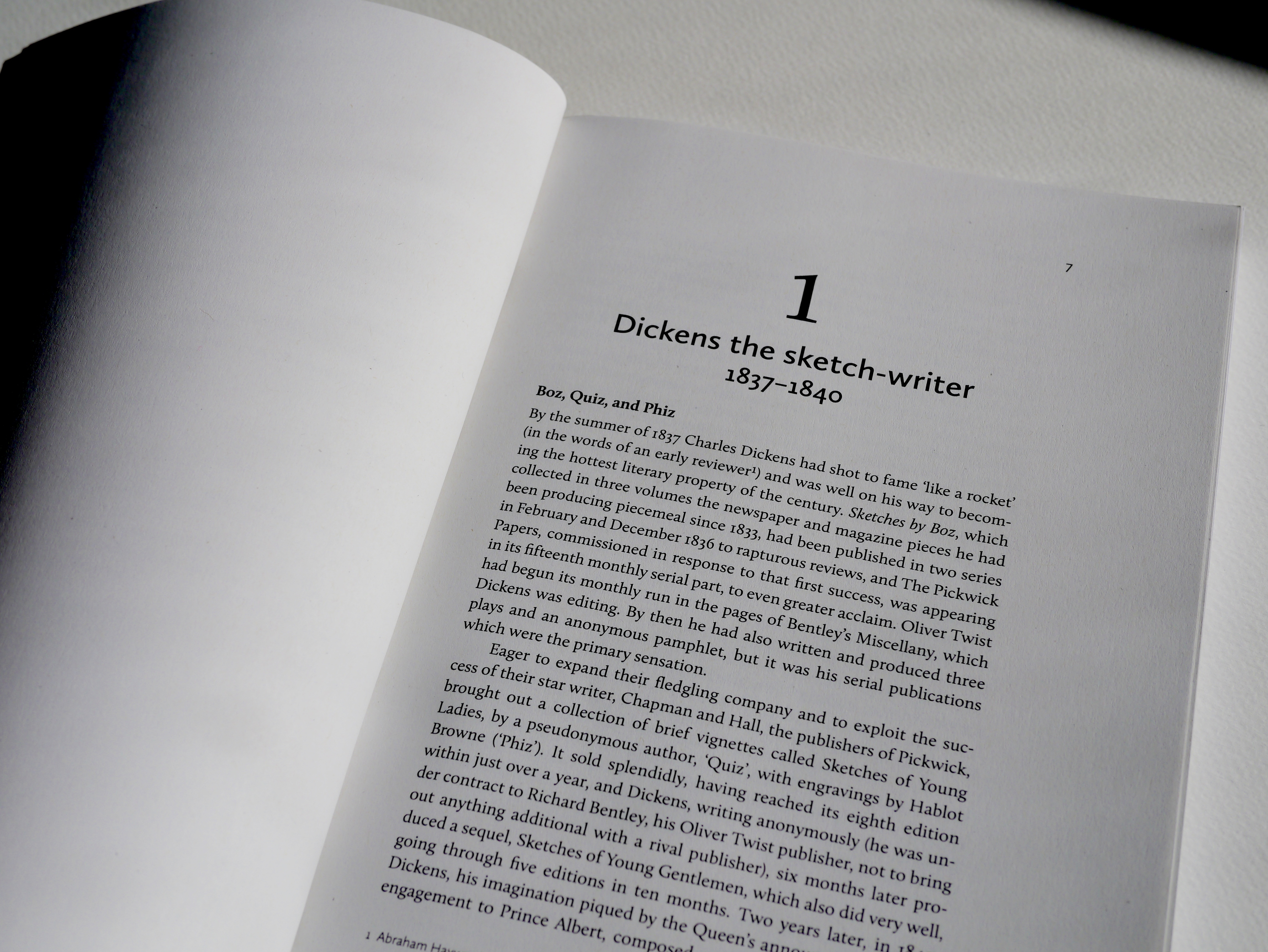
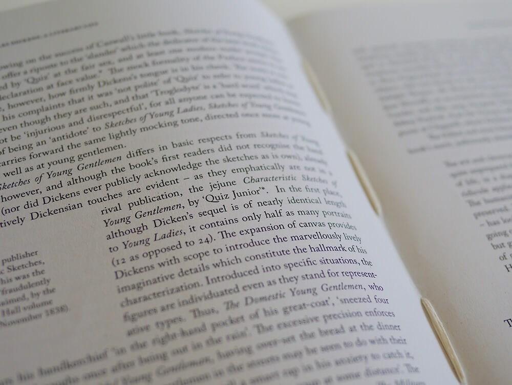
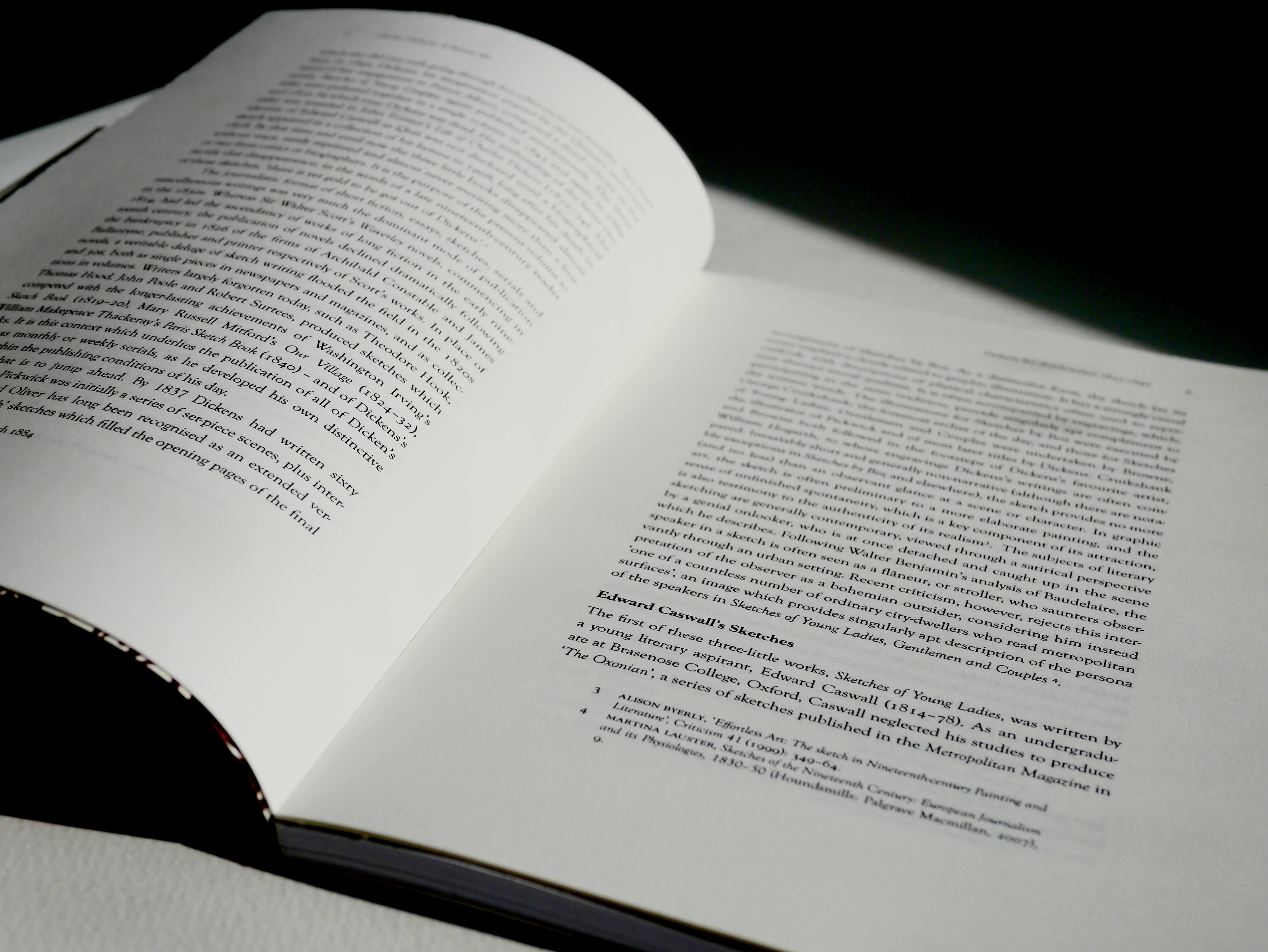
This project was the first time the majority of our year had handled a large amount of continuous text, as well as fully exploring the editorial features on InDesign. After completing a small editorial task in part 1, we had the basis to fully immerse ourselves in this larger and more life-like brief. It was also about using InDesign effectively – we had to imagine we were typesetting the whole book, and how to use tools to make this task more efficient. Master pages and stylesheets were crucial to success in this project.
As well as receiving weekly feedback sessions which were vital to our success and development, the supporting readings for this course were essential in applying theory to practice, and understanding why certain typographic conventions exist. These included books such ‘Elements of Typographic Style’ by Robert Bringhurst, and ‘Designing books, practice and theory’ by Jost Hochuli.
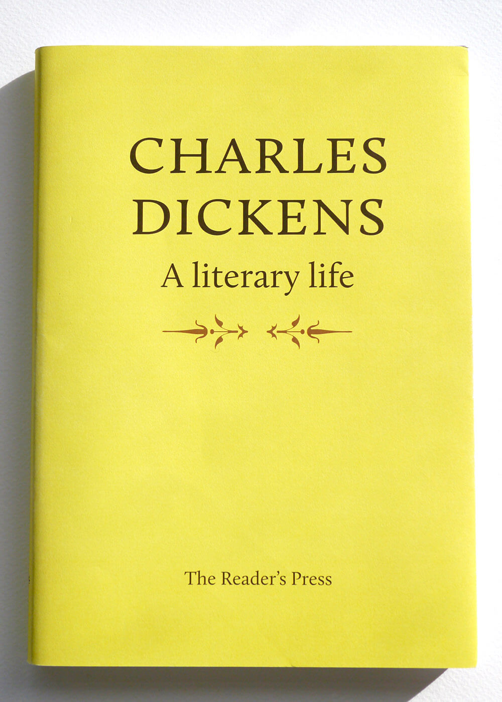
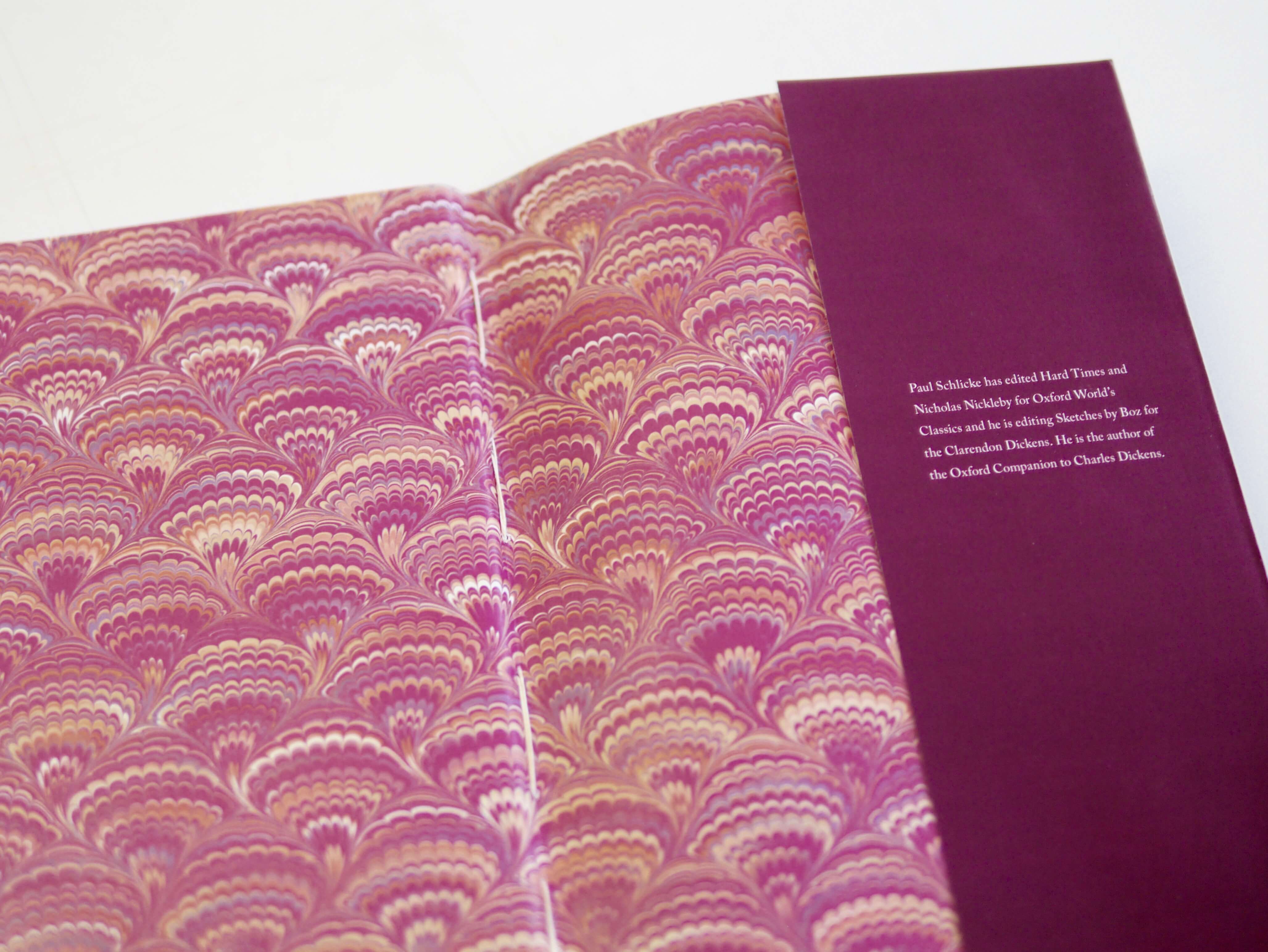
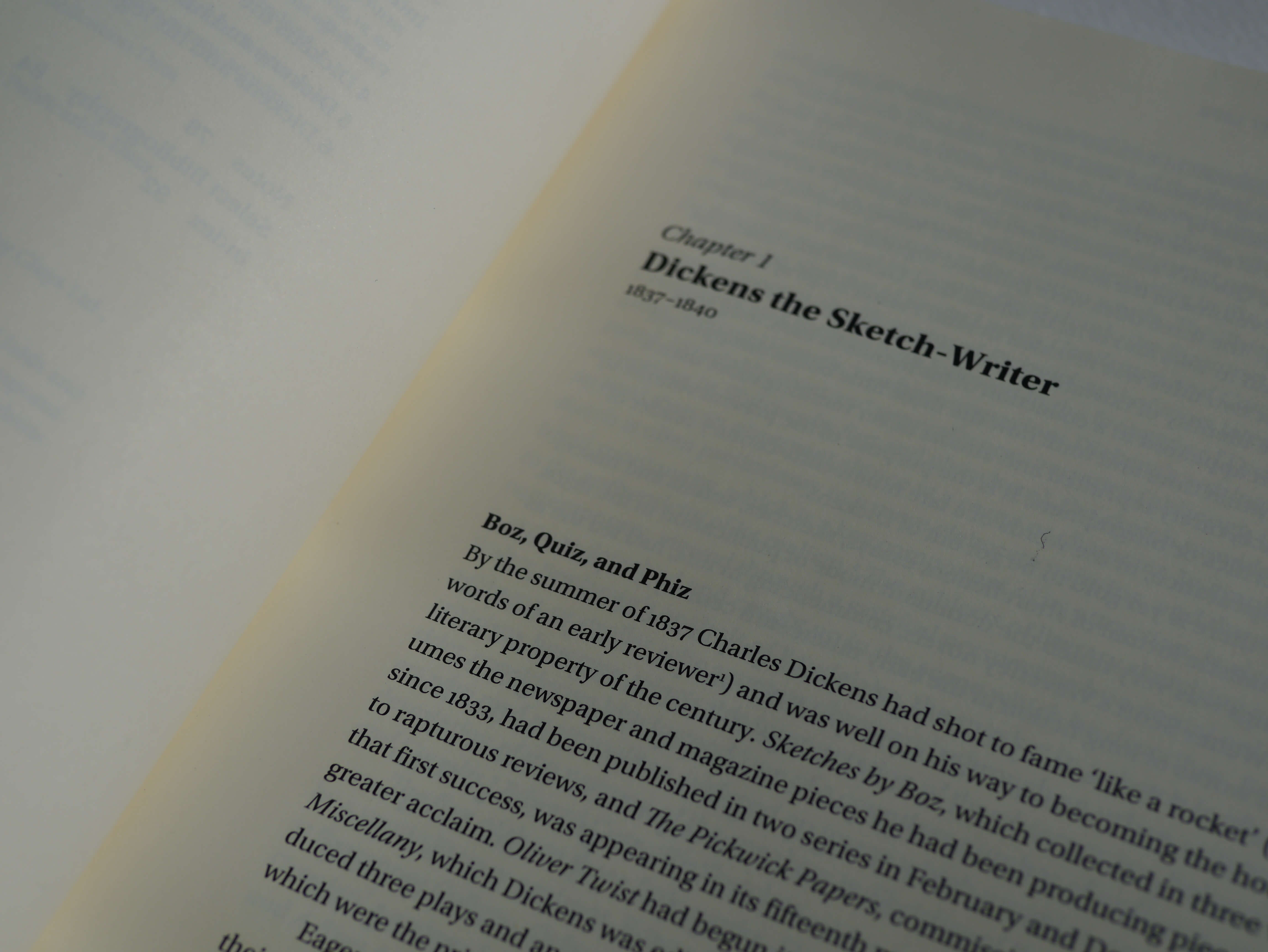
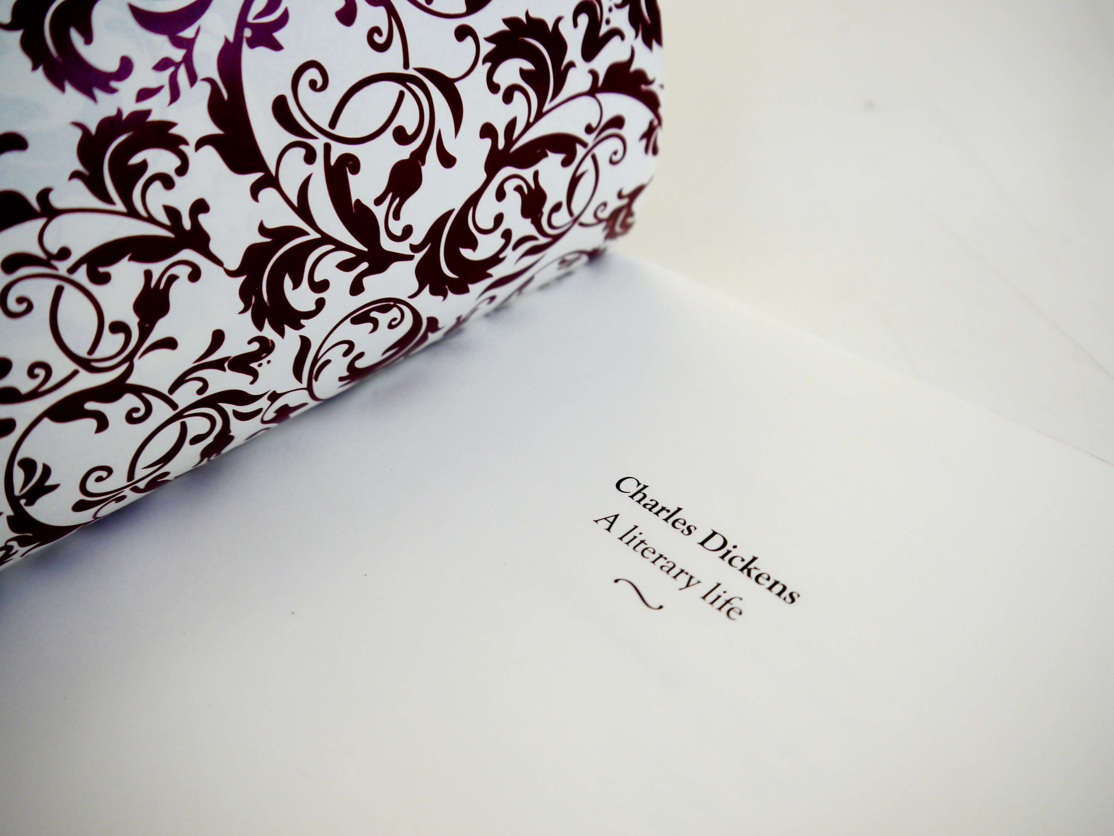
We were provided with text from the book “Charles Dickens: a literary life”, as well as the specified book format of 170 x 245mm. From there, we had freedom in the typesetting of the document, paper stock, as well as a cover design. Some of my peers took it a step further, adding dust jackets and patterned endpapers to their book.
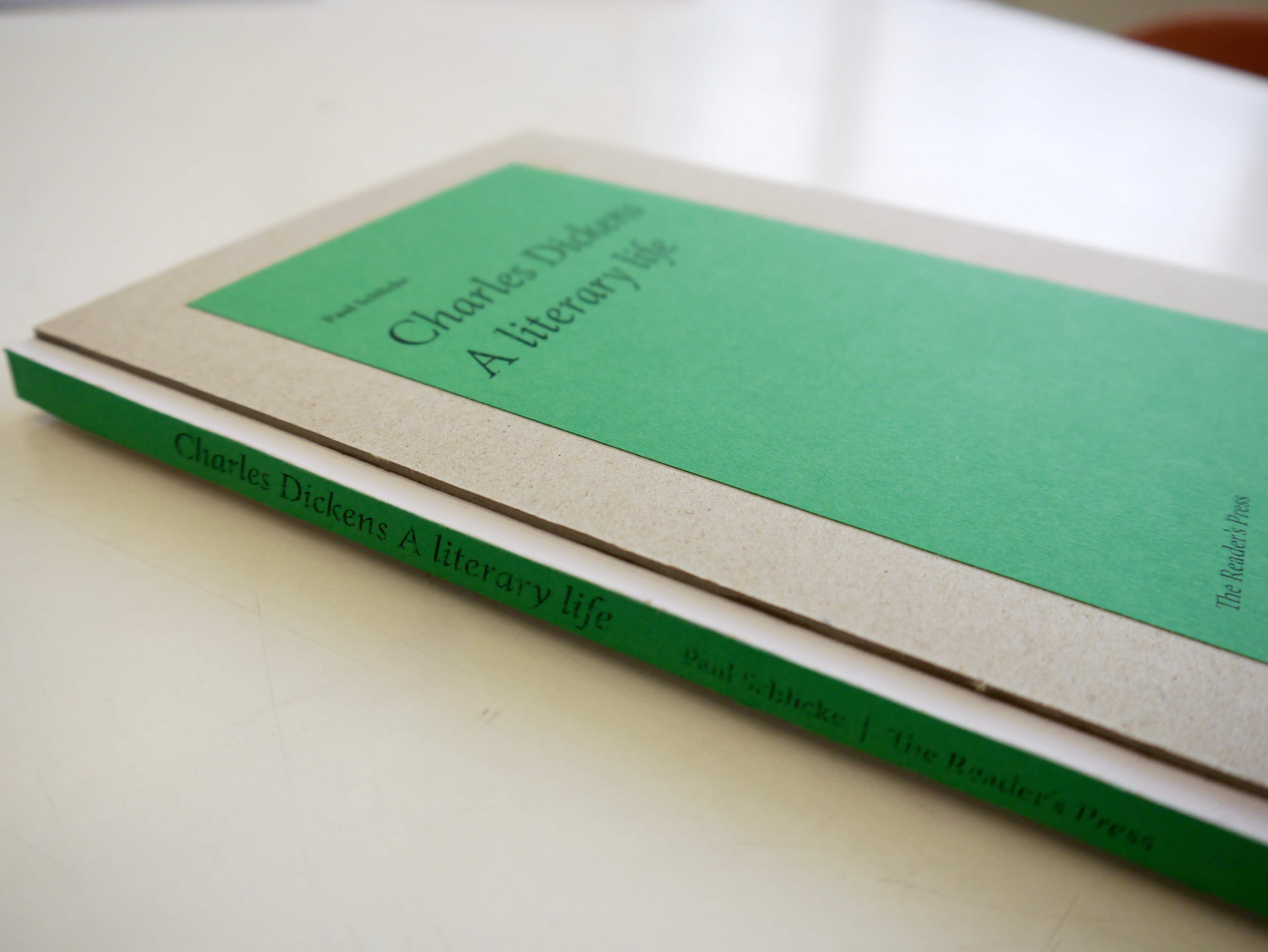
We also were taught how to perfect bind our books. This is where a block of single pages is glued down the spine to hold the book together. Book binding was another new skill to learn, as previously we had only worked with a few spreads. Some of my peers experimented with different binding techniques, using visible stitching to bind their pages, or showing the binding on the outside of the book. This included Fay Rayner, who used a more traditional technique for her book: “I really wanted to reflect on Charles Dickens and his history, therefore I did not use perfect binding but the more traditional technique of section sewn binding, as I believed it better reflected Dickens and the era in which he lived. In addition, I used a symmetrical layout with large margins and added marbled endpapers, which were typically used in Victorian books”.
 Maciej Bykowski: Visible binding on the spine with a grey-board cover
 Fay Rayner: Decorative endpapers and hand sewn binding
How did I find the project?
Personally, I found this project to be my favourite so far. I fully enjoyed having the freedom of typeface choice, as well as deciding a typographic hierarchy system for the book. It was a big leap from the first typesetting project we did in part 1, but I feel that it has helped prepare me for future editorial design projects. It has also potentially decided my career path: editorial design, as I enjoyed this project so much.
Overall, my peers seemed to agree that this project was a huge help in getting to grips with the InDesign software, as well as learning binding techniques. Jacob Hawkins commented: “Although at first I thought this project would be less interesting, it turned out to be very rewarding and has taught me the importance of typography, such as how the smallest detail can have a huge impact on your design. I have thoroughly enjoyed this project and it has sparked my interest in book design. I’m excited about upcoming editorial and typographic projects next year.”
Examples of student work
Detailed typography on chapter 1 and cover design by Charles Parish.
An elegant spread alongside decorate endpapers by Jacob Hawkins.
Laura Marshall’s yellow dust jacket alongside her chapter opener.