Author: Kirsten Dagas

TY1SK Let’s Talk Type

Design ideas and design process

Podcast Cover Design 1
Podcast Cover Design 2
Podcast Cover Design 3


Analysing an existing podcast cover

My design process started off with analysing existing podcast covers which includes ‘The Michelle Obama Podcast’. With the podcast cover, I examined the main layout such as, where the title was located and where the focus was.

For this cover, the title is located at the bottom, the streaming platform is at the top and the main focus is in the centre with Michelle Obama’s photo. With this, I created my 3rd design that had the main properties of this cover. I also mimicked the title to have the same style for example ‘The Typography Podcast’. Personally I don’t think it’s very successful as it doesn’t give the same impact, this could be by not having a better image and clarity.

Generating ideas

Next I started a word generation for the name of my podcast and some elements that I may use in the design process. With my 2 designs, ‘Let’s Talk Type’ and ‘Type Cast’ were used as my titles. I chose them as they felt catchy and memorable. The elements were different tools that the podcast cover could have like a microphone.

Layering of text
Layering of text

For the 1st design, I used the word ‘paper’ to start off my background. With this, I built up the idea of layering torn pieces of paper. It added texture and depth to the background. ‘Let’s talk type’ was the title I chose. To continue the feeling of depth, I had different fonts for each layer. This made the title fun and different whilst keeping the name distinguishable.

Overview of all ideas

The 2nd design was the simplest. First, I chose some paint splatters that I made and scanned. With this, I manipulated the splatters to show the title ‘Type Cast’. The colour decision of using black and white was made because they have the highest contrast and made it stand out. I tested using other colours asides from white however, none made the same effect as white looks with black.

Software tutorials

Adobe Photoshop was already something that I was familiar with. I knew the basic tools that are shown on the right side of the screen. The first video that I watched shows a man creating his own podcast cover titled ‘Hungry for returns’. He starts off with writing the type first using the type tool. After this, he plays with the placement of each word on the page by rotating it or flipping it. To make the title stand out he adds a background colour to only the type. Watching this video allowed me to understand his design process and the meaning of each element that he uses. It gives me a new perspective in approaching my own podcast cover. To colour, he would use the pen tool to create a square, then paint the space with the paintbrush tool. This gave me another example of another way to create a filled shape; usually I would use the marquee tool to give me the rectangular shape, then fill it with the colour. The mask tool was also something that was used. It’s purpose is to mask the areas chosen and make it transparent. This is a tool that I was unfamiliar with but with the aid of the video, I now know what it does. 

The second video I watched was about how to make mock up files on Photoshop. The reason that I watched this video was out of curiosity and interest after I used a mock-up file for my podcast cover. I wanted to know how to do it because it could be helpful for future subjects. This can be especially helpful if I can’t find a specific mock-up file, I could just make it. Making mock-up files is a skill that I definitely want to acquire because it can potentially be very useful.
I also want to improve on more technical skills by exploring what each of the drop down menus do as well as potential shortcuts – that could be important to make working more efficient. 

Resources for research and inspiration 

Firstly, I researched existing podcast covers and came across a blog. The blog spoke about the ‘45 Best podcast of 2020’. Upon reading it, I found that it covered a lot of genres and that there was no correlation in genre. The designs of the covers are varied from minimalism to busy designs. The reason I chose ‘The Michelle Obama podcast’ was that it was one of the few that used photography. It also had a neat layout that I’d like to try and incorporate in my cover. Overall, it gave me the most inspiration from the layout to the use of colour. 

The 2nd website I came across was titled ‘How to design a podcast cover’. This blog points out step-by-step what to have and add to your podcast cover. It stresses on the designer or founder thinking about the meaning and what the podcast will do. This is important as it gets the message across the target audience and will possibly attract them to listen to the podcast. The website made me think about the details that are key to making a successful podcast cover. With this knowledge, I tried to apply it on my covers.
The writer also spoke about colour theory and how colour can affect the impression of an audience. Using colours that compliment each other is more pleasing. Certain colours can also set the mood, for example red could mean anger or crime and yellow could represent a happy and light hearted content. This made me think of what I’m representing to the audience and if it’s correct. 

1 = https://www.youtube.com/watch?v=uXPRZTxNm0M 

2 = https://www.youtube.com/watch?v=VnBMQHdQZaA

3 = https://www.goodhousekeeping.com/life/entertainment/g28353940/best-podcasts/ 

4 = https://99designs.co.uk/blog/design-other/how-to-design-a-podcast-cover-the-ultimate-guide/

Cinema Brochure

The first adjustment I did was the the space between the location and the director. The first feedback was that the space looked odd, I assumed that it was took big, so I adjusted the leading. This made my columns  nearly have the same length, which overall made it neater. The 2nd feedback was the underlining of the director’s name. The feedback says that it was distracting from the  location and time. Another feedback was that the director was not as important as the date and time. To resolve this, I underlined the location, date and time instead of the director.

Safety signs

I’ve found that there are different categories that are common withing the signs. Overall, most of the signs were yellow to attract attention and to alert people. On some occasion, the use of a blue and white text was used.  I categorized my work with the message of the sign. There are a lot of signs around shops to make sure that people are following the rules.

The Curious Incident of the dog in the nighttime.

‘The curious incident of the dog in the nighttime’, is a book about a 15 year old boy who discovers the body of his neighbor’s dog. The book is written, almost as a diary, about his experiences when trying to uncover the mystery. Although it is wasn’t explicitly stated, it is believed that this boy has autism which is a crucial fact in his adventures.

The main cover of the book is blue with white star shapes. It has a cartoon image of a dog in the middle. The font used is an imitated version of  a handwriting but in a 3D version, so I tried to find a type that looks handwritten but didn’t make it 3D to stick to the original Penguin cover. I made the symbol, that encapsulates the writing ‘penguin books’, purple.  I tried to stick to the main layout of the penguin cover whilst making sure that i add the appropriate features for ‘The Curious Incident of the dog in the nighttime’.

Royalty


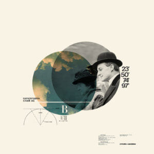
Cristiana Couciero was my inspiration for this work. She has a simple photomontage style that I thought would be appropriate for the style i am going for.

Using the image shown, I implemented the circle to show the main image. The ruler and protractor outlines show order and depth to the image. The number that I chose in my final work was the day Queen Elizabeth II was crowned. This added more meaning to photomontage. Couciero’s work is centered towards the middle and leaves the outer space empty. The use of black space  allows balance and the text creates more texture.


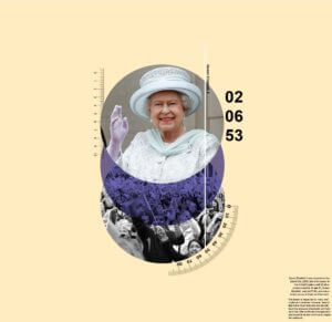
The first image represents supporters and followers. The colour blue gives a calm ambiance to the image and the lighter peach background exudes warmth. Overall, the image is giving a positive aesthetic.


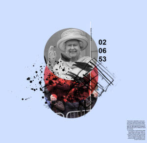
Instead of a blue circle, it changes to red to give a more aggressive tone. The blue background compliments the red and makes it more dynamic as it’s darker. Mark making were used to replaced the measurements to represent more chaos and irregularity.  The photos of the fans were replaced with paparazzi to represent the invasion of privacy and loudness that they represent.
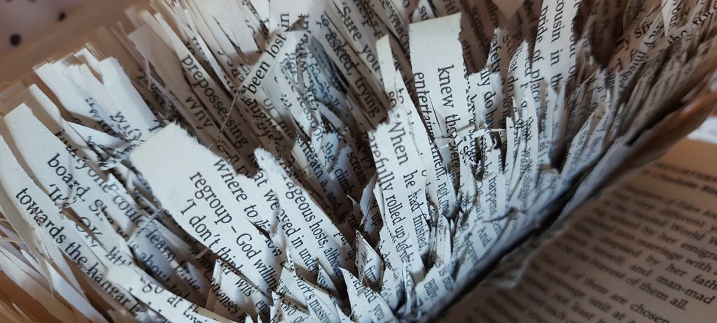
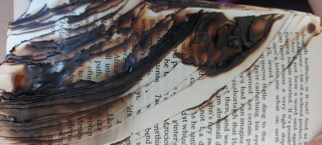
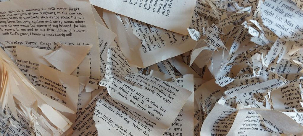
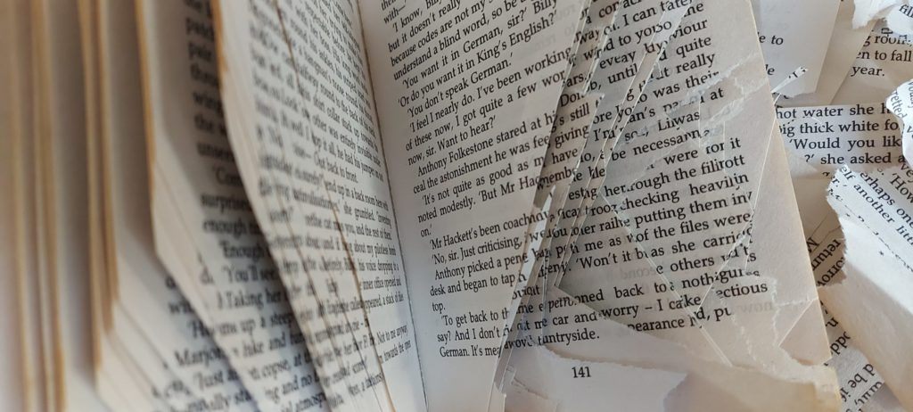