There is a good community of Typography graduates working at Apple, and in recent days we got a peek at what they’ve been working on. During the annual World Wide Developers Conference held in San Franscisco MATD graduate Antonio Cavedoni took to the stage to introduce the new system fonts for the Apple platforms.
The talk is an excellent overview of the work that typeface designers do “behind the scenes” to ensure the texts we read on our devices are readable and well-structured – and a superb introduction to the level of detail that typeface designers work every day.
The latest issue of Eye magazine, the international review of graphic design, is dedicated to typography and typeface design. The Department is very well represented in the issue: it includes an extensive profile of Fred Smeijers, long-time collaborator of Eric Kindel on research in stencil letterforms, and past External Examiner for the MA Typeface Design programme. Our graduate Paul Barnes wrote a tribute to James Mosley’s contributions to scholarship in typography, and Gerry Leonidas led Beyond Latin, a panel article on typeface design for global scripts featuring John Hudson, Neelakash Kshetrimayum, Kamal Mansour, and Pascal Zoghbi.
Google’s PlayBooks application features a new typeface family by Type-Together, which was founded by Reading alumni Veronika Burian and José Scaglione. The brief for the new typeface demanded an outstanding reading experience across a wide range of devices and high resolution screens utilising different rendering technologies. Furthermore, the new typeface family was expected to avoid conventions for e-Readers that have roots in the lower resolutions of earlier devices, and demonstrate how e-Readers could provide a typographic environment comparable to printed pages.
The typeface, called Literata, not only had to define a distinct visual identity for Google’s native app, but achieve this across the three scripts required for pan-european coverage. Fellow MATD alumna Irene Vlachou worked on the Greek character set, with support from Gerry Leonidas. Images of the typeface are available on Flickr.
Congratulations go to Part 3 students, Mel Towriss and Peter Loveland (pictured above) who, over the summer, took part in the University’s Undergraduate Research Opportunity Programme (UROP) and worked with Centre for Information Design Research. Their project examined how on-screen text format affected people’s reading speed and comprehension, as well as people’s views on which text formats were most appropriate for different purposes. The texts used for the study dealt with employers’ responsibilities to run a payroll and were drawn from the GOV.UK web site. Mel and Peter found strong agreement among study participants regarding the text formats; for example, what might be appropriate for beginner or professional readers of the information. Reading times for the different formats did not differ significantly across format but there were differences in comprehension of the information they presented. Mel and Peter were runners up in a research poster competition for all students taking part in the UROP scheme and will be taking their poster to the 2015 British Conference of Undergraduate Research.
As students were settling into their Halls for Welcome Week and the start of the new academic year, Sunday marked the return of several members of the Typography family from the annual ATypI conference, a highlight in the calendar of international type professionals. Held in Barcelona’s impressive new Museu del Diseny by MBM Arquitectes the conference was especially significant for Typography: to celebrate the award of the Sir Mischa Black Medal to Michael Twyman, the Association invited him to deliver the Keynote lecture on the topic of “Typography as a university study”. (The image above, of visuals marked up by Tschichold for a facsimile edition of Vespasiano’s 1572 writing manual, is from Michael’s collections – and seen by postgraduates who join his seminars.)
Forty years after the foundation of the Department of Typography & Graphic Communication (and a few more since the inception of the original course, in the late 1960s), Michael’s integration of history, theory and practice continues to define typographic education. These ideas have proven not only resilient, but prescient: graphic communication education worldwide is moving towards these ideas, holding Reading as a model for both new courses and institutions realigning their design studies.
(Above: Fiona Ross and Michael Twyman in Barcelona. Photos by Elena Veguillas)
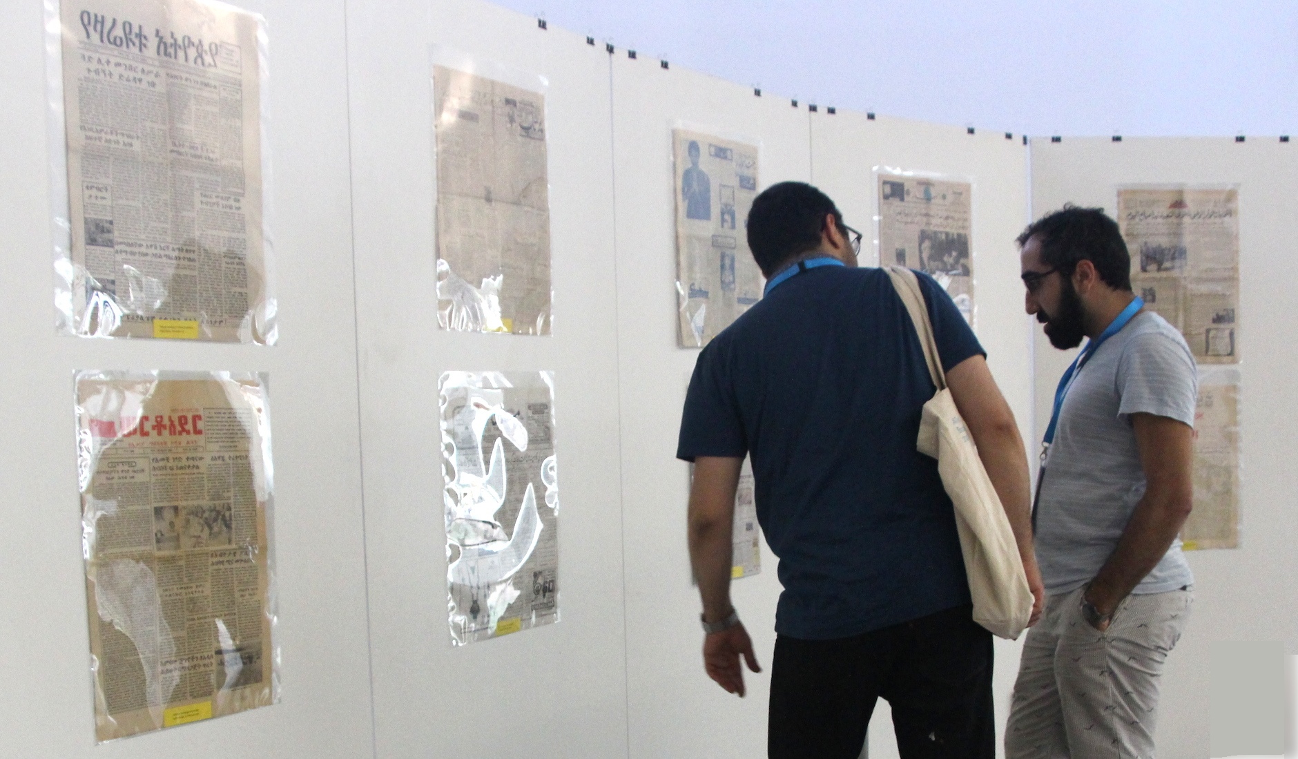
Borna Izadpanah and Behdad Esfahbod reviewing the Urdu section of the exhibition.
ATypI president (and Reading alumnus) José Scaglione’s announcement that ATypI 2015 will take place in São Paulo, the first South American location for the Association, which will bring the conference closer to the substantial community of Brazilian alumni.
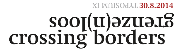
The ninth Typosium, organised by Initiaal, took place at the Museum Plantin Moretus in Antwerp on 30 August, with the theme Crossing Borders/Genze(n)loos. Our own Jo De Baerdemaeker, Fiona Ross and Gerard Unger were amongst the presenters. Gerard spoke about his Alverata project, a contemporary typeface drawing on romanesque sources and employing a wide range of historically-inspired alternate shapes. Fiona wand Jo conducted a Dialogue on type, looking at a range of projects for global scripts. Pictures on Jan Van der Linden’s photostream.
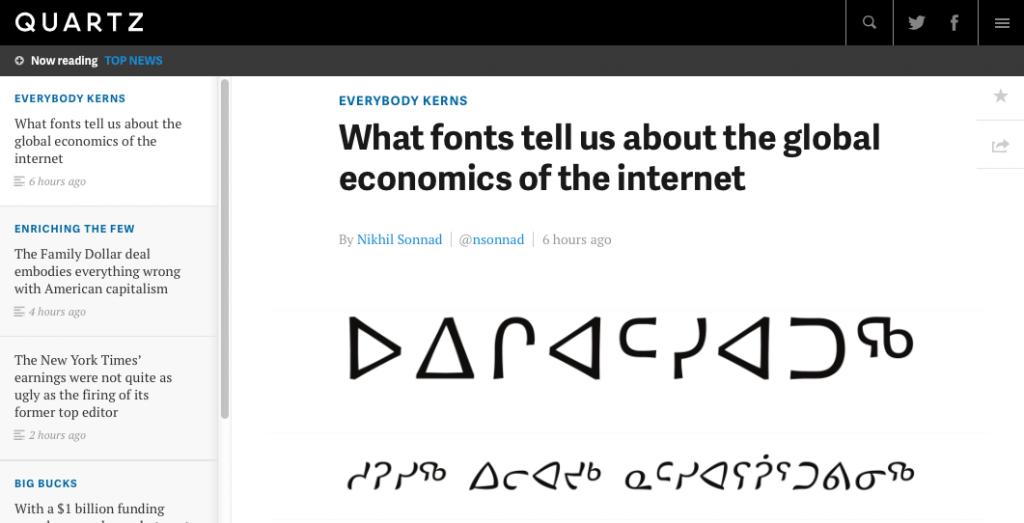
Quartz just published an extensive report on the globalisation of the typeface design market and the impact on the communication sector, with support from Gerry Leonidas, alumnus David Březina, and a reference to MATD alumna Juliet Shen’s design for Lushootsheed.
Quartz’s post is another entry in a the growing list of articles in business and general interest publications about typefaces, evidence that awareness about the importance of typeface design is spreading to fields far outside the design sector.
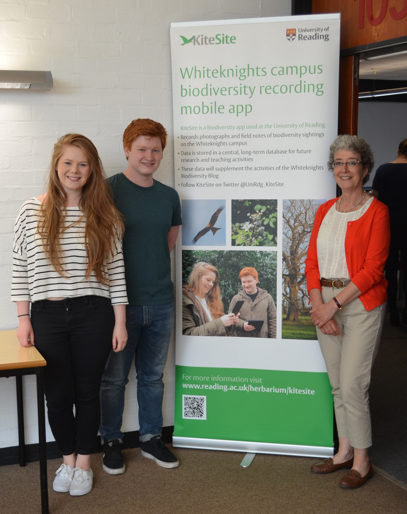
The University has launched its biodiversity mapping tool, KiteSite, which is to be used in teaching to track sightings of plant and animal life and, through GPS, map their location on campus. The tool was developed from existing open-source software by a joint team of biologists, computer scientists and designers as part of a University-funded Teaching and Learning Development project. Typography and Graphic Communication student, Liam Basford (pictured centre), developed the branding and communications for the project. He is with Bethany Everett (left), one of a group of student volunteers who tested the tool, and Alison Black, of Centre for Information Design Research, who was part of the academic team involved in the project.
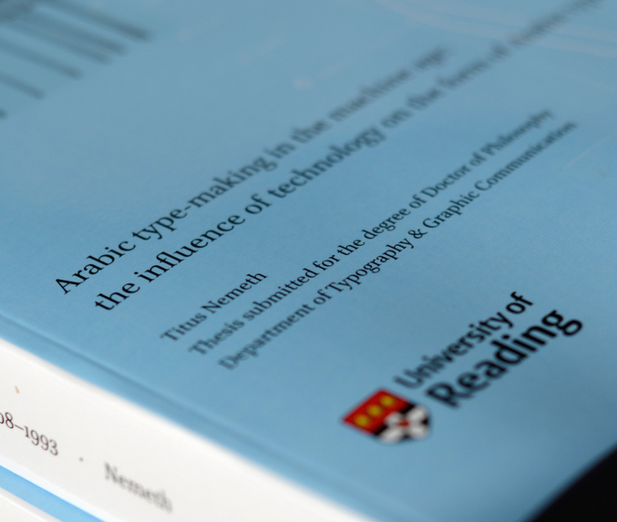
Titus Nemeth submitted his PhD thesis in 2013, on the evolution of Arabic type-making under the influence of changing technologies. The thesis spans the period from 1908, when the first adaptation of Arabic to mechanical typesetting introduced machine-aided composition; and 1993, when the adoption of Unicode marked the end of typeface design’s association with specific platforms. Titus’ research was supported by an AHRC Studentship.
Titus’ PhD represents a number of type-related research projects drawing on archival material, and is a useful reference for all researchers in this area. He has now published on his blog an engaging reflection on his experience doing a PhD at Reading. His article is a source of inspiration and guidance for potential researchers, and contains useful advice for research at this level.
The PhD was not Titus’ first experience in Reading. He had graduated from the MA Typeface Design in 2006, having completed an importantLatin/Arabic typeface and a dissertation on Arabic newspaper typography.
Sponsored by Monotype, the 2014 TYPE& events in Tokyo included a masterclass for professional typeface designers, and presentations and panel discussion on multi-script typography and typeface design. The events captured the growing interest by Japanese type foundries to expand into Latin typeface design, and gave an opportunity to discuss Reading’s approach to developing multi-script design skills. Gerry Leonidas ran the masterclass on the first day of the event, and presented on the second, answering many questions on the MA Typeface Design programme’s contribution in the area. Reading alumna and Monotype employee Reiko Hirai was instrumental in the success of the event.