Within the theme of pain I wanted to demonstrate the difference between mental and physical pain. To do this I illustrated a scene of two friends sat drinking. One is wearing a sling on his arm to represent physical pain. For the other man I drew a brain that is beaten up/ bandaged and bloody, my intentions with this was to create a metaphor for mental illness as it cannot be seen in the same way as physical illness but can often be just as painful. To represent the invisibility of mental pain I used animation so that the brain appears on and off to show how we can always see physical pain like broken bones but cannot always see mental pain.
Category: TY1DP1
Work by Part 1 students as part of their ‘Design Practice’ module.
Initial Identity
Our names are a huge part of our identity, especially when we don’t come across others with the same name, like myself. This in turn means people’s initials are part of their identity. Whilst creating a monogram of my own initials I wanted to be able to reflect my personality within this. The monogram is something that represents me, something that identifies me in the same way a brand has a logo. The following is the journey I undertook during my ‘monomorphis’.
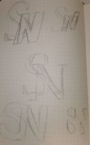
Like any designer I started my process with some initial thumbnails to capture the essence of my ideas, shown on the left. Part of this also meant I looked at different versions of the fonts we were allowed to utilise (Futura and Garamond). Garamond is a very elegant yet formal type face in my opinion with it’s serifs more curved and softened, whereas Futura is a more bold, simplistic, potentially even boring typeface. I like to think of myself as a more diverse personality so I decided to go with the S being in the sleek more angular typeface (Garamond) while doing the N in a more simplistic fashion (Futura).
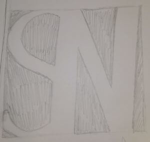
Having decided which of my initial ideas I preferred I started the process of crating those initial sketches into what it would look like. An example of this is visible on the right hand side.
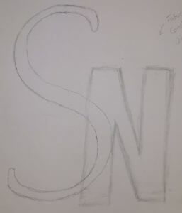
In order to reach the best possible monogram I did this with the majority of my initial sketches. This also meant I could better see what worked and what I needed to improve on, e.g. the Garamond S on the right is lost in the design as it doesn’t carry enough weight. Thus making me recreate it with a heavier version of Garamond.
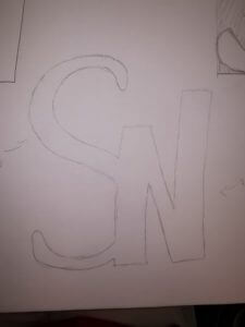
I found once I corrected the design that it still looked too standard, it didn’t really convey my personality yet. So I started playing around with the letter forms some more. This can be seen on the right where some of the N has been stretched higher than the rest, thus creating a more dynamic and interesting design.
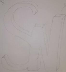
Whilst I wasn’t unhappy with my design by this stage I still thought that it could be improved upon, become more than it is. So I kept playing about with it, eventually I layered it and created a sort of 3D effect (shown on the left).
By this time I was starting to run out of ideas of how I could continue this ideas development. However I was still drawn to one of my initial designs which displayed the counters rather than the letters themselves, creating a longer lasting impression. I then decided to combine the two designs, taking the last step in this journey to create my monogram.

Loop – A book redesign
Today’s session was hosted by Berta Ferrer, who talked to us about books: What they are, what makes a book a book. We have also looked at examples by other artists and designers, who took an alternative approach in creating books. From cutting up pages to rearranging the words to create a novel, I have learnt that a book doesn’t necessarily need to look like a monotonous novel. A book is just an object, and the text within it is its content; therefore, books don’t need a narrative in order to be considered a book. Artists such as Keith Smith, whose work we looked at, replaces content with other objects (thread) to alter one’s experience with the book.
Consequently, we were asked to create our own book, using a book we already have. Since I haven’t found a book I could use, I chose to work with one of the magazines I own and alter it in that way. The title of my book was a loop, and it tells us a story of a man who gets pulled into a book, and re-lives the same memory over and over. Since the book mentioned a female character I decided to work with that instead, as I was intrigued by this mysterious character in the story.
Unlike the works of others, mine differed a lot due to my limited resources available. Working with a magazine proved to be a lot more difficult, as the pages were thin and full of images rather than text. The pages were also thinner which made them a lot more difficult to manipulate them to form different shapes. On the other hand, I quite enjoyed the activity, despite the ‘manual’ aspect of it. As a designer I find myself working more comfortably digitally, so working hands-on was a bit of a challenge. Having said this, however, I really enjoyed working with different media and creating collages, that I would have never thought of making.
Religion – Free the Uighurs
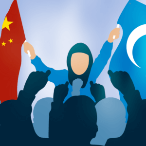 Creating impactful images with Sara was probably one of my favourite activities so far. Creating work with deeper meaning has always been something I felt passionate about, and the activity allowed me to practice my illustration skills. As part of the brief, I was asked to create two images based on the theme of religion. Based on my own knowledge, I was aware of the current issues in China regarding the Uighurs, an ethnic minority found mostly in east Asia. the idea was based on a photograph I saw of Uighur protests, I have used it as a reference for my idea. I decided to produce my ideas using Procreate and Illustrator, as these are two illustrating software I’m most familiar with.
The first image presents a girl in a hijab (wearing blue, a symbolic colour for Uighur people) holding two flags: on the left, the flag of China and on the right, the flag of East Turkestan. I chose to use a young girl for this image for two specific reasons: to portray the innocence of Uighur people and to make a statement on the sexist standards that are still part of the Chinese culture
I think that some of this was communicated through my image, although I could have made the flags more clear and visible so that It is obvious what my work is about. Personally, I have struggled with creating the flags. Due to their weird form and the physics involved, I had no idea how to go about making the flags look realistic but still readable.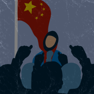
In the second image, I was aiming to make the flag seem like its strangling the girl, who’s hanging down from it, showing China’s oppression on the Uighurs. I have also removed the Uighur flag from the image, to create more of downward motion. To add to this, I chose to add a darker filter, to further emphasise the disturbing and menacing theme of the image.
Things I often overlook
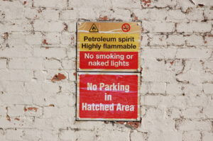
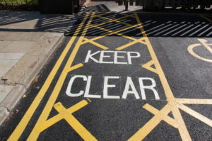
For this project, we were instructed to photograph lettering around the University. From what sounded quite a simple task, it was actually very interesting to see things I often overlook. We often don’t stop to thing why things look the way the do and what the impact that has on us.
In the 2 hours we had to photograph, I walked around campus collecting images of signs, posters and words in the environment. Once the time was up, we were then asked to edit and organise the photos into categories of our choice. I chose to organise them into ‘Instruct’, ‘Direct Information’ and ‘Advertisement’.
I found that the ‘Instruct’ category featured signs with bold colours to catch attention and provide a warning. They also featured verbs to act as strong instructions.
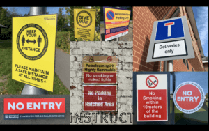
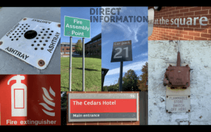
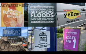
Lettering in the environment
For this task we were sent away with the motive of finding lettering in the environment and capturing it in a photo to later analyse. Every day we look and read 100s of different typefaces that we may not even take a moment to think about normally, so it was nice to slow down and really question things like why did the creators of something chose to do it in this particular way?
I tried to capture a wide variety of different letter forms, techniques and materials but this began proving slightly difficult with being restricted to campus where they have a distinctive typeface to help brand the university. Over coming this set-back i looked for inspiration in more creative ways like car window stickers and stone drains.
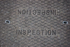
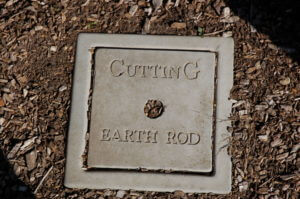
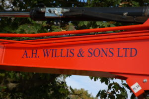
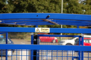
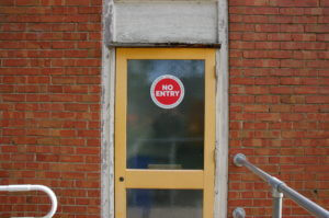
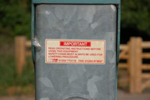
We were then asked to individually group out photos in-whatever way we please and it was really interesting to see the different and creative ways other people chose to group their work. i grouped mine into the different techniques and materials in which the letters were formed which included vinyl/stickers, stone casts, card/posters and carved metal. I feel i approached this challenge head on and to the best of my ability but if i was to do it again i would try harder to think outside the box and be more creative with my ideas.

Labyrinth
The brief was to design a book for a client writing a novel based on a labyrinth. I have therfore created a series of concept pages which could be filled with content from the book.
When I read the brief for the labyrinth book idea there were certain key words that stood out to me, I have chosen to focus on them within this design project. The first was “unexpected spatial characteristics,” to me this implies a change in the way the main body of text is presented, the unexpected may also suggest that this presentation is not consistent throughout the novel.
Next was the use of the word “shifting” from this I decided that the text would be at different levels and areas of the page.
The most interesting point was the “impossibly infinite” maze that the characters are stuck in. This gave me the idea to have each page or double page spread to have its own unique theme, not only does this work with the previous comments it links to the story and the lack of direction within the labyrinth.
A common thing in labyrinths is their lack of distinct features. This is used as a tactic, so you find it more difficult to gain your bearings, because of this I have chosen a simple color scheme with minimalist designs on the page rather than complex additions.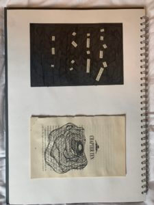
Politician
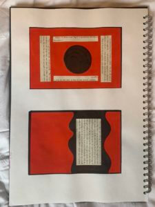
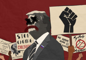
I was given the stimuli of Politician, from this my immediate thoughts went to the politcal unrest happening in America right now. Here I have created two contrasting images, the first shows Trump as he would like the world to view him; proud, patriotic and powerful. The second image however displays the truth, here you see the things people are having to fight for due to his lack of leadership. To create these images I used an app on my iPad and combined a proganda image with different protest signs I’ve seen over the past few months.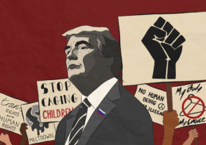
Education Inequality
My addition to the first image is a troll which demonstrates the obstacles that disadvantaged students face. The troll does not contrast the initial image very effectively, which makes the meaning less clear.


A book without words
In my first mini project, I attempted to tell the brief’s story within the pages. I represented the main character’s frantic search for nothing with rough edges and tears. I split the story into sections and varied cutting/ripping/sticking the pages of my book up until the end, where the reader finds nothing. If I redid this project, I would take it less literally and try to present the obsession so that it is clear what the story is upon first glance.
