
Context
Founded in 2016 and led by Jennifer Christine Stokes, Reside Dance aims to bring individuals and communities together by developing connections to places and others through dance. With a special focus on promoting and celebrating cultural diversity, Reside Dance aims to become Reading’s first dance company to bring its’ residents side by side to celebrate their individual and collective cultures within site-specific places. Drawing upon techniques and processes from dance theatre, social choreography and somatic practice, Reside Dance aims to strengthen Reading’s dance offering by creating innovative, high quality and accessible performances, workshops and programmes that widen dance audiences through its exploration of issues prevalent to Reading life.
The brief
Reside Dance were looking to establish and represent their values through consistent branding and a coherent visual identity, starting with a logo redesign as the foundation for this. They wanted branding to tie together all of their media under one visual identity, both online and printed. The overall aim of the rebrand and logo redesign was to increase awareness and promote the organisation to a larger audience in Reading, showing how they aim to become Reading’s first dance company to focus on promoting and celebrating cultural diversity, bringing residents side by side to celebrate their individual and collective cultures in a community based way.
Being my second real job project and working on my own for this project, I felt prepared for the task. I was in charge of managing myself and my own schedule rather than having to manage other people. Before the initial client meeting I carried out background research into Reside Dance, their competitors and their outlook and during the first and only face-to-face meeting we established a clear set of aims and objectives. Through a list of questions I had prepared before the meeting I was able to find out all of the information quickly and efficiently to then write up the restated brief. During the initial meeting we also decided that our main mode of contact would be via weekly emails. Meeting in person was hard as they job ran over Christmas and my client was also a full time masters student as well as running a Reside Dance. However, emails worked well and we were able to get back to each other on a weekly basis with in depth feedback as we stuck to the restated brief schedule rigorously.
Aims and Objectives
- To establish and represent the company values through strong, consistent branding and visual identity, starting with a logo redesign as the foundation for this.
- To create a coherent and clearly communicated set of brand guidelines for: typefaces, colour palette, layout, imagery
- Tie together all media through the a strong visual identity: posters, flyers, website, social media sites
- To increase awareness and promote the organisation through a strong visual identity.
- Show how they aim to become Reading’s first Charitable Incorporated Dance Organisation that focus on promoting and celebrating cultural diversity, bringing its’ residents side by side to celebrate their individual and collective cultures in a community based way.
Deliverables
- New logo to be used on multiple applications as jpeg and png files
- Brand guidelines document including: typographic detailing for all media, colour palette for all media, template example layouts for promotional material as a pdf file
Writing and signing off the restated brief helped me establish the guidelines and timeframes for the project and it was a very useful process to understand and confirm the terms of the contract as at first the deliverables of the project were too vague and negotiable. I ended up producing 2 restated briefs, 1 copy written for myself and 1 for the client only containing what they need to know. This was to keep the clients copy concise and relevant.
The biggest challenge I initially faced was confirming the deliverables as my client wanted brand guidelines with the logo but then asked for ‘future implementation of the brand guidelines’. However, this part of the contract was too vague as there was no timeframe and the project needed a finish date to aim for. Instead, we agreed on keeping in touch after the real job contract expired so the visual identity could be implemented in the future under a separate contract. Alternatively, another student could take on the job in the future and implement my brand guidelines to deliverables such as a leaflets and posters for future dance events.
How the project evolved
Initial stages
Once the restated brief, schedule and deliverables were confirmed I was able to look into the specific needs of the user and client and start looking for ways i could add my own ideas to the rebrand. I started by looking at similar organisations and competitors logos and branding for guidance in terms of colour schemes, typography, imagery and ethos. Here I began to think how each element could be used to promote certain brand values and characteristics.
I began by working on the logo concepts first as they would act as the foundations for the rest of the rebrand. I proposed a range of initial concepts to my client and from there the finer details would follow such as colour schemes and typefaces. After receiving feedback on the initial concepts I began to develop the logos as vectors in Illustrator and we went through multiple different ideas before narrowing it down to two concepts. The weekly email feedback made the sharing of files and timeframe manageable for both of us with busy schedules. Throughout this exploration process I was able to gain a better sense of Reside Dance’s ethos and values through the feedback my client was providing me and this would later help when writing the brand guidelines.
Initial logo concepts
The dancing figure logos are conceptually self explanatory. The concept behind the rounded shape logos was the merging together of different groups of people represented by the overlapping abstract shapes and different colours – creating readings diverse community. The concept behind the geometric, building like shapes was to give a sense of the community coming together in a range of public buildings around reading where the dance performances would be held – emphasising the word reside ‘to have ones home or be situated in a place’ (public spaces around reading). These ideas eventually combined to create the concept of a group of people holding hands from a birds eye view, forming a building like shape – the community creating a sense of place and space through dance performance.


– Logo concept explorations
We eventually narrowed it down to the final logo concept after exploring various other possibilities through process of elimination. The client feedback I received was extremely useful during this process as they had a clear vision for the logo and they understood what was possible and what wasn’t. Here I made the requested adjustments from weekly feedback until my client was happy with the concept that fit the overall brand ethos. Once decided on the final concept, I was able to work on finer details such as typography, composition, form and colour. I feel that the weekly feedback approach with both my client and project supervisor worked well as it gave enough time to make the amendments and to consider feedback, giving the project structure.
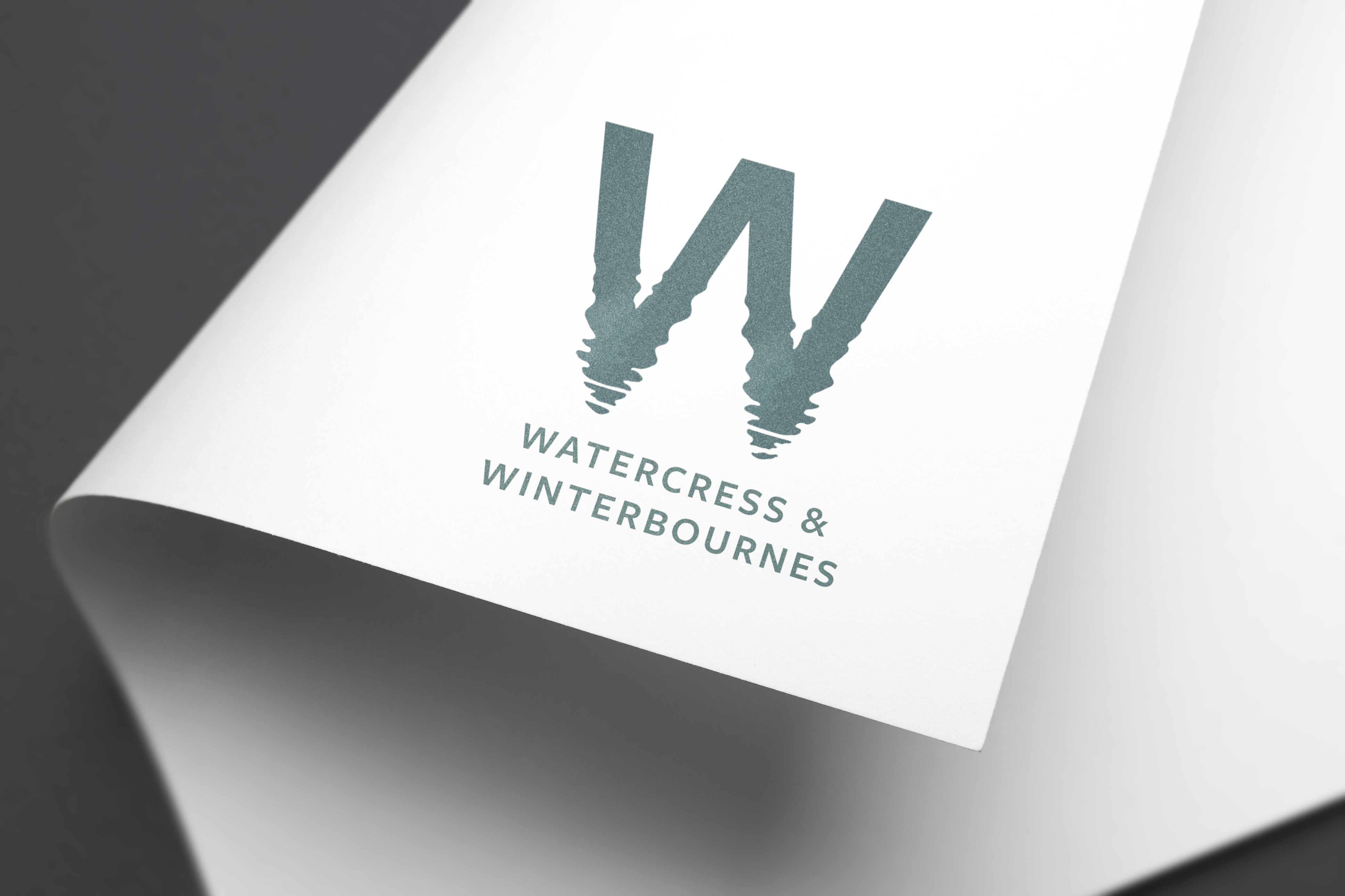
Final logo
The Reside Dance logo conveys its values and brand through the imagery and colours used. The imagery shows a culturally diverse circle of people holding hands and dancing around the name ‘Reside Dance’ from a birds eye view. This imagery resembles the coming together of different ethnicities to create a strong network and community through dance and movement. The dancing figures also form a shape that resembles a safe public space or building in which the community is performing. The warm colour pallet also resembles the welcoming nature of the organisation as well as cultural diversity.
![]()
– Final logo
Brand guidelines
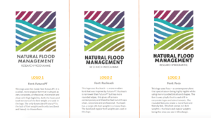
The finished logo worked as the foundation for the brand guidelines document and after I had finalised these visual guidelines I was able to apply them to business card and leaflet mock-ups using copy provided by my client in order to show how the branding would be implemented. The brand guidelines I produced included guidelines for the brand identity and ethos, logo, colour scheme, typography, business card mock-up, leaflet mock-up, Facebook, Twitter and Instagram logo mock-ups.


– Leaflet and business card templates to show how the brand guidelines would be implemented
Final stages
Towards the end of the project my client got ill which slowed down the project as I needed feedback and confirmation to finish the brand guidelines. This resulted in us having to push back the finish date but after some negotiation with my client and supervisor we were able to settle on a later finish date in order to get the best results for the project deliverables, rather than handing over unfinished work. Here I learnt the importance of negotiation and patience when unforeseen circumstances arise in a project.
There was regular communication between me and my supervisor during the final stages of the project as I finalised the logo and brand guidelines. Here I learnt the importance of copy editing and writing in a style that a non-designer is able to understand. I also learnt how important it is to get feedback on designs and written work from other people as I kept missing small errors throughout the brand guidelines. My client, supervisor and peers were all helpful in providing this feedback. My supervisor also helped me tidy up my logo vector file so it was ready for multiple applications at different scales. These are all important skills that I will take forward with me into the future.
How the project was received
After handing over the final deliverables to my client I received an email of thanks. It was satisfying to know that the final outcome was well received and even more so to see the logo used throughout their social media platforms and on their website. It was also reassuring to hear that my attitude was professional and organised as working with a real client was something I hadn’t had much experience with before. After we finished the project, we decided to keep in contact for future implementation of the brand guidelines and any other work Reside Dance might need in the future which further emphasised the success of the project and the relationship with my client.
Reflection
I feel that the final outcome of the project definitely achieved its initial aims, despite working on a project out of my usual comfort zone. Being a charitable organisation, it wasn’t the typical style of work I was used to but this forced me to work out of my comfort zone which was rewarding as I was constantly learning new skills. Working out of my comfort zone also boosted my confidence, making me realise how the skills I have learnt at university are transferable to all styles and areas of design. I feel that if I am able to practice and refine the skills and styles i have learnt on this project, it’s definitely an area of design that I would want to do more of in the future.
I feel that the final outcome of the final logo is a little generic, looking like many other charitable organisation logos. Despite going through a wide range of initial concepts, some with more intriguing messages and visual forms, my client picked one that I wasn’t initially sure about. However, this made me realise that ultimately, the work is being designed for the client and it is my job to provide them with the vision they have for the project. On most other university projects, the work produced would be for myself, under my own guidelines, but here I was working for a client which made me realise the importance of being able to interpret and create other peoples visions. It was also morally fulfilling knowing that the work produced was helping a charitable organisation and the wider community in Reading.
Overall, I feel that the project ran smoothly and this was thanks to having an engaged and enthusiastic client. Now that all of the deliverables are tied together under the brand guidelines document I feel they act as a strong foundation for the future of Reside Dance. The most rewarding aspect of this project was working with a real client as previously I was used to making my own design decisions, based on my own preferences. This project meant that I had to work to a tighter specification where I was designing for someone with different ideas and tastes to my own. At first I found this challenging but I have learnt lots of valuable lessons from it and I feel that I can now handle negotiations and work on feedback (even if I don’t agree with it) in a much more professional way. This is an extremely useful skill that I will take into the future with me.
Final deliverables
![]()
– Final logo


– Example spreads from the brand guidelines


 When I first started working on the concepts of the poster, I focused on the geometry that can be created when rotating the typeface and creating a pattern out of it. While it was fitting of the brief and did a nice work in promoting the unique selling points of the typeface, I found the results to be bland and unimaginative when compared to other typeface promotional posters, in the sense that it didn’t characterise all those features that Lisbeth was described earlier. So I decided to focus on the three-dimensional feature of the typeface and try to create a graphic out of blown up characters using the display font of the type family.
 After creating the blend of “M”, I started experimenting with the positioning of the character, taking up most of the poster. It was really easy to create an aesthetically good result due to the changing twisting lines that when viewed on a screen, can seem like they are moving when viewed in smaller sizes and higher quality. After deciding on the position of the character, I added a secondary copy of it in a parallel line below it, while also making it bigger, with thinner strokes. This allowed me to create a more subtly shown blend, on top of the main one, that helped bring out the three dimensionality of the typeface.
 Overall, I am quite happy with the end result, even though when I look at it now, I can see a lot of improvements that could have been made. What I really enjoyed during the competition, was not the end result, but rather the process of creating the poster and experimenting with techniques that I wouldn’t usually get to use. The Lisbeth brief for me personally, was one of the most fun and enjoyable projects I took on during my second year and left me wanting to do more similar work in the future. Although, I do understand that such briefs come rarely, I’m hoping to take more similar work in the future. Not promoting typefaces particularly, but rather design work that allows me to use my own personal style and gives me space to try new things.