Author: Orla O'Connell

Joyce Legal Branding and Stationary

Client: Richard Joyce

The brief

W. R. Joyce & Company are a small firm of solicitors based in Co. Wicklow, Ireland. The client asked for the company’s visual identity to be updated and for it to become more distinguished. In addition to this, the client  was keen to implement a consistent design across all forms of company communication and also attract a larger client base through the updated brand identity. The main deliverable for this job was the creation of a new logo for the company. In addition to this, the client asked for business cards, compliment slips and letterheads to be designed and printed using the new logo design.

Research

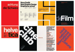
Before creating initial logo designs for W R Joyce & Company, I wanted to gain inspiration from the Weimar/ modernist design that the client was keen to feature in the updated visual identity of the company. This style of design is something I had not previously experimented with or used within any of my design work. Therefore I was quite interested in how my logo designs would turn out. Below are examples of some of my findings when searching the modernist style of design. I immediately noticed the interesting use of the sans serif typefaces and the alignment of the type. Also, this style of design commonly featured different shapes and bright and vibrant colours.
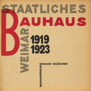
The title page of Staatliches Bauhaus in Weimar by Lazlo Moholy-Nagy
A selection of Modernist design


I also looked into the symbolic meanings behind values that would be closely associated to the work of solicitors. These included trust, loyalty, leadership and wisdom. I found that the most appropriate symbols for a logo design would be an oak tree and the Celtic symbol of a Dara knot, which are both often associated with trust. From carrying out research, I learnt that as a designer it provides you with a good starting point to base your ideas on, making them a lot more focused on the clients needs.

Transform

After my supervisor signed off the re-stated brief and I had updated the schedule from what Stephen Hickson had previously agreed with his client, I began to create logo designs. I first began creating designs using the symbols, shown below in the images. These logos were a lot more traditional in their design and did not necessarily achieve the modern and updated visual identity the client was keen to achieve.
I was also determined to experiment with creating logo designs that stuck to the weimar/ modernist style of design. This was not as daunting because of the initial research I had done on the style, I now had inspiration and ideas of what made a modernist design successful. Within each of the logo designs, I experimented with the placement of the text ‘W. R. Joyce & Co Solicitors’, colour and shapes. Below are the logos that my both my client and supervisor felt were most effective.
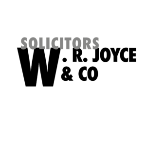
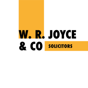
After feedback from my client and supervisor on my initial logo ideas, it was clear that the logos featuring the modernist style of design were to be the ones I would develop further and improve. I was extremely happy to hear from my client that they were ‘delighted with the progress so far’. My next step was to experiment with different typefaces within the logo designs. In terms of typeface choices, I wanted to stick to the typical modernist typefaces, which included Futura, Optima, Helvetica and Alte Haas Grotesk. Below I have included one of the logo designs, but in the different typeface choices, rather than including all of the different variations I had created.
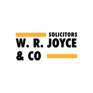
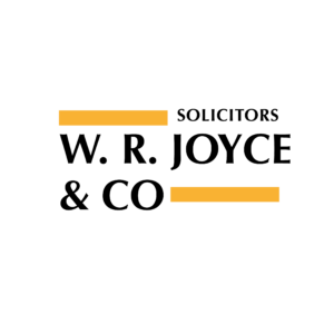
I then sent these variations of typeface choices to my client to see if he had any particular preferences. However, for a few weeks my client was unable to respond to my email because of his heavy work load. In the mean time I completed three print estimation forms using the link on my trello board, for the business cards, compliment slips and the letterheads. Geoff got back to me within a few days and I was able to send these to my client as well so he had an idea of what things may cost for a few different amounts. It was important for me to do this before any designs were finalised because the client needs to always be informed of cost as the job develops.

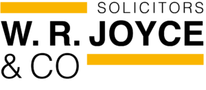
At this stage of the real job I was very aware that the original deadline has now past and was keen for the job to move forward. I made the decision to give my client a quick call to discuss the emails I had sent him, he then replied to the email the day after which was great.  I was also able to update the schedule within the restated brief. Within this email he chose the logo below as his favourite design, which uses the typeface Alte Haas Grotesk. The logo design is shown below. I was then keen to meet with my supervisor to make sure I improved the design further, before moving forward with the job.
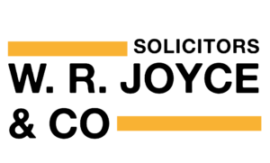
He also said he would prefer to use his local printers, who have previously printed all of his materials, rather than using DPS. This is understandable as he is based in Ireland and would not have to worry about getting the printed materials over to him. My client also mentioned that he would be happy to pay me to create the website for his company as a separate job. I was delighted at this offer as this will be my first job outside of the real job scheme and once finished it will be a great achievement.

I then talked to my supervisor about how to improve the chosen logo design further. He suggested that I tighten the spacing between some of the characters, knocking back ‘Solicitors’ so it is less dominant and exploring ways to solve the award space underneath ‘Joyce’. As well as making these changes, I also needed to make sure the logo worked on the printed materials (business card, letterhead and compliment slips).
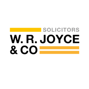
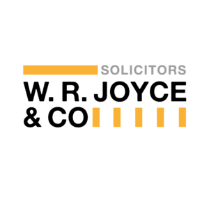
My supervisor gave me helpful advise on further ways to make the logo look much more refined and dynamic. The most important change here was changing the typeface to Helvetica. This occurred because Alte Haas Grotesk looked very messy when looking at it close up. This change was not dramatic as the typefaces are practically the same. Another important change was the inclusion of different font weights within Helvetica, emphasising the hierarchy of the different elements of the logo. My client’s response to the updated logo design was ‘the suggested change is perfect – very subtle’.  I also had a discussion with my supervisor about the benefits of the company investing in creating a spot colour for the mustard yellow/ orange colour. This would allow the colour on their printed deliverables to be much more solid and vibrant. Using a spot colour will mean that there are no white spaces between the printed ink, like there is when using the four colour process. A spot colour is something I will definitely mention to my client.
 

In addition to the logo, I created a pattern, by creating different sized blocks of colour using the text within the logo. I felt that this was an interesting way of adding to the company’s visual identity. The pattern would be a meaningful addition to the range of deliverables I will create later on. Although, it was important for me to keep in mind that the pattern should never overpower the logo within a design, it should always be a subtle addition to a design, otherwise it loses its effectiveness.


What is next?

After the 14th, I will continue with this brief by finalising the print deliverables, which include a business card, compliment slip and letterhead. I will need to ensure that the files are ‘print ready’ for my client to send to his printers in Ireland and finalised to a professional standard. In addition to this, I aim to create a guideline document for the client, which will ensure that the consistency of the brand continues in future design outcomes, especially when used by others. Furthermore, I need to make my client aware of the regulations relating to the use of a typeface, if he would prefer to continue the use of Helvetica outside of the logo design. In addition to this, I will need to discuss with him the benefits of creating a spot colour for print deliverables. This is because the colour will then print much more solid and vibrant compared to creating the colour using the 4 colour process.

What have I learnt?

Throughout the job so far I have learnt how beneficial it is to regularly show my design work to others, especially my supervisor. This is because I am constantly able to improve my designs and learn new techniques to help a design become more effective. For example how effective different font weights of a typeface can be within a logo, to break up the text and the hierarchy. I have also been able to design a logo in a style that sits out of my normal comfort zone, as the client asked for me to create a logo in a weimar/ modernist style. This taught me that I should try not to limit my design ideas; I am able to be much more versatile in my design ideas. When I have finalised the brand guidelines, I will have been able to improve my understanding and the skills involved in creating clear and precise guidelines.



Houndsley Dog Walking Branding

Restated brief

After we met with the client to discuss what they aimed to achieve, we sent them a restated brief, which was approved by both the client and our superviser.

We aimed to create a logo for a unique style of bag as part of a UK brand, which will be used by style conscious dog walkers. This logo needs to be able to adapt in size but also when it will be used on promotional material and different types of fabric in the future. The logo must work in a single colour both positive and reversed on a dark background, including being debossed onto leather.

The bag itself will be will be similar to a messenger bag, with different compartments for accessories such as treats and a lead for the dog. There will also be space for the dog owners own belongings (phone and house keys for example) The unique selling point for the bag will be the compartment for the poo bags as this will mask any odors. It is a bag that allows dog walkers to go from walking their dog, to socialising with friends in a cafe, with possible hashtags #WalkiesToWhine / #WalkiesToWine.

The target audience for this brand, are dog walkers who live in the countryside, rather than those who live in the city where bins are readily available. In addition to this, the unique and stylish bag is is aimed at those who are aged 30–60+, especially those who enjoy an upper-class lifestyle. The audience is likely to take their dog on a long walk, then head to their local pub for lunch afterwards, taking their dog with them. It is also for those who are environmentally aware and disagree with dog walkers who do not look after the countryside.


Transform

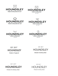
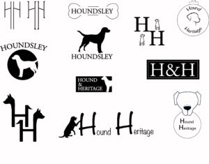
The client had not yet decided on their company name and were stuck between ‘Houndsley’ and ‘Hound Heritage’. When we created our first set of initial logo ideas, we created ideas using both of these names, as shown below.


A selection of our initial logos for Houndsley and Hound Heritage


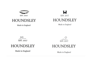
After submitting these initial ideas to our supervisor, our main feedback was to place each logo idea onto 1 page each on a PDF, making it clearer for client. We also then selected our favorite logos from the set to develop, before sending to the client for their first approval. Below displays the three logos we discussed with our supervisor.


Our feedback from our client was that they did not want an illustrative logo, but rather a “clean, mainly text” one. They liked the current Chapman bags logo, which is rather a focus on typography and a small motif above, which is not too twee and obvious.

In addition to this, the client decided to go with the name ‘Houndlsey’ because it was only one word, rather than two and also because it sounded memorable. With this decision made, it allowed us to have a clearer focus on creating logos for that name only.

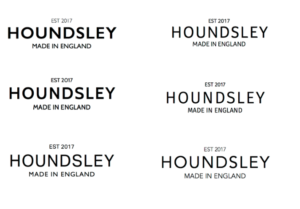
With this in mind, we focused more so on the typography and a small illustration above, (as shown below). We explored a range of serif and san serif typefaces. In the end we chose to explore mainly sans serif typefaces, such as Avenir, Aktiv Grotesk, Futura and Gill Sans. As well as this, we looked at a range of simple illustrations for the motif, we wanted something that was not too predictable but also represented the brand well.  As the clients wanted a primary focus to be the “English heritage/ Established” and “Made in England” style logo, we added these above and below ‘HOUNDSLEY’.

Typographic logos


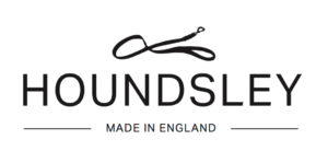
The clients narrowed down their favourite typefaces to Avenir and Aktiv Grotesk. They also decided that they liked the idea of using a dog lead as the motif. From there we were able to play with the shape of the lead, rather than just having it laid in a straight line. 


After many developments and tweaking of the logo ideas, the client decided that they preferred the typeface Avenir because the stroke was very similar to that of the heart motif.


The final logos

After developing the logo numerous times, we decided that the logo would be more of a success if we had two versions of it, one that will be used for debossing, called the ‘alternative logo’, because it has a suitable amount of space within it and has a much better structure enabling it to be clearly debossed. The other version of the logo is called the ‘regular logo’, one that will be seen as the main logo for Houndsley, used in places like the website and promotional materials. However, if the client decided to do so, the ‘alternative logo’ could be used as an option, rather than just for debossing.

The regular logo
The alternative logo


Alongside, the two main versions of the logo, we wanted to make sure that Clare and Becks had access to other variations of the logo, incase they were needed in the future. This included the logo with ‘England’ in bold and also a variation without ‘England’.


The logos with ‘England’ in bold.
The logos with no ‘England’.


We feel that the logos that we have created for our client achieves the unique, refined and sophisticated logo which we aimed to produce. As well as this, the logo is very versatile as it can be carried across many platforms, with the use of the different variations. The logo we have designed, also achieves the clients wish to relate to english heritage with the classic and clean design.


Guidelines and file package

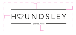
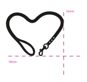
To ensure that the Houndsley logo would be used correctly in different design platforms the client chooses, we devised a set of logo guidelines. These guidelines explain the minimum size requirements for the logo itself as well as the lead motif, should that ever be used on its own. It also displays how much space must surrounded the logo when it is used.  
The diagram shows the amount of white space which should be left around the logo.
Minimum size for the motif


We also designed the logo to be placed on black or different coloured backgrounds, with the negative option for the client.

If the logo was to be placed on a coloured background, the client could use this variation.


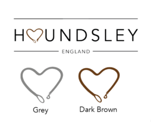
The client also mentioned as to whether there may be a coloured option, that may be used with different variations of their products. So in the guidelines explains the opportunity to add colour for the heart motif, as shown below.

The regular logo with experimentation of a coloured motif.


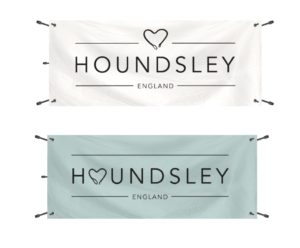
The guidelines display mockups as to how the logo and motif will appear on different textures and design platforms, and debossed on leather. As the client will sell the product at trade shows, we also displayed how the logo will appear placed on a banner, as shown below.


A mockup of how the logo could appear on banners at trade shows.


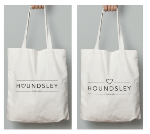
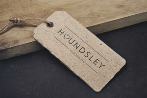
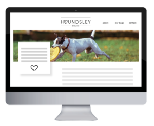
Other mockups within the guidelines includes a tag, website and dust bag, as shown below.

A mockup of a dust bag.


A mock up of a tag using the logo.
A mock up of how the logo could be used on their website.


Within the guidelines and also in conversation with the clients themselves, we needed to explain the importance of having the typeface license, if it was to be used in other material other than the logo. Currently, the client does not need to get the Avenir typeface license because we have converted the typeface to an outline in the logo and so the type is not ‘live’. However, they are aware that the typeface license will need to be purchased if they continue to use Avenir in future designs.


File package

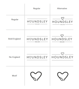
When we had finalised the logo design and the logo guidelines for the client, we needed to make sure that the client received the files in a clear and structured manner as there would be many parts to the suite of files. To make this as easy as possible for them, we gave each version of the logo its own name, rather than numbering them. Along with this, we gave them a key to help guide them when looking through the files.

This is the key we gave our clients to make sure they understood the different versions of the logo.


As well as this, we made sure that the client received PDFs and JPEGs of the logos so they were able to view them, as well as the illustrator files, which they can pass onto another designer or printer in the future. We placed each logo on its own A4 artboard, each having a width of 40mm as the height varied depending on the version of the logo. The A4 artboard enable the future designer or printer to have control over the amount of space surrounding the logo.

What did we learn?

Throughout this job, we learned that it is very important to communicate with your client and check that you are both on the same path as this allows the process to be more successful and run smoother. As well as this, we were able to learn the requirements which needed to be followed in order to create a logo which will be used in a print process such as debossing. This meant that we were able to see how two versions of the logo worked much better over different platforms.

When finalising the logos, we were able to see how important it was to make sure that the spacing of the different elements of the logo were balanced and also that the tracking of the characters were sufficient enough to be embossed onto the bag.

It was interesting to create and put together a logo guidelines as we had not yet done this before. During this, we realised how much detail and thought needed to be put into this, to make it as clear as possible for third parties to use if they took on the files. We also learned how to prepare the logo for different uses, such as placing it on different coloured backgrounds, therefore we had to ensure the logo was versatile for these platforms. Furthermore, we learned how to package the files effectively so that printers and future designers may access the files with ease.

We also learnt that it is very useful to ask others who are not part of the job to ask their opinion of the logo. This is because they are able to notice specific details that could be improved or made clearer. In conclusion, it was a very interesting learning process, to design something that will be used on a range of design platforms.

In April 2018 our client sent us photos of the finalised Houndsley bags which had been through production. As designers for the project we were so pleased to see our designs working effectively on the product, as we had always envisioned. Furthermore, the Houndsley website is now up and running with our logo as the header. It was also flattering for the client to note thank you for our design work in contribution to the Houndsley brand on their new website.


London International Development Centre (LIDC) rebrand

RJ00227 London International Development Centre (LIDC) rebrand

Designers: Fabio Rahmani and Orla O’Connell

This London International Development Centre Real Job project was assigned to Fabio during the Christmas break period, and began with initial back and forth emails with the client to discover what work needed to be done. It was decided that a re-brand was required which included work for the social media presence of the organisation, a re-designed website to improve the user experience and a new logo.

Initial meeting

For the initial meeting, Fabio travelled to London to the office of LIDC to meet with the managing director to get a better understanding of the requirements of the project and the direction that the new director had envisioned for the organisation to go towards. Fabio prepared multiple questions to gain a better understanding of the organisation and their budget. Budget turned out to not be a huge factor, although it was constantly considered within every stage of the design. Through this meeting, Fabio also found that the client wanted to approach the rebrand in a way which would portray a modern and approachable identity towards the clients target audience.

Logo

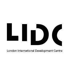
The design process of the logo involved analysing competitors brand identities, which allowed us to highlight that key features such as approachability and community. We showed the client 12 initial sketches and they decided on the fractured letters that spelled out LIDC, but also made some suggestions for changes that they would like to see. We then went on to make the changes, and add another set of variations of that logo to allow the client to decide on which style they preferred. Once the logo had been finalised, we went on to add the colours and created variations with the colours to show the client. Below shows the finalised logo design, as chosen by the client.

Communication

For a few weeks after the initial meeting, there was a lack of response from the clients end, and when a response was sent it was often not relevant to the question asked which made progressing a little difficult. This may have been due to the client not knowing exactly what they wanted. Due to the lack of communication in this time, Fabio began designing the new website with existing content on their current website due to not being supplied with a new site map or content for the new website. Through the lack of responses Fabio learned that he should not always rely on emails but should instead use phone calls to get an instant response when it’s needed.

Second meeting & Communication workshop

After a long period of silence, Fabio received an email stating that LIDC had hired a communication manager to truly find out what direction the organisation should head towards with the re-brand. The new communications manager invited Fabio to attend a workshop that she was hosting to get all the members of LIDC to voice their opinions about the way in which the brand should progress. Fabio also showcased the first iteration of the website whilst at the workshop, explaining the key features and explaining whether some ideas were feasible from a web development standpoint. Through this we learned the benefits of hosting a workshop when the client doesn’t know exactly what they want or need and it also allows direct face to face communication which is far more efficient than conversing via email.

Website design 

Initially Fabio designed the website using the copy and site map of the existing website due to not being informed about the changes that needed to be made. As the deadline approached, certain changes were made to the structure of the rebranding project such as the implementation of a communication consultant who then quickly informed me of the updated site map and written copy for the new website.

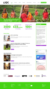
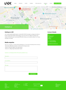
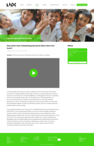
One of the main aims of the website re-design was to cut down on the content, and to create a more concise site map. The old website had a lack of colour and a very outdated theme which meant that one of our main aims was to create a modern design, that also doesn’t detract away from the information that is being displayed. We had to ensure that the design appealed to both potential research students as well as research funders. Through creating clearly labelled calls to action we aimed to allow users of any technical ability to efficiently use the website.

To make the website more friendly and approachable, the use of bright vibrant colours was used in conjunction with the use of colourful photography. We also decided to keep most the background white as it would increase the contrast of the text being set against it, allowing for increased legibility for the users of the website.


An additional Designer

After the long period of a lack of communication, LIDC requested for Fabio to create the mobile version of the website also but due to the way in which the deadline had been pushed back, this was no longer possible for Fabio so Orla was brought on to develop the mobile website following the style guidelines implemented by Fabio. We had 2 weeks to create the web designs for desktop and mobile.

Mobile design

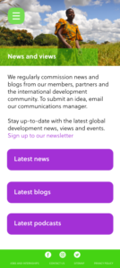
Orla had to adjust the information and the style that Fabio had created to fit the smaller canvas size of a phone. The small size of the mobile screen meant that the information needed to be broken down into smaller sections, to enable the user to read and understand the content with ease.

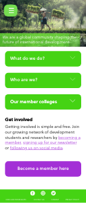
 On quite a few of the pages, the information is broken up into different sections within the app, for example shown in the three green boxes below. When the box is clicked, information is revealed, making it less overwhelming for the user, rather than the user having to read all the information in the section in one go.

An important part of any design is consistency, the mobile version of the website consistency uses the visual identity of the desktop design. At the top of each mobile screen, there is an image along with the section of the app the user is in, for example ,’About us’, ‘Contact us’ or ‘Teaching’, this helps the user when navigating through the app.

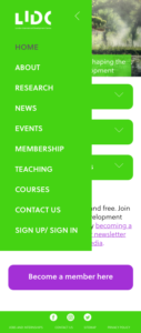
Furthermore, on each of the screens there is a burger menu in the top left corner. Once clicked, this then reveals the menu. Here the user is able to go to different sections of the website.

 A second colour is introduced on some of the mobile screens, which is also quite bright and eye catching. The purple is used for buttons that lead to another page. The addition of a second colour adds differentiation to the clickable elements of the screen, the green is mainly for sections of the screen containing information, whereas the purple buttons link to a new section.


It seems that there may have been some misunderstanding that Fabio and Orla were working on the mobile and desktop version of the website separately as the client only responded to Fabio with feedback and corrections. However, Orla was still able to use the feedback given to Fabio to make improvements to her mobile screens. From this real job, Orla learnt how important communication is between designer and client, in order to make sure both parties are on the same page. In addition to this, Orla  was able to improve her skills in being able to adapt a design, to work successfully in another format.


To conclude

The new deadline was the same time as 2 other projects and our dissertation which meant that we could not pay complete attention to this project as we had hoped during the 2-week window that we were given to complete the web designs. We were still in the process of refining the designs when we received an email stating that they wanted to take what we had done already to their web developer so he could create the website for a quick launch. They said that they liked our designs and that they would be enough for the developer to create the website from. Due to this we were not able to complete the web designs to a standard that we had hoped to achieve.

In the end, we learned that if the client is not communicating at an reasonable speed, we should do more to go out of our way to get a response such as using phone calls to get the clients attention rather than an email. We also learned about the importance of thinking about the way in which web design functions between various platforms. The workshop was also a good learning experience and is something that we will utilize if we ever have a client that doesn’t quite know what they want.

If we had more time we would have continued to develop both the desktop and mobile designs to a standard we were both happy with. Furthermore, if we were able to work on the majority of the design aspect of the job during term time, instead of the Easter break, we would have made sure to utilise supervisor feedback more effectively. During the time we worked on the brief, we made sure to meet up and discuss our designs regularly, in order to help each other improve. We also made sure to show our peers the designs we were working on, in order to gain additional feedback. Also, if we were to take this project on again we would utilise Trello more effectively as we primarily communicated our designs and process vocally whilst meeting up and showing each other the work we had done, but through using Trello we would have been able to record our progress more effectively and we would be able to refer back to it to effectively back up our design decisions and reference pivotal moments within the design process.