
Restated brief
After we met with the client to discuss what they aimed to achieve, we sent them a restated brief, which was approved by both the client and our superviser.
We aimed to create a logo for a unique style of bag as part of a UK brand, which will be used by style conscious dog walkers. This logo needs to be able to adapt in size but also when it will be used on promotional material and different types of fabric in the future. The logo must work in a single colour both positive and reversed on a dark background, including being debossed onto leather.
The bag itself will be will be similar to a messenger bag, with different compartments for accessories such as treats and a lead for the dog. There will also be space for the dog owners own belongings (phone and house keys for example) The unique selling point for the bag will be the compartment for the poo bags as this will mask any odors. It is a bag that allows dog walkers to go from walking their dog, to socialising with friends in a cafe, with possible hashtags #WalkiesToWhine / #WalkiesToWine.
The target audience for this brand, are dog walkers who live in the countryside, rather than those who live in the city where bins are readily available. In addition to this, the unique and stylish bag is is aimed at those who are aged 30–60+, especially those who enjoy an upper-class lifestyle. The audience is likely to take their dog on a long walk, then head to their local pub for lunch afterwards, taking their dog with them. It is also for those who are environmentally aware and disagree with dog walkers who do not look after the countryside.
Transform
The client had not yet decided on their company name and were stuck between ‘Houndsley’ and ‘Hound Heritage’. When we created our first set of initial logo ideas, we created ideas using both of these names, as shown below.

After submitting these initial ideas to our supervisor, our main feedback was to place each logo idea onto 1 page each on a PDF, making it clearer for client. We also then selected our favorite logos from the set to develop, before sending to the client for their first approval. Below displays the three logos we discussed with our supervisor.


Our feedback from our client was that they did not want an illustrative logo, but rather a “clean, mainly text” one. They liked the current Chapman bags logo, which is rather a focus on typography and a small motif above, which is not too twee and obvious.
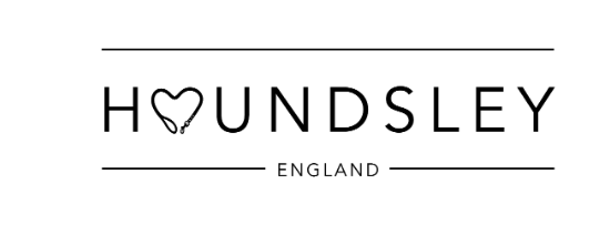
In addition to this, the client decided to go with the name ‘Houndlsey’ because it was only one word, rather than two and also because it sounded memorable. With this decision made, it allowed us to have a clearer focus on creating logos for that name only.
With this in mind, we focused more so on the typography and a small illustration above, (as shown below). We explored a range of serif and san serif typefaces. In the end we chose to explore mainly sans serif typefaces, such as Avenir, Aktiv Grotesk, Futura and Gill Sans. As well as this, we looked at a range of simple illustrations for the motif, we wanted something that was not too predictable but also represented the brand well. As the clients wanted a primary focus to be the “English heritage/ Established” and “Made in England” style logo, we added these above and below ‘HOUNDSLEY’.
Typographic logos


The clients narrowed down their favourite typefaces to Avenir and Aktiv Grotesk. They also decided that they liked the idea of using a dog lead as the motif. From there we were able to play with the shape of the lead, rather than just having it laid in a straight line.


After many developments and tweaking of the logo ideas, the client decided that they preferred the typeface Avenir because the stroke was very similar to that of the heart motif.
The final logos
After developing the logo numerous times, we decided that the logo would be more of a success if we had two versions of it, one that will be used for debossing, called the ‘alternative logo’, because it has a suitable amount of space within it and has a much better structure enabling it to be clearly debossed. The other version of the logo is called the ‘regular logo’, one that will be seen as the main logo for Houndsley, used in places like the website and promotional materials. However, if the client decided to do so, the ‘alternative logo’ could be used as an option, rather than just for debossing.


Alongside, the two main versions of the logo, we wanted to make sure that Clare and Becks had access to other variations of the logo, incase they were needed in the future. This included the logo with ‘England’ in bold and also a variation without ‘England’.


We feel that the logos that we have created for our client achieves the unique, refined and sophisticated logo which we aimed to produce. As well as this, the logo is very versatile as it can be carried across many platforms, with the use of the different variations. The logo we have designed, also achieves the clients wish to relate to english heritage with the classic and clean design.
Guidelines and file package
To ensure that the Houndsley logo would be used correctly in different design platforms the client chooses, we devised a set of logo guidelines. These guidelines explain the minimum size requirements for the logo itself as well as the lead motif, should that ever be used on its own. It also displays how much space must surrounded the logo when it is used.


We also designed the logo to be placed on black or different coloured backgrounds, with the negative option for the client.

The client also mentioned as to whether there may be a coloured option, that may be used with different variations of their products. So in the guidelines explains the opportunity to add colour for the heart motif, as shown below.

The guidelines display mockups as to how the logo and motif will appear on different textures and design platforms, and debossed on leather. As the client will sell the product at trade shows, we also displayed how the logo will appear placed on a banner, as shown below.

Other mockups within the guidelines includes a tag, website and dust bag, as shown below.


Within the guidelines and also in conversation with the clients themselves, we needed to explain the importance of having the typeface license, if it was to be used in other material other than the logo. Currently, the client does not need to get the Avenir typeface license because we have converted the typeface to an outline in the logo and so the type is not ‘live’. However, they are aware that the typeface license will need to be purchased if they continue to use Avenir in future designs.
File package
When we had finalised the logo design and the logo guidelines for the client, we needed to make sure that the client received the files in a clear and structured manner as there would be many parts to the suite of files. To make this as easy as possible for them, we gave each version of the logo its own name, rather than numbering them. Along with this, we gave them a key to help guide them when looking through the files.

As well as this, we made sure that the client received PDFs and JPEGs of the logos so they were able to view them, as well as the illustrator files, which they can pass onto another designer or printer in the future. We placed each logo on its own A4 artboard, each having a width of 40mm as the height varied depending on the version of the logo. The A4 artboard enable the future designer or printer to have control over the amount of space surrounding the logo.
What did we learn?
Throughout this job, we learned that it is very important to communicate with your client and check that you are both on the same path as this allows the process to be more successful and run smoother. As well as this, we were able to learn the requirements which needed to be followed in order to create a logo which will be used in a print process such as debossing. This meant that we were able to see how two versions of the logo worked much better over different platforms.
When finalising the logos, we were able to see how important it was to make sure that the spacing of the different elements of the logo were balanced and also that the tracking of the characters were sufficient enough to be embossed onto the bag.
It was interesting to create and put together a logo guidelines as we had not yet done this before. During this, we realised how much detail and thought needed to be put into this, to make it as clear as possible for third parties to use if they took on the files. We also learned how to prepare the logo for different uses, such as placing it on different coloured backgrounds, therefore we had to ensure the logo was versatile for these platforms. Furthermore, we learned how to package the files effectively so that printers and future designers may access the files with ease.
We also learnt that it is very useful to ask others who are not part of the job to ask their opinion of the logo. This is because they are able to notice specific details that could be improved or made clearer. In conclusion, it was a very interesting learning process, to design something that will be used on a range of design platforms.
In April 2018 our client sent us photos of the finalised Houndsley bags which had been through production. As designers for the project we were so pleased to see our designs working effectively on the product, as we had always envisioned. Furthermore, the Houndsley website is now up and running with our logo as the header. It was also flattering for the client to note thank you for our design work in contribution to the Houndsley brand on their new website.