
Restated brief
Two groups of students in Geography required logos and a simple brand system for their project. Each team was acting as a consultancy of their own and would pitch their reports in presentations to their year group at the end of term. The outputs required for both teams were a logo and Microsoft Powerpoint template. They were to reflect the professionalism of the group and represent their research areas accurately staying away from clichéd imagery.
The first team, Permadrain, wanted a logo that was simple and modern that would reflect the urban aspect of their research as well as promote the idea of sustainability. The second team, Barkham Brook Water Quality, wanted a brand system that was simple and modern relating to downstream water quality.
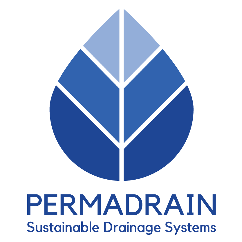
Permadrain
The design process for Permadrain saw the experimentation with the concept of the urban environment and the flow of water through the neighbourhood. I also considered different typefaces and arrangements for the logomark and type in consideration of their uses. The final logo is a leaf-water droplet with the veins of the leaf representing the pipeline of water going through the area of research.


Barkham Brook Water Quality
For Barkham Brook Water Quality, the logo is a reflection of the changing water quality as it is filtered through the purification system – the core aspect of the research focus. This is also reflected in the colour gradient that gradually lightens as it reaches the bottom. The group changed their name in the last minute, but the concept remained the same.


The slides for Barkham Brook Water Quality were much simpler than the Permadrain ones due to its “footer” quality. The graphic does not get in the way of text boxes, allowing it to remain in the same position no matter what type of slide is used.

Key takeaways
At the time of the brief, neither of the teams had names and this made it particularly difficult to create a concept or factor in the length of the name in the design. Although this was an opportunity to suggest names paired with concepts to them, the students felt that they better understood their research context and chose their own names instead.
Towards the end of the Real Job, it came to light that several groups had misunderstood the brief and the names of some groups changed last minute. This affected one of my groups, but because the logo was built on a concept based on their research (rather than relying on imagery from the original name), I was able to continue with the design process.
I also learned the difficulty of using and designing for Microsoft programmes on a Mac system. The features offered in the Windows systems were also different from the ones offered on an Apple machine. This limited my choice of typefaces and I had to consider using fonts that are readily available. Due to the rushed timeline towards the end, the Powerpoint slides I created for the groups were very basic and I did not have time to play around with the visual impact much. I also did not manage to control transitions, which might have affected the quality and coherence of the presentation (although that in itself is unknown).
As my first Real Job, and the only one I did alone, it was a good stepping-stone for future expectations working with non-designers – particularly having to keep in mind the “anything that can break will break” scenario.