Author: Caroline Teng

A to Z of Ephemera Exhibition and Website

Brief

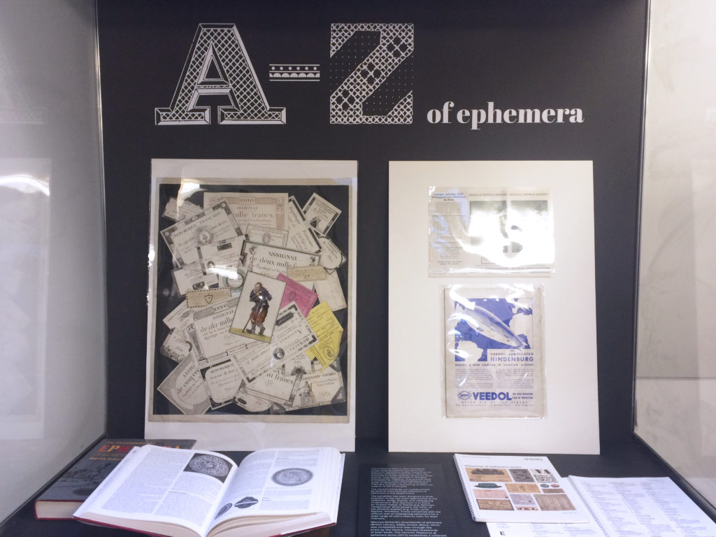
The Centre for Ephemera Studies at the Department of Typography and Graphic Communication planned an exhibition titled “A to Z of Ephemera” for their 25th anniversary. In addition to print deliverables such as posters, exhibition captions and decorative alphabet labels, the clients also wanted a simple visual system and a website to bring the ephemera to a broader audience and to create an online presence.

Deliverables

Our deliverables included high quality scans of the items, a website design, a consistency between print and online channels and assistance with setting up and design of the physical exhibition.

Initial steps

The very first stage of the project was to scan each item from the collections into an external hard drive. In order to preserve the intricate details of the objects, we had the scanning resolution set to very high (2400dpi). As a result, each scan took a minimum of five minutes up to 45 minutes to scan, process and save. Having both the A3 and A4 scanners running simultaneously really helped me completing the task much quicker. Most items were scanned in within the first three days after the project began.

Website process

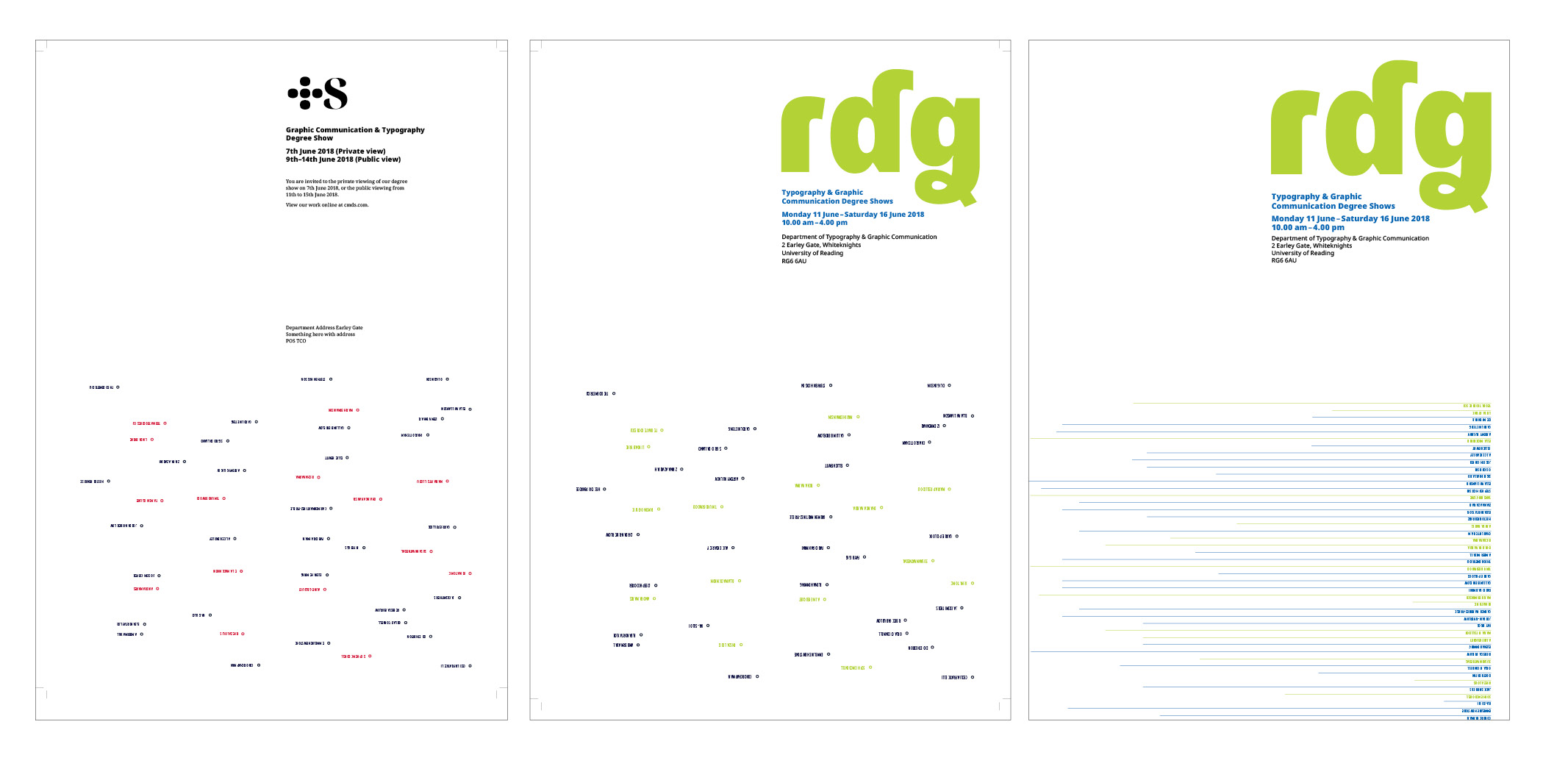
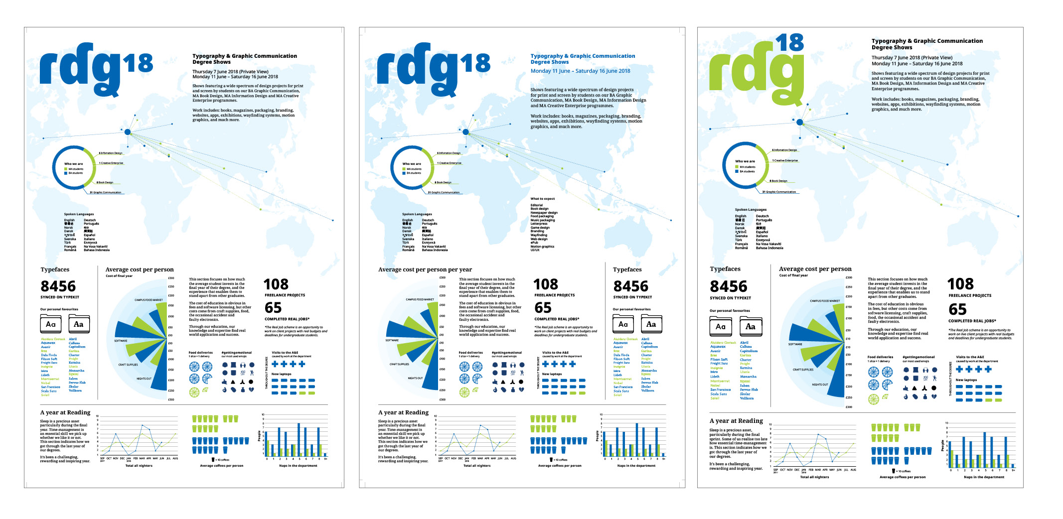
We started by researching specific platforms we could use (Cargocollective versus WordPress) and the costs that would be involved with either one. Initially we explored basic dark and light themes that had features such as “You might like” and a “highlights” section. This was partially due to the assumption that we would customise an existing template, so I was working within typical website layouts and functionalities. Caroline was introduced to Mark Barratt, who would help with the website.

We were initially using Europa as a typeface for the entire website, but later realized that the two weights it had (Light and Regular) were insufficient to support the entire website as a whole. I switched to Open Sans as it is a clean, sans-serif GoogleFont that is easy to import into the website template, which also has enough variations to differentiate the information in the exhibition.

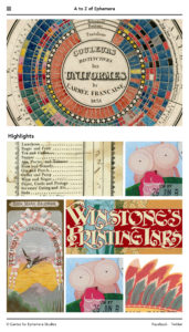
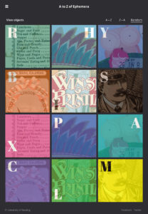
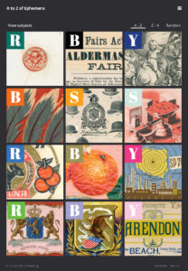
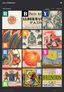
It became apparent fairly quickly after that, that a cookie-cutter template would not work for the website the client had in mind, so we started again, trying to come up with something more interactive and fun to use. We tested and mocked up the hover-states and visual appearance of the “Instagram-like” page that featured the items in an alphabetical grid. We also considered the use of decorative letters, colours (one, and many) in the website.


Using GoogleAnalytics with Mark, we decided on the full-width dimensions of the website based on the most common desktop browser sizes and also had insight into most-commonly used browser platforms.

During this time Kash also completed the bulk of the image processing and scanning – a total of nearly 200GB of data. We had also begun to think of the necessary cropping, exporting and resizing of images for the website and testing out different crops. The main challenges of this task was to make the objects on screen look as close as the ones in real life in order to give the audience an accurate impression of how the items look like in the physical exhibition. We had to take various factors into account such as the lighting of the environment and how the content would be displayed while adjusting the colour and the brightness and contrast settings as well as how these changes would look on different computer monitors.
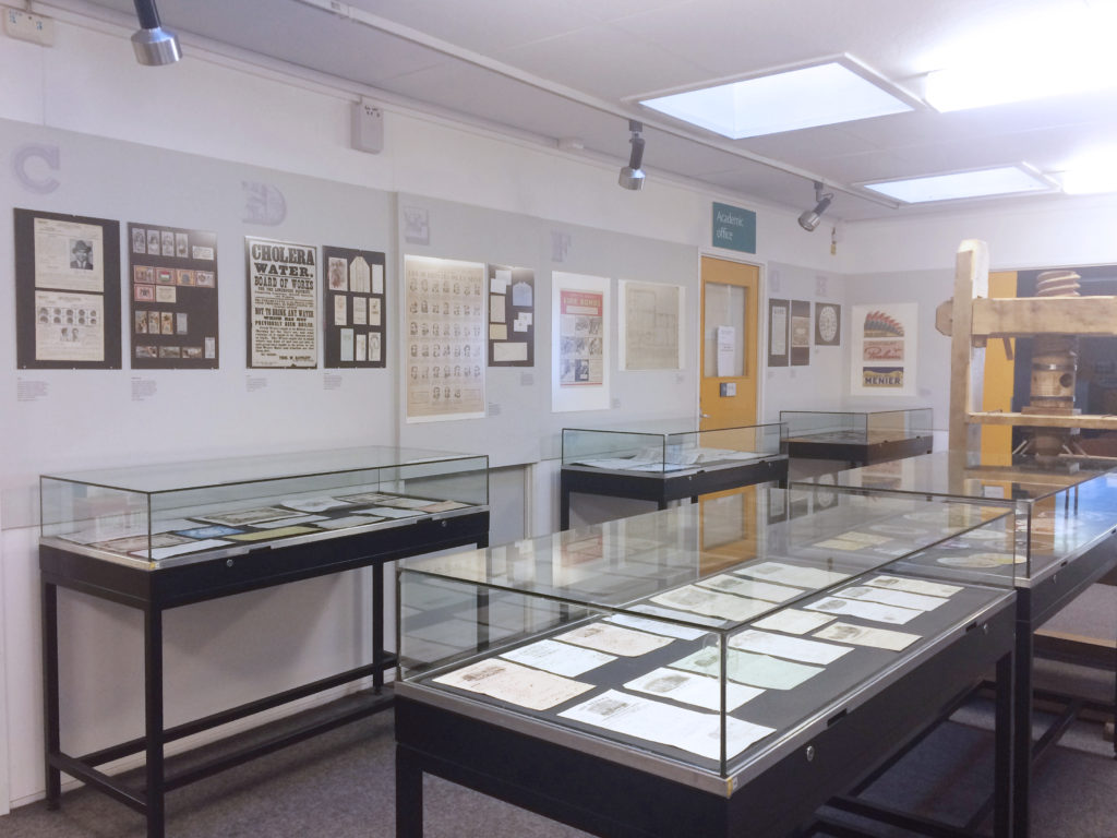
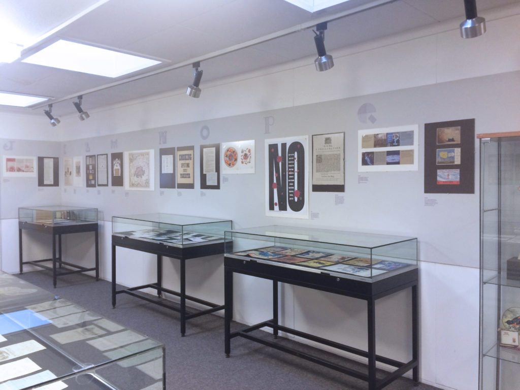
Exhibition design

Finally, both Kash and I helped with setting up the physical exhibition. We helped Michael Twyman copy edit the captions, which were still not finalized. Several last minute deliverables were added including a video for the 40-inch TV screen, an A3 welcome poster and an opening poster to be mounted onto the side of the display case (113x59cm). Our final work for these last minute deliverables were based off Kash’s ideas and initial executions, as we worked together and shared ideas.

We decided to print them on self-adhesive vinyl, which looks more aesthetically pleasing than pinning paper on the boards. We printed a grey background colour matching the boards so they would blend in with the wall. Getting the accurate colour was not as easy as it seemed. Several colour test strips were printed in order to get the closest matching colour possible.

As the initial opening date approached, the website’s functionalities were stripped down to the minimum, providing a simpler user experience. The website required final fine-tuning such as including the dimensions of the objects, changing some of the navigational features, and including the decorative letters that we had installed in the physical exhibition.

Overview of exhibition

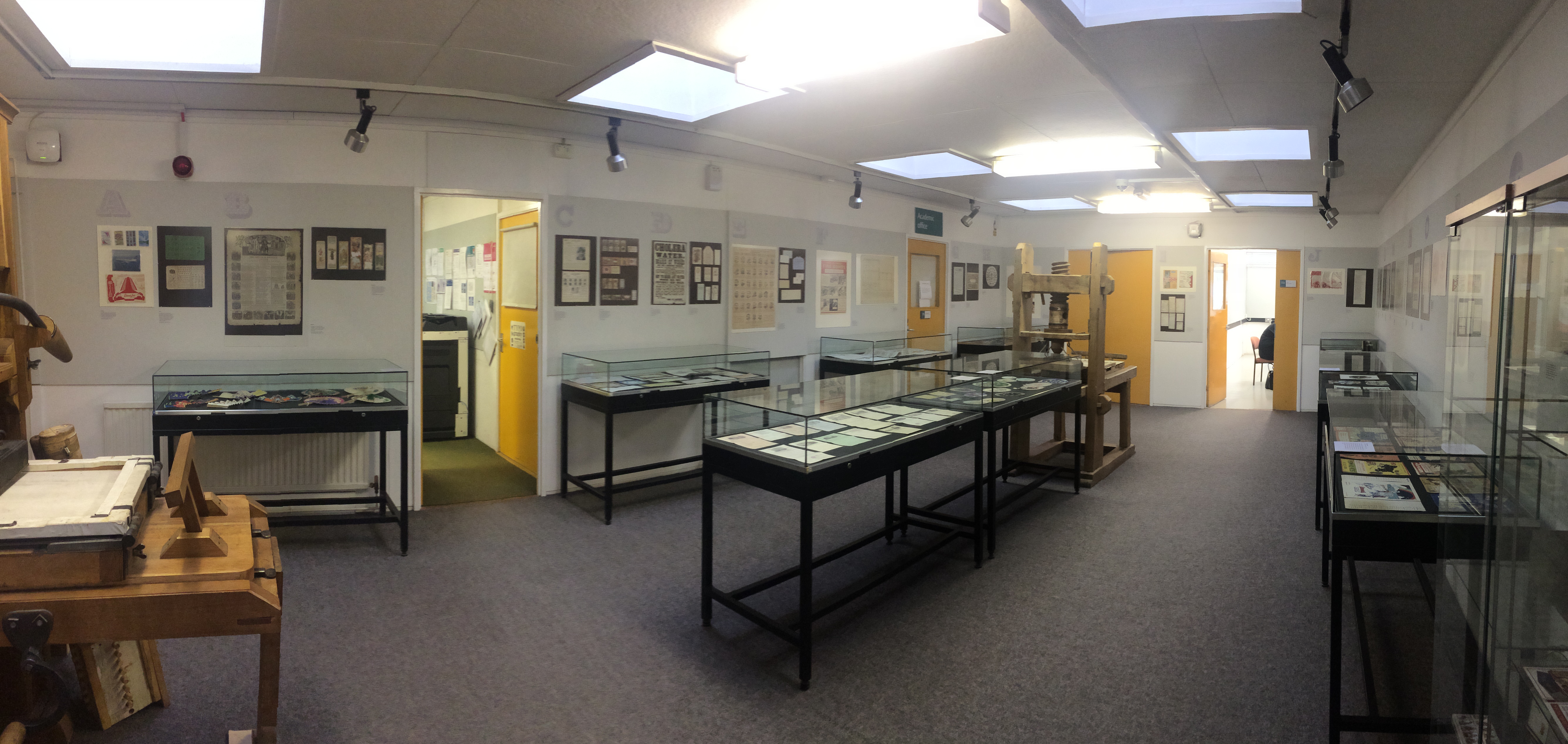
The design of the website and the physical exhibition and posters informed each other. The website determined the typefaces we used for the captions in the exhibition, the inclusion of the decorative letters in the physical display case as an opener was eventually integrated into the online experience as well.

Introductory material and context in a display case
Exhibition space in the department
Decorative letter on vinyl
Colour matched vinyl

Key takeaways

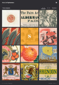
The exhibition overall was well received and the website brought a new perspective to the ephemera due to the high quality scans and the interesting crops. Additionally, the png format of images allowed us to play with the rough and imperfect edges of the items thereby bringing out the age and physical quality of the ephemera on the screen. The zoom functionality of the website also brings a new dimension to the experience that is not accessible in the physical exhibition.

Despite that, there were still several things we would like to change and correct. If we had more time, we would have come up with a new brand identity for the exhibition. The current monochrome approach does work well and consistently with the website, but it is not very effective in terms of drawing attention.

Working in a team with a partner who has significantly different focuses of the project forced us to clarify messages and think about what was really necessary for clear communication.

“I signed up to web design because I wanted to be challenged and to expand my portfolio. This Real Job was intimidating at times as I was thrown out of my comfort zone. But I am now more confident in my web design skills and communicating with a web developer. I also realize that much of my role involved communicating between the various stakeholders, while forming my own design opinions and decisions and including them into the messages at the same time. Above all, I realized that working with people who are passionate about the subject matter makes the work much easier and quicker as a whole.” – Caroline

“During the process, there were times when I felt overwhelmed by the conflicting feedback and sudden demand from the client and defeated and embarrassed by the blunders I had made. However, I believe these experiences will help me prepare for the real-life work environment where these situations would often appear. Working on a large-scale project like this one was great fun and I really enjoyed almost every second of it. It was fulfilling and rewarding and helped improve my technical and social skills in many ways. I now feel more confident of presenting ideas in front of clients and expressing my disagreement on some of the things they say. I must acknowledge the time and effort the whole team had put into this this task which led to the success of the exhibition, I would certainly not be able to achieve it all by myself.” – Kash

Wynkyn de Worde Society Material

Restated Brief

As a team of four, we have been tasked with designing the promotional material for the Wynkyn de Worde Society throughout the year. As these deliverables are being made for a creative audience, the designs should be of a high standard and something the receivers will want to keep.

The outputs we will have been involved in designing include a series of booking forms, a letterhead template, a member’s handbook and menus. Each output is sent through the post (with exception of the menu which will be presented on the day of the dinner). This project is not limited by a budget, giving us the opportunity to explore different stocks and print finishes.

Designing

Booking Forms

The booking forms are created by different people of the team. As the illustrations and visual appearance of these are very different across the series, the same typeface (De Worde) has been used to create consistency throughout the series.

July

The July booking form was themed on a summer celebratory barbecue for the society’s 60th anniversary. This was not to be mixed up with the November anniversary or the previous booking form themed as a ‘Summer Outing’.

Since most of the booking forms before this used vector artwork, we decided that using watercolour as an artwork technique would give the booking form a fresh feel and contrast to previous work. Artwork was painted and scanned and arranged in Illustrator to achieve a seamless pattern that would divide neatly along the two folds as well as have perfect cutouts for the type.

July booking form uses a gate fold – another way of differentiating forms from one another throughout the year.
Detail of inside panel for the July booking form reveals the watercolour texture.

The inside of the booking form also features a single panel of artwork that reveals the watercolour paper texture. The sizeable difference between the fruits on the inside and outside created a dynamic and fresh design for the summer barbecue.

August

The theme for the booking form was Benjamin Franklin and his time as a printer. Although extensive research about Benjamin Franklin, and his opinion on printing, was conducted it was obvious by the end of the design process just how challenging it was to visualise his numerous achievements.

The form went through a series of design iterations, and the most simple design was chosen in the end. A picture of Benjamin Franklin on the outside and some images of his printed works on the inside. The most important lesson learnt from designing this form was not to overcomplicate ideas.

This was integral to appealing to an audience with strong and varying design taste. The cropping of images, not too loosely or tightly, was important when designing the form as it helped to retain the shapes of the objects in the images, but not to compromise the structure of the layout. Editing the levels in the images made them to print well on the paper.

A change in typeface for the whole form, was appropriate for the theme and, proved that the design template we had created for the form was versatile.

The August booking form featured reversed out text

September

The September booking form was the last of the Real Job and celebrated the 60th Anniversary. This presented the challenge of differentiating it from the earlier forms whilst sticking with the existing format. The final design is a colour pencil artwork that features the current Wynkyn de Worde logo and a ‘6’, reading as ‘60’ when opened flat. The artwork was expanded on the inside panel creating a vibrant and punchy opening. This paired well with the keepsake and menu that had suns from previous years. We used two-thirds of an A4 for the last booking form due to the artwork’s dimensions, as well as the lack of content.

Colour pencil artwork that wrapped around the exterior of the booking form
2-panel design of the September booking form

Menu

The menu measures 120 x 120mm and is a single folded menu. The design incorporated four different Wynkyn de Worde suns from past events, mirroring the keepsake that guests received.

These were made into a pattern with a cutout for the print and design credits. During the design process, we experimented with different colours and sizes of the suns and also considered using spot colours for printing. However due to time constraints, the menu was digitally printed on 160gsm paper.

Keepsake

To commemorate their 60th Anniversary, the society wanted a keepsake that reflected their history as an organization. This was achieved by going through their archives and scanning unusual iterations of their sun logo and choosing twelve for an A3 poster.

The keepsake was foiled in black on watercolour 300gsm paper. The size was specially chosen as it is easy to frame.

The poster did not have size limitations, but A3 was chosen as it is an easy size to frame and the aspect ratio works best with the layout. The suns were first arranged by “mathematical” values and later visually rearranged and balanced out. We also experimented with rainbow printing and mocked this up using gradients in Illustrator. The poster was finally foiled in black on Bockingford Watercolour 300gsm by R. K. Burt and Co.

Lessons

We learned both technical skills as well as soft skills during this Real Job. We shared files amongst team members as well as with Rob, our supervisor and client, which meant learning how to work with someone else’s documents. Through this we learned the importance and efficiency of having neatly sorted and labeled paragraph/character styles.

Another aspect of this project was learning to create a design concept and layout before receiving the copy. It was sometimes necessary to create booking forms that reflected the whole theme of the event rather than a specific idea within the theme. Our audience’s taste was also a challenge as designing for an extremely design conscious audience meant that our most obvious idea was not always the one our audience would appreciate.

By the tail end of the Real Job we had set up templates for the booking forms and only changed the necessary and relevant styles with each event. However, design is never a one-size-fits-all solution and typographic details always had to be looked over and refined according to how much copy we received.

Working as a team of four with Rob as our supervisor and client also taught me that picking up on subtleties of each others’ language contributes to better communication and better process overall. After a few months of working together, we had a grasp of how everyone on the team worked and communicated as well as their particular strengths, and this helped the design process and outputs.

The rare opportunity of working with the same audience over an extended period of time also meant that we became more familiar with the things they appreciate and find interesting. This allowed us to shorten the time needed to generate ideas suited to the audience.

Generally, it was said that members of Wynkyn de Worde liked the work we had done. However, given more time to experiment with a wider variety of ideas perhaps we could have created booking forms that were even more diverse in style than what we currently have.

Barkham Brook and Permadrain branding

Restated brief

Two groups of students in Geography required logos and a simple brand system for their project. Each team was acting as a consultancy of their own and would pitch their reports in presentations to their year group at the end of term. The outputs required for both teams were a logo and Microsoft Powerpoint template. They were to reflect the professionalism of the group and represent their research areas accurately staying away from clichéd imagery.

The first team, Permadrain, wanted a logo that was simple and modern that would reflect the urban aspect of their research as well as promote the idea of sustainability. The second team, Barkham Brook Water Quality, wanted a brand system that was simple and modern relating to downstream water quality.


Permadrain

The design process for Permadrain saw the experimentation with the concept of the urban environment and the flow of water through the neighbourhood. I also considered different typefaces and arrangements for the logomark and type in consideration of their uses. The final logo is a leaf-water droplet with the veins of the leaf representing the pipeline of water going through the area of research.

Experimentations & early iterations


Final logo


Powerpoint template

Barkham Brook Water Quality

For Barkham Brook Water Quality, the logo is a reflection of the changing water quality as it is filtered through the purification system – the core aspect of the research focus. This is also reflected in the colour gradient that gradually lightens as it reaches the bottom. The group changed their name in the last minute, but the concept remained the same.

Draft logo


Final logo

The slides for Barkham Brook Water Quality were much simpler than the Permadrain ones due to its “footer” quality. The graphic does not get in the way of text boxes, allowing it to remain in the same position no matter what type of slide is used.

Presentation slide template

Key takeaways

At the time of the brief, neither of the teams had names and this made it particularly difficult to create a concept or factor in the length of the name in the design. Although this was an opportunity to suggest names paired with concepts to them, the students felt that they better understood their research context and chose their own names instead.

Towards the end of the Real Job, it came to light that several groups had misunderstood the brief and the names of some groups changed last minute. This affected one of my groups, but because the logo was built on a concept based on their research (rather than relying on imagery from the original name), I was able to continue with the design process.

I also learned the difficulty of using and designing for Microsoft programmes on a Mac system. The features offered in the Windows systems were also different from the ones offered on an Apple machine. This limited my choice of typefaces and I had to consider using fonts that are readily available. Due to the rushed timeline towards the end, the Powerpoint slides I created for the groups were very basic and I did not have time to play around with the visual impact much. I also did not manage to control transitions, which might have affected the quality and coherence of the presentation (although that in itself is unknown).

As my first Real Job, and the only one I did alone, it was a good stepping-stone for future expectations working with non-designers – particularly having to keep in mind the “anything that can break will break” scenario.

Degree Show 2018 RJ00207

Brief

The degree show is an annual display of work by the undergraduate and postgraduate students at the Department of Typography & Graphic Communication. Traditionally the MA and BA programmes would send out separate invites. However, this year the brief was to combine the shows. A print invite would be mailed and an email will also be sent out later to remind invitees of the event. Additionally, the degree show required online presence to generate buzz as well as a point of reference for students’ work – this included a website and social media campaign.

Deliverables

  1. A print invite that is in a format suitable for post and that would give incentive (in terms of content and quality of design) to come to the show
  2. An email invite created and sent via MailChimp based on the print invite
  3. A simple visual identity for the degree show, including a name
  4. A website with information on the event as well as students’ work
  5. Social media campaign/event

Schedule & Team

The degree show dates were: 7th June 2018 (Private view), 11th – 16th June 2018 (Public view).

A team was formed in early October 2017 comprising of four members: Sigrid, Callum, Emmeline and Caroline. An initial deadline for the print invite was set for end of spring term (23rd March). However, this eventually shifted a month later, to 23rd April 2018. Two weeks later the email invite would follow. The website also needed to be completed before the invites were sent out (around mid-May) and the social media campaign would start around April to build a following and awareness.

Designing

In the beginning of the project, everyone put out potential concepts and ideas for the degree show. Because the degree shows combined the MA and BA programmes (with the exception of MA Type Design), we needed a solution that would allow our work to mingle but simultaneously distinguish the MAs from the BAs. Several approaches were considered for example, typographic, abstract graphic and symbolic (using icons). During this time we also looked into past solutions from the department as well as what students from other colleges/universities had done that we enjoyed. Eventually we decided on an information design approach which would allow the flexibility of distinction between programmes, while presenting the graduating class as greater than the sum of its parts. We also wanted to include a personal quality to the invite, somehow reflecting each person’s experience of the degree, and for it to have a dual-quality of formally inviting people yet being an informal piece of information design.

Print

A3 was the format chosen for the degree show invite as we wanted it to be a poster of reasonable size that we could still mail out. Going into C5 envelopes, the degree show invite would be folded twice into A5. This influenced the design as we had to take into account the fold lines (not putting text along the folds and not using a reversed out design due to cracking ink). The print invite went through several iterations and refinement.

The degree show invite is a representation of the graduating class from the MA Information Design, MA Creative Enterprise, MA Book Design and BA Graphic Communication programmes. We created a survey to gather responses on people’s experience and thoughts on the degree, which would then feed into the design of the invite. We did extensive research on data visualisation techniques as well as approached our tutors and lecturers in the department for feedback and advice.

Degree Show draft designs

We also considered using a typeface designed by alumni from the MA Type Design programme in order to further encompass the department’s specialties. However, the incompleteness of the typeface we had access to affected our decisions and we used Googlefont’s Noto Sans for the final design.

Invite front design process showing the changing identity and approach.

The front of the invite was an opportunity for us to explore interesting reveals with the (un)folding. It was also an opportunity for us to put down the names of the graduating class as information in this space was less crucial than the inside page. We included a map to the department indicating parking availability and instructions for getting permits. This was also redrawn to match the style of the invite overall.

Our colour scheme altered as the project progressed as we moved towards the possibility of spot colour printing. This simplified our colour scheme, stripping it down to three colours – lime green, jean blue and black. Suprisingly this helped the design look more cohesive and worked for the better in the long run.

Layout refinements and experimentation
Final invite

MailChimp

The MailChimp invite had a dual function – to get invitees to opt into being emailed again next year due to a recent change in EU laws regarding information and privacy. This was the primary call to action. The secondary call to action was to RSVP to the show. We combined these call to actions as a single button.

The MailChimp invite echoed the printed invited but stripped it down significantly to provide only the essential information.

Website

The website uses the Bootstrap framework and is responsive. In keeping with the concept of the print invites, we created a randomised display of people’s works so that no one persons’ work is prioritised.

To collect people’s work, we created a submission point using php that formed a database of people’s work that gets called and displayed according to their names. This eased the process of getting students to upload their work and ensured that communication was as clear as possible between the team and students.

PHP Submission form with instructions on how to submit work, ensuring clear communication between the team and students.


Social Media Campaign

Our Instagram account was created to feature students’ work and process images of the degree show. We wanted the social media to reveal more detail about the work behind the degrees that every student completed and is suitable because of the informal nature of the platform. We also used hashtags to increase our visibility and reach.

Instagram posts to increase engagement with the degree show

Lessons

Through this Real Job, we learned the advantages of working together with team members of different strengths. Having someone on the team dedicated to the website and another person leading the print design allowed the team to focus on each deliverable. Frequent feedback sessions with different members of staff each time also allowed us to push the design further as we would get fresh eyes on the material.

However, a lengthy project that has a similar deadline to our dissertations meant that we lost stamina over the course of the project. If we did this project again, we would have avoided delaying the print job by a month and more fully exploited the possibility of printing in spot colours. This would have contributed to a more vibrant print design that people would be more likely to keep.

On the website, we also learnt that no matter how simple you try to make things, people will still upload things wrong and there needs to be leeway for extra time to fix and edit their mistakes.

Overall, this was an enjoyable project with deliverables that many of the graduating class are eager to keep for themselves. Working in a team also taught us to learn to trust each other and give each other feedback. The reception to the invites have generally been positive from both the graduating class as well as members of staff; we look forward to seeing the fruits of our labour at the final degree show.