
During the summer term of 2017, TypeTogether organised a poster competition for the Part 2 students of our department in order to showcase their new typeface. Lisbeth was designed by Louisa Fröhlich, a Typeface Design MA graduate from University of Reading, who started working on the typeface as part of the MA. When describing her typeface in a conversation with TypeTogether, she recalls:
“I always liked the idea of a stroke which has a subtle three-dimensional feel to it and which has the ability to somehow move more freely. Not to create a swashy diva, but rather to put this vividness and energy inside practical and efficient letter proportions.”
After seeing the typeface myself when the competition was first announced, it’s this subtle three dimensional feel of the typeface that inspired me and motivated me to take part in the competition and try experimenting with the letterforms to create a typographical poster using Lisbeth. The brief was simple: To create a 70cm x 44cm portrait poster as a digital output in order to showcase and promote the release of Lisbeth, while only using 3 spot colours. The primary audience of the poster would be graphic designers and the secondary would be other type users.
I was excited at the idea of the competition right away, since the brief gives us a lot of freedom on what we can produce and allows for a lot of experimenting with the typeface. As a first step, I looked into the TypeTogether foundry to research other similar posters that were created to promote and showcase other typefaces, eg. the Bree Typeface poster. The common features of all the posters I had found were their simplicity and focus on the letterforms, making sure that the typeface itself is the main element of the poster, with no other competing graphics on the posters.
Next, I looked into reading about the typeface, through the profile page of Lisbeth on TypeTogether, and the interview between the foundry and the designer when the typeface was being released. The unique features of Lisbeth come from its subtle three-dimensionality, its twisted letterforms, and the fact that it was an italic-only typeface.
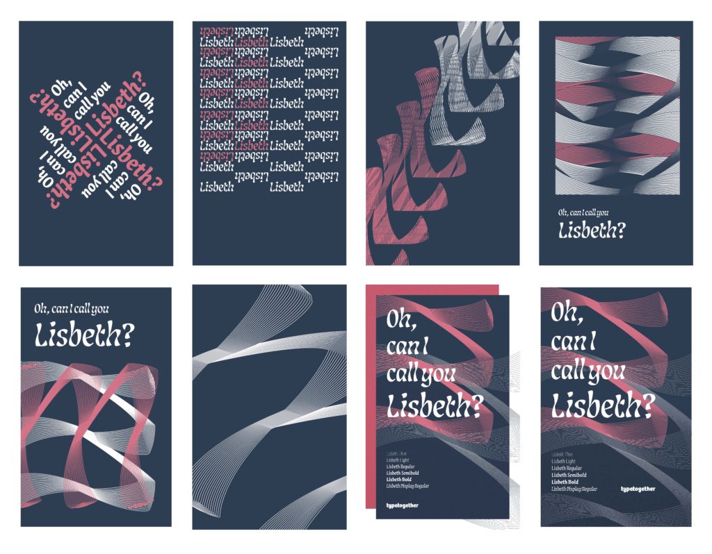
 When I first started working on the concepts of the poster, I focused on the geometry that can be created when rotating the typeface and creating a pattern out of it. While it was fitting of the brief and did a nice work in promoting the unique selling points of the typeface, I found the results to be bland and unimaginative when compared to other typeface promotional posters, in the sense that it didn’t characterise all those features that Lisbeth was described earlier. So I decided to focus on the three-dimensional feature of the typeface and try to create a graphic out of blown up characters using the display font of the type family.
I could not, nor did I wanted to, change any of the shapes of the letters in order to create a 3D graphic, so I had to find another way of really showcasing its three dimensionality. I started to experiment by using the letterforms as clipping masks in Illustrator, and fill them up with different shapes and lines, without corrupting its design, but due to the complicated and twisted characters, it was very hard to add any other elements within the type. On a second try, I started working with the idea to create a blend of a character from the typeface, in order to truly highlight its twisted shapes.
On the technical side, I had to edit the lines and anchor points of a letter, (in this case ‘M’), find all the parallel sides in the character, and try to create a blend for each part, without changing any of its shape. In order to do so, I connected 8 different parallel lines using the blend feature of Illustrator each time, and then manually had to connect each anchor point of each line, in each blend (there were about 16 inner lines for each blend), since not all the anchor points lined up exactly with each other. There are also no parallel lines on the sharp caps of the typeface, so the blend had to be made from a single anchor point, which ended up requiring a lot of editing after the blend, in order to keep the shape of the cap the same with the original letterform.
It took quite a lot of time till I had managed to create the effect out of 2 letters, “L” & “M”, chosen for no other particular reason, other than “L” was one of the easiest characters to create the effect from when trying it out, and “M” being one of the characters with the most parallel features, which really helped highlight the twisted lines of Lisbeth when blown up using this effect.
 After creating the blend of “M”, I started experimenting with the positioning of the character, taking up most of the poster. It was really easy to create an aesthetically good result due to the changing twisting lines that when viewed on a screen, can seem like they are moving when viewed in smaller sizes and higher quality. After deciding on the position of the character, I added a secondary copy of it in a parallel line below it, while also making it bigger, with thinner strokes. This allowed me to create a more subtly shown blend, on top of the main one, that helped bring out the three dimensionality of the typeface.
In order to bring out the lighter lines of pink and white against the blue background, I created a grain effect behind the lines, to increase the contrast between the colours. The pink colour created a feminine character for the typeface, but was also overpowering the dark blue background and being very clear and stout, even though the lines of the blend were only at 2pts. After deciding on the rough position of the blended characters and the colours of the poster, I started adding the main text of the poster. I created a tagline using a quote from the book The Girl with the Dragon Tattoo, as I found the characteristics of Lisbeth very similar to the protagonist of the book.
“Lisbeth. Oh, can I call you Lisbeth? I want you to help me catch a killer of women.”
The main tagline was left aligned and was positioned between the interacting arches between the two “M”, in order to make sure that the text was legible and was not hidden away behind the blended characters. Based on the grid that I created for the poster structure, I aligned the TypeTogether logo along with the various weights and styles of the typeface at the bottom of the poster.
 Overall, I am quite happy with the end result, even though when I look at it now, I can see a lot of improvements that could have been made. What I really enjoyed during the competition, was not the end result, but rather the process of creating the poster and experimenting with techniques that I wouldn’t usually get to use. The Lisbeth brief for me personally, was one of the most fun and enjoyable projects I took on during my second year and left me wanting to do more similar work in the future. Although, I do understand that such briefs come rarely, I’m hoping to take more similar work in the future. Not promoting typefaces particularly, but rather design work that allows me to use my own personal style and gives me space to try new things.
While winning the competition was a reward in itself, I was more excited about seeing my work first on the TypeTogether blog, and then days later, shared by Louisa Fröhlich herself on her personal social media account. As I haven’t produced much work outside of university so far, it was rewarding seeing my design living outside of the bubble of the university and in the real world. Only thing I can hope for is more Lisbeth poster competitions in the years after graduating.