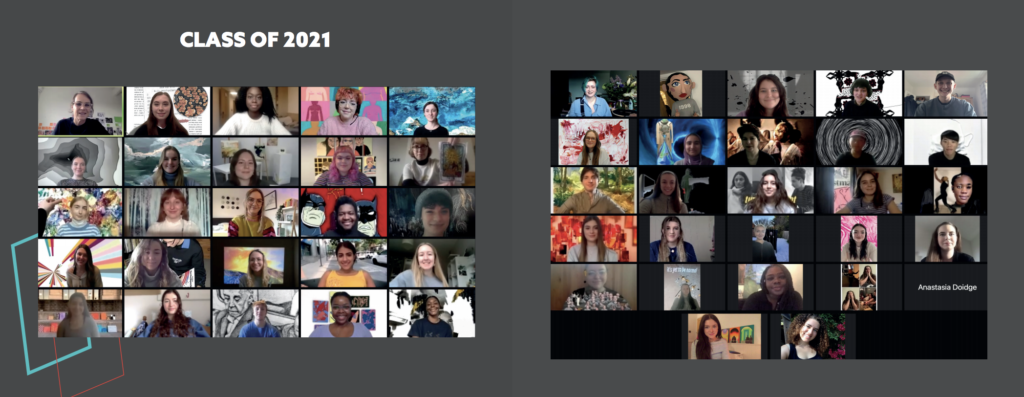
Art for Research Reading is an organisation that runs yearly to raise money for Cancer Research UK Children and Young People, by running an art competition for 4 to 14 year olds. It is reasonably newly founded, with 2019/20 being the first year of the competition. There were many entries in the first year and the aim is to get more and more as the years go on, though this has been difficult to achieve this year with Covid-19. Art for Research Reading enrols students to compete in the competition through their schools, so the advertising material targets the schools as well as the students who will compete. Every child pays a small fee to enter their work and donation to pick it up again at the end of the exhibition, so it is really important to have as many children competing as possible in order to raise the most money. I joined the committee for the year to join in with monthly meetings, and fundraising events as it is a great way to stay up to date with what is happening in the project, as well as it being rewarding to help for charity.
Unfortunately for Art For Research Reading, Covid-19 has made it difficult to gather entries for the competition, which is really what makes it successful as this is how they raise money for cancer research. The committee decided to postpone the competition from March 2021 until June 2021 so there is more time to gather more entries and organise the event. The event will now be held it online where entries are submitted and displayed through Facebook.
Deliverables
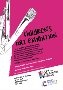
This project involved making a poster, flyer and programme to support Art for Research Reading’s 2021 children’s art competition. The poster aimed to advertise the competition and encourage children to enter work into it. This was completed in May 2020 and sent out in June, nearly a year before the closing date for entries. The flyer originally aimed to get people to come to visit the exhibition, but since the charity changed their mind to hold an online event rather than a physical one, it was more informative of how this would work. The programme contains all the information about the children’s work, judges and the charity. Despite only now having an online event, the committee still decided they wanted a programme showing information about the charity, the competition and all the entries, so that children could see their hard work and awards presented formally and it gives them the opportunity to print it out themselves. Art for Research Reading also hopes that this will encourage interest from more people in the competition for following years.
Research
Art for Research Reading already had a strong visual identity when I joined the team, which had been established by a previous University of Reading typography student. Therefore, I had a reasonably clear starting point when creating material to fit in with this.
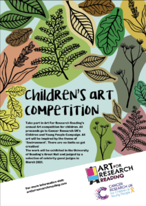
The theme for this year’s competition was the environment, so the main focus that the client wanted was for it to fit into the theme. After researching into the branding of charity events, material aimed at children and the previous year’s identity for Art for Research Reading, the client decided they wanted a child appropriate approach with clear information and bright colours, as this was the primary target audience.
The design process and development
The client was clear in wanting the target audience for all designs to be for children, 4 to 14 year olds who might enter the competition. Despite this, all entrants are enrolled to compete through their schools so all material has to go through schools and parents to encourage them to get children to enter the competition, before it even reaches the children. Therefore, the target audience is not only children but their schools and parents, with home learning being done as a result of the Covid-19 pandemic. The client was reasonably open to approaches in the design style as long as it fitted with the theme of the environment, was child friendly, and had a consistent design that could work across multiple formats to represent this years competition.
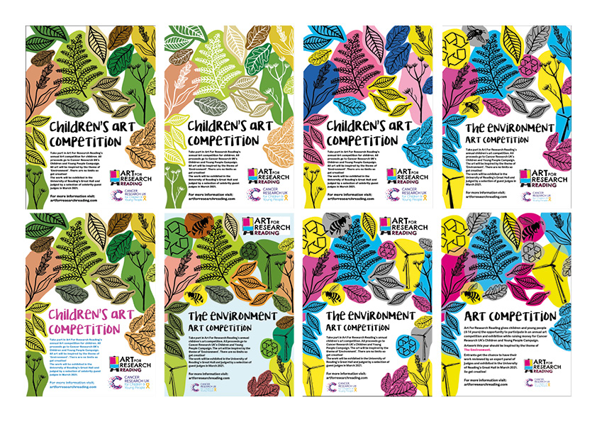
My original design clearly mimicked the previous year’s poster but including a strong environmental theme. The client fed back that they liked the illustrative style but wanted more environmental imagery to get contestants thinking about sustainability and recycling as well as nature.
Art for Research Reading competition poster from 2020Original concept ideaExamples of some experimental styles explored when looking into the identity for the 2021 competition
To follow on from this I created multiple variations with a new design in which the client could choose from. They decided they liked the brighter designs and wanted me to experiment using the colours from cancer research, pink, yellow, blue and grey. I also looked into using different features with the overlapping illustrations such as overlaying the colours and having different textures instead of block colours.
Overall the client decided that this design would be the most appropriate as the illustrative style and bright colours help appeal to a child audience, and the individual illustrative blocks can easily be conveyed to other material. This makes the design easily pliable in different contexts enforcing consistency between all the material for the 2020/21 competition, making it easily recognisable.
Communications with the client
The client was very open minded in allowing me to experiment with what would work best as an approach. Though they had clear constraints and ideas in which were to be included in the material, they were open to all my ideas. The committee have been very supportive in giving me clear feedback and were very active in the design process, allowing us to work together to figure out the approach they wanted. They have also had very clear deadlines in which everything must be done by, helping me to manage my time appropriately.
When I first began this real job, I was given the opportunity to join the Art for Research Reading committee, which I accepted. This ended up being one of the most beneficial parts of this project as not only was I able to connect with the client on a personal level but also stay up to date and contribute my ideas about fundraising and the exhibition. This has allowed me to get a full understanding of the client’s needs and the users I am working for. I also helped share my knowledge of social media and ideas to get the most contestants contributing, which was crucial for the client this year due to the exhibition being held online. Due to having a friendly and trusting relationship with the client it has meant that I have had speedy responses and excellent constructive feedback. As this is a charity everybody is there because they want to be, and the committee are always happy to help out. This has made the real job very positive and fun to be a part of.
Covid-19 restrictions
Due to Covid-19, the client made the decision to postpone the exhibition and hold it online where entries are submitted and displayed through Facebook. Despite this, they still decided they wanted a programme showing information about the charity, the competition and the entries, so that children could see their hard work and awards presented formally and it gives them the opportunity to print it out themselves. They also hope that this will encourage more people to be interested in the competition for following years. The committee decided to postpone the competition from March until June so there is more time to gather more entries and organise the event online. Because this is past the real job deadline, I have created a programme template using the text and information from last year’s competition and will continue to work with them after the real job deadline to create a programme with the up to date information on time for the online exhibition in June.
Conclusion
Overall, I have found this project to be very rewarding. The support from the client has meant it has been really enjoyable and I have gained valuable skills in sticking to very short deadlines, where the client needs something to be completed within a few days, as well as very long ones, where I have six months or so before something needs to be completed. There have been moments in this project where no design work needs to be done but in this time I have continued to attend committee meetings to support with the development of the competition.
In their second term, Part 1 students take on a website project where they are given the logos and brand guidelines in order to help them concentrate on the UX aspect of the project. The brief for this real job required two sets of brand guidelines for local businesses to be created to be used in the Part 1 project. This was a hypothetical rebrand and the businesses included Berkshire Black Business, Readifood, Mobility Trust, and The Mustard Tree. We were allocated one business and were then able to choose the second business we created guidelines for. For each rebrand a colour, white, and black logo had to be created alongside a choice of typefaces and colours. The aim of this job was to create realistic brand guidelines that were suitable for use on a mobile website. This project had a very quick turnaround of two weeks as well as tight deadlines for feedback within this period of time.
To allow this job to progress quickly, all communications were made over email and although research was required, there was no call for a trello board to track progress. The requirements for the job included deliverables of:
Item 1 Brand guidelines on given template for allocated business Item 2 AI or EPS files for logo versions for allocated business (black, white-out, and full colour) Item 3 Brand guidelines on given template for chosen business Item 4 AI or EPS files for logo versions for chosen business (black, white-out, and full colour)
Process
Research
Although this job had a tight deadline, it was crucial that the research phase was not ignored. The job required research into the rebranding process of a major branding company and also research into the business that we would be rebranding. From this research it was clear that the logos needed to be easily scalable so thin strokes could not be used as they would become very thin when scaled up. The logos also had to be uncomplicated as they would be seen at a small size on mobile platforms. Researching into rebranding processes also gave insight into how elements of an old brand can be pulled out and made to work with the new brand whilst also keeping some recognisable traits of the original branding. I was required to design the brand guidelines for Mobility Trust and after researching the other businesses I also chose to rebrand ReadiFood as my chosen business. Mobility Trust is a charity that provides funding for mobility equipment and ReadiFood is a food bank run by Faith Christian Group.
Design
After completing research and having a plan for how I would move forward with the project quickly, I began sketching ideas for the logo. Although there was a tight turnaround for this job, I still felt it important to first complete sketches by hand before moving into Adobe Illustrator. This allowed for more ideas to be quickly sketched which was less time consuming than drawing them in Illustrator first. Doing this also meant that only the strongest logo ideas would be developed in Illustrator which, again, sped up the designing process. The aim for the Mobility Trust logo was to incorporate a vector wheelchair graphic with the name ‘Mobility Trust’ and create a clean, professional logo that would be trusted by the users of the business. The ReadiFood was able to use softer elements than Mobility Trust due to the caring nature of a foodbank in comparison to a charity funding for expensive equipment.
Mobility Trust logo sketchesReadiFood logo sketches
I pulled these sketches into Illustrator and began to draw the strongest ideas that would work well at the smaller size required for mobile websites. These ideas were presented for feedback and the logos that had the most potential were carried forward to begin working more thoroughly on the type that accompanied them.
Mobility Trust logo ideasReadiFood logo ideas
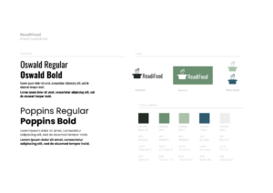
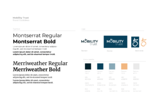
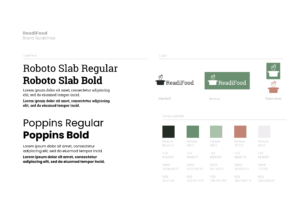
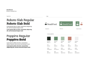
As this project had to be completed quickly, only one logo for each business was chosen to be developed further. Type was explored to see how effectively it could work with each logo. At this stage, colour combinations were also carefully tested and thought about. To match the serious funding side of Mobility Trust the use of blue was deemed appropriate but incorporated in this, a bright accent colour that could be used for call to action elements on a website. The colour choices for ReadiFood were chosen to use natural, warm tones that matched the nurturing aspect of the brand and created a caring feel.
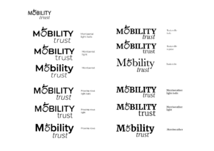
Mobility Trust type experimentsReadiFood type experimentsMobility Trust colour choicesReadiFood colour choicesSelected colour ways for Mobility Trust and ReadiFood
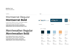
These ideas were presented for feedback using brand guidelines template. At this stage, an accompanying typeface had been chosen for each business using guidance from articles that discuss suitable typeface combinations for use on websites. The typeface choices of Merriweather and Montserrat for Mobility Trust worked well with each other and were versatile with many font weights. Merriweather can be used as a display or body text typeface and they also adequately complement each other as one is a serif and the other is a sans serif.
The colours for Mobility Trust worked well but the dark blue initially chosen for ReadiFood was quite dull and did not stand out compared to the green tones also chosen.Oswald and Poppins were originally chosen for ReadiFood, but the two sans serif typefaces did not allow for much contrast when used on a website.
Initial ReadiFood guidelines
Following this, the ReadiFood guidelines were changed to use a muted red/light burgundy which contrasted well with the green and also worked well with the caring, soft feel that was intended when creating the logo. Roboto Slab was chosen in place of Oswald as it still complemented Poppins but provided a serif typeface for the guidelines and suited the style of the finished logo as previously the condensed look of Oswald sat slightly uncomfortably with the pot used in the logo.
Mobility Trust guidelinesReadiFood guidelines
Feedback
Unfortunately, my guidelines were not chosen by any of the current Part 1s to use for their websites. However, I received some general feedback from them and what they experienced when using brand guidelines created in past years. The general comments were that they chose to use guidelines based on their imagined suitability with the topic, such as pinks for a florist. They also found that it was useful having five colours that worked together well but also provided some contrast. An issue that also arose for a few of the students was logos having multiple layers or using thin strokes that did not size up correctly. This made it difficult for them to use as they had to edit the logos and try and fix them before they could be used.
Developments
I was able to develop my logos from the feedback provided to tidy them up and ensure that they worked better for their intended purpose. This included making the pot logo more balanced for the ReadiFood logo and ensuring that the steam rising from it was not too thin. The pot was previously very dominating and sat awkwardly next to the type. To correct this, I scaled the pot down and also edited the pot handles to allow the logo to feel more balanced. I made the rising steam into a more obvious heart shape as although this was a subtle feature it did not stand out clearly enough. I also ensured that the strokes for these were outlined to make them a shape which allows the logo to be resized without affecting the weight of the strokes of the steam, allowing it to be more adaptable.
ReadiFood developed guidelines
The Mobility Trust logo received good feedback but I refined the use of the wheelchair wheel as the ‘O’ in Mobility to make it fit the shape of the ‘O’ in the typeface more accurately which allows it to sit more comfortably in place of the ‘O’. This also prompted rotating the person using the wheelchair in the logo to make them more fluent with the direction of the ‘O’ and the logo. I also slightly changed the tone of the light blue used to make it brighter. This contrasted better with the darker blues and was not as dull as the original blue. Another issue that arose was the logo being too deep to work effectively on a mobile format. This was solved easily by moving the ‘trust’ up next to ‘Mobility’ in the logo instead of below to create a long logo but one that was more suitable to fit mobile formats.
Original vs new logoNew logo matches shape of ‘O’ from typefaceMobility Trust developed guidelines
Guidelines In use
Although my guidelines were not used by the Part 1s, I used the colour scheme and one of the typeface choices for my own web project. I found that the orange worked really well as a contrasting colour and the dark blue was a really strong background colour that worked effectively with the off-white text colour. I did have to change the light blue that was first chosen to a lighter blue which is shown in the developed guidelines. The previous light blue was too grey and originally made the design feel boring as it blended in too much. Choosing a brighter, more sky blue elevated the design and created a lighter, more upbeat feel.
Use of Mobility Trust colour way on project unrelated to the job
Reflection
The quick turnaround for this project did create some limitations to exploring and refining the designs. However, it also made me really focus on the project to ensure that I achieved a well thought through design process even in a short amount of time. I was unsure at first how I would manage to complete adequate research and come up with a variety of ideas in such a short timeframe but, although very fast-paced, I realised it was more than possible as I was able to do this whilst also completing work for other projects.
I found it difficult to choose colours without being able to see them used in practice and this was a limitation to the amount of time we had to complete the guidelines. If the timeframe was longer, it would have been really beneficial to experiment with different colour ways on a website mock-up to see how they would work together and complement each other. This was something I found when using the Mobility Trust guideline colours, myself and is a factor that I will definitely consider when designing in the future. Being able to refine the logos after the deadline was beneficial as it allowed me to look at them with a fresh perspective. I found that tweaking the smallest aspects, such as making the Mobility Trust wheelchair logo more round to fit the typeface, allowed the design to look more thought through and therefore work more effectively.
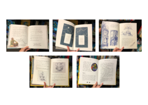
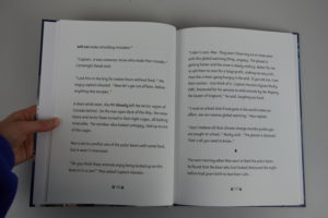
Whilst in Covid-19 lockdown, the client wrote an illustrated children’s book aimed at 6–9-year-old children where all profits will go to Heads Up, a mental health charity, and the WWF. The requirement for the job was to design the layout of the book and make suitable typographic decisions based on the audience and content of the book. The book needed to integrate illustrations with the text in a fun and exciting way to make the book attractive to children.
Restated brief
The aim of this project was to typeset a children’s book which meant a variety of different considerations had to be taken in order to provide a book that would be appropriate for children. The initial brief was to create the text files for a 203x254mm full colour printed book and also an e-book. The client had also asked for some aid with the cover design. Although the book was to be printed, the client knew that they would be researching into this themselves and although they would need some help to ensure the files were appropriate, there were no production arrangements that had to be made as part of this job. However, the client did require different file types for both physical printing and also e-book text files.
Target audience
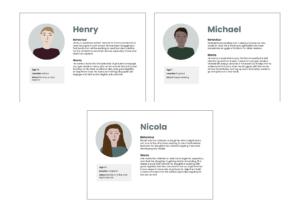
Children aged 6–9 years old were the target audience for this job and therefore the book had to be formatted to suit the reading ability of this age group and also include typographic detail that would be appropriate but also create some excitement for the audience. Although the book was aimed at younger children, the user personas represented those that may be buying the book for the children as this would often be parents or adults. Therefore, the book needed to be liked and deemed appropriate to aid reading for children by parents and adults that would be buying the book for a child. This is reflected in the user personas created.
User personas
New restated brief
The original brief asked for the book to be typeset and files suitable for print and use on e-books to be provided as well as some assistance with the book cover design. However, the client’s ambition for their project changed throughout the job and with this came the need for the book to be marketed in French as well as English. The deliverables for the job therefore required both English and French print ready text files as well as English and French e-book files.
Schedule
The original competition date was due to be in mid-September 2020, but this was more of an aim date as the client was quite flexible. The research and initial designing phase took longer than expected due to the job starting in the summer and therefore prior commitments getting in the way of being able to progress the project quickly. This meant the completion date was pushed back to the end of October. By October all design work had been signed off and both the client and supervisor of this job were happy with the outcomes. However, the original text files that had been handed over from the client turned out to be only a draft copy and needed to be proofread. Therefore, a lot of changes had to be made and the text had to be reformatted each time as large pieces of the copy had been changed and edited. This took a lot of extra time that had not be scheduled in which therefore pushed back the completion date even further. The client was continually sending updated copies of the text files and, learning from past mistakes and in order to save myself time, I requested that they highlight any changes in a different colour. This made it much easier to change the text quickly and meant that the text did not have to be reformatted each time as it was a new file.
Along with changes to the copy and also formatting a French version of the book, the completion date was pushed back to mid-December and finished print-ready files were handed over before this. However, the client required assistance with uploading the text files to Amazon as both a paperback and e-books which took time as it was more difficult than originally expected. This meant that the job was not complete until February 2021 as the client required assistance with making the books available online, despite all design work and files being completely finished by the end of November 2020.
Process
Contact with the client
Due to the covid-19 pandemic, the client was contacted over video call. This method was also used for future meetings with the client which did allow for easy discussion as files could be shared and worked on whilst on the call.
Research
Although I had worked on editorial books before, research into children’s book typography was very important in order to create pages that were attractive and accessible for children. Fortunately, shops were open at the time of research so WHSmith and Waterstone’s were visited to look at competitor books and also get an idea of the features that children’s books include that previous editorial projects would not have used. From this research it was clear that large typefaces with loose leading was very common which allows for easy legibility for children. ‘Fairytale’ style books were also researched as this is what the client wanted their book to be marketed as. These use a larger format and therefore allow for the illustrations to be seen and appreciated more. A lot of the books researched used interesting ornamental flourishes which created more excitement for children and is therefore something that was considered when designing the pages of the book.
Children’s book researchChildren’s fairytale book research
Trello board
As this was a one-person job, I did find it difficult to keep up with the trello board. On previous jobs, where work was done as a team, it was easier to keep the trello board updated regularly as it was an easy platform to share files and keep on track of the job with each other. However, working individually meant that it was more convenient to email the supervisor directly with files. All research was completed and shown to the supervisor as well as progress throughout the project but were not uploaded to trello in a very timely manner. It is acknowledged that this is not the most effective way of working but files and progress were shared throughout and kept organised.
Initial designs
The story of this book has a target audience of 6–9-year-olds and therefore the typography needed to be considered in relation to this. As well as looking at other children’s books for this age range research was also carried out and a ‘Typography for Children’ article by Ilene Strizver was read to gain a better understanding of typography for children (Strizver, www.fonts.com). The inclusion and integration of the illustrations with the text was also something that needed to be carefully considered to ensure a sense of cohesion with the text throughout the book. The client had commissioned an illustrator to bring the story of the book to life and as the job began, some of these had already been completed. As the illustrations were high quality the typography needed to match this to present the text in a fun and intriguing way that also represented the sense of mystery created from the story.
The format for the book was decided to be 203x254mm as this was just smaller than A4 and suited the ‘fairytale’ style that the client required. This format worked well with the illustrations and also allowed an appropriate body of text to sit comfortably at a large size.
Type
Initially, typefaces that had the characteristics explained in the article mentioned above were explored and tested. However, the client requested that ‘Sassoon Primary’ was used for the book. Unfortunately, this typeface had to be paid for and after explaining to the client that this would come at an extra cost, more research was conducted to choose a similar typeface that would still be appropriate. An article from indesignskills.com was read but a lot of the recommended typefaces were more display based and not what the client desired. After discussion with the supervisor, Sue Walker was contacted, and permission was given to use the typeface Fabula that she had created as part of a study into the suitability of children’s typography. This typeface was approved by the client and worked well with the book as it has similar features to Sassoon Primary and is specifically created to aid children’s legibility.
Fabula typeface example
Fabula was used at 15pt on 28pt leading as this is a recommended type size for children’s books for the target age. These sizes were found to be appropriate from the research and also research conducted by the client who was aware that the type needed to be much larger for children. The type also used 28pt spacing between each paragraph instead of indents as this allows for better legibility for children and is therefore accessible for the target audience.
Example of type set in Fabula
Images and text
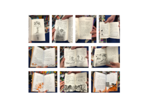
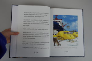
The initial illustrations that I had been given had defined edges that meant that unless they sat on their own on one page, they did not sit well with the text, especially as they were all portraits. Experiments were made to give an idea for vignette edges, similar to some of the illustrations which did not have defined edges and sat more comfortably with the text. Unfortunately, as I was having to communicate with the illustrator through the client, my ideas were not taken forward, but the client was happy for the portrait illustrations with defined edges to be used at full page which allowed them to sit easily alongside the text on a spread.
During the designing stage of the text formatting, the illustrations were still being drawn so although I had designed the spreads to use full page portrait images, I received illustrations that varied in their format. Some did not have full backgrounds so blended into the page more and others were landscape with an attempted vignette blurred edge. These did not fit with the agreed format and could not be changed due to the illustrator’s time restraints. Fortunately, the illustrations with no background sat happily underneath the text taking up half a page and this did not combat the design. However, the landscape illustrations had the blurred edge taken off them as this did not match the rest of the illustrations and although they did not sit as comfortably below the text, this was where they suited the format the most. The client signed off these decisions and was happy with their placement, so although not the most desired format for the illustrations it was how the client had imagined the book format to look.
Experimenting with format of illustrations
Whilst proofreading changes were coming in from the client, they also requested that the illustrations used captions. Research conducted earlier in the process suggested that this was not a usual occurrence for children’s books, but the client felt it would aid the reading journey for the audience and ensure that the illustrations linked to the correct element of the story. As all the illustrations sat at the bottom of the pages, the captions were easy to incorporate but only where they were one line long as otherwise the size of the illustration was compromised which was not desirable. Some of the captions were very long and also repeated some of the story which was not necessary and therefore were acting as more than just an image caption. The client agreed that they could be shortened, and this was an easy fix, though did take some back-and-forth correspondence where some captions needed more words taken out than others to ensure they sat comfortably on one line.
Different format of illustrationsFull-page illustration
Folios and section breaks
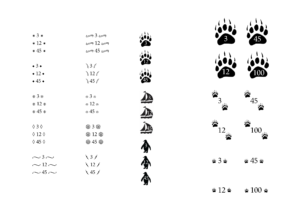
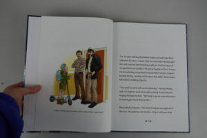
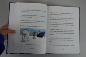
When researching children’s books, many of them used interesting elements such as small illustrations or ornamental flourishes to dress the folios. Usually this is uncommon in a normal editorial book or novel so it was definitely something that needed to be explored as adding extra elements would fit in well with this heavily illustrated book. Different types of flourishes and small illustrations were tested to see which would be most appropriate. Ornamental flourishes were used in some children’s books found in the research but for this particular book illustrations that matched the images were deemed to be more appropriate. As the book is about arctic animals and boats, these types of illustration were mocked up around one, two, and three-digit page numbers to see how they would work best. It was deemed that the polar paw print was most appropriate and suited the purpose most effectively as it related to the story and was not too complex to be seen at small sizes. It also wasn’t too dark and did not distract from the rest of the text.
Folio experiments
Instead of using chapters, the book used section breaks initially indicated using an asterisk. However, after finding appropriate illustrations to be used alongside the page numbers, it was appropriate to use another related illustration to indicate a new section within the text. The penguin was chosen as again, it related well to the story and created a fun section indication for children to notice and link to the story. At first these were made too large and fought with the text. Downsizing these to a similar size as used for the folios made them more appropriate and sit much more comfortably to be noticed in the text without attracting too much unneeded attention.
Section break development
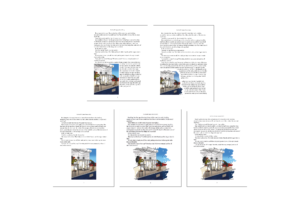
Production
The client knew from the beginning of the job that they would be sourcing their own printer and all that needed to be provided were print ready files. However, as they were on a tight budget and any profits from the book were going to support charity, the printers that were chosen only printed a limited number of formats. Unfortunately, the originally agreed 203x254mm format was not able to be used and so the book had to be changed to 203x276mm. This was not ideal, but fortunately easy to change as the margins were made slightly longer in order to fill the extra space. Although an easy fix, this still took some time to get right as the book had to be redesigned in some places which meant that the already pushed back competition date had to be made even later than originally expected.
The original job had requested for aid with the cover design. However, the illustrator took charge of this as it was deemed most appropriate as the illustration style used in the book correlated to the cover. The illustrator sent over the files that I then assembled in InDesign; however, this incurred issues with sizing, especially as the book format had to be changed very close to the deadline. Fortunately, these issues were resolved easily after contacting the illustrator directly to ensure that the size of the files were exactly correct.
French copy
Halfway through the job, the client decided for the book to also be formatted in French, as the hero of the story lives in Paris. All typographic and design decisions had already been made so this was not too much extra work to take on. However, it did involve formatting the text and ensuring that section breaks were in the correct places and also that the text matched up with the illustrations shown on the corresponding pages. This was a challenge as I do not know any French, fortunately, the translator was able to provide some notes in English on the text file to signal where particular images needed to be placed to ensure that they would be on the correct pages. Like the English copy, the French also went through many iterations and small changes which took time as they had to be sent to the client who sent them on to the translator and back again. Although this was a challenge, it was very interesting, and some valuable skills were gained as it is very different formatting French text than the usual English. It also meant that communication had to be kept on top of to ensure the correct changes were being made and any queries were clearly stated so they could be passed on via the client.
E-book
Part of the job was to create print ready files but also files suitable to be uploaded as an e-book. This involved some research using LinkedIn Learning courses and also some testing but was not too complex. There are two formats of e-book which are reflowable layout and fixed layout. The fixed layout worked for this book as there are a blot of illustrations that have to stay in certain places in the book in order to correlate to the correct part of the story. A reflowable layout was tested but this completely reorganised the format and did not work. The e-book files were created and tested on the Amazon Kindle Preview app. It was also ensured that the colour space of all the illustrations was changed from CMYK in the print appropriate files to RGB which is used for screens.
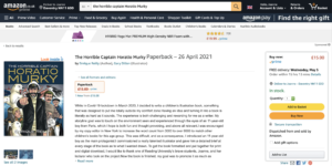
Amazon book
As the e-book files had been created as EPUBs they were easily uploaded to Amazon by the client, but Amazon also provides a service where the book can be bought by the reader and printed from Amazon which is a cheap alternative to using a printer and distributing the books in bookshops. Therefore, as the book profits go to charity, this was a suitable method for the client to sell the book. Due to the nature of this process and similarly to the printers that the client had chosen, they only printed certain book formats. Unfortunately, the new format of 203x276mm was not available but the original format 203x254mm was which meant no changes had to be made as the files were also up to date in this size as well. For consistency, this is not ideal but due to cost limitations it was convenient for the client who approved both sizes being used. Part of the challenge of uploading the print files to amazon included ensuring that the correct ISBN number was on the correct book as different numbers had been used for both the English and French printed texts and also the English and French Amazon texts. This meant thorough checks had to be made before uploading and confirming the files to be printed. The real problem came with uploading the cover files which had specific requirements in relation to bleed and print area. This took a lot of trial and error and also required the illustrator to edit the cover and move elements where the barcode had to be added with no control over its placement. Eventually, using the specific requirements for the file, this was rectified.
The client has limited technical ability, so screen recordings were made to aid them upload the correct files and use the correct settings to ensure that the upload process was easy and uncomplicated for them. At a later date, the client also decided to upload the book to Barnes and Noble. The process was very similar and the files that were made suitable for Amazon were also correct for Barnes and Noble too which meant a seamless uploading process.
Book available to purchase on Amazon
Final designs
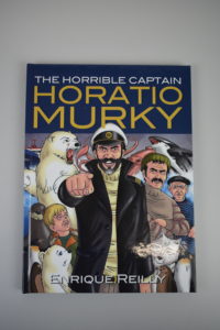
These are some example spreads in the book shown on screen and in print. The cover of the book is not any of my own artwork and the only role I played was assembling the separate front, back, and spine files from the illustrator into one file in InDesign.
Book cover
Reflection
Although this was my third real job, it was the first one that I had completed on my own. There were positives and negatives to being an individual on a job. I found that it was much easier to develop designs quickly as my supervisor was my main point of consultation. However, where I lacked creativity and struggled to think of new ideas there was no one else who knew the project that I could discuss developments with which is a beneficial factor of working in a team. The use of the trello board for this job also suffered as I did not need to share my ideas with anyone but my supervisor and client which was more convenient to do over email. Although my files were organised, it would have been easier to keep up to date and show progression with regular uploads to the trello board.
Formatting text for books was something I was familiar with, but this was not editorial, but a novel so required different types of typography. The target audience was also children which meant that many different factors had to be considered that do not have to be as crucially correct in a book formatted for adult reading, such as specific type legibility, size and leading. This job allowed for some creativity with the illustrated folios and a lot of new skills were also learnt. Specifically, communicating with those other than the client such as the illustrator and the translator which meant any questions had to be carefully related through the client and emails had to be constantly kept on top of.
This was my first experience of working with printers and also printing platforms and e-books. The e-books presented less of a challenge than I had expected but uploading the book to Amazon and also experiencing constraints with format size was something I had not expected. Fortunately, these issues were resolved without many additional problems, but they did take more time than expected. For this reason, it was fortunate that the client understood that these problems were unavoidable and was able to be flexible with the completion date.
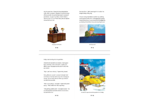
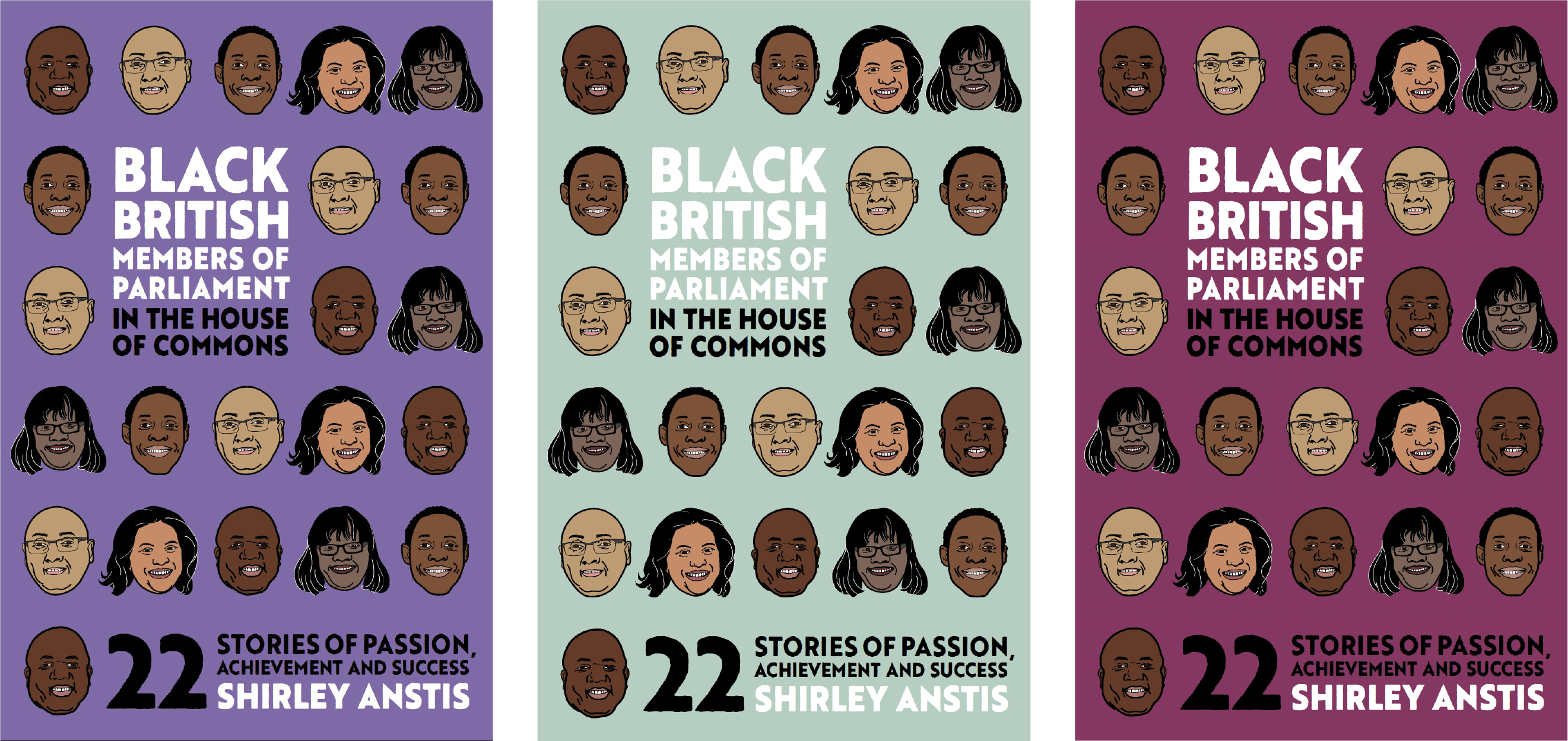
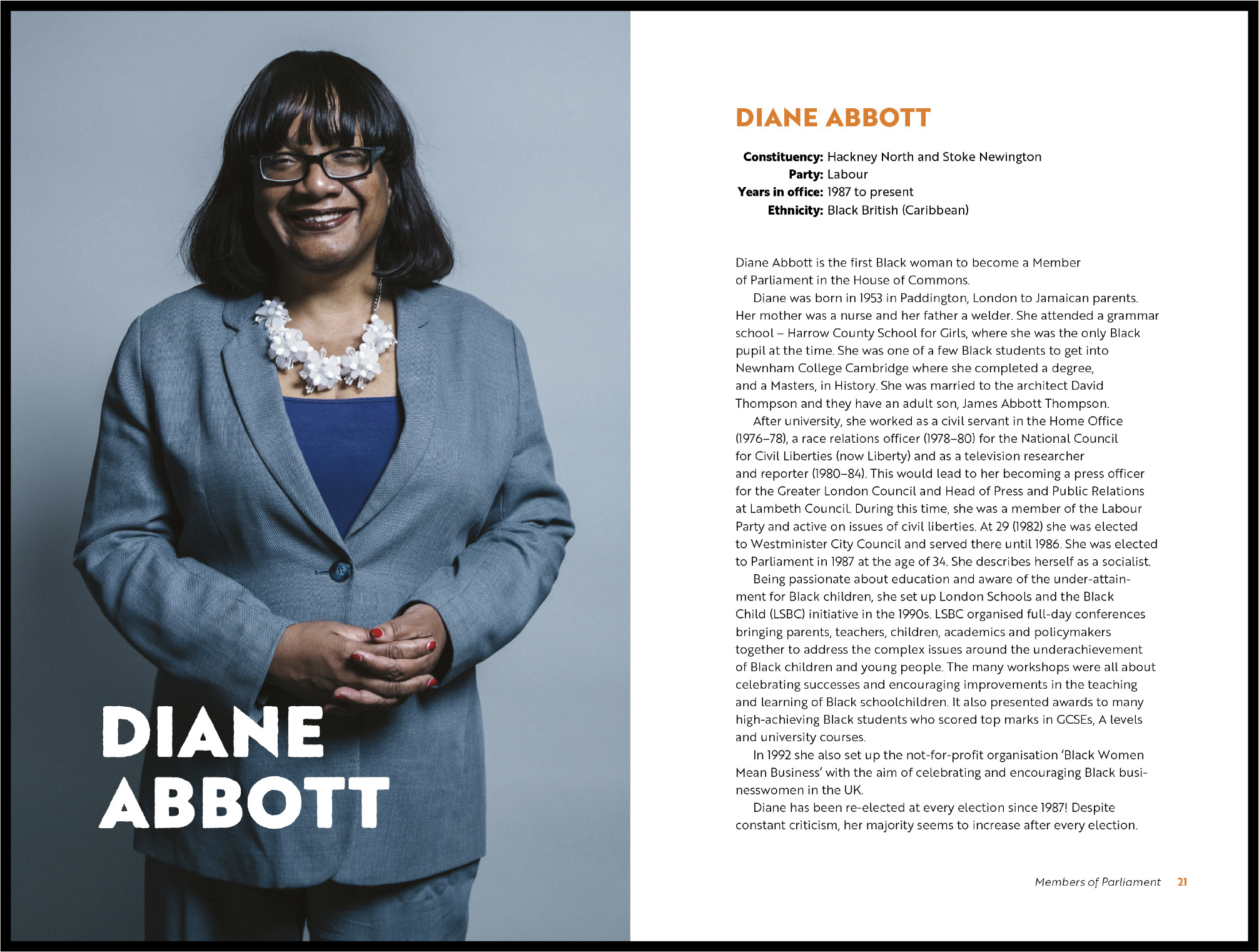
Labiba and Yaa took the opportunity to design the book Black British Members of Parliament in the House of Commons: 22 Stories of Passion, Achievement and Success for author and client Shirley Anstis.
Brief
We accepted the real job while the book was in the writing process and met with the client to obtain further information. From our meeting, we found the book was a compilation of 22 mini-biographies of Black parliament members. The aims were to inspire and educate readers on potential career paths and role models. The target audience were secondary school students, and the secondary audience was schools and parents. The three deliverables included: a book cover, eBook, and files for a printed book. We established objectives to produce an inspiring, attractive and appropriate book and book cover for the target audience.
Research
As our target audience were teenagers, we looked at different biographies aimed at our target market; to understand the style and get inspiration. Almost all of the books we looked at had a figure on the front cover, indicating the role model of the biography. Additionally, most of these covers were illustrative, so we concluded illustration would be the most appropriate design to attract the target audience. We further researched different illustration styles and layouts we could adopt to create a more engaging book.
Moodboard of biographies aimed at our target audience
Cover
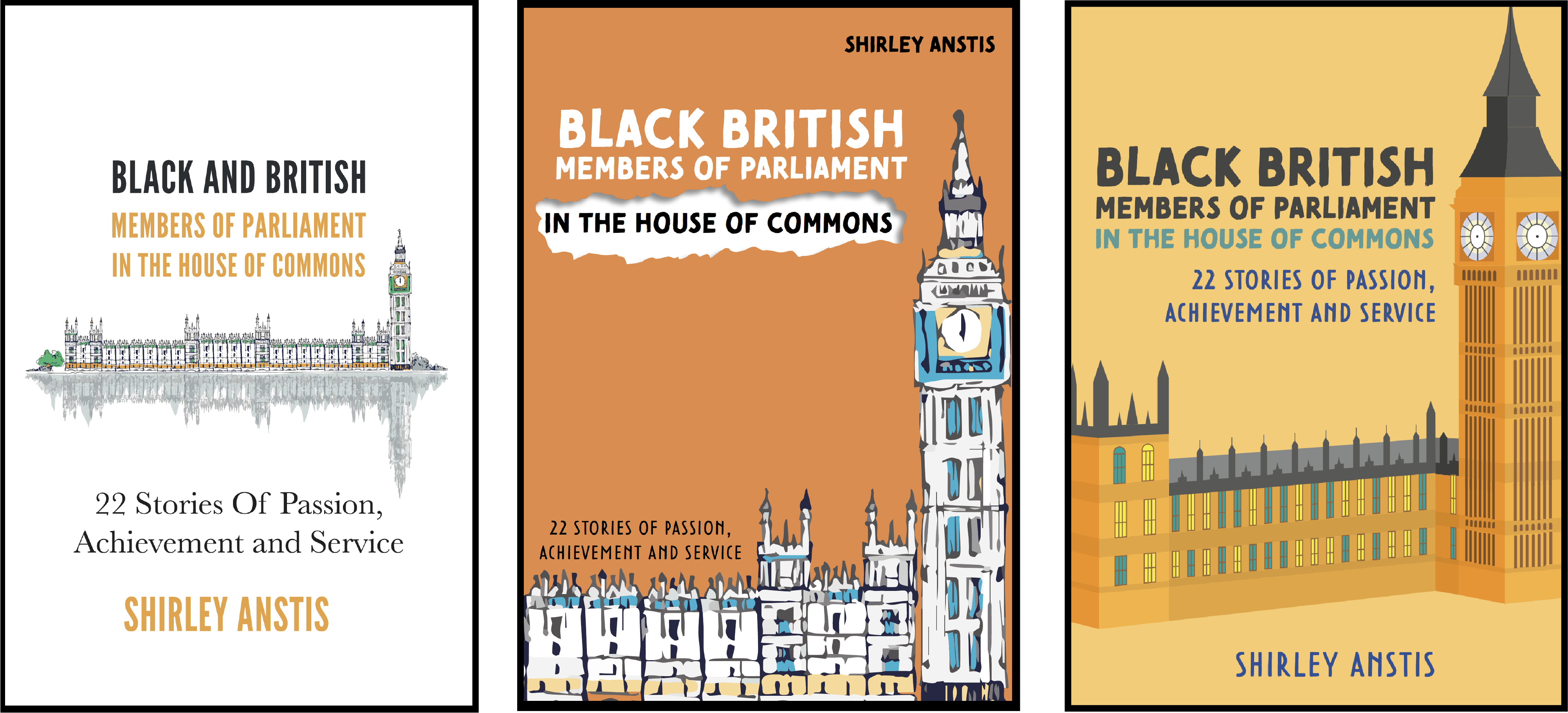
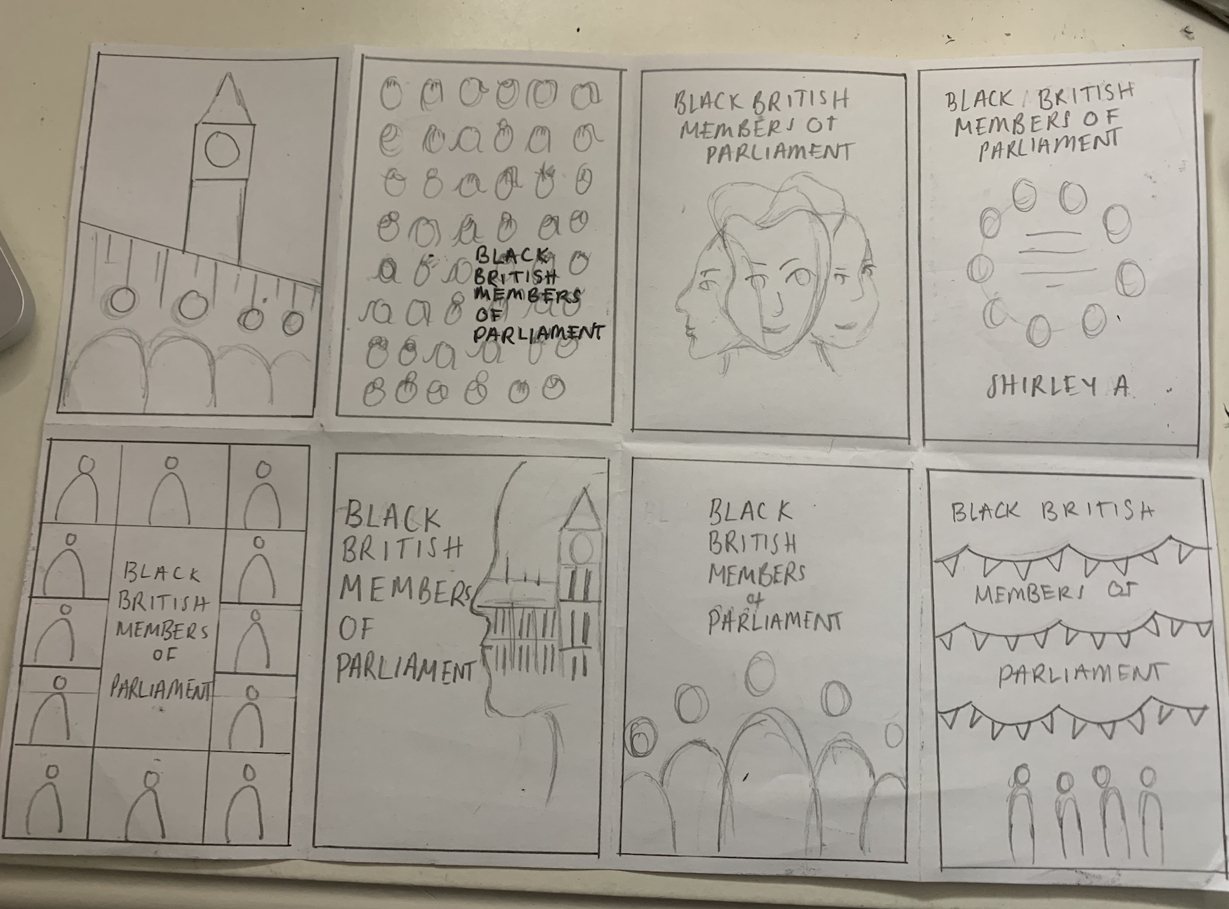
The client presented an initial book cover design. We found it not appropriate for the target audience as it was too mature. Therefore, we tried to adapt the design and work with the illustration provided but noticed it reduced the overall appeal of the cover. After discussing this with the client, she was open to new concepts but adamant about using the Houses of Parliament. We eventually realised that having the Houses of Parliament on the cover would not work despite our illustration attempts because it lacked interest. We had to take a different approach to make it more enticing. After creating some sketches and developing a couple of ideas, we eventually opted for illustrative portraits of the MPs on the cover.
Original cover design (left), the first iteration using the illustration provided by the client (middle) and our illustrated version of the building (right).Sketches of new cover design conceptsDeveloping iterations of the front cover (background experimentation)
We needed to be cautious about our designs and illustration styles to avoid being racially insensitive. For example, one of the first iterations we created had vibrant colours and a large image. We wanted to add some flair to the cover by adding texture, so we implemented a ripped paper effect. However, class feedback highlighted this effect was messy and unprofessional, thus emphasising racist connotations by reflecting the MPs poorly. We also took into consideration the racist undertones of adopting certain illustration styles. Black people have a long-standing history of experiencing racism due to their facial features. We avoided a caricature style as the exaggerated features within this technique perpetuates racist stereotypes.
We selected the typeface Brother 1816 Printed for the title as the printed texture in combination with the illustration style making the cover appropriate and appealing to the target audience. The solid typeface made the book title bold and complimented the thick lines of the illustration portraits. Initially, we selected different typefaces for the subtitle but received feedback to use the same typeface for the entire cover.
Final book front cover
Copy-editing
Once we had received the manuscript, it was essential to clean the copy of hidden characters and correct any mistakes first. Despite our attempts at cleaning the manuscript before designing, we found ourselves making changes throughout the design process. Then we flagged the inconsistent use of names, incorrect labelling of nationality with ethnicity, broken/missing source links, and missing information in the table. Then relayed these to the client for correction.
eBook
As this was the first time either of us had designed an eBook, we educated and guided ourselves through LinkedIn Learning courses. We discovered there were different types of eBooks. As our client intended to upload to the Kindle bookstore, a reflowable EPUB format was most appropriate because it would adjust to fit the readers’ device.
Generally, eBook design is crude, designing for functionality rather than aesthetics. It was essential to assign the correct paragraph, character and object styles to all the content. These controlled and affected the function and outcomes of the eBook preview. Initially, we noticed that exporting the design from InDesign to EPUB produced entirely different appearances in size, spacing, positioning and images. Hence we needed to install a Kindle previewer to check and test each iteration of the EPUB.
We considered typography in terms of on screen readable type, headings and lists. However, the line-length, hyphenation, widows and orphans and headers and footers were irrelevant as these changed by the device and the user’s personal settings. Images appeared in black and white for some devices but in colour for others. They also had to be manually anchored to prevent shifting to incorrect locations.
As EPUB removes multiple-spacing, all spacing occurs within the styles. When designing the contents page, we struggled with creating adequate space between the page number and the section title as the EPUB minimised the space. After a few iterations and feedback back-and-forth with our supervisor, we realised that the page numbers were redundant as they change for different devices. We resolved it by removing the page numbers and ensuring the hyperlinks in the interactive contents linked to the correct section.
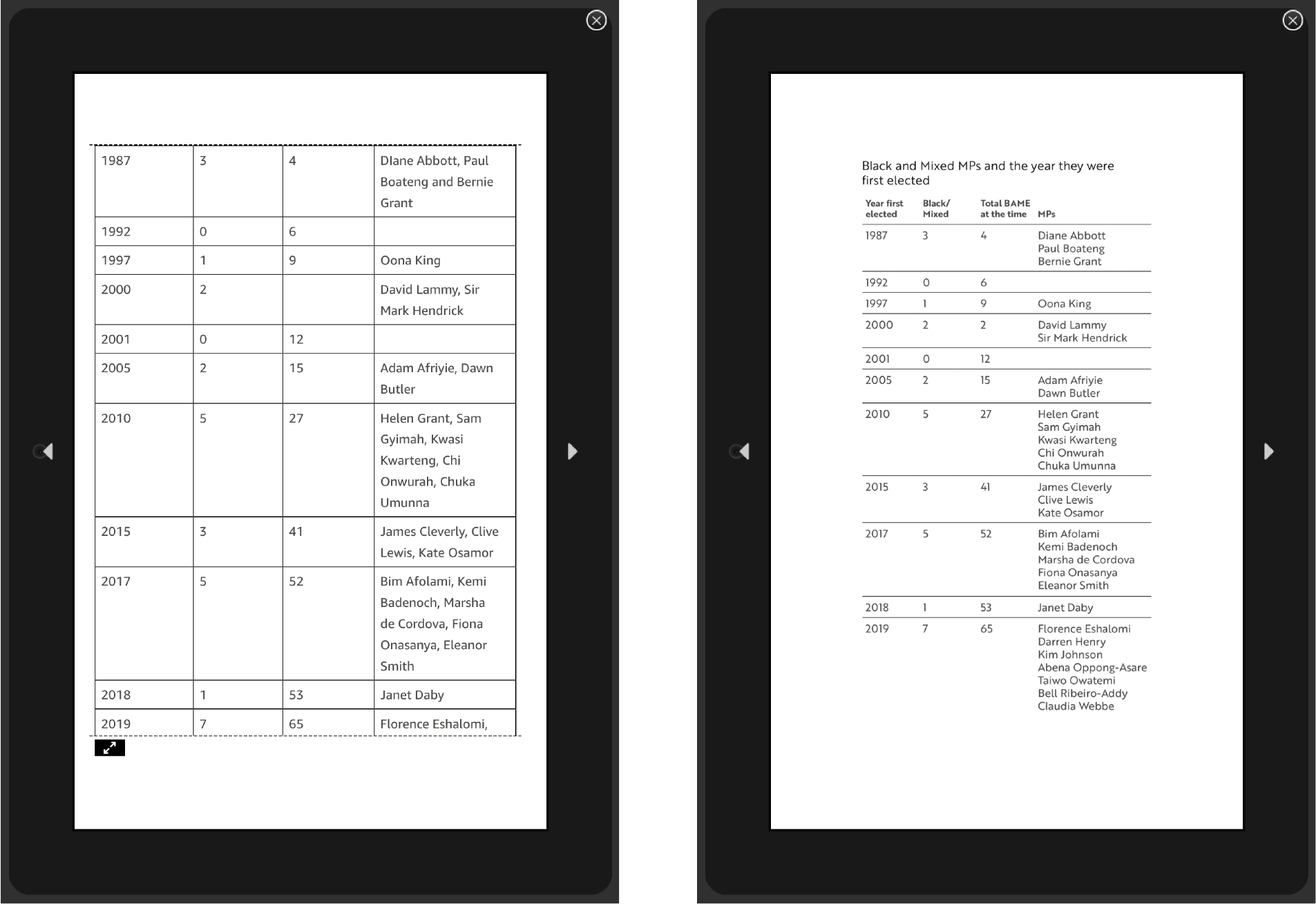
The reflowable format created an issue with implementing the table. It would cut the table across pages rather than presenting it as a unit. Our supervisor requested we indicate that the table continues from the previous page. However, as the table broke by rows, it would be impossible to ensure it appears in the correct place for different devices. Instead, we converted the table into an image so it would always appear as one unit.
Before (left) and after (right) of the table
After spending hours trying to rectify a simple error, causing all the images to misalign, we learnt that saving new versions of the file for each iteration was crucial. It was hard to identify the cause of new issues being unable to see the previous EPUB iteration for reference. A lot of trial and error was needed to reach the final deliverable.
eBook layout
Book
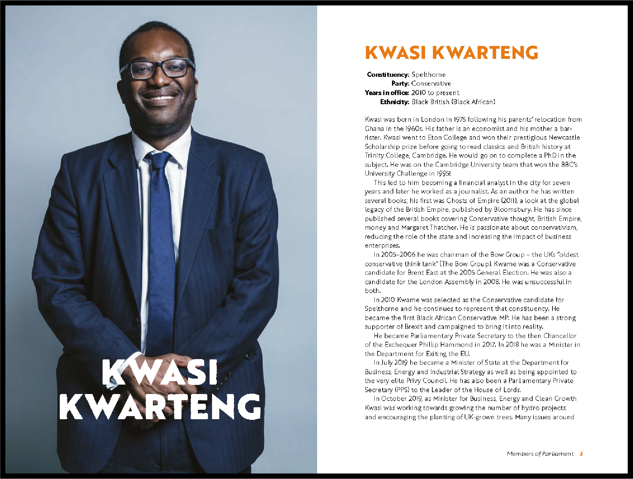
The design process for the hardcopy was more straightforward. We developed three sample layouts demonstrating a long and short mini-biography, and the chosen layout was the client’s preference. Flowing the text and images into the document was simple. Most effort and time went into refining the typography, ensuring consistency and removing errors throughout the copy.
Chosen sample layout
Unlike the eBook, printing needed considering. Initially, the hardcopy was supposed to be in colour due to the use of photography. However, due to cost, the client also requested a black and white version of the inside pages.
We also found out orange was a troublesome colour to print and needed to figure out how to print the cover. As few copies were going to print, it ruled out the use of spot colours. Instead, we used a Pantone Bridge swatch, providing a close copy of spot colour in CMYK. We also contacted Geoff, who suggested implementing a silk coated paper stock for the cover. Ultimately the client picked a glossy paper stock as she self-published through Kindle Direct Publishing on Amazon.
Digital spread from the physical book
Issues
One of the main issues was the tight deadline provided by the client. Towards the end of September, after sending us the manuscript, the client stated that she wanted the eBook completed for Black History Month in October. We were concerned that we would be unable to design the eBook to a high standard within the time frame presented. After planning out the tasks we could do within the timeframe provided, we updated the restated brief and sent it to the client. As designing an eBook was a new experience for us, the process of learning how to do it slowed us down. We also came across many issues that the videos did not cover or were covered briefly.
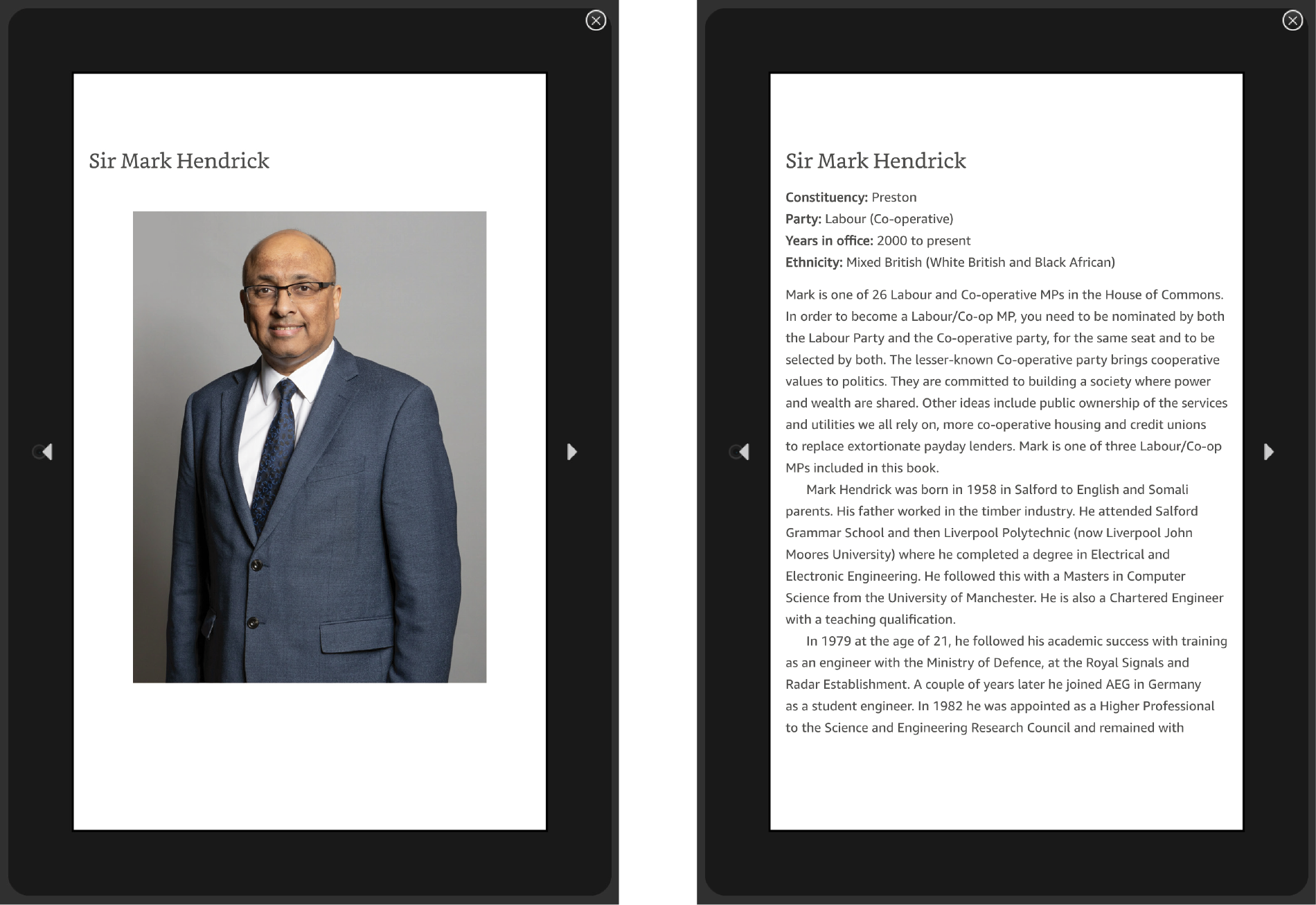
The photographs in the book and the references for the illustrations on the cover used were the MPs’ official portraits on the Government website. It raised a copyright concern as the client did not own the images. We emailed the copyright compliance office at the university to verify whether using the images for illustrative purposes on the cover and within the book would be allowed. They confirmed that using them for our specific project was permitted if we acknowledged the photographers. They also provided a structure for crediting the photographer to assist us.
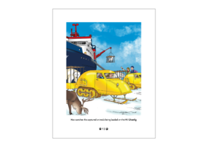
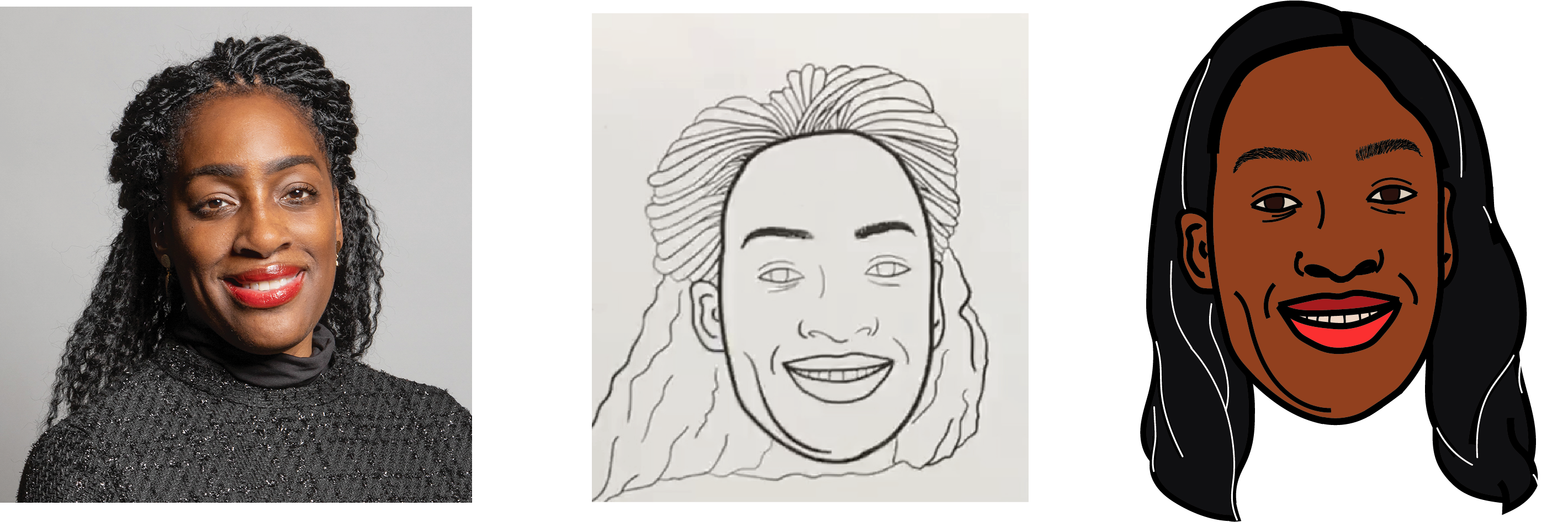
One of Yaa’s main concerns was illustrating the braids of the female MPs as it is a hairstyle she struggled to draw. In addition, making the braids visible on a smaller scale was also a significant issue. Eventually, Yaa figured out a technique that worked. Most MPs wearing braids in their official portrait are wearing braids in the illustration on the front cover. However, Kate Osamor’s hairstyle was difficult to illustrate in a way that did her appearance justice. Yaa repeatedly tried to replicate the braiding style shown in her official portrait, but each attempt was unsuccessful. Therefore, she began considering alternative solutions. Black women tend to wear different braiding hairstyles, so she researched different protective hairstyles previously worn by Kate. Kate has frequently worn her straight based on recent Google Images. Ideally, we would have liked to display Kate’s African heritage through her braided hairstyle because it is a significant part of black culture. However, we decided to change Kate’s hair to match one of her recent hairstyles to convey her appearance without being offensive.
Before (middle) and after (right) of Kate Osamor’s illustration
Reflection
It was challenging to take on a project having no experience in eBook design. Still, the opportunity allowed us to learn and expand our design skills, and working intensely on typography has renewed our attention to detail. Yaa also uncovered and developed her digital illustration abilities. The skills and lessons we have learnt from the project have taught us how to handle pressure and tight deadlines, maturing us as designers in the process. Overall, we are happy with the outcomes, but there is room for improvement. If we had more time, we could further refine the designs for all the deliverables. Furthermore, having the books printed through the department instead of Amazon would have produced a more professional appearance.
Hardcopy of Black British Members of Parliament Book. Printed via Amazon
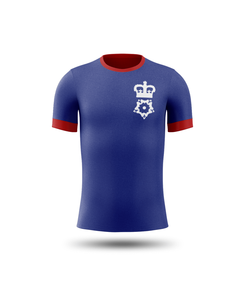
Hampshire RFU covers 32 rugby clubs in Hampshire with different membership types, e.g. paid members club, representative rugby, 7’s teams, women’s rugby, a LGBT+ team as well as a large number of volunteers and coaches that look towards Hampshire RFU. The RFU want to move away from their current branding in order to communicate a modern and inclusive rebrand that differentiates themselves from the RFU governing body.
The main issue that Hampshire Rugby Football Union was facing was that users struggling to identify which part of their website housed certain pieces of information, as well as which part related to them directly. Furthermore, it was easy to mistake the RFU for an individual club or with the RFU governing body as a whole. The task was to fix their inconsistent branding to suit the new younger demographic and the users that would come along with it such as parents or volunteers, as well as make their online platforms easier for users to navigate and find the information they need. In order that we could best target the younger demographic, clearer communication on various social media platforms needed to be addressed.
The following deliverables will help create solutions to their current problems :
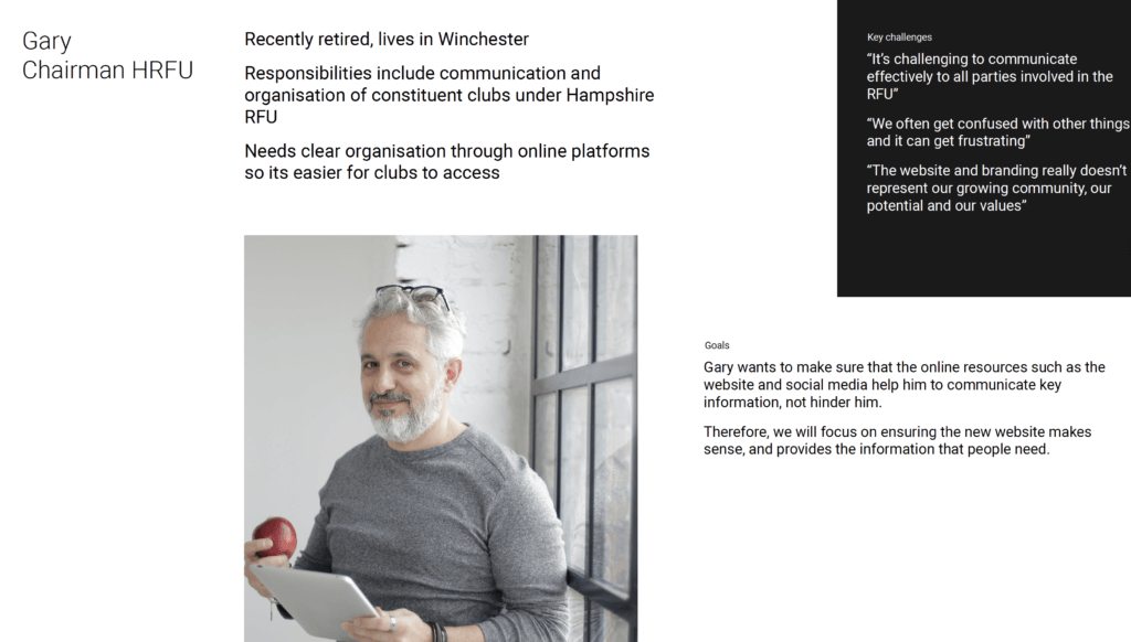
A list of user personas, in particular a volunteer as the club needs them to run. A parent may be useful as if you are unfamiliar with the sport it may be confusing that HRFU isn’t an individual club it houses around 40 cubs which you can be directed to from HRFU’s website.
A new website on sports focused CMS pitchero
New branding including: – A new or refreshed logo, colour palette and typography that modernises the club but keeps long standing members satisfied and resonates with fans and sponsors.
– A brand that can be easily reproduced and worked across their sub brands such as their referee site or their coaching and volunteering guides.
– A set of brand guidelines that can be easily followed by non-graphic designers and future designers for both web and print.
– A new social media and communications template and style guide
– Letterheads for print, email signatures and social media footers
Deliverables
Our deliverables included a logo refresh, a brand application proposal with brand guidelines, visual design of a Pitchero account, and lastly a presentation pitch to the HRFU board to assess which of our ideas they wanted to implement.
Initial steps
The very first stage of the project was to contact our client in order to organise a call and fill out our initial client meeting document. We also contacted our supervisor so we could go through the information gathered at this meeting, and really understand the user needs, so we could successfully restate the brief. We began researching the other clubs, as well as the pitchero platform at an early stage. After our initial meeting with the client, we also organised a weekly meeting to catchup and feedback on our developments, as well as keeping an open line of communication via email. Frequent conversations were vital in the quick and efficient progression of the project.
User personas
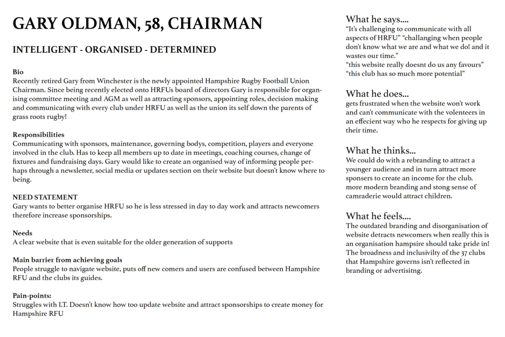
Not only are user personas one of the requested deliverables for the project, they are an important part of the research process for a branding project. The process began in our initial discussion with out client, where we could brainstorm the audience types which would most regularly use, and benefit from the brand refresh. We collectively came to the conclusion that the people we needed to target were the RFU chairman, a parent of a child playing in one of the clubs within the RFU, as well as volunteers, or potential volunteers. Once we were happy with the personas, we began developing these personas into characters, so we could target their needs and therefore inform our design with realism. A focus on the user needs meant we could create a ‘question/answer’ approach to the project. We in that way had a ‘response’ and acted on each of our users needs.
These elements were then able to be developed into a professional looking graphic that we could present as part of our deliverables to the client. Furthermore, we now had much more information so we could focus on the nuances and details that would be desired by our user, and deliver in the rest of our design work,.
Developed user personas based on what we felt the users needed from the refresh
Branding process (logo and other deliverables)
We started by making some sketches and brainstorming some ideas together, taking some ideas from our initial client meeting form, as well as any additional information our client gave us regarding their branding. From here, we individually began developing some digitized sketches, which we felt had some scope of development, with initial ideas starting out quite broad and abstract, such as those pictured below.
Initial digital logo proposals
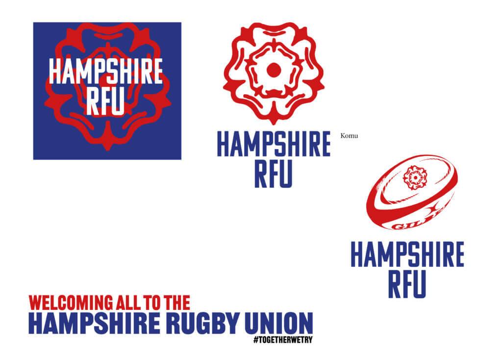
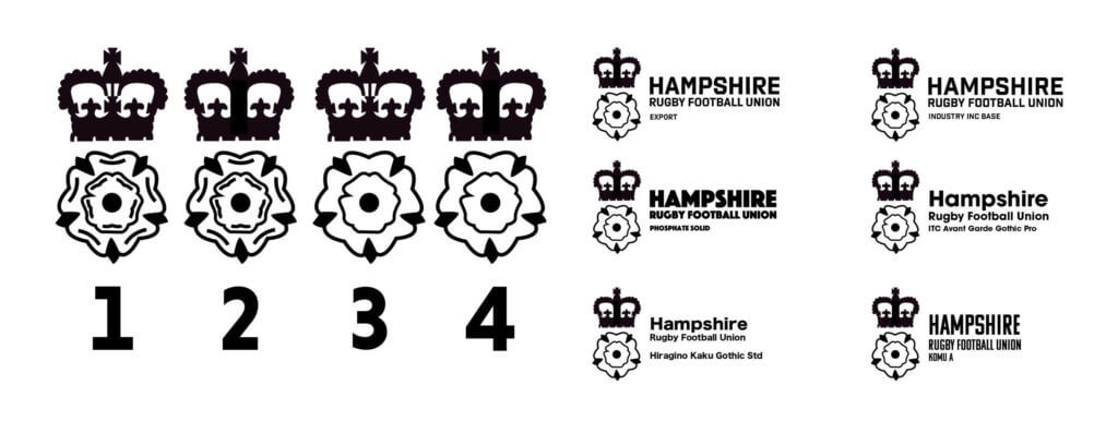
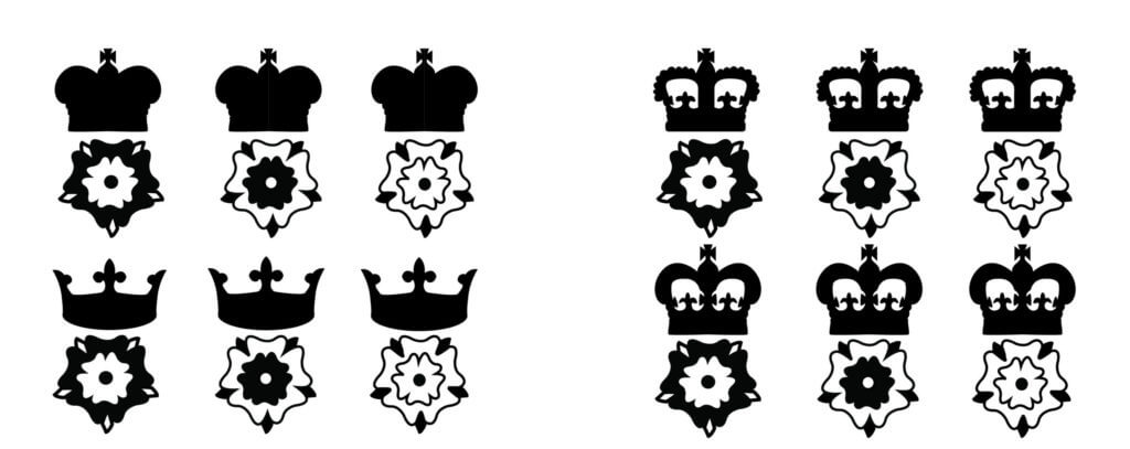
From here, we further developed our concepts. Our client suggested that the examples on the left were too detailed, and that although they were unique icons, they likely wouldn’t work as well at a range of sizes due to the level of detail. Furthermore, the client stated that they preferred that we include a crown of some sort in our logo, as they did in their previous logo. Our client did however enjoy the way we both managed to incorporate the Tudor Rose of their old logo. On this iteration, we focused on creating a simplified version of their own logo, for a fresh take on their current logo.
Developments of the logo following feedback
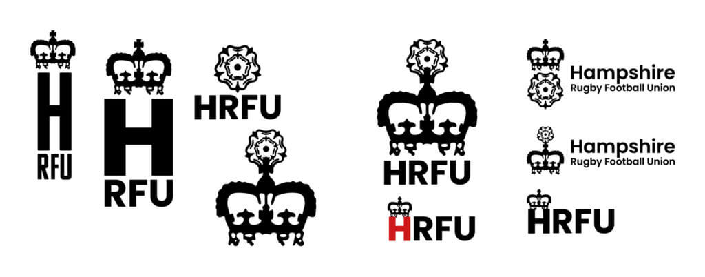
The client really enjoyed this approach and suggested that they most enjoyed the idea with the crown on top of the rose, with text to the right of the logo. From here, I experimented with drawing a range of different roses, with different colour emphasis, as well as different crowns with varying levels of detail. I also began to look into the typeface I could use for the accompanying text to the logo.
Further logo developments
From here, the client was able to choose the feel of typeface they felt was right to represent their brand in a modern way, without losing the historic nature of the HRFU. They also gave us some feedback as to which icon variants they preferred.
Logotype selection process
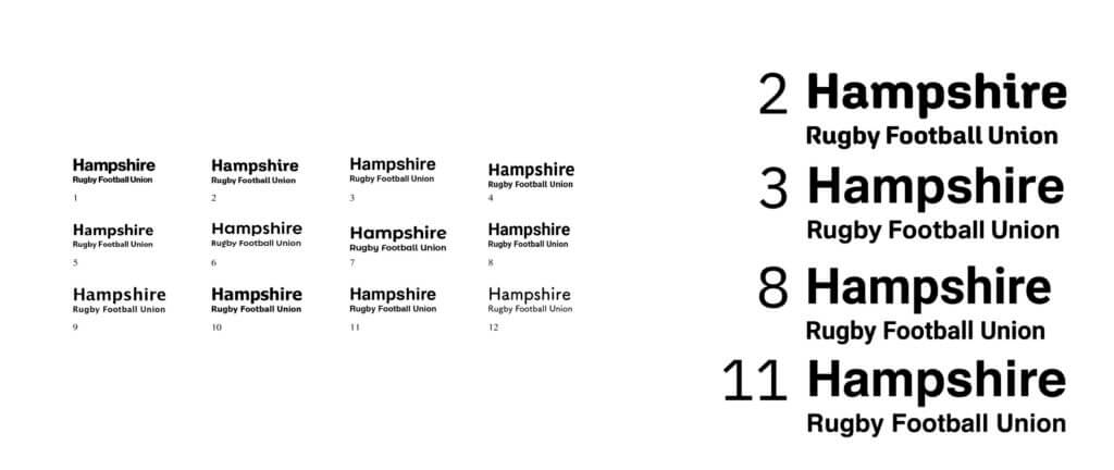
Out of the typefaces presented to them, the client suggested that they would prefer a clean, ‘swiss style’ typeface. From here, we presented them with a range of typefaces that fit their needs, to see if any of them were suitable to be the typeface we used for the logo. Out of this selection, they chose the typeface ‘Roboto’.
Now the typeface was chosen, the icon could be balanced and placed alongside the typeface, to create an ‘extended’ version of the logo, as well as a singular icon. We consulted Sara for a meeting at this point, to get her advice, particularly when it came to striking the right balance of line weight and shade in the logo itself. At this point, we also looked into colour, deciding on using (as is tradition) the colour palette of the RFU as it already exists.
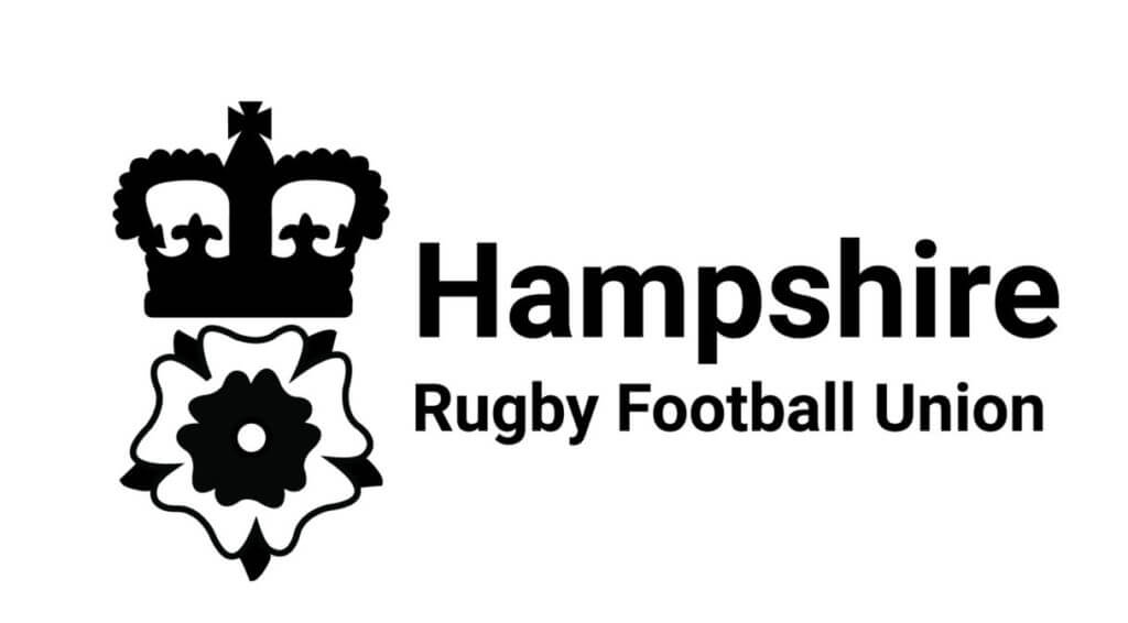
From here, the logo was refined, particularly focusing on the details of the icon, and redrawing it where necessary. The finalised logo is pictured below.
Refined logo proposal
From this point onwards, the logo can be applied in a variety of different ways, including on shirts, letterheads, website branding, or any other deliverables needed. Some examples of how the new logo could now be applied are below.
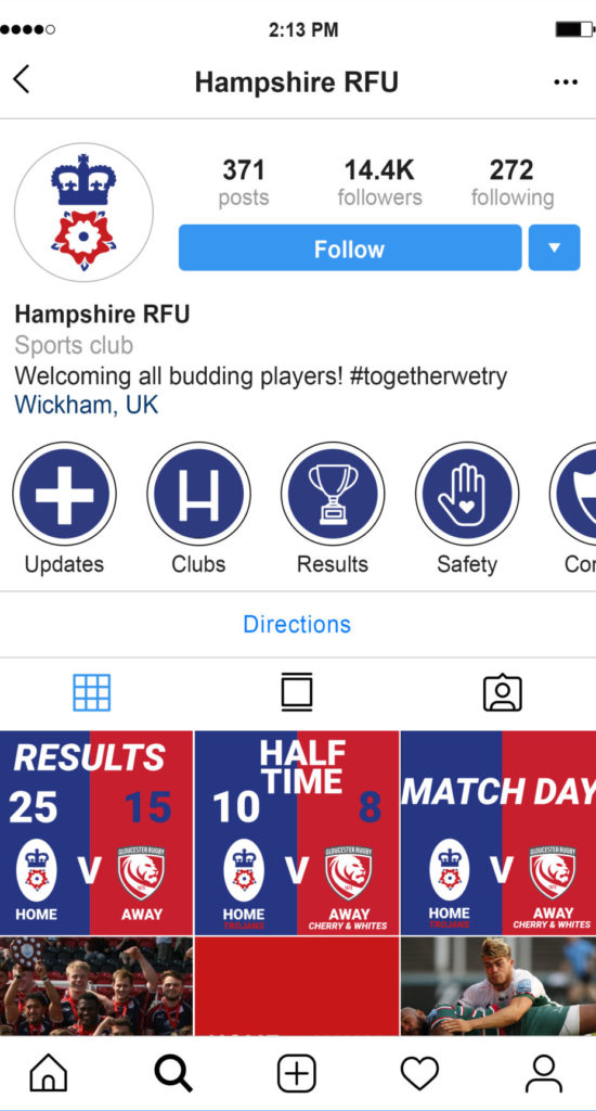
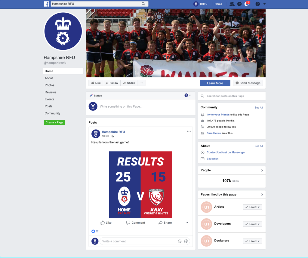
Social media
In addition to applying the logo and brand colours to social media, we were tasked with creating additional elements for their platforms, across LinkedIn, Instagram and Facebook. This elements focused in on the needs of our previously created user personas, and meant that the brand was not only applied consistently across platforms, but it fulfilled its purpose more effectively than their previous platforms. We produced icons for their Instagram stories, so all elements of information were easily available, and directly answered the concerns of our personas by making the information needed by users accessible at a glance. Tiles such as the match day tiles above were designed in order to help users see the outcomes of matches without having to ‘dig’ for the information. Each tile was designed to work individually, as well as a set, so they looked appealing and eye catching at the profile view, as well as when users come across them whilst on their feed. The features of each platform were explored, as well as the potential uses for them, in order to reach a wide audience, and to provide a convenient location for club members and patrons to find the information they need. In order to educate our client on how they can best apply the branding, as well as use their social media in the future, we created a more specific social media guide for the client. In addition to this, we made the client Powerpoint templates as requested to make their social media posts on, to ensure that the client could replicate our design with basic office software.
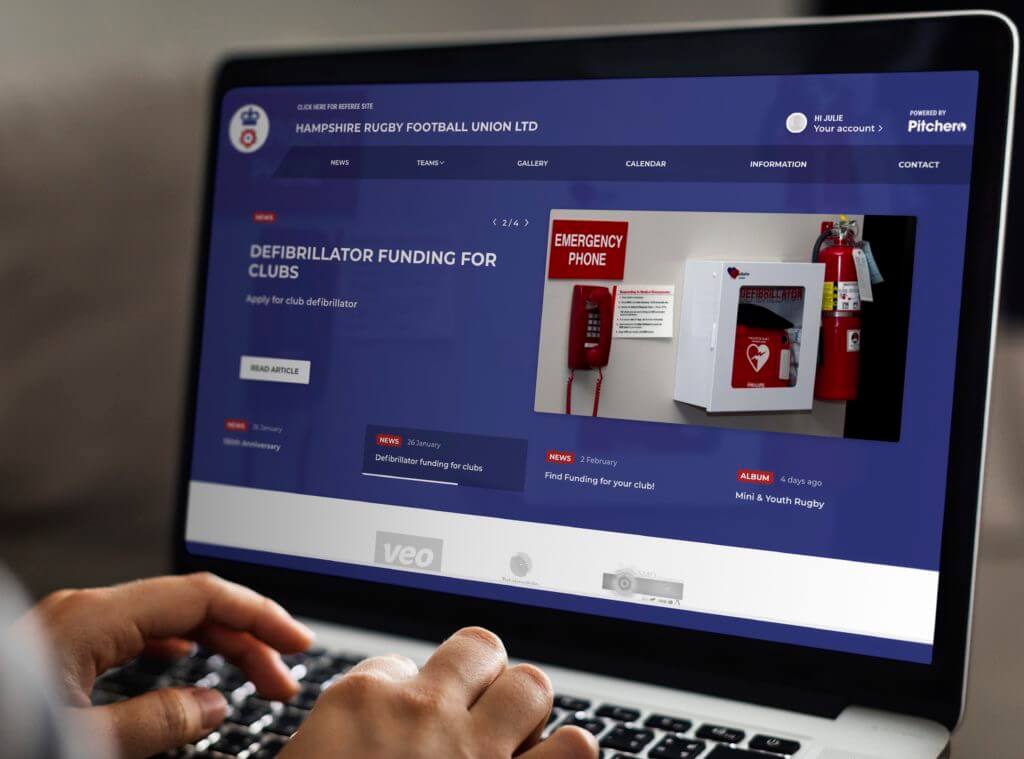
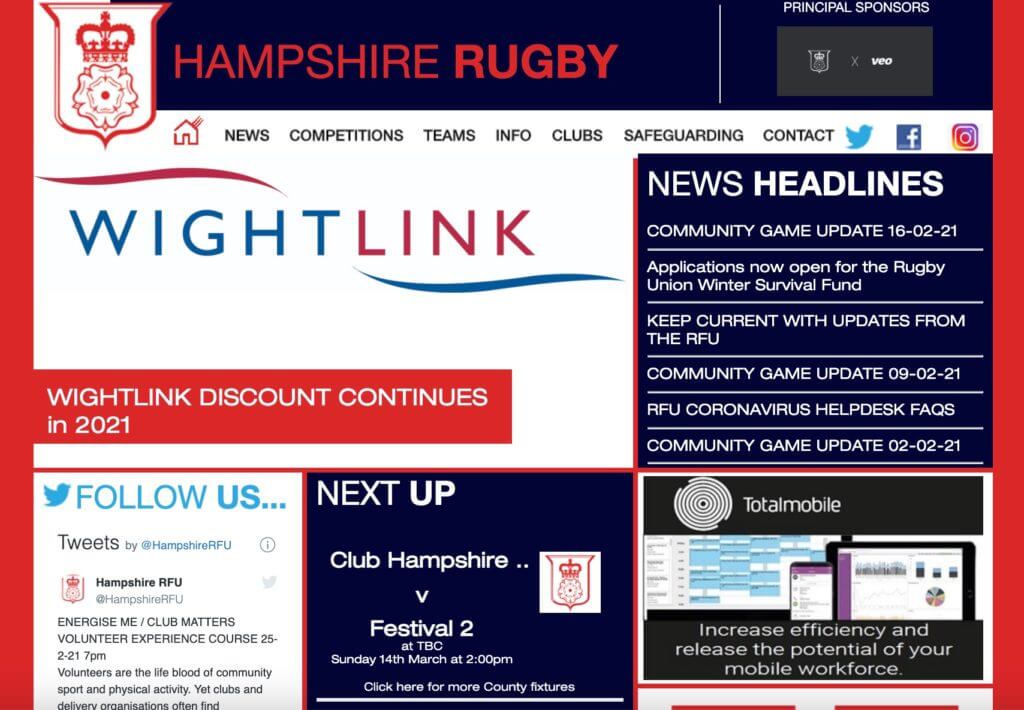
Pitchero website design
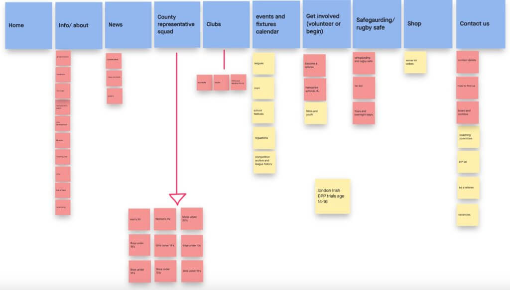
The clients were keen for us to use the sports focused CMS Pitchero platform, which can easily be edited in the future by non designers. This was particularly important to our specific client as they are a charity who release on volunteers. Prior to having access to the CMS we examined the current site and found various problems with navigation as there is so much information to find and poorly designed archives of news, latest updates and fixtures. We struggled to find how the user persona we created could differentiate between the HRF Union and the various clubs within the umbrella of the union. Putting ourselves ‘into the shoes’ of an aspiring volunteer, we found it difficult to find any vacancies or advice about how to apply for volunteering, as well as what information or checks were required to be involved. There is so much information on the current website, and lots of it is essential to include, but it is laid out in a way which is very overwhelming. We therefore decided to focus our efforts on creating a new hierarchy to target the needs of our created user personas more directly.
Hampshire RFU’s previous websiteA developed structure of organisation for our website
This encouraged me to make a far less cluttered website, but also to take advantage of Pitchero’s carousel function which would showcase our choice of topic. We felt it was important for the average user to have updates and news at the forefront of the site so they feature on the carousel on the landing page.
A mockup of the proposed Pitchero site
After accessing the CMS we initially found difficulty with their restrictive on the homepages top bar tabs, in turn meaning we had to keep the “information” tabs contents extremely organised. Therefore, the site would be less cluttered and wouldn’t overload the user with options, meaning navigation throughout the site was much easier.
Our proposed website hosted on Pitchero
Presentation to the board
We were given the opportunity by Mark to give a presentation to the HRFU board due to COVID-19, we had to present our work entirely over zoom. We presented our user personas which were well received and then explained our design process over the past 5 months. Starting with logos and branding, an important area to please the older generation on the board, and moving through to Rowans social media guidelines and the benefits of the new design decisions and later onto the pitchero and physical deliverables. After the presentation we asked the board for any question or suggestions and were very glad to see the design was well received by all. A board member asked whether we could include email signatures in our deliverable handover, which we took on board and have now added to our deliverables.
We were most pleased when Mark followed up our meeting with an email response “Whilst I was expecting this outcome I’m still in slight shock that everyone on the board was 100% behind what you have suggested. “ . Thow we would have preferred to give the presentation face to face we couldn’t be more pleased with Marks reply and felt our efforts were greatly appreciated by the board.
Key takeaways
This project was a great learning experience for both of us, with a wide range of deliverables, and diversity in the number of skills we had to show as a team. As a two person team from two different year groups, Ro (Year 3) and Jemima (Year 2) had varying ranges of experiences with real jobs and clients, and both learnt a huge amount through working together.
We believe that we split the workload fairly evenly, dependent on our existing skills, however we each discussed the progress of our research and designs regularly, to ensure that we were progressing well, as well as to offer advice and feedback. As a result of our different experiences we took a lot of time to brainstorm together, as well as reaching out to our supervisor Sara, in addition to the real job meetings for objective feedback. The opportunity for our year groups to mix in this way is very much a reflection on future design employment, and we believe that this helped us grow and develop as designers, both individually and as part of a team.
Furthermore, despite this job running a little bit longer than we initially planned, we believe that we handled the workload well. The deliverables, and number of things the client wanted us to deliver did seem to increase somewhat, and we quickly realised we would have to put a lot of accessibility elements in for our clients, such as templates, guides and icons, to make the implementation of our ideas easier. However, the client took this in stride, and due to our consistent communication, an extension to our initial deadline was agreed upon. One of the most significant hurdles in our process was our conflicting schedules of lectures and other deadlines, limiting the times in which we could work on the project together. The periods of closure at the University due to COVID, also meant that most of our meetings had to be remote. Despite these issues, we believe that we have delivered a successful project to our client, as well as learnt a lot about organising our schedules so we could both stay on track. We are very pleased with the comments that we have received from our supervisor, as well as the client, and grateful for the opportunity to work with Sam and Mark.
We both learned more specific skills whilst working on this job. With it being Jemima’s first job, she got an insight into how real jobs function, the organisation and level of communication required with the client, as well as becoming particularly proficient on the platform Pitchero. As a third year student, Ro further developed her skills on Adobe Illustrator, as well as drawing from her experiences on a chosen optional module, the Branding Project. The knowledge she developed from this project helped her approach this project in a methodical way which addressed the needs of the user effectively.
To conclude, in the future, we may have benefitted from a more diverse initial exploration of ideas for our logo. This may have made our design more ambitious, and unique from their previous logo. Furthermore, more exploration into the successful social media platforms and their branding could have made each element fit together most efficiently, as well as being more visually interesting. We had a great experience on this project, and it was valuable to our development in the design world.
Quote from supervisor, Sara Chapman
‘Well done! Very professional. : ) S’ – Comment regarding presentation to the HRFU board
Quote from us – Jemima Hughes ‘Since seeing this real job advertised, I had been particularly keen on the user experience design aspect of the project and was delighted when I was taken on for this opportunity. I feel very lucky to have had Rowan to help me learn the ropes of the Real Jobs module as this is my first real job. Additionally, we were very lucky to have the constant guidance of Sam Winslet from IBM and to top it off the perfect client, Mark who has always been enthusiastic towards our designs and easily contactable and I’m very grateful for the time and opportunity Sam and Mark have given me.
Working as a pair is something I have really enjoyed and feel we bounced off each other well. I can look back at my initial logo designs and see how much my design skills have developed, mostly due to my guidance from my more experienced partner who encouraged a simpler and in turn more effective design. I have also most enjoyed exploring the CMS Pitchero, it has introduced me to how to approach the limitations and benefits of the CMS, something that I believe will be beneficial in my future career.’
Quote from client – Mark Castle
‘Thank you so much for presenting tonight and all your hardwork in getting this project to that point. Whilst I was expecting this outcome I’m still in slight shock that everyone on the board was 100% behind what you have suggested. They really liked the new brand, logo, social media and colour palette, only debate was if we move to Pitchero which was more of a practical discussion and was also approved. So well done, Hampshire RFU will implement all of your suggestions and I now need to put my skills into place to project manager the move from the old to new.’ – Comment regarding presentation to the HRFU board
Our client Ilaria Mezzogori is involved with a Community Kitchen, a communal and social place where free community-based programmes are run so people can learn to cook, learn about their food habits and make their budget go further, all whilst breaking loneliness. Cookery classes range from basic cooking skills to mastering specialised skills, which anyone can attend.
This community kitchen (Community Cooking & Well-being Kitchen) is ‘the child’ of two social enterprises, ‘Empower to Cook’ and ‘Khepera’. These organisations reinvest any profit into the community. “Empower to Cook’ aims to teach basic cooking skills to improve the health and well-being of the local community. ‘Khepera’ focuses on vegan and healthy food education.
The company required a logo that reflects the idea of giving back to the community and environmental sustainability. The logo also needed to utilise the fixed colour palette of yellow and purple: a fifty fifty balance of the partnerships’ (‘Empower to Cook’ and ‘Khepera’) colours. The logo was created by Emma and Bethan.
Restating and understanding the brief
The brief was to create a logo that reflects the Community Cooking & Well-being Kitchen : giving back to the community and environmental sustainability, representing the two partnership companies (‘Empower to Cook’ and ‘Khepera’).
In the initial meeting the required outcomes were established:
A logo
Possibly a visual identity
Possibly a social media presence
Within these outcomes there were certain fixed design elements:
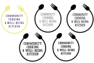
Colour palette of yellow and purple (partnerships’ colours) but these colours do not have to be the same shade as the partnerships’ colours.
Circular design to reflect community
Whole name of the company must be included (Community Cooking & Well-being Kitchen)
Our key objectives were to produce a logo that successfully raises Community Cooking & Well-being Kitchen’s profile as a company and to effectively reflect the partnership enterprises and their objectives.
These aims were measured by feedback from the client, regarding whether they were effectively promoting them as a company. To ensure an appropriate logo, visual mockups were utilised, using the signage size supplied by the client (2450x710mm). We would schedule regular feedback via zoom during the initial stages and then via email when finalising the logo to allow our client to share our designs with the rest of her team. Zoom meetings were also used to discuss any issues involved in the process.
Further through the process the required outcomes were changed:
A logo
Visual identity guidelines
Schedule
The original deadline for this project was 30th Nov, however we exceeded this deadline. This is mainly because the design process took considerably longer than we had initially planned for. Due to Covid-19, the deadline the client had originally supplied us with could be extended. Therefore, we prioritised producing a logo that fitted the client’s brief as much as possible. On reflection we could have been more efficient during certain parts of the process. The colour scheme of the logo was also a challenge which took longer to solve than we initially anticipated. However, the additional time we spent on getting this aspect of the logo right has proven beneficial.
Research
Personas
In the initial stages of the project we produced some user personas. Carrying out this process allowed us to identify who the logo would primarily be aimed at. After producing the personas we collectively produced a list of key aims of the logo. The main aim is to create a logo that reflects the friendly and welcoming nature of the Community Kitchen.
Partnership companies
We then researched the partnering companies to gain a wider understanding of their aims and programmes. ‘Khepera’ highlighted the high importance of wellbeing and nutritional support, as suggested by the name which translates to “transformation”. ‘Empower to Cook’ focuses on sustainability and accessibility. They target vulnerable communities to educate them about affordable but nutritious food. Therefore, we aimed to incorporate these key incentives into our logo design. We also looked at the colours used in the partnerships’ existing logos for inspiration.
Partnership social enterprises’ company logos
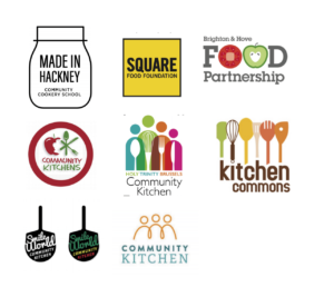
Existing community kitchen logos
Since neither of us had come across a Community Kitchen before, we looked at some pre-existing Community Kitchen logos. Formulating a mood board of these existing logos assisted our design process as it helped to highlight current logo design trends.
Moodboard of existing logos
There were certain trends we noticed:
Friendly and fresh feel
Presence of kitchen utensils
Joining of lines/illustrations to reflect community feel
Illustration style providing ‘home-made’ feel
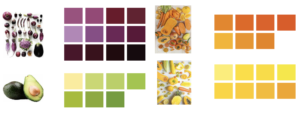
We also looked at a selection of pre-existing logos that have yellow and purple colour schemes. Initially, the colour scheme felt quite limiting, however, after viewing existing logos and gaining feedback from our supervisor we focused on using purple and yellow shades from fruits and vegetables. We found that this produced a fresh feel to the logo as well as representing both social enterprises that make up the company.
Colour shades inspired by fruit and vegetables
Design Development
Initial concepts
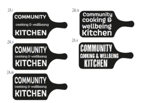
Initial design ideas
In the initial stages of the process we formulated four different concepts based on our research and input from the client. Creating these various concepts allowed us to explore different solutions and discover which work best. After having a meeting with our supervisor we selected our strongest two ideas to show the client and continue to develop these further.
Design concepts shown to client
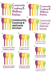
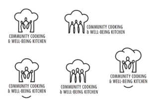
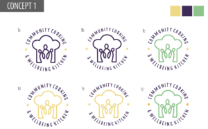
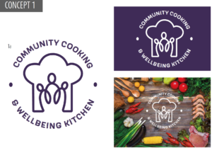
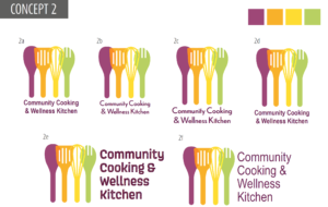
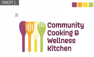
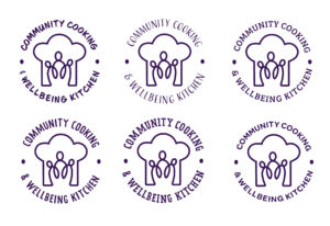
These designs presented the idea of ‘community’ the best and were two completely different approaches, therefore provided options for the client. ‘Concept 1’ utilises a chef’s hat and people connected together via a single line as we found that both of these trends were popular when conducting research. This ‘icon’ also represents the company’s objectives and name in a single image. ‘Concept 2’ uses a set of utensils that could also be representative of people, which overlap which also reflects the ‘connection’ and community feel. Our supervisor also suggested adding an element of texture to ‘Concept 2’ to reflect the wooden utensils, which we experimented with. Refining these logos to a standard which was suitable to present to the client took substantially longer than we initially had planned. Also, on reflection we should have been more efficient at communicating with our client at this stage, explaining the process we were going through.
Feedback from our client indicated that her and her team felt that ‘Concept 1’ represented them as a company the best. Therefore, we continued to refine and develop this logo.
Experimentation of type and image
Experimentation of type
Final typeface choice
Once we had established the logo design to take forward, we worked on refining the details. We started by finding the appropriate typeface to complement the line drawing. We aimed to select typefaces that had ‘friendly’ and ‘homely’ connotations to reflect the key objectives. We made a collective decision with the client that the fourth typeface would be best. (As displayed above)
Experimentation of image
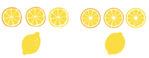
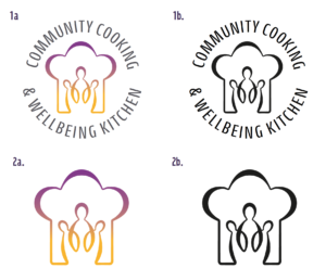
During the design process, we experimented with the placement of icons. These included lemons and leaves, however these did not work as effectively as we had originally anticipated. Therefore, after consideration, it was concluded that the icons interrupted the company name and disrupted the fluidity of the logo.
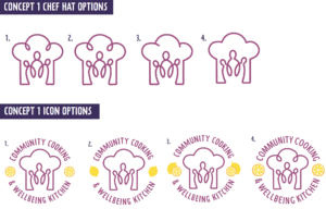
The style of the illustration was also experimented with, especially how the chef’s hat was drawn. The client’s preference was the fourth option with clean consistent lines.
Experimentation with colour scheme
Experimentation of colour
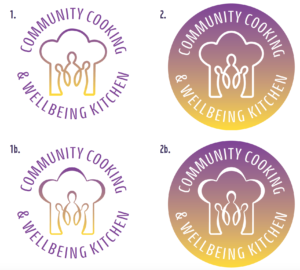
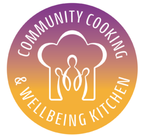
As we progressed through the design process, the importance of having a fifty fifty purple and yellow colour scheme was highlighted. Since the Community Kitchen is ‘the child’ of two social enterprises (‘Empower to cook’ and ‘Khepera’) these colours needed to be presented equally. Therefore, we experimented with using a gradient to ‘blend’ the two colours together.
We also trialled using a combination of thick and thin lines for the icon, which the client preferred to the original.
Experimentation of text colour
The challenge of achieving fifty fifty balanced colours remained for the text elements. As a solution we introduced a third colour of charcoal. This was selected as it compliments the shades of purple and yellow used. This was approved by the client.
We also introduced the idea of a single icon without text for uses where the text would be illegible at small sizes, which was also approved by the client.
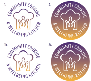
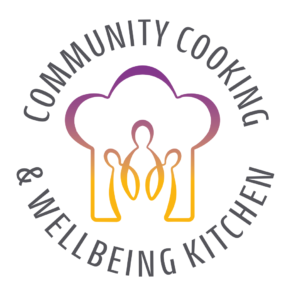
Final Design
For our Client
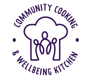
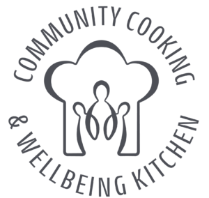
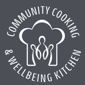
The image below shows our final logo design for our client. With the restrictions of having the two colours, representing the two founding companies, equally shown on the branding the charcoal text was a good compromise. We have also provided a charcoal version for any instances they may have where only one colour is available. In cases of overlapping the logo onto an image or colored background we have created a white logo so legibility is not lost.
Our recommended design
In context of the restrictions of having equal amounts of only purple and yellow, the logos below are what we believe would work best with our clients desired brand. We recommended to our client, that if possible, that if another colour could not be added perhaps making the text all purple would be better than having it charcoal or black. This maintains their brand colours and ends up being a cohesive design. Along with this positive design, we recommended a negative logo design to place on any coloured or photographic backgrounds. The negative design creates positive connotations with Instagrams branding. However these two designs were not chosen by the client due to their colour restrictions to create an equal representing logo.
Reflection
Completing this real job took a lot longer than we both had initially anticipated. The deadline was extended partly due to COVID-19 as this meant the urgency for the completion of the logo was far less. This resulted in no ‘concrete’ deadline and on reflection we should have set our own personal deadline to be more efficient with our time. We could have also used the time between sending draft designs and receiving feedback from the client more effectively, which may have sped up the process. However, we believe that the extra time we have used for refinement purposes benefitted the logo in terms of meeting the clients brief.
Even though the process took a lot longer than we initially anticipated, the completion of the logo has provided us both with invaluable experience. Our communication skills have improved during the process, initially we were so focused on completing high quality designs that sometimes we would not update the client as efficiently as we should have. However, further through the process we ensured to update the client as much as possible so that she did not feel disconnected from the process.
The main challenge during the design process was ensuring that the colour scheme met the client’s brief but also produced a visually appealing logo. To find a suitable solution we had to experiment with finding alternative solutions and gain inspiration from existing logos. For example, logos such as ‘Instagram’ utilise a gradient in their logo, which in the case of our logo, means that the two colours work effectively together, without competing with one another and provides a ‘fresh’ and modern feel to the logo.
We believe that the logo produced has met the objectives of the ‘Community Cooking & Wellbeing Kitchen’. The integration of purple and yellow as a gradient represents the two companies but also reflects the idea of ‘Community’. Similarly, the single line forming the icon reflects the ‘community’ aspect as it provides the idea that everyone is together and connected when at their Community Kitchen. The icon could also hold connotations with the ‘sustainability’ objective since it is a continuous line drawing. We also feel that we have achieved a logo that is unique to the Community Kitchen but is also inline with all the current trends that we established during the research stage of the process.
Every year, the art department hosts two art shows for finalist art students: the Winter Cabaret and the Summer Art Degree Show. Both shows always have a designated individual theme and branding. It is a moment for the students to showcase their work and make important connections. We will work together with a committee of art students to create a branding that clearly showcases what their year was about. At the time this report was submitted, the job was not yet completed, but in stages of near completion.
Brief/restated brief
This real job included two large projects: branding, a website, and social media assets for an event in December and branding, a website, social media assets, and a publication for the 2021 undergraduate art degree show. Initially, the job seemed to be smaller with a website that would be updated between the December event and the degree show and an overarching branding. However, after a meeting with the client and later with the art students, this job included two separate events. Our job was to work closely with the art students to produce visual identities that they were happy with and believe reflected the visions they had. The Art Degree Show committee had an estimated budget, dependent on grants and fundraising (generated from the December event for the degree show), which aimed to cover the cost of all deliverables:
To create two sets of branding. One that represents a chosen theme by art students for their annual December event, and one that successfully encapsulates the fine art’s graduating class of 2020/2021.
To design and create a website to showcase students’ work and the live stream for the December event, as well as create a separate website showcasing finalists’ work and their live stream for the degree show. These websites needed to successfully use the branding in the point above.
To create social media templates that will promote the events by showcasing students’ work and communicating important information, such as the link, date and time. This includes Instagram posts, icons, and live stream backgrounds.
To design and create a catalogue of student work for the degree show. As with the website, this also needed to successfully implement the branding. Despite the coronavirus, the intention was to print the catalogue, however, it also needs to be suitable as a PDF.
COVID–19
While this job already started during the pandemic, COVID-19 still posed several challenges. Our usual approaches to working with clients and in a group had to change. Instead of meeting face-to-face every week with the client and art students to go over work and discuss ideas, we held these meetings in Teams. Although this meant that we still had consistent meetings, our feedback was still compromised. It was more difficult to get responses from people behind screens than it would have been in an in-person setting. However, we worked through this, by following up with the students in a more informal setting when more feedback was needed.
Further, the nature of the exhibitions changed. The winter cabaret and degree show moved from being in the art department to being fully online. Usually, these events would require physical invites, posters, business cards, and other promotional materials. This year, the deliverables were narrowed down to social media assets, websites, and other digital media. However, the major publication would still be printed, but this also had to be available in PDF format for people who could not physically be at the degree show. While this might sound like less work, there was more emphasis on the importance of the website, what it looked like, and what it was capable of.
Allocating roles
As a team of four students, we knew it would be beneficial to split up the roles based on our strengths and what we wanted to learn. Charlotte was the only one in our team who had experience with making websites, specifically using Elementor on WordPress. However, Liselot wanted to learn these skills. So, for the Winter Cabaret, the roles were allocated to be that everybody would work on creating branding, and then the website would be made by Liselot and Charlotte, while Hiba and Shanzeh worked on the social media assets. For the degree show, the roles changed a little. Branding was still shared (at the end only one person made edits to assure there would be no file mixups), social media was allocated to Hiba, the brainstorming and planning for the publication was a team effort, but making edits and designing each individual page was left to Shanzeh, and the website was mainly Liselot’s job. Charlotte helped both with designing individual pages for the publication and with designing the website. However, the team is planning to get back together again to input all the content for each individual artists’ website pages. This way Shanzeh and Hiba get to learn about website building as well and the work will be done quicker.
The design process
Although this job was a two-in-one job, the design process for both was similar. However, by having two projects following each other so closely in time, we could apply what we had learned quickly. Our first approach assumed we would not need as much time to work on the branding. The schedule we had created and the client had signed off on reflected this. In the end, our branding took more weeks than we had planned, leaving us to create an entire website in less than two weeks. Although the winter cabaret had more of a time crunch than the degree show, we knew to expect to spend more time on the branding. Hence, we planned an entire term solely for perfecting the branding and how this would translate to the publication.
For the website, we figured out that less time was needed than we initially expected. Even though we worked overtime to get the Winter Cabaret website finished, we knew not to worry as much about the degree show. The first time around, three of us also had not used WordPress before other than to post these reports, meaning much time was spent on learning as well. For the degree show’s website, these skills only needed refreshing.
Themes
The themes for the events were solely chosen by the art students to best represent their year and work. To make both the December event and the degree show connect, the names were decided at the same time: Connectivité for the December event and Pièce de Distance for the degree show. They related both to how everything was online and at a distance the past year. Since Pièce de Distance is a play on pièce de résistance, the art students stayed within French-sounding names. For the design, we first focused on Connectivité, which was a mix of digital and renaissance. For the degree show, we made it its own event by having a complete opposite visual theme that focused heavily on technology and darker colours, meaning there was a contrast despite the unity. How we came to these visual themes is discussed below.
Research
In order to fully understand the subject of Connectivite, we underwent some initial research into both the themes of connecting and the French Renaissance. This enabled a deeper understanding of each theme and some potential ways in which we could link these all together in a way that was fresh yet kept some of the historical Renaissance-style work which the clients wished to have. To keep our research organised and collated in one place, we created a shared Pinterest board that the art students could also add to, where we saved inspiration for several of our deliverables; the website, catalogue and the branding.
We applied this process to brainstorm ideas for the degree show. By which we researched the theme “Pièce de résistance” in terms of context and the ways we can modernise it. According to the Merriam–Webster dictionary, the phrase translates to “An outstanding item or event, the showpiece.”Which is an immediate reflection of what the degree show is about, presenting the students best work forward. Similar to the winter cabaret, this theme still had French connections but leaned more on the theme of distancing, which was fitting because of the current pandemic and social distancing rules. Shown below are our Pinterest pages we used to collaborate with the students to brainstorm our initial ideas, allowing the students to add their own photos in order to better understand their vision. We did this both for the winter and summer shows, focusing on each one individually. This meant that we could work efficiently and bounce ideas between the members in a way that was quick and easy to do.
Branding
The branding for the events was based on the collaborative Pinterest boards with the art students. This way we could suggest visual themes and they could build on them as well as the other way around. It was clear that at the beginning of the design process of both the events, that there were many ideas. While the overarching theme of Connectivité was being connected digitally and in person, it still could be visually represented in different ways. The same was for Pièce de Distance, which was more about the distance. The design process for both of the events was very similar. We had a close collaboration with the art students due to our weekly meetings. Because of this, we were able to show multiple different directions we could take, narrow it down, and keep editing and narrowing it down further every week, which is shown in Figures 1–4 (for the winter cabaret) and Figures 5–9 (for the degree show) . Since the branding for the Winter Cabaret went smoothly, we knew that sticking to the process would also make branding the degree show go smoothly. One lesson for us after both these events, however, is to make sure to not show designs you are unsure of yourself (whether that is the logistics or the actual design), or else the client might fall in love with it.
Winter cabaret (connectivite)
Figure 1: Initial ideas
Figure 2: Developed ideas
Figure 3: Branding options
Figure 4: Final branding
Figure 4: Final branding
Art Degree show (Piece de Distance)
Figure 5: Initial ideas
Figure 6: Developed ideas
Figure 7: Developed ideas 2
Figure 8: Developed ideas 3
Figure 9: Final designs
Figure 9: Final designs
Social media
Because of the pandemic, the art students and ourselves were forced to adapt and switch to online communication. This shift applied to the promotional material of the events, social media presence became crucial than ever, in this case, the artists wanted Instagram to be their main social media outlet. For the social media pages for both the events, we combined both the students work with our branding to create a sense of cohesion among all platforms. The layout and size of elements within the logo were tested with the mockups to ensure that they were legible at any size required. The purpose of the Instagram page is to create a complete individual identity for the events. The profile picture for the winter cabaret was straightforward, unlike the degree show by which we struggled to scale down the logo whilst maintaining legibility because of the angle of type and 3D output. We simplified the logo for the social media posts, by choosing the key sports that needed to stand out along with the appropriate background colour. For the winter cabaret, we designed a specific set of posts to lie a complete image when viewing the profile (shown in the image below), this made the show’s feed visually appealing, however, it was not functional. Taking that into consideration, for the degree show the designers and students had separate posts that can be shuffled and published anytime, hence the Instagram posts were designed to be more flexible; creating separate filler posts and backgrounds for the images which can be posted in random order, shown in Figures 10.
Figure 10: Art Degree show Instagram feed
Catalogue
Since the Winter Cabaret was promoted digitally, we only designed a catalogue for the art degree show. This was unfamiliar territory, which required extensive research and experimentation. Luckily, we had enough time to understand the standard catalogue format and the rules that needed to be implemented, whilst exploring graphic treatments (on text, images and stock). Within the initial stages of design, we started with a traditional grid and page layout that held the contents; images and text. Which was developed into different formats and layouts that were later refined and the final layout was chosen by the art students, shown in Figures 11–12. In the next stage, we applied our branding on both the text and images, to see which works the best. This experimentation continued with the cover design, which required several iterations as the first few designs were not cohesive with the inside pages, shown in Figures 13–21.
Process
Figure 11: Initial ideasFigure 12: Developed ideas
The overall feedback that we received was to simplify the imagery in order to focus on the students’ work and display the information clearly. It was challenging to find a balance between the students’ requests to focus solely on the images whilst also including the design elements of the branding. We eventually found a middle ground for stylising the title text while leaving the rest of the page clean and legible. Because of the simple design of the inside contents we created more visually engaging pages for the prelims. Using solid blocks of colour for the background and changing the alignment of text and shapes elevated the catalogue, overall creating a dynamic visual output.
The website was created using WordPress. In our team, only Charlotte had experience with this. We were very lucky because this meant that she already knew about Elementor and how to use the basics. Before going to WordPress, we designed the website in Illustrator so we knew what we were working towards. However, it would have been useful to have a better look at what was capable with Elementor before we did that. We convinced the art students about our ideas and had clear visions of what we wanted just to later figure out that we could not make it a reality. These ideas were not far-fetched, so it was quite a surprise when we couldn’t figure it out. For example, we wanted images to open in a light box with a caption and extra information. However, the plugins would not allow us to add the extra information, meaning we had to work around it and create separate pages for each artwork. It was extremely stressful to have to figure out alternative solutions when we only had two weeks to make the website, but we did it in the end.
Because of what happened with the Connectivité website, we knew to better prepare ourselves for the constraints we would have. Although the art students had some great visions with 3D websites and moving elements, we knew this would not be possible with our capabilities. Luckily, they ended up liking our proposed design as well. While the website’s general structure was not as dynamic as everybody (both us and the art students) would have loved, we made up for it by applying the branding as much as possible and making it look as much as the catalogue we had designed and they loved. Further, we also made a GIF for the logo to give the illusion of a 3D aspect. It was all about compromise. Unfortunately, at the time this report was written, the website was still being made, so there might be more obstacles that came our way.
Despite its challenges, this project was useful and eye-opening, as we were introduced to different media, particularly WordPress. It was also interesting to gain a true understanding of client budgeting, as many design choices depending on their funding, particularly print finishes. This emphasised the importance of a design that was realistic and achievable, with the resources available. This was also challenging because of the number of students involved, which naturally led to fresh ideas and feedback. This forced us to promote different ideas we favoured or compromise our designs to be more suitable to the range of students. By designing for two separate types of projects, the winter cabaret and the art degree show, this helped identify previous strengths and weaknesses in the project. This reduced any issues or mistakes in the winter cabaret to occur in the art degree show. By establishing a strong client relationship, ideas and feedback were shared more openly, leading to a more suitable and attractive project that the students favoured.
Founded in 2011, The Art Therapy Agency is a membership based group of art therapists. The agency was set up to raise awareness of art therapy as a creative alternative to talk therapies. They specialize in offering a reliable service from their therapists to a range of different audiences, as well as membership support through regular training and support groups. After ten years, they are now looking for a redesign to make their branding more modern.
Restated Brief
Branding
The first part was to create a new logo and set of branding for the Agency. Like the website, the client stated that they wanted the brand to look more fresh and modern. This included redesigning the brand’s colour palette, as well as completely redesigning the logo. From the first meeting, the client said that they wanted to keep a similar colour palette to what they already had, however update the colours to look brighter. The Art Therapy Agency needed a logo which could work in a variety of different formats, including online on their website and social media, as well as physically printed onto letterheads.
Website
The second part was to redesign their website. In particular, ensure that it is more user friendly and has a modern style. The client made it clear that she wanted the website to be much easier for users to find suitable therapists for their specific needs. This would be achieved by having a search bar option, which was missing in the Agency’s original website. The client also wanted to include a feature that would allow all the therapists to be able to edit their own pages and add anything they want without having to ask an admin to do it for them. Along with the client, we agreed that both of the deliverables should keep the same colour palette to create consistent branding.
Teamwork
To help manage the workload and to meet our deadlines, we split the work evenly. We decided to break the job down into two sections; the branding (including colours and logo) – which Ellie designed, and the website – which Kamal and Dan designed. This meant that we weren’t all working on the same thing at once and that we could each manage and organise our own sections. As well as this, we frequently discussed the project using an online team group-chat to ensure that we were all in contact and working together as a team to tackle the brief. Setting up a group-chat was also really beneficial for our team as it allowed us to give each other regular peer feedback on each other’s work.
Extension of Deadline
Between us and our client, we agreed on an extension for the deadline of the project. This was mainly because we felt like we were rushing the design of the website and we did not feel like we would be able to meet the deadline with a quality of work we were completely happy with. Our client was very lenient with the deadline because she didn’t mind when she got the redesigned logo and website as long as it fully met her demands and we were all happy with it.
Logo and Colour Design
For the logo we spent a while at the start of the project brainstorming ideas together before Ellie took on the task on her own. Doing this was helpful as it gave us a wide range of initial ideas to take to our supervisor and the client. One part of important feedback that we got from our supervisor in the early days of the job, was to ensure that we were presenting our logo ideas to the client as part of a mockup (Logo mockups). We found this feedback really helpful taking the job forward as it allowed the client to be able to visualize what the logo would look like on the website, not just on a blank document.
The icon
The Art Therapy Agency’s original logo had no icon, it just used typography. One of the main things we wanted to improve with the logo was it’s adaptability to social media platforms – which was also an important factor in modernising it. For us, this involved creating an icon to assist the typography for the logo. To start the design, Ellie hand painted some different shapes to explore how the idea of ‘art’ could be visually portrayed to users . Using a paintbrush to create texture, the hand drawn style also indicates the work that the Agency does. We felt that this style worked really well as it looked soft and inviting and our supervisor and client also agreed. For the icon shape, after feedback from our supervisor about initial sketches (Initial sketches) we decided to brand away from stereotypical concepts such as hearts and stars and really consider the brand’s aims and missions. We wanted to create a design which promoted the caring, inclusive nature of The Art Therapy Agency and so we began to look at circles – a symbol of togetherness and inclusion (Paint experiments) (Heart paint experiments). This idea worked really well and our supervisor was happy with how the circle looked in the brush stroke style, alongside the cursive typeface ‘bree’ – which we had chosen due to it’s soft and friendly style. There was a lot of experimentation using the circular icon (Logo experimentation) and in the end, we decided to create two different logo formats to give more flexibility for the Agency to use. One logo is a longer rectangle logo, which can be used to letterheads and sections of the website with more horizontal space. The second version is a circular logo, which can be placed in social media icons and areas with more square space. Creating two versions of the logo was more challenging than Ellie initially thought, as she had to ensure that they both looked consistent with the brand, whilst having different layouts.
Overcoming problems
We thought that we had finished the logo, as both our client and supervisor were happy with the design and it worked well across both the long and round formats, however we then realized an issue. Luckily before the logo was signed off, our client contacted us with her concerns that it looked very similar to their rival agency. On our behalf, we had failed to ask the client about their main competitors at the start of the project, which then caused these problems later on in the job. Reflection upon this, this has been a learning curve as it has taught us to always consider the client’s competitors during the research process, before we start any designs. However, we quickly responded to these concerns and came up with a solution to the problem and “save the day” as our client kindly said. By exploring with brush stroke marks again, Ellie came up with the idea of half a circle (RJ00485_BrushStrokeIcon), which our client said looks like a smile when placed alongside the typography. They really liked the way we had incorporated the text and image to create this and so we chose it for our final designs (RJ00485_Long_Logo) (RJ00485_RoundLogo).
Website Design
For the website design, it was crucial to first find the right wordpress theme for the client’s website. To narrow down the wordpress theme options, it was essential to make a list of the features needed, choose a responsive theme while keeping in mind the branding and the structure of the website. After taking everything into consideration, we found a theme that met all the requirements which was also approved by the client.
After choosing the theme, it was essential to download relevant plugins for the website which bring in important functions to the website, whether it’s UI and UX design, SEO, site speed, online store.. etc Whatever we needed, was most likely covered by a plugin. It was a bit challenging at the beginning, because we weren’t familiar with certain plugins, but after doing our research, we learned how to use them.
Once the relevant plugins were downloaded it was time for us to get familiar with the wordpress UI, which includes sections such as:
The welcome page – The most important areas of the admin panel listed as quick shortcut links; including a step by step section on how to make your website look good.
Posts – Where you create blog posts.
Media – Upload images and other media files.
Pages – Create sub-pages for the website.
Appearance – Changing your site identity (site name, colours, logo, typography etc..)
Plugins – Install and manage website plugins.
Users – Manage user accounts that can access the admin panel of the website
Settings – The main settings.
After we got the hang of it, we dived straight into the design of the main pages. We met with the client several times to discuss what the main pages should be, how they should look and the features that should be included. Due to previous experience, we suggested using a plugin called Elementor, which is a website builder that controls every aspect of the website design work-flow from one place. This was a great suggestion because it made designing the website a lot easier thanks to the simple, powerful and flexible visual design tools and a faster performance. Thanks to Elementor we were able to straightaway start with the Homepage, while adding the other main pages into a menu bar. The menu bar includes; the home page, about page, therapist page, a join us page and a contact page. These pages were designed taking into consideration the client’s requests according to her standards, the branding and the visual content approved by the client after the meetings.
After finishing with the page designs, it was crucial to optimize the website and make sure that it was compatible with other devices such as desktops, tables and mobile phones. This was also another challenging aspect of this project, but with the help of everyone we managed to make a responsive website compatible with different devices.
Last but not least it was important to map the domain before launching the website. The domain management of the website was another important task in order to fulfill the website’s identity. The client was already paying for a domain host, so it was our job to map the domain to WordPress and launch it.
Reflection
Dan
Personally, it has been an enjoyable project, however it took much longer than any of us would’ve thought. At the beginning of the project, I did not have any experience in designing a website with full functionality. However, it was a steep learning curve and I have learnt a huge amount of experience that will benefit my career. We definitely had times where we struggled in creating a good solution, but we worked our way around any issues swiftly. The main challenge of the project was to create a website that looked great visually, but also had the functionality that would make it successful, and I believe we have achieved that. In general, we had a close relationship with our client as we met regularly to go over changes and make any new ones to suit our clients demands. To improve in future projects, I should manage my time better and ensure deadlines are met.
Kamal
Overall, the project went very well. I really enjoyed it even though it took a lot longer than expected. One of the main reasons why I chose this Real Job was because I had some experience in web design, however during the project we encountered a lot of unexpected challenges such as finding the right website plugins and learning how to use them which took time to learn. Nevertheless, we managed to overcome these hurdles as a team and reached the client’s expectations. I’ve learned a lot throughout this project and gained plenty of experience which will come in handy in the future.
Ellie
This project has really opened my eyes with how long rebranding jobs can take. Despite a couple hurdles, I have really enjoyed working on this job with Dan and Kamal, of whom I had not worked closely with before. I think that we worked really well as a team as we were in constant communication regarding the job and we weren’t afraid to give each other constructive criticism. I chose this job as I am interested in a career in branding and I feel that this job has taught me some valuable lessons for that – such as making sure I fully research the client’s competitors so I don’t cause any copyright issues later on in the project. As well as this, I have also learnt a great deal about the production side of creating logos, which will be beneficial for my future as a designer.
The Department of Typography and Graphic Communication at the University of Reading building wayfinding needs some refinement. The department needs a distinctive sign to indicate the building upon arrival. The design of an external wall graphic needs to be impactful because the sign would need to be noticed from afar from the enterprise car park for students, delivery and prospect students coming for application day, open days etc.
Brief
The brief was to design an external wall graphic for the department that can easily be recognised and needs to represent the department and the students and tutors alike. The final deliverable would be a press-ready pdf and the ai file ready for production by the department.
In the brief we stated, the success of this project would come from the users being able to recognise the building. The building would be eye-catching in an effective and positive way. The success of the project also depends on if the graphic elements represent the building and the department. Throughout the project, we ensured that the graphic elements were a representation of the department and are relatable with the tutors and the students. We wanted to make the department as user-centric as possible this was demonstrated through the surveys taken and the frequent feedback between students to get their perspective on what the department means to them. Although the real job has yet to be finalised as we wait on the specifications of the new windows our client and our supervisors alike have stated that the current design proposals are very encouraging.
Communication
Throughout the project, we had regular meetings with our clients and supervisors as well as attending frequent real jobs meetings. We felt it was important to get a different perspective to make sure we were in the right direction through the project especially after both of us have never designed wall graphics before. We also communicated with our peers to get their perspective on what they would like to see in the wall graphic. We conducted a survey to get the perspective of both the tutors and students and collated this to get an idea of what we could do moving forward.
Schedule
The schedule for this project has been disrupted heavily due to the COVID-19 pandemic. The original deadline was 20/04/2020. This has led to the project having to be stalled for a couple of months. The project is still currently progressing as we wait for the specification of the new department windows. At first, the project was progressing gradually without interruption and after the covid restrictions, we were limited to what we could do. We were able to successfully carry out the survey where we were able to make progress with making design decisions. Once we had an idea of the colour scheme and themes via the mood boards and survey, we were able to start proposing designs to our supervisors and our client. The process was mostly moving swiftly barring lockdowns in between. The designs were refined and edited during the months of feedback from our supervisors and clients.
Design Process
We attempted to start our design process with a general mood board (see Trello) showcasing different variations of wall graphics, both indoor and out. This collection of images is so we can gain inspiration from and look to gain any insights that may not have been so apparent beforehand. These general ideas would stand as a basis that may allow us to incorporate further ideas to at a later point in idea generation. During this time, however, we realised that the job at hand is very much to do with the community within the department than just the department itself. We realised that we wanted the people who reside within the building to be reflected in the graphic also; a more personal approach to the department would make more sense for this specific real job. The best way we thought we would do this is by creating a survey for all members of the department, staff and students, to take part in. The questions would be set up to try and gauge what the community thought that the building represented and what they wanted it to represent. These answers would go on to inform much of the decisions going forward and acts as a basis for us to refer back to in order to progress. Answers to do with the actual visual identity of the department are the best for these types of decisions; an example would be the colours that people came up with when they thought of the department.
An example of the survey result
From here we started on initial ideas for the graphic, and now we had a stronger basis for idea generation from the survey. Immediately we started to incorporate these findings within our work; some of which displayed the most popular answer for the colour that attributes to the department. Some of the initial designs also attempted to go the route of modern via the feedback that the departments do not represent modernity in design as much as they should, and some took the opposite route of embracing the traditional and historic look and feel of the department. We also took to approaching the graphic in multiple ways, some being with the use of type, some with the use of photography, and some with illustrations. We wanted to try out multiple solutions, and the brief in general is one that would allow us to do so. Throughout the entire project we had also been trying out different approaches to where exactly on the wall we would be designing the graphic for; the brief was left open for us to choose ourselves what the best option may be, and our client also shared this sentiment when asking him. He would often tell us that he wanted us to have more control over design decisions and that making decisions on things like where the graphic should be would detract from finding possible design solutions, and could essentially stunt creativity. This did allow for us to flex our creativity where we wished, but it did make it difficult when making decisions, and at times felt like too much freedom was given to us. The further we moved through the process the more we started to hone in on more solid concepts and ideas that would genuinely reflect the department and those insides.
Our next set of ideas incorporated the inside of the building. The interior of the department is very distinctive and has many pieces of ephemera and many old display pieces on the walls and in the hallways; we decided to take these as inspiration. Not only do they represent the inside of the building and its unique visual interior, but they also embody a large part of what is recognised from the department; its historic collections and general historic reputation. Moving from here, however, we would attempt to work in more modern elements to balance out the more traditional part of the concept; it would also allow meaning that we hit another criteria that were mentioned in the survey. This part would be to do with what was missing from how the department was being represented. This is the point where we decided to integrate the more modern use of iconographic illustrations. The icons did well to balance the traditional with the modern, especially when we started to illustrate the historical ephemera also.
At this point we had also decided on the use of multiple colours pointed out from the survey. We were also in conversations with Geoff to do with the application of the actual graphic, giving us the choice of multiple types of wall mounted panels.
At this point we had also decided on the use of multiple colours pointed out from the survey. We were also in conversations with Geoff to do with the application of the actual graphic, giving us the choice of multiple types of wall-mounted panels.
Around this time, we were given feedback from our client regarding a suggestion of placing the graphic onto the windows, and after further conversations with Geoff, we were given the green light for a whole new avenue of designs. Our proposals now included ideas that would be placed onto the windows using a one-way see-through material called Contravision.
Unfortunately, as a new door opened, new problems arose. The department is due to get new windows installed and even up until submission it has remained unclear exactly what the dimensions of the windows are to be. Instead of waiting, however, we made the decision to move forward instead of lingering for an unknown amount of time. As a result of not knowing what the specific dimensions were, we took the initiative to base our designs on the most recently installed double glazed windows in the department at the time.
At the point of submission, we have not been able to finalise our designs and achieve a press ready outcome. Due to the nature of our job it was been agreed on that we will submit what we have at the moment, and make it as close to a convincing set of proposals as we can. It is to be noted that we will also be carrying on the real job after submission, and so the concepts we are submitting are currently still in development. Both our client and us as a group, believe that the concept is such that is flexible in application and is able to be adapted effectively to a new set of window dimensions if need be; until we get the correct dimensions from the project manager, we will be continuing with the sizes we have at the moment.
Feedback
We are still yet unable to get feedback for the final product however based on the progress we have made so far it has been mostly positive from the client and the supervisor. Overall our client has been happy with the progress we have been making and has often remarked our concepts as quite strong outcomes with a good amount of potential when finally implemented. A word from our client to justify this; “you have so far made very good progress on the real job, and have found a viable, realistic and attractive design direction, which shows considerable promise. I look forward to you continuing with the project so you can bring it to a successful conclusion in the coming weeks, following your submission of work completed to date.” Our supervisor is also encouraged with our current proposition and once we have the correct window settings we believe we can create a design that represents the department in a distinctive and eye-catching way.
The Ure Museum can be found in the Classics Department within the Edith Morley building on the University of Reading’s Whiteknights campus. Before I started this job, I wasn’t familiar with the museum, however now I wish I had discovered it sooner as it is such an interesting asset to the campus. Before the COVID19 pandemic hit, the Ure Museum used to hand out physical exhibition guides to explain the beautiful objects in their exhibitions to vistors. However, the coronavirus pandemic has meant that this cannot happen and so, the museum have expanded their exhibition booklet to an online format. This is a really exciting step for the museum, as it is leading them into a new digital world – hopefully expanding their audience and encouraging more remote visitors from around the country.
I was assigned this real job with the task to design a digital exhibition guide for their upcoming exhibition – Troy: Beauty and Heroism, which is a spotlight loan from the British Museum, due to visit the Ure between September and December 2021. During my intial client meeting, I was told that the digital booklet would include a combination of images and text relating to each of the different objects in the exhibition. Originally the exhibition was meant to take place in February 2021 but COVID19 stopped this from happening – pushing the dates back. Upon reflection, I’m glad that this happened, as it meant that I could spend longer on the project – handing over a design at the end that I am really happy with.
Restated Brief
The main deliverable for this project was an interactive eBook , of which vistors could download remotely to read about the exhibition objects on their phones, tablets or laptops. Due to the exhibition being a spotlight loan, it was important that I incorporated in both sets of branding to create an exhibition guide with reflects the branding of both museums. As the Ure Museum and British Museum already have very strict guidelines, I had to ensure that I was considerate and consistent in my designs.
The specific objectives
Within the restated brief, my specific objectives for the job were that:
The eBook must be easy to navigate for a reader – including the use of clear, interactive links.
There must be clear divisions to show the three main sections of the exhibition.
The prelims and end matter must be easy to find and read.
These three objectives gave me a clear starting point and a constant focus throughout the project, which helped me to stay motivated and on-track. Due to not having any specific software requirements to create the eBook in, I was free to chose an appropriate software, which I found really interesting as I learnt a lot about how eBooks can be made.
Changes to the brief
As the brief was very focused from the start, I didn’t encounter may changes. Although, due to the exhibition date being pushed back to a lot later in the year, it gave me some freedom and more time to get to know my client, which I really appreciated. However, at times I think that this did make the design process feel very lengthy, as I ended up working on the project for a couple months longer than originally scheduled.
Research
To start the ideation process, I began by looking at examples of other digital exhibition booklets to discover what navigational systems worked well, as well as mainly studying typeface sizes and the treatment of images and prelims/end matter. One particular example I was drawn to was the Pompei exhibition at Grand Palais (available to view at: https://www.grandpalais.fr/pdf/Guide_Visite_Pompei_GB.pdf). I liked this example as it is quite simple, yet effective, due to the large typeface, limited colour palette and straight-forward navigation system. As well as this, the clear clickable links within the guide related to the specific objectives I had been set as part of my brief, therefore, I used this resource as inspiration for starting my eBook.
I think that the guide is so easy to navigate as the different sections are clearly divided by large headings and the navigational bar is consistent on every page. This encouraged me to consider consistency during my own design process. However, the Pompei exhibition guide also urged me to think about what things didn’t work so well, or were missing, so that I could incorporate these into my own design. One thing I did find confusing with the booklet, was that the clickable links were not highlighted, so there was no immediate indication of which parts of press. This research was valuable to my designs as I knew that as a user, this is something I subciously look for online. Therefore, when designing the Troy exhibition guide, I used colour to show which links were interactive – furthering the clarify of the navigation system for the reader.
Creating the eBook
Due to my lack of experience in creating eBooks at the start of the job, I had to spend a lot of time discussing options with my supervisor. Having professional insight into the area gave me a lot more knowledge, of which I can now take forward for future projects. After researching different softwares, I finally decided to design the publication in InDesign as I had a lot of experience working with it and so I felt more comfortable. It was a really interesting process creating the eBook as I had never created an interactive pdf before – I thought it would be really time consuming but the process was very straightforward and by creating basic mockups I was able to experiment with different types of navigation.
Navigation
I started by focusing on navigation as I didn’t want to waste time creating layouts which could then be effected by changing the navigation. By the time I placed the text in, I was glad that I had this thought rationale, as I changed the original navigation system from a bar running down the left page margin, to small icons at the bottom of the page.
The final navigation systemThe original navigation system
From using InDesign for editorial projects before, I was able to create a plan of what elements I wanted to focus on first. I started off by considering the following:
Margins and columns
Master pages
Headers and footers
Running heads and folios
Stylesheets
Paragraph and character styles
I chose to start the design with these page features as I wanted to create a strong foundation to place the text into.
Branding
After designing the main layout of the guide by using masterpages for different sections, I then moved onto the design stage. Having the Ure Museum’s brand guidelines was really helpful as it limited my choice of what colours and typefaces I could use. When I first met with my client, they gave me a selection of previous design jobs commissioned for the museum and these really helped me to get a feel of their branding. Looking through other examples, gave me a clearer idea of what the exhibition guide should look like in order to be consistent with other designs that had been created for the Ure Museum as they all clearly utilized the same colour schemes, graphic devices and typefaces. This job was my first experience of working on brand guidelines and I really enjoyed it as it gave me a clear direction with my designs.
Alongside the Ure Museum, working with the British Museum was a huge privilege. I was in frequent contact with their Press and Marketing Manager, who regularly assisted me along the project. Creating contacts with someone from such a respected company has been one of the most rewarding parts of this job. I received the British Museum’s brand guidelines for the Troy exhibition and had to ensure that I read them and understood them before I sent anything to my client. This process largely improved my proof reading skills as I had to read the text through many times to ensure it was all correct.
The cover
The final part of the design process, was designing the front cover for the exhibition guide. This part was where I incorporated in the British Museum’s branding – using their logo, featuring exhibition image and exhibition layout guide. As well as the booklet being consistent with the rest of the Ure publications, it also has to be consistent with the publications being produced by other museums working with the British Museum for this exhibition tour. This is why I chose the layout for the cover. I decided to change the boxes into the Ure Museum brand colours to add their touch to the British Museum’s layout. I think that the cover nicely combines the two brands together.
Originally, the whole publication was set in the Ure Museum’s blue brand colour. However, after placing in the images on the front cover, it seemed appropriate to use their orange brand colour instead – to create harmony between the text and images. Overall, the client and I agreed that this colour scheme worked a lot better than the original – which taught me that I should’ve furthered my experimental process within the brand guidelines at the start.
The final front cover design
The first draft of the front cover design
Reflection
I have thoroughly enjoyed working on this project with the Ure Museum, as it has improved my editorial and reader navigations skills, as well as teaching me many new skills – including how to create eBooks and how to work with brand guidelines. Being trusted to work on a project with the British Museum has also improved my confidence as a designer. Receiving such positive feedback from my client has been a huge highlight of the real jobs scheme for me and having the opportunity to create connections within the branding and marketing world has made the lengthy process of this job worth it.
Coming away from this project, I feel as if I could’ve worked more efficiently to still finish the job closer the original deadline, however having extra time allowed me to work with my client for longer, which I really enjoyed.