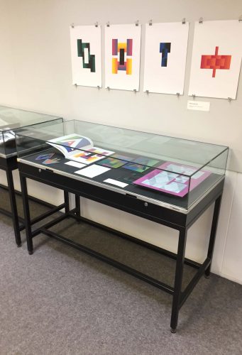
Vaibhav Singh's exhibition on non-keyboard ‘index’ typewriters ran in the Department in late 2018. Check out all the details at Contextual Alternate.
Category: Collections-based research
Science communication for children

A new AHRC-funded project begins today. Transforming science for young people: Marie Neurath and Isotype books for children aims to find new audiences for the approach to science communication taken by Marie Neurath in her books for children, produced in the 1940s and 1950s. The illustrations in these books, in series such as the ‘Wonder world of nature’ and ‘Wonders of the modern world’, were innovative in their approach to the design of complex information.
Following on from Isotype revisited, the project will make extensive use of the materials in the Otto and Marie Neurath Isotype Collection, to identify approaches to science communication relevant to teaching in primary schools today. We will work with teachers and teacher educators as part of the design process to ensure that their ideas and needs are taken into account. Pilot schools will be involved in evaluating the effectiveness of the resources to ensure they are relevant and effective.
An exhibition at House of Illustration in London in summer 2019, Marie Neurath: Picturing Science, will display examples of Marie Neurath’s illustrations from the children’s books, as well as sketches, drawings and correspondence that show the iterative nature of the design process.
Project people and partners
Prof Sue Walker and Prof Eric Kindel, Department of Typography & Graphic Communication, University of Reading
Dr Andrew Happle, Institute of Education, University of Reading
Dr Emma Minns (Project Officer)
Partners:
Science communication for children
A new AHRC-funded project begins today. Transforming science for young people: Marie Neurath and Isotype books for children aims to find new audiences for the approach to science communication taken by Marie Neurath in her books for children, produced in the 1940s and 1950s. The illustrations in these books, in series such as the ‘Wonder world of nature’ and ‘Wonders of the modern world’, were innovative in their approach to the design of complex information.
Following on from Isotype revisited, the project will make extensive use of the materials in the Otto and Marie Neurath Isotype Collection, to identify approaches to science communication relevant to teaching in primary schools today. We will work with teachers and teacher educators as part of the design process to ensure that their ideas and needs are taken into account. Pilot schools will be involved in evaluating the effectiveness of the resources to ensure they are relevant and effective.
An exhibition at House of Illustration in London in summer 2019, Marie Neurath: Picturing Science, will display examples of Marie Neurath’s illustrations from the children’s books, as well as sketches, drawings and correspondence that show the iterative nature of the design process.
Project people and partners
Prof Sue Walker and Prof Eric Kindel, Department of Typography & Graphic Communication, University of Reading
Dr Andrew Happle, Institute of Education, University of Reading
Dr Emma Minns (Project Officer)
Partners:
Activity in Antwerp
Our use of the Lettering, Printing and Graphic Design Collections in the Typography Department, and our distinctive approach to collections-based research, was exceptionally well demonstrated at the 2018 ATypI conference in Antwerp. We enjoyed top quality presentations by Typography staff and PhD students. In a conference with over 550 international delegates, who repeatedly mentioned the ‘Reading’ influence in conversations and comments, it was humbling to realise just how influential and significant our work with collections has been in developing new knowledge about type and typography, and in inspiring people to undertake research.
Typography staff
Fiona Ross and Alice Savoie introduced their new Leverhulme-funded project: ‘Women in Type’
Eric Kindel: ‘Objet-type: the French stencil letter‘
AHRC-funded Design Star PhD students
Riccardo Olocco: ‘The success of Jenson’s roman type‘
Borna Izadpanah: ‘Early Persian printing and typography in Europe‘
Recently graduated PhD student
Emanuela Conidi: ‘Uncovering Arabic type history, informing design‘
Activity in Antwerp

Our use of the Lettering, Printing and Graphic Design Collections in the Typography Department, and our distinctive approach to collections-based research, was exceptionally well demonstrated at the 2018 ATypI conference in Antwerp. We enjoyed top quality presentations by Typography staff and PhD students. In a conference with over 550 international delegates, who repeatedly mentioned the ‘Reading’ influence in conversations and comments, it was humbling to realise just how influential and significant our work with collections has been in developing new knowledge about type and typography, and in inspiring people to undertake research.
Typography staff
Fiona Ross and Alice Savoie introduced their new Leverhulme-funded project: ‘Women in Type’
Eric Kindel: ‘Objet-type: the French stencil letter‘
AHRC-funded Design Star PhD students
Riccardo Olocco: ‘The success of Jenson’s roman type‘
Borna Izadpanah: ‘Early Persian printing and typography in Europe‘
Recently graduated PhD student
Emanuela Conidi: ‘Uncovering Arabic type history, informing design‘
Letterpress: possibilities & practice
Due to popular demand, now on until 20 July 2018
We’re pleased to announce the continuation of our exhibition, ‘Letterpress: possibilities & practice’, until Friday 20 July 2018. Stop by to see a range of innovative letterpress practices and possibilities. To tempt you, two practices in the exhibition are featured below. Read on!
Reconstructing historical typography
Letterpress printing practice encompasses scholarly investigations of historical typography in pursuit of new knowledge. The two examples on display here involve the reconstruction of fifteenth-century relief printing surfaces in an effort to better understand the production of well known incunable works. The type on the left (in the image, below) is a facsimile of that used in Gutenberg’s 42-line Bible, printed in 1455. It has been composed to replicate a page from that book. The type was produced as part a BBC Four documentary, ‘The machine that made us’, on the life and work of Johannes Gutenberg, featuring Alan May alongside Martin Andrews and Stephen Fry. On the right are type and decorated borders and initials that together comprise a speculative reconstruction of the relief surfaces used to print a multi-coloured page from the 1457 Mainz Psalter of Fust & Schoeffer. The reconstruction was part of a research project to investigate Fust & Schoeffer’s probable working methods.


Re-invention of historical technique
This work has been created by the Leipzig designer, Pierre Pané-Farré. It takes its inspiration from compound-plate printing, a nineteenth-century technique that exploited multiple interlocking printing surfaces. Inked separately (in different colours) and then combined, a single impression would be taken from the interlocking surfaces, resulting in precisely aligned multicolour printed images. Pané-Farré has revisited the technique using laser-cut MDF printing surfaces, which produced the various sets of interlocking components displayed here. Ink was applied to each component in the set, either as ‘flat’ colour or in graduated hues. The set was then printed in a single impression to produce the polychromatic prints. The project was accompanied by the publication of Die polychrome Druckerei (Leipzig: Institut für Buchkunst, 2014), which reproduces the prints in four-colour offset lithography. Pané-Farré cites Michael Twyman’s book, Printing 1770–1970 (1970), and Maureen Greenland’s doctoral thesis, ‘Compound-plate printing: a study of a nineteenth-century colour printing process’ (University of Reading, 1996), as starting points for his work.


Letterpress: possibilities & practice
Due to popular demand, now on until 20 July 2018
We’re pleased to announce the continuation of our exhibition, ‘Letterpress: possibilities & practice’, until Friday 20 July 2018. Stop by to see a range of innovative letterpress practices and possibilities. To tempt you, two practices in the exhibition are featured below. Read on!
Reconstructing historical typography
Letterpress printing practice encompasses scholarly investigations of historical typography in pursuit of new knowledge. The two examples on display here involve the reconstruction of fifteenth-century relief printing surfaces in an effort to better understand the production of well known incunable works. The type on the left (in the image, below) is a facsimile of that used in Gutenberg’s 42-line Bible, printed in 1455. It has been composed to replicate a page from that book. The type was produced as part a BBC Four documentary, ‘The machine that made us’, on the life and work of Johannes Gutenberg, featuring Alan May alongside Martin Andrews and Stephen Fry. On the right are type and decorated borders and initials that together comprise a speculative reconstruction of the relief surfaces used to print a multi-coloured page from the 1457 Mainz Psalter of Fust & Schoeffer. The reconstruction was part of a research project to investigate Fust & Schoeffer’s probable working methods.


Re-invention of historical technique
This work has been created by the Leipzig designer, Pierre Pané-Farré. It takes its inspiration from compound-plate printing, a nineteenth-century technique that exploited multiple interlocking printing surfaces. Inked separately (in different colours) and then combined, a single impression would be taken from the interlocking surfaces, resulting in precisely aligned multicolour printed images. Pané-Farré has revisited the technique using laser-cut MDF printing surfaces, which produced the various sets of interlocking components displayed here. Ink was applied to each component in the set, either as ‘flat’ colour or in graduated hues. The set was then printed in a single impression to produce the polychromatic prints. The project was accompanied by the publication of Die polychrome Druckerei (Leipzig: Institut für Buchkunst, 2014), which reproduces the prints in four-colour offset lithography. Pané-Farré cites Michael Twyman’s book, Printing 1770–1970 (1970), and Maureen Greenland’s doctoral thesis, ‘Compound-plate printing: a study of a nineteenth-century colour printing process’ (University of Reading, 1996), as starting points for his work.


Women in Type

‘Women in type: a social history of women’s role in type-drawing offices, 1910–90’ is a new three-year research project now underway in the Department, funded by the Leverhulme Trust and led by Professor Fiona Ross. The project team includes Dr Alice Savoie and Dr Helena Lekka. For more information about this exciting and timely project, see the Leverhulme Trust’s newsletter for January 2018 (p. 11).
Professor Michael Twyman on forms design and the history of forms
(Cross posting from Centre for Information Design Research)
We are delighted to be able to point you to a video of one of a series of seminars for masters students and postgraduate researchers in the Department of Typography & Graphic Communication. The seminars, covering a range of topics, are given during the academic year by Professor Emeritus Michael Twyman.
This seminar focuses on the design of forms and its history, and draws together the Department’s research interests both in the history of printing and graphic communication and in the design of information for its users. The seminar demonstrates the use of material from collections and archives, which has been a key part of the Department’s approach to teaching and research since the 1970s.
We are grateful to the Friends of the University for funding the preparation of this recording.
Isotype at the Science Museum

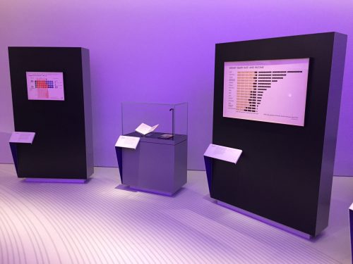
The Department has made a long-term loan of Isotype work to the Science Museum, London. The loans are featured in the museum’s new Mathematics gallery, designed by Zaha Hadid Architects, which opened to the public today (8 December). Following a visit to the Isotype Collection, Science Museum curator David Rooney chose examples of Isotype that convey simply and directly the underlying application of mathematics to the production of pictorial statistics. Captions written for the items note Marie Neurath’s early training as a mathematician.


