Our experienced supervisors welcome applications in the history, theory and practice of design for reading. Here are some of our recent and current PhD topics
If you have any ideas do get in touch with Sue Walker for an informal chat, and to discuss funding opportunities.
Why not join us as an AHRC-funded Design Star student?
Our Graduate School at Reading is excellent, and provides a stimulating environment.
And the experience we provide in Typography is world leading, not least because much of our PhD work is supported by our outstanding collections and archives, and the research training we provide.
In the last in a series of posts about artefacts in the exhibition ‘Material histories’ (now on in the Department), Eric Kindel tells the story of a stencil cut to commemorate the 1876 Centennial Exhibition in Philadelphia.
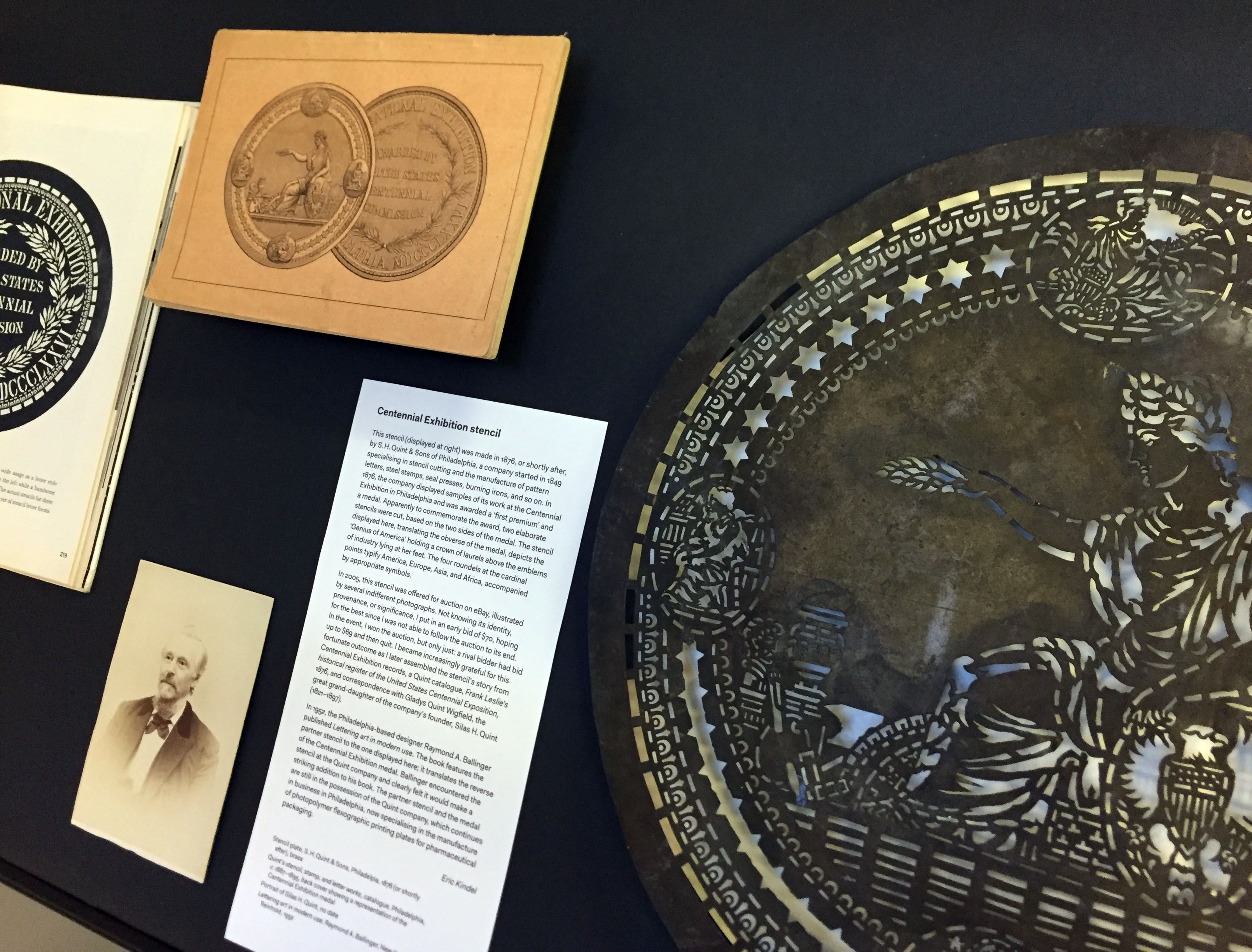
Centennial Exhibition stencil (at right), alongside (from left) Lettering art in modern use (1952) by Raymond A. Ballinger; portrait of Silas H. Quint (no date); and back cover of the catalogue Quint’s stencil, stamp, and letter works (c. 1887–1895) showing a representation of the Centennial Exhibition medal.
Centennial Exhibition stencil
This stencil (shown above, at right) was made in 1876, or shortly after, by S. H. Quint & Sons of Philadelphia, a company started in 1849 specialising in stencil cutting and the manufacture of pattern letters, steel stamps, seal presses, burning irons, and so on. In 1876, the company displayed samples of its work at the Centennial Exhibition in Philadelphia and was awarded a ‘first premium’ and a medal. Apparently to commemorate the award, two elaborate stencils were cut, based on the two sides of the medal. The stencil displayed here, translating the obverse of the medal, depicts the ‘Genius of America’ holding a crown of laurels above the emblems of industry lying at her feet. The four roundels at the cardinal points typify America, Europe, Asia, and Africa, accompanied by appropriate symbols.
In 2005, this stencil was offered for auction on eBay, illustrated by several indifferent photographs. Not knowing its identity, provenance, or significance, I put in an early bid of $70, hoping for the best since I was not able to follow the auction to its end. In the event, I won the auction, but only just: a rival bidder had bid up to $69 and then quit. I became increasingly grateful for this fortunate outcome as I later assembled the stencil’s story from Centennial Exhibition records, a Quint catalogue, Frank Leslie’s historical register of the United States Centennial Exposition, 1876, and correspondence with Gladys Quint Wigfield, the great grand-daughter of the company’s founder, Silas H. Quint (1821–1897).
In 1952, the Philadelphia-based designer Raymond A. Ballinger published Lettering art in modern use. The book features the partner stencil to the one displayed here; it translates the reverse of the Centennial Exhibition medal. Ballinger encountered the stencil at the Quint company and clearly felt it would make a striking addition to his book. The partner stencil and the medal are still in the possession of the Quint company, which continues in business in Philadelphia, now specialising in the manufacture of photopolymer flexographic printing plates for pharmaceutical packaging.
On display
Stencil plate, S. H. Quint & Sons, Philadelpia, 1876 (or shortly after), brass Quint’s stencil, stamp, and letter works, catalogue, Philadelphia, c. 1887–1895, back cover showing a representation of the Centennial Exhibition medal
Portrait of Silas H. Quint, no date Lettering art in modern use, Raymond A. Ballinger, New York: Reinhold, 1952
‘Material histories’ presents graphic communication artefacts with a story to tell. The stories – the material histories – describe the artefacts in particular: what they are about, where they came from, their material qualities, their circumstances of production, how they were acquired, and crucially how they link to other artefacts, narratives and representations.
In the third in a series of posts about artefacts in the exhibition ‘Material histories’ (now on in the Department), Rob Banham tells the story of Jan Tschichold’s history of the ampersand.
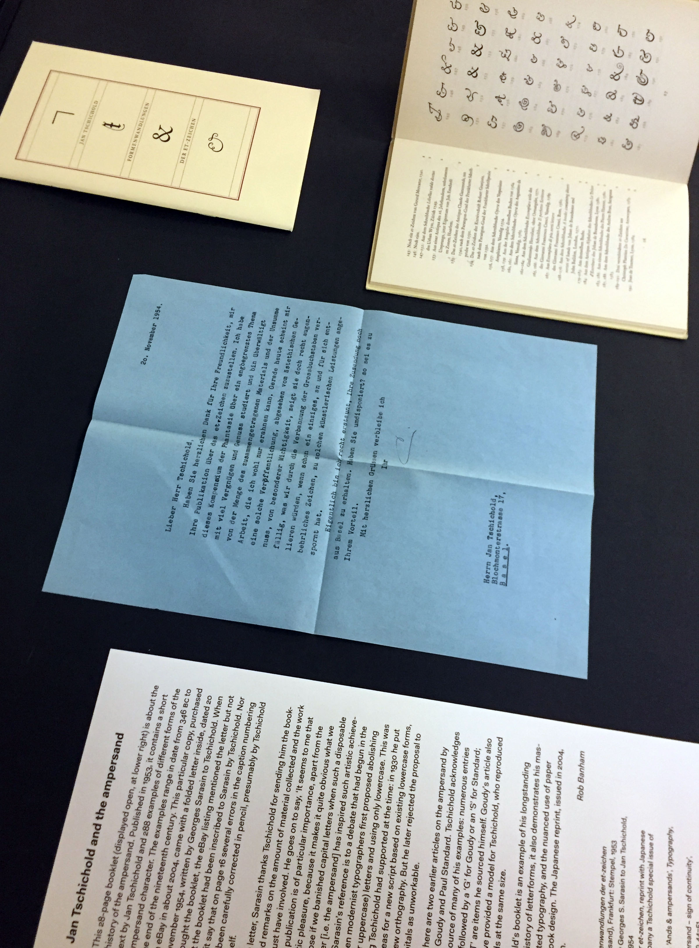
Formenwandlungen der et-zeichen (Forms of the ampersand) (1953) by Jan Tschichold (at upper right); letter from Georges Sarasin to Tschichold (centre); reprint of Formenwandlungen der et-zeichen (2004).
Jan Tschichold and the ampersand
This 28-page booklet (above, displayed open at upper right) is about the history of the ampersand. Published in 1953, it contains a short text by Jan Tschichold and 288 examples of different forms of the ampersand character. The examples range in date from 346 BC to the end of the nineteenth century. This particular copy, purchased on eBay in about 2004, came with a folded letter inside, dated 20 November 1954, written by Georges Sarasin to Tschichold. When I bought the booklet, the eBay listing mentioned the letter but not that the booklet had been inscribed to Sarasin by Tschichold. Nor did it say that on page 16 several errors in the caption numbering had been carefully corrected in pencil, presumably by Tschichold himself.
In the letter, Sarasin thanks Tschichold for sending him the booklet, and remarks on the amount of material collected and the effort this must have involved. He goes on to say, ‘It seems to me that such a publication is of particular importance, apart from the aesthetic pleasure, because it makes it quite obvious what we would lose if we banished capital letters when such a disposable character [i.e. the ampersand] has inspired such artistic achievements.’ Sarasin’s reference is to a debate that had begun in the 1920s when modernist typographers first proposed abolishing capital (or uppercase) letters in favour of only lowercase. This was something Tschichold had supported at the time: in 1930 he put forward ideas for a new script based on existing lowercase forms, and for a new orthography. But he later rejected the proposal to abolish capitals as unworkable.
Also on display are two earlier articles on the ampersand by Frederick W. Goudy and Paul Standard. Tschichold acknowledges both as the source of many of his examples: numerous entries in his list are followed by a ‘G’ for Goudy or an ‘S’ for Standard; those with a ‘T’ are items he sourced himself. Goudy’s article also appears to have provided a model for Tschichold, who reproduced his ampersands at the same size.
While Tschichold’s booklet is an example of his longstanding interest in the history of letterforms, it also demonstrates his mastery of understated typography, and the nuanced use of paper and binding in book design. The Japanese reprint, issued in 2004, is a pale imitation.
On display
Jan Tschichold, Formenwandlungen der et-zeichen (Forms of the ampersand), Frankfurt: Stempel, 1953
Copy of a letter sent by Georges S. Sarasin to Jan Tschichold, dated 20 November 1954 Formenwandlungen der et-zeichen, reprint with Japanese text, issued to accompany a Tschichold special issue of Idea magazine, 2004
Frederick William Goudy, ‘Ands & ampersands’, Typography, no. 3, 1937, pp. 11–18
Paul Standard, ‘The ampersand – sign of continuity’, Signature, no. 8, 1938, pp. 44–51
‘Material histories’ presents graphic communication artefacts with a story to tell. The stories – the material histories – describe the artefacts in particular: what they are about, where they came from, their material qualities, their circumstances of production, how they were acquired, and crucially how they link to other artefacts, narratives and representations.
In the third in a series of posts about artefacts in the exhibition ‘Material histories’ (now on in the Department), Rob Banham tells the story of Jan Tschichold’s history of the ampersand.
Formenwandlungen der et-zeichen (Forms of the ampersand) (1953) by Jan Tschichold (at upper right); letter from Georges Sarasin to Tschichold (centre); reprint of Formenwandlungen der et-zeichen (2004).
Jan Tschichold and the ampersand
This 28-page booklet (above, displayed open at upper right) is about the history of the ampersand. Published in 1953, it contains a short text by Jan Tschichold and 288 examples of different forms of the ampersand character. The examples range in date from 346 BC to the end of the nineteenth century. This particular copy, purchased on eBay in about 2004, came with a folded letter inside, dated 20 November 1954, written by Georges Sarasin to Tschichold. When I bought the booklet, the eBay listing mentioned the letter but not that the booklet had been inscribed to Sarasin by Tschichold. Nor did it say that on page 16 several errors in the caption numbering had been carefully corrected in pencil, presumably by Tschichold himself.
In the letter, Sarasin thanks Tschichold for sending him the booklet, and remarks on the amount of material collected and the effort this must have involved. He goes on to say, ‘It seems to me that such a publication is of particular importance, apart from the aesthetic pleasure, because it makes it quite obvious what we would lose if we banished capital letters when such a disposable character [i.e. the ampersand] has inspired such artistic achievements.’ Sarasin’s reference is to a debate that had begun in the 1920s when modernist typographers first proposed abolishing capital (or uppercase) letters in favour of only lowercase. This was something Tschichold had supported at the time: in 1930 he put forward ideas for a new script based on existing lowercase forms, and for a new orthography. But he later rejected the proposal to abolish capitals as unworkable.
Also on display are two earlier articles on the ampersand by Frederick W. Goudy and Paul Standard. Tschichold acknowledges both as the source of many of his examples: numerous entries in his list are followed by a ‘G’ for Goudy or an ‘S’ for Standard; those with a ‘T’ are items he sourced himself. Goudy’s article also appears to have provided a model for Tschichold, who reproduced his ampersands at the same size.
While Tschichold’s booklet is an example of his longstanding interest in the history of letterforms, it also demonstrates his mastery of understated typography, and the nuanced use of paper and binding in book design. The Japanese reprint, issued in 2004, is a pale imitation.
On display
Jan Tschichold, Formenwandlungen der et-zeichen (Forms of the ampersand), Frankfurt: Stempel, 1953
Copy of a letter sent by Georges S. Sarasin to Jan Tschichold, dated 20 November 1954 Formenwandlungen der et-zeichen, reprint with Japanese text, issued to accompany a Tschichold special issue of Idea magazine, 2004
Frederick William Goudy, ‘Ands & ampersands’, Typography, no. 3, 1937, pp. 11–18
Paul Standard, ‘The ampersand – sign of continuity’, Signature, no. 8, 1938, pp. 44–51
‘Material histories’ presents graphic communication artefacts with a story to tell. The stories – the material histories – describe the artefacts in particular: what they are about, where they came from, their material qualities, their circumstances of production, how they were acquired, and crucially how they link to other artefacts, narratives and representations.
In the second in a series of posts about artefacts in the exhibition ‘Material histories’ (now on in the Department), Sue Walker tells the story of ‘crossed letters’.
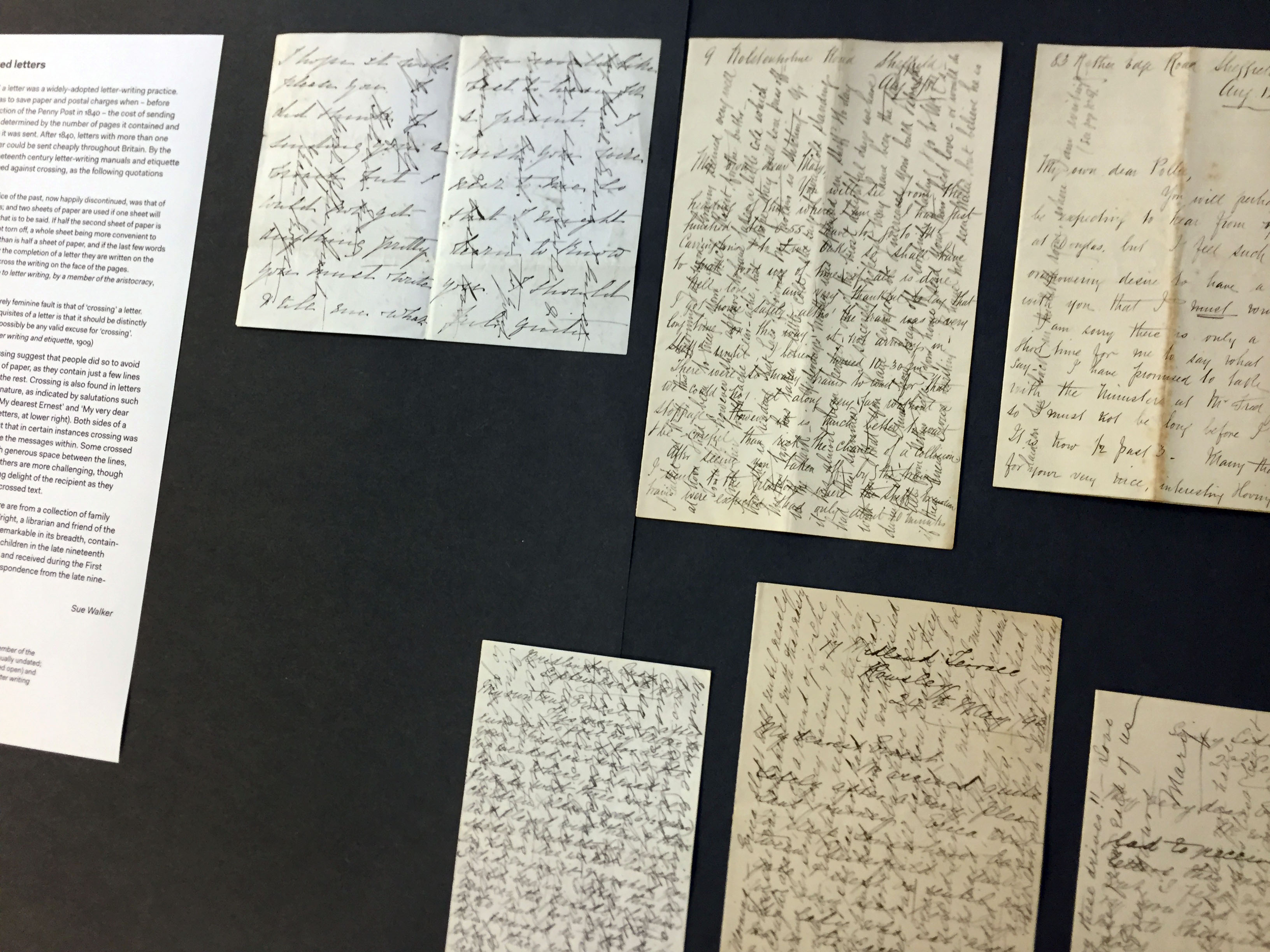
Crossed letters, 1880s–1910s, from the collection of Sue Walker.
Crossed letters
‘Crossing’ a letter was a widely-adopted letter-writing practice. The aim was to save paper and postal charges when – before the introduction of the Penny Post in 1840 – the cost of sending a letter was determined by the number of pages it contained and the distance it was sent. After 1840, letters with more than one sheet of paper could be sent cheaply throughout Britain. By the end of the nineteenth century letter-writing manuals and etiquette books cautioned against crossing, as the following quotations confirm:
‘Another practice of the past, now happily discontinued, was that of crossing letters; and two sheets of paper are used if one sheet will not contain all that is to be said. If half the second sheet of paper is left blank it is not torn off, a whole sheet being more convenient to hold and to fold than is half a sheet of paper, and if the last few words are necessary for the completion of a letter they are written on the margin and not across the writing on the face of the pages.’ (The correct guide to letter writing, by a member of the aristocracy, 1892)
‘Another almost entirely feminine fault is that of ‘crossing’ a letter. As one of the first requisites of a letter is that it should be distinctly written there cannot possibly be any valid excuse for “crossing”.’ (E. M. Busbridge, Letter writing and etiquette, 1909)
Some examples of crossing suggest that people did so to avoid starting a second sheet of paper, as they contain just a few lines written at 90 degrees to the rest. Crossing is also found in letters of a personal or intimate nature, as indicated by salutations such as ‘My own true Ernest’, ‘My dearest Ernest’ and ‘My very dear Ernest’ (see row of three letters, at lower right). Both sides of a sheet fully crossed suggest that in certain instances crossing was a deliberate ploy to disguise the messages within. Some crossed letters, especially those with generous space between the lines, are relatively easy to read. Others are more challenging, though one can imagine the unfolding delight of the recipient as they slowly deciphered a densely crossed text.
The crossed letters shown here are from a collection of family letters given to me by Vivian Wright, a librarian and friend of the Department. The collection is remarkable in its breadth, containing letters sent and received by children in the late nineteenth century, love letters, letters sent and received during the First World War, and day-to-day correspondence from the late nineteenth century to the 1960s.
On display
Crossed letters, 1880s–1910s
Etiquette books: The correct guide to letter writing, by a member of the aristocracy (published in many editions, usually undated; on display are editions from 1892 and the early 20th century); E. M. Busbridge, Letter writing and etiquette, 1909
‘Material histories’ presents graphic communication artefacts with a story to tell. The stories – the material histories – describe the artefacts in particular: what they are about, where they came from, their material qualities, their circumstances of production, how they were acquired, and crucially how they link to other artefacts, narratives and representations.
‘Material histories’ is a small exhibition now on display in the Department. It presents graphic communication artefacts with a story to tell. The stories – the material histories – describe the artefacts in particular: what they are about, where they came from, their material qualities, their circumstances of production, how they were acquired, and crucially how they link to other artefacts, narratives and representations.
In the first in a series of posts about artefacts in the exhibition, James Mosley tells the story of Emil Hübner’s Exempla scripturae epigraphicae Latinae.
Exempla scripturae epigraphicae Latinae
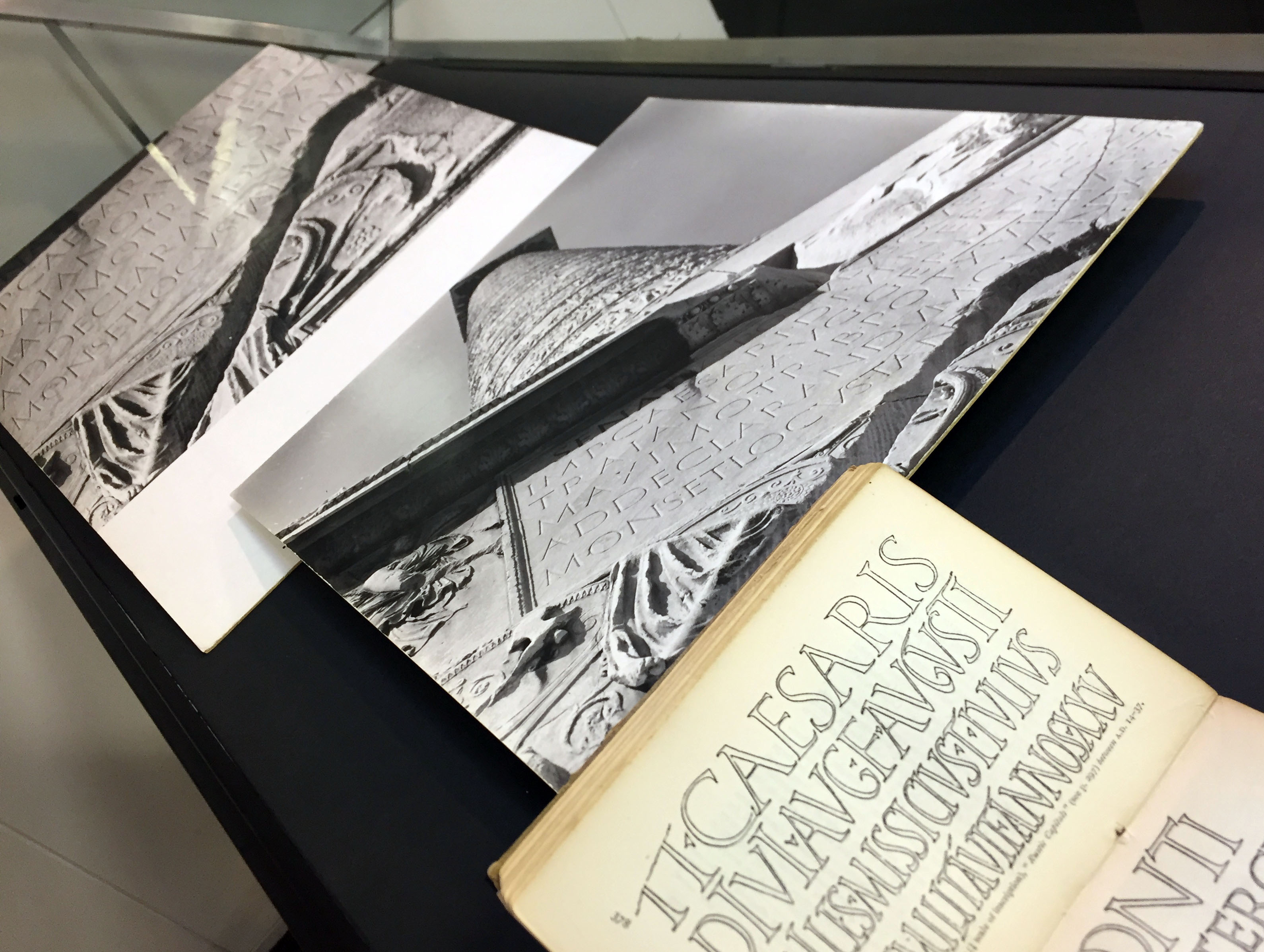
Emil Hübner’s collection of Latin inscriptions, Exempla scripturae epigraphicae Latinae, is a big book. It is not easy for the ordinary reader to approach. All the text – and there is a lot of it – is in Latin. But every inscription that is listed is shown in a line illustration. Many of the original inscriptions are routine jobs, while others delightfully capture calligraphic qualities. The inscriptions, as presented in the book, are well drawn, often (according to the captions) from photographs of the originals. They are printed from ‘zincographs’, which are relief etchings made directly from the drawings. Zincography was a relatively new process at the time, whose early history needs recording.
Emil Hübner, Exempla scripturae epigraphicae Latinae, opened to item 265, a sample of letters from the inscription at the base of Trajan’s column, Rome.
Edward Johnston was rightly impressed with what he called these ‘fine outline drawings’, and he included samples of them in his little handbook, Writing & illuminating, & lettering (1906). In her book, Lettering on buildings (1960), Nicolete Gray complained that the scale of the originals was difficult to judge, which is true. But over a thousand inscriptions are shown and the size of each line is given.
So Hübner’s book is on many people’s list of things to look at. In 1979, I received a prospectus from a publisher in Berlin offering a reprint, which I ordered for the St Bride Library. What I got was a surprise: a copy of the original book, printed in 1885, and not bound, but sewn and ready to use. I imagine that before the reprint was put in hand someone must have come across copies of the original book that had somehow survived in a warehouse, perhaps in Berlin, for nearly a century. I tipped off the ‘Typography Department’ at Reading, which ordered its own copy of the 1885 printing. This is the copy displayed here.
At Reading, Hübner’s book served a serious purpose. Study tours of Rome and Florence to see inscriptions on the spot and in context had become a distinctive part of the teaching undertaken by the newly created department. My own contribution was to offer images of some of the originals that I had made during my own research trips, and which I used in my teaching. Two of these are on display.
Edward Johnston, Writing & illuminating, & lettering, showing reproductions from Hübner; photographs of the inscription at the base of Trajan’s column, made by James Mosley in 1963.
On display
Emil Hübner, Exempla scripturae epigraphicae Latinae, Berlin: George Reimer, 1885
Edward Johnston, Writing & illuminating, & lettering, London: John Hogg, 1906 (2nd edition, 1908)
Inscription at the base of Trajan’s column, Rome, photographs by James Mosley, 1963
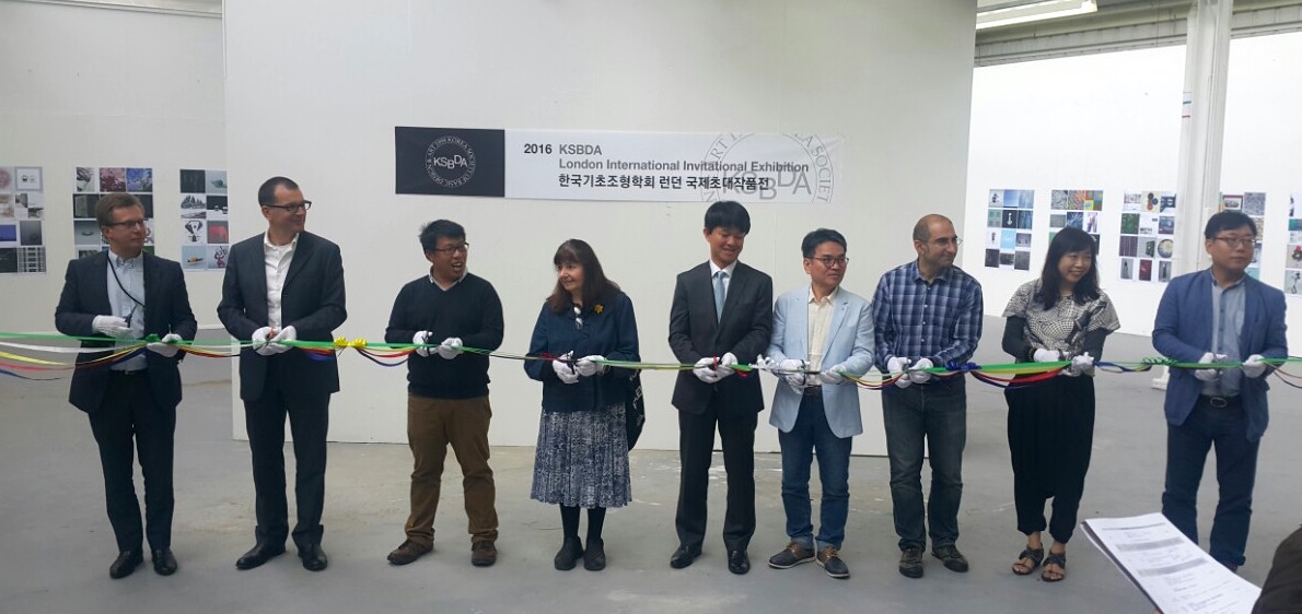
Ribbon-cutting ceremony in the Art Department gallery.
The Department of Typography did not get the memo that July is supposed to be a quiet period. We kicked off the month by hosting the KSBDA International Invitational Exhibition, its first stop after Seoul, and on its way to Katowice, Poland. The exhibition, attended by members of the current Board of the KSBDA and several past presidents, was held with the kind collaboration of the Department of Art. The visitors had the opportunity to examine material from the Collections in Typography, and discuss their use in teaching.
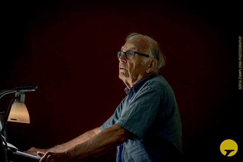
Professor Michael Twyman delivering the opening keynote at Thessaloniki.
The second week of July saw many staff, research students, and postgraduates fly off to Thessaloniki, to take part in the 6th ICTVC conference. The triennial event is spearheaded by alumnus Dr Klimis Mastoridis and aligns closely to the research strands of the Department. Several members delivered papers, and Emeritus Professor Michael Twyman delivered the opening keynote.
Celebrating the Monotype Studentship, from left: senior designer Malou Verlomme, Type Director Dr Nadine Chahine, the VC Sir David Bell, and Head of Department Professor Eric Kindel.
Back in Reading, we marked the tenth anniversary of the Monotype Studentship, a substantial initiative in funding support for our postgraduates. The Studentship is only one element of our deep collaboration with the company, which stretches from research support to technical training.
Over the two last weeks of July the Department was taken over by the annual TDi summer course. The international cohort (with participants from Bangladesh, Brazil, Canada, Dubai, India, Jordan, Korea, Malaysia, UAE, USA, as well as European countries and the UK) spent long days in sessions led by several members of the Department’s staff and student community, working in our studios, with material from the Department Collections, and personal staff collections. Through lectures and seminars, to hands-on sessions with archival material and letterpress equipment, the TDi provides a unique distillation of key areas of the Department’s narrative on typography and typeface design. Marek Jeziorek documented this year’s course in several albums, starting here.
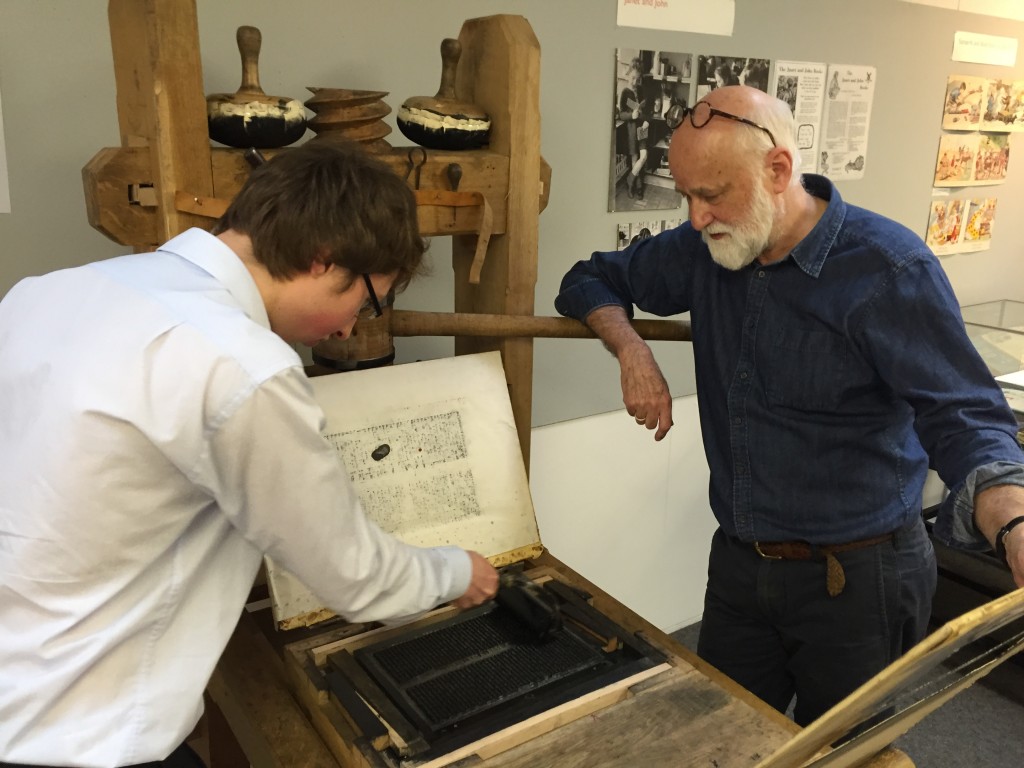
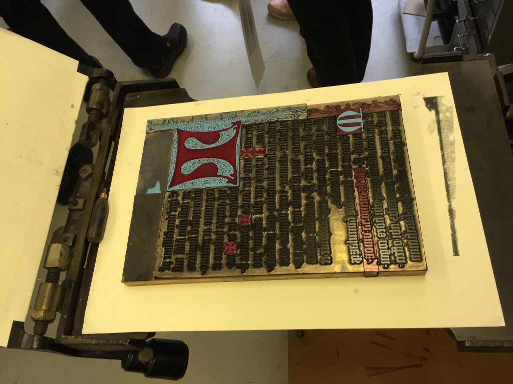
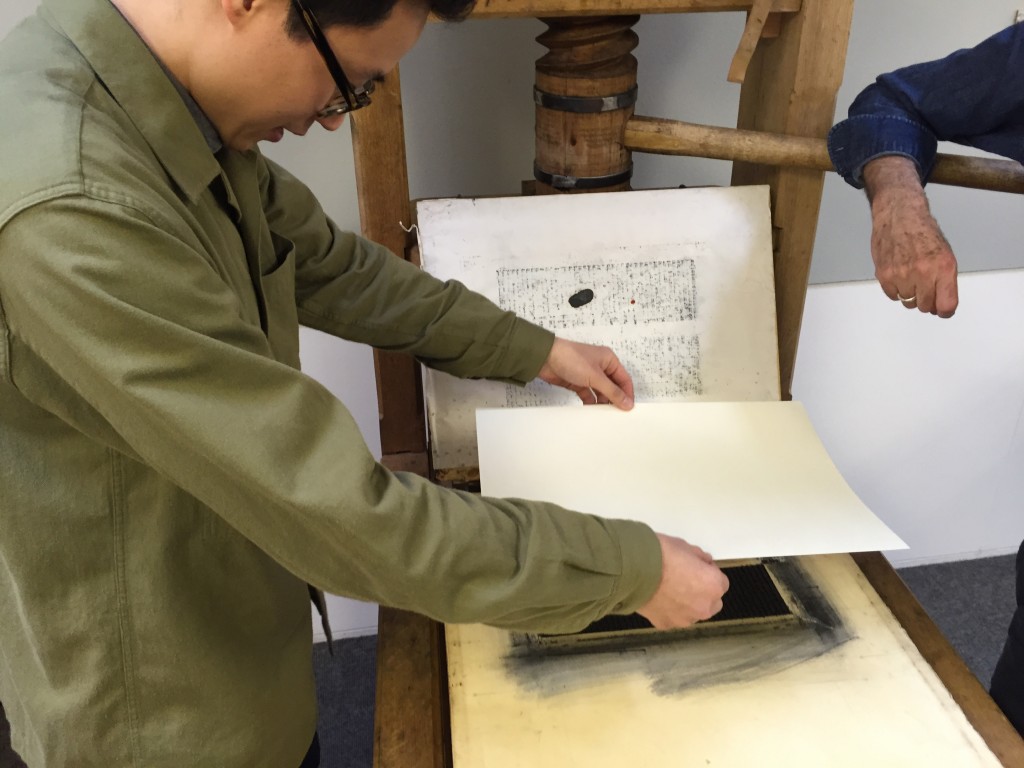
This workshop, based around the printing press collection in Typography, attracted postgraduate students, academic staff, museum and library professionals, and members of the public interested in the materiality of text, books and ephemeral documents.
Participants used the presses under craft supervision, and had a go at casting metal type.
They printed a page from the Gutenberg bible on a reconstructed one-pull wooden press that Gutenberg would have used, as well as 19th century woodblocks on another.
Alan May demonstrated printing of a Fust and Schoeffer 2-colour initial.
The workshop culminated in a fascinating talk by Dr Elizabeth Savage (British Academy Postdoctoral Fellow, Centre for Material Texts & Research Fellow, History of Art,Cambridge University) ‘Deciphering the First Colour-Printed Images in England: The Book of St Albans, 1486’
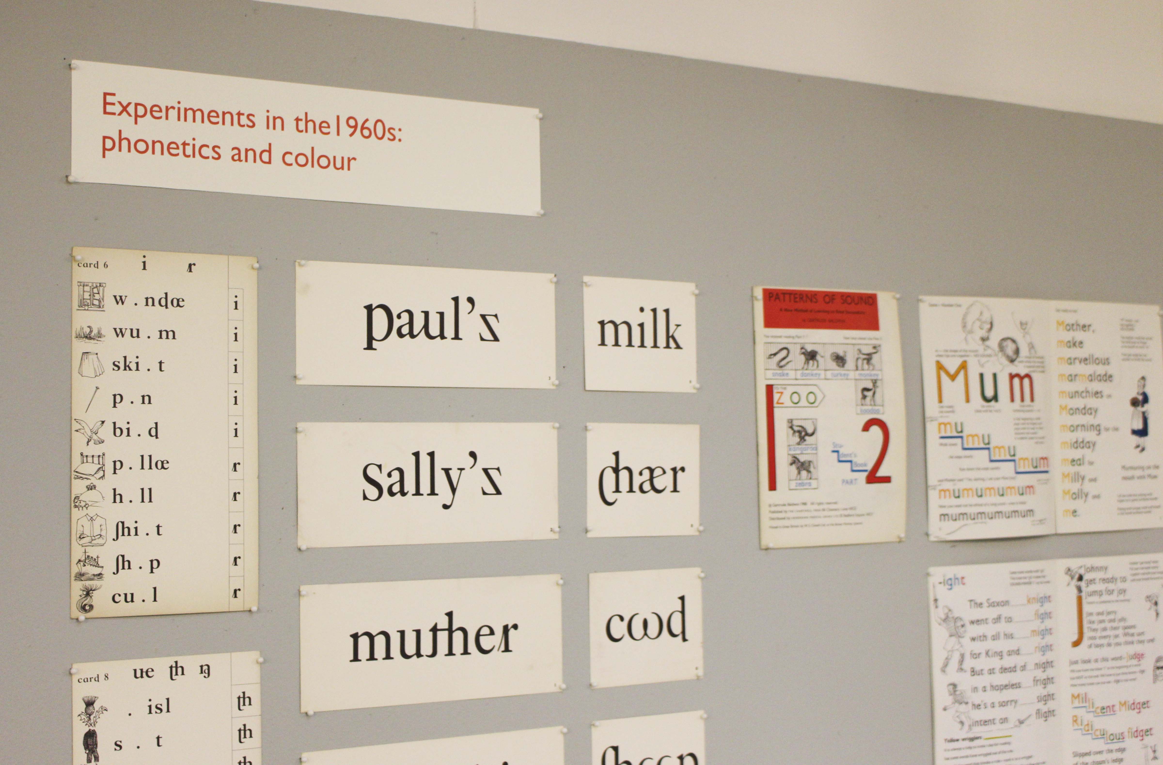
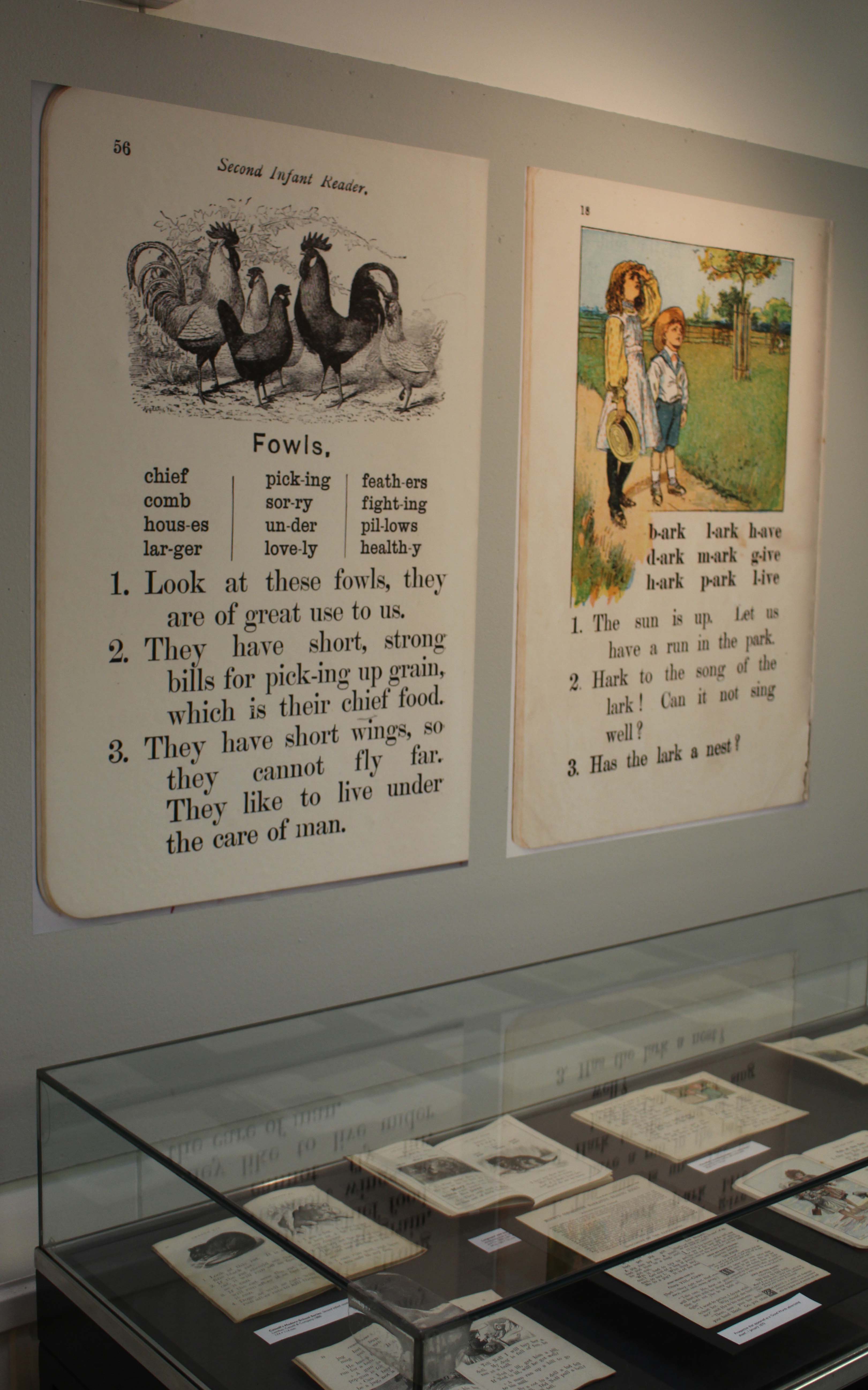
The use of typography and illustration in reading books for children has changed during the last hundred years. There has been a gradual shift from graphic conventions determined by printing and typesetting practice for adult readers to those more appropriate for beginning and emerging readers. Illustrations have become more important and many reading schemes used known artists to create the much-loved characters who featured in the narrative.